When it comes to the world of research, it is crucial to share your findings with your audience. One of the most common ways to do so is by using charts.

So how do you render your graphs on your website? One method is using images. In some cases, this is perfectly fine. However, there is one tiny issue in this case: sometimes, images don’t render well on high-pixel screens. Moreover, they become blurry when enlarged.
To mitigate this, you would have to increase the graphic’s resolution. But this will lead to another problem: larger images take up more memory and thus take a longer time to load. How do we get rid of this problem?
Luckily, this is where ApexCharts.js comes in. It is an easy-to-use, open source library that allows you to build interactive charts for your project.
Here are some of its features:
Before materializing a chart, we first need to initialize a React project:
npx create-react-app apex-tutorial
Next, to install the required dependencies, execute the following terminal command:
npm install apexcharts react-apexcharts
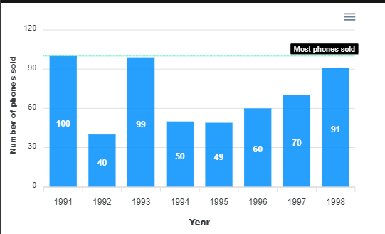
Bar charts are useful when you want to exhibit a comparison of values across various subgroups of your data. One notable example is comparing heights between multiple skyscrapers.
We will replicate this sample data from Math Goodies:
This piece of code renders a basic bar chart using the data above:
export default function SampleLine() {
  const series = [
    {
      name: "Temperature in Fahrenheit", //will be displayed on the y-axis
      data: [43, 53, 50, 57]
    }
  ];
  const options = {
    chart: {
      id: "simple-bar"
    },
    xaxis: {
      categories: [1, 2, 3, 4] //will be displayed on the x-asis
    }
  };
  return (
    <div>
      <Chart options={options} type="bar" series={series} width="80%" />
    </div>
  );
}
As you can see, the Chart component accepts three important props:
options prop specifies the configuration of the graph. Here, we have specified the labels for the x-axistype prop tells ApexCharts which kind of chart we want to display. In this case, we are rendering a bar chartseries prop contains the data that we want to display. Apex will display this on the y-axis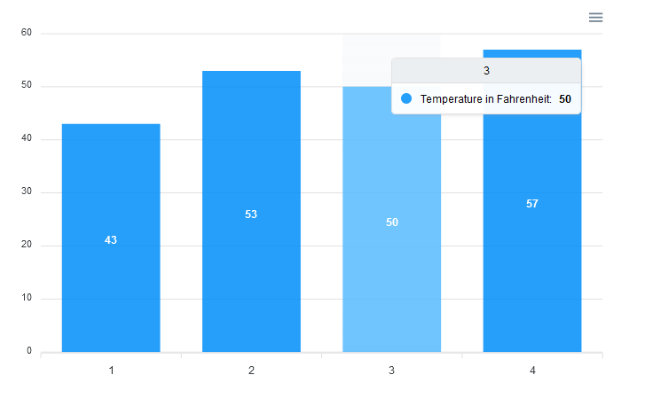
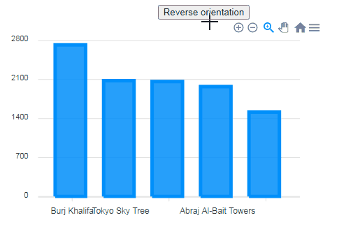
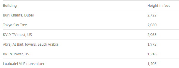
For this example, we will load this dataset from Statistics How To:
We can render this data by writing the following code:
const series = [
  {
    name: "Height in feet",
    data: [2722, 2080, 2063, 1972, 1516],
  },
];
const options = {
  chart: {
    id: "simple-bar",
  },
  xaxis: {
    categories: [
      "Burj Khalifa",
      "Tokyo Sky Tree",
      "KVLY-TV mast",
      "Abraj Al-Bait Towers",
      "Bren Tower",
    ],
  },
};

return (
  <div>
    <Chart options={options} type="bar" series={series} width="80%" />
  </div>
);
Notice that this time, we have passed in an array of string values into the xaxis.categories property. No further configuration was needed!
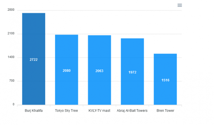
This will be the output of the program:
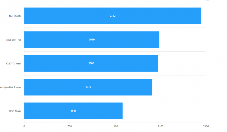
By default, Apex displays our charts in vertical orientation. You can render them horizontally by using the option.plotOptions.bar.horizontal property:
const options = {
  plotOptions: {
    bar: {
      horizontal: true, //horizontal bar chart
    },
  },
  //extra code removed for brevity
};

return (
  <div>
    <Chart options={options} type="bar" series={series} width="80%" />
  </div>
);
In the snippet above, we set the horizontal property to true. This will flip the chart’s orientation.
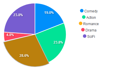
Pie charts allow you to show data in terms of percentages or ratios.
To demonstrate pie charts, we will use this dataset from Math Is Fun:
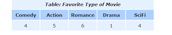
Just like bar charts, building pie charts is easy. To do so, you need to pass in your data and assign the type prop to pie like so:
const options = { labels: ["Comedy", "Action", "Romance", "Drama", "SciFi"] };
const series = [4, 5, 6, 1, 5]; //our data

return (
  <div className="donut">
    <Chart options={options} series={series} type="pie" width="380" />
  </div>
);
Here, the options.label property contains an array. Each element in this array corresponds to a section in the chart. Later on, we changed the type prop to pie. This will tell Apex to render a pie chart.
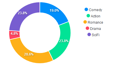
To morph this into a donut chart, modify the value of type to donut :
<Chart options={options} series={series} type="donut" width="380" />
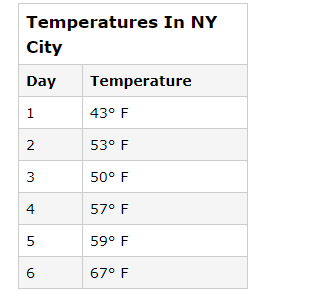
This type of chart is common when you want to depict trends or behaviors with respect to time.
As an example, we will use this table from Chartio:
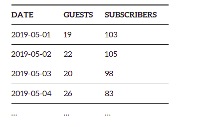
To get started with line charts, let’s display the Guests column only. In the next section, we will display both Guests and Subscribers in the same graph.
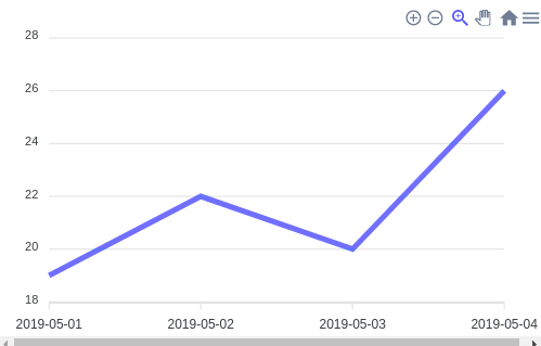
The following code renders information from the Guests array:
const series = [
    {
      name: "Guests",
      data: [19, 22, 20, 26]
    }
  ];
  const options = {
    xaxis: {
      categories: ["2019-05-01", "2019-05-02", "2019-05-03", "2019-05-04"]
    }
  };
  return <Chart type="line" series={series} options={options} />;
In this piece of code, we are rendering the Guests field. Furthermore, we have also used date values on our x-axis. Apex will automatically parse these values and display them as a timeline.
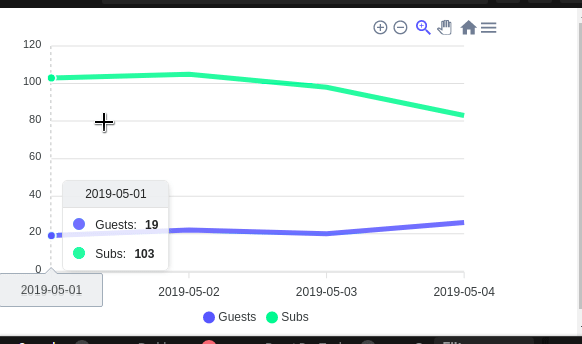
The Apex library also allows users to plot multiple datasets in the same graph.
Here, we will render both the Guests and Subscribers data this time.
To add more data to your sheet, append another object to the series array like so:
const series = [
  {
    name: "Guests",
    data: [19, 22, 20, 26],
  },
  //additional data in this array..
  {
    name: "Subs",
    data: [103, 105, 98, 83],
  },
];
This will be the result:
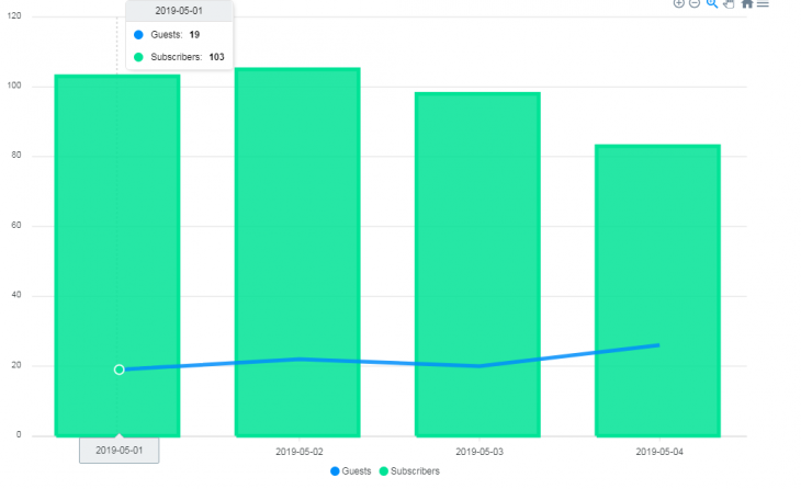
In some cases, it is common to display multiple chart types in one figure. One such example can be to couple a bar chart and a line chart together.
To do this with Apex Charts, you can specify the type property in the series array like so:
const series = [
  {
    type: "line", //render a line chart for this data
    name: "Guests",
    data: [19, 22, 20, 26],
  },
  {
    type: "column", //use column chart here.
    name: "Subscribers",
    data: [103, 105, 98, 83],
  },
];
return (
  <div>
    <Chart options={options} type="line" series={series} width="80%" />
  </div>
);
Here, we are rendering the Guests data in a line graph. Later on, we told React to represent the Subscribers dataset with a bar (column) chart.
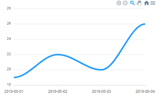
Apex even offers developers the option to customize the look of their lines.
To opt for a smoother looking line, change the options.stroke.curve property to smooth:
const guestOption = {
  stroke: {
    curve: "smooth",
  },
  //..
};
return (
  <div>
    <Chart type="line" series={guestSeries} options={guestOption} width={500} />
  </div>
);
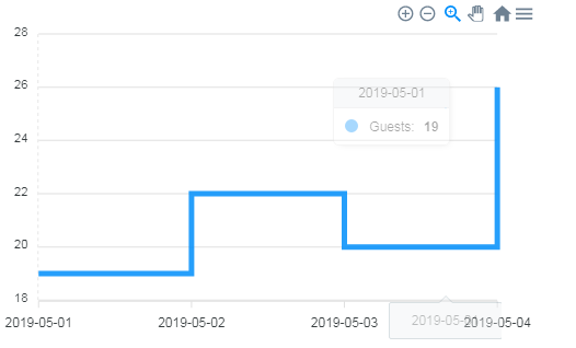
If you want to use a stepline curve, change the curve option to stepline:
const guestOption = {
  stroke: {
    curve: "stepline",
  },
//further code...
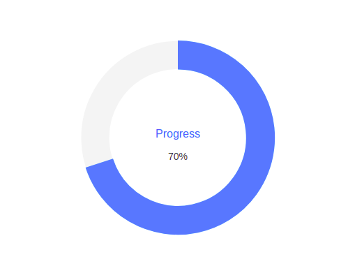
Radial charts are suitable for indicating progress. An example is showing the progress of a file download:
const series = [70]; //70 percent
const options = {
  labels: ["Progress"], //label of this diagram
};
return <Chart type="radialBar" series={series} options={options} />;
This time, we set the type property to radialBar. This will display a circular gauge on the page.
To showcase the capabilities of the radial bar, we will build a simple loading bar using ApexCharts:
const [progress, setProgress] = useState(0);
let interval = useRef(null);

useEffect(() => {
  interval.current = setInterval(() => {
    setProgress((old) => old + 50);
  }, 1000);
  return () => {
    clearInterval(interval.current);
  };
}, []);

useEffect(() => {
  if (progress < 100) return;
  clearInterval(interval.current);
}, [progress]);

const series = [progress]; //70 percent
return <Chart type="radialBar" series={series} options={options} width={500} />;
Here is an explanation of this code:
interval Hook. This is an instance of useRef and will be responsible for controlling our interval throughout the application’s lifecyclesetInterval method. This will increment the value of progress by 50 unitsprogress Hook changes, the app will check if its value exceeds 100. If this condition is met, React will remove the interval from memory. As a result, the program stops incrementing the value of progress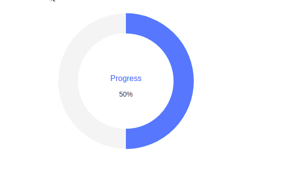
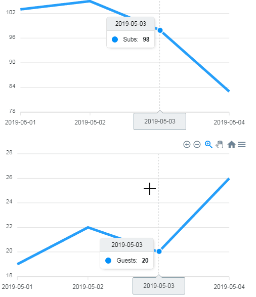
If you have multiple charts with the same x-axis values, it might be good to visualize them through synced charts.
Using synced charts in your app is an effortless process, but you have to ensure that your code meets the following conditions:
xaxis.categories are the same for all graphschart.group option should be identical. Otherwise, Apex won’t sync your chartswidth and height properties) should also be similaroptions.id should be different for each graph. This allows the library to identify each figure and render them to the screenThe snippet of code below will display the guests and subscribers graphs and sync them together:
//create series and options for our 'guests' data
const guestSeries = [
  {
    name: "Guests",
    data: [19, 22, 20, 26],
  },
];
const guestOption = {
  chart: {
    id: "guest",
    group: "social",
  },
  xaxis: {
    categories: ["2019-05-01", "2019-05-02", "2019-05-03", "2019-05-04"],
  },
};
//create series and options for our 'subscribers' data
const subSeries = [
  {
    name: "Subs",
    data: [103, 105, 98, 83],
  },
];
const subOptions = {
  chart: {
    id: "Subs",
    group: "social", //group name same as guestOptions
  },
  xaxis: {
    categories: ["2019-05-01", "2019-05-02", "2019-05-03", "2019-05-04"],
  },
};
return (
  <div>
    <Chart type="line" series={subSeries} options={subOptions} width={500} />
    <Chart type="line" series={guestSeries} options={guestOption} width={500} />
  </div>
);
In this piece of code, we created a series and an options object for each dataset. It is also important to notice that our group property and the x-axis values of each set are identical. This allows Apex to render the charts and pair them together to build synchronized charts.
This will be the output:
As stated earlier, Apex lets developers modify graph animations to suit their needs. In this section, we will cover some important properties that allow control over the animation.
To remove animations entirely, assign the options.chart.animations.enabled property to false:
const guestOption = {
  chart: {
    animations: {
      enabled: false, //no animations
    },
  },
  //unnecessary code redacted..
};

return (
  <div>
    <Chart options={guestOption} series={series} type="line" />
  </div>
);
The code above tells React to render the charts and remove the animations.
You can speed up or slow down your animations via the speed property. The default value is 800.
In the code below, we are accelerating our animation:
const options = {
  chart: {
    id: "simple-bar",
    animations: {
      speed: 100, //make the transition faster
    },
//further code..

To make the animation slower, increase the value of speed like so:
const options = {
  chart: {
    id: "simple-bar",
    animations: {
      speed: 1900, //make the transition slower
    },
//further code..

You can find the source code for this program in this CodeSandbox.
In this guide, we discussed a handful of important graphs and concepts to help you get started with the Apex charting library. If you want to render graphs in your web app, then Apex Charts will be a great fit for your arsenal. The lines of code required to render your charts are minimal, thus reducing boilerplate code.
Thank you so much for reading!
Install LogRocket via npm or script tag. LogRocket.init() must be called client-side, not
server-side
$ npm i --save logrocket

// Code:

import LogRocket from 'logrocket';
LogRocket.init('app/id');
// Add to your HTML:

<script src="https://cdn.lr-ingest.com/LogRocket.min.js"></script>
<script>window.LogRocket && window.LogRocket.init('app/id');</script>

Learn how contrast-color() automatically picks accessible text colors using native CSS, without JavaScript.

Learn how to build smooth staggered animations in CSS using modern features like sibling-index(), complete with practical examples, fallbacks, and accessibility tips.

Compare the top AI development tools and models of July 2026. View updated rankings, feature breakdowns, and find the best fit for you.

Learn how to detect unused and ghost dependencies in JavaScript projects using Knip, a project-level linter that keeps your dependency graph accurate.
Hey there, want to help make our blog better?
Join LogRocket’s Content Advisory Board. You’ll help inform the type of content we create and get access to exclusive meetups, social accreditation, and swag.
Sign up now

 Learn more →
