react-ts-form
Building forms with React can often be cumbersome and time-consuming, requiring repetitive code to handle form state, user input, and data validation.

Although several form libraries exist to simplify the process of building forms in React, not all have built-in support for type-safe forms. Thus, even when using a form library like Formik, creating type-safe forms in TypeScript can result in boilerplate code.
One solution to this problem is react-ts-form, a complete and customizable library for creating type-safe forms in React. Thanks to this library, you can avoid boilerplate code and make type-safe form development in React more maintainable.
In this article, you will learn what react-ts-form is, what its most important features are, and how to use it to build a type-safe React form in TypeScript. Jump ahead:
react-ts-form makes building type-safe forms possible in Reactreact-ts-formCheck out the complete GitHub repository for the example type-safe form we’ll create later in this article using react-ts-form.
The boring and time-consuming task of building forms in React generally involves the following steps:
Each of these steps needs to be implemented manually. So, dealing with several forms can become particularly tedious. And as we mentioned earlier, this task generally results in cumbersome, boilerplate, and repetitive code.
As a result, several libraries have been developed to make it easier to create and manage forms. The most popular one is Formik, an open source library that makes it easier to deal with form state, handle user input, implement validation, and manage form submission.
Formik drastically reduces the amount of boilerplate code required to create forms in React. However, its main problem is that even though it is written in TypeScript, it does not offer built-in support for type-safe forms.
You can manually integrate Formik with schema validation libraries like Zod and Yup, but that will involve boilerplate code. As a result, this library may not be the best solution for building type-safe forms with TypeScript in React.
So, is there an alternative to Formik for type-safe forms? Yes, and it is called react-ts-form!
react-ts-form makes building type-safe forms possible in ReactThe lightweight react-ts-form library leverages Zod’s powerful data validation capabilities and extends React Hook Form with additional developer-friendly features.
In other words, this form library allows you to define form type schemas using Zod’s syntax, including field validation and description. Plus, it integrates with React Hook Form to handle type-safe form state management, user input tracking, and form submission.
Compared to other form libraries like Formik, react-ts-form provides a more concise and streamlined syntax. This makes it easier to define and manage form schemas while avoiding boilerplate code.
That does not mean that react-ts-form sacrifices customizability. On the contrary, it supports custom validation rules, types, and input components. It also offers a flexible and extensible error-handling system, allowing developers to customize error messages and display them as they want.
react-ts-formAs opposed to Formik, react-ts-form comes with advanced type schema validation capabilities. In particular, it equips you with everything you need to build a type-safe form in just a few lines of code.
Some pros of the react-ts-form library include:
zod schemasHowever, you should also keep the following considerations in mind:
Time to see react-ts-form in action!
Let’s see what react-ts-form has to offer when it comes to building type-safe forms in React through some examples. Here’s what we’ll cover in this section:
react-ts-formThe complete code for this example type-safe form is available on GitHub. You can check it out to follow along as we get started.
react-ts-formTo get the most value out of react-ts-form, you need the following:
strict field in compilerOptions to true in your tsconfig.json file to enable stricter type checking@ts-react/form to your project’s dependencieszod, react-hook-form, and @hookform/resolversTo meet the last two prerequisites, install the library and peer dependencies with the following command:
npm install @ts-react/form
npm install zod react-hook-form @hookform/resolvers
You are now ready to create a type-safe form in React!
First, you need to define a type-to-component mapping object to map Zod primitives to your input components. Then, you can use that object to create a global form component with createTsForm():
// src/components/MyTypeSafeForm.tsx

import { createTsForm } from "@ts-react/form"
import { z } from "zod"
// import the custom input components
import TextField from "./TextField"
import NumberField from "./NumberField"
import CheckBoxField from "./CheckBoxField"
import DateField from "./DateField"

// specify the mapping between the zod types
// and your input components
const mapping = [
    [z.string(), TextField],
    [z.boolean(), CheckBoxField],
    [z.number(), NumberField],
    [z.date(), DateField],
] as const // <- note that this "as const" is necessary

// create the type-safe form React component
const MyTypeSafeForm = createTsForm(mapping)

export default MyTypeSafeForm
Since the mapping between types and components is generally the same across the entire project, you typically need only one form component.
You can then use <MyTypeSafeForm> to define a type-safe form, as in the example below:
// src/components/LoginForm.tsx

import { z } from "zod"
import MyTypeSafeForm from "./MyTypeSafeForm"

const LoginSchema = z.object({
  email: z.string(), // will render a <TextField> component
  password: z.string(), // will render a <TextField> component
  keepSignedIn: z.boolean(), // will render a <CheckBoxField> component
})

export default function LoginForm() {
  function onSubmit(data: z.infer<typeof LoginSchema>) {
    // retrieve type-safe data when the form is submitted
    // and call the login API...
    const requestBody = {
      email: data.email, // string
      password: data.password, //string
      keepSignedIn: data.keepSignedIn, //boolean
    }

    fetch("https://api.example.com/login", {
      method: "POST",
      headers: {
        "Content-Type": "application/json",
      },
      body: JSON.stringify(requestBody),
    })
      .then((response) => {
        // ...
      })
      .catch((error) => {
        // ...
      })
  }

  return (
    <MyTypeSafeForm
      schema={LoginSchema}
      onSubmit={onSubmit}
      // add the Submit button to the form
      renderAfter={() => <button type="submit">Login</button>}
      defaultValues={{
          keepSignedIn: true
      }}
    />
  )
}
As you can see, <MyTypeSafeForm> accepts a schema object containing the form fields. react-ts-form renders each field as the input component specified in the mapping object passed to createTsForm().
In other words, the library will initialize each field with the values defined in the optional defaultValues prop. When a user clicks on the type="submit" button, it will then pass the typed form values to the onSubmit() callback.
Note that if your Zod schema involves a type that does not have a mapping, react-ts-form will fail with the following error:
No matching zod schema for type `<ZodType>` found in mapping for property `<your_property>`. Make sure there's a matching zod schema for every property in your schema.
Another important aspect to take into account is that all fields specified in the schema are required by default. To make them optional, you can use the Zod’s optional() function:
const LoginSchema = z.object({
  email: z.string(),
  password: z.string(),
  keepSignedIn: z.boolean().optional(), // optional field
})
In the onSubmit callback, keepSignedIn will now have the type boolean | undefined.
Also, react-ts-form supports labels and placeholders through Zod’s describe() method:
const LoginSchema = z.object({
  // label: "Email", placeholder: "[email protected]"
  email: z.string().describe("Email // [email protected]"),
  // label: "Password" and no placeholder
  password: z.string().describe("Password"),
  keepSignedIn: z.boolean().optional(),
})
Keep in mind that labels and placeholders must be specified in the following format:
<LABEL> // <PLACEHOLDER>
In the example above, the email and password fields are both rendered with the generic <TextField> component. This happens because they are both of type string. However, the password field should require a specialized input component.
For this reason, react-ts-form supports type collisions through the createUniqueFieldSchema() function. Use it to map the same zod schema type to different components, as below:
// src/components/MyTypeSafeForm.tsx

import { createTsForm, createUniqueFieldSchema } from "@ts-react/form"
import { z } from "zod"
import TextField from "./TextField"
import NumberField from "./NumberField"
import PasswordField from "./PasswordField"

export const PasswordSchema = createUniqueFieldSchema(
    z.string(),
    "password" // a string ID that must be unique across all zod schema types
)

const mapping = [
    [z.string(), TextField],
    [PasswordSchema, PasswordField], // special mapping
    [z.boolean(), CheckBoxField],
    [z.number(), NumberField],
    [z.date(), DateField],
] as const

// MyTypeSafeForm...
You can then use the new zod type in z.object() while creating a schema:
// src/components/LoginForm.tsx

import { z } from "zod"
import MyTypeSafeForm, { PasswordSchema } from "./MyTypeSafeForm"

const LoginSchema = z.object({
    email: z.string(), // will render a <TextField> component
    password: PasswordSchema, // will render a <PasswordField> component
    keepSignedIn: z.boolean(), // will render a <CheckBoxField> component
})

// LoginForm...
The password field will now be rendered in a <PasswordField> input component.
As explained earlier, the zod-to-component mapping object associates zod schema types to input components. These cannot be just any components — they must follow a particular logic. More specifically, they must rely on the useTsController() hook:
// src/components/TextField.tsx

import { useDescription, useTsController } from "@ts-react/form"

export default function TextField() {
    const { field } = useTsController<string>()
    // to render the label and placeholder
    const { label, placeholder } = useDescription()

    return (
        <>
            <label>{label}</label>
            <input
                placeholder={placeholder}
                value={field.value ? field.value : ""}
                onChange={(e) => {
                    // to update the form field associated to this
                    // input component
                    field.onChange(e.target.value)
                }}
            />
        </>
    )
}
useTsController() is a typed extension of React Hook Form’s useController() hook, responsible for keeping the form state up-to-date. Also, note the use of the useDescription() hook to retrieve the field label and placeholder.
react-ts-form is also aware of the input component props. Suppose that your <TextField> component requires a bordered boolean:
// src/components/TextField.tsx

import { useDescription, useTsController } from "@ts-react/form"

export default function TextField({ bordered }: { bordered: boolean }) {
    // ...
}
<MyTypeSafeForm> in <LoginForm> will now throw a type error:
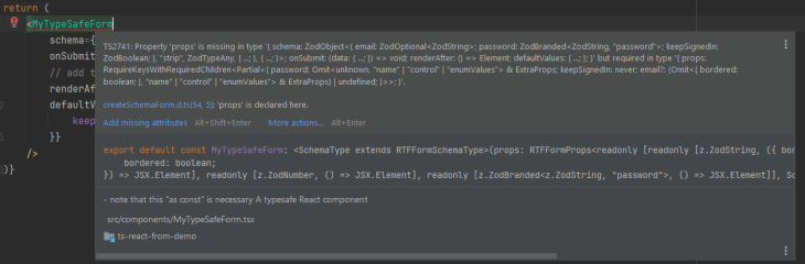
This is because you must specify the bordered prop on all <TextField> fields. Thanks to the type-handling capabilities of react-ts-form, your IDE will offer autocomplete functionality for the input component props:
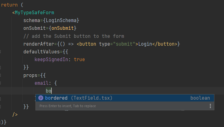
Update your form as follows to make the type error disappear:
<MyTypeSafeForm
    schema={LoginSchema}
    onSubmit={onSubmit}
    // add the Submit button to the form
    renderAfter={() => <button type="submit">Login</button>}
    defaultValues={{
        keepSignedIn: true
    }}
    props={{
        email: {
            bordered: false
        }
    }}
/>
If you do not know how to implement the most common input components, the react-ts-form docs provide sample implementations you can reference for help.
Your form may also involve non-input UI components, such as a header. You can specify them in react-ts-form with the renderBefore and renderAfter props. Similarly, you can use the beforeElement and afterElement to add UI elements between input components.
See those props in action in the following example:
<MyTypeSafeForm
    schema={LoginSchema}
    onSubmit={onSubmit}
    // add the Submit button to the form
    renderAfter={() => <button type="submit">Login</button>}
    // add a header section to the form
    renderBefore={() => <h1>Login</h1>}
    defaultValues={{
        keepSignedIn: true
    }}
    props={{
        password: {
            // separate the form input components with a line
            afterElement: <hr />
        }
    }}
/>
renderAfter is typically used to add a “Submit” button to the form. When clicked, it will automatically trigger the onSubmit callback. Other UI components are optional and can be added as you see fit.
Another crucial aspect when it comes to building a form in React is data validation, which plays a key role in preventing server-side errors.
For example, some fields may be mandatory or accept only data in a specific format. Performing data validation on the frontend means not allowing users to submit the form until all values are valid.
To avoid making the validation process frustrating, it is critical to notify users of the error made during entry. For this reason, the useTsController() hook also returns an error object.
You can use useTsController to display the validation error message by adding a special feedback <span> to your input components:
// src/components/TextField.tsx

import { useDescription, useTsController } from "@ts-react/form"

export default function TextField() {
    const { label, placeholder } = useDescription()
    const { field, error  } = useTsController<string>()

    return (
        <>
            <label>{label}</label>
            <input
                placeholder={placeholder}
                value={field.value ? field.value : ""}
                onChange={(e) => {
                    field.onChange(e.target.value)
                }}
            />
            // the validation error <span>
            {error?.errorMessage && <span className={"error"}>{error?.errorMessage}</span>}
        </>
    )
}
Then, you can specify a validation constraint and message in zod as below:
const LoginSchema = z.object({
  email: z.string()
      .describe("[email protected]")
      .email("Enter a valid email"),
  password: z.string()
      .min(1, "Password must have at least 8 characters")
      .min(8, "Your password cannot be longer than 16 characters in length"),
  keepSignedIn: z.boolean(),
})
Zod comes with several built-in validation methods, but you can also define custom validation rules.
Et voilà! You can now build type-safe forms in React with custom input components, error handling, data validation, and no boilerplate involved! Check out the official react-ts-form docs to explore the remaining features offered by @ts-react/form.
In this article, you learned what it takes to build type-safe forms in React and how a powerful library like react-ts-form can help you with that.
As you saw here, popular form libraries like Formik do not have complete type-safe capabilities. Thus, they may not be the ideal solution for React form development in TypeScript.
With react-ts-form, you can easily build a type-safe form in TypeScript with a handful of lines of code, avoiding tedious and repetitive operations.
Install LogRocket via npm or script tag. LogRocket.init() must be called client-side, not
server-side
$ npm i --save logrocket

// Code:

import LogRocket from 'logrocket';
LogRocket.init('app/id');
// Add to your HTML:

<script src="https://cdn.lr-ingest.com/LogRocket.min.js"></script>
<script>window.LogRocket && window.LogRocket.init('app/id');</script>

Learn how to use Fallow to analyze AI-generated code, detect dead code, duplicate logic, and complexity issues, and integrate automated code quality checks into your AI-assisted development workflow.

Learn how to protect full-stack projects from NPM supply chain attacks with a practical security checklist.

Explore 15 essential MCP servers for web developers to enhance AI workflows with tools, data, and automation.

Learn how contrast-color() automatically picks accessible text colors using native CSS, without JavaScript.
Hey there, want to help make our blog better?
Join LogRocket’s Content Advisory Board. You’ll help inform the type of content we create and get access to exclusive meetups, social accreditation, and swag.
Sign up now

 Learn more →
