Flutter, as a cross-platform application framework, enables you to develop apps that look and feel great on any platform using a single codebase. With the release of Flutter 3.0, we now have Windows, macOS, and web completely stable on it.

This means that when developing an app for these platforms, we must take into account different device specifications and ensure that the appeal of our app is consistent and provides users with a seamless experience.
With this in mind, Flutter provides a variety of widgets and classes for creating responsive layouts in applications; including MediaQuery, LayoutBuilder, Expanded, Flexible, and AspectRatio.
In this article, we’ll be looking at how we can build a responsive login page using the two main approaches recommended by the Flutter team, which are the MediaQuery and LayoutBuilder classes.
Before proceeding, I recommend that you ensure you meet the following prerequisites to continue with this tutorial:
So with all that out of the way, let’s get started.
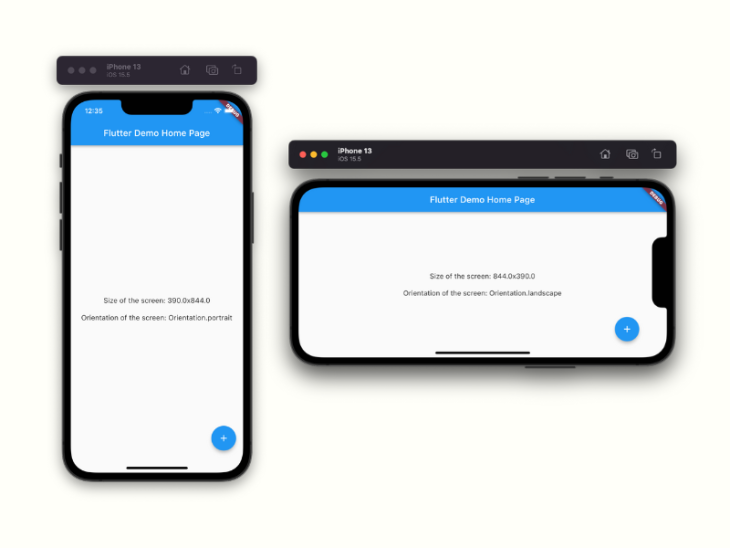
The MediaQuery class has a .of method that takes in a context and gives you access to the size (width/height) and orientation (portrait/landscape) of your current app.
Here is an example:
//...
class _MyHomePageState extends State<MyHomePage> {
  @override
  Widget build(BuildContext context) {
    final size = MediaQuery.of(context).size; //getting the size property
    final orientation = MediaQuery.of(context).orientation; //getting the orientation
    return Scaffold(
      appBar: AppBar(
        title: Text(widget.title),
      ),
      body: Center(
        child: Column(
          mainAxisAlignment: MainAxisAlignment.center,
          children: <Widget>[
            Text('Size of the screen: ${size.width}x${size.height}',
                style: const TextStyle(fontSize: 16)),
            const SizedBox(height: 20),
            Text('Orientation of the screen: $orientation',
                style: const TextStyle(fontSize: 16)),
          ],
        ),
      ),
      floatingActionButton: FloatingActionButton(
        onPressed: incrementCounter,
        tooltip: 'Increment',
        child: const Icon(Icons.add),
      ),
    );
  }
}
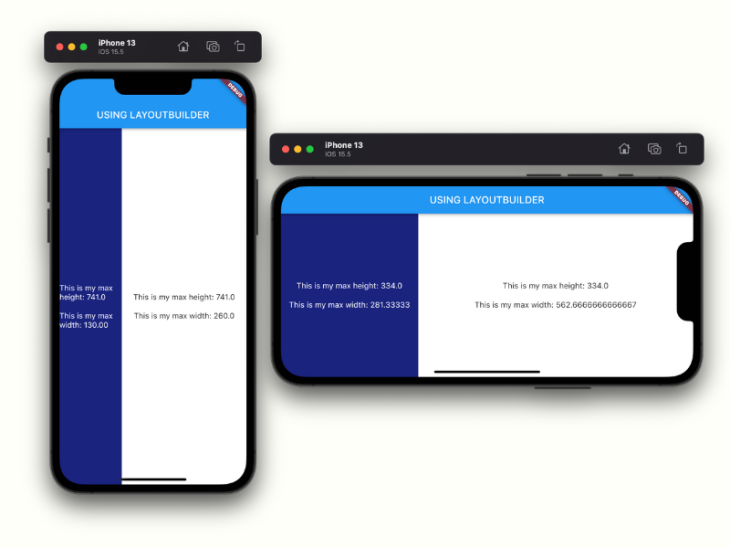
The LayoutBuilder class has a builder property that allows us to access a BoxConstraint object.
This object contains constraint information for a specific widget, which can be used to calculate the widget’s maxWidth and maxHeight. These values are crucial in adjusting our display based on the size constraints assigned to our widget.
Here’s an example:
//...
class _MyHomePageState extends State<MyHomePage> {
  @override
  Widget build(BuildContext context) {
    return Scaffold(
      appBar: AppBar(
        title: const Text('USING LAYOUTBUILDER'),
      ),
      body: Row(
        children: [
          Expanded(
            flex: 2,
            child: LayoutBuilder(builder: (context, constraints) {
              return Container(
                width: constraints.maxWidth,
                height: constraints.maxHeight,
                color: Colors.indigo.shade900,
                child: Column(
                  mainAxisAlignment: MainAxisAlignment.center,
                  children: <Widget>[
                    Center(
                      child: Text(
                          'This is my max height: ${constraints.maxHeight}',
                          style: const TextStyle(
                              fontSize: 16, color: Colors.white)),
                    ),
                    const SizedBox(height: 20),
                    Center(
                      child: Text(
                          'This is my max width: ${constraints.maxWidth.toStringAsFixed(2)}',
                          style: const TextStyle(
                              fontSize: 16, color: Colors.white)),
                    ),
                  ],
                ),
              );
            }),
          ),
          Expanded(
            flex: 4,
            child: LayoutBuilder(builder: (context, constraints) {
              return Container(
                width: constraints.maxWidth,
                height: constraints.maxHeight,
                color: Colors.white,
                child: Column(
                  mainAxisAlignment: MainAxisAlignment.center,
                  children: <Widget>[
                    Text('This is my max height: ${constraints.maxHeight}',
                        style: const TextStyle(fontSize: 16)),
                    const SizedBox(height: 20),
                    Text('This is my max width: ${constraints.maxWidth}',
                        style: const TextStyle(fontSize: 16)),
                  ],
                ),
              );
            }),
          ),
        ],
      ),
    );
  }
}
Now that we have a general idea of how they function, let’s use them to build a responsive login page that looks great on all platforms.
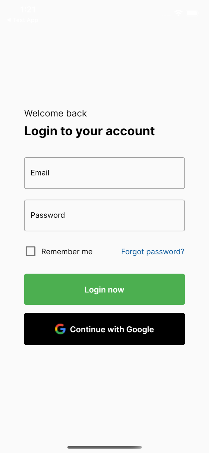
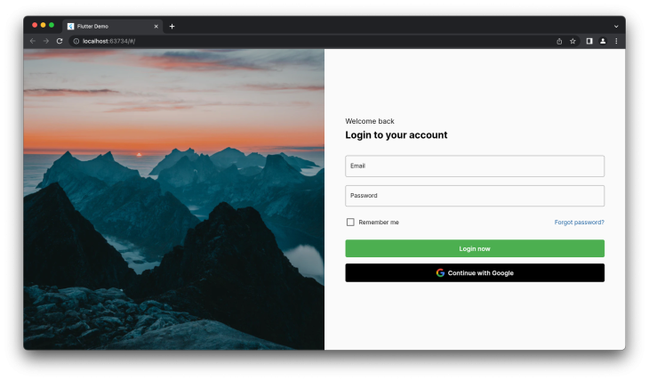
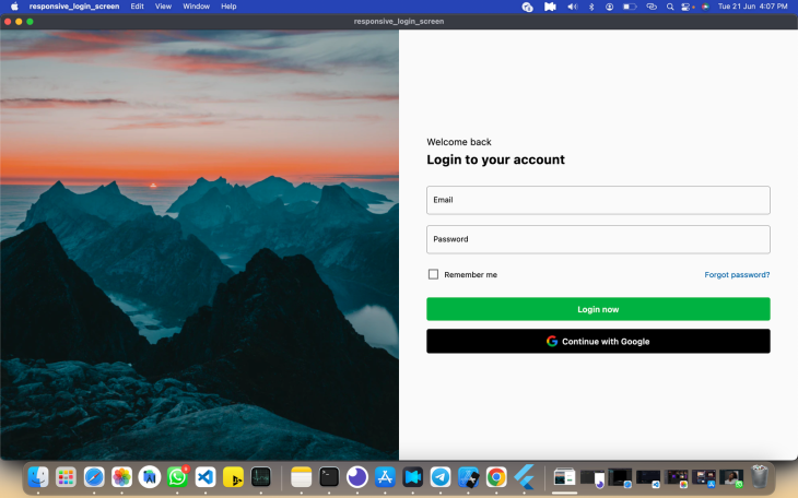
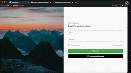
To begin with, we will be building a simple login screen similar to the images below:
Now, let’s create a new Flutter project, and paste the following code into your main.dart file as the starting point of our app:
import 'package:flutter/material.dart';

void main() {
  runApp(const MyApp());
}

class MyApp extends StatelessWidget {
  const MyApp({Key? key}) : super(key: key);
  // This widget is the root of your application.
  @override
  Widget build(BuildContext context) {
    return MaterialApp(
      title: 'Flutter Demo',
      debugShowCheckedModeBanner: false,
      theme: ThemeData(
        primarySwatch: Colors.blue,
      ),
      home: const LoginScreen(), //<--
    );
  }
}
Notice in the above code snippet that we have a LoginScreen widget; now let’s create the LoginScreen widget. This widget can house our LayoutBuilder class, as well as how we can return different screens based on the device size specifications.
class LoginScreen extends StatelessWidget {
  const LoginScreen({Key? key}) : super(key: key);
  @override
  Widget build(BuildContext context) {
    return Scaffold(
      body: LayoutBuilder(
        builder: (context, constraints) {
          if (constraints.maxWidth < 600) {
            return const LoginMobile();
          } else if (constraints.maxWidth > 600 && constraints.maxWidth < 900) {
            return const LoginTablet();
          } else {
            return const LoginDesktop();
          }
        },
      ),
    );
  }
}
From the code snippet above, notice how we set a width breakpoint and then used the constraint object derived from the LayoutBuilder widget to check if the device maxWidth value is greater or less than the width breakpoint — and return appropriate widgets as needed.
In our case, we return the mobile view if the maxWidth is less than 600, the tablet view if it is between 600 and 900, and the desktop/web view otherwise.
The LoginMobile widget basically has two TextFormField widgets that serve as our email and password fields, as well as a button to handle event submission, as shown in the code snippet below.
The mobile and tablet view essentially renders the same thing, so for the sake of brevity, I won’t be including the tablet view code.
class _LoginMobileState extends State<LoginMobile> {
  bool _isChecked = false;
  @override
  Widget build(BuildContext context) {
    return Center(
      child: SingleChildScrollView(
        child: Padding(
          padding: const EdgeInsets.all(30),
          child: Center(
            child: SizedBox(
              width: 300,
              child: Column(
                mainAxisAlignment: MainAxisAlignment.center,
                crossAxisAlignment: CrossAxisAlignment.stretch,
                children: [
                  Text(
                    'Welcome back',
                    style: GoogleFonts.inter(
                      fontSize: 17,
                      color: Colors.black,
                    ),
                  ),
                  const SizedBox(height: 8),
                  Text(
                    'Login to your account',
                    style: GoogleFonts.inter(
                      fontSize: 23,
                      color: Colors.black,
                      fontWeight: FontWeight.w700,
                    ),
                  ),
                  const SizedBox(height: 35),
                  TextFormField(
                   //...
                  ),
                  const SizedBox(height: 20),
                  TextFormField(
                   //...
                  ),
                  const SizedBox(height: 25),
                  Row(
                    //...
                  ),
                  const SizedBox(height: 30),
                  TextButton(
                   //...
                  ),
                  const SizedBox(height: 15),
                  TextButton(
                  //...
                  ),
                ],
              ),
            ),
          ),
        ),
      ),
    );
  }
}
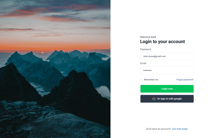
For the web view, we’ll show a split screen with an image and our previously created login components. We do that by placing them side by side using a Row widget and then wrapping both sides with an Expanded widget to take up the remaining free space.
//...
class _LoginDesktopState extends State<LoginDesktop> {
  //...
  bool _isChecked = false;
  @override
  Widget build(BuildContext context) {
    return Row(
      children: [
        Expanded( //<-- Expanded widget
          child: Image.asset(
             'assets/image 1.png',
             fit: BoxFit.cover,
        )),
        Expanded( //<-- Expanded widget
          child: Container(
            constraints: const BoxConstraints(maxWidth: 21),
            padding: const EdgeInsets.symmetric(horizontal: 50),
            child: Column(
              mainAxisAlignment: MainAxisAlignment.center,
              crossAxisAlignment: CrossAxisAlignment.stretch,
              children: [
                Text(
                  'Welcome back',
                  style: GoogleFonts.inter(
                    fontSize: 17,
                    color: Colors.black,
                  ),
                ),
                const SizedBox(height: 8),
                Text(
                  'Login to your account',
                  style: GoogleFonts.inter(
                    fontSize: 23,
                    color: Colors.black,
                    fontWeight: FontWeight.w700,
                  ),
                ),
                const SizedBox(height: 35),
                TextField(
                 //...
                ),
                const SizedBox(height: 20),
                TextField(
                 //...
                ),
                const SizedBox(height: 25),
                Row(
                  //...
                ),
                const SizedBox(height: 30),
                TextButton(
                  //...
                ),
                const SizedBox(height: 15),
                TextButton(
                 //...
                ),
              ],
            ),
          ),
        ),
      ],
    );
  }
}
Achieving responsiveness in your app makes it look consistent and gives users a seamless experience, and we’ve seen a variety of approaches to tackling responsiveness. You can also look into responsive packages like responsivebuilder, responsivesizer, and responsive_framework.
Here’s a GitHub link to the sample project we made:
https://github.com/dev-tayy/responsiveloginscreen
Install LogRocket via npm or script tag. LogRocket.init() must be called client-side, not
server-side
$ npm i --save logrocket

// Code:

import LogRocket from 'logrocket';
LogRocket.init('app/id');
// Add to your HTML:

<script src="https://cdn.lr-ingest.com/LogRocket.min.js"></script>
<script>window.LogRocket && window.LogRocket.init('app/id');</script>

Compare the top AI development tools and models of July 2026. View updated rankings, feature breakdowns, and find the best fit for you.

Learn how to detect unused and ghost dependencies in JavaScript projects using Knip, a project-level linter that keeps your dependency graph accurate.

Learn how Storybook MCP enables AI agents to understand your component library, generate accurate UI, and validate code using documentation, stories, and automated tests.
Debug RSC hydration mismatches in production with Next.js instrumentation, Suspense isolation, HTML diffing, and CI smoke tests.
Hey there, want to help make our blog better?
Join LogRocket’s Content Advisory Board. You’ll help inform the type of content we create and get access to exclusive meetups, social accreditation, and swag.
Sign up now

 Learn more →
