Creating dashboards can be difficult for developers, especially when they must be responsive on all devices. To make dashboards easier to implement, many devs use predefined components, or UI libraries and style guides, to make the work faster and easier.

A standout example of these is Base Web (in npm as baseui), a design system and UI library created by Uber to help devs create beautiful, device-agnostic apps. Base Web consists of a series of React components and is designed to be “reliable, accessible, and extensively customizable.”
In this article, we’ll be looking into Base Web, its origin, my personal experience with it, and what makes it different from other UI libraries. Finally, we will play around with Base Web by implementing a simple dashboard in React to demonstrate its simplicity and function.
The Replay is a weekly newsletter for dev and engineering leaders.
Delivered once a week, it's your curated guide to the most important conversations around frontend dev, emerging AI tools, and the state of modern software.
Before we can get to the fun part, there are a few prerequisites that you should have in order to follow along with this tutorial. They are:
Base Web is a React UI framework that was created with robust components out of the box to help make UI implementation easier. Base Web is consists of complex components such as Data-Table, Input, and Datepicker, among others.
The following are the features of Base Web that I find most useful.
With the introduction of themes and the override API, Base Web becomes easy to customize, which actually includes changing the components to suit your taste. This level of customization accepts modifying the component or creating your own style guide on Base Web.
Base Web uses super-fast Styletron, a CSS-in-JS engine to run and power the styling.
Base Web components are built with accessibility in mind. They do the heavy lifting so that the developer can concentrate on the UI setup without ignoring users with accessibility requirements.
The Base Web community is getting bigger day by day, which helps with the quality of products associated with it. It’s also easy to find answers to any questions you might have while working with it.
There are many different UI libraries in the React ecosystem, which can make things complicated, especially when we are trying to select the library that is best for our specific use case. In this section, we will be comparing Base Web to Ant Design, MUI, and reactstrap.
Base Web and Ant Design are known to offer a robust suite of components, while MUI offers premium themes. Reactstrap, which was designed to work with Bootstrap, also has plenty of prebuilt components.
From my own perspective, Base Web components like Data Table, Drag and Drop List, Grid Table, and Payment Card are unique among other libraries, which makes it particularly useful. I should also mention that choosing the best library is dependent on your project’s specific component requirements. Before working with a UI library, you should make sure it has the components you want.
Base Web and Ant Design can easily be customized, though each uses different approach. Base Web makes use of the Override API and Ant Design uses theme configurations. Unfortunately, MUI and reactstrap cannot be customized easily.
Support for TypeScript as been one of the main issues many JavaScript libraries face, because most are written for JS and require restructuring to support TypeScript, while others support previous versions of TypeScript but need an update to support newer versions.
Luckily, Base Web supports TypeScript without any extra configuration. Ant Design and reactstrap also support TypeScript, but you may need to install an additional library in order for it to function properly. Finally, MUI still has a few issues with TypeScript, so I wouldn’t advise using it in this case.
What makes Base Web different from other libraries is the ability to maintain small file sizes. Unfortunately, Ant Design is known for its large file sizes. Reactstrap, however, depends on Bootstrap styles to function, so it’s able to maintain small file sizes. MUI is also able to keep file sizes to a minimum.
Firstly, we need to create a React project in order to build our example dashboard. To do so, run this command on your preferred terminal:
npx create-react-app base-ui-dashboard
This will install all necessary dependencies and create the project folder structure. After successful installation, open the project with your favorite text editor.
Next, install the required dependencies for Base Web with the following:
# using yarn
yarn add baseui styletron-engine-atomic styletron-react react-icons
# using npm
npm install baseui styletron-engine-atomic styletron-react react-icons
After installation, open your App.js file and paste the following code inside:
import {Client as Styletron} from 'styletron-engine-atomic';
import {Provider as StyletronProvider} from 'styletron-react';
import {LightTheme, BaseProvider} from 'baseui';

const engine = new Styletron();
function App() {
  return (
    <StyletronProvider value={engine}>
      <BaseProvider theme={LightTheme}>
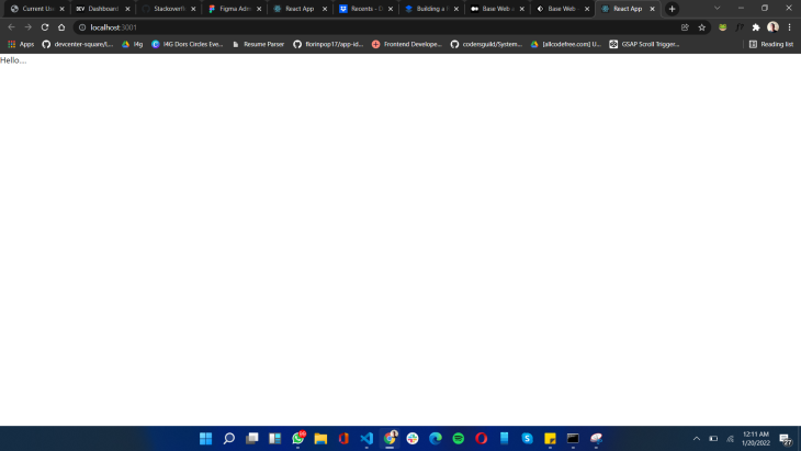
        Hello....
      </BaseProvider>
    </StyletronProvider>
  );
}
export default App;
In the code block above, we are importing Styletron (the styling engine for Base Web) and BaseProvider, which will save the style state and LightTheme.
LightTheme is the default styling for all components, which has been passed into BaseProvider to persist the theme to other components on the project. An engine instance has been created with the Styletron engine, which has been passed into the StyletronProvider to help run the styling well.
After a successful setup, you should see something like this:

Start by creating a folder called components. This will be where we house the components for the dashboard.
Next, create the following components: dashboard.js, sidebar.js, dashboardHeader.js, dashboardContent.js, and sidebarNavItem.js. These components will be the foundation of the project.
Let’s start writing our UI. Go to App.js and replace the “Hello…” text with the following:
<Dashboard />
Then, import the component at the top like so:
import Dashboard from './components/Dashboard';
Before we continue with building the dashboard, let’s create a folder for assets. Inside, create a folder for images and a file for constants called constant.js.
Add a logo (any image you like) inside the images folder with the name logo.svg. Then, add the following code inside the constant.js file:
 import { FaBook, FaChartPie, FaLightbulb, FaTicketAlt, FaUsers, FaUserTie } from 'react-icons/fa';
export const menuData = [
    {
        title: 'Overview',
        icon: <FaChartPie style={{ marginRight: '0.5rem' }} />,
    },
    {
        title: 'Tickets',
        icon: <FaTicketAlt style={{ marginRight: '0.5rem' }} />,
        active: true
    },
    {
        title: 'Ideas',
        icon: <FaLightbulb style={{ marginRight: '0.5rem' }} />,
    },
    {
        title: 'Contacts',
        icon: <FaUsers style={{ marginRight: '0.5rem' }} />,
    },
    {
        title: 'Agents',
        icon: <FaUserTie style={{ marginRight: '0.5rem' }} />,
    },
    {
        title: 'Articles',
        icon: <FaBook style={{ marginRight: '0.5rem' }} />,
    }
]
This code contains an array, which is the list of menu items for the sidebar. It uses icons from the react-icons library to pair with the menu text.
Now open your sidebar.js file and paste this code inside:
import React from 'react'
import {styled, useStyletron} from 'baseui';
import logo from '../assets/images/logo.svg'
import SideNavListItem from './SideNavListItem';
import { menuData } from '../assets/constant';

const Sidebar = ({open, setOpen}) => {
    const [css] = useStyletron();
    return (
        <SidebarWrapper className={css({
            '@media (max-width: 768px)': {
                display: open ? 'block' : 'none',
            }
        })}>
            <div className={css({
                position: 'fixed',
                top: '0',
                left: '0',
                width: '100vw',
                background: 'rgba(0, 0, 0, 0.5)',
                height: '100vh',
                zIndex: '-1',
                display: 'none',
                '@media (max-width: 768px)': {
                    display: open ? 'block' : 'none',
                }
            })}
                onClick={() => setOpen(false)}
            />
            <Logo>
                <img className={css({
                    width: '2rem',
                    height: '2rem',
                    marginRight: '0.5rem',
                })} src={logo} alt="logo" />
                Dashboard Kit
            </Logo>
            {
                menuData.map(({ icon, title, active }, index) => (
                    <SideNavListItem key={index} active={active} title={title}>
                        {icon}
                    </SideNavListItem>
                ))
            }
        </SidebarWrapper>
    )
}
export default Sidebar
const SidebarWrapper = styled('section', {
    position: 'fixed',
    top: '0',
    left: '0',
    width: '100%',
    maxWidth: '255px',
    height: '100vh',
    background: '#363740',
    zIndex: '1',
    overflowX: 'hidden',
});
const Logo = styled('div', {
    padding: '2.5rem 2rem',
    display: 'flex',
    alignItems: 'center',
    justifyContent: 'center',
    fontSize: '1.25rem',
    color: '#f2f2f2',
    fontWeight: 'bold',
    boxSizing: 'border-box',
    background: 'none',
})
In the code above, we are using the useStyletron and style properties to create styles for a dynamic and responsive sidebar. Then, we created a styled component for the SidebarWrapper and the logo, and some inline styling using the CSS prefix generated from the useStyletron Hook.
SideNavListItem which was imported in the code block above will be created next by following the steps below.
Open the SideNavListItem.js component and add the following code:
import React from 'react'
import {styled} from 'baseui';
const SideNavListItem = ({ title, children, active }) => {
    return (
        <StyledMenuItem $active={active} title={title}>
            {children}
            {title}
        </StyledMenuItem>
    )
}
export default SideNavListItem
const StyledMenuItem = styled('div', props => ({
    padding: '1.25rem 2rem',
    background: props.$active ? '#9FA2B4' : 'none',
    display: 'flex',
    alignItems: 'center',
    justifyContent: 'flex-start',
    fontSize: '1rem',
    color: props.$active ? '#DDE2FF' :'#A4A6B3',
    cursor: 'pointer',
    width: '100%',
    borderLeft: props.$active ? '4px solid #DDE2FF' : 'none',
    ':hover': {
        background: '#9FA2B4',
        color: '#DDE2FF',
        borderLeft: '4px solid #DDE2FF',
    }
}))
This component serves as the menu list item for the sidebar. It’s collecting the title, active, and children as props. The active prop serves as the active state of the component while the children props collect content into the component, like the icon.
For the styling, the styled component is taking in the active state as a prop which has been used to write a condition to check if the component is active or not.
Now open the dashboard.js file and add the following code:
import React from 'react'
import {styled} from 'baseui';
import Sidebar from './Sidebar';
import DashboardHeader from './DashboardHeader';
import DashboardContent from './DashboardContent';
const Dashboard = () => {
    const [open, setOpen] = React.useState(false);
    return (
        <DashboardWrapper>
            <Sidebar open={open} setOpen={setOpen} />
            <DashboardHeader open={open} setOpen={setOpen} />
            <DashboardContent />
        </DashboardWrapper>
    )
}
export default Dashboard
const DashboardWrapper = styled('section', {
    display: 'flex',
    flexDirection: 'column',
    alignItems: 'flex-start',
    background: '#F7F8FC',
    position: 'relative',
    paddingLeft: '285px',
    paddingRight: '2rem',
    width: '100%',
    minHeight: '100vh',
    maxWidth: '100vw',
    boxSizing: 'border-box',
    '@media (max-width: 768px)': {
        paddingLeft: '0',
    }
});
In the code above, we created a DashboardWrapper style to serve as the container for the dashboard. The Sidebar, dashboardHeader, and dashboardContent have been imported, and an open state was created. This has been passed as a prop to the Sidebar and dashboardHeader components to control how the sidebar behaves on phones.
Now, open dashboardHeader and pass in the following code:
import React from 'react'
import {
    HeaderNavigation,
    ALIGN,
    StyledNavigationItem as NavigationItem,
    StyledNavigationList as NavigationList,
  } from 'baseui/header-navigation';
import { Avatar } from "baseui/avatar";
import { useStyletron } from 'baseui';
import Menu from 'baseui/icon/menu'
const DashboardHeader = ({open, setOpen}) => {
    const [css] = useStyletron();
    return (
        <HeaderNavigation className={css({
            width: '100%',
            borderBottom: 'none !important',
            marginBottom: '1.5rem',
            '@media (max-width: 768px)': {
                paddingLeft: '0',
            }
        })}>
            <NavigationList $align={ALIGN.left}>
                <NavigationItem className={css({
                    fontSize: '1.5rem',
                })}>
                    <div className={css({
                        display: 'none',
                        '@media (max-width: 768px)': {
                            display: 'block',
                        }
                    })}>
                        <Menu
                        size='1.5rem'
                        onClick={() => setOpen(!open)}
                        />
                    </div>
                    <span className={css({
                        display: 'block',
                        '@media (max-width: 768px)': {
                            display: 'none',
                        }
                    })}>
                        Tickets
                    </span>
                </NavigationItem>
            </NavigationList>
            <NavigationList $align={ALIGN.center} />
            <NavigationList $align={ALIGN.right}>
                <NavigationItem>
                    <Avatar
                        name="Jane Doe"
                        size="2.5rem"
                        src="https://avatars.dicebear.com/api/human/yard.svg?width=285&mood=happy"
                    />
                </NavigationItem>
            </NavigationList>
        </HeaderNavigation>
    )
}
export default DashboardHeader
Looking at the code above, some components have been imported from baseui/header-navigation, which has been used to set up the header section.
The components are as follows:
HeaderNavigation, a component used to create the header navigation, which is mostly in two parts (though it can be modified): the logo and the menuALIGN, which is used to align a component based on the specified directionNavigationItem, which is used to set the menu items of a navigation menuNavigationList, a component used to list out menu items, which accepts the alignment propertyTo create the dashboard content (which includes a table), we will add the necessary data in a constant.js file. Open the file and add this code below:
export const tableTitles = ["Ticket details", "Customer name", "Date", "Priority"]
This array serves as the content for the table header. To create the data for the table body, paste the code below into tableTitles:
export const data=[
    [
      "Contact Email not Linked",
      "Tom Cruise",
      "May 26, 2019",
      "High"
    ],
    [
      "Adding Images to Featured Posts",
      "Matt Damon",
      "May 26, 2019",
      "low"
    ],
    [
      "When will I be charged this month?",
      "Robert Downey",
      "May 26, 2019",
      "High"
    ],
    [
      "Payment not going through",
      "Christian Bale",
      "May 25, 2019",
      "Normal"
    ],
    [
      "Unable to add replies",
      "Henry Cavil",
      "May 26, 2019",
      "High"
    ],
  ]
The code above contains the content of the table.
Let’s quickly look at the last component, which is the DashboardContent. Open the component file and add the following code:
import { useStyletron } from 'baseui';
import React from 'react';
import { Table } from "baseui/table-semantic";
import Filter from 'baseui/icon/filter'
import {
    Label2,
    Paragraph4,
} from 'baseui/typography';

import { data, tableTitles } from '../assets/constant';

const DashboardContent = () => {
    const [css] = useStyletron();
    return <div className={css({
        width: '100%',
        borderRadius: '0.5rem',
        background: '#fff',
        border: "1px solid #DFE0EB",
        overflow: 'hidden',
        '@media (max-width: 768px)': {
            margin: '0 1.5rem'
        }
    })}>
        <div className={css({
            padding: '2rem',
            display: 'flex',
            alignItems: 'center',
            justifyContent: 'space-between',
        })}>
            <Label2>All tickets</Label2>
            <div className={css({
                display: 'flex',
                alignItems: 'center',
                cursor: 'pointer',
            })}>
                <Paragraph4 className={css({
                    display: 'flex',
                    alignItems: 'center',
                })}><Filter size='2rem' className={css({
                    marginRight: '0.3rem',
                })} />Filter</Paragraph4>
            </div>
        </div>
        <Table
            columns={tableTitles}
            data={data}
        />
    </div>;
};
export default DashboardContent;
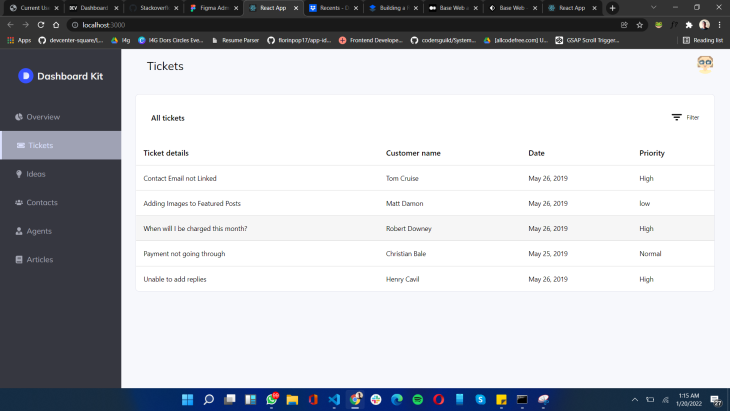
In the code above, the table component is used to display the information in tabular form.
If you followed these instructions correctly, you should have something like this:

In this article, I demonstrated how powerful the Base Web library is, including its limitations. I believe that it’s hard to create a fully customized dashboard without the use of additional CSS, but the library flexibility makes it interesting to work with. It also increases the possibility of expansion in the future, as the community surrounding Base Web is growing very fast. If you’re interested, you can find the source code for this article here.
Install LogRocket via npm or script tag. LogRocket.init() must be called client-side, not
server-side
$ npm i --save logrocket

// Code:

import LogRocket from 'logrocket';
LogRocket.init('app/id');
// Add to your HTML:

<script src="https://cdn.lr-ingest.com/LogRocket.min.js"></script>
<script>window.LogRocket && window.LogRocket.init('app/id');</script>

Why the future of DX might come from the web platform itself, not more tools or frameworks.

A hands-on test of Claude Code Review across real PRs, breaking down what it flagged, what slipped through, and how the pipeline actually performs in practice.

CSS art once made frontend feel playful and accessible. Here’s why it faded as the web became more practical and prestige-driven.

Learn how inline props break React.memo, trigger unnecessary re-renders, and hurt React performance — plus how to fix them.
Would you be interested in joining LogRocket's developer community?
Join LogRocket’s Content Advisory Board. You’ll help inform the type of content we create and get access to exclusive meetups, social accreditation, and swag.
Sign up now