From the moment we start learning to code, one thing that is difficult to do without is collecting data for interactions from users. And to collect data from users, we need some type of form.

From collecting reviews to registering, logging in, making purchases, or providing feedback in our applications, we use forms. Forms are a critical part of the web, hence, we must ensure that everyone is able to interact with them regardless of disabilities.
Accessibility is often perceived only as a way to accommodate blind users, but it goes far beyond just that. There are varying forms of disabilities, which include temporary disabilities like hand or arm injuries, situational disabilities like slow internet, and permanent ones like blindness and others.
We want to make sure all of our users are able to use forms without having a poor experience at any point in time, and the goal is to make these key user interactions as frictionless as possible. When forms are made accessible, they are easier to use for not just people with disabilities, but for everyone.
It is also important to note that it’s increasingly important — and gradually becoming a legal requirement — for businesses to comply with web accessibility standards across many countries, including the United States, United Kingdom, and Canada.
In 2016, Target paid millions to the National Federation of the Blind because there was no alt text on their product images, among other accessibility issues. Just recently, the U.S. Supreme Court rejected a petition from Domino’s after losing in a lower court to a blind man who had sued the company after being unable to make an order on its website despite using a screen reader.
It’s only a matter of time before more countries adopt similar laws and create even more standards, giving websites clear steps to follow to achieve accessibility.
As we try to improve existing forms or create new ones, here are a couple things to figure out to identify the steps we need to take:
There are a number of ways to help improve forms and make them closer to being completely accessible to everyone. Here are a couple recommendations:
This is number one because a lot of accessibility issues can already be taken care of if the right HTML element is used. There are over 100 HTML elements, each with a unique purpose to carry out a task.
Thanks to the constant improvements in HTML, it is usually unnecessary to use another element laced with custom JavaScript code to make it function like another element because of customizations. Use a button element in the right place instead of customizing a div to look and function like a button. This makes it easier for screen readers to provide more information about the element to the user.
There are numerous HTML input types, each one created to make it easier to retrieve a specific type of data from the user. By specifying the right type and name attributes — e.g., type="password" to help hide the text shown, type="email" to collect emails — the browser becomes optimized to receive the data and also provide autofill suggestions to the user.

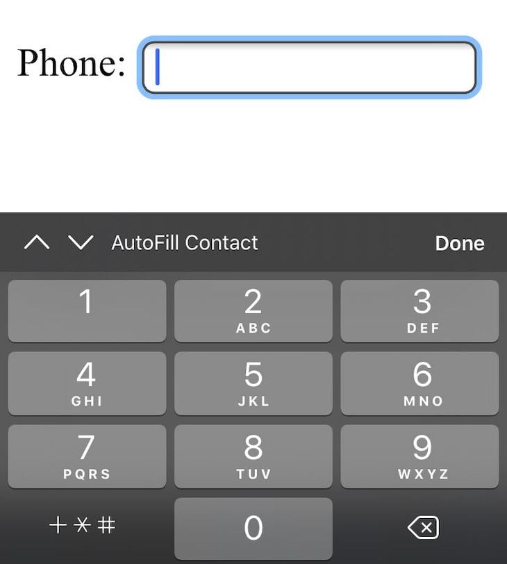
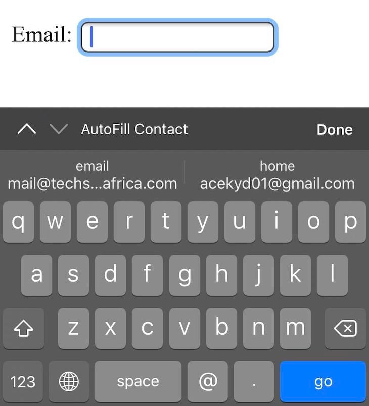
On mobile, using the correct input types shows the appropriate keyboard. For example, when using type="tel", the keyboard displays a keyboard to input phone numbers, while type="email" shows a keyboard with the @ button prioritized.


Also, please use <input type="submit"> to create the submit button for your form. This will enable users to submit by simply pressing the enter button on their keyboards.
I think labels are one of the most underrated elements in HTML. They are quite powerful and make a lot of things work better. Aside from the presentational purpose of knowing what data the input is requesting, it can be taken a step further.
By connecting labels directly to the input using the for attribute, we can have increased usability.
<label for="hungry">Are you hungry?:</label>
<input type="checkbox" name="hungry" id="hungry">
With this, we get a larger target size for each input element because clicking on the label puts the input in focus. This is useful for people with motor disabilities, especially when they have to select smaller elements like a radio or checkbox. Screen readers also read out the connected label for an input instead of simply calling out what input type it is when in focus.

The for attribute of the <label> tag should be equal to the id attribute of the related element to bind them together, as shown in the example above. For users without visual disabilities, it should also be easy to visually associate a label with its connecting form field.
On some occasions, users are left with just the placeholder in place of labels telling them what should go in each input. The problem with this approach is that once the user starts typing, the placeholder disappears.
People with cognitive disabilities also tend to have issues with placeholders because it can be assumed to be prepopulated text. Please avoid providing instructions via placeholders; they’re not a replacement for labels.
Depending on the type of data required from a form, it’s good practice to include instructions when needed at the top of the form. Since only one <label> element is allowed per field, in situations where you need to provide descriptive text for the input, it can be linked with the form field using the aria-describedby attribute. Screen readers will announce both the label and this help text when the form field has focus.
<label for="employment_date">Employment date:</label>
<input type="date" name="employment_date" id="employment_date" aria-describedby="employment_date_help">
<span id="employment_date_help">MM/DD/YYYY</span>
It’s also recommended to include examples of input data instead of long descriptive messages, as it’ll be easier to understand for users.
In situations where you have to provide multiple controls for a purpose — usually when using radio buttons or checkboxes — it’s highly recommended to use the <fieldset></fieldset> element to group them, and then use <legend></legend> to provide their descriptive text.

Using <fieldset></fieldset> and <legend></legend> ensures that the text description is read to screen reader users once the grouped controls are in focus.
Validations on forms are done either server side or client side using JavaScript. HTML5 provides a range of in-built functionalities to help validate inputs like email addresses. When errors occur, it’s important to show them to the user in an accessible manner — which includes making it easier for users with screen readers.
To do this, error messages should be displayed with the attribute role="alert" on them since screen readers support this and would notify users immediately of the error. Error messages can also include suggestions or examples to make it easier for the user to correct the error.
A common practice is to sum up all errors and add them to the top of the form, but it’s better to associate errors directly with the input. Add the error messages below, connect them with aria-, and visually indicate which input fields have errors.
For required input fields, they should be identifiable using labels. HTML5 also provides the required attribute that can be added to form controls to indicate they are required. This attribute is supported by modern web browsers and communicates required inputs that are missing to users.
Forms are critical to the general usability of a web application because they are used for varying types of interactions on the internet. Using the right HTML elements takes us a step closer, but making the conscious decisions to put additional things in place ensures that every user, regardless of their disabilities or lack thereof, will be able to use our forms.
To find out even more ways to make the entire web experience accessible for users, Web Content Accessibility Guidelines (WCAG) 2.0 provides instructions that will make content accessible to a wide range of people with and without disabilities.
As we improve accessibility and usability for our forms, everyone benefits.
Install LogRocket via npm or script tag. LogRocket.init() must be called client-side, not
server-side
$ npm i --save logrocket

// Code:

import LogRocket from 'logrocket';
LogRocket.init('app/id');
// Add to your HTML:

<script src="https://cdn.lr-ingest.com/LogRocket.min.js"></script>
<script>window.LogRocket && window.LogRocket.init('app/id');</script>
Hey there, want to help make our blog better?
Join LogRocket’s Content Advisory Board. You’ll help inform the type of content we create and get access to exclusive meetups, social accreditation, and swag.
Sign up now
Consider using a React form library to mitigate the challenges of building and managing forms and surveys.

In this article, you’ll learn how to set up Hoppscotch and which APIs to test it with. Then we’ll discuss alternatives: OpenAPI DevTools and Postman.

Learn to migrate from react-native-camera to VisionCamera, manage permissions, optimize performance, and implement advanced features.

SOLID principles help us keep code flexible. In this article, we’ll examine all of those principles and their implementation using JavaScript.