
Editor’s Note: This post was reviewed for accuracy on 1 March 2023. To learn more about implementing scrolling in your React app, check out additional articles on Framer Motion, using React Hooks for infinite scroll, and how to maintain and restore scroll positions in React mobile apps.
Scrolling animations are implemented on many web pages, particularly those with large content, to make scrolling better and less tedious. These scrolling animations are becoming increasingly common on the web because of the introduction of devices capable of handling them.
There are lots of different types of scroll animations: sticky scroll, smooth scroll, and CSS parallax, to name a few. Though some of these scroll animations — like CSS parallax — can be implemented with CSS, you might need libraries like Framer Motion or GSAP to handle more complex animations in your project.
This article will take a look at the react-locomotive-scroll package, or Locomotive Scroll as we’ll call it, a library for handling and creating different scroll animations in React.
react-locomotive-scroll and react-scrollThe Replay is a weekly newsletter for dev and engineering leaders.
Delivered once a week, it's your curated guide to the most important conversations around frontend dev, emerging AI tools, and the state of modern software.
Locomotive Scroll is a React scroll library that builds on ayamflow’s virtual-scroll, a library used to create custom scrollers that support touch and keyboard. Locomotive Scroll provides support for various forms of scrolling animations, including smooth scrolling, animated page overlays, and parallax effects.
Without further ado, let’s set up our workspace and dive in using the Locomotive Scroll package in a React application. Run the command below to scaffold a new React project:
yarn create react-app <Name-of-your-app>
Next, change the directory into the project folder and install the Locomotive Scroll package using the command below:
cd locomotive-scroll-react && yarn add locomotive-scroll react-locomotive-scroll
Clear out the unnecessary files in the src folder and navigate to the App.js file. Replace the entire boiler code with the code block below:
import './App.css';

function App() {
  return (
    <main>
      <section className='intro'>
        <h1>This is the Introduction section</h1>
      </section>

      <section className='contents'>
        <h1>I Love React</h1>
      </section>

        <section id="stick">
          <h1>
            Hey I'm Sticky
          </h1>
          <p>other contents</p>
          <p>other contents</p>
          <p>other contents</p>
          <p>other contents</p>
          <p>other contents</p>
          <p>other contents</p>
          <p>other contents</p>
          <p>other contents</p>
        </section>

      <section className='footer'>
        <h1>Let's end the application with this Footer</h1>
      </section>
    </main>
  );
}
export default App;
Next, replace the entire the App.css with the styles below:
* {
  margin: 0;
  padding: 0;
  box-sizing: border-box;
}
.App {
  text-align: center;
}
h1{
  font-size: 5rem;
  font-weight: bolder;
}
p {
  font-size: 3rem;
  margin: 1rem;
}
section {
  height: 100vh;
  color: white;
  display: flex;
  align-items: center;
  justify-content: center;
}
.intro{
  background-color: black;
}
.contents {
  background-color: goldenrod;
}
#stick {
  background-color: rgb(71, 14, 64);
  display: flex;
  height: 100vh;
  flex-direction: column;
  justify-content: center;
  align-items: center;
}
.footer {
  background-color: whitesmoke;
  color: seagreen;
}
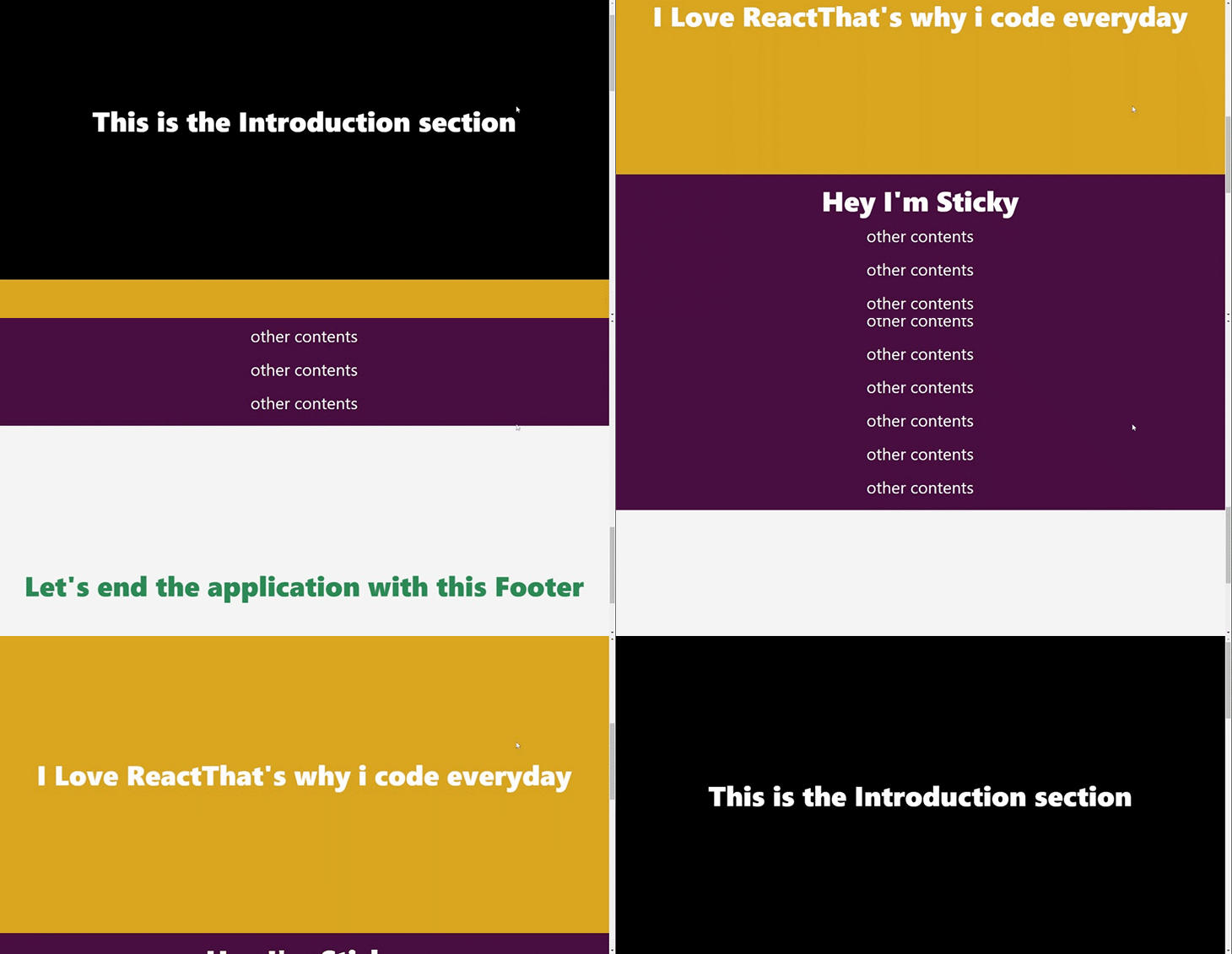
After running the development server with yarn start, we should get something similar to the GIF below:
The Locomotive Scroll library stores various HTML data attributes with specific styles and then attaches event listeners to these data attributes. These events then trigger specified behaviors depending on where the data attributes are in the browser’s viewport.
Let’s look at some of these data attributes and their specified behaviors in the Locomotive Scroll library.
The data-scroll attribute detects if the element that it is attached to is in the browser’s viewport.
The data-scroll-container attribute creates a container you can use to wrap around whatever page you want to watch for scrolling. This attribute is also necessary for styling.
The data-scroll-section attribute works like the data-scroll-container attribute. The difference is that you can break your pages into components and then use the data-scroll-section attribute for each component instead of using the data-scroll-container for an entire page.
When data-scroll-direction is used on an element, this attribute takes a specified direction — vertical or horizontal — and then moves the element accordingly. This attribute is used for smooth scrolling purposes and is typically used together with the data-scroll-container and data-scroll-section attributes.
You can use data-scroll-speed for smooth scrolling purposes. This attribute takes a number to determine the spend at which the element that it is attached to moves. A negative number reverses the scroll direction, but only when used with the data-scroll-direction attribute.
The data-scroll-target attribute is also used for smooth scrolling purposes. It targets a particular element and works well when used with the data-scroll-sticky attribute.
Finally, data-scroll-sticky also helps with smooth scrolling. It works with the data-scroll-target attribute to check if a targeted element is in view, then makes that element a sticky element.
This section will cover some features in the Locomotive Scroll package and how to implement them into our application.
Smooth scrolling is one of the biggest features of the Locomotive Scroll package. This gives the application a swift and fluid feel when scrolling through various sections. Let’s see how this will look in our application.
Locomotive Scroll has some custom attributes that possess some styles. When added to a component, those styles give the component “locomotive” features.
Add the styles below to your App.css file, as recommended by the react-locomotive-scroll package’s documentation:
html.has-scroll-smooth {
  overflow: hidden;
}

html.has-scroll-dragging {
  -webkit-user-select: none;
  -moz-user-select: none;
  -ms-user-select: none;
  user-select: none;
}

.has-scroll-smooth body {
  overflow: hidden;
}

.has-scroll-smooth [data-scroll-container] {
  min-height: 100vh;
}

[data-scroll-direction="horizontal"] [data-scroll-container] {
  height: 100vh;
  display: inline-block;
  white-space: nowrap;
}

[data-scroll-direction="horizontal"] [data-scroll-section] {
  display: inline-block;
  vertical-align: top;
  white-space: nowrap;
  height: 100%;
}

.c-scrollbar {
  position: absolute;
  right: 0;
  top: 0;
  width: 11px;
  height: 100%;
  transform-origin: center right;
  transition: transform 0.3s, opacity 0.3s;
  opacity: 0;
}

  .c-scrollbar:hover {
    transform: scaleX(1.45);
}

  .c-scrollbar:hover, .has-scroll-scrolling .c-scrollbar, .has-scroll-dragging .c-scrollbar {
    opacity: 1;
}

[data-scroll-direction="horizontal"] .c-scrollbar {
    width: 100%;
    height: 10px;
    top: auto;
    bottom: 0;
    transform: scaleY(1);
}

[data-scroll-direction="horizontal"] .c-scrollbar:hover {
      transform: scaleY(1.3);
}

.c-scrollbar_thumb {
  position: absolute;
  top: 0;
  right: 0;
  background-color: black;
  opacity: 0.5;
  width: 7px;
  border-radius: 10px;
  margin: 2px;
  cursor: -webkit-grab;
  cursor: grab;
}
  .has-scroll-dragging .c-scrollbar_thumb {
    cursor: -webkit-grabbing;
    cursor: grabbing;
}
  [data-scroll-direction="horizontal"] .c-scrollbar_thumb {
    right: auto;
    bottom: 0;
}
With that done, navigate to the App.js file and import LocomotiveScrollProvider from react-locomotive-scroll, as well as the useRef hook into the App.js file.
The react-locomotive-scroll package exports a provider component that acts as a top-level wrapper to our application, thereby granting it locomotive scrolling features.
Next, wrap up the return statement of App.js with LocomotiveScrollProvider and add some attributes to our tags:
import { LocomotiveScrollProvider } from "react-locomotive-scroll";
import { useRef } from "react";

function App() {
  const ref = useRef(null);

  const options = {
    smooth: true,
  }

  return (
    <LocomotiveScrollProvider options={options} containerRef={ref}>
      <main data-scroll-container ref={ref}>
        <section className="intro" data-scroll-section>
          <h1>This is the Introduction section</h1>
        </section>
        <section className="contents" data-scroll-section>
          <h1>I Love React</h1>
        </section>
        <section className="footer" data-scroll-section>
          <h1>Let's end the application with this Footer</h1>
        </section>
      </main>
    </LocomotiveScrollProvider>
  );
}
In the code block above, we created and assigned our options object to the options prop and the useRef hook to the ref prop in LocomotiveScrollProvider.
The options prop takes an object as a parameter used in customizing the scroll behavior. We’ve also added some attributes to our tags.
The attribute is the data-scroll-container that’s always added to the top-level tag, thereby giving its children components smooth scrolling ability.
The data-scroll-section attribute is added to every component to initialize it with Locomotive Scroll and prevent some messy behavior.
With that done, we should be able to achieve the smooth scrolling behavior shown below:

With the react-locomotive-scroll package, pages and sections can be manipulated to make them appear over other sections when scrolling. Let’s see how this feature works by writing some code:
 <main data-scroll-container ref={ref}>
  <section
    className="intro"
      data-scroll //This attribute makes this section an independent scrollable container
        data-scroll-speed="4"
          data-scroll-section
    >
       <h1>This is the Introduction section</h1>
  </section>

        ...
</main>
In the code block above, we added two attributes to our introduction section tag: data-scroll, which makes the section an independent scrollable container, and data-scroll-speed, which determines the scroll speed of the section.
Together, the two attributes give a nice, animated, scroll-out overlay to the introduction part of the application as shown in the GIF below:

Floating elements coming into view when scrolling is so cool and can be easily achieved using react-locomotive-scroll! Let’s implement this by updating our App.js code:
      <main data-scroll-container ref={ref}>

        ...

        <section className="contents" data-scroll-section>
          <h1
            data-scroll
            data-scroll-direction="horizontal"
            data-scroll-speed="9"
          >
            I Love React
          </h1>
          <h1
            data-scroll
            data-scroll-direction="vertical"
            data-scroll-speed="9" // Values provided here affect the animations
          >
            That's why I code every day
          </h1>
        </section>

        ...
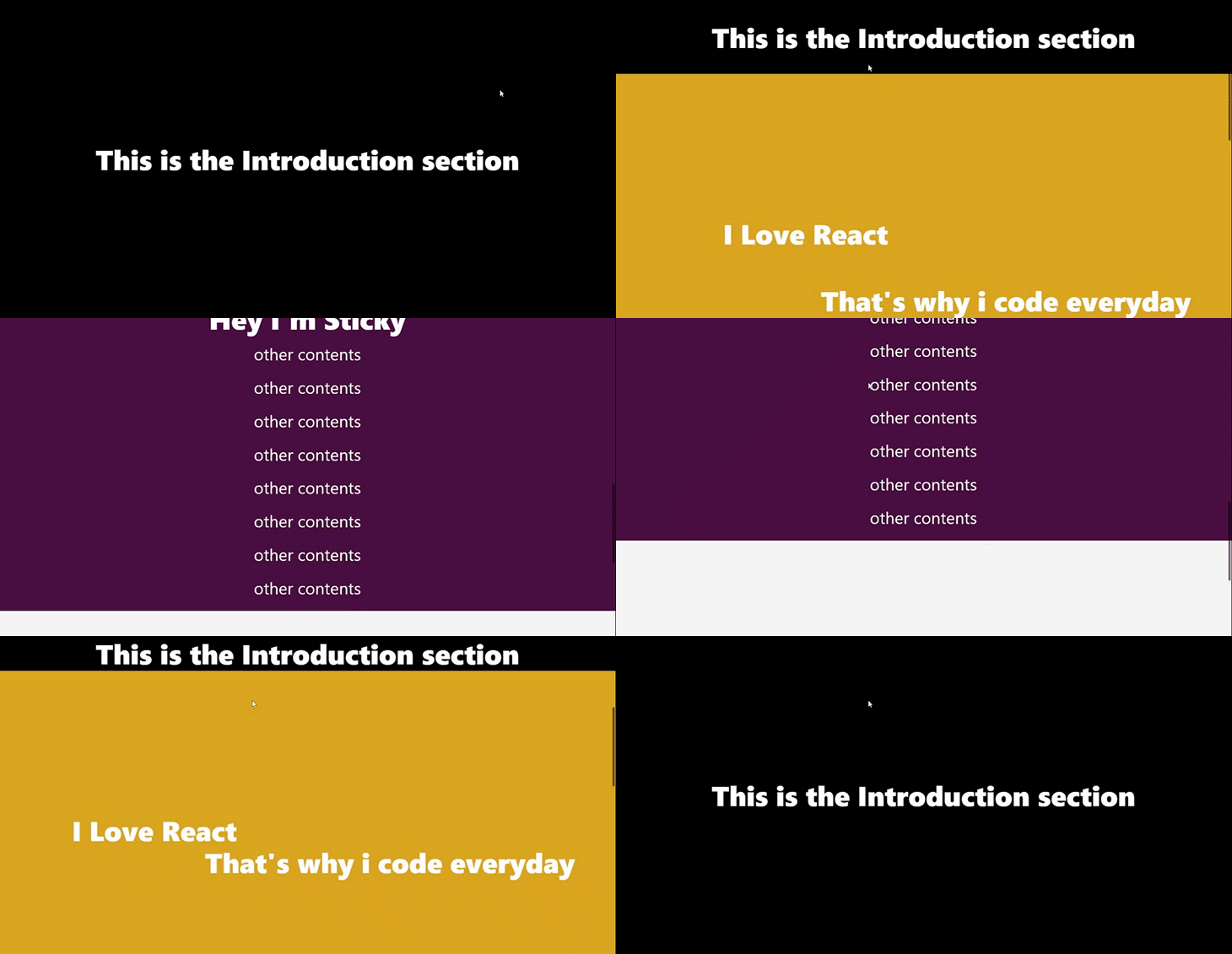
In the code block above, we’re leveraging the data-scroll-direction and data-scroll-speed attributes. They give the elements a floating animation as specified by the value provided to the data-scroll-speed attribute:
Let’s talk about making a text or component stick to its position when scrolling. I think it looks more creative when trying to pass information or when improving the user’s feel and experience.
Let’s see how we can achieve this using the locomotive-scroll package. Add the code below to the App.js file:
      <main data-scroll-container ref={ref}>

        ...

        <section id="stick" data-scroll-section>
          <h1
            data-scroll
            data-scroll-speed="5"
            data-scroll-sticky // Attibute that enables the sticky scroll
            data-scroll-target="#stick"
          >
            Hey I'm Sticky
          </h1>
          <p>other contents</p>
          <p>other contents</p>
          <p>other contents</p>
          <p>other contents</p>
          <p>other contents</p>
          <p>other contents</p>
          <p>other contents</p>
          <p>other contents</p>
        </section>

        ...
      </main>
In the code block above, we gave our h1 text the sticky attribute and assigned its target environment to the sticky section. This data-scroll-target attribute confines its child to the section provided. Now, we have this:

Have you ever thought of adding your own custom animation when scrolling into view? The react-locomotive-scroll package has got you covered. It gives you the flexibility to call other classes when scrolling into view.
Let’s demonstrate this with a simple fade-in animation. Add the styles below to the App.css file:
.op-class{
    opacity: 0;
}
.fadeIn {
    opacity: 1;
    transition: opacity 4s ;
}
Next, update the footer section:
     <main data-scroll-container ref={ref}>

        ...

        <section className="footer" data-scroll-section>
          <h1
            className="op-class"
            data-scroll
            data-scroll-class="fadeIn"
            data-scroll-repeat="true"
            data-scroll-speed="2"
          >
            Let's end the application with this Footer
          </h1>
        </section>
      </main>
In the code block above, we added our op-class and also added the data-scroll-class attribute. op-class triggers a class when its element is scrolled into view, and data-scroll-repeat makes the entire process loop by removing the class when it’s not in view.
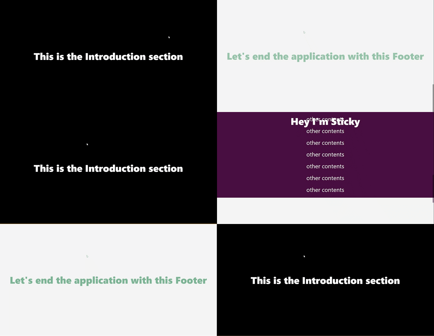
This combination of these attributes creates a nice fade-in animation to the footer section of our application, as shown below:

The Locomotive Scroll package also gives you the ability to determine the scroll speed of your entire application. Super cool right?
Let’s give our application some super scrolling speed.
Update the options object in the App.js:
  const options = {
    smooth: true,
    multiplier: 9, //added this
  };
We added the multiplier property to our options object as shown in the code block above. The multiplier property takes in a number to determine the speed of the application.
The GIF below displays the speed of our application after setting up our multiplier:
Let’s put all that we’ve learned so far into building a portfolio website! Here we’ll implement a couple of Locomotive Scroll’s features.
First, clone and run the project’s starter file from GitHub. The starter file comes with basic components and styling as seen in the GIF below. We will implement the various features of Locomotive Scroll as we go:

We will start by importing the useRef hook and LocomotiveScrollProvider into the App.js file and wrapping our return statement with LocomotiveScrollProvider. After this, we‘ll create our options object that’ll be passed to LocomotiveScrollProvider:
import { useRef } from "react";
import { LocomotiveScrollProvider } from "react-locomotive-scroll";

const options = {
    smooth: true,
    multiplier: 3,
}

 return (
    <LocomotiveScrollProvider
      options={options}
      containerRef={ref}
    >
      <main data-scroll-container ref={ref}>
        <Introduction />
        <Work />
        <Message />
      </main>
    </LocomotiveScrollProvider>
  );
Let’s get started customizing our portfolio with some nice scroll effects for each section. Let’s start with the “Introduction” component on the site.
Head over to the src/components/intro/Introduction.jsx file:
// src/components/intro/Introduction.jsx

const Introduction = () => {
  return (
    <section
      className="intro-section"
      data-scroll-section
      data-scroll
      data-scroll-speed="6"
    >
      <div className="intro-image">
        <img src={image} height={700} alt="profile" />
      </div>
      <div className="intro-title">
        <h1 data-scroll data-scroll-speed="9">
          Isaac Junior
          <br />A Frontend Engineer and Technical writer with a deep focus on
          creating pixel-perfect designs
        </h1>
      </div>
    </section>
  );
};
In the code block above, we’ve initialized our component with an overlay effect using the data-scroll and data-scroll-speed attributes. We also gave the text some scroll speed to create a scroll-disappearing effect.
Next, head over to the src/components/work/Work.jsx file and update the code to the one below:
// src/components/work/Work.jsx
const Work = () => {
  return (
    <section id="case-stick" data-scroll-section className="work-section">
      <p
        className="case"
        data-scroll
        data-scroll-sticky
        data-scroll-target="#case-stick"
      >
        CASE STUDIES <br />
        Latest Works
      </p>

      ...

    </section>
  );
};
In the code block above, we’re making our section a scroll container using the data-scroll-section attribute. We’re also making our text sticky when scrolling using the data-scroll-sticky and data-scroll-target attributes, targeting our section’s id.
It would be nice if we could give our card a little scroll effect. Head over to the src/components/Card.jsx file and update the file with the code below:
// src/components/Card.jsx

function Card(props) {
 const {image, title, description} = props;
  return (
    <div
      data-scroll
      data-scroll-speed="9"
      className="card container"
    >
      <div className="cardImg">
        <img src={image} alt="img" />
      </div>
      <div className="cardContent">
        <p className="cardTitle">{title}</p>
        <p className="cardDesc">{description}</p>
      </div>
    </div>
  );
}
In the code block above, we’re initializing our card with the data-scroll attribute and giving our card component some scroll speed.
Finally, let’s customize our “Message” section. But before we head over there, add the styles below to the src/components/message/message-style.css file:
// src/components/message/message-style.css
.op-class{
    opacity: 0;
}
.fadeIn {
    opacity: 1;
    transition: opacity 4s ;
}
We will use the styles above to create a nice fade-in animation for this section. Now, head over to the src/components/message/Message.jsx file and update the code to the one below:
// src/components/message/Message.jsx
const Message = () => {
  return (
    <section data-scroll-section className="message-section">
      <p
        data-scroll
        data-scroll-direction="horizontal"
        data-scroll-speed="2"
        className="message"
      >
        Drop a Message
      </p>
      <div
        className=" op-class"
        data-scroll
        data-scroll-repeat="true"
        data-scroll-class="fadeIn"
        data-scroll-speed="4"
      >
        <input type="text" name="fullName" placeholder="Full Name" id="" />
        <input type="text" name="email" placeholder="Enter Email" id="" />
        <textarea name="" placeholder="Message" id="" />
      </div>
    </section>
  );
};
In the code block above, we called the fadeIn class when the inputs are about to scroll into view. We also added the data-scroll-repeat attribute and set it to true to enable the fadeIn animation to repeat itself continuously.
With that done, you should be able to see the results of the Locomotive Scroll library on our new portfolio website, as shown below:

Most websites nowadays place a lot of importance on aesthetics. A visually pleasing website provides a better user experience and has been shown to have a positive effect on user conversions. You can give your users a fluid experience when they browse through your sites and even evoke emotions in site visitors.
The Locomotive Scroll library has tons of options and attributes that, when combined together, can evoke a positive response and increase website conversions. That being said, the Locomotive Scroll library might not be the best for every situation.
Not every website has to have smooth scrolling and animations floating all around. Sites like e-commerce websites and STEM blogs are good places where you might consider not using this library as it could affect the user experience negatively.
Using the Locomotive Scroll library is a great idea when the plan is to inspire and tell a story to your users. Sites related to cinema, art, or even food and drinks are great places where the capabilities of the Locomotive Scroll really shine through.
Ultimately, the decision to use the Locomotive Scroll rests in the hands of the web creator. This choice should be made with your site visitors in mind.
You can head over to the Locomotive Scroll docs to learn more.
In web development, events are triggers that are fired off to notify changes, either from user interactions (click, scroll, or form submission), browser changes (page load), environmental changes (low battery), and other causes.
Anything that causes an adverse effect to an event is known as jacking. There are many forms of jacking in web development, including web jacking, clickjacking, scroll jacking, and more. The focus of this section will be on scroll jacking and Locomotive Scroll.
Scroll jacking takes control of the scroll motion of the browser and changes the expected scroll motion to some other unexpected one. Scroll jacking makes it hard to navigate a page, as the expected up/down or side-to-side behavior is repurposed with unexpected behavior.
One example of this is stopping a user from scrolling past a piece of text for a few seconds to make sure they read the text. It could also be momentarily disabling the scroll to the “I accept the terms and conditions” section altogether to make sure the user reads through the terms and conditions of a particular software.
Scroll jacking is a controversial practice that has negative effects on usability, accessibility, and performance.
Locomotive Scroll uses scroll jacking to create a more appealing and fluid experience when scrolling, while also providing beautiful and advanced animations, as stated on the official website. The decision to enable scroll jacking when building an application should be made responsibly so as to avoid negative implications.
react-locomotive-scroll and react-scrollThe react-locomotive-scroll library is not the only library that is capable of scrolling animations in React. We will look at and compare the react-scroll library to the react-locomotive-scroll library.
The react-scroll library is used for animating vertical scrolling. This library has more than 400k downloads on npm with 4k stars on Github. In comparison, the react-locomotive-scroll library has 1k downloads on npm with 5.9k stars on Github.
react-scroll vs. react-locomotive-scrollThe react-scroll library comes with various properties to help you define scroll behavior in your application. One huge benefit of using the react-scroll library is that you get tons of options for animating the vertical scrolling of your application.
Some of the animations that react-scroll makes available to be added to your applications include easeIn, easeInAndOut, and more. Check out some visual representations of how these animations could look in your application.
The react-locomotive-scroll library gives you predefined data attributes for detecting components and animating detected components. The react-locomotive-scroll library also allows you to animate your application like libraries such as GSAP.
Benefits of the react-locomotive-scroll library include that you can define animations for your applications and also handle custom scroll behavior for your application.
react-locomotive-scroll vs. react-scrollThe react-scroll library is great for whenever you want to animate scroll behavior in your application. It is also great for occasions when you need pre-defined smooth scrolling options.
The react-locomotive-scroll library is great in situations where you want the best of both animation and handling scroll behavior. It is also great for when you want to utilize scroll jacking to build semi-opinionated scrolling sites.
In this article, we learned how to use the react-locomotive-scroll package to give our websites better scroll behavior. We looked at how to provide components with their own custom scroll behavior, as well as the relationship between scroll jacking and Locomotive Scroll.
Here is the link to the source code on GitHub and a link to the hosted application on Netlify.
Install LogRocket via npm or script tag. LogRocket.init() must be called client-side, not
server-side
$ npm i --save logrocket

// Code:

import LogRocket from 'logrocket';
LogRocket.init('app/id');
// Add to your HTML:

<script src="https://cdn.lr-ingest.com/LogRocket.min.js"></script>
<script>window.LogRocket && window.LogRocket.init('app/id');</script>

Learn about TypeScript v6’s breaking changes, new ES2025 features, and deprecated options. A complete migration guide from v5 to prepare for v7.

Learn how Vite+ unifies Vite, Vitest, Oxlint, Oxfmt, Rolldown, and Node.js management in one CLI.

AI companies are buying developer tools as coding agents turn runtimes, package managers, and linters into strategic infrastructure.

Learn how AI-assisted development governance uses rules, agents, hooks, and protocols to help AI coding tools produce safer, more consistent code.
Hey there, want to help make our blog better?
Join LogRocket’s Content Advisory Board. You’ll help inform the type of content we create and get access to exclusive meetups, social accreditation, and swag.
Sign up now