When it comes to building mobile applications, there are several frameworks available to use if you decide against using the native SDKs. React Native and Flutter, for example, are used to build cross-platform mobile applications.

For the web, some libraries and frameworks allow us to build mobile-like frontend applications. In this article, we’ll use Mint UI and Vue.js to build a simple to-do application with a mobile-friendly user interface.
Vue.js is an open-source JavaScript library for building frontend user interfaces. It can also be used to build mobile and desktop user interfaces, and depending on your requirements and the type of application you’re developing, it can be used as a framework as well.
Vue.js is a very easy library to set up. Using npm, install from your terminal with:
$ npm install vue
To install the CLI:
$ npm install -g @vue/cli
According to the library homepage, Mint UI is a library of mobile UI elements for Vue.js. Mint UI provides abundant CSS and JS components for building mobile-like applications. The styles of the elements are close to what users expect in mobile applications; Mint UI’s default user interfaces are similar to those in iOS. At roughly 30KB, it is very lightweight.
To install Mint UI from your terminal, run:
$ npm i mint-ui
Now that we have Vue CLI installed, we can proceed to create a Vue.js project:
$ vue create mint-todo
At the prompt, make sure you select the default preset. This will install every required dependency. Once that is done, switch into your project directory:
$ cd mint-todo
Next, serve the project on your localhost:
$ npm run serve
You should be presented with a user interface similar to this:
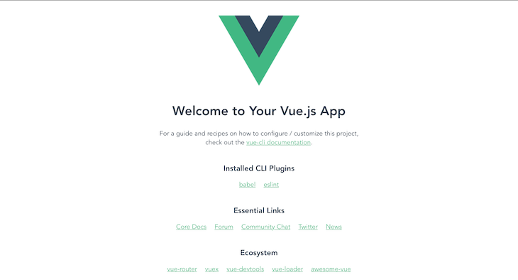
Now we’re set to start building our simple to-do application.
Our to-do application will have the following functionalities:
The Vue.js folder structure is quite easy to understand. For this tutorial, we’ll be working with the src folder.
The src folder contains the assets folder, which will hold our project assets such as image, video, audio files. The components folder serves as the directory where our components for this project will live.
The public folder contains the HTML files that will be served. App.vue is the main component of our application, and main.js is the main entrance to our application.
main.jsThe main.js file is the main entrance to our application. It initializes the root component into an element on our page.
To use Mint UI in our app, we need to import and specify that Vue uses Mint UI. Copy and paste this inside your main.js file:
import Vue from 'vue'
import App from './App.vue'
import MintUI from 'mint-ui'
import 'mint-ui/lib/style.css'
Vue.config.productionTip = false
Vue.use(MintUI)
new Vue({
  render: h => h(App),
}).$mount('#app')
Vue.config is an object containing Vue’s global configurations. The productionTip property is set to false to prevent the production tip on Vue startup.
We also need to install MintUI in our project, so we run:
npm i mint-ui
In this section, we’ll be building a feature that allows our app to display to-do items. We’ll start by having dummy todo items and making sure we can display them in our applications. To get started, create and paste the following code in the respective files.
Todo.vueIn the src/components, create a Todo.vue file and paste the following into it:
<template>
  <div>
    <p>{{ todo.title }}</p>
  </div>
</template>
<script>
export default {
  name: 'Todo',
  props: [
    "todo"
  ]
}
</script>
<style scoped>
</style>
In this component, we’ll be rendering each to-do item passed as props from our to-do list.
Todos.vueCreate a Todos.vue file in the src/components folder. This component is used to render every to-do item in our to-do list:
<template>
  <div>
    <mt-header fixed title="Todo List"></mt-header>
    <mt-index-section v-bind:key="todo.id" v-for="todo in todos">
          <Todo v-bind:todo="todo"/>
      </mt-index-section>
  </div>
</template>
<script>
import Todo from './Todo';
export default {
  name: 'Todos',
  components: {
    Todo
  },
  props: [
    "todos"
  ]
}
</script>
<style scoped>
</style>
In the code block above, we’ve imported the Todo component responsible for rendering each to-do item. The props array is added to define the properties we need to use in our Todos.vue, passed down from our App.vue component.
We used the Mint UI mt-header component to create a fixed header for our application passing the title name as a property. We’ve also used mt-index-list and mt-index-section to create a list container section where all our to-do items will be rendered.
The height property is used to define the height of the container. If not specified, it will automatically extend to the bottom of the viewport.
App.vueApp.vue is the root of our application. It’s usually used to define the template for our page(s).
<template>
  <div id="app">
    <Todos />
  </div>
</template>
<script>
import Todos from './components/Todos';
export default {
  name: 'app',
  components: {
    Todos
  },
  data() {
    return {
      todos: [
        {
          id: 1,
          title: 'Attend morning standup',
          completed: false
        },
        {
          id: 2,
          title: 'Send CTO an email',
          completed: false
        },
        {
          id: 3,
          title: 'Unit meeting by 2pm',
          completed: false
        },
        {
          id: 4,
          title: 'Call wifey',
          completed: false
        },
        {
          i: 5,
          title: 'Stop by at the mall',
          completed: false
        }
    }
  },
}
</script>
<style>
</style>
In the code block above, we’ve imported the Todos component from earlier. In our script tag, we’ve also created our JSON dummy data called todos, which is passed down from this component to the Todos component.
Before we create this component, we will require the uuid library for us to generate unique IDs for each todo item. To install that from your terminal:
$ npm install vue-uuid
Now let’s create the AddTodo.vue component and paste the following code:
<template>
  <div>
    <form @submit="addTodo">
      <mt-field label="To do" placeholder="What do you want to do?" type="textarea" rows="2" v-model="title" name="title"></mt-field>
      <mt-button type="submit" size='large'>Add</mt-button>
    </form>
  </div>
</template>
<script>
import {uuid} from "vue-uuid";
export default {
  name: 'AddTodo',
  data() {
    return {
      title: ''
    }
  },
  methods: {
    addTodo(e) {
      e.preventDefault();
      const newTodoObj = {
        id: uuid.v4(),
        title: this.title,
      }
      this.$emit('add-todo', newTodoObj);
      this.title = '';
    }
  }
}
</script>
<style scoped>
</style>
In the code block above, we’ve imported our vue-uuid method and added some data in our script tag. The data contains a title, which is bound to an input in our form where we ask for the to-do item.
This is commonly called two-way binding. It allows any changes made in your form to instantly update in your data, and then we can proceed to use the last updated value when we’re adding a new to-do item.
We also created the addTodo method. This method is responsible for creating a new to-do item object and managing our add-todo event. e.preventDefault(); prevents the default behavior of the form tag, which will trigger a page reload. The newTodoObj holds the to-do item and its unique ID.
In the template tag, we’ve bounded our addToDo method to the @submit event handler. We’ve also used the Mint UI mt-field to create a text area with a label, placeholder, row, name, and type properties. The v-model directive is used to bind the input to our component data. The Mint UI mt-button button component is used to create a button to submit our form data.
Now that we’ve created our AddToDo component, we need to be able to call and use it. To do this, we need to modify our App.vue component to:
<template>
  <div id="app">
    <Todos v-bind:todos="todos"/>
    <AddTodo v-on:add-todo="addTodo"/>
  </div>
</template>
<script>
import Todos from './components/Todos';
import AddTodo from './components/AddTodo';
export default {
  name: 'app',
  components: {
    Todos,
    AddTodo
  },
  data() {
    return {
      todos: [
        {
          id: 1,
          title: 'Go workout',
          completed: false
        },
        {
          id: 2,
          title: 'Do laundry',
          completed: false
        },
        {
          id: 3,
          title: 'Cook food',
          completed: false
        },
        {
          id: 4,
          title: 'Clean up room',
          completed: false
        },
        {
          i: 5,
          title: 'Finish work',
          completed: false
        }
      ],
    }
  },
  methods: {
    addTodo(newTodoObj) {
      this.todos = [...this.todos, newTodoObj];
    }
  }
}
</script>
<style>
</style>
In the code block above, we’ve imported and registered the newly created AddToDo component in our script tag. We added a new method addTodo that takes in the to-do object and simply adds it to our todos array by using the spread operator. The spread operator (…) copies our current todos array and adds our new todo object to it.
In our template tag, we have added a v-on directive to define that on the add-todo event we call the addTodo function, which we defined in our script tag.
Marking a to-do item as done will not require us to add a new component. We can simply create a styling rule that strikes through a to-do item conditionally.
Modify your Todo.vue component as below:
<template>
  <div v-bind:class="{ 'completed': todo.completed }">
    <p v-on:click="markComplete">{{ todo.title }}</p>
  </div>
</template>
<script>
export default {
  name: 'Todo',
  props: [
    "todo"
  ],
  methods: {
    markComplete() {
      this.todo.completed = !this.todo.completed
    }
  }
}
</script>
<style scoped>
  .completed {
    text-decoration: line-through;
  }
</style>
Looking at our style script, we’ve created a custom styling class .completed with a text-decoration property value of line-through.
In our script tag, we’ve created the markComplete method, and it simply changed the state of a to-do item from completed to not completed. Then, in our template tag, we use v-bind:class to only use the class if the to-do is completed.
Now when you click on a to-do item, you should be able to mark it as completed with a strikethrough.
Implementing the logic for deleting to-do items is fairly simple. We will create an event in our main component that calls a delete function, which takes an ID as argument, then it deletes the object in our to-dos array with the passed ID. We will create a button to emit the event that calls the delete function. Update the Todo.vue component to:
<template>
  <div v-bind:class="{ 'completed': todo.completed }">
    <p v-on:click="markComplete">{{ todo.title }}</p>
    <mt-button type="primary" size='small' @click="$emit('delete-todo', todo.id)">Delete</mt-button>
  </div>
</template>
<script>
export default {
  name: 'Todo',
  props: [
    "todo"
  ],
  methods: {
    markComplete() {
      this.todo.completed = !this.todo.completed
    }
  }
}
</script>
<style scoped>
  .completed {
    text-decoration: line-through;
  }
</style>
Now we’ve added a button that emits the event delete-todo on click and passes the to-do ID with it. We’ll handle this event in Todos.vue component.
The only part of this component we will update is the Todo component, using the v-on directive to emit the delete-todo event:
<Todo v-bind:todo="todo" v-on:delete-todo="$emit('delete-todo', todo.id)"/>
Also, we need to update our App.vue component so that it calls the method that removes the to-do from our to-dos array by creating a deleteTodo method. This will delete the to-do item based on the ID passed:
deleteTodo(todoId) {
      this.todos = this.todos.filter(todo => todo.id !== todoId);
}
Putting it all together, the components will look like:
// App.vue

<template>
  <div id="app">
    <Todos v-bind:todos="todos" v-on:delete-todo="deleteTodo"/>
    <AddTodo v-on:add-todo="addTodo"/>
  </div>
</template>
<script>
import Todos from './components/Todos';
import AddTodo from './components/AddTodo';
export default {
  name: 'app',
  components: {
    Todos,
    AddTodo
  },
  data() {
    return {
      todos: [
        {
          id: 1,
          title: 'Attend morning standup',
          completed: false
        },
        {
          id: 2,
          title: 'Send CTO an email',
          completed: false
        },
        {
          id: 3,
          title: 'Unit meeting by 2pm',
          completed: false
        },
        {
          id: 4,
          title: 'Call wifey',
          completed: false
        },
        {
          i: 5,
          title: 'Stop by at the mall',
          completed: false
        }
      ],
    }
  },
  methods: {
    addTodo(newTodoObj) {
      this.todos = [...this.todos, newTodoObj];
    },
    deleteTodo(todoId) {
      this.todos = this.todos.filter(todo => todo.id !== todoId);
    }
  }
}
</script>
<style>
</style>
// todo.vue

<template>
  <div v-bind:class="{ 'completed': todo.completed }">
    <p v-on:click="markComplete">{{ todo.title }}</p>
    <mt-button type="primary" size='small' @click="$emit('delete-todo', todo.id)">Delete</mt-button>
  </div>
</template>
<script>
export default {
  name: 'Todo',
  props: [
    "todo"
  ],
  methods: {
    markComplete() {
      this.todo.completed = !this.todo.completed
    }
  }
}
</script>
<style scoped>
  .completed {
    text-decoration: line-through;
  }
</style>
// Todos.vue
<template>
  <div>
    <mt-header fixed title="Todo List"></mt-header>
    <mt-index-list height=500>
      <mt-index-section v-bind:key="todo.id" v-for="todo in todos">
          <Todo v-bind:todo="todo" v-on:delete-todo="$emit('delete-todo', todo.id)"/>
      </mt-index-section>
    </mt-index-list>
  </div>
</template>
<script>
import Todo from './Todo';
export default {
  name: 'Todos',
  components: {
    Todo
  },
  props: [
    "todos"
  ]
}
</script>
<style scoped>
</style>
// AddToDo.vue

<template>
  <div>
    <form @submit="addTodo">
      <mt-field label="To do" placeholder="What do you want to do?" type="textarea" rows="2" v-model="title" name="title"></mt-field>
      <mt-button type="submit" size='large'>Add</mt-button>
    </form>
  </div>
</template>
<script>
import {uuid} from "vue-uuid";
export default {
  name: 'AddTodo',
  data() {
    return {
      title: ''
    }
  },
  methods: {
    addTodo(e) {
      e.preventDefault();
      const newTodoObj = {
        id: uuid.v4(),
        title: this.title,
        completed: false
      }
      this.$emit('add-todo', newTodoObj);
      this.title = '';
    }
  }
}
</script>
<style scoped>
</style>
Now that we’re done building our simple to-do app, we can go ahead and see what it looks like now. In your terminal, type:
$ npm run serve
If all goes fine, go ahead and load up the local URL in your Android emulator or iOS simulator at http://localhost:8080. You should be presented with a website that looks like the image below:
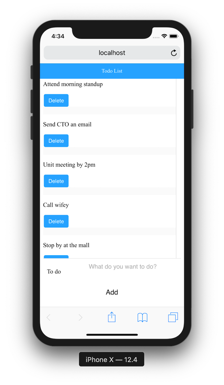
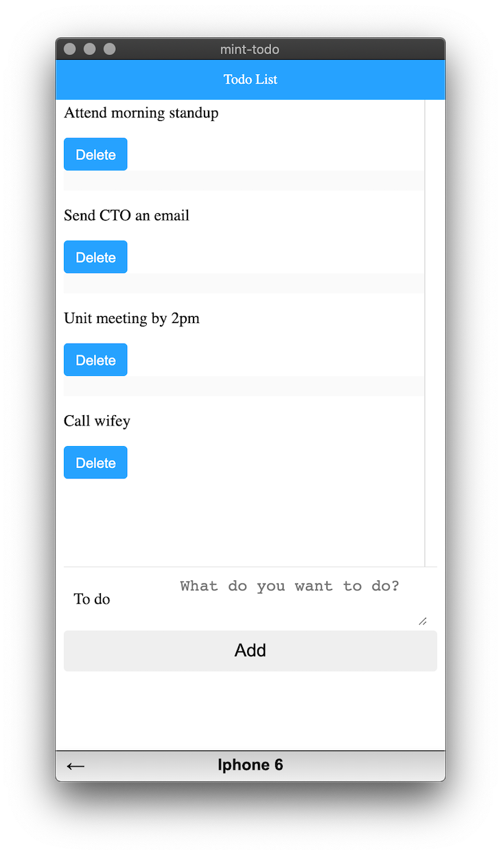
If you don’t have an emulator, you can put the browser in a responsive mode, and it should look like this:
Now that we’ve got everything working fine, we need to deploy our website and make it live:
$ npm run build
This will work and create a folder called dist. The dist folder will contain the website ready to be deployed in a production environment. You can follow this guide to deploy on Netlify.
As you can see, Mint UI provides simple, clean, responsive mobile user interface components. You can extend this example by adding more features and adapting more Mint UI components. Find a comprehensive list of Mint UI components here.
Debugging Vue.js applications can be difficult, especially when users experience issues that are difficult to reproduce. If you’re interested in monitoring and tracking Vue mutations and actions for all of your users in production, try LogRocket.
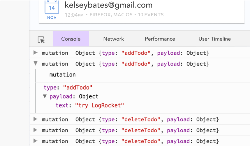
LogRocket lets you replay user sessions, eliminating guesswork by showing exactly what users experienced. It captures console logs, errors, network requests, and pixel-perfect DOM recordings — compatible with all frameworks.
With Galileo AI, you can instantly identify and explain user struggles with automated monitoring of your entire product experience.
Modernize how you debug your Vue apps — start monitoring for free.
Would you be interested in joining LogRocket's developer community?
Join LogRocket’s Content Advisory Board. You’ll help inform the type of content we create and get access to exclusive meetups, social accreditation, and swag.
Sign up now
Which AI frontend dev tool reigns supreme in July 2025? Check out our power rankings and use our interactive comparison tool to find out.

Learn how OpenAPI can automate API client generation to save time, reduce bugs, and streamline how your frontend app talks to backend APIs.

Discover how the Interface Segregation Principle (ISP) keeps your code lean, modular, and maintainable using real-world analogies and practical examples.

<selectedcontent> element improves dropdowns

 Learn more →
