One of the most significant advances in dev tools in recent years has been the arrival of SwiftUI, a UI framework that allows developers to design and build user interfaces using declarative code.

SwiftUI currently supports only iOS 13 and newer. This tutorial requires Xcode 11 (or a later version) and we will be using Swift 5 throughout.
In this article, we will be building a form in SwiftUI together, so feel free to follow along with this tutorial at your own pace. We will cover:
Let’s waste no time and get started!
SwiftUI is an innovative shift in Apple’s ecosystem. App building through declarative code of the same complexity — with a lot less code — enables developers to rapidly develop apps in iOS.
With a much simpler and faster UI pattern, you can employ features like dynamic types, dark mode, localization, and accessibility right away when you use SwiftUI.
SwiftUI is accessible on all Apple platforms, including macOS, iOS, iPadOS, watchOS, and tvOS. Developers can spend more time writing code efficiently, making platform-specific features, and focusing on the UI because of the time saved using SwiftUI.
In short, I’ve found it to be a very useful tool in my experience!
Moreover, the Apple ecosystem allows you to use SwiftUI and UIKit alongside each other. This is a great advantage for all iOS developers, making it easier to adapt to the new shift.
Let’s understand the basic components of SwiftUI:
For the most part, this framework removes the need to create view controller code and makes it easy to sync app data with a single source.
This tutorial demonstrates how to design and use forms in SwiftUI by guiding you through building a form with basic UI settings.
The controls that are used for data input are wrapped inside the Form element. SwiftUI can incorporate a number of these elements, such as text fields, pickers, buttons, toggle, sliders, and more.
The basic syntax of a Form in SwiftUI with a simple Text element looks something like this:
var form: some View {
Form {
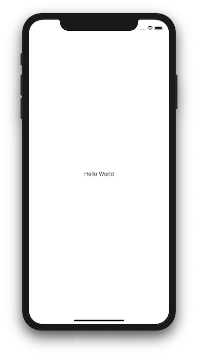
Text("Hello World").padding()
}
}
The View contains a Form element, which has a Text as its child element. The example Text written is visible in the preview below:
To begin, open Xcode and choose “Create a new Xcode project” from the menu. When using iOS, choose “Single View Apps”.
It’s time to name and describe your app. The “Use SwiftUI” option must be selected at the bottom. If you don’t click this option, Xcode will create the storyboard file for you.
Now, Xcode will automatically create a file named ContentView.swift. This file will show you a live preview of your code on the right-hand side.
If you have not yet seen the preview, just hit the “Resume” button inside the preview pane. Once the project is built, you’ll be able to see the preview.
With the new instant preview feature, you can input code and see the visual changes in real-time, making the whole programming experience faster and allowing you to see alterations as they happen.
To build a form using SwiftUI, we are going to develop the different UI elements. Let’s implement them one by one and get to understand them better.
Let’s begin with a simple implementation using the text labels and the text fields:
//
Text("Name").font(.headline)
The above line creates a label using the Text component and sets the value of that label as Name. In addition, the .font property sets its font type to headline. To create a text field with a placeholder, you need to write the code like this:
//
TextField(.constant(""), placeholder: Text("Enter your name"))
You need to tell the SwiftUI framework using a VStack and arrange both the components as desired in order to put the label above the text field. The below code snippet shows how to do this:
//
struct ContentView : View {
    var body: some View {
        VStack(alignment: .leading) {

            Text("Name").font(.headline)
            TextField(.constant(""), placeholder: Text("Enter your name"))

        }
    }
}
Now that we have created the basic text field and label, let’s improve the look and feel:
//
struct ContentView : View {
    var body: some View {
        VStack(alignment: .leading) {
            Text("Name").font(.headline)
            TextField(.constant(""), placeholder: Text("Enter your name"))
                .padding(.all)
                .background(Color(red: 200.0/255.0, green: 200.0/255.0, blue: 200.0/255.0, opacity: 0.7), cornerRadius: 8.0)
        }
    }
}
In the above code, we have added a .padding(.all) property, which gives padding to the text typed inside the text input field.
Additionally, the .background property allows you to define the background color of the text input field and set a cornerRadius of 8.0, for this example.
Next, let’s fix the spacing with the screen edges. To do so, you need to specify the .padding property to the VStack, which holds the elements within itself:
//
struct ContentView : View {

    @State var name: String = ""

    var body: some View {
        VStack(alignment: .leading) {
        Text("Name").font(.headline)
            TextField(.constant(""), text: $name, placeholder: Text("Enter your name"))
                .padding(.all)
                .background(Color(red: 200.0/255.0, green: 200.0/255.0, blue: 200.0/255.0, opacity: 0.7), cornerRadius: 8.0)
        }
        .padding(.horizontal, 16)
    }
}
Note that we have also added a State variable called name to hold the value of text input.
To populate different UI components and views, it is more efficient to reuse them instead of duplicating the code.
A Form in SwiftUI is a container view that allows you to group controls used for data entry. The above-mentioned components can be coded with the Form as shown below:
//
struct ContentView: View {


    @State var name: String = ""

    var body: some View {
        NavigationView {
            Form {
                Section(header: Text("Profile")) {
                    Text("Name").font(.headline)
                    TextField(.constant(""), text: $name, placeholder: Text("Enter your name"))
                        .padding(.all)
                        .background(Color(red: 200.0/255.0, green: 200.0/255.0, blue: 200.0/255.0, opacity: 0.7), cornerRadius: 8.0)
                    }
                }
                .padding(.horizontal, 16)
            }
            .navigationBarTitle("Settings")
        }
    }
}
The above code allows you to specify the Form object inside a NavigationView. The Section allows you to create a separate section inside the “Form” view, which you can then label using the header property.
You have successfully created the first component in the form using SwiftUI!
Let’s update your form by adding a Toggle to give the option to make the profile hidden:
//
struct ContentView: View {


    @State var name: String = ""
    @State var isHidden: Bool = false

    var body: some View {
        NavigationView {
            Form {
                Section(header: Text("Profile")) {
                    Text("Name").font(.headline)
                    TextField(.constant(""), text: $name, placeholder: Text("Enter your name"))
                        .padding(.all)
                        .background(Color(red: 200.0/255.0, green: 200.0/255.0, blue: 200.0/255.0, opacity: 0.7), cornerRadius: 8.0)
                    }
                    Toggle(isOn: $isHidden) {
                        Text("Hide account")
                    }
                }
                .padding(.horizontal, 16)
            }
            .navigationBarTitle("Settings")
        }
    }
}
The Toggle is added below the TextField, as shown in the code. This allows you to turn the Toggle on or off. It also saves the value to be processed in the variable called isHidden, which allows you to access and update the business logic as required.
You can select the desired value from a list of options using the SwiftUI Picker component. For a Picker to work properly, you must provide it with an array of options and a State variable that records which one was selected.
Let’s create a Picker that allows us to store chosen preferences:
//
struct ContentView: View {


    @State var name: String = ""
    @State var isHidden: Bool = false
    @State var email: String = ""
    @State var receiveEmails: Bool = false
    @State private var index = 0
    var emailOptions = ["All", "Transactional", "Marketing"]

    var body: some View {
        NavigationView {
            Form {
                Section(header: Text("Profile")) {
                    Text("Name").font(.headline)
                    TextField(.constant(""), text: $name, placeholder: Text("Enter your name"))
                        .padding(.all)
                        .background(Color(red: 200.0/255.0, green: 200.0/255.0, blue: 200.0/255.0, opacity: 0.7), cornerRadius: 8.0)
                    }
                    Toggle(isOn: $isHidden) {
                        Text("Hide account")
                    }
                }
                .padding(.horizontal, 16)


                Section(header: Text("Emails")) {
                    Toggle(isOn: $receiveEmails) {
                        Text("Receive emails")
                    }
                    TextField(.constant(""), text: $email, placeholder: Text("Enter your email"))
                        .padding(.all)
                        .background(Color(red: 200.0/255.0, green: 200.0/255.0, blue: 200.0/255.0, opacity: 0.7), cornerRadius: 8.0)
                    }
                    Picker(selection: $index, label: Text("Email types")) {
                        ForEach(0 ..< emailOptions.count) {
                            Text(self.emailOptions[$0])
                        }
                    }
                }
                .padding(.horizontal, 16)
            }
            .navigationBarTitle("Settings")
        }
    }
}
As you can see in the code, a new section named Emails is introduced, which has a Toggle to enable email notifications, a TextField to take email as an input, and a Picker component to select the type of email.
A slider is a component that allows you to drag the selection on a line to choose a value from a range that has already been set. The UISlider in UIKit is similar to the Slider in SwiftUI.
You can define a slider like this:
//
struct ContentView: View {


    @State var name: String = ""
    @State var isHidden: Bool = false
    @State var email: String = ""
    @State var receiveEmails: Bool = false
    @State private var index = 0
    var emailOptions = ["All", "Transactional", "Marketing"]
    @State var volumeSliderValue: Double = 0

    var body: some View {
        NavigationView {
            Form {
                Section(header: Text("Profile")) {
                    Text("Name").font(.headline)
                    TextField(.constant(""), text: $name, placeholder: Text("Enter your name"))
                        .padding(.all)
                        .background(Color(red: 200.0/255.0, green: 200.0/255.0, blue: 200.0/255.0, opacity: 0.7), cornerRadius: 8.0)
                    }
                    Toggle(isOn: $isHidden) {
                        Text("Hide account")
                    }
                }
                .padding(.horizontal, 16)


                Section(header: Text("Emails")) {
                    Toggle(isOn: $receiveEmails) {
                        Text("Receive emails")
                    }
                    TextField(.constant(""), text: $email, placeholder: Text("Enter your email"))
                        .padding(.all)
                        .background(Color(red: 200.0/255.0, green: 200.0/255.0, blue: 200.0/255.0, opacity: 0.7), cornerRadius: 8.0)
                    }
                    Picker(selection: $index, label: Text("Email types")) {
                        ForEach(0 ..< emailOptions.count) {
                            Text(self.emailOptions[$0])
                        }
                    }
                }
                .padding(.horizontal, 16)

                Section(header: Text("Emails")) {
                    Slider(value: $volumeSliderValue, in: 0...100, step: 1)
                    .padding()
                    .accentColor(Color.blue)
                    .border(Color.blue, width: 3)
                }
                .padding(.horizontal, 16)
            }
            .navigationBarTitle("Settings")
        }
    }
}
In the above code, a state variable called volumeSliderValue is defined, which stores the current value of the slider. The Slider component is created by passing the volumeSliderValue along with a range of possible values across the Slider.
You can also add the increment value for the Slider by defining the step value in the parameter. You can additionally change the color of the slider and the border around it using the modifiers accentColor() and border(), respectively.
A stepper is a UI control element that lets you increase or decrease a value by using its plus or minus buttons. SwiftUI’s Stepper resembles UIKit’s UIStepper.
Let’s have a look at how a Stepper can be added to SwiftUI Forms.
First of all, you’ll need to declare a variable that will hold the value of the Stepper as shown below:
@State var stepper: Int = 0
Once declared, you need to pass it to initialize the Stepper as shown below:
VStack {
    Stepper("Stepper's value is: ", value: $stepper)
}.padding()
Now let’s learn how to define the step value for the stepper. To do so, you need to provide a step value to allow incrementing or decrementing actions.
Here’s how you can define the step value:
Stepper("Stepper's value is: ", value: $stepper, step: 1)
In many cases, you may want to limit the Stepper values to a certain range. You can limit the range of the Stepper by declaring the range as shown below:
Stepper("Stepper's value is: ", value: $stepper, in: 1..10, step: 1)
The result should look like this:

After adding the Stepper, your code would look something like this:
//
struct ContentView: View {

    @State var name: String = ""
    @State var isHidden: Bool = false
    @State var email: String = ""
    @State var receiveEmails: Bool = false
    @State private var index = 0
    var emailOptions = ["All", "Transactional", "Marketing"]
    @State var volumeSliderValue: Double = 0
    @State var stepper: Int = 0

    var body: some View {
        NavigationView {
            Form {
                Section(header: Text("Profile")) {
                    Text("Name").font(.headline)
                    TextField(.constant(""), text: $name, placeholder: Text("Enter your name"))
                        .padding(.all)
                        .background(Color(red: 200.0/255.0, green: 200.0/255.0, blue: 200.0/255.0, opacity: 0.7), cornerRadius: 8.0)
                    }
                    Toggle(isOn: $isHidden) {
                        Text("Hide account")
                    }
                }
                .padding(.horizontal, 16)


                Section(header: Text("Emails")) {
                    Toggle(isOn: $receiveEmails) {
                        Text("Receive emails")
                    }
                    TextField(.constant(""), text: $email, placeholder: Text("Enter your email"))
                        .padding(.all)
                        .background(Color(red: 200.0/255.0, green: 200.0/255.0, blue: 200.0/255.0, opacity: 0.7), cornerRadius: 8.0)
                    }
                    Picker(selection: $index, label: Text("Email types")) {
                        ForEach(0 ..< emailOptions.count) {
                            Text(self.emailOptions[$0])
                        }
                    }
                }
                .padding(.horizontal, 16)

                Section(header: Text("Emails")) {
                    Slider(value: $volumeSliderValue, in: 0...100, step: 1)
                    .padding()
                    .accentColor(Color.blue)
                    .border(Color.blue, width: 3)
                }
                .padding(.horizontal, 16)

                Section(header: Text("Volume")) {
                    Stepper("Volume is: ", value: $stepper, in: 1..10, step: 1)
                    .padding()
                    .accentColor(Color.blue)
                }
                .padding(.horizontal, 16)
            }
            .navigationBarTitle("Settings")
        }
    }
}
Now let’s look at an example of how you can add a DatePicker to your SwiftUI Forms.
First of all, you need to declare a property data type as shown below:
@State var date = Date()
Once declared, the property needs to be passed to initialize the DatePicker as shown below:
DatePicker("Pick a date", selection: $date, displayedComponents: .date)
}
Tapping on each different date or time will show a dedicated picker UI element.:

With the DatePicker added, here’s how your code will look:
//
struct ContentView: View {

    @State var name: String = ""
    @State var isHidden: Bool = false
    @State var email: String = ""
    @State var receiveEmails: Bool = false
    @State private var index = 0
    var emailOptions = ["All", "Transactional", "Marketing"]
    @State var volumeSliderValue: Double = 0
    @State var stepper: Int = 0
    @State var date = Date()

    var body: some View {
        NavigationView {
            Form {
                Section(header: Text("Profile")) {
                    Text("Name").font(.headline)
                    TextField(.constant(""), text: $name, placeholder: Text("Enter your name"))
                        .padding(.all)
                        .background(Color(red: 200.0/255.0, green: 200.0/255.0, blue: 200.0/255.0, opacity: 0.7), cornerRadius: 8.0)
                    }
                    Toggle(isOn: $isHidden) {
                        Text("Hide account")
                    }
                }
                .padding(.horizontal, 16)


                Section(header: Text("Emails")) {
                    Toggle(isOn: $receiveEmails) {
                        Text("Receive emails")
                    }
                    TextField(.constant(""), text: $email, placeholder: Text("Enter your email"))
                        .padding(.all)
                        .background(Color(red: 200.0/255.0, green: 200.0/255.0, blue: 200.0/255.0, opacity: 0.7), cornerRadius: 8.0)
                    }
                    Picker(selection: $index, label: Text("Email types")) {
                        ForEach(0 ..< emailOptions.count) {
                            Text(self.emailOptions[$0])
                        }
                    }
                }
                .padding(.horizontal, 16)

                Section(header: Text("Emails")) {
                    Slider(value: $volumeSliderValue, in: 0...100, step: 1)
                    .padding()
                    .accentColor(Color.blue)
                    .border(Color.blue, width: 3)
                }
                .padding(.horizontal, 16)

                Section(header: Text("Volume")) {
                    Stepper("Volume is: ", value: $stepper, in: 1..10, step: 1)
                    .padding()
                    .accentColor(Color.blue)
                }
                .padding(.horizontal, 16)

                Section(header: Text("Date")) {
                    DatePicker("Pick a Date", selection: $date,displayedComponents: .date)
                }
                .padding(.horizontal, 16)
            }
            .navigationBarTitle("Settings")
        }
    }
}
Now let’s add a Button that will allow you to reset the SwiftUI form’s configuration to its default values. Once the Button is clicked, it will reset all the values of the various elements inside the Form.
The Button would look like this:
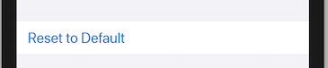
The code to achieve this functionality would look like this:
//
struct ContentView: View {

    @State var name: String = ""
    @State var isHidden: Bool = false
    @State var email: String = ""
    @State var receiveEmails: Bool = false
    @State private var index = 0
    var emailOptions = ["All", "Transactional", "Marketing"]
    @State var volumeSliderValue: Double = 0
    @State var date = Date()

    var body: some View {
        NavigationView {
            Form {
                Section(header: Text("Profile")) {
                    Text("Name").font(.headline)
                    TextField(.constant(""), text: $name, placeholder: Text("Enter your name"))
                        .padding(.all)
                        .background(Color(red: 200.0/255.0, green: 200.0/255.0, blue: 200.0/255.0, opacity: 0.7))
                    }
                    Toggle(isOn: $isHidden) {
                        Text("Hide account")
                    }
                }
                .padding(.horizontal, 16)


                Section(header: Text("Emails")) {
                    Toggle(isOn: $receiveEmails) {
                        Text("Receive emails")
                    }
                    TextField(.constant(""), text: $email, placeholder: Text("Enter your email"))
                        .padding(.all)
                        .background(Color(red: 200.0/255.0, green: 200.0/255.0, blue: 200.0/255.0, opacity: 0.7))
                    }
                    Picker(selection: $index, label: Text("Email types")) {
                        ForEach(0 ..< emailOptions.count) {
                            Text(self.emailOptions[$0])
                        }
                    }
                }
                .padding(.horizontal, 16)

                Section(header: Text("Slider")) {
                    Slider(value: $volumeSliderValue, in: 0...100, step: 1)
                    .padding()
                    .accentColor(Color.blue)
                    .border(Color.blue, width: 3)
                }
                .padding(.horizontal, 16)

                Section(header: Text("Volume")) {
                    Stepper("Volume is: ", value: $stepper, in: 1..10, step: 1)
                    .padding()
                    .accentColor(Color.blue)
                }
                .padding(.horizontal, 16)

                Section(header: Text("Date")) {
                    DatePicker("Pick a Date", selection: $date)
                }
                .padding(.horizontal, 16)

                Section {
                    Button(action: {
                        print("Reset to Default")
                        name = ""
                        isHidden = false
                        email = ""
                        receiveEmails = false
                        index = 0
                        volumeSliderValue = 0
                    }) {
                        Text("Reset to Default")
                    }
                }
                .padding(horizontal, 16)
            }
            .navigationBarTitle("Settings")
        }
    }
}
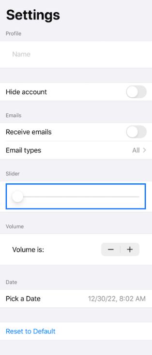
And we’re done! The final Form we just created in SwiftUI should look like this:
This article showcases the use of SwiftUI and how you can create a form using SwiftUI. While this article shows the basics of the concept, SwiftUI offers much more.
Check out the further resources below, such as Apple’s documentation and the WWDC 2019 sessions given about this framework:
Have any other questions about building forms with SwiftUI? Comment them below!
Install LogRocket via npm or script tag. LogRocket.init() must be called client-side, not
server-side
$ npm i --save logrocket

// Code:

import LogRocket from 'logrocket';
LogRocket.init('app/id');
// Add to your HTML:

<script src="https://cdn.lr-ingest.com/LogRocket.min.js"></script>
<script>window.LogRocket && window.LogRocket.init('app/id');</script>
Hey there, want to help make our blog better?
Join LogRocket’s Content Advisory Board. You’ll help inform the type of content we create and get access to exclusive meetups, social accreditation, and swag.
Sign up now
This guide explores how to use Anthropic’s Claude 4 models, including Opus 4 and Sonnet 4, to build AI-powered applications.

Which AI frontend dev tool reigns supreme in July 2025? Check out our power rankings and use our interactive comparison tool to find out.

Learn how OpenAPI can automate API client generation to save time, reduce bugs, and streamline how your frontend app talks to backend APIs.

Discover how the Interface Segregation Principle (ISP) keeps your code lean, modular, and maintainable using real-world analogies and practical examples.

 Learn more →
