The aim of this post is to examine how frontend developers build fast landing pages, as judged by Core Web Vitals.

These webpage performance metrics are a new ranking signal for Google Search and are a concern for digital marketers and SEO professionals. Since Google announced them in May 2000, business owners asked frontend developers to fix slow pages and build faster ones.
Now that Core Web Vitals has started rolling out, I went looking for the best frontend performance patterns.
The Replay is a weekly newsletter for dev and engineering leaders.
Delivered once a week, it's your curated guide to the most important conversations around frontend dev, emerging AI tools, and the state of modern software.
The topic of Core Web Vitals includes three user-centric, webpage performance metrics derived from real Chrome user data (CrUX). The scores are aggregated to the 75th percentile over a rolling 28-day period. The three metrics are:
It is critical to measure your pages against users with the slowest connections and devices.
So, I throttle my connection to fast 3G and slow down my CPU by 6x. Only then am I able to surface issues reported by Google’s Search Console.
The secret to fixing page speed problems is to reverse engineer pages that already have good Vitals. First, I needed a page type that is common to most sites, so, for the purpose of this article, I chose to measure the ubiquitous pricing page because they are visually similar across websites and generally include a prominent call to action.
Then, I tested the 114 mobile pages with Lighthouse and compared them against Core Web Vitals. This left me with 25 fast landing pages to analyze.
Technologies on these sites ranged from Next.js to WordPress to Ruby on Rails, and some even used jQuery. No matter what stack you (are forced to) use, there is always a way to improve your Core Web Vital scores.
As these patterns are reverse-engineered from existing pages using data from the Google Chrome User Experience Report (CrUX), I am confident that if you follow them, you will build a fast webpage, or even fix a slow one.
To investigate these patterns on your own, I recommend loading the page, then viewing the source code.
The fastest 10 sites had server responses ranging from 75ms to 380ms with a 110ms median. The takeaway? The 75th percentile from the field probably needs to be consistently under 600ms.
| Domain | URL | TTFB |
|---|---|---|
| basecamp.com | https://basecamp.com/pricing | 59 |
| getharvest.com | https://www.getharvest.com/pricing | 322 |
| postermywall.com | https://www.postermywall.com/index.php/premium | 94 |
| loom.com | https://www.loom.com/pricing | 380 |
| evernote.com | https://evernote.com/compare-plans | 255 |
| trello.com | https://trello.com/pricing | 107 |
| loom.com | https://www.loom.com/pricing | 123 |
| shopify.com | https://www.shopify.com/pricing | 202 |
| agilecrm.com | https://www.agilecrm.com/pricing | 118 |
| newrelic.com | https://newrelic.com/pricing | 76 |
| sproutsocial.com | https://sproutsocial.com/trial/ | 129 |
Before looking at code, I recommend performing an inventory of the files requested and breaking them down by content type. Then compare your page to that of a fast page. This is called a performance budget.
I created my budget by breaking down each type of file that loads prior to the largest contentful paint (LCP). For example, Shopify loads over 100 files but built the page so that it loads 17 files before the largest contentful paint.
Before LCP, fast pages generally load:
Properly built pages start by finding all the domains used by these 35 files and then use the preconnect resource hint. Shopify uses this pattern to preconnect to critical domains:
<head>
      <link rel="preconnect" href="https://cdn.shopify.com" />
      <link rel="preconnect" href="https://monorail-edge.shopifysvc.com" />
      <link rel="preconnect" href="https://sessions.bugsnag.com" />
      <link rel="preconnect" href="https://www.google-analytics.com" />
      <link rel="preconnect" href="https://www.googletagmanager.com" />
      <link rel="preconnect" href="https://bat.bing.com" />
      <link rel="preconnect" href="https://www.facebook.com" />
      <link rel="preconnect" href="https://connect.facebook.net" />
      <link rel="preconnect" href="https://tags.tiqcdn.com" />
      <link rel="preconnect" href="https://lux.speedcurve.com" />
</head>
This allows the browser to open connections before files are requested.
Most sites rely on custom fonts and use font-display: swap so that text is visible until the custom font is downloaded. PosterMyWall is an example of the pattern where the font is preloaded and self-hosted. This is the fastest way to load and render custom fonts.
<head>
     <link rel="preload"
href="https://www.postermywall.com/assets/fonts/NunitoSans/NunitoSans-R
egular.woff2"
     as="font" type="font/woff2" crossorigin="anonymous">
<!-- Suggested improvement →
<link rel="preload" as="style"
      href="https://pro.fontawesome.com/releases/v5.13.0/css/all.css"
      onload=”this.rel='stylesheet'">
</head>
If you need to use Google Fonts, you should look to use Mario Ranftl’s google-web-fonts-helper.
The main reason to avoid icon fonts is that they create a request chain. This means that the root document has to load a stylesheet, which in turn loads the icon font file before it can render the icon. But a simple image with a height and width attribute has no dependencies.
If you need to use an icon font, Sproutsocial outlines a useful pattern when it preloads the font and asynchronously loads it. I would additionally recommend preloading the icon font files as well.
<head>
<link rel="preload" as="style"
      href="https://pro.fontawesome.com/releases/v5.13.0/css/all.css"
      onload=”this.rel='stylesheet'">
<!-- My recommendation -->
<link rel="preload"
            href="https://pro.fontawesome.com/releases/v5.13.0/webfonts/fa-so    lid-900.woff2"
      as="font" type="font/woff2"
crossorigin="anonymous">
</head>
I have also seen the benefit of adding @fontface rules inline as well, which removes the render-blocking all.css.
I was surprised to discover that many sites do not inline styles. They instead create small bundles of CSS to load in the <head>. For example, Loom preloads external stylesheets that total about 15KB.
That said, Amazon AWS loads a single 74KB render-blocking CSS file. So, don’t just use a pattern because Lighthouse or a post (like this) recommends it.
<head>
  <link rel="preload" href="/_next/static/css/4971ebe5c5a60f5f989b.css"
    as="style" />
  <link rel="stylesheet" href="/_next/static/css/4971ebe5c5a60f5f989b.css"/>
  <link rel="preload" href="/_next/static/css/33a02aaca547371a75e0.css"
    as="style" />
  <link rel="stylesheet" href="/_next/static/css/33a02aaca547371a75e0.css"/>
</head>
My budget recommends no more than 10 scripts before the largest contentful paint. This is not permission to load 10 massive files, but the best sites load small scripts (2 to 35KB) at the bottom of the page intelligently applying async or defer attributes.
Several sites use Next.js, which provides the ability to load scripts before and after interactive shipping JavaScript inline, as well as the ability to lazy load scripts (excellent for third-party vendors). Scripts are also preloaded.
If you have a different technology stack when you are preloading scripts, pay attention to resource ordering.
If you have images that can be relatively small SVGs, inline them. Trello inlines all the SVG images above the fold and then lazy loads those that are offscreen or hidden.
I also have used loading=eager for images above the fold. Sites like Trello use the native loading=lazy attribute, but JavaScript solutions were also observed.
<body>
     <svg
        height="16"
        viewBox="0 0 16 16"
        width="16"
        <path>...</path>
      </svg>
      <!-- Native -->
      <img
         src="//images.ctfassets.net/TREL-210_Trello_Access_Spot_Illo.svg"
                alt="Atlassian Access"
          width="271"
          height="190"
          loading="lazy"
                class="Picture__Image-sc" />
      <!-- Script -->
      <img
         src="https://www.postermywall.com/assets/.../placeholder-image.png”
    data-src="https://d1csarkz8obe9u.cloudfront.net/.../green-restaurant.jpg"

                  class="pmw-lazy" alt="Blog post" />
</body>
<picture> element to display a large hero imageNone of the pages analyzed included a hero image component, so I searched and found Trulia, which employed a novel pattern. To start, they set a PerformanceMark, which indicates to me a high degree of intentionally.
Risking oversimplification, I observed that for the large hero image, the developers used the <picture> element containing 19 <source> elements covering all types of use cases. Not only is the image sized and compressed correctly for desktop and mobile, but they take advantage of the <picture> art direction capabilities. This tells me also that the UX team was part of this solution.
<picture class="Picture__PictureContainer-sc-1exw3ow-1 gteZiU">
<source
      srcSet="https://www.trulia.com/images/app-shopping/homePage/extraLarge.jpg"
      media="(min-width:993px)" />
<source
      srcSet="https://www.trulia.com/images/app-shopping/homePage/medium.jpg"
      media="(min-width:768px)" />
<source
      srcSet="https://www.trulia.com/images/app-shopping/homePage/medium.jpg"
      media="(min-width:570px)" />
<source
      srcSet="https://www.trulia.com/images/app-shopping/homePage/small.jpg"
      media="(min-width:376px)" />
<source
      srcSet="https://www.trulia.com/images/app-shopping/homePage/small.jpg"
      media="(min-width:0px)" />
<img
      loading="auto"
      decoding="auto"
      id="homepage-banner-image"
      style="background:url(src="data:image/image/png;base64,iVBOR==");
      background-size:cover"
      width="100%"
      height="100%"
src="https://www.trulia.com/images/app-shopping/homePage/extraLarge.jpg"
alt=""
class="Picture__Image-sc-1exw3ow-0 tzLdz" />
</picture>
And, to emulate a background image, they use the position property to layer several <div> elements to complete the component. The result is amazing.
On the desktop, the large background image appears in 600ms and LCP occurs at 900ms. Then on a slow mobile device, it appears at 1.8s and completes by 2.2s.
The secret to image painting is ingenious.
The <img> element has an inline style setting, a base 64 encoded, and a 10px by 5px JPG as a background image with the height and width set to 100%. This is why it paints so quickly and has a nice effect that makes the image go from blurry to crystal clear. Wow.
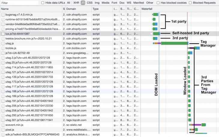
<readyState> is interactiveManaging third-party vendors is challenging, especially when the budget recommends only four scripts be loaded before LCP. The business can still use third-party vendors despite this, as the pages analyzed requested an average of 103 third-party files be fully loaded. So I set out to see how the best pages dealt with vendor scripts.
The best pattern loaded up to four scripts (i.e., tag manager, AB testing, RUM) before readyState is interactive, then loaded the remaining after document.readyState was complete.
<head>
    <link rel="preconnect" href="https://assets.adobedtm.com" />
</head>
<body>
      <!-- Bottom of HTML →
<script src="https://assets.adobedtm.com/launch-EN.min.js" async></script>
<! -- Self-host -->
<script src="https://cdn.shopify.com/speedcurve-lux/js/lux.js?id=64441087" async defer crossorigin="anonymous"></script>
</body>
If you employ a tag manager, the waterfall ought to be expected. It loads critical third parties before DOMContentLoaded, including your tag manager script. Then, set the browser event trigger to Window Loaded for all your remaining scripts.

This describes the best pattern. However, your situation may require something less aggressive. The takeaway is to take control over when your scripts are being loaded, not just for vendors, but for all scripts in order to optimize the waterfall.
I am sure I missed some things when addressing LCP issues, but these case studies highlight why Core Web Vitals (First Input Delay) do not result in better JavaScript patterns.
Additionally, I would not expect these high-quality sites to fail Cumulative Layout Shift. But, I think I would find more CSS patterns if I analyzed ad-supported articles instead of pricing pages.
This analysis is not a surprise. All of these patterns are well documented, with the exception of using the picture element for a large hero image.
But if you are choosing a solution, I would recommend using these patterns, which are based on case studies rather than recommendations listed by Lighthouse.

Learn how Vite+ unifies Vite, Vitest, Oxlint, Oxfmt, Rolldown, and Node.js management in one CLI.

AI companies are buying developer tools as coding agents turn runtimes, package managers, and linters into strategic infrastructure.

Learn how AI-assisted development governance uses rules, agents, hooks, and protocols to help AI coding tools produce safer, more consistent code.

A step-by-step guide to building your first MCP server using Node.js, covering core concepts, tool design, and upgrading from file storage to MySQL.
Hey there, want to help make our blog better?
Join LogRocket’s Content Advisory Board. You’ll help inform the type of content we create and get access to exclusive meetups, social accreditation, and swag.
Sign up now