Charts can help app users better visualize data and more readily identify trends. Additionally, many users find it easier to retain data that is presented graphically.

SwiftUI can be used to build charts for iOS apps faster as it requires less code. SwiftUI offers a rich graphics capability that can be used to create and style a variety of charts across all Apple platforms.
In this article, we’ll use SwiftUI to create bar charts and line charts modeled after those from Apple’s Health app. We’ll also demonstrate how to create bar and line charts with just a few lines of code using Apple’s Swift Charts framework. This framework, which is built on top of SwiftUI, greatly simplifies working with charts and provides dynamic sizing, localization, dark mode, high-contrast mode, voiceover, and audio graphs support for free.
At the time of writing, Swift Charts is still in beta and is only available for iOS 16.0+, iPadOS 16.0+, macOS 13.0+, Mac Catalyst 16.0+, tvOS 16.0+, and watchOS 9.0+. A public release is expected by late September 2022.
You’ll be able to use these examples in this article to create and style charts in your own iOS app.
Jump ahead:
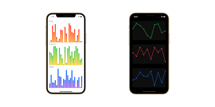
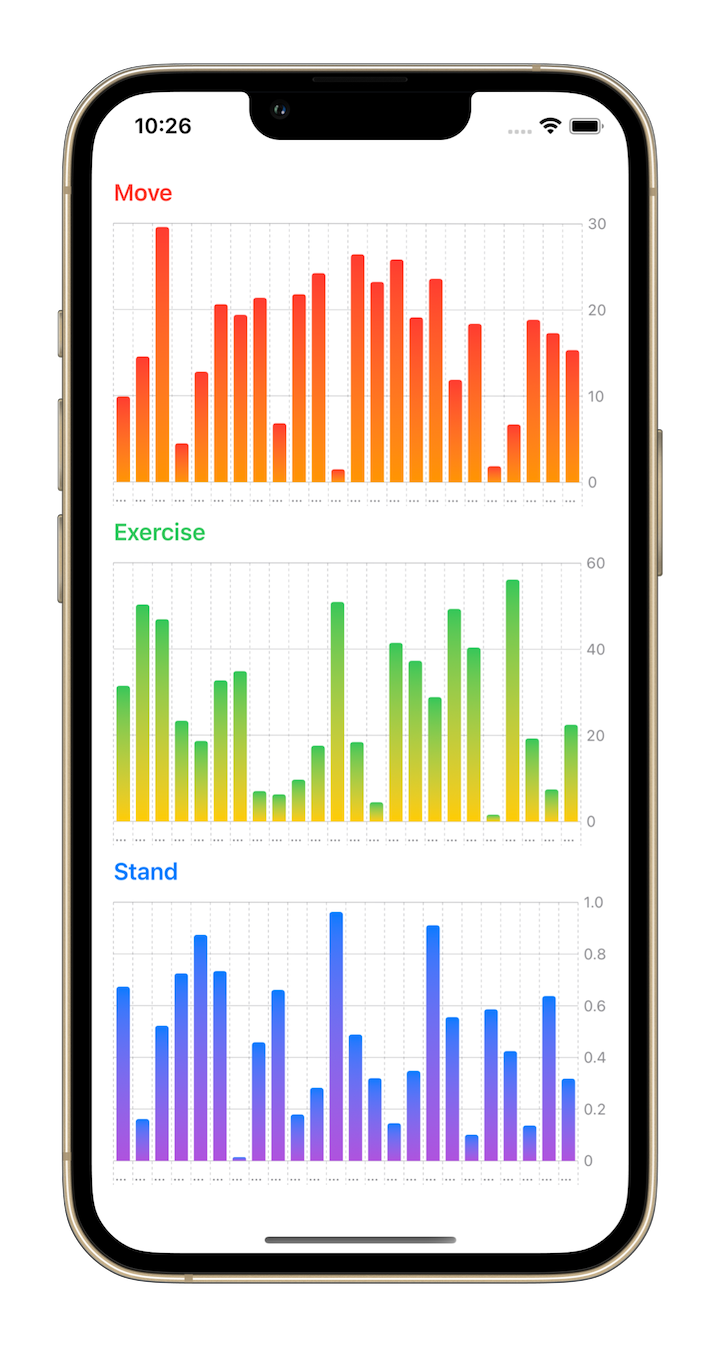
Here are the custom charts we’ll build:
Let’s get started!
Bar charts are useful for comparing the values of different groups or subgroups of data. Quarterly revenue by product category or monthly ROI by campaign are common examples of data that would display well as a bar chart.
We’ll start by creating the bars of the chart. We’ll give them a linear gradient coloration. Start by creating a View named BarView:
struct BarView: View {
  var datum: Double
  var colors: [Color]

  var gradient: LinearGradient {
    LinearGradient(gradient: Gradient(colors: colors), startPoint: .top, endPoint: .bottom)
  }

  var body: some View {
    Rectangle()
      .fill(gradient)
      .opacity(datum == 0.0 ? 0.0 : 1.0)
  }
}
First, define two parameters: datum and a Color array. Then, based on the colors parameter, define a computed property gradient.
In the body of the View, declare a Rectangle view and fill it with the gradient. If the datum value is 0.0, then the View is not visible.
Next, create a file BarChartView.swift and add the following code:
struct BarChartView: View {
  var data: [Double]
  var colors: [Color]

  var highestData: Double {
    let max = data.max() ?? 1.0
    if max == 0 { return 1.0 }
    return max
  }

  var body: some View {
    GeometryReader { geometry in
      HStack(alignment: .bottom, spacing: 4.0) {
        ForEach(data.indices, id: \.self) { index in
          let width = (geometry.size.width / CGFloat(data.count)) - 4.0
          let height = geometry.size.height * data[index] / highestData

          BarView(datum: data[index], colors: colors)
            .frame(width: width, height: height, alignment: .bottom)
        }
      }
    }
  }
}
We first accept an array of data. In this case, we use a Double array, but you could also pass in an object. For the second parameter, we accept a Color array.
Next, we use a computed property highestData to calculate the maximum value data.max(). This value is used to define the maximum height of the bar.
In the body of the View, we start with a GeometryReader and declare a horizontal stack HStack(). We declare a ForEach() and loop over the BarView by providing the individual values.
The geometry parameter is used to determine the width and height of each bar. The width of each bar is calculated by taking the full width and dividing it by the data count: geometry.size.width / CGFloat(data.count). The height of each bar is determined by taking the full height and multiplying it by the ratio of the individual data divided by the maximum height: geometry.size.height * data[index] / highestData.
With BarChartView ready, it’s time to use it in a view!
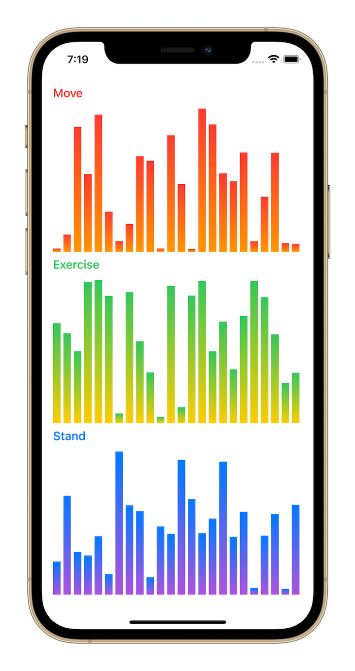
Create a View called ActivityView. For this tutorial, we’ll add mock data with random values:
struct ActivityView: View {
  @State private var moveValues: [Double] = ActivityView.mockData(24, in: 0...300)
  @State private var exerciseValues: [Double] = ActivityView.mockData(24, in: 0...60)
  @State private var standValues: [Double] = ActivityView.mockData(24, in: 0...1)

  var body: some View {
    VStack(alignment: .leading) {
      Text("Move").bold()
        .foregroundColor(.red)

      BarChartView(data: moveValues, colors: [.red, .orange])

      Text("Exercise").bold()
        .foregroundColor(.green)

      BarChartView(data: exerciseValues, colors: [.green, .yellow])

      Text("Stand").bold()
        .foregroundColor(.blue)

      BarChartView(data: standValues, colors: [.blue, .purple])
    }
    .padding()
  }

  static func mockData(_ count: Int, in range: ClosedRange<Double>) -> [Double] {
    (0..<count).map { _ in .random(in: range) }
  }
}
In this example, we first create variables for moveValues, exerciseValues, and standValues.
Next, we create corresponding headings (Move, Exercise, and Stand) for the fitness data, which will be displayed in a vertical stack.
We add BarChartView to pass the relevant data and colors. When the View appears, we provide variables with random values. In your own app, you will call your specific method to load actual data into the charts.
And just like that, we’ve created our first bar chart!
A line chart displays numerical information as a series of data points (or markers) connected by lines. A stock chart, which shows changes in a stock’s price, is a common example of a line chart.
We’ll start by creating the chart’s lines. Create a View named LineView:
struct LineView: View {
  var dataPoints: [Double]

  var highestPoint: Double {
    let max = dataPoints.max() ?? 1.0
    if max == 0 { return 1.0 }
    return max
  }

  var body: some View {
    GeometryReader { geometry in
      let height = geometry.size.height
      let width = geometry.size.width

      Path { path in
        path.move(to: CGPoint(x: 0, y: height * self.ratio(for: 0)))

        for index in 1..<dataPoints.count {
          path.addLine(to: CGPoint(
            x: CGFloat(index) * width / CGFloat(dataPoints.count - 1),
            y: height * self.ratio(for: index)))
        }
      }
      .stroke(Color.accentColor, style: StrokeStyle(lineWidth: 2, lineJoin: .round))
    }
    .padding(.vertical)
  }

  private func ratio(for index: Int) -> Double {
    1 - (dataPoints[index] / highestPoint)
  }
}
This View accepts data points in the form of an array — in this case, Double. You could replace this with an object. Next, the View accepts a Color for filling the line stroke.
Similar to the method used in BarChartView, we use a computed property, highestPoint, to calculate the dataPoints.max(). This value is used to define the maximum height of the line.
Inside GeometryReader, we create a Path type that moves to the first point. The location of each point on the line is determined by multiplying the height by the ratio of the individual data point divided by the highest point: height * self.ratio().
We loop over the LineView until reaching the last point, connecting each point with a line.
Next, we’ll create the data markers. Create a file LineChartCircleView.swift and add the following code:
struct LineChartCircleView: View {
  var dataPoints: [Double]
  var radius: CGFloat

  var highestPoint: Double {
    let max = dataPoints.max() ?? 1.0
    if max == 0 { return 1.0 }
    return max
  }

  var body: some View {
    GeometryReader { geometry in
      let height = geometry.size.height
      let width = geometry.size.width

      Path { path in
        path.move(to: CGPoint(x: 0, y: (height * self.ratio(for: 0)) - radius))

        path.addArc(center: CGPoint(x: 0, y: height * self.ratio(for: 0)),
                    radius: radius, startAngle: .zero,
                    endAngle: .degrees(360.0), clockwise: false)

        for index in 1..<dataPoints.count {
          path.move(to: CGPoint(
            x: CGFloat(index) * width / CGFloat(dataPoints.count - 1),
            y: height * dataPoints[index] / highestPoint))

          path.addArc(center: CGPoint(
            x: CGFloat(index) * width / CGFloat(dataPoints.count - 1),
            y: height * self.ratio(for: index)),
                      radius: radius, startAngle: .zero,
                      endAngle: .degrees(360.0), clockwise: false)
        }
      }
      .stroke(Color.accentColor, lineWidth: 2)
    }
    .padding(.vertical)
  }

  private func ratio(for index: Int) -> Double {
    1 - (dataPoints[index] / highestPoint)
  }
}
This View follows similar logic to the LineView. However, instead of creating lines, this View draws a circle for each data point.
We combine the LineView and LineChartCircleView to create the LineChartView:
struct LineChartView: View {
  var dataPoints: [Double]
  var lineColor: Color = .red
  var outerCircleColor: Color = .red
  var innerCircleColor: Color = .white

  var body: some View {
    ZStack {
      LineView(dataPoints: dataPoints)
        .accentColor(lineColor)

      LineChartCircleView(dataPoints: dataPoints, radius: 3.0)
        .accentColor(outerCircleColor)

      LineChartCircleView(dataPoints: dataPoints, radius: 1.0)
        .accentColor(innerCircleColor)
    }
  }
}
Inside a ZStack, we add the LineView with dataPoints and specify an accentColor. On top of this, we add an outerCircleColor with a radius of 3.0. Then we add a top layer innerCircleColor with a radius of 1.0. This results in a white circle with a colored outline.
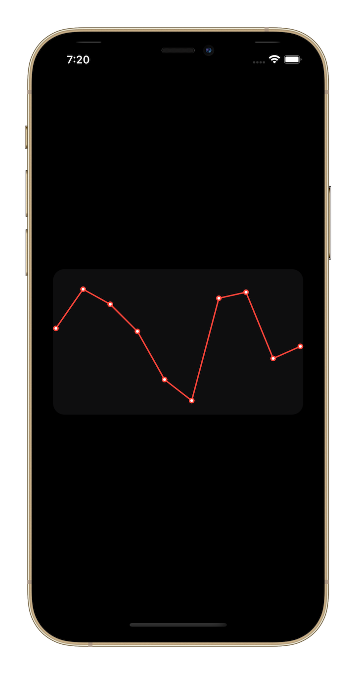
Now, we put the LineChartView into a container view, HeartRateView, to pass in the relevant data:
struct HeartRateView: View {
  @State var dataPoints: [Double] = [15, 2, 7, 16, 32, 39, 5, 3, 25, 21]

  var body: some View {
    LineChartView(dataPoints: dataPoints)
      .frame(height: 200)
      .padding(4)
      .background(Color.gray.opacity(0.1).cornerRadius(16))
      .padding()
  }
}
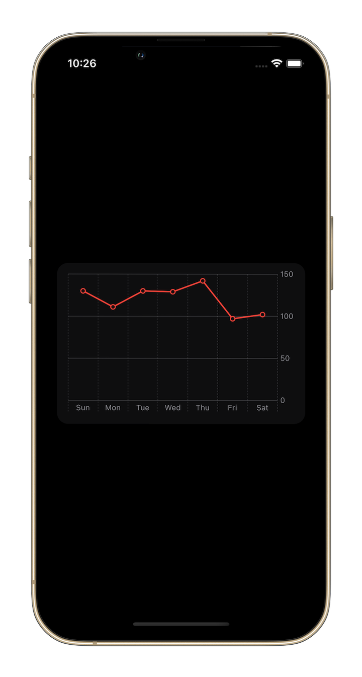
Here’s the line chart that we have created and configured:
In the Swift Charts framework, we have a Chart structure that takes in the content of a chart. There’s also a Barmark function for defining a bar chart; each BarMark represents an individual bar.
struct NewBarView: View {
  var data: [Double]
  var colors: [Color]

  var gradient: LinearGradient {
    LinearGradient(gradient: Gradient(colors: colors), startPoint: .top, endPoint: .bottom)
  }

  var body: some View {
    Chart(data, id: \.self) { value in
      BarMark(x: .value("Type", "\(value)"),
              y: .value("Value", value))
      .foregroundStyle(gradient)
    }
  }
}
As shown in the code above, we simply provide the value for the x and y axis for each individual BarMark. Then, we loop over the data using the Chart structure in the Swift Charts framework, to create the bar chart.
Here’s an example of a Swift Chart bar chart created with just two lines of code!
The Swift Charts framework can also be used to simplify the creation of line charts. We use a LineMark instead of a BarMark, and provide the relevant values of the x and y axis. To create a circle marker for data point, we use the symbol modifier. This modifier may be used to provide different marker shapes as well.
struct HeartRate: Hashable {
  var day: String
  var value: Int = .random(in: 60..<150)
}

extension HeartRate {
  static var data: [HeartRate] {
    let calendar = Calendar(identifier: .gregorian)
    let days = calendar.shortWeekdaySymbols

    return days.map { day in
      HeartRate(day: day)
    }
  }
}

struct NewLineChartView: View {
  var dataPoints: [HeartRate]

  var body: some View {
    Chart(dataPoints, id: \.self) { rate in
      LineMark(x: .value("Day", rate.day),
               y: .value("Heart rate", rate.value))
      .foregroundStyle(.red)
      .symbol(Circle().strokeBorder(lineWidth: 1.5))
    }
  }
}
Here’s the same custom line chart we created earlier. With Swift Charts, we were able to generate the chart with just four lines of code!
In this article, we demonstrated how easy it is to create and style simple charts in SwiftUI for use across all Apple platforms. In addition to the traditional process for building charts in SwiftUI, we also demonstrated how to build charts with minimal development time using Swift Charts.
To learn more about Apple’s Swift Charts framework, refer to the WWDC 2022 session on Hello Swift Charts. For tips on customizing and creating more elaborate charts, head over to one of these WWDC sessions: Swift Charts: Raise the bar, Design app experiences with charts, and Design an effective chart.
Swift Charts is generally the best way to add charts to your app for the majority of the cases. However, your custom implementation will still be needed to support older iOS versions.
Open source libraries can also be helpful for building charts with less effort and reduced development time. For more advanced customization and inspiration, check out this list of additional open source libraries.
Install LogRocket via npm or script tag. LogRocket.init() must be called client-side, not
server-side
$ npm i --save logrocket

// Code:

import LogRocket from 'logrocket';
LogRocket.init('app/id');
// Add to your HTML:

<script src="https://cdn.lr-ingest.com/LogRocket.min.js"></script>
<script>window.LogRocket && window.LogRocket.init('app/id');</script>
Hey there, want to help make our blog better?
Join LogRocket’s Content Advisory Board. You’ll help inform the type of content we create and get access to exclusive meetups, social accreditation, and swag.
Sign up now
Not sure if low-code is right for your next project? This guide breaks down when to use it, when to avoid it, and how to make the right call.

Compare Firebase Studio, Lovable, and Replit for AI-powered app building. Find the best tool for your project needs.

Discover how to use Gemini CLI, Google’s new open-source AI agent that brings Gemini directly to your terminal.

This article explores several proven patterns for writing safer, cleaner, and more readable code in React and TypeScript.


2 Replies to "Building custom charts in SwiftUI"
Sir your ratio is wrong it should be 1 – (dataPoints[index] / highestPoint). 0,0 on the graph is top left. data is inverted technically. Otherwise great blog!!
Thanks for pointing that out, Mike! We’ve updated the post accordingly. Also, I appreciate your feedback!