Editor’s note: This article was last updated on 22 July, 2022 to bring the code and examples up to date with the most recent version of React.
A progress bar indicates activities such as file uploads, downloads, data loading, and more on web and mobile applications. This visual representation can go a long way toward enhancing the UX of your apps.
In this tutorial, we’ll demonstrate the creation of a simple, customizable, easy-to-use circular progress indicator for React using SVGs. We’ll do so using no external dependencies.
Here is a visual representation of the circular progress component we’ll build:
Since this project has a lot to do with circles, I’ve named it SVG Pi. You can reference the complete source code for this tutorial in this GitHub repo.
Let’s dive in!
The Replay is a weekly newsletter for dev and engineering leaders.
Delivered once a week, it's your curated guide to the most important conversations around frontend dev, emerging AI tools, and the state of modern software.
The elaboration of the abbreviation “SVG” reveals the proper answer to this question. SVG stands for Scalable Vector Graphics, which provide pixel-perfect rendering regardless of the screen resolution.
In modern frontend development, PNGs and GIFs are not considered fit for app assets like icons and loaders. SVGs can do this job perfectly; and here are some pointers in support of this opinion.
Vector graphics are resolution-independent and provide a pixel-perfect experience.
It is possible to add infinite interactive effects and animations to SVGs using CSS and JavaScript.
We can add different foreign elements to SVGs, including HTML, whenever we need to since SVGs are XML-based.
SVGs are easily embeddable in HTML documents. Even CSS supports its various geometric and presentational attributes as properties.
Despite their scalability and interactivity, SVGs are usually compact in file size.
Because SVGs are XML-based, they support adding keywords and descriptions wherever appropriate, which is way better than the usual alt tags for HTML images.
Once you understand the basics of SVGs, you can edit them just like an XML file.
Almost every modern web and mobile browser support SVGs. Find out more about support and compatibility here.
From iconography to interactivity, modern frontend development makes extensive use of SVGs. Looking at their flexibility and wide areas of application, it’s not a bad idea to learn and adopt SVGs for your projects too.
Before we go deep into the JavaScript part, let’s first look at SVG technicalities to tackle the circular progress indicator problem.
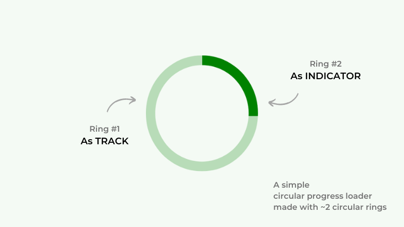
We can make such an indicator with two overlapping circular ring-like shapes, where one acts as the track and the other as the progress indicator.
Look at the below graphic that demonstrates the role of these two circles.
Let’s try creating something like that with some simple SVG elements and their different properties. Starting with the markup, add two circle elements as shown below:
<svg class="svg-indicator">
  <circle class="svg-indicator-track" />
  <circle class="svg-indicator-indication" />
</svg>
I’ve added some CSS classes to both the circles as most of their presentational attributes are available in CSS as properties. We are going to manipulate these two elements with CSS only for now.
We need to ensure the following points for these circles to work together like a progress indicator:
Transparent fill with some stroke color and width will make the circles look like rings.
Note that the cx and cy properties collectively define the center of an SVG circle, while the r property defines its radius. Both of these circle elements should apply these three values exactly the same way.
Once we define the size and stroke-width of the circles, we can easily determine their center and radius. Here are some calculations based on this theory:
size = 100
strokeWidth = 10
center = size / 2
       = 100 / 2 = 50
radius = center - strokeWidth
       = 50 - 10 = 40
Simple circle math. Let’s write some CSS styles for our indicator rings based on the previous calculations:
/* Define the size */
.svg-indicator {
  width: 100px;
  height: 100px;
}

/*
 * Add the center and the radius using the size
 * and `stroke-width` values.
 */
.svg-indicator-track,
.svg-indicator-indication {
  cx: 50px;
  cy: 50px;
  r: 40px;
  fill: transparent;
  stroke-width: 10px;
}

/* Some color to highlight the rings */
.svg-indicator-track {
  stroke: #ddd;
}

.svg-indicator-indication {
  stroke: #07c;
}
Circular Progress Indicator with SVG: Step #1
No Description
As you can see above, our indicator only displays the indicator ring, while the track ring hides behind it. It would look like that only when the progress hits 100 percent.
To make it ready for any given progress value, let’s make use of the stroke-dasharray and stroke-dashoffset properties.
stroke-dasharrayThe stroke-dasharray property allows us to give the SVG stroke a dash-like look. A higher dasharray value indicates more space between dashes in the stroke until it reaches a value equal to the perimeter of the related shape.
Circular Progress Indicator with SVG: Step #2.1 (dashArray)
No Description
As shown above, the dashes in the stroke vary depending on the value supplied to the stroke-dasharray property.
stroke-dashoffsetThe stroke-dashoffset property works in conjunction with stroke-dasharray to specify where the dash begins along an SVG path. As this number increases, the dashes will appear further along the path.
Circular Progress Indicator with SVG: Step #2.2 (dashOffset)
No Description
The demo above shows that the origination of the dashed stroke shifts in proportions to the value of the stroke-dashoffset property.
dasharray and dashoffsetThe basic circle geometry says the length of an arc of a ring is equal to its circumference. You’ll observe no changes after providing circumference as the value to the stroke-dasharray property.
But you’ll notice that the dashed stroke goes off the view if you give the stroke-dashoffset property the same value. This is how we want the progress indicator to look at zero percent progress.
Let’s revisit our circle calculations and add some more data to them so we can evaluate this shifting needed for any given progress value:
size = 100
strokeWidth = 10
center = size / 2
       = 100 / 2 = 50
radius = center - strokeWidth
       = 50 - 10 = 40
progress = 0
arcLength = 2 * π * radius
          = 2 * 3.14 * 40 = 251.2
arcOffset = arcLength * ((100 - progress)/100)
          = 251.2 * ((100 - 0)/100) = 251.2
Suppose our progress indicator has to indicate 25 percent progress. Here is how to calculate the appropriate indication for this number:
progress = 25
arcOffset = arcLength * ((100 - progress)/100)
          = 251.2 * ((100 - 25)/100) = 188.4
Adding the so-obtained shifting value to the stroke-dashoffset property for the indication ring, we have the following output.
Circular Progress Indicator with SVG: Step #4 (dashArray x dashOffset)
No Description
This looks exactly like a quarter, or 25 percent, of our ring! Let’s also rotate it counterclockwise to shift the indication origination point to the top like a clock.
SVG Pi: Circular Progress Indicator with SVG and CSS
No Description
Above are our SVG progress indicators obtained by strategic shifting with different progress values. I’ve used the stroke-linecap property to make the progress ring look rounded.
The first step is to create a React app that takes Node as the primary requirement.
Open a terminal and cd into the directory where you want to add your project. Now, type the following command:
npx create-react-app react-progress-bar
You may also consider using yarn if the npx command takes too much time. Open the project with any IDE of your choice once done with the installation.
Our React project has an src directory that will contain all of our components. For now, we only have the App component inside of it.
On running the app using the npm start command, you’ll see the dummy app in the browser window, which we do not want.
The next segment covers clearing all the dummy data and adding our default settings.
The index.css file carries the styles that are to be applied globally. Clear its contents and add the new ones to provide a better reboot to the default styles:
:root {
  box-sizing: border-box;
}

*,
*:after,
*:before {
  box-sizing: inherit;
}

body {
  margin: 0;
  font: 1em/1.618 sans-serif;
  background-color: #fff;
}

svg {
  max-width: 100%;
  vertical-align: middle;
}
Same with the App.css file, replace everything with these new CSS styles to align the app to the middle of the screen:
.App {
  max-width: 800px;
  margin: 0 auto;
}

.App-content {
  padding: 3em;
}

.App-loading,
.App-content-loading {
  min-height: 100vh;
  display: flex;
  align-items: center;
  justify-content: center;
}
I’m not hard lining things here; feel free to customize the CSS files your way if you are comfortable with CSS layout and alignment properties.
Clear everything that looks unnecessary from App.js as well. The point here is have a clear canvas before we start to paint the picture of our React app:
import "./App.css"

const App = () => {
  return (
    <div class="App">
      ...
    </div>
  )
}

export default App
As the code above shows, we are using functional components that make things much easier when paired with different React hooks.
We’ll be adding more to mostly all of these files as we go further with the development.
It’s time to implement whatever we made with SVG above in React. Let’s create a subdirectory called components in the src directory to keep things well-organized.
Again, create another one called ProgressBar inside our components directory with two files called ProgressBar.js and ProgressBar.css.
Let’s start making the ProgressBar component by adding the regular React and stylesheet imports, component definitions, and then the export statement:
import "./ProgressBar.css"

const ProgressBar = () => {
  ...
}

export default ProgressBar
From shapes and sizes to labels and animation, there will be many props in our ProgressBar component. Here’s a list of all these properties:
label defines the textual information in the indicator component other than the numeric progress datalabelColor controls the coloring of the information defined by labelspinnerMode is a boolean that controls the indeterminate behavior by toggling a CSS keyframe animation class to the ProgressBar component; it defaults to falsespinnerSpeed manages the speed of looping animationprogress takes numeric data to show the progress information percentage-wiseindicatorColor is the color of the progress indicationindicatorCap controls the round and smooth shape of the progress indication; it takes all three values valid for stroke-linecap SVG attributesize adds the dimensions to the componenttrackColor takes care of the coloring of the track ringindicatorWidth manages the thickness of the indication ringtrackWidth takes care of the thickness of the track ringInstead of defining them one by one as parameters, let’s use JavaScript’s object destructuring as shown below. You may also typecheck them and mark them as required with React propTypes if you like:
...

const ProgressBar = (props) => {
  let {
    size = 150,
    progress = 0,
    trackWidth = 10,
    trackColor = `#ddd`,
    indicatorWidth = 10,
    indicatorColor = `#07c`,
    indicatorCap = `round`,
    label = `Loading...`,
    labelColor = `#333`,
    spinnerMode = false,
    spinnerSpeed = 1
  } = props

...
It’s time to apply the circle calculations to our component. These calculations will be used further while returning the SVG indicator element later on:
...

const ProgressBar = props => {
  ...

  const center = size / 2,
        radius = center - (trackWidth > indicatorWidth ? trackWidth : indicatorWidth),
        dashArray = 2 * Math.PI * radius,
        dashOffset = dashArray * ((100 - progress) / 100)}

...
The structure of our indicator component is similar to our previous examples. Wrapping it inside a division is a good idea to keep the transformation we apply to the SVG element from clashing with the alignment of the label information.
It’s better to use SVG attributes now instead of CSS properties for better control and utility. Note that JSX supports HTML and SVG attributes written in camelCase and not in kebab-case.
Along with the wrapper sizing and SVG attribute handling, I’m also adding some spinning animation logic to our indication ring for the indeterminate progress indicator variation:
...

const ProgressBar = props => {
  ...

  return (
    <>
      <div
        className="svg-pi-wrapper"
        style={{ width: size, height: size }}
      >
        <svg
          className="svg-pi"
          style={{ width: size, height: size }}
        >
          <circle
            className="svg-pi-track"
            cx={center}
            cy={center}
            fill="transparent"
            r={radius}
            stroke={trackColor}
            strokeWidth={trackWidth}
          />
          <circle
            className={`svg-pi-indicator ${
              spinnerMode ? "svg-pi-indicator--spinner" : ""
            }`}
            style={{ animationDuration: spinnerSpeed * 1000 }}
            cx={center}
            cy={center}
            fill="transparent"
            r={radius}
            stroke={indicatorColor}
            strokeWidth={indicatorWidth}
            strokeDasharray={dashArray}
            strokeDashoffset={dashOffset}
            strokeLinecap={indicatorCap}
          />
        </svg>
      </div>
    </>
  )
}
Conditional label info would be a nice little addition. Let’s also take care of the percentage loading that makes no sense when the indicator size is too small or the spinning animation is hooked:
...

const ProgressBar = props => {
  ...

  let hideLabel = (size < 100 || !label.length || spinnerMode) ? true : false

  return (
    <>
      <div
        className="svg-indicator-wrapper"
        ...
      >
        <svg
          ...
        >
          ...
        </svg>

        {!hideLabel && (
          <div
            className="svg-pi-label"
            style={{ color: labelColor }}
          >
            <span className="svg-pi-label__loading">
              {label}
            </span>

            {!spinnerMode && (
              <span className="svg-pi-label__progress">
                {`${
                  progress > 100 ? 100 : progress
                }%`}
              </span>
            )}
          </div>
        )}
      </div>
    </>
  )
}

export default ProgressBar
Lastly, let’s add some CSS to ProgressBar.css, most of which is taken from our previous examples. The key role of this piece of CSS is to align things correctly, fix the indicator’s orientation, and add a spinning animation support, for which we made a toggleable control in the above code:
.svg-pi-wrapper {
  position: relative;
}

.svg-pi {
  transform: rotate(-90deg); /* Fix the orientation */
}

/* Animated spinner version */
.svg-pi-indicator--spinner {
  animation: spinner .75s linear infinite;
  transform-origin: center;
}

.svg-pi-label {
  position: absolute;
  top: 50%;
  left: 50%;
  transform: translate(-50%, -50%);
  text-align: center;
}

.svg-pi-label__loading {
  opacity: .5;
  font-size: 0.75em;
}

.svg-pi-label__progress {
  font-size: 1.5em;
  font-weight: bold;
}

.svg-pi-label__loading,
.svg-pi-label__progress {
  display: block;
}

/* Spinner animation */
@keyframes spinner {
  0% {
    transform: rotate(0)
  }
  100% {
    transform: rotate(360deg)
  }
}
ProgressBar component in action with React HooksIt’s time to import the freshly baked ProgressBar component into our blank App.js and set it up for action.
Let’s show the progress indicator at the start of the application before the required components finish loading. It’s apt to use two widely used React hooks here to control the loading display as well as the numeric data for our progress indicator.
As you may already know, the useEffect hook takes care of performing different side effects in React without affecting the component rendering.
In this case, the useState hook maintains the loading and progress states and we manipulate these states with the help of useEffect based on the expiry of a timing function and maximum progress value.
Hence, the progress and the loading states automatically become two dependencies here for the useEffect hook.
Dividing the loadingDuration by 100 ensures the progress indicator ticks correctly, and in a controlled manner with an impression of a determinate indicator:
import {useState, useEffect} from 'react'
import ProgressBar from "./components/ProgressBar/ProgressBar"
import "./App.css"

const App = () => {
  const [loading, setLoading] = useState(true)
  const [progress, setProgress] = useState(0)
  const loadingDuration = 3000 // 3 seconds

  useEffect(() => {
    let loadingTimeout = setTimeout(() => {
      if (loading >= 100) return
      setProgress(progress + 1)
    }, loadingDuration/100)
    if (progress === 100) {
      setLoading(false)
    }
    return () => {
      clearTimeout(loadingTimeout)
    }
  }, [progress, loading])

  return (
    ...
  )
}

export default App
Lastly, let’s return the appropriate components according to the current loading state. When loading is set to true, we return the ProgressBar component. And when it changes, we return a different component of our choice to the DOM:
...

const App = () => {
  ...

  return (
    <div className="App">
      {loading ? (
        <ProgressBar progress={progress} trackWidth={5} indicatorWidth={10} />
      ) : (
        <div
          className="App-content"
        >
          <p>...</p>
        </div>
      )}
    </div>
  )
}

...
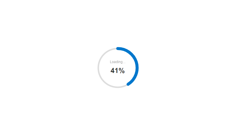
SVG Pi React implementation: Controlled Progress Indicator
No Description
Note that if you remove the loadingDuration logic from the above code, the progress indicator would still show up but that would be a bit hard to notice.
ProgressBar component while fetching dataLet’s use the ProgressBar component during a network call. Most of the implementation is going to remain the same, but we’ll be adding the data fetching logic in our previous example.
I’m using the fake JSON Placeholder API to fetch some data into our app. Again, we’ll be using the useEffect hook to make a trip to the API and show the fetched data in our app. The objective is to show a progress indicator in the meanwhile:
...

// The fake JSON Placeholder API url
const postUrl = `https://jsonplaceholder.typicode.com/posts`

const App = () => {
  const [postData, setPostData] = React.useState(true)
  const postUrl = `https://jsonplaceholder.typicode.com/posts`

  // Network call
  useEffect(() => {
    const getUsers = async () => {
      try {
        await fetch(postUrl)
          .then((res) => res.json())
          .then((data) => {
            setPostData(data)
          })
      } catch (e) {
        console.log(e)
      }
    }
    getUsers()
  }, [])

  return (
    ...
  )
}

...
Let’s also slip in the data we fetched from the API. We’ll make use of the postData‘s current state here, and if there’s any data there, we’ll list it, otherwise a ProgressBar will be displayed.
Here’s what the final structure looks like:
...

const App = () => {
  ...

  return (
    <div className="App">
      {postData.length ? (
        <div className="App-content">
          <h2>Dummy posts</h2>
          <ul className="App-post-list">
            {postData.map(({ id, title, body }) => (
              <li key={id} className={id}>
                <h3>{title}</h3>
                <p>{body}</p>
              </li>
            ))}
          </ul>
        </div>
      ) : (
        <ProgressBar
          trackColor="#333"
          indicatorColor="#f7c"
          size={50}
          progress={25}
          trackWidth={5}
          indicatorWidth={5}
          spinnerMode={true}
        />
      )}
    </div>
  )
}

export default App
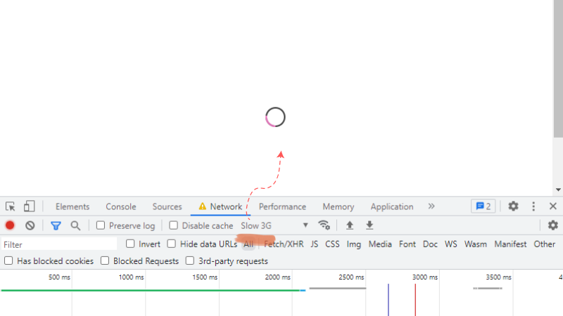
SVG Pi React implementation: Spinner Mode
No Description
To notice the spinning progress indicator more clearly, head over to the Network tab in the developer tools of your browser, and choose a slower connection.
You should now have a good understanding of how to create a custom circular progress indicator with SVG and then implement it in a React app with the useState and useEffect hooks.
These indicators will look great with React page transitions, but we’ll cover that in another article. Or feel free to experiment yourself with that. I’ll suggest you to add CSS transition to the indicator and then try to fix the delay added by it in the React implementation.
You have the complete source code of the examples from this tutorial at your disposal in this GitHub repo. Thanks for reading through to the end!
Install LogRocket via npm or script tag. LogRocket.init() must be called client-side, not
server-side
$ npm i --save logrocket

// Code:

import LogRocket from 'logrocket';
LogRocket.init('app/id');
// Add to your HTML:

<script src="https://cdn.lr-ingest.com/LogRocket.min.js"></script>
<script>window.LogRocket && window.LogRocket.init('app/id');</script>
A side-by-side look at Astro and Next.js for content-heavy sites, breaking down performance, JavaScript payload, and when each framework actually makes sense.
AI-generated tests can speed up React testing, but they also create hidden risks. Here’s what broke in a real app.re

Why the future of DX might come from the web platform itself, not more tools or frameworks.

A hands-on test of Claude Code Review across real PRs, breaking down what it flagged, what slipped through, and how the pipeline actually performs in practice.
Hey there, want to help make our blog better?
Join LogRocket’s Content Advisory Board. You’ll help inform the type of content we create and get access to exclusive meetups, social accreditation, and swag.
Sign up now

 Learn more →
