MUI or Bootstrap, to get the job done quickly. In any case, UI designs frequently include custom elements that necessitate a unique implementation strategy. It’s crucial to know which library to use for a project.

If you’re familiar with some of the most popular UI libraries, you might be interested in Mantine, a new UI library that has recently been making waves. In this article, we will learn how to use Mantine and why it stands out from the competition.
The Replay is a weekly newsletter for dev and engineering leaders.
Delivered once a week, it's your curated guide to the most important conversations around frontend dev, emerging AI tools, and the state of modern software.
To follow and understand this tutorial, you will need the following:
Mantine is a full-featured React component framework that enables you to build fully functional and accessible online applications fast. It incorporates a variety of custom components and Hooks that may be used dynamically in a project.
Mantine has been widely used in a variety of projects since its inception, with over 23,000 weekly downloads. Some of the major features associated with Mantine are as follows:
First is theming. A Mantine theme is just an object that builds components in a unique way. It allows you to extend the root of your application with additional attributes and values.
Second are Mantine’s components, which can be reused. Some components include typography, modals, inputs, and buttons, among other things.
Finally, Mantine’s unique Hooks. Mantine has several Hooks for managing the state and UI that can be used to create custom components.
To begin, let’s generate a default template for Mantine. In your terminal, create a new React app and run the command below:
yarn create react-app mantine-react-framework --template typescript
The next step is to install the basic Mantine packages that will enable us to utilize features like components and Hooks. In your terminal, copy and paste the command below:
yarn add @mantine/hooks @mantine/core
Now that the packages have been installed, run the application to make sure everything is working as it should.
As mentioned earlier, Mantine’s components, theming abilities, and Hooks make it stand out from the competition. In the next sections, we’ll take a closer look at these features, why they’re particularly useful, and learn how to use them.
In this segment, we will look at some of Mantine’s components that stand out from other libraries.
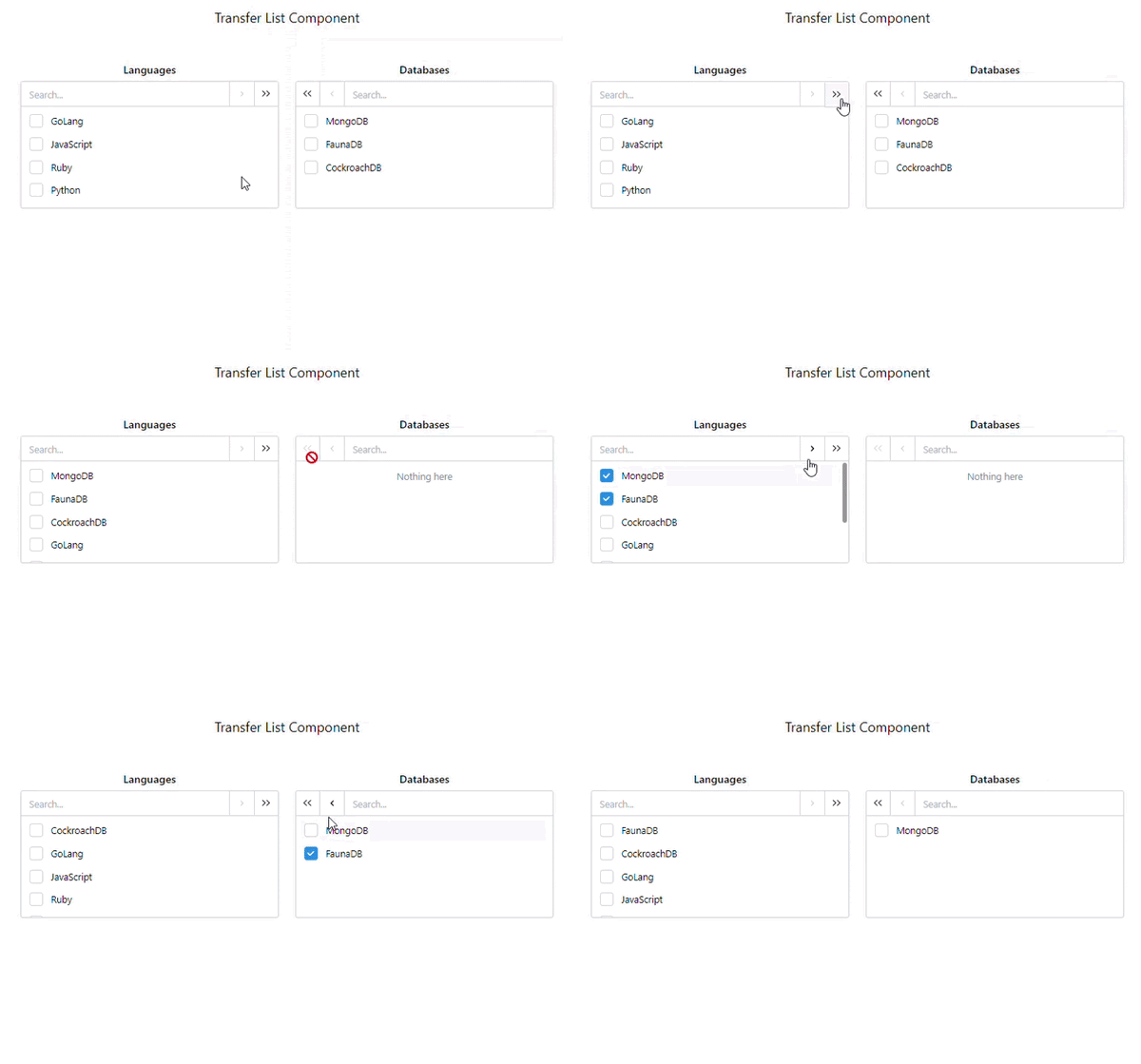
Take a look at the TransferList component in the layout below. Create a subfolder called components and pages inside the src folder. Make a file called TransferList.tsx in the components subfolder.
Next, copy and paste the following code:
import { useState } from "react";
import { Text, TransferList, TransferListData } from "@mantine/core";

const initialValues: TransferListData = [
  [
    { value: "go", label: "GoLang" },
    { value: "js", label: "JavaScript" },
    { value: "ruby", label: "Ruby" },
    { value: "python", label: "Python" },
  ],
  [
    { value: "mongo", label: "MongoDB" },
    { value: "fauna", label: "FaunaDB" },
    { value: "cockroach ", label: "CockroachDB" },
  ],
];

const TransferListPage = () => {
  const [data, setData] = useState<TransferListData>(initialValues);
  return (
    <>
      <Text style={{ padding: "1rem" }} size="xl">
        Transfer List Component
      </Text>
      <TransferList
        value={data}
        onChange={setData}
        searchPlaceholder="Search..."
        nothingFound="Nothing here"
        titles={["Languages", "Databases"]}
        breakpoint="sm"
      />
    </>
  );
};

export default TransferListPage;
Now let’s look at some of the details in the code above.
The TransferList component from the Mantine core package was imported here and rendered as a standalone component that handles the data inside the TransferListData component. The TansferListData component is a variable that stores a list of information in the form of an object array.
The current value of the TransferListData is indicated by the value prop. When the value changes, the onChange props will be called.
The nothingFound prop acts as an error handler, displaying an error message if no other options are available, and the titles prop enables you to quickly name a certain column.
The key point here is that these actions only require two major components to compare and transfer data from one column to another. This saves developers time and effort because writing the entire logic from scratch would necessitate many more lines of code.
Consider the MUI library; it requires numerous components to do these activities because it uses the grid system, button, checkbox, and list components, resulting in many lines of code that may not be required in Mantine. Mantine simplified the use of features dynamically with standalone components.
Let’s run the application and see what the output looks like. But before that, we have to link the files together.
Navigate to the pages subfolder, and make a file called Home.tsx. This is where you’ll put the link to the TransferList file you made before. Copy and paste the following code:
import TransferListPage from "../components/TransferListPage";

const Home = () => {
  return (
    <div style={{ padding: "2rem" }}>
      <TransferListPage />
    </div>
  );
};

export default Home;
This is what your output should look like.

Now let’s look at another component: NumberInput.
Create a file called NumberInput.tsx in the components subfolder. Copy and paste the following code:
import { NumberInput, Text } from "@mantine/core";

const NumberInputPage = () => {
  return (
    <>
      <Text style={{ marginTop: "2rem" }} size="xl">
        Number Input Component
      </Text>
      <NumberInput
        defaultValue={50}
        placeholder="Your age"
        label="Your age"
        required
      />
    </>
  );
};

export default NumberInputPage;
In the code above, a single NumberInput component was imported from the Mantine core package. It accepts various properties, such as defaultValue, label, required, and placeholder.
When the browser loads, defaultValue simply indicates a fixed base value, and label functions as a naming title tag.
As you’ve seen, several component modifications can be performed with a single independent component. It is not necessary to import any additional components in order to add a label or an input.
Consider the NumberInput component in the Chakra UI library. Instead of providing a single entry component with prop options, you must utilize five distinct components. This strategy may appear to be adaptable, but it is difficult to work with all of those components introduced just for one action. This is called code bloating.
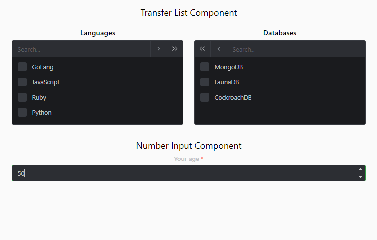
This is what your output for the NumberInput component should look like.

At times, it can be difficult to work with the default styling. The default styling that is displayed when you create a project may not be your favorite, so Mantine allows you to customize your themes to make every project perfect. Let’s take a look at how the theme configurations work in Mantine!
To modify the overall theme of the site, utilize the MantineProvider component. This step is not required if you opt to utilize the default theme. Theming allows you to give your app a uniform look and feel and allows you to modify every part of your project’s design to match the unique requirements of your application.
There are two methods for configuring your theme: the base wrapper method and the Hooks method.
This is simply using the MantineProvider component to wrap the base of a project application (usually the app.jsx or app.tsx).
Navigate to the src folder and create a subfolder called utils, as well as a file called theme.ts within it. Copy and paste the following code into your index.tsx file:
import React from "react";
import ReactDOM from "react-dom";
import "./index.css";
import App from "./App";
import reportWebVitals from "./reportWebVitals";
import { MantineProvider } from "@mantine/core";
import theme from "./utils/theme";

ReactDOM.render(
  <React.StrictMode>
    <MantineProvider theme={theme}>
      <App />
    </MantineProvider>
  </React.StrictMode>,
  document.getElementById("root")
);

// If you want to start measuring performance in your app, pass a function
// to log results (for example: reportWebVitals(console.log))
// or send to an analytics endpoint. Learn more: https://bit.ly/CRA-vitals
reportWebVitals();
If you look closely at the code above, you’ll notice that MantineProvider functions as a wrapper, with a theme prop that extends any styles that need to be overridden or altered from the theme.ts file. The theme.ts file will include all of the application’s style parameters.
Now, navigate to your theme.ts file and copy the code below:
import { MantineThemeOverride } from "@mantine/core";

const theme: MantineThemeOverride = {
  colorScheme: "dark",
  primaryColor: "green",
};

export default theme;
In this case, the MantineThemeOverride type allows you to store a theme override object in a variable. It should be noted that you can configure any styling within this object; it is not limited to colorSheme and primaryColor.
The output is shown below.

The setup appears to be simpler here! Rather than wrapping the application in MantineProvider, a Hook will be used to return the theme from the MantineProvider context or the default theme.
Copy the following code below:
export const HooksWay = () => {
  const theme = useMantineTheme();
  return (
    <>
      <Text style={{ marginTop: "2rem" }} size="xl">
        Number Input Component Two
      </Text>
      <NumberInput
        style={{ background: theme.colors.dark[1]}}
        defaultValue={50}
        placeholder="Your age"
        label="Your age"
        required
      />
    </>
  );
};
The useMantineTheme Hook enables you to connect to the Mantine provider without referencing it in your base root application.
This theming pattern allows you to easily customize your component without any strict overrides. Theming has a wide range of applications, including responsive layouts.
You can dynamically override or configure any styles or breakpoints (in terms of responsiveness). However, we will use the default breakpoint in this application because Mantine has a standard breakpoint that aids in responsive layouts.
Now that we have covered the fundamentals of theming, how about creating a dynamic toggle theme switch with the help of some theming packages such as ColorSchemeProvider and ColorScheme?
Navigate to App.tsx, so we can modify the file with some changes. Copy and paste the following code:
import { useState } from "react";
import {
  MantineProvider,
  ColorSchemeProvider,
  ColorScheme,
} from "@mantine/core";
import "./App.css";
import Home from "./pages/Home";

const App = () => {
  const [colorScheme, setColorScheme] = useState<ColorScheme>("light");
  const toggleColorScheme = (value?: ColorScheme) =>
    setColorScheme(value || (colorScheme === "dark" ? "light" : "dark"));


  return (
    <div className="App">
      <ColorSchemeProvider
        colorScheme={colorScheme}
        toggleColorScheme={toggleColorScheme}
      >
        <MantineProvider theme={{ colorScheme }}>
          <Home />
        </MantineProvider>
      </ColorSchemeProvider>
    </div>
  );
};

export default App;
In the code above, ColorSchemeProvider supports dynamic color scheme change and assists in setting up color scheme context.
ColorScheme, imported from the Mantine core package, serves as a type alias that is passed to useState for strict type checking. To handle the user’s action, a toggleColorScheme function was created, which checked whether or not a condition met a requirement.
To get the logic to work, use the useMantineColorScheme Hook to consume the ColorSchemeProvider context anywhere in your application.
Navigate to your Home.tsx file and copy and paste the following code:
import { Button, useMantineColorScheme } from "@mantine/core";
import NumberInputPage from "../components/NumberInput";
import TransferListPage from "../components/TransferListPage";
import { UseDebouncedValuePage } from "../hooks/UseDebounce";
import { UseIdPage } from "../hooks/UseId";
import { UseIdlePage } from "../hooks/UseIdle";

const Home = () => {
  const { colorScheme, toggleColorScheme } = useMantineColorScheme();
  const dark = colorScheme === "dark";
  return (
    <div style={{ padding: "2rem" }}>
      <Button
        color={dark ? "yellow" : "blue"}
        onClick={() => toggleColorScheme()}
      >
        Toggle Mode
      </Button>
      <TransferListPage />
      <NumberInputPage />
      <UseDebouncedValuePage />
      <UseIdlePage />
      <UseIdPage />
    </div>
  );
};

export default Home;
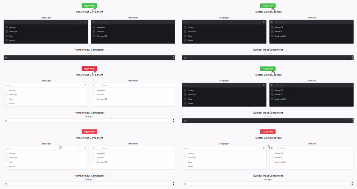
The colorScheme state that was created was being used inside toggleColorScheme for the conditional rendering of the light and dark mode.
The following is what your output should look like.

Mantine uses Hooks to do the majority of the heavy lifting. It enables you to use a Hook for any activity, right down to the smallest detail. Exploring some of Mantine’s Hooks will give you a better understanding of how to use them.
use-debounced-valueConsider the following scenario: you search for a specific product on an ecommerce site and can’t find it. What do you do? Most people would continue to manipulate the input value (the search term) in order to obtain the exact name of the product so that it appears in the search result.
However, when you start modifying the input values to fit your search, you risk causing excessive rerendering of React components and consuming API bandwidth.
Debounce events, as the name implies, allow you to invoke a function that ensures a time-consuming operation does not trigger as frequently. It’s a function that takes a function as a parameter, wraps it in a closure, and returns it, displaying the “wait for a bit” behavior.
While implementing this action may necessitate the creation of time-consuming logic, Mantine offers you a Hook that does all of the work. You simply need to use the Hook in the places where you require it in your application.
Copy the following code:
import { useState } from "react";
import { useDebouncedValue } from "@mantine/hooks";
import { TextInput, Text } from "@mantine/core";

export const UseDebouncedValue = () => {
  const [value, setValue] = useState("");
  const [debounced] = useDebouncedValue(value, 500);

  return (
    <>
      <TextInput
        label="Enter value to see debounce"
        value={value}
        style={{ flex: 1, marginTop: "2rem" }}
        onChange={(event) => setValue(event.currentTarget.value)}
      />

      <Text>Value: {value}</Text>
      <Text>Debounced value: {debounced}</Text>
    </>
  );
};
In the code above, the useBouncedValue function was imported and takes two parameters, value and time. Value keeps track of a user’s debounced input value, and time functions similarly to a timed out effect.
Finally, useState keeps track of the values entered by the user and updates them in real time.
This is how your output should look.

use-idleThis Hook detects if the user does nothing on the page, and renders the component idle.
To see it in action, copy the following code:
import { Badge, Button, Text } from "@mantine/core";
import { useIdle } from "@mantine/hooks";

export const UseIdlePage = () => {
  const idle = useIdle(2000, { events: ["click", "touchstart"] });
  return (
    <>
      <Text style={{ marginTop: "2rem" }} size="xl">
        UseIdle State
      </Text>
      <Button color={idle ? "gray" : "green"}>
        Current state: {idle ? "idle" : "not idle"}
      </Button>
    </>
  );
};
The imported useIdle Hook accepts setTimeout parameters, as well as events that listen for click and scroll events in order to determine idle status.
The idle variable was used in a conditional check to render or trigger the idle status. This Hook is handy when you want to execute an action based on whether or not certain criteria are met.
Your output should look like the following.

use-idThis Hook auto generates a unique ID for elements. It relieves the stress of installing external packages like the UUID npm into your application.
Let’s see how it works. Start by copying the following code:
import { useState } from "react";
import { Button, List, Text } from "@mantine/core";
import { useId } from "@mantine/hooks";

export const UseIdPage = ({ id }: { id?: string }) => {
  const uuid = useId(id);
  const [state, setState] = useState(uuid);

  const generateId = () => {
    setState(uuid);
    window.location.reload();
  };

  return (
    <>
      <Text style={{ marginTop: "2rem" }} size="xl">
        UseId Hook
      </Text>
      <List>
        <List.Item>Logrocket - id - {state}</List.Item>
        <Button style={{ marginTop: "1rem" }} onClick={generateId}>
          Generate New ID
        </Button>
      </List>
    </>
  );
};
The use-id function generates a random ID that remains consistent across renders.
By default, useState accepts the UUID and is updated when the user clicks the generate button.
Your output should look like the following.

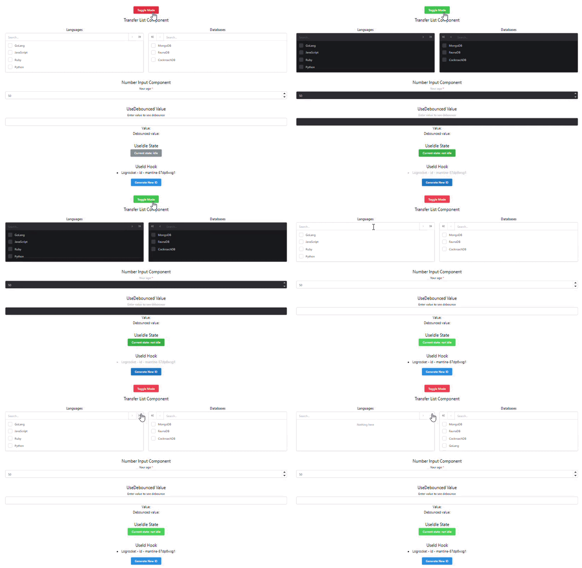
Yay! We have finished the project. This is how our entire application should look.

If you’re looking for an alternative to Mantine, you could consider Chakra UI. Mantine is a newer UI component library than Chakra UI, but both are widely used and appreciated by developers. Let’s compare these two libraries to see how they stack up.
:focus styles for mouse focus; this default styling can be difficult to removeMantine is a powerful UI component library with a large number of components, Hooks, and utilities to choose from, but it has some drawbacks. Let’s look at some of Mantine’s limitations and open issues.
Mantine offers a lot of components, which is generally a benefit. Sometimes, though, developers can spread themselves too thin by trying to work on too many components.
Mantine also has had a history of shipping breaking changes, such as:
Mantine is a UI library with specific components and Hook features that can greatly enhance your project performance. It saves a significant amount of time due to its prebuilt templates.
Mantine has made its mark for itself by being flexible. Because of their rigidity, MUI and Bootstrap may not be fully recommended for use in a large project application if the layout design necessitates a large number of custom implementations.
By now, you should have a good understanding of how Mantine works, why it is important in web applications, what its limitations are, what alternatives are available, and how to set up a basic Mantine web application.
Install LogRocket via npm or script tag. LogRocket.init() must be called client-side, not
server-side
$ npm i --save logrocket

// Code:

import LogRocket from 'logrocket';
LogRocket.init('app/id');
// Add to your HTML:

<script src="https://cdn.lr-ingest.com/LogRocket.min.js"></script>
<script>window.LogRocket && window.LogRocket.init('app/id');</script>

A step-by-step guide to building your first MCP server using Node.js, covering core concepts, tool design, and upgrading from file storage to MySQL.

Using security headers in your Next.js apps is a highly effective way to secure websites from common security threats.

A deep dive into May 2026’s AI model and tool rankings. We break down performance, usability, pricing, and real-world capabilities across 50+ features to help you pick the right tools for your development workflow.

A practical guide to Agent Browser CLI. Learn how AI agents navigate, snapshot, and interact with web pages using stable references, enabling efficient automation and exploratory testing.
Hey there, want to help make our blog better?
Join LogRocket’s Content Advisory Board. You’ll help inform the type of content we create and get access to exclusive meetups, social accreditation, and swag.
Sign up now