The influence of data analysis on various sectors has grown over the years, as it has become a critical part of decision-making for companies. Data analysis techniques can reveal trends, patterns, and metrics to proffer insights and optimization. This is why developers should understand how to build programs that enable easy data visualization.

Flask is a Python web framework that provides the tools, libraries, and technologies required to build web applications. D3.js is a JavaScript library that manipulates DOM elements using data to render visual components.
In this article, using Flask and D3.js, you will build a simple, interactive data dashboard that will help you understand some factors related to a hypothetical customer churn rate. This article will specifically cover:
Flask and D3 require minimal development time compared to other frameworks. D3 gives you flexibility and complete control of your visualization, allowing you to customize your data however you want. The amount of visualizations you can create with D3 is nearly limitless and is bound by your level of creativity.
Flask is most suitable for building lightweight applications. When combined with D3, which is very fast in terms of interactivity, the overall user experience can be quite pleasant. They are also both open-source projects, which implies that you can build on both source codes and contribute your features to them.
Although D3 has gained a reputation for having a steep learning curve and not being so beginner-friendly, your strong knowledge of HTML, CSS and SVG should be sufficient to get you started on D3.
Likewise, Flask is beginner-friendly and you can develop simple Flask web apps based on your fundamental knowledge of Python. Both frameworks have a huge community of developers who are actively improving the libraries and may be able to provide help if needed.
It is essential to create an isolated local environment to specify the various installed packages and versions that only apply to this project to prevent global installations and package collisions.
Begin by creating a virtual Python environment.
pip install virtualenv
Navigate to the project root folder and create the virtual environment:
virtualenv flask
The virtual environment must be activated before you can install packages. In the project root folder, execute:
source flask/bin/activate
Your terminal should have the virtual environment name in parentheses after activating it as shown below:
![]()
Install Flask from your terminal using the following command:
pip install Flask
Install the Pandas library:
pip install pandas
Install the NumPy library:
pip install numpy
Run the following command to generate a requirements.txt file that contains the project dependencies:
pip freeze > requirements.txt
The requirements.txt file should contain the following packages, at a minimum:
certifi==2021.10.8click==8.0.3Flask==2.0.2itsdangerous==2.0.1Jinja2==3.0.3MarkupSafe==2.0.1numpy==1.21.2pandas==1.3.5python-dateutil==2.8.2pytz==2021.3six==1.16.0Werkzeug==2.0.2The version numbers generated in your requirements file may be different from what is written here because this depends on the type of application you’re building and the versions of the packages you have installed when building your app.
If you’d prefer to fetch the file from the requirements.txt file found in the GitHub repository for this project, run the following command after copying the content of the file in the repo to your project:
pip install -r requirements.txt
Upon successfully installing the required Python packages, you can proceed to set the project file structure and required files as shown below:
.
├── README.md
├── app.py
├── flask
├── requirements.txt
├── static
│   ├── css
│   ├── data
│   ├── js
│   └── logo.jpeg
└── templates
    └── index.html
The Flask app receives the customer churn data and performs a data wrangling operation with Python, then sends the formatted data to the data dashboard. Here, D3.js will render the respective charts using JavaScript.
Below is a graphical representation of the environment we just built:
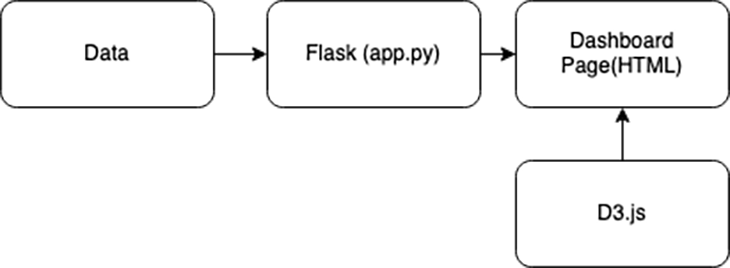
The app.py Python script is a Flask instance that contains the entry point, routing, and endpoint. Python’s Pandas and NumPy libraries are used for data wrangling operations. The preprocessed data is serialized to JSON format before serving it to the index.html file.
The analysis covers the following features:
In the data folder, create a churn_data.csv file and add the content here to the file. Then, add the below code snippet to the app.py file:
from flask import Flask, jsonify, render_template
import pandas as pd
import numpy as np
app = Flask(__name__)
#Reading data
data_df = pd.read_csv("static/data/churn_data.csv")
churn_df = data_df[(data_df['Churn']=="Yes").notnull()]
@app.route('/')
def index():
return render_template('index.html')
def calculate_percentage(val, total):
"""Calculates the percentage of a value over a total"""
percent = np.round((np.divide(val, total) * 100), 2)
return percent
def data_creation(data, percent, class_labels, group=None):
for index, item in enumerate(percent):
data_instance = {}
data_instance['category'] = class_labels[index]
data_instance['value'] = item
data_instance['group'] = group
data.append(data_instance)
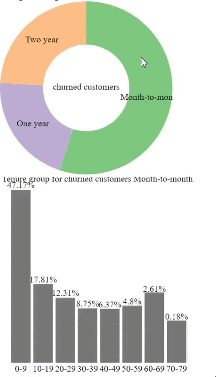
@app.route('/get_piechart_data')
def get_piechart_data():
contract_labels = ['Month-to-month', 'One year', 'Two year']
_ = churn_df.groupby('Contract').size().values
class_percent = calculate_percentage(_, np.sum(_)) #Getting the value counts and total
piechart_data= []
data_creation(piechart_data, class_percent, contract_labels)
return jsonify(piechart_data)
@app.route('/get_barchart_data')
def get_barchart_data():
tenure_labels = ['0-9', '10-19', '20-29', '30-39', '40-49', '50-59', '60-69', '70-79']
churn_df['tenure_group'] = pd.cut(churn_df.tenure, range(0, 81, 10), labels=tenure_labels)
select_df = churn_df[['tenure_group','Contract']]
contract_month = select_df[select_df['Contract']=='Month-to-month']
contract_one = select_df[select_df['Contract']=='One year']
contract_two = select_df[select_df['Contract']=='Two year']
_ = contract_month.groupby('tenure_group').size().values
mon_percent = calculate_percentage(_, np.sum(_))
_ = contract_one.groupby('tenure_group').size().values
one_percent = calculate_percentage(_, np.sum(_))
_ = contract_two.groupby('tenure_group').size().values
two_percent = calculate_percentage(_, np.sum(_))
_ = select_df.groupby('tenure_group').size().values
all_percent = calculate_percentage(_, np.sum(_))
barchart_data = []
data_creation(barchart_data,all_percent, tenure_labels, "All")
data_creation(barchart_data,mon_percent, tenure_labels, "Month-to-month")
data_creation(barchart_data,one_percent, tenure_labels, "One year")
data_creation(barchart_data,two_percent, tenure_labels, "Two year")
return jsonify(barchart_data)
if __name__ == '__main__':
app.run(debug=True)
The entry point of the app.py file has an index.html template file for the data dashboard layout. This template consists of two containers: the writeup section and the visualization section.
Add the code below to the index.html file:
<!DOCTYPE html>
<html lang="en">
<head>
<meta charset="utf-8">
<meta name="viewport" content="width=device-width, initial-scale=1, shrink-to-fit=no">
<meta name="description" content="Data Dashboard">
<meta name="author" content="Aboze Brain">
<meta http-equiv="content-type" content="text/html; charset=utf-8"/>
<title>Data Dashboard</title>
</head>
<body>
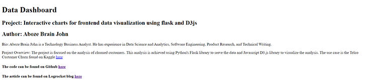
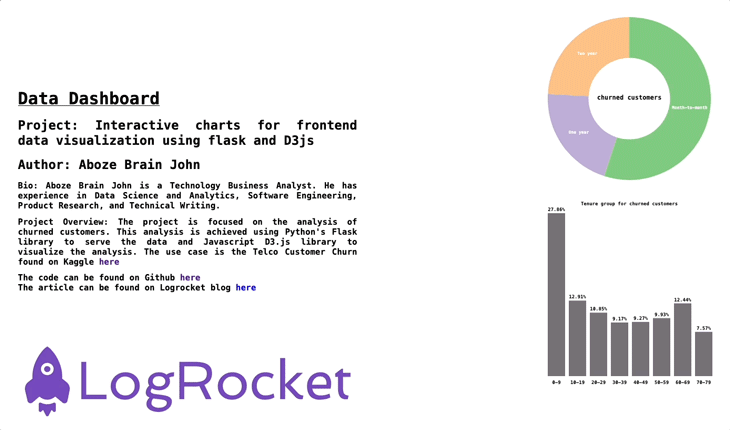
<div class="about">
<h1>Data Dashboard</h1>
<h2>Project: Interactive charts for frontend data visualization using flask and D3js</h2>
<h2>Author: Aboze Brain John</h2>
<p>Bio: Aboze Brain John is a Technology Business Analyst.
He has experience in Data Science and Analytics, Software Engineering, Product Research, and Technical Writing.</p>
<p>Project Overview: The project is focused on the analysis of churned customers.
This analysis is achieved using Python's Flask library to serve the data and Javascript D3.js library to visualize the analysis.
The use case is the Telco Customer Churn found on Kaggle <a href="https://www.kaggle.com/blastchar/telco-customer-churn">here</a>
</p>
<h4>The code can be found on Github <a href="https://github.com/codebrain001/Interactive-charts-for-frontend-data-visualization-using-flask-and-D3js">here</a></h4>
<h4>The article can be found on Logrocket blog <a href="https://blog.logrocket.com/build-interactive-charts-flask-d3js/">here</a></h4>
<img src="{{ url_for('static', filename='logo.jpeg')}}" alt="Logrocket logo">
</div>
<div class="visualization">
<div id="pieChart"></div>
<div id="barChart"></div>
</div>
</body>
</html>
At this point, you can run the application using the command below and view it on your browser via localhost:5000:
python app.py
The application appears to render only the text content of the HTML file without the charts. This is because you’ve yet to link the JavaScript scripts that will fetch the data from the Python file and render it on the HTML file.
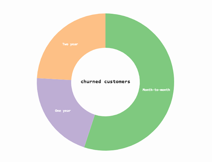
The d3PieChart function below accepts two arguments:
dataset — contains the pie chart datadatasetBarChart — updates the bar chart upon selection of a slice of the pie chart. This function will leverage SVG elements because they provide different shapes and offer more flexibility and controlCreate a pieChart.js file in the static folder and add the function below to the file:
function d3PieChart(dataset, datasetBarChart){
   // Set up SVG dimensions and properties
   const margin = {top:20, right:20, bottom:20, left:20};
   const width = 350 - margin.left - margin.right,
   height = 350 - margin.top - margin.bottom,
   outerRadius = Math.min(width, height) / 2,
   innerRadius = outerRadius * .5,
   color = d3.scaleOrdinal(d3.schemeAccent); //color scheme

   // Selecting the div with id pieChart on the index.html template file
   const visualization = d3.select('#pieChart')
       .append("svg")      //Injecting an SVG element
       .data([dataset])    //Binding the pie chart data
       .attr("width", width)
       .attr("height", height)
       .append("g")        //Grouping the various SVG components
       .attr("transform", "translate(" + outerRadius + "," + outerRadius + ")"); //Piechart tranformation and transition upon page loading

   const data = d3.pie()   //Creating the data object that will develop the various segment of the pie chart.
       .sort(null)
       .value(function(d){return d.value;})(dataset);    // Retrieve the pie chart data values from our Flask app, the pie chart where tied to a 'value' key of a JSON object.

   // Generate an arc generator that produces the circular chart (outer circle)
   const arc = d3.arc()
       .outerRadius(outerRadius)
       .innerRadius(0);

    // Generate an arc generator that produces the circular chart (inner circle)
   const innerArc = d3.arc()
       .innerRadius(innerRadius)
       .outerRadius(outerRadius);

   // Create pie chart slices based on the data object created
   const arcs = visualization.selectAll("g.slice")
       .data(data)
       .enter()    // creates the initial join of data to elements
       .append("svg:g")
       .attr("class", "slice")
       .on("click", click);

   arcs.append("svg:path")     // create path element
       .attr("fill", function(d, i) { return color(i); } )     //Add color to slice
       .attr("d", arc)     // creates actual SVG path with associated data and the arc drawing function
       .append("svg:title")        // Add title to each piechart slice
       .text(function(d) { return d.data.category + ": " + d.data.value+"%"; });

   d3.selectAll("g.slice")     // select slices in the group SVG element (pirchart)
       .selectAll("path")
       .transition()           //Set piechart transition on loading
       .duration(200)
       .delay(5)
       .attr("d", innerArc);

   arcs.filter(function(d) { return d.endAngle - d.startAngle > .1; })     //Define slice labels at certain angles
       .append("svg:text")     //Insert text area in SVG
       .attr("dy", "0.20em")      //shift along the y-axis on the position of text content
       .attr("text-anchor", "middle")      //Position slice labels
       .attr("transform", function(d) { return "translate(" + innerArc.centroid(d) + ")"; }) //Positioning upon transition and transform
       .text(function(d) { return d.data.category; }); // Append category name on slices

   visualization.append("svg:text") //Append the title of chart in the middle of the pie chart
       .attr("dy", ".20em")
       .attr("text-anchor", "middle")
       .text("churned customers")
       .attr("class","title");

   // Function to update barchart when a piechart slice is clicked
   function click(d, i) {
       updateBarChart(d.data.category, color(i), datasetBarChart);
    }
}
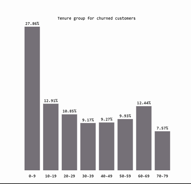
The d3BarChart function defines the default group that the browser will render when the page is loaded and no specific contract class is selected. The default group is the distribution of the tenure of churned customers. d3BarChart accepts just one argument: the served bar chart data.
Within the static folder, create a barChart.js file and include the following code in the file:
//Set up SVG dimensions and properties
const margin = {top: 20, right: 10, bottom: 20, left: 20},
width = 350 - margin.left - margin.right,
height = 350 - margin.top - margin.bottom,
barPadding = 5,
graph_misc = {ylabel: 4, xlabelH : 5, title:9};

// Setting the default group
const group = "All";

// Function to get the percentage values  for a specific selected group from the whole dataset.
function get_percentage(group, datasetBarChart){
   const _ = [];
   for (instance in datasetBarChart){
       if (datasetBarChart[instance].group==group){
           _.push(datasetBarChart[instance])
       }
   } return _;
};

function d3BarChart(datasetBarChart){
   defaultBarChart = get_percentage(group, datasetBarChart);

   const xScale = d3.scaleLinear()     // Barchart X axis scale
       .domain([0, defaultBarChart.length]) // Scale range from 0 to the length of data object
       .range([0, width]);

   const yScale = d3.scaleLinear() // Barchart y axis scale
       .domain([0, d3.max(defaultBarChart, function(d) { return d.value; })])    //Scale range from 0 to the maximum value of the default bar chart data
       .range([height, 0]);

   // // Selecting the div with id barChart on the index.html template file
   const bar = d3.select('#barChart')
       .append('svg')
       .attr('width', width + margin.left + margin.right)
       .attr('height', height + margin.top + margin.bottom)
       .attr('id', 'barChartPlot');

   //Adding barchart title
   bar.append('text')
       .attr('x', (width + margin.left + margin.right)/2)
       .attr('y', graph_misc.title)
       .attr('class','title')
       .attr('text-anchor', 'middle')
       .text('Tenure group for churned customers');

   const visualization = bar.append('g')
       .attr("transform", "translate(" + margin.left + "," + (margin.top + graph_misc.ylabel) + ")");

   visualization.selectAll("rect")
       .data(defaultBarChart)
       .enter()
       .append("rect")
       .attr("x", function(d, i) {
           return xScale(i);
       })
       .attr("width", width / defaultBarChart.length - barPadding)
       .attr("y", function(d) {
           return yScale(d.value);
       })
       .attr("height", function(d) {
           return height-yScale(d.value);
       })
       .attr("fill", "#757077");

   //Adding  barchart labels
   visualization.selectAll('text')
       .data(defaultBarChart)
       .enter()
       .append("text")
       .text(function(d) {
               return d.value+"%";
       })
       .attr("text-anchor", "middle")

       .attr("x", function(d, i) {
               return (i * (width / defaultBarChart.length)) + ((width / defaultBarChart.length - barPadding) / 2);
       })
       .attr("y", function(d) {
               return (yScale(d.value) - graph_misc.ylabel); //Setting the Y axis to represent the value in the served JSON data
       })
       .attr("class", "yAxis");

   const xLabels = bar
       .append("g")
       .attr("transform", "translate(" + margin.left + "," + (margin.top + height + graph_misc.xlabelH)  + ")");

   xLabels.selectAll("text.xAxis")
       .data(defaultBarChart)
       .enter()
       .append("text")
       .text(function(d) { return d.category;})
       .attr("text-anchor", "middle")
       .attr("x", function(d, i) {
           return (i * (width / defaultBarChart.length)) + ((width / defaultBarChart.length - barPadding) / 2);
       })
       .attr("y", 15)
       .attr("class", "xAxis");
}
So far, you have successfully created the default bar chart. There’s just one more piece left to get the charts fully functional: making the charts interactive.
The updateBarChart.js file that you will create within the static folder will allow you to update the bar chart with any selection of any slice of the pie chart. This file will contain an updateBarChart function that accepts three arguments:
group – the group selected on the pie chartcolor – the color of the pie chart slicedatasetBarChart – the updated bar chart dataTake a look at the function:
function updateBarChart(group, color, datasetBarChart){
   const currentBarChart = get_percentage(group, datasetBarChart);

   //Defining chart scale, same as the default bar chart
   const xScale = d3.scaleLinear()
       .domain([0, currentBarChart.length])
       .range([0, width]);

   const yScale = d3.scaleLinear()
       .domain([0, d3.max(currentBarChart, function(d) { return d.value; })])
       .range([height,0]);

   const bar = d3.select('#barChart svg');  //Selecting the div containing bar chart ID and creating an SVG element

   // Add title to Barchart
   bar.selectAll("text.title")
       .attr("x", (width + margin.left + margin.right)/2)
       .attr("y", graph_misc.title)
       .attr("class","title")
       .attr("text-anchor", "middle")
       .text("Tenure group for churned customers "+group);

   const visualization = d3.select('barChartPlot')
       .datum(currentBarChart);    //binding data to multiple SVG elements

   visualization.selectAll('rect')
       .data(currentBarChart)
       .transition()
       .duration(750)
       .attr('x',  (width + margin.left + margin.right)/2)
       .attr('y', graph_misc.title)
       .attr('class', 'title')
       .attr('text-anchor', 'middle')
       .text('Tenure group for churned customers '+group);

   const plot = d3.select('#barChartPlot')
       .datum(currentBarChart);        //binding data to multiple SVG elements

   plot.selectAll('rect')
       .data(currentBarChart)
       .transition()       //Setting bar chart change transition
       .duration(800)
       .attr('x', function(d,i){
           return xScale(i);
       })
       .attr('width', width/currentBarChart.length - barPadding)
       .attr('y', function(d){
           return yScale(d.value)
       })
       .attr("height", function(d) {
           return height-yScale(d.value);
       })
       .attr("fill", color);

   plot.selectAll("text.yAxis")
       .data(currentBarChart)
       .transition()
       .duration(750)
       .attr("text-anchor", "middle")
       .attr("x", function(d, i) {
           return (i * (width / currentBarChart.length)) + ((width / currentBarChart.length - barPadding) / 2);})
       .attr("y", function(d) {
           return yScale(d.value) - graph_misc.ylabel;})
       .text(function(d) {
       return d.value+'%';})
       .attr("class", "yAxis");
};
The JavaScript scripts created above use a functional programming paradigm with various functions to create components executed in a central file with the name index.js. The index.js file uses Promises to handle asynchronous operations and is responsible for the eventual completion (or failure) of the operation and resulting values.
Here is the code snippet for the index.js file:
const urls = [pieChartDataUrl, barChartDataUrl];

Promise.all(urls.map(url => d3.json(url))).then(run);

function run(dataset) {
   d3PieChart(dataset[0], dataset[1]);
   d3BarChart(dataset[1]);
};
Lastly, within the body tag of the index.html file, add the below snippet to link the JavaScript files to the HTML file:
 <script src="https://d3js.org/d3.v5.min.js"></script>
   <script>
       const pieChartDataUrl = "{{ url_for('get_piechart_data') }}";
       const barChartDataUrl = "{{ url_for('get_barchart_data') }}";
   </script>
   <script src="{{ url_for('static', filename='js/pieChart.js') }}"></script>
   <script src="{{ url_for('static', filename='js/barChart.js') }}"></script>
   <script src="{{ url_for('static', filename='js/updateBarChart.js') }}"></script>
   <script src="{{ url_for('static', filename='js/index.js') }}"></script>
The HTML file contains access points to the script files and a CDN to link D3.js to the project. The scripts include and perform the following functions:
pieChart.js — renders the pie chartbarChart.js — renders the default bar charupdateBarChart.js — updates the bar chart based on a selection of the pie chartindex.js — includes the main script that runs the chart’s functions to render on the dashboardThe index.html template also fetches the JSON response data via the routing URLs with two variables: pieChartDataUrl and barChartDataUrl.
Upon refreshing the application on your browser, your application should look similar to this:
At this point, you can interact with the application by clicking on different slices of the pie chart. Notice how the bar chart responds to each click!
Although the application appears to be fully functional, it still needs some finishing touches with its styling. Create a styles.css static file within the CSS folder and add the following code to the file to style the application:
/* Reset default browser settings */

/* Box sizing rules */
*,
*::before,
*::after {
 box-sizing: border-box;
}

/* Remove default padding and margin */
* {
 padding: 0;
 margin: 0;
}

/* Set core body defaults */
body {
 position: fixed;
 display: flex;
 background: #fdfdfd;
 scroll-behavior: smooth;
 text-rendering: optimizeSpeed;
 font-family: "Roboto Mono", monospace;
 font-weight: bold;
 -webkit-font-smoothing: antialiased;
 overflow-x: hidden;
}

/* Make images easier to work with */
img {
 max-width: 100%;
 display: block;
}

.about {
   margin: 10% 2%;
   width: 40%;
   text-align: justify;

}
h1 {
   text-decoration: underline;
   margin: 0.5em 0em;
}

p, h2, h6 {
   margin: 0.7em 0em;
}

a {
   text-decoration: none;
}

.visualization {
   display: flex;
   align-items: center;
   flex-direction: column;
   width:60%;
}

#pieChart {
   margin-top: 4em;
   font-size: 12px;
}

#barChart {
   font-size: 9px;
   margin-top: 4em;
}

#pieChart .title, #barChart .title{
   font-weight: bold;
}

.slice {
   font-size: 8px;
    font-family: "Roboto Mono", monospace;
   fill: white;
   font-weight: bold;
   cursor: pointer;
}
Link the styles.css file to the index.html file by adding the line of code below within the head tag of the HTML file:
<link href="{{ url_for('static', filename='css/styles.css') }}" rel="stylesheet">
Here’s the final output of the application:
In this article, you learned how to build an interactive dashboard for charts using served and preprocessed data with Flask. You manipulated DOM elements to render the visualizations with D3.js on a webpage.
You can use this technique to render bar charts or pie charts, and easily incorporate data visualizations in your next project.
This project is available in full on GitHub.
Install LogRocket via npm or script tag. LogRocket.init() must be called client-side, not
server-side
$ npm i --save logrocket

// Code:

import LogRocket from 'logrocket';
LogRocket.init('app/id');
// Add to your HTML:

<script src="https://cdn.lr-ingest.com/LogRocket.min.js"></script>
<script>window.LogRocket && window.LogRocket.init('app/id');</script>

Learn how to build smooth staggered animations in CSS using modern features like sibling-index(), complete with practical examples, fallbacks, and accessibility tips.

Compare the top AI development tools and models of July 2026. View updated rankings, feature breakdowns, and find the best fit for you.

Learn how to detect unused and ghost dependencies in JavaScript projects using Knip, a project-level linter that keeps your dependency graph accurate.

Learn how Storybook MCP enables AI agents to understand your component library, generate accurate UI, and validate code using documentation, stories, and automated tests.
Would you be interested in joining LogRocket's developer community?
Join LogRocket’s Content Advisory Board. You’ll help inform the type of content we create and get access to exclusive meetups, social accreditation, and swag.
Sign up now