Modals are an essential component of mobile app development, allowing developers to present information or actions unobtrusively. In React Native, modals are typically used to show additional content without navigating to a new screen.

While React Native provides a basic Modal component, using it to create custom and scrolling modals with a seamless user experience can be a bit challenging. Thankfully, the react-native-modalize library (aka Modalize) offers an elegant and flexible solution to build highly customizable scrolling modals in React Native.
In this article, we will explore how we can easily create custom scrolling content modals in React Native with Modalize. You can find the complete code used in this tutorial on GitHub.
Jump ahead:
Modalize is a popular open source library. It provides an advanced modal component that offers smooth and natural scrolling behavior, making it ideal for displaying a wide range of content, from simple text to complex forms or lists. The library is built on top of React Native’s Animated API, ensuring smooth animations and transitions that will impress your users.
To start off, we’ll create a new React Native project by running the command below in the terminal:
npx react-native init <project-name-here>
Next, install Modalize using npm or Yarn:
npm install react-native-modalize
# or
yarn add react-native-modalize
This library has a dependency on React Native Gesture Handler, so we will go ahead and install it in our project:
yarn add react-native-gesture-handler
# or
npm install react-native-gesture-handler
For Gesture Handler versions ≥2.0.0, we need to follow these steps to make it work:
GestureHandlerRootView componentreact-native-gesture-handler at the top of your index.js fileWith the above changes, your index.js and App.tsx files will look like the below:
// index.js

// Add this 👇
import 'react-native-gesture-handler';

import {AppRegistry} from 'react-native';
import App from './App';
import {name as appName} from './app.json';
AppRegistry.registerComponent(appName, () => App);
// App.tsx
import {SafeAreaView, StyleSheet, Text} from 'react-native';
import {GestureHandlerRootView} from 'react-native-gesture-handler';
const App = () => {
return (
<GestureHandlerRootView style={styles.container}>
<SafeAreaView style={styles.container}>
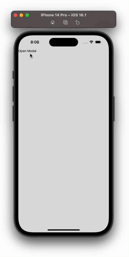
<Text>{'Open Modal'}</Text>
</SafeAreaView>
</GestureHandlerRootView>
);
};
const styles = StyleSheet.create({
container: {
flex: 1,
},
});
export default App;
With Gesture Handler installed, we can now dive into creating custom scrolling modals that will elevate the user experience in our React Native apps.
Let’s start by implementing a basic example to understand how to use Modalize effectively. To that end, we’ll create a simple modal that displays some text.
Add the below code in your App.tsx file:
import {useRef} from 'react';
import {SafeAreaView, StyleSheet, Text, View} from 'react-native';
import {GestureHandlerRootView} from 'react-native-gesture-handler';
import {Modalize} from 'react-native-modalize';

const App = () => {
  const modalRef = useRef<Modalize>(null);
  const openModal = () => modalRef?.current?.open();
  return (
    <GestureHandlerRootView style={styles.container}>
      <SafeAreaView style={styles.container}>
        <Text onPress={openModal}>{'Open Modal'}</Text>
        <Modalize ref={modalRef}>
          <View style={{padding: 20}}>
            <Text style={{fontSize: 22, fontWeight: 'bold', lineHeight: 34}}>
              {'This is a modal'}
            </Text>
            <Text>
              {
                'Lorem ipsum dolor sit amet, consectetur adipiscing elit. Sed et euismod nisl. Nulla facilisi. Aenean et mi volutpat, iaculis libero non, luctus quam. Vestibulum ante ipsum primis in faucibus orci luctus et ultrices posuere cubilia Curae; Curabitur euismod dapibus metus, eget egestas quam ullamcorper eu.'
              }
            </Text>
          </View>
        </Modalize>
      </SafeAreaView>
    </GestureHandlerRootView>
  );
};
const styles = StyleSheet.create({
  container: {
    flex: 1,
    backgroundColor: '#ddd',
  },
});
export default App;
Here, we created a ref for our modal named modalRef and assigned it to our Modalize component. The Modalize component wraps the content we want to display inside the modal. The ref attribute allows us to access the modal’s methods, such as opening and closing it.
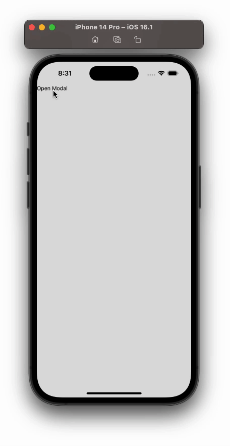
The above code gives us the following output:
N.B., the previews here will show our app running on iOS, but you can view the same previews on an Android device in the GitHub repo.
One of the significant advantages of using Modalize is its high level of customization. You can tailor the modal to match your app’s design and user experience requirements.
By default, the content inside any modal built with react-native-modalize is automatically scrollable if it exceeds the modal’s height. This allows you to present lengthy information without worrying about content overflow.
Let’s take a look at what happens if we have content larger than the modal height. Modify the code in the Modalize component like so:
<Modalize
  ref={modalRef}
  modalHeight={200}
  scrollViewProps={{showsVerticalScrollIndicator: false}}>
  <View style={{padding: 20}}>
    <Text style={{fontSize: 22, fontWeight: 'bold', lineHeight: 34}}>
      {'This is a modal'}
    </Text>
    <Text>
      {
        'Lorem ipsum dolor sit amet, consectetur adipiscing elit. Sed et euismod nisl. Nulla facilisi. Aenean et mi volutpat, iaculis libero non, luctus quam. Vestibulum ante ipsum primis in faucibus orci luctus et ultrices posuere cubilia Curae; Curabitur euismod dapibus metus, eget egestas quam ullamcorper eu.'
      }
      {'\n\n'}
      {
        'Lorem ipsum dolor sit amet, consectetur adipiscing elit. Sed et euismod nisl. Nulla facilisi. Aenean et mi volutpat, iaculis libero non, luctus quam. Vestibulum ante ipsum primis in faucibus orci luctus et ultrices posuere cubilia Curae; Curabitur euismod dapibus metus, eget egestas quam ullamcorper eu.'
      }
    </Text>
  </View>
</Modalize>
We have explicitly set our modal’s height to 200 and used scrollViewProps to hide the scroll indicator. Modalize will automatically wrap the content inside a ScrollView. Let’s see how our modal looks now:
Snap points refer to specific positions that the modal can animate to when opening or closing. Instead of smoothly transitioning to its full height immediately, the modal can stop at predefined heights during its opening or closing animation. This behavior allows you to present the modal in different states or sizes, enhancing the user experience and providing a more dynamic interaction.
Many third-party modal libraries — Modalize included — offer a snapPoint prop that allows you to define these snap points. When the modal is opened, it will smoothly animate to the specified snap point; when closed, it will animate back to either its starting position or another specified snap point.
Update your Modalize declaration using the code below to see how we can use snap points:
<Modalize
  ref={modalRef}
  modalHeight={600}
  snapPoint={300}
  closeSnapPointStraightEnabled={false}
  scrollViewProps={{showsVerticalScrollIndicator: false}}>
  <View style={{padding: 20}}>
    <Text style={{fontSize: 22, fontWeight: 'bold', lineHeight: 34}}>
      {'This is a modal'}
    </Text>
    <Text>
      {
        'Lorem ipsum dolor sit amet, consectetur adipiscing elit. Sed et euismod nisl. Nulla facilisi. Aenean et mi volutpat, iaculis libero non, luctus quam. Vestibulum ante ipsum primis in faucibus orci luctus et ultrices posuere cubilia Curae; Curabitur euismod dapibus metus, eget egestas quam ullamcorper eu.'
      }
      {'\n\n'}
      {
        'Lorem ipsum dolor sit amet, consectetur adipiscing elit. Sed et euismod nisl. Nulla facilisi. Aenean et mi volutpat, iaculis libero non, luctus quam. Vestibulum ante ipsum primis in faucibus orci luctus et ultrices posuere cubilia Curae; Curabitur euismod dapibus metus, eget egestas quam ullamcorper eu.'
      }
    </Text>
  </View>
</Modalize>
In this example, the snapPoint prop is set to 300. This means that when the modal is opened, it will smoothly animate to a height of 300 units. When the modal is closed, it will animate back to its starting position.
closeSnapPointStraightEnabled indicates whether the modal should be stopped at the snap point when closing. When set to false, the modal stops at the snap point before closing, and the opposite when set to true. By default, its value is true.
With our above code changes, our modal now looks like this:
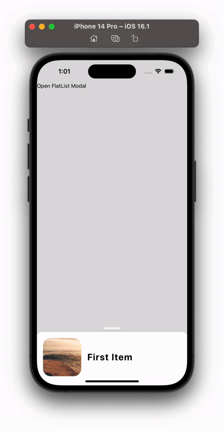
FlatListModalize uses ScrollView as its default renderer, but it also allows us to use FlatList or SectionList as renderers. Let’s see how we can use FlatList as a renderer for our Modalize component.
Let’s add the below code to our App.tsx:
// <imports here>

const DATA = [
  {
    id: '1',
    title: 'First Item',
    imgUrl: 'https://picsum.photos/800',
  },
  // Other 9 Items like this here
];

const App = () => {
  const flatlistModalRef = useRef<Modalize>(null);
  const openFlatListModal = () => flatlistModalRef?.current?.open();

  const renderItem = ({item}) => (
    <View
      style={{
        flexDirection: 'row',
        alignItems: 'center',
        paddingVertical: 16,
      }}>
      <Image
        source={{uri: item?.imgUrl}}
        style={{
          height: 100,
          width: 100,
          borderRadius: 20,
          marginHorizontal: 16,
        }}
      />
      <Text style={{fontWeight: '700', fontSize: 24, letterSpacing: 1.4}}>
        {item?.title}
      </Text>
    </View>
  );

  return (
    <GestureHandlerRootView style={styles.container}>
      <SafeAreaView style={styles.container}>
        <Text onPress={openFlatListModal}>{'Open FlatList Modal'}</Text>
        <Modalize
          ref={flatlistModalRef}
          modalTopOffset={80}
          flatListProps={{
            data: DATA,
            keyExtractor: item => item.id,
            showsVerticalScrollIndicator: false,
            renderItem,
          }}
        />
      </SafeAreaView>
    </GestureHandlerRootView>
  );
};

const styles = StyleSheet.create({
  container: {
    flex: 1,
    backgroundColor: '#ddd',
  },
});

export default App;
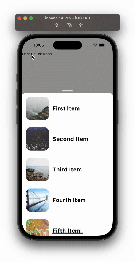
Above, we used Modalize’s flatListProps to initialize our FlatList inside the modal. These are the standard props that we pass into FlatList while creating a List.
The above code creates the below modal list:
We can use the alwaysOpen prop in react-native-modalize to control the modal’s behavior, ensuring that it remains open and visible on the screen. When set to any number value, the modal will not be closable, and it will remain displayed at the given height with no way for users to close it.
Let’s add the following prop to our FlatList modal:
<Modalize
  ref={flatlistModalRef}
  modalTopOffset={80}
 // Add this 👇
  alwaysOpen={140}
  flatListProps={{
    data: DATA,
    keyExtractor: item => item.id,
    showsVerticalScrollIndicator: false,
    renderItem,
  }}
/>
This will make our modal always open with a height of 140 units:
You might use the alwaysOpen prop in scenarios where you want to present essential information or instructions that should always remain visible. For example, you could use it to display an important announcement or a tutorial that users need to read before interacting with the rest of the app.
Because alwaysOpen prevents the user from closing the modal under any circumstances, it’s essential to use it thoughtfully. Doing otherwise could seriously impact your app’s user experience.
If the information inside the modal is crucial for the user’s interaction, it might be a suitable choice. But for content that the user might reasonably want to dismiss, consider using the modal’s default behavior or providing a close button.
Creating custom, scrolling modals in React Native is simple with the react-native-modalize library. Its flexibility and numerous customization options make it an excellent choice for developers who want to deliver an outstanding user experience.
We explored the basics of using Modalize and learned how to implement a custom modal with scrolling content. We also touched upon some of the essential customization options available in the library, such as using snap points, rendering a FlatList in the modal, and configuring always-open modals. Again, you can find the full code we used in this tutorial in the GitHub repo here.
As you continue to build React Native applications, consider incorporating Modalize to create visually appealing and interactive modals that enhance user engagement and interaction. Thank you for reading!

LogRocket's Galileo AI watches sessions for you and and surfaces the technical and usability issues holding back your React Native apps.
LogRocket also helps you increase conversion rates and product usage by showing you exactly how users are interacting with your app. LogRocket's product analytics features surface the reasons why users don't complete a particular flow or don't adopt a new feature.
Start proactively monitoring your React Native apps — try LogRocket for free.

We built the same app in TanStack Start RSC and Next.js RSC. TanStack shipped 40% less JS and built 4x faster — but Next.js is still the safer production bet.

From RSC vulnerabilities and the Vercel breach to TypeScript 7.0 Beta and AI agents — the nine frontend storylines that defined H1 2026, ranked.

AI tools generate working React code fast, but miss race conditions, empty states, debouncing, and accessibility. Here’s how to catch bugs before production.

Learn how to use Gemini CLI subagents to delegate frontend, backend, testing, and docs tasks to specialized agents with guardrails and clear ownership.
Would you be interested in joining LogRocket's developer community?
Join LogRocket’s Content Advisory Board. You’ll help inform the type of content we create and get access to exclusive meetups, social accreditation, and swag.
Sign up now

 Learn more →
