In this blog post, we are going to create our own rating component using React. These concepts will going to be same in any JavaScript library as well.

The easy part of this problem is clicking and hovering over the star, but the tricky part is implementing a specific star rating component — half rating, for example, or any specific-number precision. We will focus on the latter part in this blog.
Before diving into this blog post, note that there are a lot of ways to implement this rating system. This one is just one of the approaches!
To follow along with this post, you need to have a basic understanding of both React and JavaScript. If you are above a beginner level, you can also implement this in your framework of choice, as the concepts are largely the same for every framework.
For this specific post, I am using:
Before we get into it, I would not recommend this approach unless you are intentionally implementing a half-star rating system. This approach assumes we have to implement with a precision-based rating system, so it will be much more complex. If you just need full stars, you can implement a such a system via:
n number of starsclick, mouseover, and leave handlers to your componentWe will cover only half-stars in this post, but this approach should work for any specific precision you want. Keep aligned with the blog, and you should be able to implement any fractional star-rating component you desire.
We will go through these steps:
Now, let’s dive into the fun part!
If you have Node.js installed in your system, proceed; if you don’t, install it before moving on to the next steps.
yarn create vite star-rating --template react
yarn add @mui/material @emotion/react @emotion/styled
yarn add @mui/icons-material
That’s all you need to start. If you are using Vite, you can now run the project using the following command; otherwise, check the instructions of your preferred tool:
yarn run dev
Forget about hover or click functionality. If you have to create a simple star rating component UI using only React, how would you do that?
All right — you can do it with by tracking totalStars and activeStars. Based on that, we can simply render active and inactive stars. (My stars are MUI icons.)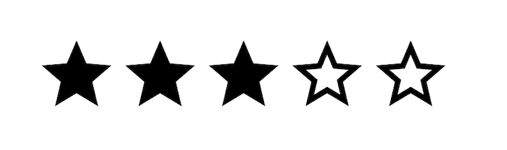 The code for this would be:
import React from "react";
import Box from "@mui/material/Box";
import StarIcon from "@mui/icons-material/Star";
import StarBorderIcon from "@mui/icons-material/StarBorder";

const BasicFn = () => {
  const totalStars = 5;
  const activeStars = 3;

  return (
    <Box>
      {[...new Array(totalStars)].map((arr, index) => {
        return index < activeStars ? <StarIcon /> : <StarBorderIcon />;
      })}
    </Box>
  );
};

export default BasicFn;
The logic for hovering and selecting the stars involves state manipulation, same kind I mentioned earlier in my explanation (inside Project overview and setup section) for creating a simple star-rating component. As mentioned there, too, you can go with this approach.
Now, we come to the next part. How will you create a half-star rating?
This one is tricky. For this, we need more help from CSS.
Let’s start by creating n number of filled and n number of unfilled stars. It would look like this on first instance: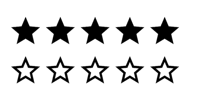 Here’s what our code for this looks like so far:
<Box sx={{ display: "inline-flex" }}>
  {[...new Array(totalStars)].map((arr, index) => {
    return (
      <Box>
        <Box>
          <StarIcon />
        </Box>
        <Box>
          <StarBorderIcon />
        </Box>
      </Box>
    );
  })}
</Box>;
Note: I am using MUI, which is a css in jslibrary, so most of my CSS is written in same component file.
Since the goal is to render a half-star, we will create two separate stars and, with the help of the absolute, overflow , and width CSS properties, we will generate specific star precision. What I mean is this: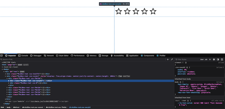 If you can see in the above image, we set the
 width of our filled icon to 0. This will come in handy soon.
With the help of the absolute position prop, we overlap our filled and unfilled stars on top of each other. By now, you probably already got the context, but if not, not to worry: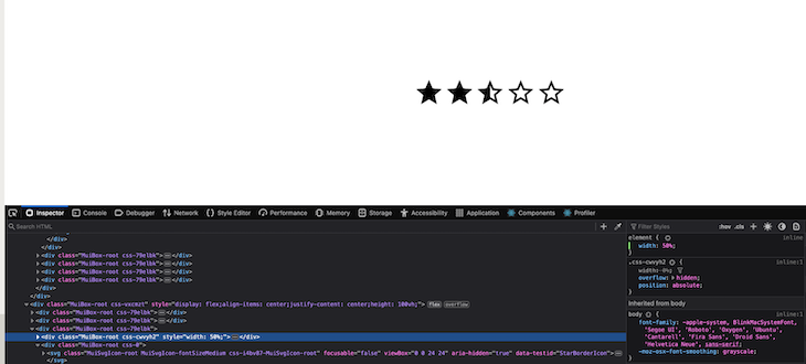 This is what happens when we set up
 widths for specific stars.
Now, we just need to play with state to enable functionality for this:
<Box
  sx={{
    display: "inline-flex",
    position: "relative",
    cursor: "pointer",
    textAlign: "left",
  }}
>
  {[...new Array(totalStars)].map((arr, index) => {
    return (
      <Box position="relative">
        <Box sx={{ width: "0%", overflow: "hidden", position: "absolute" }}>
          <StarIcon />
        </Box>
        <Box>
          <StarBorderIcon />
        </Box>
      </Box>
    );
  })}
</Box>;
So far, we have created a CSS skeleton that we will use as a reference for handling the more dynamic parts of this component, i.e., our click and hover functionality.
Since we are focusing on stars with precision, we should impose rules about clicking on the star accordingly — so we need to add functionality that allows users to select star with precision also. For example 3.5 stars.
If you don’t need to handle half-star implementation, you simply need to track indexes and render based on condition:
const Rating = () => {
  const [activeStar, setActiveStar] = useState(-1);
  const totalStars = 5;
  const activeStars = 3;
  const handleClick = (index) => {
    setActiveStar(index);
  };
  return (
    <Box
      sx={{
        display: "inline-flex",
        position: "relative",
        cursor: "pointer",
        textAlign: "left",
      }}
    >
      {[...new Array(totalStars)].map((arr, index) => {
        return (
          <Box
            position="relative"
            sx={{
              cursor: "pointer",
            }}
            onClick={() => handleClick(index)}
          >
            <Box
              sx={{
                width: index <= activeStar ? "100%" : "0%",
                overflow: "hidden",
                position: "absolute",
              }}
            >
              <StarIcon />
            </Box>
            <Box>
              <StarBorderIcon />
            </Box>
          </Box>
        );
      })}
    </Box>
  );
};
It will allow users to select the star-rating they want to show.
https://stackblitz.com/edit/react-bytdr4?file=src%2FApp.js
A similar process for hovering also works with this method; try it out yourself and let me know how it goes in the comments!
Coming back to the point — how we are going to select a half star? Let’s dive into that implementation.
To implement a precision-based rating system, we need help from some DOM APIs:
clientX: According to the W3C docs, this is defined as: “The horizontal coordinate at which the event occurred relative to the viewport associated with the event.”getBoundingClientRect: According to the MDN docs, this is defined as: “The Element.getBoundingClientRect() method returns a DOMRect object providing information about the size of an element and its position relative to the viewport.”So, technically, we want to do some math to figure out which star we’ll start with, and the above two methods will help us achieve it. In a nutshell, we can explain it like this: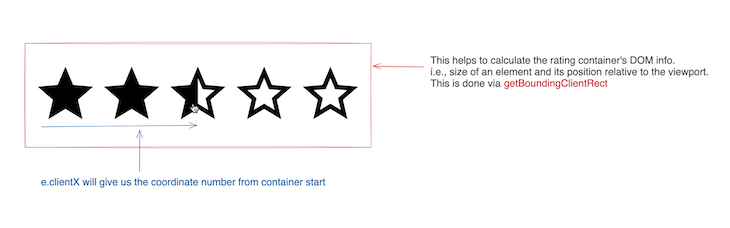 Source: Here is excalidraw link.
In React, we can use help from the useRef API. Our code would be something like this:
const ratingContainerRef = useRef(null);
...
...
...
<Box
...
ref={ratingContainerRef}
...
From ratingContainerRef, we will calculate the Box‘s dimension. We are only interested in calculating width and left, since we want to find the star we want to begin with.
This is a great image to understand how getBoundingClientRect works.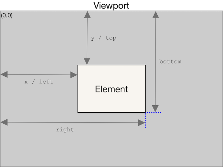 Source
To calculate a percentage, where we have clicked or move our mouse we can simply create this formula:
/*
e.clientX -> will also have left included so we want to remove that part
so that we get coordinate value started from first rating item and we simply
divided by width to get the percentage
*/
let percent = (e.clientX - left)/width;

/* Since percent is in decimal, for calculation we need to multiply this percent with totalNumberOfStar so it will give
numbers which is less than or equal total number of start and is in readable form
*/
//For example: 0.4834 is 48% of total width. But lies on which star make sure by below formula
let numberInStars = percent * totalStars;
This will give us context for where we’ve clicked. If the returned value is 0%, we’ve clicked to the left of the window; if it’s 100%, we’ve clicked to the right of it.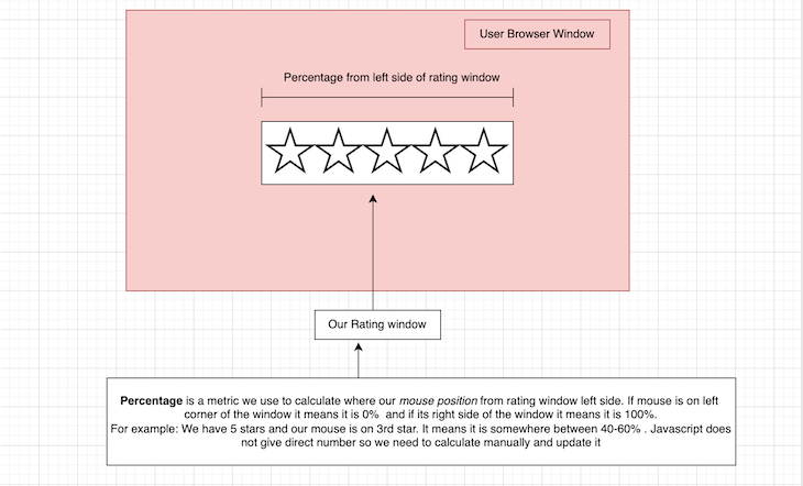 For example, if it returns
 70%, we can say we’ve clicked somewhere in the fourth star.
Next, we need to find the precise value of the halfway point of each star.
Let’s say we use 0.5 for our precise value, and numberInStars is 3.6666. By now, it should be clear we need to handle precision by doing some math.
So, in the above case, the nearest integer would be 4, and it should select 4 stars.
Let’s write out the nearest number formula according to our given precision. You don’t need to be a math expert to write precise math. By doing a simple Google search, you can find it in JavaScript:
//This will give number close to number with precision.
//For Example: numberInStars - 4.666666666666667, precision-> 0.5 will give 5
/*
    For reference you can think of nearest number as the next interval of precision.
    4.223 -> 4.5
    3.45 -> 3.5
    3.60 -> 4
*/
const nearestNumber  = Math.round((numberInStars+ precision/2)/precision) * precision
If you’d like to learn more, there’s a great explanation on Stack Overflow you can follow.
One more thing: in the above formula, we have added precision/2 . This will always make sure that, if we hover between the second and third stars, it will select the nearest number according to our precision rules.
That’s it! From this, you will be able to generate an exact number, which we need to display beneath each active rating item.
If you are not using high-precision values, like 0.55454, then this check is not required. But to run a safe check of our application, adding the following to make sure it should never go beyond that value is helpful:
Number(nearestNumber.toFixed(precision.toString().split(".")[1]?.length || 0));
Our final function should look like this:
const calculateRating = (e) => {
  const { width, left } = ratingContainerRef.current.getBoundingClientRect();
  let percent = (e.clientX - left) / width;
  const numberInStars = percent * totalStars;
  const nearestNumber = Math.round((numberInStars + precision / 2) / precision) * precision;;
  return Number(
    nearestNumber.toFixed(precision.toString().split(".")[1]?.length || 0)
  );
};
This is the only tricky part where most people struggle, mostly because we’re writing some logic here. From this, we will be able to generate accurate rating number like 0.5,1.5,2.
Now let’s append this to our star-rating item selector.
If you click on the star, you will see different behavior from what we expected. Click on any star and you’ll see something like this: There are different ways to solve this problem, but we’ll go through the one I prefer.
We know our active star value (i.e., 2,3.5,5). Let’s say we have selected 3.5. This means the first three stars should be full and our fourth star should be half filled. The remaining one should be empty.
We already render all of our stars empty(see Using CSS to create half-stars section), so we need to take care to only display one unfilled star.
But instead of rendering all empty items, we can render filled ones which are less than our active star (3.5 means we need to show 3 full star) i.e.:
{
  [...new Array(totalStars)].map((arr, index) => {
    const activeState = activeStar;
        /*
        we only need to render empty icon layout when active state
        is not set i.e -1  in our case or active state is
        less than index+1 (number of stars start from 0) i.e show only when its
        index is greater that active state
      */
    const showEmptyIcon = activeState === -1 || activeState < index + 1;

    return (
      <Box
        position={"relative"}
        sx={{
          cursor: "pointer",
        }}
        key={index}
      >
        <Box
          sx={{
            width: `${(activeState % 1) * 100}%`,
            overflow: "hidden",
            position: "absolute",
          }}
        >
          <StarIcon />
        </Box>
        {/* Notice here */}
        <Box>{showEmptyIcon ? <StarBorderIcon /> : <StarIcon />}</Box>
      </Box>
    );
  });
}
This will start by selecting the star that you want to select.
Now, we need to render our precision-based star. Here’s the code for that logic:
{
  [...new Array(totalStars)].map((arr, index) => {
    const activeState = activeStar;
    /*
        we only need to render empty icon layout when active state
        is not set i.e -1  in our case or active state state is
        less than index i.e show only when its
        index is greater that active state
      */
    const showEmptyIcon = activeState === -1 || activeState < index + 1;

    const isActiveRating = activeState !== 1;
    const isRatingWithPrecision = activeState % 1 !== 0;
    const isRatingEqualToIndex = Math.ceil(activeState) === index + 1;
    const showRatingWithPrecision =
      isActiveRating && isRatingWithPrecision && isRatingEqualToIndex;

    return (
      <Box
        position={"relative"}
        sx={{
          cursor: "pointer",
        }}
        key={index}
      >
        <Box
          sx={{
            width: showRatingWithPrecision
              ? `${(activeState % 1) * 100}%`
              : "0%",
            overflow: "hidden",
            position: "absolute",
          }}
        >
          <StarIcon />
        </Box>
        {/*Note here */}
        <Box>{showEmptyIcon ? <StarBorderIcon /> : <StarIcon />}</Box>
      </Box>
    );
  });
}
Here are some definitions for the functions in the above code:
isActiveRating: Checks if the star is clicked (or hovered in next part, in which case its value should not be -1)isRatingWithPrecision: Checks if we need to use a specific precision rating (i.e., half-stars)isRatingEqualToIndex: Checks whether we need to show an active state of rating for the current index.
1, isRatingWithPrecision is going to be 0, so our showEmptyIcon condition will be enough to handle full-star functionalityshowRatingWithPrecision: Ensures if the above three conditions are satisfied, and if so, determines if we need to show a precision based star.
3.5 %1 -> 0.5 means we need to show a 50%filled star. We handle this with the showRatingWithPrecision conditionFinally, we have tackled the biggest part of our problem!
Setting our hover logic will follow largely the same steps as above; we just need to track whether or not we are hovering.
//Similar to active star state, we need to handle hover state
const [hoverActiveStar, setHoverActiveStar] = useState(-1);
// Not necessary. But handy in readability of code.
const [isHovered, setIsHovered] = useState(false);
...
...

//Event listener for mouse move and leave
const handleMouseMove = (e) => {
  setIsHovered(true);
  setHoverActiveStar(calculateRating(e)); // We already calculation in this function
};
const handleMouseLeave = (e) => {
  setHoverActiveStar(-1); // Reset to default state
  setIsHovered(false);
};

...
...

//If you remember we have created separate variable `activeState`.
// Simply toggle state if its hovering take hover one otherwise take active one
const activeState = isHovered ? hoverActiveStar : activeStar;
And rest will follow the same steps as setting the precision rating.
You can find the complete source code and demo at the links provided.
This isn’t only related to star-rating components! You can use any set of icons, so long as you have both filled and empty image versions. Feel free to check out the repo code, as I added different icon examples.
This is just a proof of concept for creating a generic rating component in any JavaScript framework, and is not specific to React.
I referenced and took inspiration MUI’s rating component. Most things we don’t need to know internally, but this one is a common interview question, so I thought sharing my knowledge and understanding of this component would be helpful.
There are lot of improvements you can make to this code as well. If you find any bugs, feel free to raise a PR or reach out to me via email or in the comments.
Install LogRocket via npm or script tag. LogRocket.init() must be called client-side, not
server-side
$ npm i --save logrocket

// Code:

import LogRocket from 'logrocket';
LogRocket.init('app/id');
// Add to your HTML:

<script src="https://cdn.lr-ingest.com/LogRocket.min.js"></script>
<script>window.LogRocket && window.LogRocket.init('app/id');</script>

A guide for using JWT authentication to prevent basic security issues while understanding the shortcomings of JWTs.

Discover how to build, render, and automate product demo videos with Remotion, replacing traditional screen recordings with reusable React code.

Chrome’s Modern Web Guidance embeds modern web platform skills into AI coding agents, helping them choose native HTML, CSS, and browser APIs over legacy patterns.

Learn how to use Fallow to analyze AI-generated code, detect dead code, duplicate logic, and complexity issues, and integrate automated code quality checks into your AI-assisted development workflow.
Hey there, want to help make our blog better?
Join LogRocket’s Content Advisory Board. You’ll help inform the type of content we create and get access to exclusive meetups, social accreditation, and swag.
Sign up now

 Learn more →
