
Bootstrap is a CSS framework that has revolutionized the ease and efficiency of web development. It primarily provides a collection of pre-styled components and layouts that can easily integrate into any web project. This collection includes everything from navbars and buttons to forms and modals, all pre-styled for instant use.
In this guide, we’ll explore the origins of Bootstrap and how it has evolved over the years. We’ll also go into key Bootstrap features, its use cases, why you should choose Bootstrap, and briefly explain how Bootstrap compares with other top CSS frameworks.
The Replay is a weekly newsletter for dev and engineering leaders.
Delivered once a week, it's your curated guide to the most important conversations around frontend dev, emerging AI tools, and the state of modern software.
The origins of Bootstrap can be traced back to 2011 when its creators, Mark Otto and Jacob Thornton, were working at Twitter. Since the previous styling libraries they used caused design discrepancies and were difficult to maintain, they opted to create their own.
Initially, the team designed Bootstrap as an internal tool to improve design consistency and further unify the platform’s frontend standards. Recognizing the project’s potential outside of Twitter’s internal use, the team opted to open source it, making it public later that year.
Since then, Bootstrap has changed considerably — most notably, in its relationship with JavaScript libraries.
Originally, Bootstrap relied heavily on jQuery to implement dynamic components such as dropdowns and modals. However, Bootstrap v5 made a significant shift by abandoning jQuery in favor of vanilla JavaScript — an intentional attempt to adopt new JavaScript standards and improve performance.
Behind the scenes, the Bootstrap team and other contributors have compiled a file containing numerous CSS style definitions linked to specific class names. This file, which is called bootstrap.css, allows you to rapidly apply these styles to your project by referencing the appropriate class names.
Additionally, utilizing these styles in your project is pretty straightforward. First, you link Bootstrap’s CSS and JavaScript files in your markup, as shown below:
<!DOCTYPE html>
<html lang="en">
<head>
    <meta charset="UTF-8">
    <meta name="viewport" content="width=device-width, initial-scale=1.0">
    <title>Bootstrap Example</title>
    <!-- Bootstrap CSS -->
    <link href="https://cdn.jsdelivr.net/npm/[email protected]/dist/css/bootstrap.min.css" rel="stylesheet">
</head>
<body>
    <h1>Hello, Bootstrap!</h1>
    <!-- Bootstrap JavaScript -->
    <script src="https://cdn.jsdelivr.net/npm/[email protected]/dist/js/bootstrap.bundle.min.js"></script>
</body>
</html>
With the files linked, you can start using Bootstrap in your HTML by adding Bootstrap’s class names to your markup elements. For example, to create a primary-colored button, you would use:
<button type="button" class="btn btn-primary">Primary Button</button>
Over time, developers have enhanced Bootstrap’s adaptability by integrating it with various JavaScript frameworks. For instance, BootstrapVue exclusively caters to Vue.js, while React-Bootstrap is specifically designed for React.
Bootstrap for web development offers numerous benefits:
These benefits make Bootstrap a great choice for almost any project. However, Bootstrap has occasionally faced criticism for its distinctive, recognizable style, which some may consider its most significant drawback — possibly even its only major one. Let’s discuss this next.
The similarity in appearance across Bootstrap websites, particularly in elements like buttons and navbars, has led to the narrative that all Bootstrap websites look alike. This criticism holds some truth, especially in earlier versions where customization options were more limited and developers used similar design templates.
However, recent versions of Bootstrap have significantly addressed these concerns. The framework now offers enhanced extensibility and customization options. Developers can easily personalize components to fit their unique design needs without being confined to the default styles.
While Bootstrap’s enforced style was once a point of debate, the framework’s evolution has made it more adaptable and versatile, enabling developers to override default styles and create unique, visually distinct web designs.
Bootstrap is packed with many components and features. Let’s quickly explore some of its most common elements in an everyday application.
Bootstrap’s grid system is a powerful and flexible tool that forms the foundation of most layouts within the framework. Central to this system are the concepts of containers, rows, and columns:
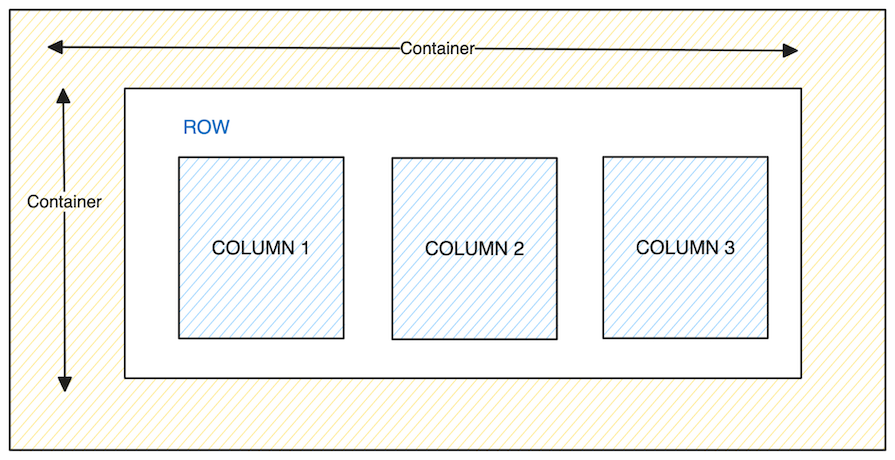
Containers are Bootstrap’s most basic layout element and are required when using the grid system. They contain, pad, and align your content within a device or viewport.
Inside a container, you can create rows using the .row class. Each row is considered a single horizontal group for your columns. Significantly, each row is divided into 12 equal columns, providing a consistent and flexible way to layout content.
Columns are created with classes like .col-md-*, where * can be any number from 1–12. This number indicates how many of the 12 available columns in the grid system the column should span. For example, using .col-md-4 means the column will span four out of the 12 available columns.
Here’s a basic example of a row with four columns:
><div class="container">
  <div class="row">
    <div class="col-md-3">Column 1</div>
    <div class="col-md-3">Column 2</div>
    <div class="col-md-3">Column 3</div>
    <div class="col-md-3">Column 4</div>
  </div>
</div>
In this code, we’ve added col-md-3 to each column, allocating one-quarter of the horizontal space per column in a medium-sized viewport:

Bootstrap’s grid system is responsive by default, meaning these column sizes will be automatically adjusted based on the viewport’s size. Additionally, you can use Bootstrap Flex utility classes to change the direction and alignment of these grid systems.
Bootstrap offers a range of utility classes designed to rapidly customize background and text colors within HTML elements. To change the background color of an element, you can use the .bg-[color] class. Additionally, to alter a text color, the .text-[color] class is available.
Here, [color] represents a color from Bootstrap’s predefined color schemes — such as primary, secondary, and success — and not traditional color names like red or orange:

In addition to individual text and background classes, Bootstrap introduces a combined class, .text-bg-[color].
This combined class merges the functionalities of .text-[color] and .bg-[color], providing a convenient way to set both text and background colors simultaneously. It smartly adjusts the text color for optimal contrast against the specified background color:

Furthermore, in recent Bootstrap versions, you can adjust an element’s opacity via the .text-opacity-[percentage] class. This allows you to set the opacity to 25 percent, 50 percent, or 75 percent of its original value:

Styling HTML tables for both responsiveness and visual appeal can be challenging. Fortunately, Bootstrap simplifies this task with a variety of utility classes. You can start by adding the .table class to your HTML <table> tag to instantly transform a basic table into a more professionally styled one, as shown below:

Further customization is possible with color-specific classes. For example, you can apply a color theme to an entire table or specific table cells using .table-[color] classes, such as .table-dark, for a dark color theme:

Bootstrap’s table class list is extensive, allowing for various styling options:
.table-striped to create a zebra-stripe effect on table rows.table-bordered for borders around all parts of the table and cells and .table-borderless for a borderless design.table-responsive class ensures your table remains responsive and scrolls horizontally on smaller devices, accommodating numerous columns without breaking the layoutWith the help of this set of Bootstrap table classes, you can quickly create tables that are both aesthetically pleasing and functional.
Alerts are key visual elements that convey important messages to users, ranging from success notifications to warnings or error information. Bootstrap significantly simplifies the creation of these alerts with its utility classes.
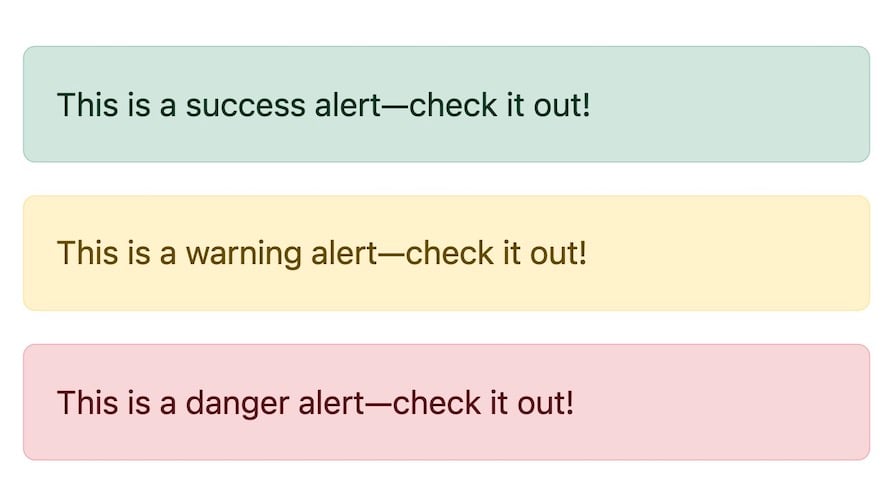
To create a styled alert, you only need to add the .alert class along with a .alert-[color] class to a div or any other suitable container element. In the .alert-[color] class, [color] reflects the nature and severity of the message. For example:
<div class="alert alert-success" role="alert">
  This is a success alert--check it out!
</div>
<div class="alert alert-warning" role="alert">
  This is a warning alert--check it out!
</div>
<div class="alert alert-danger" role="alert">
  This is a danger alert--check it out!
</div>
The code above produces the following output:
To further enhance the functionality of these alerts, Bootstrap allows them to be dismissible. This feature is particularly useful for messages that do not need to remain on the screen indefinitely.
You can add a button within the alert that triggers its dismissal and the .alert-dismissible class on the alert element itself, as shown below:
<div class="alert alert-warning alert-dismissible fade show" role="alert">
  Click <strong>X</strong> to close this alert!
  <button type="button" class="close" data-dismiss="alert" aria-label="Close">
    <span aria-hidden="true">×</span>
  </button>
</div>
The code above will produce the following output:

The Bootstrap alert component is a fantastic tool for presenting information in an aesthetically pleasing and intuitive way.
One of the simplest yet most impactful features of Bootstrap is the styling options for buttons. Bootstrap offers various classes to create visually appealing buttons with minimal effort. To create a styled button, add the .btn and .btn-[color] classes to your HTML button elements:

Bootstrap also includes outline button designs for a more minimalistic look. These are created using the .btn-outline-[color] class, which renders a button with only the border and text colored. The background only gets filled in on hover or focus:

Beyond basic styling, Bootstrap makes it easy to customize button sizes. For example, you can create larger or smaller buttons by adding .btn-lg or .btn-sm to your button tag. Bootstrap’s button documentation provides information for more advanced button features and customization options.
Bootstrap cards serve as modern, modular containers for displaying content. They offer a sleek and organized way to present a mix of images, text, links, and more.
To create a Bootstrap card, you typically structure the card into different sections: the card header, body, and an optional footer for actions like buttons or links. Here’s an example:
<div class="card" style="width: 32rem">
  <img
    src="https://source.unsplash.com/random/?nature&1"
    class="card-img-top"
    alt="..."
  />
  <div class="card-body">
    <h5 class="card-title">Your Card Title Here</h5>
    <p class="card-text">
      Lorem ipsum dolor sit amet consectetur adipisicing elit. Porro . . .
    </p>
    <a href="#" class="btn btn-dark">Action Button</a>
  </div>
</div>
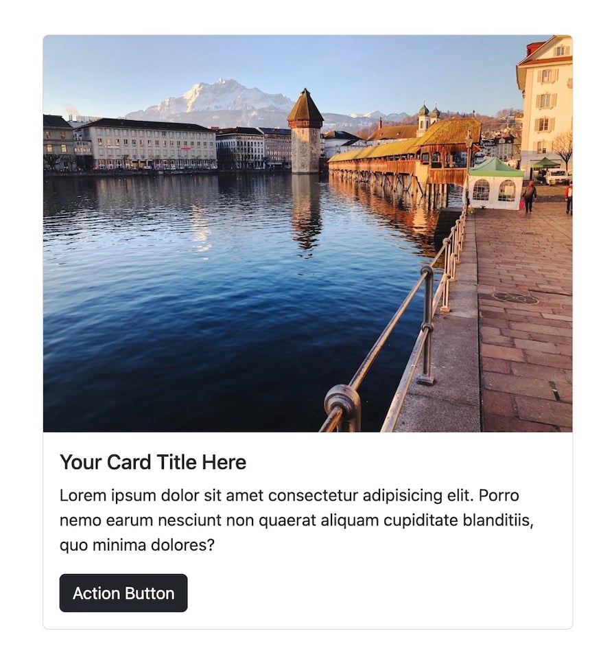
The code above creates a basic card with an image at the top, followed by a title, text, and a button within the card body, as shown below:
Additionally, Bootstrap offers a card variant with image overlays, where the text is positioned over the image. This is particularly useful for creating more visually striking cards:
<div class="card text-bg-dark">
  <img
    src="https://source.unsplash.com/random/?dark&cover"
    class="card-img"
  />
  <div class="card-img-overlay">
    <h5 class="card-title">Your Card Title Here</h5>
    <p class="card-text">
       Lorem ipsum dolor sit amet consectetur adipisicing elit. Porro . . .
    </p>
    <p class="card-text"><small>Last updated 3 mins ago</small></p>
  </div>
</div>
The code above creates a card where the text content overlays the image, providing a more engaging and cohesive visual experience:
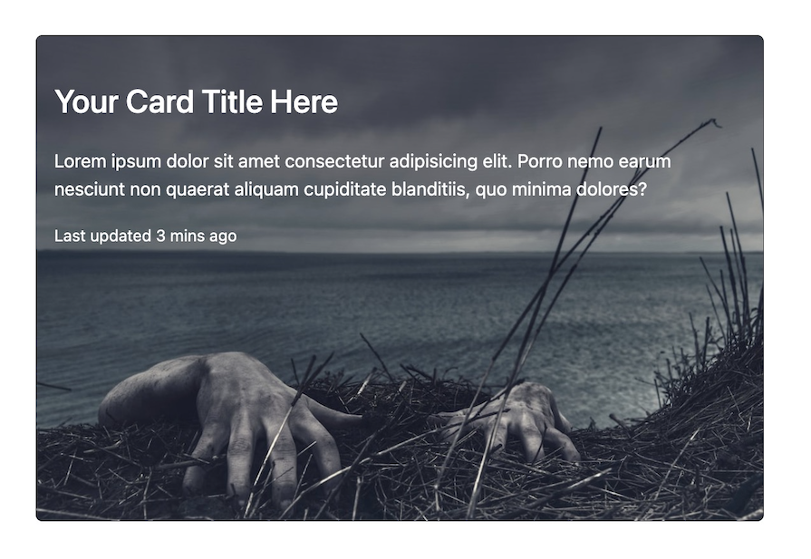
Bootstrap’s card component demonstrates its flexibility and efficiency in web design, providing a complex yet easy-to-implement solution for displaying content in a structured and attractive way.
Bootstrap is more than just components and design elements. It also includes a comprehensive set of utility classes, providing flexibility in customizing layout and appearance.
For example, you can use the m-* classes for setting margins and the p-* classes for padding. These classes follow a simple naming convention where the asterisk * represents the size of the margin or padding. For instance, m-3 applies a moderate margin, and p-2 applies a smaller padding.
Bootstrap also includes:
w-* and height h-* of elementsshadow-* classes, which come in handy for adding box shadows. These range from small (shadow-sm) to large (shadow-lg), allowing for varied levels of depth and emphasis on elementsposition-* classes to quickly change the CSS position of an element. These include static, relative, absolute, fixed, and stickyBootstrap’s utility classes cover various functionalities, from display properties and text alignment to visibility and sizing. For a comprehensive list of all available utility classes and detailed explanations of their usage, the Bootstrap documentation is a valuable resource.
An often underappreciated yet crucial aspect of Bootstrap is its commitment to accessibility. Its interactive components are designed to work for touch, mouse, and keyboard users. Beyond this, Bootstrap also includes a range of classes specifically designed to make web content more accessible to the visually impaired.
For example, Bootstrap provides a .visually-hidden class to hide information intended only for screen readers from the page layout. This feature is particularly useful for visually impaired users for adding additional context or descriptions:
<p class="text-danger">
  <span class="visually-hidden">Danger: </span>
  This action is not reversible
</p>
As demonstrated in the example above, the text Danger will not be visible on the browser, but it will be captured by screen reader technologies.
In addition to its vast array of components and utility classes, Bootstrap also offers a rich library of icons. This library is designed to be generic and easy to incorporate, with elements such as arrows and user icons, as well as more specific symbols such as file types and tools.
To use Bootstrap icons in your project, you must first include the icon library in your HTML markup.
<link rel="stylesheet" href="https://cdn.jsdelivr.net/npm/[email protected]/font/bootstrap-icons.min.css">
Once the icon library is linked, you can start referencing the icons in your HTML by using <i> tags with the appropriate class names. Each icon has a unique class that starts with bi-, followed by the icon’s name.
<i class="bi bi-rocket-fill"></i>
This line of code will display a rocket icon from the Bootstrap icons library. It’s also worth mentioning that Bootstrap icons are SVGs, which means they scale well for all screen sizes and are customizable via CSS.
Further reading:
One of the simplest methods for customizing Bootstrap is creating a new CSS file where you can override the default styling. This approach is particularly user-friendly for those who may not be familiar with Sass or are less comfortable with deeper code manipulations.
To do this, link your custom CSS file after Bootstrap’s stylesheet to ensure your custom styles take precedence over Bootstrap’s default styles:
<!-- Link to Bootstrap CSS -->
<link rel="stylesheet" href="path/to/bootstrap.css" />
<!-- Your custom styles -->
<link rel="stylesheet" href="path/to/your-stylesheet.css" />
You can now redefine Bootstrap’s classes in your CSS file to match your desired aesthetics.
Furthermore, you can download Bootstrap’s source Sass files for more in-depth customization and modify the Sass variables to suit your needs. This customization can range from changing the default color scheme to adjusting the global font size, border-radius values, or even the box-shadow intensity:
// Customizing primary color
$primary: #yourCustomColor;
// Customizing border-radius
$border-radius: 0.25rem;
After adjusting the variables, simply compile your Sass files to generate a new CSS file that will reflect all your customizations.
Bootstrap’s versatility makes it a go-to framework for a wide range of web development projects, ranging from creating simple landing pages to building complex, interactive dashboards:
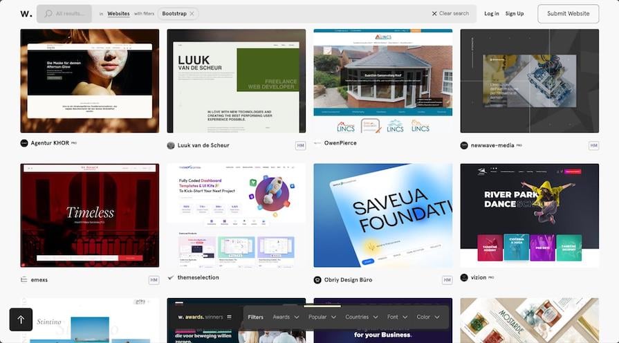
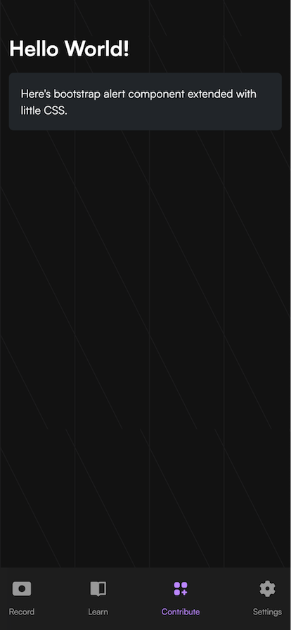
Furthermore, you can seamlessly integrate Bootstrap with JavaScript frameworks like React, Vue, and Capacitor to develop responsive mobile apps, expanding its usage beyond traditional web applications.
Below is an example of a mobile page I designed with Bootstrap, complemented with custom CSS for additional styling:
If you’re looking for inspiration or want to learn more about the framework’s possibilities, you can check out resources like Awwward’s best Bootstrap websites and the official Bootstrap themes web page, which has options for free and paid templates.
While Bootstrap is an all-around excellent option for styling applications, other popular CSS libraries like Tailwind CSS, Material UI (MUI), and Bulma also offer unique strengths and ideal use cases.
For example, Bootstrap is known for its quick-start capabilities, offering pre-designed components for rapid development.
In contrast, Tailwind CSS focuses on utility-first CSS, providing more granular control over styling, while MUI is known for its Material Design components. Similarly, Bulma stands out for its simplicity and usage of Flexbox, providing a modern, minimalist approach that prioritizes responsiveness and ease of use.
Below is a table comparing key points to help you quickly choose from these frameworks:
| Factor | Bootstrap | Tailwind CSS | Material UI (MUI) | Bulma |
|---|---|---|---|---|
| Design philosophy | Pre-built components and styles; grid system for layout | Utility-first, low-level utility classes for custom designs | Pre-built components and styles based on Google’s Material Design | Flexbox-based, simple, with some pre-built components |
| Predefined styles | Many predefined styles and components | No predefined styles; utility classes for custom designs | Predefined styles and components following Material Design | Basic components and elements; focuses on layout |
| Customization | Global customization using Sass or theme variables | Utility-first approach for specific style customization | Global customization using theme variables | Customizable via Sass variables |
| Learning curve | Relatively low, easy to start | Steeper, requires learning utility classes | Moderate, requires understanding of prebuilt components and customization | Easier due to simplicity and layout focus |
| Speed of development | Quick with prebuilt components | Quick for custom designs, but requires understanding of utility classes | Quick with many prebuilt components | Balanced with ready-to-use components and layout options |
| Accessibility | Good, but varies with implementation | Manual effort required for accessibility | Good adherence to accessibility standards | Good, varies with implementation |
For an in-depth comparison of Bootstrap, Tailwind CSS, and MUI, check out the following LogRocket article: Comparing Bootstrap vs. Tailwind CSS vs. Material UI (MUI).
Throughout this article, we’ve explored Bootstrap’s core features, adaptability in various projects, and customizability. We also compared it to frameworks like Tailwind CSS and Material UI.
Bootstrap stands out as a user-friendly, versatile framework, perfect for quick development and offering extensive customization for unique design needs. Its ease of use, supportive community, and comprehensive documentation make it reliable for creating responsive, modern applications.
Install LogRocket via npm or script tag. LogRocket.init() must be called client-side, not
server-side
$ npm i --save logrocket

// Code:

import LogRocket from 'logrocket';
LogRocket.init('app/id');
// Add to your HTML:

<script src="https://cdn.lr-ingest.com/LogRocket.min.js"></script>
<script>window.LogRocket && window.LogRocket.init('app/id');</script>

Learn how AI-assisted development governance uses rules, agents, hooks, and protocols to help AI coding tools produce safer, more consistent code.

A step-by-step guide to building your first MCP server using Node.js, covering core concepts, tool design, and upgrading from file storage to MySQL.

Using security headers in your Next.js apps is a highly effective way to secure websites from common security threats.

A deep dive into May 2026’s AI model and tool rankings. We break down performance, usability, pricing, and real-world capabilities across 50+ features to help you pick the right tools for your development workflow.
Would you be interested in joining LogRocket's developer community?
Join LogRocket’s Content Advisory Board. You’ll help inform the type of content we create and get access to exclusive meetups, social accreditation, and swag.
Sign up now