Bootstrap is a CSS framework that offers a variety of components, such as buttons, panels, and dropdowns. You can use it to quickly design a website or a graphical interface for a web application.
To create a Bootstrap frontend, all you need is some knowledge of HTML and CSS. However, some functionalities can only be implemented with the help of JavaScript. For this, the Bootstrap framework offers a simple JavaScript interface.
In this article, we will explore how to modify and control Bootstrap components via the JavaScript interface. The example we will use is a simple button that allows the users to open a dialog (modal).
If you take a look into the Bootstrap documentation, you will notice that the interface for the other interactive Bootstrap components, such as Carousel, Collapse or Dropdown, is very similar. Therefore, what you learn in this article can be easily applied to other components.
Below, you can see the HTML code for the basic structure of our sample page. It is based on the starter template of Bootstrap 4.5 combined with a fluid container in which the content of the page is to be placed.
<!DOCTYPE html>

<html>

<head>

<meta charset="UTF-8"/>

<meta name="viewport" content="width=device-width, initial-scale=1, shrink-to-fit=no">

<!-- Bootstrap CSS -->

<link rel="stylesheet" href="https://cdn.jsdelivr.net/npm/[email protected]/dist/css/bootstrap.min.css" integrity="sha384-TX8t27EcRE3e/ihU7zmQxVncDAy5uIKz4rEkgIXeMed4M0jlfIDPvg6uqKI2xXr2" crossorigin="anonymous">

<title>Bootstrap Example</title>

</head>

<body>

<div class="container-fluid">

<h1>My Bootstrap Playground</h1>

</div>

<script src="https://code.jquery.com/jquery-3.5.1.slim.min.js" integrity="sha384-DfXdz2htPH0lsSSs5nCTpuj/zy4C+OGpamoFVy38MVBnE+IbbVYUew+OrCXaRkfj" crossorigin="anonymous"></script>

<script src="https://cdn.jsdelivr.net/npm/[email protected]/dist/js/bootstrap.bundle.min.js" integrity="sha384-ho+j7jyWK8fNQe+A12Hb8AhRq26LrZ/JpcUGGOn+Y7RsweNrtN/tE3MoK7ZeZDyx" crossorigin="anonymous"></script>

</body>

</html>
There are two things to consider in this example:
The use of a CDN will allow your website to connect to external servers, which you may need to mention in your privacy policy. Alternatively, the files of the framework can also be downloaded manually and hosted on your own server.
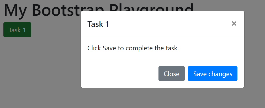
In the following section, we will review a button/modal example without additional JavaScript. The modal can be opened by the user with a click on the button. It can be closed again by clicking on “Close” or on “x”.
To implement additional behaviors (like when the user clicks on “Save”), we need custom JavaScript. The possibilities for this are examined in the subsequent sections.
Let’s start by adding a few components to our example page. First, we will add a button (button):
<div class="container-fluid">

<h1>My Bootstrap Playground</h1>

<button type="button" class="btn btn-success">Task 1</button>

</div>
When the button is clicked, a modal should open that displays the following text: “Click Save to complete the task.” The Live demo section explains how this behavior can be implemented:
The button must be supplemented with the attributes data-toggle="modal" and data-target="#task1_Modal".
<button type="button" class="btn btn-success" data-toggle="modal" data-target="#task1_Modal">Task 1</button>
The HTML code of the modal component must be inserted. The assigned ID (here: task1_Modal) must be correctly referenced in the data-target property of the button (with a preceding # sign, so it reads as #task1_Modal”).
< div class="modal fade" id="task1_Modal" tabindex="-1" aria-labelledby="task1_ModalLabel" aria-hidden="true">

<div class="modal-dialog">

<div class="modal-content">

<div class="modal-header">

<h5 class="modal-title" id="task1_ModalLabel">Task 1</h5>

<button type="button" class="close" data-dismiss="modal" aria-label="Close">

<span aria-hidden="true">×</span>

</button>

</div>

<div class="modal-body">
</div>

<div class="modal-footer">

<button type="button" class="btn btn-secondary" data-dismiss="modal">Close</button>

</div>

</div>

</div>

</div>
If you look at the page in your browser, you will notice that when you click on the button, the dialog is displayed and can be closed again by clicking on the button “Close”.
Here you can try out the first version of our example.
Without the use of the Bootstrap framework, such interaction would only be possible with additional JavaScript code. We would have to react to click events, show and hide the modal, and adjust the style of the button. The Bootstrap framework does all of these things for us.
Please note that the following code examples require the JavaScript library jQuery to be included in the website. If you would like to change the code to simple JavaScript, I recommend an excellent cheat sheet by Tobias Ahlin.
In the Bootstrap documentation of the individual components, there is often a methods section. Bootstrap provides us with a useful toggle method to control the button via JavaScript. To use the method we first have to give the button an ID, like task1_button:
<button id="task_button"… </button>
By calling the toggle method we can switch the appearance of the button from “not clicked” to “clicked” and vice versa via JavaScript.
In order to test it, insert the following code section just before the closing body tag:
…

<script>

$("#task1_button").button("toggle");

</script>

</body>
The code is executed immediately after the page is loaded by the browser.
By using the selector #task1_button, we indicate that the method toggle should only be applied to the button with the ID task1_button (even if there should be more buttons on the page).
When opening the page, the button should look like a button that has already been clicked (dark green).
Now add a second call of toggle:
$("#task1_button").button("toggle");

$("#task1_button").button("toggle");
When opening the page the button should now be in its initial state again (light green).
The methods section of the modal component has a similar structure. There is also a toggle method here, with which the modal can be moved programmatically from closed to open state (and back again).
…

<script>

$("#task1_Modal").modal("toggle");

</script>

</body>
With this code snippet, the modal is automatically opened when the page is loaded, without the user having to click on the button first. A second call causes the dialog to close.
To open and close the dialog, you can also use the separate methods show and hide. We can use the hide method to close the modal after clicking the “Save” button. This requires 2 steps:
First, use the attribute onclick to define which JavaScript function should be executed when the button is clicked, e.g. task1_save():
<button type="button" class="btn btn-primary" onclick="task1_save()">Save changes</button>
Then, insert the following script code before the closing body tag:
<script>

function task1_save(){

$("#task1_Modal").modal("hide");

}

</script>
</body>
Other interactive components, such as Carousel, Collapse, and Dropdown, have similar methods for controlling the component state.
For some Bootstrap components, there is an additional “Events” section in the documentation. This is about reacting programmatically to predefined events that the user triggers during interaction with the respective component.
For a modal, for example, we can define what should happen when the events show or hide are triggered (e.g. by calling the corresponding show or hide methods of the component).
In our example the following shall be defined:
show event is triggered, the label of the button changes from “Task 1” to “Task 1 in progress…”.hide event is triggered, the label changes back to “Task 1”.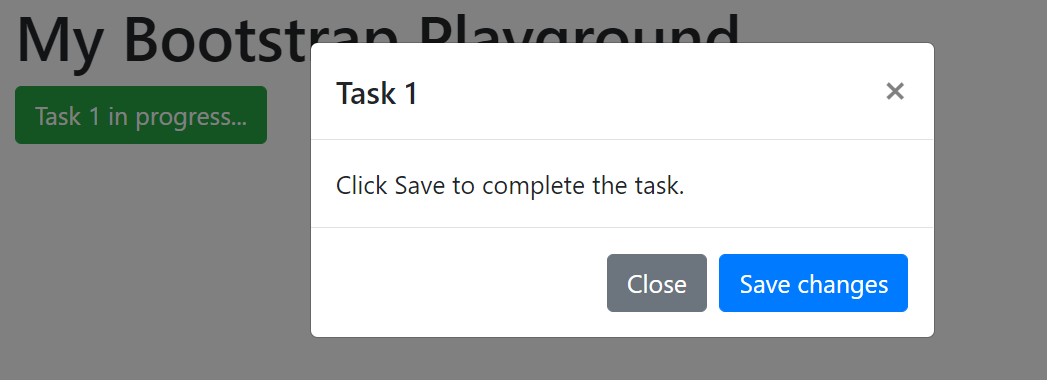
Insert the following code in the script area at the bottom of the page:
$('#task1_Modal').on('show.bs.modal', function (e) {

$("#task1_button").text("Task 1 in process...");

});

$('#task1_Modal').on('hide.bs.modal', function (e) {

$("#task1_button").text("Task 1");

});
You will now notice that in any case when closing the dialog the label is reset, no matter if the user clicks on “Close” or “Save”. The hide event is triggered in both cases.
You can try out the second version of our example here.
In the previous example, we have seen how the jQuery function text can be used to customize the text content of an HTML element. With JavaScript, you can modify all properties of an HTML element, including the CSS classes or the individual CSS properties. Take a look at the following examples:
task1_save functionAfter saving the dialog, we change the CSS class btn-success to btn-secondary for the button. This indicates that the task is already completed:
function task1_save(){

$("#task1_Modal").modal("hide");

$("#task1_button").removeClass("btn-success");

$("#task1_button").addClass("btn-secondary");

}
Contextualize the button with a small progress bar:
<h1>My Bootstrap Playground</h1>
<button id="task1_button" type="button" class="btn btn-success" data-toggle="modal" data-target="#task1_Modal">Task 1</button>

<div id="task1_progress" class="progress">
<div id="task1_progressbar" class="progress-bar bg-success" style="width:0%" role="progressbar" aria-valuenow="0" aria-valuemin="0" aria-valuemax="100"></div>
</div>
The progress bar starts at 0%. We now want to implement the following behavior:
First, while the dialog is displayed, the progress should already be set to 100%. For this, we must modify the CSS property width. Since the task is still in progress, we want to display an animated stripe pattern on the progress bar. We achieve this by adding the CSS classes progress-bar-striped and progress-bar-animated.
$('#task1_Modal').on('show.bs.modal', function (e) {

$("#task1_button").text("Task 1 in progress...");

$("#task1_progressbar").css("width", "100%");

$("#task1_progressbar").addClass("progress-bar-striped");
$("#task1_progressbar").addClass("progress-bar-animated");

});
Then, after hiding the dialog (regardless of whether the user has saved or closed), the animation and the stripe pattern is removed and the progress is set to 0%.
$('#task1_Modal').on('hide.bs.modal', function (e) {

$("#task1_button").text("Task 1");

$("#task1_progressbar").css("width", "0%");

$("#task1_progressbar").removeClass("progress-bar-striped");
$("#task1_progressbar").removeClass("progress-bar-animated");
});
If the user has saved the dialog, then the progress must be permanently set to 100%.
function task1_save(){

$("#task1_Modal").modal("hide");

$("#task1_button").removeClass("btn-success");
$("#task1_button").addClass("btn-secondary");

$("#task1_progressbar").css("width", "100%");

}
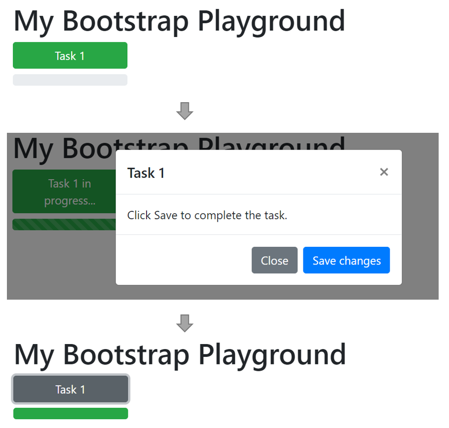
Note, this will display the button and progress bar before, during, and after opening the dialog when the user clicks on “Save changes.”
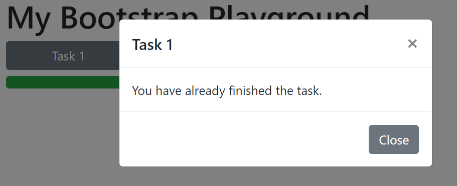
After a task has already been saved, a second click on the button should display another dialog with the content “You have already finished the task”. We are preparing a second modal for this.
The code for this modal is the same as for our first modal, but we have to choose a different ID, for example, task1_Message. We will then set the text in the body of the modal to “You have already finished the task.”
In the function task1_save(), which we call when we save the first dialog, we add an instruction that changes the attribute data-target for the button from task1_Modal to task1_Message:
function task1_save(){

$("#task1_Modal").modal("hide");

$("#task1_button").removeClass("btn-success");
$("#task1_button").addClass("btn-secondary");

$("#task1_progressbar").removeClass("progress-bar-striped");
$("#task1_progressbar").removeClass("progress-bar-animated");

$("#task1_button").attr("data-target", "#task1_Message");

}
You can download the code for the complete example here: bootstrap_example.html
Alternatively, you can try the final version of our example on CodePen.
Even without additional JavaScript, you can still use interactive Bootstrap components, including Button, Modal, Carousel, Collapse, and Dropdown. However, utilizing Bootstrap’s small JavaScript interface allows for more interactivity with methods and events.
Install LogRocket via npm or script tag. LogRocket.init() must be called client-side, not
server-side
$ npm i --save logrocket

// Code:

import LogRocket from 'logrocket';
LogRocket.init('app/id');
// Add to your HTML:

<script src="https://cdn.lr-ingest.com/LogRocket.min.js"></script>
<script>window.LogRocket && window.LogRocket.init('app/id');</script>
Hey there, want to help make our blog better?
Join LogRocket’s Content Advisory Board. You’ll help inform the type of content we create and get access to exclusive meetups, social accreditation, and swag.
Sign up now
Not sure if low-code is right for your next project? This guide breaks down when to use it, when to avoid it, and how to make the right call.

Compare Firebase Studio, Lovable, and Replit for AI-powered app building. Find the best tool for your project needs.
Discover how to use Gemini CLI, Google’s new open-source AI agent that brings Gemini directly to your terminal.

This article explores several proven patterns for writing safer, cleaner, and more readable code in React and TypeScript.

 Learn more →
