
A few weeks ago the Bootstrap team released the alpha version of Bootstrap 5. A major version that comes with amazing announcements like:

While you might be excited to jump on it, it is worth noting that this release is not stable yet and as such is not recommended to use in production.
In this post, I intend to share my understanding of what is new, and how to quickly get started with it. We’ll take things a step further and look at how we can use the new version in a React project.
The Replay is a weekly newsletter for dev and engineering leaders.
Delivered once a week, it's your curated guide to the most important conversations around frontend dev, emerging AI tools, and the state of modern software.
To get started, first install Bootstrap into your React project. At this point, you should have set up a React project to work with. If you need instructions on how to do that, check out how to create a React app here.
Here are a few ways to do this, you can:
If you use a package manager, you will be required to set up a workflow to compile Sass. In this tutorial, we’ll use Yarn. In your React project’s root directory, run the following command:
yarn add install [email protected]
This will install Bootstrap 5 and the icons package in your React project. If you check your project’s package.json file, you should have this new package added in the dependencies object:
"dependencies": {
  //...
  "bootstrap": "5.0.0-alpha1",
  //...
},
First, we need to install node-sass to make Sass available in our React project. You can use any package manager of choice, again I’ll use yarn:
yarn add node-sass
Next, create a src/main.scss folder and import the Bootstrap source stylesheet into it like so:
@import "../node_modules/bootstrap/scss/bootstrap.scss";
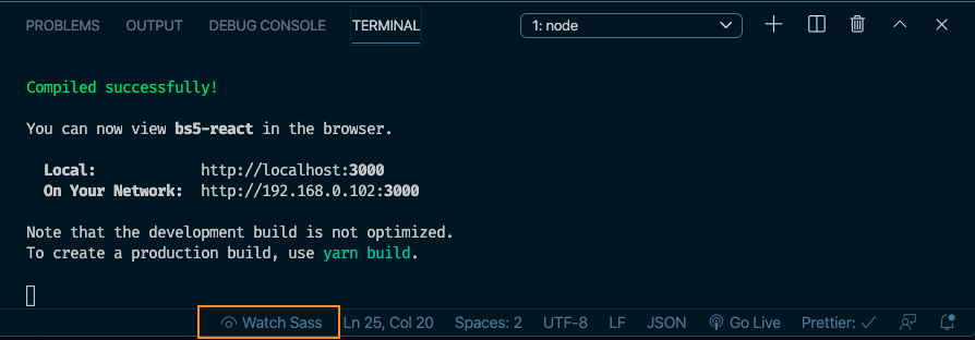
When you click the highlighted Watch Sass button in the screenshot above, it will automatically compile into CSS and create a CSS folder that has all your Bootstrap packages in it.
Finally, you can import the newly created main.scss file at the top of your src/index.js file like this:
import "../src/main.scss";
In our React project, we’ll build a small sign up page with Bootstrap. This should be enough to introduce us to some of the new Bootstrap 5 features. First off, let’s create a user sign up form. Open your App.js file and replace the contents with the snippet below:
import React from "react";
function App() {
  return (
    <div className="container mt-3">
      <h2 class="text-center">Register</h2>
      <div>
        <div class="mb-3">
          <label for="email" class="form-label">
            Email address
          </label>
          <input
            type="email"
            class="form-control"
            id="email"
            placeholder="[email protected]"
          />
        </div>
        <div class="mb-3">
          <label for="password" class="form-label">
            Password
          </label>
          <input
            type="password"
            class="form-control"
            id="password"
            placeholder="Password"
          />
        </div>
        <div class="mb-3">
          <label for="bio" class="form-label">
            Tell us about you
          </label>
          <textarea class="form-control" id="bio" rows="3"></textarea>
        </div>
        <div class="col-12">
          <button class="btn btn-primary" type="submit">
            Register
          </button>
        </div>
      </div>
    </div>
  );
}
export default App;
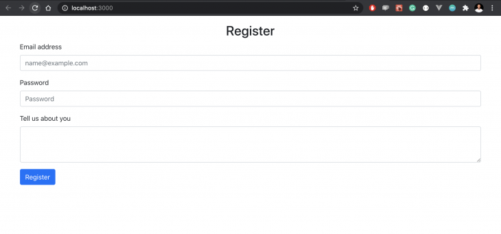
These are regular Bootstrap 4 classes. We’ve only just set up form fields for email, password, and bio. We also added a button to submit the form on completion. If you run this app, you should get the following view on localhost:3000:
Now that we have a regular form to work with, let’s start adding Bootstrap 5 features to further customize the form and give it the look and feel we want.
First, to demonstrate how to override default Bootstrap variables, let’s change the value of the primary color variable that is set on the button. Open the src/main.scss file and update it with this snippet:
// src/main.scss
$primary: #000000;
@import "../node_modules/bootstrap/scss/bootstrap.scss";
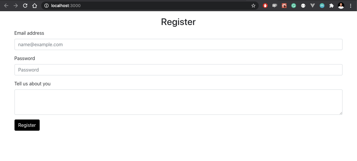
What we’ve done is change the value of the primary color variable from blue to black. As a result, if we save this change and reload the browser, our button should change accordingly from blue to black:
That’s not all, we can also perform the same action on the border-radius variables like so:
//src/main.scss
$primary-btn: #000000;
$border-radius: 15px;
@import "../node_modules/bootstrap/scss/bootstrap.scss";
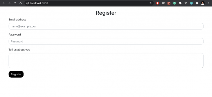
This will exert the border-radius effects on the form fields and the button to give it more visible rounded corners like this:
Now that we’ve seen how to use custom variables, let’s dive into the Utilities API and see how it works. According to the Bootstrap documentation:
The utilities API can be used to change or extend Bootstrap’s utility classes.
In our case, we will add a new custom utility, to the existing Bootstrap utility API. To keep our examples consistent and simple, let’s use the form elements we already have above.
Notice that the default margin-bottom on the form elements above is mb-3. Say, for instance, that it is too small according to my UI specifications and needs to be changed across the board, what we can do is create a new margin-bottom utility that will have my required specifications. In this case, a bigger margin value.
To do that, let’s open the main.scss file and update it with the snippet below:
//Custom utilities
$utilities: (
  "custom-margin": (
    property: margin-bottom,
    class: mb,
    values: (
      0: 0,
      1: 1rem,
      2: 2rem,
      3: 3rem,
    ),
  ),
);
I’ve created a custom-margin utility that specifies the level of margin-bottom property I’d like to apply in my project. The property could be any property of your choice depending on what you want to do, e.g padding, margin, opacity, flex, display, etc. You can create any custom utility of your choice and it will override any existing defaults.
With my custom utility, I’m not locked into using only the Bootstrap provided defaults, as I now have the ability to make my own. To show what this looks like, I’ve added a Utilities section to the initial project in App.js :
//src/App.js
   </div>
      <div>
        <h2 class="text-center"> Utilities! </h2>
        <div class="mb-3">
          <label for="email" class="form-label">
            Email address
          </label>
          <input
            type="email"
            class="form-control"
            id="email"
            placeholder="[email protected]"
          />
        </div>
        <div class="mb-3">
          <label for="password" class="form-label">
            Password
          </label>
          <input
            type="password"
            class="form-control"
            id="password"
            placeholder="Password"
          />
        </div>
        <div class="mb-3">
          <label for="cpassword" class="form-label">
            Confirm Password
          </label>
          <input
            type="password"
            class="form-control"
            id="password"
            placeholder="Confirm Password"
          />
        </div>
    </div>
Notice that classes are still mb-3 however, when you check the browser, you’ll get a different behavior from what we had initially:
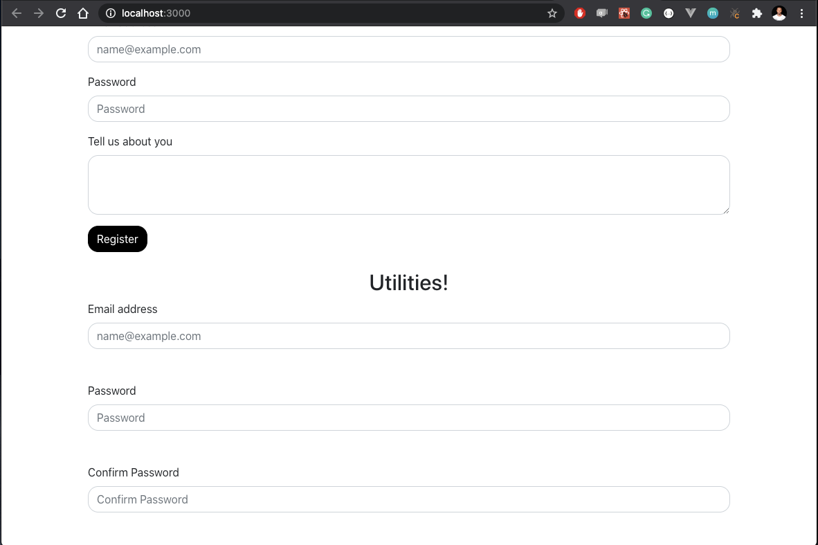
Now, my form is using the custom margin-bottom utility I created, no longer the Bootstrap default. Note that you can do this across other properties like padding, display, etc.
Bootstrap 5 also shipped with a custom icons library. Before the release of Bootstrap 5, if you wanted to use icons on a Bootstrap project, you will have to rely on third-party services like Font Awesome. What’s more? The icons come as SVG so they are scalable and easily customizable using CSS. Fun fact, you can use the Bootstrap icon library in a non Bootstrap project and it will still work like a charm.
Let’s see how we can add icons to our existing form. First, install the icon library by running the command below in your project’s root folder:
npm install bootstrap-icons
Next, update the App.js file to add icons to the form fields like so:
//src/App.js
    <div className="container mt-3">
        <h2 class="text-center"> Utilities! </h2>
        <div class="mb-2 input-group">
          <div class="icon">
            <svg
              width="1em"
              height="1em"
              viewBox="0 0 16 16"
              class="bi bi-envelope"
              fill="currentColor"
              xmlns="http://www.w3.org/2000/svg"
            >
              <path
                fill-rule="evenodd"
                d="M0 4a2 2 0 0 1 2-2h12a2 2 0 0 1 2 2v8a2 2 0 0 1-2 2H2a2 2 0 0 1-2-2V4zm2-1a1 1 0 0 0-1 1v.217l7 4.2 7-4.2V4a1 1 0 0 0-1-1H2zm13 2.383l-4.758 2.855L15 11.114v-5.73zm-.034 6.878L9.271 8.82 8 9.583 6.728 8.82l-5.694 3.44A1 1 0 0 0 2 13h12a1 1 0 0 0 .966-.739zM1 11.114l4.758-2.876L1 5.383v5.73z"
              />
            </svg>
          </div>
          <input
            type="email"
            class="form-control"
            id="email"
            placeholder="[email protected]"
          />
        </div>
        <div>
          <div>
            <div class="input-group mb-2 ">
              <div class="icon">
                <svg
                  width="1em"
                  height="1em"
                  viewBox="0 0 16 16"
                  class="bi bi-person "
                  fill="currentColor"
                  xmlns="http://www.w3.org/2000/svg"
                >
                  <path
                    fill-rule="evenodd"
                    d="M13 14s1 0 1-1-1-4-6-4-6 3-6 4 1 1 1 1h10zm-9.995-.944v-.002.002zM3.022 13h9.956a.274.274 0 0 0 .014-.002l.008-.002c-.001-.246-.154-.986-.832-1.664C11.516 10.68 10.289 10 8 10c-2.29 0-3.516.68-4.168 1.332-.678.678-.83 1.418-.832 1.664a1.05 1.05 0 0 0 .022.004zm9.974.056v-.002.002zM8 7a2 2 0 1 0 0-4 2 2 0 0 0 0 4zm3-2a3 3 0 1 1-6 0 3 3 0 0 1 6 0z"
                  />
                </svg>
              </div>
              <input
                type="text"
                class="form-control"
                id="inlineFormInputGroupUsername2"
                placeholder="Username"
              />
            </div>
          </div>
        </div>
        <div class="mb-2 input-group">
          <div class="icon">
            <svg
              width="1em"
              height="em"
              viewBox="0 0 16 16"
              class="bi bi-lock"
              fill="currentColor"
              xmlns="http://www.w3.org/2000/svg"
            >
              <path
                fill-rule="evenodd"
                d="M11.5 8h-7a1 1 0 0 0-1 1v5a1 1 0 0 0 1 1h7a1 1 0 0 0 1-1V9a1 1 0 0 0-1-1zm-7-1a2 2 0 0 0-2 2v5a2 2 0 0 0 2 2h7a2 2 0 0 0 2-2V9a2 2 0 0 0-2-2h-7zm0-3a3.5 3.5 0 1 1 7 0v3h-1V4a2.5 2.5 0 0 0-5 0v3h-1V4z"
              />
            </svg>
          </div>
          <input
            type="password"
            class="form-control"
            id="password"
            placeholder="Password"
          />
        </div>
        <div class="col-12">
          <button class="btn btn-primary" type="submit">
            Register
          </button>
        </div>
      </div>
    </div>
What we’ve done here is basically replace the form labels we had before with individual Bootstrap icons. This is only one of many different ways through which you can use the icons in your React project. If you refresh the browser again, you should get this new look on the form fields:
![]()
If you choose to, you can use the icons as external images by first saving them into a preferred directory and importing them into your project like so:
<img src="/assets/img/envelope.svg" alt="email icon" width="30" height="30" title="Email">
In addition to having other implementation options, the Bootstrap icons can accept a class attribute for further styling using CSS. In our case, I’ve styled the icons via the index.css file like so:
.icon {
  padding: 10px;
  background: rgb(145, 148, 151);
  color: white;
  min-width: 50px;
  text-align: center;
}
And then adding class="icon" to my individual icons to exert the styling effects on them.
The Bootstrap team has all my praises for this new release, they’ve done a great job mostly at removing the dependency on JQuery, giving us the utilities API and launching an all new icons library. Remember, however, that this release is still in beta and will be subject to more updates and changes. Want to play around with it? Feel free to fork this repo or send a PR, looking forward to what you build.
Install LogRocket via npm or script tag. LogRocket.init() must be called client-side, not
server-side
$ npm i --save logrocket

// Code:

import LogRocket from 'logrocket';
LogRocket.init('app/id');
// Add to your HTML:

<script src="https://cdn.lr-ingest.com/LogRocket.min.js"></script>
<script>window.LogRocket && window.LogRocket.init('app/id');</script>

A side-by-side look at Astro and Next.js for content-heavy sites, breaking down performance, JavaScript payload, and when each framework actually makes sense.

AI-generated tests can speed up React testing, but they also create hidden risks. Here’s what broke in a real app.re

Why the future of DX might come from the web platform itself, not more tools or frameworks.

A hands-on test of Claude Code Review across real PRs, breaking down what it flagged, what slipped through, and how the pipeline actually performs in practice.
Would you be interested in joining LogRocket's developer community?
Join LogRocket’s Content Advisory Board. You’ll help inform the type of content we create and get access to exclusive meetups, social accreditation, and swag.
Sign up now