ch layout shifts
CSS layout shifts refer to the unexpected movement (or shifting) of elements within the layout of a webpage during the rendering process. This occurs when the dimensions or positions of elements change, causing content to reflow or shift on the page. Layout shifts can lead to poor UX, as the movement may disrupt user interaction or make the content difficult to read or access.
In this article, we’ll investigate layout shifts that occur when using the CSS ch unit to size elements. We’ll explore why these shifts occur, consider strategies for avoiding them, and discuss best practices for working with CSS units to help provide a better user experience.
Jump ahead:
ch unitch unit
ch with remCSS layout shifts can occur due to various factors, such as:
ch unitThe CSS ch unit is a relative length unit that represents the width of the “0” (zero) character in the chosen font. It is primarily used to create responsive designs that scale with the font size.
The ch unit allows us to define element widths or spacing relative to the width of the “0” character, which is typically a monospaced character, meaning it occupies the same amount of space as other characters in the font.
With monospaced or fixed-width, fonts like Courier, where all characters are the same width, the ch unit works as an exact measurement. That is, 1ch equals one character. In proportional, or variable-width, fonts like Georgia, any given character could be wider or narrower than the “0” character.
Consider the following example:
<!DOCTYPE html>
<html lang="en">
<head>
<meta charset="UTF-8">
<meta name="viewport" content="width=device-width, initial-scale=1.0">
<style>
.box1 {
width: 25ch;
padding: 3ch;
font-family: Georgia, Arial, sans-serif;
font-size: 16px;
border: 1px solid black;
}
.box2 {
width: 25ch;
padding: 3ch;
font-family: Courier, Arial, sans-serif;
font-size: 16px;
border: 1px solid black;
}
</style>
<title>Document</title>
</head>
<body>
<div class="box1">
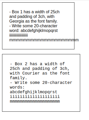
- Box 1 has a width of 25ch and padding of 3ch, with Georgia as the font family.
<br> - Write some 20-character word: abcdefghijklmopqrst iiiiiiiiiiiiiiiiiiii mmmmmmmmmmmmmmmmmmmm
</div>
<br>
<div class="box2">
- Box 2 has a width of 25ch and padding of 3ch, with Courier as the font family.
<br>- Write some 20-character words: abcdefghijklmopqrst iiiiiiiiiiiiiiiiiiii mmmmmmmmmmmmmmmmmmmm
</div>
</body>
</html>
Here’s the output from this code:
If you set the width of an element to 25ch, it will be approximately 25 times the width of the “0” character in the current font. When you change the font size, the element’s width will adjust proportionally.
In the above example, Box 1 uses the Georgia proportional font, which causes the “m” character to extend past the box. Box 2 uses the Courier monospaced font, which results in the box scaling proportionally.
The ch unit is determined by the width of the “0” character in the font of choice. It is meant to serve as a relative unit of measurement that scales with font size. It is not intended to reference graphics or nontextual items, the dimensions of which are often not defined by character widths.
Other CSS units, such as pixels (px), percentages (%), or viewport-based units (vw, vh, vmin, vmax), are commonly used to determine the size and position of photos or other nontextual elements on a webpage.
ch unitThere are several strategies you can use to avoid CSS layout shifts associated with the ch unit. Let’s take a look.
ch to directly size components, utilize padding or margins to provide space and give flexibility for content modifications. This allows the content to change without affecting the overall layoutch unit sizingch with rem: Another strategy for avoiding layout shifts and maintaining more consistent layouts is to replace the ch unit with the relative root em (rem) unit. Here are some examples of how using rem may be beneficial:
rem unit is ideal for developing flexible and responsive designs. You can simply scale the entire layout appropriately by altering the root font size with media queries or CSS preprocessors, maintaining consistent spacing and scaling across various devices and screen sizesch unit, which is determined by the width of a given character, the rem unit is determined by the font size of the root element. Setting a base font size at the root level of your CSS (often in the <html> element) makes all additional element sizes defined with ‘rem’ relative to this base size. This maintains constant size across all parts, irrespective of the font chosenrem unit can improve accessibility by allowing users to change the font size in their browser settings without disrupting the layout. As the relative sizing adjusts to the user’s desired font size, the layout remains steadyrem unit is more predictable than the ch unit. Elements scaled with the rem unit will keep their relative proportions for as long as the root font size stays stable, resulting in more dependable layoutsTo replace the ch unit with rem, follow these steps:
First, set a base font size in the root element of your CSS:
html {
  font-size: 20px; /* Base font size */
}
Next, define your element sizes using rem units:
.container {
  width: 24rem;
  padding: 1rem;
}
By using rem units consistently throughout your layout, you can achieve more reliable and adaptable designs that avoid the layout shifts associated with the ch unit.
For improved user experience, follow these best practices when using CSS units:
em or rem units, are ideal for designing responsive designs; they scale appropriately to the parent or viewport size, enabling you to adjust your layout to multiple devices and screen sizesem and rem for scalable typography: em units are positioned relative to their parent element, whereas rem units are positioned relative to the root element. They offer adaptable and accessible typography that changes proportionately to the user’s font size preferencesch or rem. Refine your design for uniformity and usability across multiple scenariosAvoiding CSS layout shifts is critical for providing a consistent user experience. You may minimize layout shifts and preserve consistency by using fixed-width containers, restricting dynamic content variations, and utilizing responsive design solutions with relative units, such as percentages or viewport-based units. Remember to test and optimize your layouts across several devices and font settings to guarantee stability and a visually appealing user experience.
As web frontends get increasingly complex, resource-greedy features demand more and more from the browser. If you’re interested in monitoring and tracking client-side CPU usage, memory usage, and more for all of your users in production, try LogRocket.

LogRocket lets you replay user sessions, eliminating guesswork around why bugs happen by showing exactly what users experienced. It captures console logs, errors, network requests, and pixel-perfect DOM recordings — compatible with all frameworks.
LogRocket's Galileo AI watches sessions for you, instantly identifying and explaining user struggles with automated monitoring of your entire product experience.
Modernize how you debug web and mobile apps — start monitoring for free.
I migrated 20 production-style components from Tailwind to StyleX. Here’s what the data showed about LOC, CSS bundle size, build time, and type safety.

A guide for using JWT authentication to prevent basic security issues while understanding the shortcomings of JWTs.

Discover how to build, render, and automate product demo videos with Remotion, replacing traditional screen recordings with reusable React code.

Chrome’s Modern Web Guidance embeds modern web platform skills into AI coding agents, helping them choose native HTML, CSS, and browser APIs over legacy patterns.
Would you be interested in joining LogRocket's developer community?
Join LogRocket’s Content Advisory Board. You’ll help inform the type of content we create and get access to exclusive meetups, social accreditation, and swag.
Sign up now

 Learn more →
