

If you’ve pointed an AI agent at a component library lately, you’ve probably watched this happen. You ask Claude Code to build a dashboard; it picks a component that was renamed two versions ago, passes a prop the library dropped, and hands you a file that looks right but won’t compile.
The agent couldn’t see the library’s actual API, so it filled in the gaps with whatever it remembered from training. What it remembered was out of date.
This isn’t a new problem, and the ecosystem has been chipping away at it. shadcn/ui shipped an MCP server. Chakra UI and Storybook did too. The idea behind all of them is the same: give the agent a machine-readable description of the components so it can query the real API instead of guessing.
Astryx is Meta’s take on that idea. Meta open-sourced it on 28 June 2026 under the MIT license after eight years of internal use. It’s built on React and StyleX, and it ships with a CLI and an MCP server that give the agent a manifest of every component, prop, and default.
I wanted to know whether that actually changes how an agent behaves. So I connected Claude Code to Astryx, built three real UIs with it, then built the same three against shadcn/ui without a manifest. Here’s what held up and what didn’t.
I started with shadcn/ui, partly because it’s what many React developers reach for and partly because it recently shipped a change that illustrates the problem. shadcn/ui v4 moved off Radix and onto base-ui. That one change invalidates a lot of what an agent may have learned from older shadcn code, with no obvious way for the agent to know the underlying model changed.
So it wrote what it remembered. It put asChild on DropdownMenuTrigger, the classic Radix composition pattern. In v4, that prop is gone, and the build failed.
To sort it out, I opened input.tsx and button.tsx to check the new base-ui patterns, then leaned on what I already knew about shadcn for the rest. It worked, but something important was missing: there was no manifest to ask and no CLI to query. The agent’s only sources were its own memory and whatever I could infer from the source.
There was a second, smaller issue in my first run, a TypeScript complaint on an onChange handler, but I couldn’t reliably reproduce it afterward. It seems to depend on how strict your tsconfig is, so I’m not going to lean on it.
Setup friction also piled up before a single component rendered. Tailwind v4 needed a manual vite.config.ts change. shadcn init dropped files into a literal @/ folder that I had to move into src/ by hand. TypeScript 6.0 wanted an ignoreDeprecations flag for a deprecated baseUrl.
None of that is Astryx’s doing, but it is part of the practical cost of the comparison.
shadcn isn’t standing still. It now ships its own MCP server, and Chakra UI and Storybook have added similar tooling.
All of these systems, Astryx included, started as tools for humans. Astryx wasn’t designed for agents eight years ago. What’s different is that its CLI, manifest, MCP server, and AGENTS.md file arrived together as part of the public release rather than being added later.
Whether that packaging changes how an agent behaves is the question. So let’s test it.
Astryx is a component library plus the tooling around it. You import precompiled CSS and typed React components. There’s no build plugin or separate styling library you need to adopt.
The component count depends on where you look. The GitHub repo lists 90-plus components, Meta’s docs say 150-plus, and when I ran npx astryx init, the generated AGENTS.md listed 153. Meta says Astryx has powered more than 13,000 of its internal apps over eight years, though that’s a company claim rather than something I independently verified.
For an agent, three pieces matter. The CLI, available as astryx or xds, prints a component’s full documentation on demand. The MCP server exposes the same surface over the protocol used by tools such as Claude Code, Cursor, and Copilot. Then there’s the manifest, which provides a machine-readable description of every component and prop.
The agent doesn’t have to scrape a docs site. It can query the system directly.

Note: Building on StyleX doesn’t require you to use StyleX yourself. Astryx authors its styles with StyleX, but that implementation detail is largely invisible to consumers. You can override components through className using Tailwind, CSS Modules, or plain CSS. You’ll need React 19 or later.
For the first test, I asked for an analytics dashboard with sidebar navigation, a top bar and user menu, four stat cards, a chart placeholder, and a data table.
The agent didn’t guess a single component name. It ran npx astryx component --list to inspect the inventory, then queried each component it planned to use: AppShell, SideNav, Card, DropdownMenu, Table, Grid, and about a dozen more.
Eighteen lookups in total. Each returned real props and, sometimes, guidance I wouldn’t have thought to ask for. The Card docs explicitly warn that cards aren’t the default layout tool. The AppShell docs pointed me to height="fill" for dashboards and contentPadding={0} for tables.
Then the agent wrote the file, and it still got four things wrong.
It guessed variant="chromeless" on a button when the real value was ghost. It put startIcon on the dropdown trigger, assuming the standard button prop applied, even though the trigger accepts a narrower set and expects icon. It forgot that SideNavSection requires a title. Finally, it imported TableRow and TableCell out of habit before realizing Astryx’s Table is data-driven and doesn’t use them.
// Guessed a variant name. It doesn't exist.
variant: 'chromeless',

// Corrected to a real one.
variant: 'ghost',

// Assumed the standard button prop applied to the dropdown trigger.
startIcon: <Avatar name="Marvel Ken" size="sm" />,

// The trigger accepts a narrower set. The real prop is icon.
icon: <Avatar name="Marvel Ken" size="sm" />,
Every one of those errors was a wrong prop name, and TypeScript caught every one at build time before anything rendered. The agent never invented a component that didn’t exist because it had already pulled the real component list.
After those four fixes, the build passed with no runtime errors. The manifest didn’t make the agent perfect. It made its mistakes cheap.
The Table component is where an agent working from memory would be most likely to faceplant. Astryx doesn’t build tables from TableRow and TableCell children. It accepts data and a column definition, with width helpers such as proportional() and pixel().
// Astryx: data-driven, no row or cell children.
<Table<TransactionRow>
  data={transactions}
  columns={[
    {key: 'date', header: 'Date', width: proportional(1)},
    {key: 'customer', header: 'Customer', width: proportional(1)},
    {key: 'amount', header: 'Amount', width: pixel(100)},
    {
      key: 'status',
      header: 'Status',
      width: pixel(100),
      renderCell: (row) => (
        <Badge
          variant={statusVariant(row.status as string)}
          label={row.status as string}
        />
      ),
    },
  ]}
  density="compact"
  hasHover
/>
For comparison, here’s the same table the agent built against shadcn, using the children-based structure it initially started to reach for with Astryx before the manifest corrected it.
// shadcn: children-based composition.
<Table>
  <TableHeader>
    <TableRow>
      <TableHead>Date</TableHead>
      <TableHead>Customer</TableHead>
      <TableHead>Amount</TableHead>
      <TableHead>Status</TableHead>
    </TableRow>
  </TableHeader>
  <TableBody>
    {transactions.map((tx, i) => (
      <TableRow key={i}>
        <TableCell className="text-xs">{tx.date}</TableCell>
        <TableCell className="text-xs">{tx.customer}</TableCell>
        <TableCell className="text-xs">{tx.amount}</TableCell>
        <TableCell>
          <Badge variant={statusVariant(tx.status)}>{tx.status}</Badge>
        </TableCell>
      </TableRow>
    ))}
  </TableBody>
</Table>
An agent trained on children-based component libraries has good reason to reach for the second pattern. The one reading Astryx’s manifest wrote the first.
This test shows the difference between a theme system that can cascade through the whole component library and one whose styling is distributed across tokens and component classes. It’s also where Astryx looked strongest.
I originally wanted to swap both libraries to the same brutalist theme to keep the comparison fair. I couldn’t. Astryx’s brutalist theme package, @astryxdesign/theme-brutalist, is listed on GitHub but wasn’t published to npm when I tested it.
I used Astryx’s gothic theme instead and hand-approximated a brutalist look on the shadcn side. The resulting UIs have different aesthetics, so the useful comparison here is the mechanism: how much work each theme swap required and how completely it propagated through the UI.
With Astryx, switching from neutral to gothic meant changing two files: the CSS import and the theme provider prop. Four lines changed, with no component files touched.
--- a/src/index.css
+++ b/src/index.css
-@import '@astryxdesign/theme-neutral/theme.css';
+@import '@astryxdesign/theme-gothic/theme.css';

--- a/src/main.tsx
+++ b/src/main.tsx
-import {neutralTheme} from '@astryxdesign/theme-neutral/built';
+import {gothicTheme} from '@astryxdesign/theme-gothic/built';

-    <Theme theme={neutralTheme}>
+    <Theme theme={gothicTheme}>
The build worked immediately because Astryx layers its theme tokens through a CSS cascade that reaches every component. Change the theme, and the UI restyles with it.
shadcn doesn’t have an equivalent theme package to swap, so I changed the token values directly with a handful of sed commands, about six edits.
It got me partway.
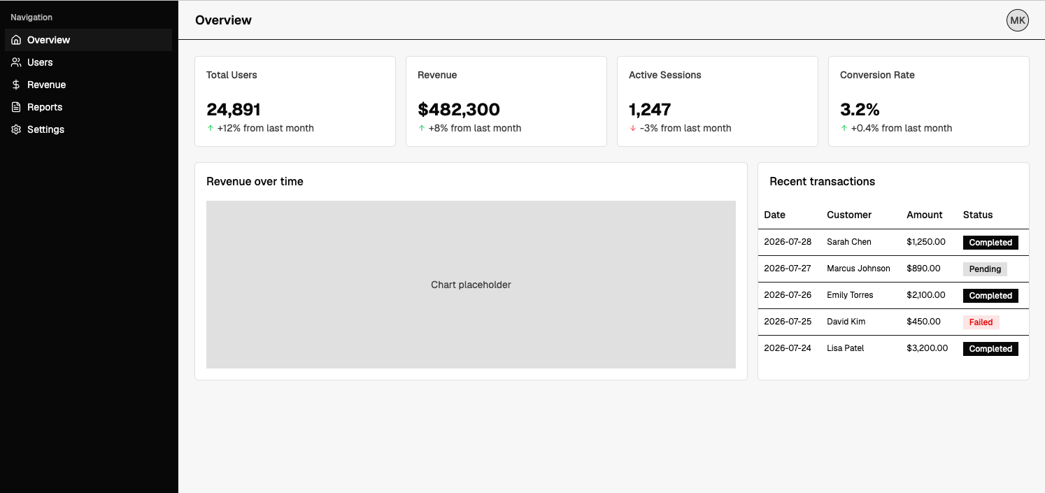
The sidebar went near-black and most corners flattened, but the theme didn’t propagate completely. The reason is structural. shadcn splits styling between CSS variables and Tailwind classes hardcoded in its component templates.
Setting --radius: 0 flattens token-driven corners, but a component with a hardcoded rounded-lg class ignores that token. Typography has the same limitation: components can hardcode classes such as text-sm and font-medium, so a broader typographic change requires editing component source.
A complete theme swap therefore crosses into the component files. Astryx’s required four changed lines and touched none.
The last task was a settings modal with a form, three toggles, and a save button.
Both libraries had every component I needed. shadcn provided Dialog, Input, Switch, Label, and Separator, and the agent composed them without anything missing. The difference was how much layout scaffolding it had to create around those components.
With shadcn, the modal needed extra wrapper divs with flex and gap utilities to hold the layout together. With Astryx, the agent used VStack, HStack, and FormLayout, primitives that already carry spacing behavior. More of the layout came from the design system itself.
The Switch makes the difference especially clear. Astryx uses value and onChange instead of the checked and onCheckedChange pattern you might expect from other libraries. It also provides description and labelSpacing props for exactly the labeled-toggle pattern the task required.
The agent knew that because it queried the component.
// Astryx: label, description, and spacing are part of the component.
<Switch
  label="Email Notifications"
  description="Receive product updates and account alerts"
  value={emailNotifications}
  onChange={setEmailNotifications}
  labelSpacing="spread"
/>
The same toggle takes more scaffolding with shadcn because the label and description layout aren’t part of the component itself.
// shadcn: you assemble the label and description with wrapper divs.
<div className="flex items-center justify-between">
  <div className="flex flex-col gap-0.5">
    <Label htmlFor="emailNotif">Email Notifications</Label>
    <span className="text-xs text-muted-foreground">
      Receive product updates and account alerts
    </span>
  </div>
  <Switch
    id="emailNotif"
    checked={emailNotifications}
    onCheckedChange={setEmailNotifications}
  />
</div>
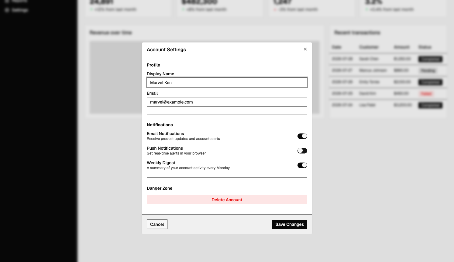
The two modals are shown on different themes, gothic for Astryx and the brutalist-inspired tokens for shadcn, because that’s where each build ended up after the previous test. The useful comparison is the composition rather than the color.
Here are the counts from the two runs, taken directly from the agent’s log rather than from a scoring system I imposed afterward.
| Metric | Astryx (MCP connected) | shadcn/ui (no manifest) |
|---|---|---|
| Component lookups before writing | 18, via the CLI | 0, read source and used prior knowledge |
| Fixes needed | 4 | 1 confirmed (asChild) |
| What the fixes were | Wrong prop names, caught at build | Outdated Radix asChild pattern on base-ui |
| Components used | 27 | 22 |
| Theme swap | 4 lines, one theme import | A few sed edits to token values |
| Theme swap result | Complete, no component files touched | Partial, radius and type stayed |
| Setup friction | None | Tailwind plugin, install hang, misplaced files, tsconfig flag |
By raw count, Astryx looks worse: four fixes compared with shadcn’s one. The count hides the important difference, which is what kind of fixes they were.
Astryx’s four errors were incorrect prop names that TypeScript rejected within seconds. The confirmed shadcn error came from an outdated mental model of the library: asChild belonged to the Radix-based version the agent knew, while v4 had moved on to base-ui.
The manifest didn’t stop the agent from making mistakes. It changed the cost of those mistakes.
Astryx is still a young public project, and a fair verdict needs to account for that.
It was in Beta at v0.0.14 when I tested it. The public project is only weeks old, and its APIs can still shift before v1.0. Eight years of internal use across a reported 13,000 Meta apps is evidence of a mature internal system. It doesn’t tell us how stable the newly public tooling will be.
The third-party ecosystem is also almost bare. I found one package on npm, @atomic-testing/component-driver-astryx, and little else. There isn’t yet a large body of community patterns or Stack Overflow answers to fall back on when you hit an edge case.
The brutalist theme package advertised in the repo, @astryxdesign/theme-brutalist, wasn’t available on npm when I tested it, which is why my theme swap used gothic instead. It’s a small issue, but exactly the kind of rough edge you’d expect from a Beta release.
The component count is inconsistent too: 90-plus in the repo, 150-plus in Meta’s docs, and 153 in the manifest generated by my CLI. Some components appear to exist internally but haven’t been extracted publicly yet.
The StyleX concern is smaller than it might initially sound. You don’t need to adopt StyleX to use Astryx because its CSS is precompiled, and you can override components through className.
The more consequential question is whether you want to build on a library whose public life is still measured in weeks. If you’re evaluating your technical debt exposure before committing to a new dependency, that’s worth factoring in.
The important result from these tests is that Astryx didn’t stop the agent from making mistakes. It kept making them. What changed was the kind of mistake it made and how expensive each mistake was to diagnose.
With Astryx, the errors were incorrect props that TypeScript caught immediately. With shadcn, the confirmed error came from a mental model the agent had no way to know was outdated. The theme test tells a similar story: four changed lines produced a complete Astryx restyle, while the shadcn version required manual token edits and still only partially changed the UI.
Whether you should adopt Astryx today is a separate question from whether its approach makes sense. Giving an agent a real contract for the design system instead of relying on whatever API it remembers from training is clearly useful, and Astryx isn’t alone in moving that way. shadcn, Chakra UI, Storybook, and others are pursuing similar approaches.
Astryx’s implementation is unusually complete for something this new, but the public project is still young. For a greenfield internal tool where you control the stack and want an agent doing substantial UI composition, it’s worth a serious look. More broadly, it offers a useful preview of what AI-friendly design systems are likely to be expected to provide.
Install LogRocket via npm or script tag. LogRocket.init() must be called client-side, not
server-side
$ npm i --save logrocket

// Code:

import LogRocket from 'logrocket';
LogRocket.init('app/id');
// Add to your HTML:

<script src="https://cdn.lr-ingest.com/LogRocket.min.js"></script>
<script>window.LogRocket && window.LogRocket.init('app/id');</script>

Explore how looping Transformers reuse layers and compare with traditional GPT models in reasoning tasks.

Learn how one solo developer used multiple Grok Bot AI agents to test, report bugs, fix code, and monitor deployments — hands-free, on a $30/month plan.

Compare the top AI development tools and models of October 2026. View updated rankings, feature breakdowns, and find the best fit for you.

Can AI agents debug React bugs across browsers? I tested Chrome, Safari, and Firefox debugging MCPs on four bugs to compare their findings, workflows, and effectiveness.
Hey there, want to help make our blog better?
Join LogRocket’s Content Advisory Board. You’ll help inform the type of content we create and get access to exclusive meetups, social accreditation, and swag.
Sign up now
 Learn more →