When building frontend applications, performance roadblocks can be encountered when trying to re-render components such as modals, pop-ups, and buttons in different locations. Passing stuff around via props isn’t an option for large scale projects. Vue’s latest version aims to introduce a solution for this issue — Vue portal.
Vue portal lets you render a component in a different location in your DOM tree. Let’s take a look at how portals can make the rendering of components such as modals and pop-ups more efficient.
The Replay is a weekly newsletter for dev and engineering leaders.
Delivered once a week, it's your curated guide to the most important conversations around frontend dev, emerging AI tools, and the state of modern software.
Portals have always been around in Vue just in the form of workarounds and plugins. portal-vue is a popular Vue plugin that creates a portal element in your app and renders any markup – text, buttons, pop-ups, or modals within that element in a different DOM node. We’ll use portal-vue to illustrate how portals operate. First, install it in your project like you would any other plugin:
npm install portal-vue --save
Now, to get a clearer view of what we’re trying to build – let’s illustrate our app’s folder structure:
+-- public
|   +-- favicon.ico
|   +-- index.html

+-- src
|   +-- main.js
|   +-- App.vue
|   +-- components
    |   +-- UserAgreement.vue
    |   +-- UserContacts.vue

|   +-- package.json
Next, enable the plugin in your project:
// main.js

import Vue from 'vue'
import PortalVue from 'portal-vue'
import App from 'App.vue'

Vue.use(PortalVue)

new vue ({
  el:  '#app',
  render: h => h(App)
})
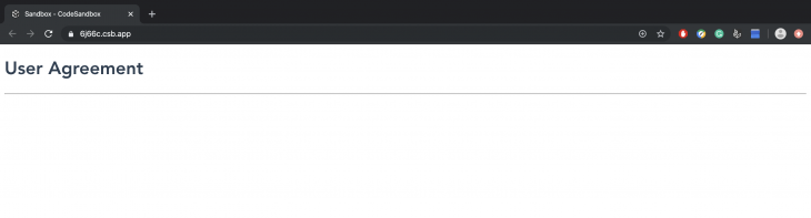
Let’s say we’ve got some data that needs to be reused in different places in our app – such as a user agreement. To reuse the user agreement, we wrap it in a portal element:
<!-- ./components/UserAgreement.vue -->

<template>
  <div class="user-agreement">
    <h1>User Agreement</h1>
    <portal to="user-contacts">
      <h3>I hereby agree to have my bank account debited for life by XYZ Corp</h3>
    </portal>
  </div>
</template>
<script>
export default {
  name: "UserAgreement"
};
</script>
Next, let’s import the UserAgreement component to the root component of our app:
<!-- App.vue -->

<template>
  <div id="app">
    <UserAgreement/>
  </div>
</template>
<script>
import UserAgreement from "./components/UserAgreement";

export default {
  name: "App",
  components: {
    UserAgreement
  }
};
</script>
<style>
#app {
  font-family: "Avenir", Helvetica, Arial, sans-serif;
  -webkit-font-smoothing: antialiased;
  -moz-osx-font-smoothing: grayscale;
  color: #2c3e50;
}
</style>
And try to display it:
The above code sample, rendered alone won’t display what is in the portal element. The reason being that although the destination of the portal was specified (as user-contacts ) in UserAgreement.vue , it was never created. Let’s try to specify a destination for the portal by creating a second component, UserContacts.vue:
<!-- ./components/UserContacts.vue -->

<template>
  <div class="contacts">
    <h1>Page Two</h1>
    <portal-target name="user-contacts"/>  <!-- specify the destination here -->
  </div>
</template>
<script>
export default {
  name: "UserContacts"
};
</script>
Next, we’ll update App.vue accordingly:
<!-- App.vue -->

<template>
  <div id="app">
    <UserAgreement/>
    <hr>
    <UserContacts/>
  </div>
</template>
<script>
import UserAgreement from "./components/UserAgreement";
import UserContacts from "./components/UserContacts";
export default {
  name: "App",
  components: {
    UserAgreement,
    UserContacts
  }
};
</script>
<style>
#app {
  font-family: "Avenir", Helvetica, Arial, sans-serif;
  -webkit-font-smoothing: antialiased;
  -moz-osx-font-smoothing: grayscale;
  color: #2c3e50;
}
</style>
Now when we display our root component, we can see the content wrapped by the portal element:
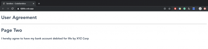
When UserAgreement and UserContact are rendered in the root component, the text in the portal element will be displayed. This makes it easy to reuse elements like buttons, modals, and popup notifications as you can have multiple portal elements in a single component that can then be sent to different components that need them. Think of setting up a button component in your project, enclosing buttons in different portals and just transporting them to wherever they are needed within that project.
Note that the capabilities of portals aren’t just limited to single file components. In a case where you may need to display a component via a .html file, you can use the target-el prop to get through. Let’s say we need to enclose a button that contains a modal functionality asking users if they want to remove an item or not.
+-- App
|   +-- index.html
|   +-- style.css
|   +-- index.js
First, we’ll include vue and portal-vue via the script tag:
<!-- index.html -->

<html>
  <head>
    <script src="https://unpkg.com/[email protected]/dist/vue.js"></script>
    <script src="https://unpkg.com/[email protected]/dist/portal-vue.js"></script>
  </head>
</html>
Then we’ll create the modal that displays the message:
<!-- index.js -->

Vue.component('RemovePhoneModal', {
  template: `
      <div v-show="open" @click="close">
        <div @click.stop>
          <h1>
           Are you sure you want to remove this phone from your list?
          </h1>
          <div>
              <button type="button" @click="close">
                Cancel
              </button>
              <button type="button">
                Remove
              </button>
            </div>
          </div>
        </div>
      </div>
  `,
  props: ['open'],
  methods: {
    close() {
      this.$emit('close')
    }
  }
})
Next, still in index.js we’ll create a component for the button, this component will embed the modal:
Vue.component('RemovePhoneButton', {
  template: `
    <button @click="openModal">
      <span>Remove Phone</span>
        <portal target-el="#modals">
          <RemovePhoneModal :open="open" @close="close" />
        </portal>
    </button>
  `,
  data() {
    return {
      open: false,
    }
  },
  methods: {
    openModal() {
      this.open = true
    },
    close() {
      this.open = false
    }
  }
})
Then we’ll create a Vue instance for our app:
const app = new Vue({
  el: '#app',
})
Next, we’ll create our HTML template:
<!-- index.html -->

<!DOCTYPE html>
<html lang="en">
<head>
    <meta charset="UTF-8">
    <meta name="viewport" content="width=device-width, initial-scale=1.0">
    <meta http-equiv="X-UA-Compatible" content="ie=edge">
    <title>Phone App</title>
    <link rel="stylesheet" href="style.css">
</head>

<body>
<div id="app">
  <!-- This button will probably be surrounded... -->
    <RemovePhoneButton></RemovePhoneButton>
  <!-- ...by a lot of markup for your site. -->


  <!-- At the very end of your markup to avoid absolute/relative positioning bugs... -->

  <div id='modals'></div>
</div>

<!-- ...Insert the portal above here.-->
  </body>
</html>
Last, we’ll add some transitions via Tailwind CSS. Include its CDN script in the <head> tag of your index.html file:
<!-- index.html -->

<head>
   <link rel="stylesheet" href="https://unpkg.com/[email protected]/dist/tailwind.min.css">
</head>
Then define your CSS transition, it can be different from mine if you wish:
<!-- style.css -->

.fade-shrink-in-enter-active,
.fade-shrink-in-leave-active {
  transition: all .3s ease;
}

.fade-shrink-in-enter,
.fade-shrink-in-leave-to {
  opacity: 0;
  transform: scale(1.1);
}
For reference purposes, you can view the Pen of this demo here. Let’s take a look at how this works in the video snippet below:
Screen Recording 2019 12 23 at 19 33 06
A short Vue demo
A lot of significant improvements have been made available in Vue 3 such as:
v-modelsPortals are no exception because in Vue’s latest release, they will be an inbuilt feature. It’s important to note that their basic functionality will still remain the same – the only difference will be that portals won’t have to be installed as they will come in the form of a Portal element. They’ll have only one property, target which renders the content in the Portal element to a DOM element that has the same query selector ( id or class ) passed to the target prop.
Let’s try to recreate one of our previous examples by implementing a portal as it should appear in Vue 3:
<!-- index.js -->

Vue.component('RemovePhoneModal', {
  template: `
      <div v-show="open" @click="close">
        <div @click.stop>
          <h1>
           Are you sure you want to remove this phone from your list?
          </h1>
          <div>
              <button type="button" @click="close">
                Cancel
              </button>
              <button type="button">
                Remove
              </button>
            </div>
          </div>
        </div>
      </div>
  `,
  props: ['open'],
  methods: {
    close() {
      this.$emit('close')
    }
  }
})
Next, in our index.html file, we’ll have the Portal element wrap RemovePhoneModal with an id which will be referenced in a different DOM element:
<!-- index.html -->

<html>
  <body>
<!-- The portal can be embedded in any Vue component where it's needed -->
    <VueComponent>
      <Portal target="#modal">
        <RemovePhoneModal />
      </Portal>
    </VueComponent>
<!-- A DOM element with the same ID is inserted just before the closing body tag -->
    <div id="modal"></div>
  </body>
<html>
Like the details we mentioned earlier in this post, Vue 3 certainly promises a lot of exciting features. It will be very interesting to see how they are used in building projects, what features will prove useful, and what features will be frowned upon by the ecosystem. Personally, I think portal is here to stay as it will go a long way in making reusable elements easy to work with.
Debugging Vue.js applications can be difficult, especially when users experience issues that are difficult to reproduce. If you’re interested in monitoring and tracking Vue mutations and actions for all of your users in production, try LogRocket.
LogRocket lets you replay user sessions, eliminating guesswork by showing exactly what users experienced. It captures console logs, errors, network requests, and pixel-perfect DOM recordings — compatible with all frameworks.
With Galileo AI, you can instantly identify and explain user struggles with automated monitoring of your entire product experience.
Modernize how you debug your Vue apps — start monitoring for free.

TSRX adds first-class control flow, conditional hooks, and scoped styles to React via a TypeScript compiler extension — no new framework required.

Learn how to build a full React Native auth system using Better Auth and Expo — with email/password login, Google OAuth, session persistence, and protected routes.

Compare the top AI development tools and models of June 2026. View updated rankings, feature breakdowns, and find the best fit for you.

Learn how Bloom filters reduce database lookups for username availability checks while preserving correctness at scale.
Would you be interested in joining LogRocket's developer community?
Join LogRocket’s Content Advisory Board. You’ll help inform the type of content we create and get access to exclusive meetups, social accreditation, and swag.
Sign up now

