I like Tailwind for two reasons. First, it makes building responsive interfaces so much easier. When you master all the utility classes, you really will be amazed at how fast you can adjust your UI elements from one interface to another.
Secondly, since you can only use Tailwind’s predefined classes to style your components, it creates a strong convention in your frontend team, which makes the process of working together much easier.
Ultimately, using Tailwind helps you create cleaner code faster with fewer bugs. Today, I want to share ten great tips with you that I really do think we can use as frontend developers to be more productive while building an application with Tailwind CSS.
Let’s get started!
!important to true.This option will append all the utility classes with the !important keyword.
This is especially useful when you’re dealing with third-party libraries that add style to some elements. This way, you’ll make sure that when you add a new utility class to these elements, they will always be applied.
javascript
// tailwind.config.js
module.exports = {
  important: true,
};
Now, all of Tailwind’s utility classes will be generated as !important:
css
.mt-1 {
  margin-top: 1px !important;
}
.mt-2 {
  margin-top: 2px !important;
}
.mt-3 {
  margin-top: 3px !important;
}
/* And so on... */
Set some settings for your container in your configuration file and it will automatically be applied to all .container classes.
javascript
// tailwind.config.js
module.exports = {
  theme: {
    container: {
      center: true,
      padding: "1.5rem",
    },
  },
};
So, there is no need to do this:
html
<div class="container p-6 mx-auto"></div>
Now, you can just do this:
html
<div class="container"></div>
The extend property in the configuration file will automatically generate and add new classes for your project. It is convenient when you need additional classes for a given CSS property.
For instance, when it comes to max-height, you only have access to the following classes:
.max-h-full    /* max-height: 100%; */
.max-h-screen  /* max-height: 100vh; */
But, what if you need to control the max-height property with a little bit more precision with classes like: max-h-xs, max-h-sm or max-h-md?
Well, here’s how you can generate them:
javascript
    // tailwind.config.js
    module.exports = {
      theme: {
        extend: {
          maxHeight: {
            xs: "20rem",
            sm: "24rem",
            md: "28rem",
            lg: "32rem",
            xl: "36rem",
            "2xl": "42rem",
            "3xl": "48rem",
            "4xl": "56rem",
            "5xl": "64rem",
            "6xl": "72rem",
          },
        },
      },
    };
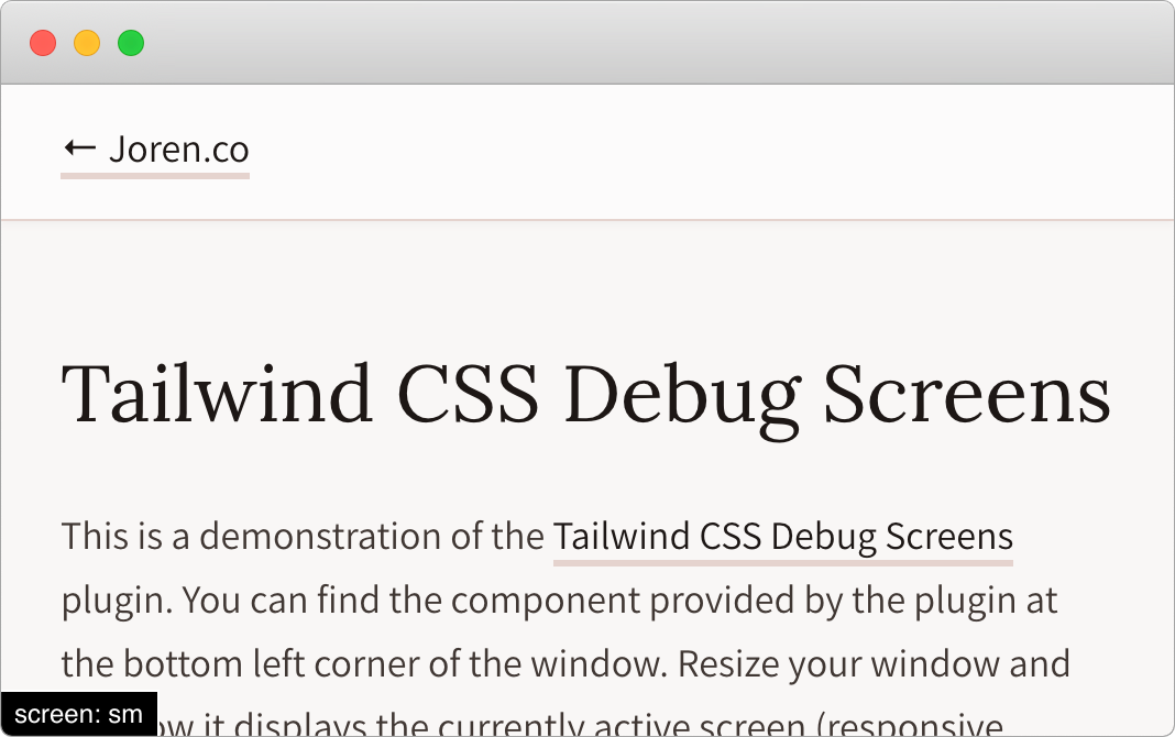
The TailwindCSS Debug Screens plugin will let you display the currently active screen in development mode. It does not take more than a few seconds to set up, and it will probably save you a lot of time in the long run. This is how you can Install it:
bash
npm install tailwindcss-debug-screens --save-dev
javascript
// tailwind.config.js
module.exports = {
  plugins: [require("tailwindcss-debug-screens")],
};
Add the class debug-screens to your <body> tag.
html
<body class="debug-screens"></body>
From the documentation: preflight is a set of base styles for Tailwind projects that are designed to smooth over cross-browser inconsistencies and make it easier for you to work within the constraints of your design system.
This means that preflight will remove all of the default margins, font sizes, etc., for all your elements like your headings, blockquotes, lists, and so on.
A few months ago, I needed to progressively integrate Tailwind into an existing project (which had rigorous base styles). The issue with preflight is that it was breaking all the application interfaces. It took me some time before I could find a way to disable it:
javascript
// tailwind.config.js
module.exports = {
  corePlugins: {
    preflight: false,
  },
};
If your designers are being used with breakpoints that are different from the ones provided by Tailwind, no worries! Just open your configuration file and define your own. Keep in mind that you can create breakpoints with both min-width and max-width definitions if necessary.
javascript
// tailwind.config.js
module.exports = {
  theme: {
    screens: {
      sm: { min: "640px", max: "767px" },
      md: { min: "768px", max: "1023px" },
      lg: { min: "1024px", max: "1279px" },
      xl: { min: "1280px" },
    },
  },
};

// Will equal to
// tailwind.config.js
module.exports = {
  theme: {
    screens: {
      sm: "640px",
      // => @media (min-width: 640px) { ... }
      md: "768px",
      // => @media (min-width: 768px) { ... }
      lg: "1024px",
      // => @media (min-width: 1024px) { ... }
      xl: "1280px",
      // => @media (min-width: 1280px) { ... }
    },
  },
};
The spacing property in your configuration file allows you to override the default spacing/sizing scale in a snap.
javascript
// tailwind.config.js
module.exports = {
  theme: {
    spacing: {
      "1": "8px",
      "2": "12px",
      "3": "16px",
      "4": "24px",
      "5": "32px",
      "6": "48px",
    },
  },
};
You are probably used to the order property if you are using flexbox. Unfortunately, Tailwind does not include it.
A great workaround is to use the tailwindcss-flexbox-order extension.
You will then be able to configure and generate the flexbox order classes with all of their responsive variants.
By default, here are the utility classes that are generated:
css
.-order-1 {
  order: -1;
}
.order-0 {
  order: 0;
}
.order-1 {
  order: 1;
}
.order-2 {
  order: 2;
}
.order-3 {
  order: 3;
}
.order-4 {
  order: 4;
}
.order-5 {
  order: 5;
}
Adam Wathan (Tailwind’s creator), said this in a tweet:
Confession: The
applyfeature in Tailwind only exists to trick people who are put off by long lists of classes into trying the framework. You should almost never use it. Reuse your utility-littered HTML instead.
In a nutshell, this can result in maintainability issues. I built several projects, and I seldom had to rely on them. So trust me, this is possible!
If you are using a framework like Vue.js or React (where you define everything as components), it will be simple to avoid using the @apply feature. I rarely (if ever) use it.
I also have another reason for not using it much: I find it easier to debug the code when I only use the utility classes in my code. You can see which style is applied to each tag as you only have one place where your team can control the style (i.e., the classes).
So, use the @apply feature carefully so you can save yourself some time in the long run!
Tailwind is a growing community full of passionate front-end developers. You can reach other users through the following channels:
That’s all for me! It would have made my life so much easier to know these tips before starting a project with Tailwind (especially the tailwindcss-debug-screens).
Since I started applying them, working with Tailwind has become even more comfortable. If you have another tip that is not listed here, please explain it in a comment and share it with all of us.
One final note: to always get the latest updates on what the Tailwind community is building, you can look at the README.md file of Awesome Tailwind. In a few seconds, you’ll be able to see all the new packages and resources that you should be paying attention to.
Happy Coding!
As web frontends get increasingly complex, resource-greedy features demand more and more from the browser. If you’re interested in monitoring and tracking client-side CPU usage, memory usage, and more for all of your users in production, try LogRocket.

LogRocket lets you replay user sessions, eliminating guesswork around why bugs happen by showing exactly what users experienced. It captures console logs, errors, network requests, and pixel-perfect DOM recordings — compatible with all frameworks.
LogRocket's Galileo AI watches sessions for you, instantly identifying and explaining user struggles with automated monitoring of your entire product experience.
Modernize how you debug web and mobile apps — start monitoring for free.

Learn how to use Fallow to analyze AI-generated code, detect dead code, duplicate logic, and complexity issues, and integrate automated code quality checks into your AI-assisted development workflow.

Learn how to protect full-stack projects from NPM supply chain attacks with a practical security checklist.

Explore 15 essential MCP servers for web developers to enhance AI workflows with tools, data, and automation.

Learn how contrast-color() automatically picks accessible text colors using native CSS, without JavaScript.
Would you be interested in joining LogRocket's developer community?
Join LogRocket’s Content Advisory Board. You’ll help inform the type of content we create and get access to exclusive meetups, social accreditation, and swag.
Sign up now

 Learn more →
