CSS Components is a tiny (2.3Kb) modern utility for composing CSS classes to React components. You can think of it as a wrapper with a best-in-class developer experience (DX).

The release of React 18 has made server components more mainstream and the default way to create React apps. However, DX is a common pain point while using CSS-in-JS in modern React web apps.
CSS Components aims to address this issue by modeling its APIs closely after popular CSS-in-JS libraries such as styled-components and Stitches. If you have already used these in your project, learning CSS Components will be smooth sailing.
In this article, you will learn how to create your own composable components using CSS Components, convert them into Hooks, and use them across your React project. We’ll also compare CSS Components to similar solutions available.
Jump ahead:
Button utilityYou can explore the final project on GitHub or simply follow along as we build it in this tutorial.
The Replay is a weekly newsletter for dev and engineering leaders.
Delivered once a week, it's your curated guide to the most important conversations around frontend dev, emerging AI tools, and the state of modern software.
CSS Components works on all modern browsers up to at least the last two versions. While it’s limited to React only, it strives to be really good at composing styles in your React application.
Although you can begin creating apps with CSS Components, it is not yet considered production-ready. The core team is actively working on a stable release.
Otherwise, using CSS Components is quite straightforward. You define a configuration using its styled API — similar to Stitches — and then begin exporting your variants:
import { styled } from "@phntms/css-components";
const Button = styled("button", {
  css: "rootStyles",
  variants : {
    // add your variants here
});
You can now export this Button component and use it anywhere inside your project by passing the various props that you defined in your configuration under variants in the code above.
CSS Components was built with modern server-side rendering in mind. It supports mixing and matching with any component library of your choice, or even CSS libraries such as CSS modules, SASS, and others.
While working with a component library, you can turn the library’s pre-defined components into Hooks and mix them with the CSS Components styled API to add your own set of custom CSS styles. This can help make your code more readable and easier to manage.
To add CSS Components to your React project, first, initialize a simple React App using a framework of your choice. This post uses Vite for its simplicity and to focus more on CSS Components rather than the boilerplate itself.
Create a new Vite project by running the following command:
npm create vite@latest
Select React as your choice of framework when prompted by the CLI.
In the latest Vite update, you might get another CLI prompt asking for a language and compiler. You can choose either javascript or javascript + swc.
This will generate a new React project for you. Now is the perfect time to install CSS Components as a dependency:
npm install @phntms/css-components
This command will add css-components to your project. Now, similar to Stitches, you can utilize the styled API to create utility classes that you can utilize throughout the project.
Button utilityThis post demonstrates how you can create reusable Button components and render them according to the variant props provided.
To create a Button component, you must first create a folder named Button under the src directory. Inside this folder, create two files — one from which the Button will be exported and another to add additional styling using CSS modules. The folder structure should look like this:
> src
  > Button
    - Button.jsx
    - button.module.css
If you’re using a global CSS file like index.css or style.css, to keep things simple, you can convert that file to a CSS module as well and rename it style.module.css.
Now let’s move on to the actual implementation. Open your Button.jsx file, import styled from CSS Components, and initialize it.
To build Button components as a utility, you can use the variants API exposed via styled. This might seem familiar if you’ve used Stitches before because CSS Components uses a similar API signature:
import { styled } from "@phntms/css-components"
  const Button = styled("button", {
        variants: {
          primary: {},
          secondary: {}
          destructive: {}
          ghost: {}
          outline: {}
      }
  }
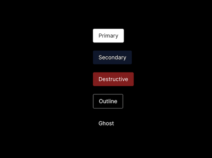
The Button component has 5 variants — primary, secondary, destructive, ghost, and outline — following common design system naming conventions.
Now for the actual usage, you might want to simply pass a variant prop like this:
<Button primary>Secondary</Button>
//Or
<Button primary={true}>Secondary</Button>
To do this, you can define styles for each of the variants in your button.module.css file. Let’s do so using the primary variant:
.primary {
  background-color: white;
  color: black;
  padding: 0.5rem 1rem 0.5rem 1rem;
  border-radius: 0.2rem;
  cursor: pointer;
  border: none;
  color: white;
}
.primary:hover {
  opacity: 0.95;
}
Now that we’ve created a button for the primary variant prop, we can invoke this variant whenever we pass true to the primary prop, like so:
import { styled } from "@phntms/css-components"
import buttonStyles from "./button.module.css"
  const Button = styled("button", {
        variants: {
          primary: {
            true: buttonStyles.primary,
          },
          secondary: {}
          destructive: {}
          ghost: {}
          outline: {}
      }
  }
Let’s continue adding CSS styles for the remaining variants in the button.module.css stylesheet, as well as adding references to those styles back in the Button variants API:
import { styled } from "@phntms/css-components"
import buttonStyles from "./button.module.css"
  const Button = styled("button", {
        variants: {
          primary: {
         true: buttonStyles.primary,
          },
         secondary: {
         true: buttonStyles.secondary,
          }
          destructive: {
           true: buttonStyles.destructive,
          }
          ghost: {
         true: buttonStyles.ghost,
          }
          outline: {
         true: buttonStyles.outline
         }
      }
  }
As you continue to add styles to the button.module.css stylesheet, you might see some repetitive properties among all the variants. To solve this, extract all the repetitive properties and create a new utility class called .btn like so:
.btn {
  padding: 0.5rem 1rem 0.5rem 1rem;
  border-radius: 0.2rem;
  cursor: pointer;
  border: none;
  color: white;
}
/* primary variant */
.primary {
  background-color: white;
  color: black;
}
.primary:hover {
  opacity: 0.95;
}
/* secondary variant */
.secondary {
  background-color: #0f172a;
}
.secondary:hover {
  opacity: 0.95;
}
By extracting out the repetitive properties, you can now add .btn as the common style utility in the styled API under the css key like so:
const Button = styled("button", {
    css: buttonStyles.btn,
    variants: {
      primary: {
        true: buttonStyles.primary,
      },
     ...rest of the variants
    },
  })
This css key also accepts an array of styles, so you can import styles from root CSS files and add them here in the array. One possible use case for this might be adding a font family and other CSS resets in the root file and including them in the array like so:
import { styled } from "@phntms/css-components"
import rootStyles from "../style.module.css"
import buttonStyles from "./button.module.css"
const Button = styled("button", {
    css: [rootStyles.root, buttonStyles.btn],
    variants: {
      // ...rest of the variants
    },
  })
To make your components easier to use with improved DX and modularity, you can turn this component into a custom React Hook. Simply wrap the entire Hook into a function called useButton and return the Button component. Then, export this Hook like so:
import { styled } from "@phntms/css-components"
import rootStyles from "../style.module.css"
import buttonStyles from "./button.module.css"
function useButton() {
  const Button = styled("button", {
    css: [rootStyles.root, buttonStyles.btn],
    variants: {

    },
  })
  return Button
}
export { useButton }
You can then utilize this Hook like so:
import { useButton } from "./Button/Button"
function App() {
  const Button = useButton()
  return (
    <>
      <main>
        <Button primary>Primary</Button>
      </main>
    </>
  )
}
export default App
Custom Hooks complement the composable behavior of CSS Components quite well. These custom Hooks follow the same rules as React Hooks and are defined only at the top level of the file.
Converting CSS Components to Hooks would promote reusability across the application and improve codebase maintainability, especially while working on a large-scale application.
By doing so, you have now achieved a fully functional and customizable button system design built on top of CSS Components API. You can also create other custom elements as well to implement similar concepts. Here’s how your Button component would look:

CSS Components allows you to compose two components via the styled API. This is useful when you already have a utility component defined and you want to reuse those styles.
In the following code, the SubscriptionButton will inherit styles from the BaseButton component. If there are styling conflicts, the SubscriptionButton will safely override those properties:
const BaseButton = styled("button", {
  css: buttonStyles.btn,
});
const SubscriptionButton = styled(BaseButton, {
  css: subscriptionStyles.btn,
});
This newly composed SubscriptionButton component can be turned into a Hook as well and can be used similarly to the BaseButton, inheriting its properties:
<BaseButton primary>Base button</BaseButton>
<SubscriptionButton ghost>Base button</SubscriptionButton>
The CSS Components team conducted a benchmark comparison between this utility and other popular solutions out there:

As you can see, CSS Components outperformed Emotion, Stitches, and styled-components in terms of injecting initial styles as well as updating CSS prop.
It also performs well when handling a larger number of DOM nodes in a tree, both in terms of deeply nested trees:

As well as in terms of wide sibling nodes:

As you can see, CSS Components performs quite well when compared to popular CSS-in-JS libraries out there. This only proves its efficiency and shows how it’s a must-use utility in your React applications.
CSS Components doesn’t aim to replace popular component libraries out there. Instead, it’s perfect to use alongside them.
You can use CSS Components to generate custom utility-based components in seconds. CSS Components also embraces a modular pattern of writing code that can prove to be quite maintainable and scalable. These features make this utility a must-use CSS-in-JS solution for React developers.
You can find the source code for the examples above in this GitHub repository.
Install LogRocket via npm or script tag. LogRocket.init() must be called client-side, not
server-side
$ npm i --save logrocket

// Code:

import LogRocket from 'logrocket';
LogRocket.init('app/id');
// Add to your HTML:

<script src="https://cdn.lr-ingest.com/LogRocket.min.js"></script>
<script>window.LogRocket && window.LogRocket.init('app/id');</script>

Learn how sibling-index() enables clean, JavaScript-free stagger animations using native CSS.

useEffect breaks AI streaming responses in ReactSee why useEffect breaks AI streaming in React, and how moving stream state outside React fixes flicker and stale updates.

A real-world debugging session using Claude to solve a tricky Next.js UI bug, exploring how AI helps, where it struggles, and what actually fixed the issue.

CSS wasn’t built for dynamic UIs. Pretext flips the model by measuring text before rendering, enabling accurate layouts, faster performance, and better control in React apps.
Would you be interested in joining LogRocket's developer community?
Join LogRocket’s Content Advisory Board. You’ll help inform the type of content we create and get access to exclusive meetups, social accreditation, and swag.
Sign up now