At first glance, CSS .wrapper and .container classes seem to do the same thing: wrap content, center it, and stop it from stretching too wide. And honestly, that’s not wrong.

But below the surface, these two classes serve slightly different roles, especially when you’re working with layout systems, design systems, or CSS frameworks.
In this article, we’ll break down what each class typically means, how they’re used in real-world code, and when it makes sense to use one over the other.
The Replay is a weekly newsletter for dev and engineering leaders.
Delivered once a week, it's your curated guide to the most important conversations around frontend dev, emerging AI tools, and the state of modern software.
.wrapper class?A wrapper class is a named CSS class typically applied to an outer HTML element, like a <div>, that groups related content together. It acts as a structural shell around content, making it easier to apply consistent layout styles like padding, margin, width, or alignment.
Unlike a container, which usually sets page-level boundaries, a wrapper is more flexible and often used to organize and style sections or blocks of content.
Here is the syntax for a wrapper class:
.wrapper {
  max-width: 1200px;
  margin: 0 auto;
  padding: 0 20px;
}
.wrapper offers different variants you can utilize according to your project’s needs. Some of which include:
This wrapper centers its children both horizontally and vertically, usually with Flexbox. It’s your go-to layout structure for things like login screens, empty states, or “hero” blocks where something needs to be perfectly centered.
Here’s what the syntax looks like:
.centering-wrapper {
  display: flex;                /* Turns the wrapper into a flex container */
  justify-content: center;     /* Centers content horizontally */
  align-items: center;         /* Centers content vertically */
  height: 100vh;               /* Fills the entire height of the viewport */
}
.box {
  background: white;
  padding: 40px;
  box-shadow: 0 0 10px rgba(0, 0, 0, 0.1);
}
This is a wrapper that stretches across the entire width of the page, but adds internal padding to prevent content from touching the edges — think hero sections or banners.
It’s useful for scenarios where you often want full-background sections, but you still need inner spacing so text or images don’t look glued to the browser edge:
.full-wrapper {
  width: 100%;              /* Full-width */
  padding: 60px 20px;       /* Top/bottom and left/right padding */
  background-color: #f3f3f3;
}
This is a wrapper that uses CSS Grid to create column-based layouts. It gives you clean, responsive, and multi-column structures with full control over spacing and responsiveness. This is useful when laying out cards, features, blog posts, etc.
Grid provides a powerful and readable way to define layouts in rows and columns:
.grid-wrapper {
  display: grid;
  grid-template-columns: repeat(auto-fit, minmax(250px, 1fr));  /* Responsive columns */
  gap: 20px;
  max-width: 1200px;
  margin: 0 auto;
  padding: 20px;
}
This wrapper uses Flexbox to align its children in a row or column. It’s ideal for horizontal layouts like navbars or toolbars, or vertical alignment with spacing:
.flex-wrapper {
  display: flex;
  justify-content: space-between;
  gap: 20px;
  padding: 20px;
}
.item {
  background: #eee;
  flex: 1;
  text-align: center;
  padding: 1rem;
}
This wrapper adapts its layout across screen sizes using media queries. It’s usually built on top of a grid or flex system. You can use it when you want different layouts for different devices. Responsive wrappers ensure your layout breaks gracefully:
.responsive-wrapper {
  display: flex;
  flex-direction: row;
  gap: 20px;
}
@media (max-width: 768px) {
  .responsive-wrapper {
    flex-direction: column;
  }
}
This is a semantically named wrapper around main content used for spacing, layout, or styles that apply only to content sections. The content wrapper tends to add clarity to your structure. It’s helpful for section-specific styling, applying themes, or distinguishing content blocks from layout containers:
.content-wrapper {
  background-color: #fff;
  padding: 40px;
  box-shadow: 0 0 20px rgba(0,0,0,0.05);
  border-radius: 8px;
}
The container class is a layout utility commonly applied to elements like <div> to define the readable, centered area of a page. It typically sets a maximum width, adds horizontal padding, and centers the content on the screen. This creates a consistent visual boundary that keeps content clean, readable, and well-aligned across different screen sizes.
Here is the syntax for a .container class:
.container {
  max-width: 1200px;    /* Sets the max width of the content area */
  margin: 0 auto;        /* Horizontally centers the container */
  padding: 0 20px;       /* Adds left/right spacing inside the container */
  width: 100%;           /* Ensures it takes full available width up to the max */
  box-sizing: border-box; /* Includes padding in width calculation */
}
Like wrappers, container classes follow flexible naming conventions. Based on the layout needs, they’re often split into different variants such as fluid, fixed, narrow, or responsive containers. Some of the examples are included below:
This container has a set max-width and stays centered on the page regardless of screen size. It is used in layouts where content should not stretch too wide, like blog sites, articles, or dashboards:
.container-fixed {
  max-width: 1200px;
  width: 100%;
  margin: 0 auto;
  padding: 0 20px;
  box-sizing: border-box;
}
This container stretches the full width of the viewport without a max-width constraint. It is used in sections that should span edge-to-edge, such as headers, banners, footers, or backgrounds that require full bleed:
.container-fluid {
  width: 100%;
  padding: 0 20px;
  box-sizing: border-box;
}
This is a container with a smaller max-width than usual. It can be used for centering forms, login boxes, or small blocks of content that shouldn’t be stretched or look too wide:
.container-narrow {
  max-width: 600px;
  margin: 0 auto;
  padding: 0 20px;
  box-sizing: border-box;
}
While both wrapper and container classes are used to organize layout in CSS, they serve distinct roles in a webpage’s structure.
A container is responsible for defining the overall layout boundary, limiting how wide content can grow, centering it within the viewport, and ensuring consistent padding across the site. It’s essentially the “outer shell” that controls the readable space of your page or section.
A wrapper, on the other hand, is more flexible and functional. It’s used inside containers or even inside other wrappers to group related content and apply layout mechanics like Flexbox, grid, spacing, or alignment. Wrappers usually don’t care about width; they care about structure within the space the container defines.
You’ll often see a container used to frame a section, and one or more wrappers inside it managing the actual layout or behavior of the elements.
| Aspect | Container | Wrapper |
|---|---|---|
| Role | Defines layout boundaries and centers content on the page | Structures and organizes elements within a section or component |
| Width control | Uses max-width, margin: auto, and padding to constrain content width |
Usually doesn’t limit width; focuses on internal layout |
| Layout purpose | Provides a consistent, centered layout frame | Handles layout mechanics like display: flex, grid, spacing, etc. |
| DOM position | Often used at the page or section level (<main>, <section>, etc.) |
Used inside containers or components to structure nested content |
| Common styles | max-width, padding, margin, box-sizing |
display: flex, display: grid, gap, justify-content, align-items, etc. |
| Nesting behavior | Usually top-level, wrapping sections | Often nested inside containers or other wrappers |
| Example use case | Wrapping a full-page section to keep it readable on all screen sizes | Aligning a row of cards, grouping a form, or laying out buttons |
Many CSS frameworks heavily rely on the .container class, but they all define it slightly differently.
Tailwind, for example, uses the .container class to manage width at various breakpoints and center the content. Bootstrap’s container approach is more opinionated. It comes with built-in rules for handling layout boundaries, offering a fixed max-width that adjusts at key breakpoints, such as 576px, 768px, and 992px, and so on.
.wrapper, on the other hand, is often left to the developer’s discretion. It’s not a built-in part of most frameworks, and you won’t usually find it in their official documentation. That’s because it’s not a layout boundary; it’s a layout tool used to group and align elements inside an already constrained area.
Use a container class when you need to define the readable space of a page or section. This means you’re setting the boundary for how wide content should go, and making sure it’s centered and padded properly. It’s the outer shell. You should reach for it when you’re laying out page sections like headers, footers, main content areas, or anything that needs to stay within a clean visual column.
Let’s create a simple blog page to see how the .container class works:
<!DOCTYPE html>
<html lang="en">
<head>
<meta charset="UTF-8">
<meta name="viewport" content="width=device-width, initial-scale=1.0">
<title>My Tech Blog</title>
<link rel="stylesheet" href="styles.css">
</head>
<body>
<header>
<div class="container header-content">
<h1>My Tech Blog</h1>
<nav>
<a href="#home">Home</a>
<a href="#about">About</a>
<a href="#articles">Articles</a>
<a href="#contact">Contact</a>
</nav>
</div>
</header>
<main class="container">
<article>
<h2>Understanding CSS Grid vs Flexbox</h2>
<p class="meta">Published on March 15, 2024 by Jane Doe</p>
<p>When I first started learning CSS layouts, I was confused about when to use Grid versus Flexbox. Both seemed to solve similar problems, but each has its strengths and ideal use cases.</p>
<p>Grid excels at two-dimensional layouts where you need to control both rows and columns simultaneously. It's perfect for complex page layouts, card grids, and any situation where you need precise control over both axes.</p>
<p>Flexbox, on the other hand, is designed for one-dimensional layouts. It's ideal for navigation bars, centering content, distributing space between items, and creating flexible component layouts.</p>
</article>
<aside>
<h3>Recent Posts</h3>
<div class="post-preview">
<h4>CSS Custom Properties Deep Dive</h4>
<p>Learn how CSS variables can revolutionize your stylesheet organization and maintainability.</p>
</div>
<div class="post-preview">
<h4>Modern JavaScript ES6+ Features</h4>
<p>Essential JavaScript features every developer should master for cleaner, more efficient code.</p>
</div>
<div class="post-preview">
<h4>Responsive Design Best Practices</h4>
<p>Proven techniques for creating websites that work beautifully on any device.</p>
</div>
</aside>
</main>
<footer>
<div class="container footer-content">
<p>© 2024 My Tech Blog. All rights reserved.</p>
</div>
</footer>
</body>
</html>
This is the CSS code:
body {
    font-family: Arial, sans-serif;
    margin: 0;
    padding: 0;
    line-height: 1.6;
    color: #333;
}
.container {
    max-width: 1200px;
    margin: 0 auto;
    padding: 0 20px;
    box-sizing: border-box;
}
header {
    background-color: #7F55B1;
    color: white;
    width: 100%;
}
header h1 {
    margin: 0;
    font-size: 2rem;
}
.header-content {
    padding: 20px 0;
}
nav {
    margin-top: 10px;
}
nav a {
    color: white;
    text-decoration: none;
    margin-right: 20px;
    font-weight: 500;
}
main {
    padding: 40px 0;
}
article {
    background: white;
    margin-bottom: 30px;
}
article h2 {
    color: #2c3e50;
    margin-bottom: 10px;
}
.meta {
    color: #7f8c8d;
    font-size: 0.9rem;
    margin-bottom: 20px;
}
aside {
    background: #ecf0f1;
    padding: 20px;
    border-radius: 8px;
    margin-top: 30px;
}
aside h3 {
    color: #2c3e50;
    margin-top: 0;
}
.post-preview {
    background: white;
    padding: 15px;
    margin-bottom: 15px;
    border-radius: 5px;
    border-left: 4px solid #7F55B1;
}
.post-preview h4 {
    margin: 0 0 10px 0;
    color: #2c3e50;
}
.post-preview p {
    margin: 0;
    color: #7f8c8d;
    font-size: 0.9rem;
}
footer {
    background-color: #7F55B1;
    color: white;
    width: 100%;
}
.footer-content {
    padding: 20px 0;
    text-align: center;
}
footer p {
    margin: 0;
}
This is the result in the browser:
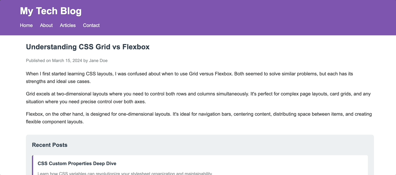
Here’s what the container is doing here:
Use a wrapper when you’re working inside that space and want to organize or align things. Wrappers are great for grouping elements, setting up Flexbox or Grid layouts, adding spacing between components, or applying specific layout behaviors. They’re tools for structure and alignment, not for defining global boundaries.
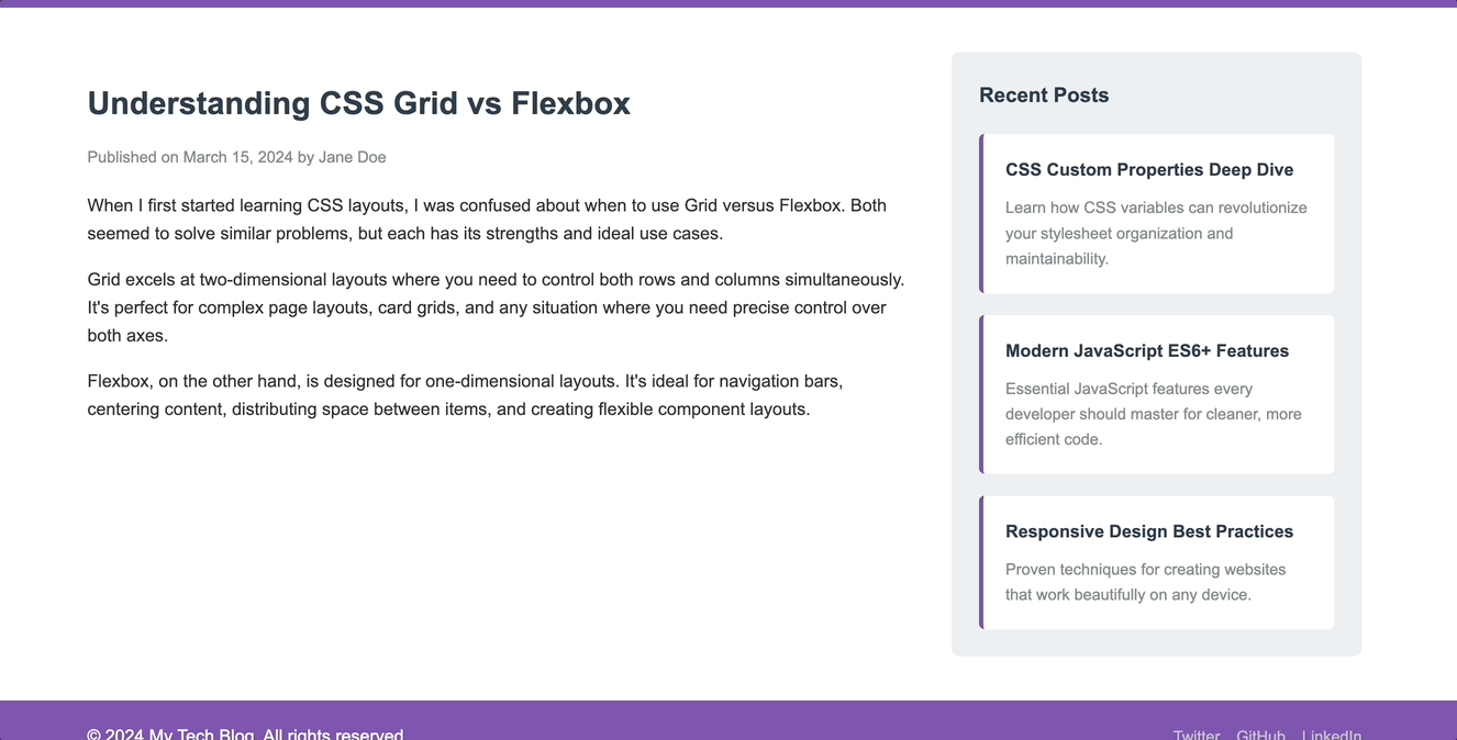
Now let’s enhance our blog with .wrapper classes. Update the code to this:
<!DOCTYPE html>
<html lang="en">
<head>
<meta charset="UTF-8">
<meta name="viewport" content="width=device-width, initial-scale=1.0">
<title>My Tech Blog</title>
<link rel="stylesheet" href="styles.css">
</head>
<body>
<header>
<div class="container">
<div class="header-wrapper">
<h1>My Tech Blog</h1>
<nav class="nav-wrapper">
<a href="#home">Home</a>
<a href="#about">About</a>
<a href="#articles">Articles</a>
<a href="#contact">Contact</a>
</nav>
</div>
</div>
</header>
<main class="container">
<div class="content-wrapper">
<article>
<h2>Understanding CSS Grid vs Flexbox</h2>
<p class="meta">Published on March 15, 2024 by Jane Doe</p>
<p>When I first started learning CSS layouts, I was confused about when to use Grid versus Flexbox. Both seemed to solve similar problems, but each has its strengths and ideal use cases.</p>
<p>Grid excels at two-dimensional layouts where you need to control both rows and columns simultaneously. It's perfect for complex page layouts, card grids, and any situation where you need precise control over both axes.</p>
<p>Flexbox, on the other hand, is designed for one-dimensional layouts. It's ideal for navigation bars, centering content, distributing space between items, and creating flexible component layouts.</p>
</article>
<aside>
<h3>Recent Posts</h3>
<div class="posts-wrapper">
<div class="post-preview">
<h4>CSS Custom Properties Deep Dive</h4>
<p>Learn how CSS variables can revolutionize your stylesheet organization and maintainability.</p>
</div>
<div class="post-preview">
<h4>Modern JavaScript ES6+ Features</h4>
<p>Essential JavaScript features every developer should master for cleaner, more efficient code.</p>
</div>
<div class="post-preview">
<h4>Responsive Design Best Practices</h4>
<p>Proven techniques for creating websites that work beautifully on any device.</p>
</div>
</div>
</aside>
</div>
</main>
<footer>
<div class="container">
<div class="footer-wrapper">
<p>© 2024 My Tech Blog. All rights reserved.</p>
<div class="social-wrapper">
<a href="#twitter">Twitter</a>
<a href="#github">GitHub</a>
<a href="#linkedin">LinkedIn</a>
</div>
</div>
</div>
</footer>
</body>
</html>
Here is the CSS code:
body {
    font-family: Arial, sans-serif;
    margin: 0;
    padding: 0;
    line-height: 1.6;
    color: #333;
}
.container {
    max-width: 1200px;
    margin: 0 auto;
    padding: 0 20px;
    box-sizing: border-box;
}
/* Wrapper classes for internal organization */
.header-wrapper {
    display: flex;
    justify-content: space-between;
    align-items: center;
    padding: 20px 0;
}
.nav-wrapper {
    display: flex;
    gap: 30px;
}
.content-wrapper {
    display: grid;
    grid-template-columns: 2fr 1fr;
    gap: 40px;
    padding: 40px 0;
}
.posts-wrapper {
    display: flex;
    flex-direction: column;
    gap: 20px;
}
.footer-wrapper {
    display: flex;
    justify-content: space-between;
    align-items: center;
    padding: 20px 0;
}
.social-wrapper {
    display: flex;
    gap: 15px;
}
/* Base styles */
header {
    background-color: #7F55B1;
    color: white;
    width: 100%;
}
header h1 {
    margin: 0;
    font-size: 2rem;
}
nav a {
    color: white;
    text-decoration: none;
    font-weight: 500;
    transition: color 0.3s ease;
}
nav a:hover {
    color: #3498db;
}
article {
    background: white;
}
article h2 {
    color: #2c3e50;
    margin-bottom: 10px;
    font-size: 1.8rem;
}
.meta {
    color: #7f8c8d;
    font-size: 0.9rem;
    margin-bottom: 20px;
}
article p {
    margin-bottom: 15px;
}
aside {
    background: #ecf0f1;
    padding: 25px;
    border-radius: 8px;
    height: fit-content;
}
aside h3 {
    color: #2c3e50;
    margin-top: 0;
    margin-bottom: 20px;
}
.post-preview {
    background: white;
    padding: 20px;
    border-radius: 5px;
    border-left: 4px solid #7F55B1;
    transition: transform 0.2s ease;
}
.post-preview:hover {
    transform: translateX(5px);
}
.post-preview h4 {
    margin: 0 0 10px 0;
    color: #2c3e50;
}
.post-preview p {
    margin: 0;
    color: #7f8c8d;
    font-size: 0.9rem;
}
footer {
    background-color: #7F55B1;
    color: white;
    width: 100%;
}
footer p {
    margin: 0;
}
.social-wrapper a {
    color: #bdc3c7;
    text-decoration: none;
    font-size: 0.9rem;
    transition: color 0.3s ease;
}
.social-wrapper a:hover {
    color: white;
}
/* Responsive design */
@media (max-width: 768px) {
    .header-wrapper {
        flex-direction: column;
        gap: 15px;
        text-align: center;
    }
    .nav-wrapper {
        justify-content: center;
    }
    .content-wrapper {
        grid-template-columns: 1fr;
        gap: 30px;
    }
    .footer-wrapper {
        flex-direction: column;
        gap: 15px;
        text-align: center;
    }
}
Now we have the following display in our browser:
So here’s what the .wrapper class adds to our blog:
.header-wrapper: Creates a horizontal layout with the logo on the left and navigation on the right, with proper vertical alignment.nav-wrapper: Spaces out navigation links with consistent gaps and centers them.content-wrapper: Sets up a two-column grid layout (main article + sidebar) with proper spacing.posts-wrapper: Organizes recent posts vertically with consistent spacing between each post.footer-wrapper: Balances the copyright text and social links horizontally.social-wrapper: Groups and spaces social media links evenlyThe key difference is that the .container says, “This content should be 1200px max and centered,” while .wrapper says, “These elements should be arranged in a flex row with space-between” or “This should be a grid with 2fr and 1fr columns.”
Both .container and .wrapper are used for layouts, but they’re not the same tool. .container defines boundaries. It controls how wide content can go and keeps everything centered and readable across devices. Meanwhile, .wrapper handles structure and alignment inside those boundaries.
You’ll often use both classes together: a container to define the space, and wrappers inside it to organize the contents within that space. But next time you’re naming your layout classes, don’t treat them as interchangeable. They have different jobs, and knowing when to use each one can make your CSS cleaner, your layouts easier to manage, and your intentions clearer, both to you and the next dev reading your code.
As web frontends get increasingly complex, resource-greedy features demand more and more from the browser. If you’re interested in monitoring and tracking client-side CPU usage, memory usage, and more for all of your users in production, try LogRocket.

LogRocket lets you replay user sessions, eliminating guesswork around why bugs happen by showing exactly what users experienced. It captures console logs, errors, network requests, and pixel-perfect DOM recordings — compatible with all frameworks.
LogRocket's Galileo AI watches sessions for you, instantly identifying and explaining user struggles with automated monitoring of your entire product experience.
Modernize how you debug web and mobile apps — start monitoring for free.
@container scroll-state: Replace JS scroll listeners nowCSS @container scroll-state lets you build sticky headers, snapping carousels, and scroll indicators without JavaScript. Here’s how to replace scroll listeners with clean, declarative state queries.

Explore 10 Web APIs that replace common JavaScript libraries and reduce npm dependencies, bundle size, and performance overhead.

Russ Miles, a software development expert and educator, joins the show to unpack why “developer productivity” platforms so often disappoint.

Discover what’s new in The Replay, LogRocket’s newsletter for dev and engineering leaders, in the February 18th issue.
Hey there, want to help make our blog better?
Join LogRocket’s Content Advisory Board. You’ll help inform the type of content we create and get access to exclusive meetups, social accreditation, and swag.
Sign up now

 Learn more →

18 Replies to "A guide to wrapper vs. container classes in CSS"
This is an incredibly thorough breakdown of .wrapper vs .container — I really appreciate how you not only explain the conceptual difference but also back it up with real-world code examples and use cases.
This article is much needed! I often mix up wrapper and container classes since they both wrap content. It’s great to learn their distinct roles, especially in layout systems.
Your article is excellent. I really liked the article you wrote. This is an extremely useful resource for me.
This is a great topic! I often confuse wrapper and container classes, so clarifying their distinct roles is super helpful.
Great breakdown of the differences between .wrapper and .container classes!
This is exactly what I was looking for—thank you!
This was a fun and approachable read, making a complex topic easy to understand.
Great breakdown! Wrapper vs container classes help structure layouts cleanly—wrappers for global spacing, containers for grid alignment. Essential CSS organization!
This perfectly aligns with what I needed—thank you so much for your help
They have different jobs, and knowing when to use each one can make your CSS cleaner, your layouts easier to manage, and your intentions clearer, both to you and the next dev reading your code.
The content wrapper tends to add clarity to your structure. It’s helpful for section-specific styling, applying themes, or distinguishing content blocks from layout containers.
This proposed feature for collapsing items with a quantity greater than one into a single line is an excellent enhancement, as it not only optimizes screen space but also streamlines project management while retaining the ability to input unique details for each item.
That’s a great breakdown! I often struggle with choosing between className and style in React. Understanding the nuances helps a lot. Speaking of relaxing activities, sometimes when my brain feels fried from CSS, I unwind with a quick Suika Game session. It’s surprisingly addictive! If you’re looking for a fun, casual distraction, give it a try. Anyone else find it strangely satisfying?
This article is very clear. It solved my naming confusion. Great frontend tips.
Thanks for shairing such an informative article
“A guide to wrapper vs. container classes in CSS is a very clear and helpful explanation. It’s great for understanding layout structures and improving web design skills.”
The distinction between wrappers for external constraints and containers for internal structure really clicked for me since I used to use the names interchangeably and it always made my CSS a mess. I started separating them this way on a project last week and it already makes responsive tweaks so much easier, so do you find this helps much with team collaboration?
Definitely. The biggest win for teams is clarity. When everyone knows what a wrapper vs a container is responsible for, layout changes stop feeling fragile. People can make responsive tweaks without worrying they’re breaking internal structure, and reviews get much easier