If you have worked with any type of form in a mobile application, then you know how complicated it is to handle dates in forms. In this article, we’ll learn how to implement a calendar for handling and manipulating dates in a SwiftUI application.

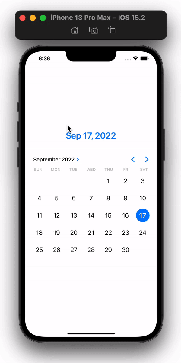
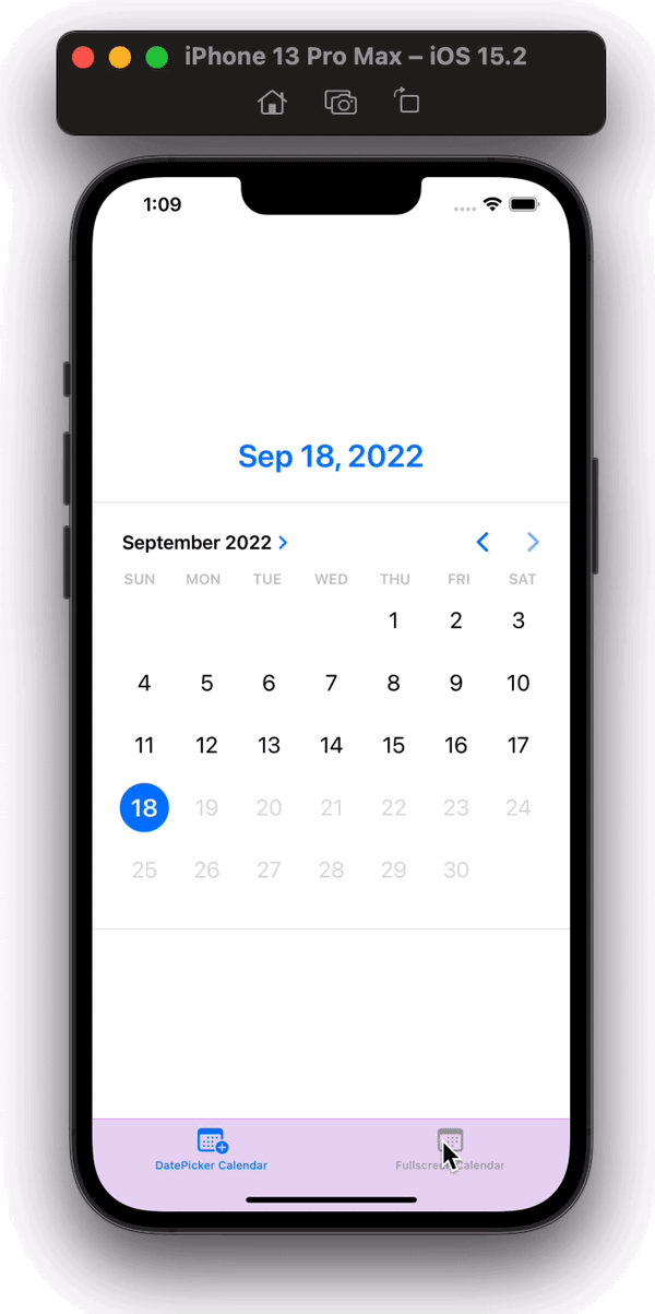
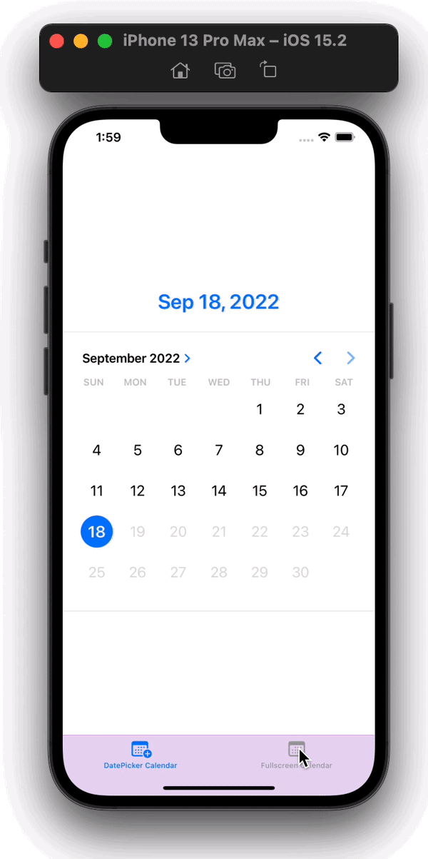
SwiftUI provides a DatePicker control for picking an absolute date from users, however, as a full-fledged calendar UI, it has some limitations. In this tutorial, we’ll also use a popular calendar library called FSCalendar, a fully customizable calendar library for iOS. Our final app will look like the images below:


You can find the complete code for this tutorial in this GitHub repository. Let’s get started!
We’ll cover the following:
DatePicker in SwiftUITabView into applicationFSCalendar into projectFSCalendar using UIViewRepresentableFSCalendarBefore writing any code, we’ll need a working SwiftUI application. Let’s create it now; open Xcode, and you’ll see a screen reading Welcome to Xcode, as shown below:
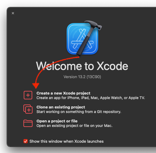
Select Create a new Xcode project, then Xcode will be launched with the choose project template popup:
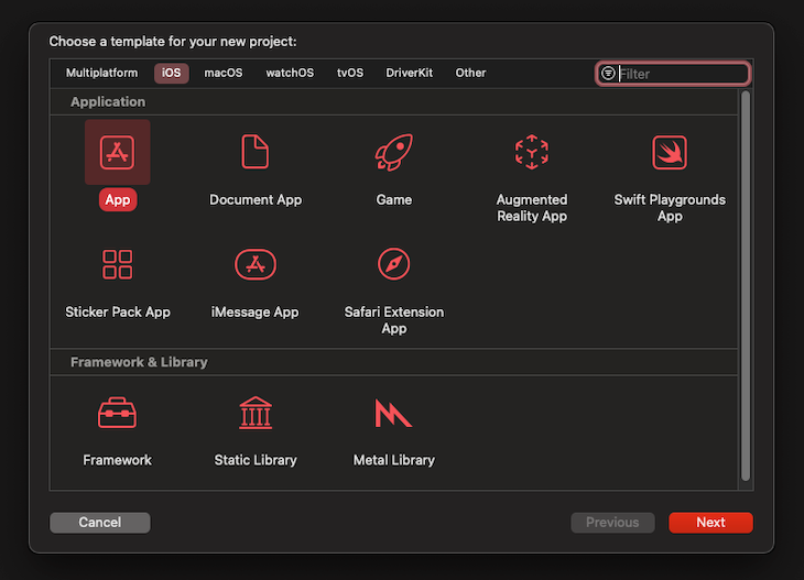
We’ll leave the selected option as the default one, App, then click Next. Enter a name for your project and click Next. Now that we’ve successfully created a SwiftUI project, let’s run it on our device or simulator.
To build the app on a device, select it from the top bar of Xcode, and then click the Play button on the left to start the build:
If everything worked correctly, you’ll see a blank screen on your device with a “Hello, World!” text in the center.
DatePicker in SwiftUITo create a calendar UI in our Swift application, we’ll start with DatePicker from SwiftUI. This structure is mainly used to select dates from a user interface, and it is very easy to use and control.
Let’s add DatePicker into our view body. Add the code below to the ContentView.swift file:
import SwiftUI

struct ContentView: View {
    @State var selectedDate: Date = Date()
    var body: some View {
        // Added DatePicker with selection equal to State variable selectedDate
        DatePicker("Select Date", selection: $selectedDate)
                  .padding(.horizontal)
    }
}
....
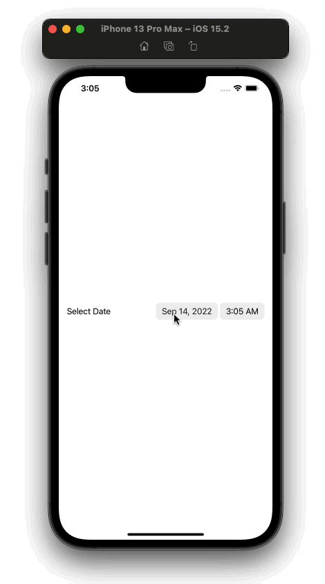
As you may have noticed, we added DatePicker with two parameters, Select Date and selection.
The first String param is the title of date picker, which is shown beside the picker controls on the UI. The second param, selection, is an important parameter that takes a Binding variable of type Date. The Date variable changes as the selected date or time is changed from the DatePicker control.
To pass the Binding into the selection param, we’ve created a State variable named selectedDate of type Date, and its initial value is the current date. We also added a little horizontal padding to the component.
The UI output from the code above will be similar to the image below:
Now, we can open a calendar view to select a date and time from a wheel picker, which are stored in the selectedDate variable. Now, let’s display it on the UI.
Replace the code in the ContentView body with the code below:
VStack(alignment: .center, spacing: 0) {
    Text(selectedDate.formatted(date: .abbreviated, time: .standard))
        .font(.system(size: 28))
        .bold()
        .foregroundColor(Color.accentColor)
        .padding()
        .animation(.spring(), value: selectedDate)
    Divider()
    Spacer()
    DatePicker("Select Date", selection: $selectedDate)
        .padding(.horizontal)
}
.padding(.vertical, 200)
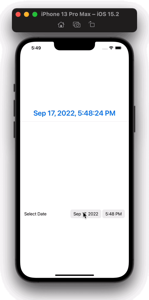
The code above will produce the following UI:
We’ve implemented a date picker into our application, but we aren’t finished yet. We want to show a calendar view in our UI that will always be displayed. For this, we’ll use the datePickerStyle modifier of the DatePicker component. We can use this modifier to display DatePicker in any predefined styles we want.
We’ll use graphical style, which shows the DatePicker as a CalendarView that is always opened. We won’t need the time component now, so we’ll pass displayedComponents in our DatePicker initializer. We’ve also omitted the time part from selectedDate when displaying it on the UI.
With the changes above, the updated code in the body of our ContentView will look like the following:
VStack() {
    Text(selectedDate.formatted(date: .abbreviated, time: .omitted))
        .font(.system(size: 28))
        .bold()
        .foregroundColor(Color.accentColor)
        .padding()
        .animation(.spring(), value: selectedDate)
        .frame(width: 500)
    Divider().frame(height: 1)
    DatePicker("Select Date", selection: $selectedDate, displayedComponents: [.date])
        .padding(.horizontal)
        .datePickerStyle(.graphical)
    Divider()
}
.padding(.vertical, 100)
The code above will result in the UI below:
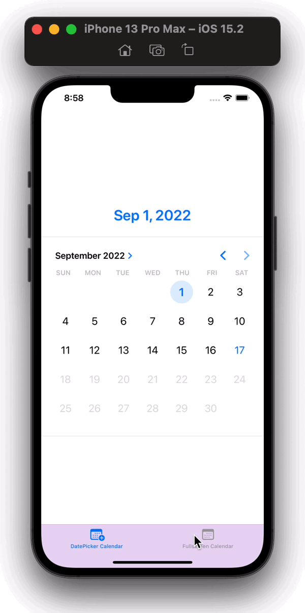
TabView into applicationSo far, we’ve integrated a calendar-like view using DatePicker. But we can improve on this by using a popular iOS library called FSCalendar.
But first, we need to separate these two screens in our app UI. For this, we’ll use TabView, which will create two tabs in our app, one for CalendarView with DatePicker, and another for FSCalendar.
Let’s start by moving the UI that we created in the section above into another SwiftUI file. Create a new SwiftUI file in Xcode and call it DatePickerCalendar. Paste the code from the body of ContentView into the body of DatePickerCalendar:
import SwiftUI

struct DatePickerCalendar: View {
    @State var selectedDate = Date()
    var body: some View {
        VStack {
            FormattedDate(selectedDate: selectedDate, omitTime: true)
            Divider().frame(height: 1)
            DatePicker("Select Date", selection: $selectedDate,
                       in: ...Date(), displayedComponents: .date)
                .datePickerStyle(.graphical)
            Divider()
        }
    }
}

struct DatePickerCalendar_Previews: PreviewProvider {
    static var previews: some View {
        DatePickerCalendar()
    }
}
In the code above, you’ll notice that we’ve implemented two changes. For one, we’ve added the in parameter in the DatePicker initializer, which allows the user to pick dates in a given range. In this case, I’ve offered all dates from the previous to the current date.
FormattedDate is a helper view that I created to make the code look clean. It is basically the same Text component that we used previously to display selectedDate on the UI with some style modifiers.
To create the FormattedDate view, create a new SwiftUI file, name it FormattedDate, and add the following code inside it:
import SwiftUI

struct FormattedDate: View {
    var selectedDate: Date
    var omitTime: Bool = false
    var body: some View {
        Text(selectedDate.formatted(date: .abbreviated, time:
              omitTime ? .omitted : .standard))
            .font(.system(size: 28))
            .bold()
            .foregroundColor(Color.accentColor)
            .padding()
            .animation(.spring(), value: selectedDate)
            .frame(width: 500)
    }
}

struct FormattedDate_Previews: PreviewProvider {
    static var previews: some View {
        FormattedDate(selectedDate: Date())
    }
}
We also need to create a new file for our calendar view that will implement the FSCalendar library. Create a new SwiftUI file named CalendarView and add the following code inside body:
Text("This is Calendar View")
Now, let’s add the TabView in our ContentView file:
TabView {
    DatePickerCalendar()
      .tabItem {
        Label("DatePicker Calendar", systemImage: "calendar.badge.plus")
            .padding()
      }
    CalendarView()
      .tabItem {
        Label("Fullscreen Calendar", systemImage: "calendar")
            .padding()
      }
}
.onAppear {
    let appearance = UITabBarAppearance()
    appearance.backgroundColor = UIColor(Color.purple.opacity(0.2))
    appearance.shadowColor = UIColor(.purple)
    appearance.backgroundEffect = UIBlurEffect(style: .extraLight)
    UITabBar.appearance().standardAppearance = appearance
    UITabBar.appearance().scrollEdgeAppearance = appearance
}
In the code above, we have added two views in our TabView. First is the DatePickerCalendar, which we created earlier, and the second is the empty CalendarView. Each view has a tabItem modifier that defines what to display inside the tab bar. We’ve also added an onAppear instance method on TabView to change the appearance of TabView.
Now, we’ll have the UI below:
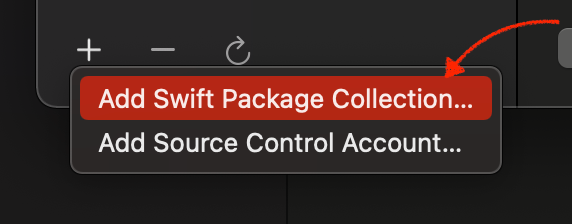
FSCalendar into our projectNow, let’s install the FSCalendar library. To add a new library, in Xcode, go to File → Add Packages, as seen in the image below:
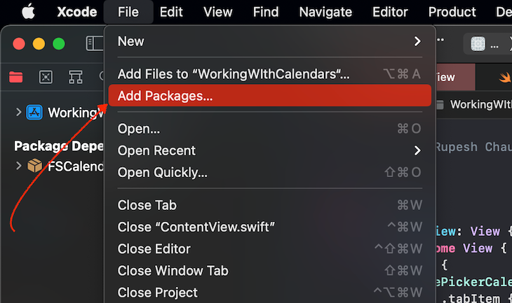
Click on the Add (+) button, then click on Add swift package collection:
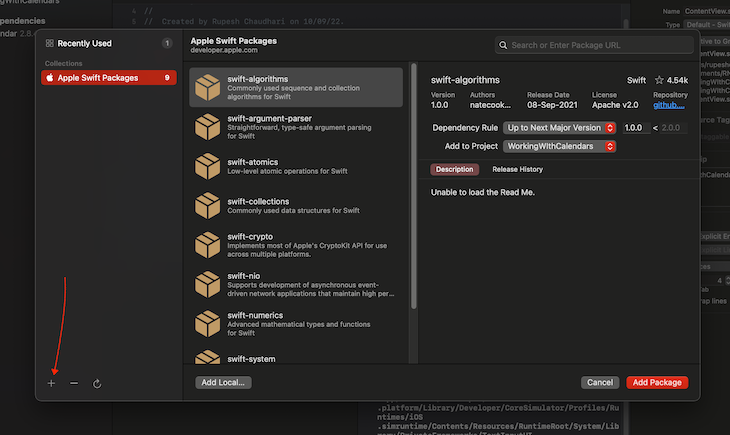
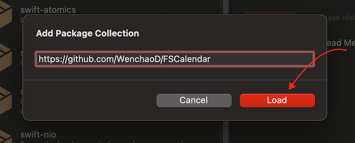
Then, paste the following link into the input and proceed:
https://github.com/WenchaoD/FSCalendar
This is the repository URL of the package we’ll use:
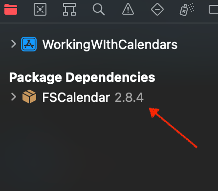
That’s it! You’ve now added FSCalendar into you project. If everything went right, you’ll now see FSCalendar in Package Dependencies on the left side of Xcode in project navigator menu:
FSCalendar with UIViewRepresentableNow, we’ve installed FSCalendar, but we cannot directly utilize the library as it is since it doesn’t support SwiftUI out of the box. Therefore, we’ll need to utilize the UIKit view provided by this library.
For this, we’ll use UIViewRepresentable as a wrapper around the UIKit view to display it in our SwiftUI view hierarchy. For more information about this, you can also refer to the official documentation.
First, we’ll create a view in the same file, which returns UIViewRepresentable. Then, we’ll implement some method inside it, which will create a UIView and will allow us to communicate with it:
import UIKit
import FSCalendar
....

struct CalendarView: View {
    var body: some View {
      CalendarViewRepresentable(selectedDate: $selectedDate)
    }
}

struct CalendarViewRepresentable: UIViewRepresentable {
    typealias UIViewType = FSCalendar

    func makeUIView(context: Context) -> FSCalendar {
      return FSCalendar()
    }

    func updateUIView(_ uiView: FSCalendar, context: Context) {}

    func makeCoordinator() -> Coordinator {
        Coordinator(self)
    }

    class Coordinator: NSObject,
          FSCalendarDelegate, FSCalendarDataSource {
            var parent: CalendarViewRepresentable

            init(_ parent: CalendarViewRepresentable) {
                self.parent = parent
            }
    }
}
In the code above, we’ve implemented three methods and one class:
makeUIView: Creates the UIView that will be rendered on the UI. For now, we directly return an instance of FSCalendar, which we’ll change as we move forward to give us more control over the calendarupdateUIView: Used to update state of the view. We won’t need this for this tutorial.makeCoordinator: Used to create a custom instance that we can use to communicate between SwiftUI and UIKit viewsCoordinator: The custom instance that is returned from makeCoordinatorUsing the code above, we now have an FSCalendar view in our application, which will look like the image below by default:
FSCalendarWe’ve successfully rendered a calendar view in our app UI. Now, let’s set the date value chosen by the user on the calendar. To do so, we’ll create a calendar variable inside our CalendarViewRepresentable and customize it as the user performs interactions on the UI:
struct CalendarView: View {
  // Added a @State var to track the selected date by user
  @State var selectedDate: Date = Date()

  var body: some View {
        VStack {
            // Displaying the selected date
            FormattedDate(selectedDate: selectedDate, omitTime: true)
            // Passing the selectedDate as Binding
            CalendarViewRepresentable(selectedDate: $selectedDate)
        }
  }
}

struct CalendarViewRepresentable: UIViewRepresentable {
  ...
  // Creating a object of FSCalendar to track across the view
  fileprivate var calendar = FSCalendar()

  // Getting selectedDate as a Binding so that we can update it as
  // user changes their selection
  @Binding var selectedDate: Date

  func makeUIView(context: Context) -> FSCalendar {
          // Setting delegate and dateSource of calendar to the
          // values we get from Coordinator
          calendar.delegate = context.coordinator
          calendar.dataSource = context.coordinator
          // returning the intialized calendar
          return calendar
  }

  ....


    class Coordinator: NSObject,
                        FSCalendarDelegate, FSCalendarDataSource {
        ....
        // Implementing the didSelect method of FSCalendar
        // this is fired with the new date when user selects a new date
        // in the Calendar UI, we are setting our selectedDate Binding
        // var to this new date when this is triggered
        func calendar(_ calendar: FSCalendar,
                        didSelect date: Date,
                        at monthPosition: FSCalendarMonthPosition) {
            parent.selectedDate = date
        }
    }

  ....
}
Now, our calendar UI will look like the image below:
Now that we’ve implemented a working calendar in our SwiftUI application, let’s customize the calendar. FSCalendar comes with a lot of customizability features. You can have a complete look at them at the GitHub repo.
After adding some custom features and styles to our calendar, the final code in our CalendarView file will be as follows:
import SwiftUI
import UIKit
import FSCalendar

struct CalendarView: View {

    @State var selectedDate: Date = Date()

    var body: some View {
              CalendarViewRepresentable(selectedDate: $selectedDate)
                .padding(.bottom)
                .padding(EdgeInsets(top: 40,
                          leading: 0, bottom: 0, trailing: 0))
                .background{
                    AsyncImage(url: URL(
                                string: "https://images.pexels.com/photos/1939485/pexels-photo-1939485.jpeg")){ img in
                        img.resizable(resizingMode: .stretch)
                            .blur(radius: 4, opaque: true)
                    } placeholder: {
                        LinearGradient(colors: [.red.opacity(0.4),
                                      .green.opacity(0.4)],
                                      startPoint: .top,
                                      endPoint: .bottom)
                    }
                }
                .ignoresSafeArea(.all, edges: .top)
    }
}

struct CalendarViewRepresentable: UIViewRepresentable {
    typealias UIViewType = FSCalendar

    fileprivate var calendar = FSCalendar()
    @Binding var selectedDate: Date

    func makeUIView(context: Context) -> FSCalendar {
        calendar.delegate = context.coordinator
        calendar.dataSource = context.coordinator

        // Added the below code to change calendar appearance
        calendar.appearance.todayColor = UIColor(displayP3Red: 0,
                                                  green: 0,
                                                  blue: 0, alpha: 0)
        calendar.appearance.titleTodayColor = .black
        calendar.appearance.selectionColor = .orange
        calendar.appearance.eventDefaultColor = .red
        calendar.appearance.titleTodayColor = .blue
        calendar.appearance.titleFont = .boldSystemFont(ofSize: 24)
        calendar.appearance.titleWeekendColor = .systemOrange
        calendar.appearance.headerMinimumDissolvedAlpha = 0.12
        calendar.appearance.headerTitleFont = .systemFont(
                                                ofSize: 30,
                                                weight: .black)
        calendar.appearance.headerTitleColor = .darkGray
        calendar.appearance.headerDateFormat = "MMMM"
        calendar.scrollDirection = .vertical
        calendar.scope = .month
        calendar.clipsToBounds = false

        return calendar
    }

    func updateUIView(_ uiView: FSCalendar, context: Context) {}

    func makeCoordinator() -> Coordinator {
        Coordinator(self)
    }

    class Coordinator: NSObject,
          FSCalendarDelegate, FSCalendarDataSource {
        var parent: CalendarViewRepresentable

        init(_ parent: CalendarViewRepresentable) {
            self.parent = parent
        }

        func calendar(_ calendar: FSCalendar,
                      didSelect date: Date,
                      at monthPosition: FSCalendarMonthPosition) {
            parent.selectedDate = date
        }

        func calendar(_ calendar: FSCalendar,
                  imageFor date: Date) -> UIImage? {
            if isWeekend(date: date) {
                return UIImage(systemName: "sparkles")
            }
            return nil
        }

        func calendar(_ calendar: FSCalendar,
                      numberOfEventsFor date: Date) -> Int {
            let eventDates = [Date(), Date(),
                                Date.now.addingTimeInterval(400000),
                                Date.now.addingTimeInterval(100000),
                                Date.now.addingTimeInterval(-600000),
                                Date.now.addingTimeInterval(-1000000)]
            var eventCount = 0
            eventDates.forEach { eventDate in
                if eventDate.formatted(date: .complete,
                              time: .omitted) == date.formatted(
                                date: .complete, time: .omitted){
                    eventCount += 1;
                }
            }
            return eventCount
        }

        func calendar(_ calendar: FSCalendar, shouldSelect date: Date, at monthPosition: FSCalendarMonthPosition) -> Bool {
            if isWeekend(date: date) {
                return false
            }
            return true
        }

        func maximumDate(for calendar: FSCalendar) -> Date {
            Date.now.addingTimeInterval(86400 * 30)
        }

        func minimumDate(for calendar: FSCalendar) -> Date {
            Date.now.addingTimeInterval(-86400 * 30)
        }
    }
}

func isWeekend(date: Date) -> Bool {
    let dateFormatter = DateFormatter()
    dateFormatter.dateFormat = "EEEE"
    let day: String = dateFormatter.string(from: date)
    if day == "Saturday" || day == "Sunday" {
        return true
    }
    return false
}
The code above will give us an output similar to the image below:
In this tutorial, we learned how to create a CalendarView UI using the DatePicker control. We also learned how to implement a calendar library to achieve our end UI result by incorporating a UIViewRepresentable to render a UIKit view inside a SwiftUI application.
Thanks for reading!
Install LogRocket via npm or script tag. LogRocket.init() must be called client-side, not
server-side
$ npm i --save logrocket

// Code:

import LogRocket from 'logrocket';
LogRocket.init('app/id');
// Add to your HTML:

<script src="https://cdn.lr-ingest.com/LogRocket.min.js"></script>
<script>window.LogRocket && window.LogRocket.init('app/id');</script>

Learn how to protect full-stack projects from NPM supply chain attacks with a practical security checklist.

Explore 15 essential MCP servers for web developers to enhance AI workflows with tools, data, and automation.

Learn how contrast-color() automatically picks accessible text colors using native CSS, without JavaScript.

Learn how to build a harness-style AI workflow using Claude Code with specialized Dev, QE, and Ops subagents, gated handoffs, MCP telemetry, and LEARNING.md.
Would you be interested in joining LogRocket's developer community?
Join LogRocket’s Content Advisory Board. You’ll help inform the type of content we create and get access to exclusive meetups, social accreditation, and swag.
Sign up now

 Learn more →
