“I really [expletive] hate generative AI. I don’t like what’s happening in the industry, and I don’t like what it’s doing to artists… We’re not introducing any generative AI into our products.”
– James Cuda, Procreate CEO via X (formerly Twitter)
After posting a video proclaiming his refusal to implement any form of generative AI into Procreate’s products, CEO James Cuda received a tremendous amount of praise from the design community. Users responding to the video said that he was “brave,” “an example in the community,” and “championing human creativity.”
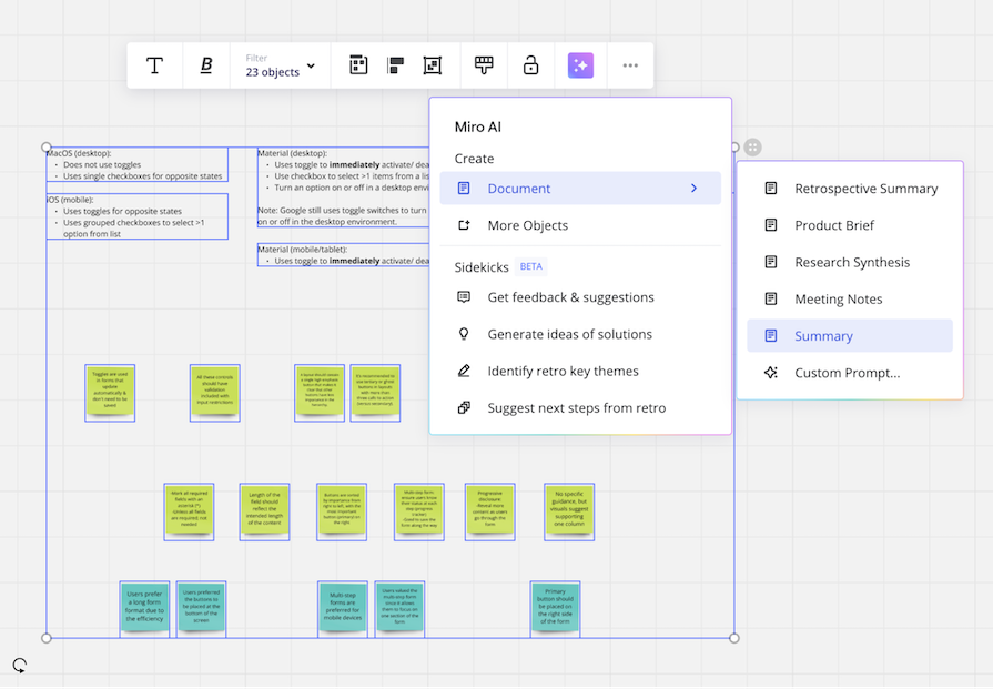
While using almost any kind of software or application in the last year, you’ve probably noticed AI (and its notorious sparkle icon) being sprinkled into features:
UX (user experience) design tools such as Miro, Figma, and Adobe have each been deploying AI features into their applications. But here’s the big question – are they actually useful?
Some companies have been pushing AI agendas for a few years, but some companies turned into many this past year. It’s almost like there’s a fear that if there’s no AI implemented in the product, the company will fail to innovate and will soon die.
There’s some truth to that in certain cases. But simply adding an AI conversational bot to a product is neither inventive or saving the company from decline.
Not all companies are only adding AI bots. Some companies are doing real user research to find features that implement AI in a way that helps users gain back time from repetitive work so they can focus on demanding tasks. These implementations of AI add value to products by being practical and useful to users.
So, it seems there is a balance to find when implementing valuable AI into products without impeding human creativity. Because whether we like it or not, AI is here to stay. Companies need to make critical decisions to only introduce AI that strikes this balance.
In this article, we’ll discuss where AI adds value in UX design, where it doesn’t, and then we’ll see where the line may be drawn between AI and human creativity.
Lately, AI has been receiving a decent amount of criticism. Some of it is warranted. But let’s be honest: there are some valuable tools out there that have incorporated AI.
Some of these features identify key trends from endless user data or help pinpoint issues that may have been missed. Others do repetitive and mundane tasks for you, allowing you to focus your valuable time elsewhere.
Let’s review some examples of tools that have added valuable AI into their product with Dovetail, Figma, and Stark.
My UX team uses a tool called Dovetail, which we use to analyze, tag, and create reports for research studies.
Before Dovetail introduced their AI features, the only automated feature I used was transcribing videos from user interviews. Other than that, everything from highlighting transcripts to creating themes from tagged data was manual – in other words, it took forever.
Throughout this year, Dovetail has introduced a multitude of AI-powered features, including automated summaries and AI-clustered highlights from user interviews.
For example, the automated summary can help busy stakeholders or designers quickly get the gist of research in seconds:
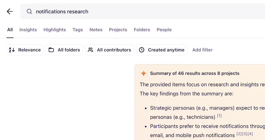
The summary can be done to individual research reports, but my favorite feature is how it summarizes search results. The generated summary will pull the most important pieces of data that exist in the entire repository. Instead of combing through multiple research reports, you can get results from a simple search query.
As for clustered highlights, this feature can assist researchers in creating themes and key insights from a mountain of user data:
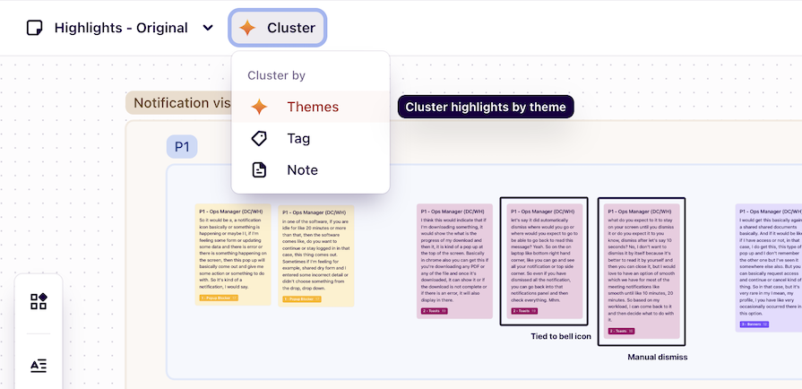
After conducting multiple user interviews, there will be a lot of data to read, re-read, and organize. Getting through this data can take days to weeks, but the automation of clustering highlights can significantly reduce this load.
If AI doesn’t get it exactly right, you can still make changes to your liking – merging AI assistance and human verification.
Figma is one of the most popular UX tools out there. They regularly release new features that are (mostly) driven by user feedback, and announce the release of major features at their annual Config conference.
At this past June’s Config, they inevitably released Figma AI. As we’ll talk about later, not all features in Figma AI were well-received by designers, but some features have proven to be incredibly useful.
Take the new “Suggested auto-layout” and “Rename layers” features, for example. These features have each received massive praise from the Figma community. Both lighten tedious tasks that some designers hate doing, procrastinate, or avoid at all costs.
“Suggested auto-layout” automatically creates frames with auto-layout, and it benefits both new and advanced Figma users. Since auto-layout is one of the most difficult concepts to understand in Figma, this feature allows new users to access auto-layout without having to completely understand the ins and outs:
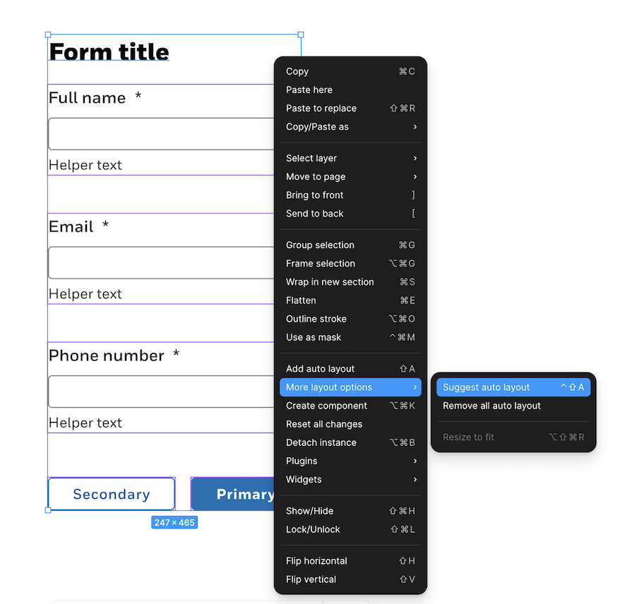
“Suggested auto-layout” also allows advanced users to let Figma do repetitive and time-consuming tasks, like creating many frames and inserting auto-layout correctly in each.
On the other hand, “Rename layers” does one of the tasks designers are infamously known for skipping – renaming “Layer 43567” to something more useful:
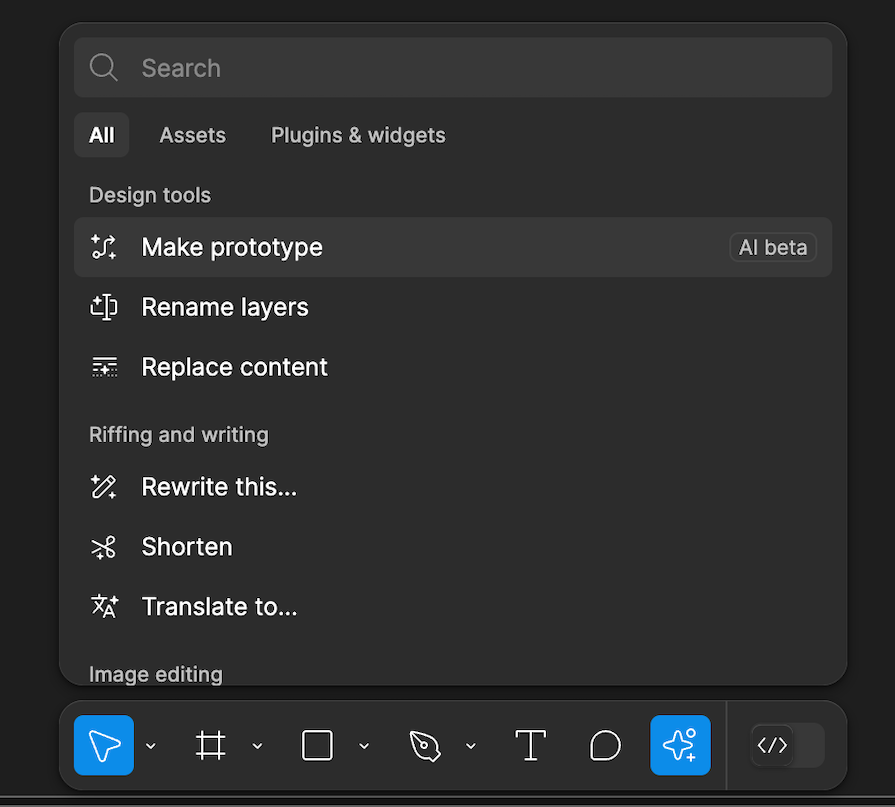
When layers are not named in any semantic way, things can get confusing for project managers, engineers, or other designers reviewing your file. But renaming so many layers eats at design time, and it’s just exhausting. With a few clicks, “Rename layers” can semantically name all the layers of a frame in seconds, saving the user’s time (and sanity).
Stark is a reliable accessibility tool that has a Figma and Sketch plugin. With their plugin, you can check for color-contrast issues, simulate color blindness, and annotate alt-text or focus order for developer-handoff. You can check for accessibility issues manually, but you can also automate some of it with their AI tool, Sidekick.
Even in Stark’s free plan, the Sidekick tool will scan pages in the Figma file and flag any color violations. It will also flag potential violations, such as not having focus order or landmarks annotated on the design:
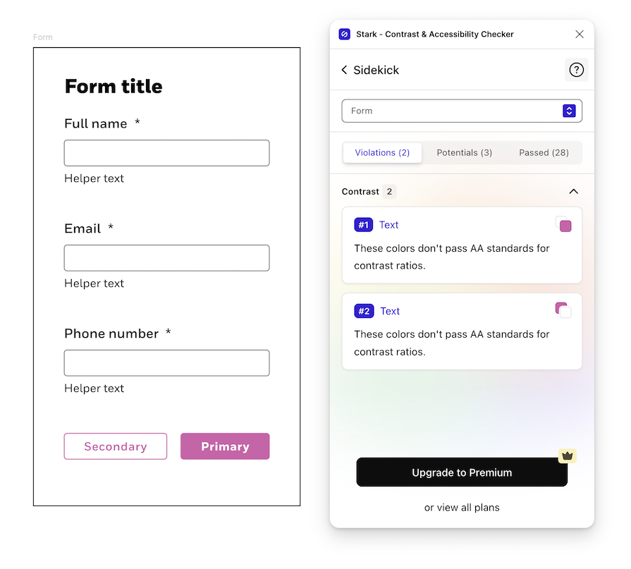
Manually checking all color-contrasts in a design is time-consuming, and there is a risk of missing violations. Stark has implemented AI in a way that gives designers time back and alleviates the possibility of unknown accessibility issues.
As most of us know, AI has a dark side to it. Generally speaking, AI is known to include bias from undiversified training data, as well as taking jobs from humans. From a design industry’s perspective, there is a possibility of an over-reliance on AI-generated content, an impact to the designer’s ability to think outside the box, and unethical practices of creating content.
When people over-rely on AI, there’s a risk of not fact-checking its generated output. As designers, we meticulously create user flows and interfaces with specific justifications. AI doesn’t do that.
Typically, AI features will include a small blurb that prompts you to “Check important information.” But if people begin to accept AI generated-content without questioning it, there may be performance issues down the road. Then someone might ask, “Why did we do it that way?”, and the response will be, “Well, AI did it.”
An over-reliance on AI may cause occasional errors, but it’s also just unoriginal.
AI doesn’t create anything truly new. It just takes existing content and repeats it (maybe with some tweaks). This was shown in Figma’s “Make a design” AI feature. Since launching it in beta this past June, they had to quickly remove “Make a design” since the generated content just copied existing designs:
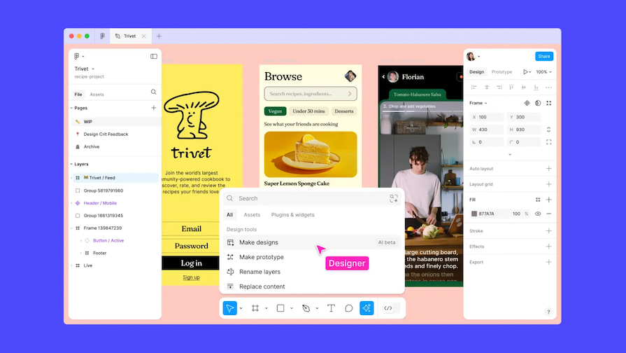
This demonstrates how AI has a negative impact on a designer’s ability to be creative and think outside the box. If AI is continuously used to iterate on designs, it will be stuck in an AI bubble – nothing genuinely innovative.
Worst of all, AI takes humanity out of creativity. Companies like Midjourney and DeviantArt have been sued by artists who claim each company’s AI models were trained using their visual designs:
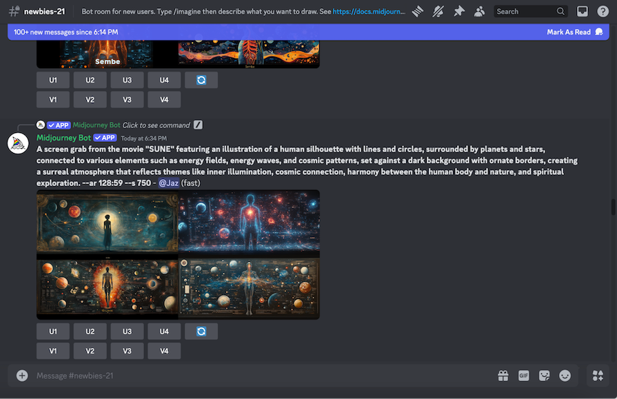
Since the models were trained using the artists’ work (without consent), the tools produce AI-generated content that copy the artists. But only these companies benefit. Instead of paying artists for their expertise in graphic design, branding, or interface designs, AI is hired instead.
But why is AI able to create decent designs in the first place? Because it’s trained off the work of talented designers.
After reading where AI does and doesn’t add value to products, you may be able to see that AI has its benefits and limitations.
Due to its limitations and potential negative impact, AI shouldn’t entirely replace human designers without significantly impacting problem-solving and empathy. But because of the benefits, AI should be used as a collaborative partner.
Let’s talk about some best practices on how to leverage AI to empower designers.
To start using AI as a collaborator, you need to find steps in your design process that are inefficient or where you may struggle (we all have them!). These steps are where AI can lend a helping hand.
Here are some examples of where you could insert AI into design workflows:
You can’t integrate AI into your design workflow without selecting the right tools for you and your design team. Tools you already use may have integrated AI into their workflows, similar to Dovetail’s cluster highlights features that we discussed earlier.
If you begin to notice sparkle symbols or icons — the new signifier of AI — popping up in your frequently-used tools, click on them and explore what they do. You never know if AI may solve a pain point for a mundane task:
Here are some examples of AI-driven tools for UX designers that I haven’t mentioned:
After you’ve identified steps and AI tools to use in your design workflow, you need to occasionally evaluate your process.
There’s a constant influx of AI products emerging for the design industry, and it’s important to remain updated. This way, your workflows are consistently being improved, and you’re using modern tools.
Here are some methods to stay up-to-date with the AI market:

Procreate’s CEO, James Cuda, made a powerful statement claiming that they won’t be introducing generative AI into their products.
Procreate is (probably) the only software company swearing off AI. Unlike the other companies, Procreate’s decision not to implement AI likely stems from knowing that it won’t add value. They believe that if they implemented AI, human creativity would be sacrificed.
Though AI has a bad rap, some companies are introducing AI-powered features that do add value to their products. UX tools like Dovetail, Figma, and Stark are using AI to assist designers with their mundane tasks, like generating alt text or writing video captions, so they have more time for projects that require critical-thinking. Many AI tools also support UX designers in creating accessible designs.
AI does contain risks. If product teams become over-reliant on AI, interfaces may not be designed with user-centered justifications. Not only that, designs could get trapped in an AI-bubble that isn’t innovative or original. Worst of all, it’s unethical for companies to use an artist’s work to train AI models without compensation or consent – taking humans out of the creative process.
AI is here, and it’s only going to grow. It’s up to designers to effectively integrate AI into their workflows by using it as their collaborator – without sacrificing their creativity.
LogRocket's Galileo AI watches sessions and understands user feedback for you, automating the most time-intensive parts of your job and giving you more time to focus on great design.
See how design choices, interactions, and issues affect your users — get a demo of LogRocket today.

As products evolve into ecosystems, navigation becomes a system-level challenge. This article explores how to align structure, context, and user journeys to create seamless movement across tools without confusion.

Figma’s AI features have exploded in 2026 — from text generation and image editing to full UI drafts and code handoff. But speed isn’t the same as quality. This guide breaks down every major feature, what it’s good at, and where human judgment still does the heavy lifting.

Zero UI works well for screenless, voice-first experiences, but most digital products still require visual interaction. Here’s why multimodal UX offers a more scalable foundation for the future of design.

Multimodal UX goes beyond designing for screens. Learn how context-aware systems, progressive modality, failover modes, and accessibility-first design create better digital product experiences.