
Editor’s note: This post was last updated 17 August 2022 to verify code accuracy and reflect changes made in Vuetify v2.x.
With the introduction of new frameworks for visual component encapsulation in web apps, several other needs have been highlighted, including routing, security, SPA and PWA support, internationalization, and, of course, the UI.
Such is true of Vue, which has been widely adopted for developing web applications and hybrid mobile applications. While Vue has a strong focus on component logic and the application as a whole, a developer will need to work with other types of UI libraries or frameworks to add style and design into the pages.
Among the numerous UI frameworks that deal with customizing and facilitating visual components and screen design, several frameworks have adopted the famous Material Design standard. The community has widely accepted this option because it embraces both the desktop and mobile universes with responsiveness, flexibility, and extensibility.
Since most developers working with both paradigms are already familiar with their use, why not join the two together? Therefore, Vuetify was born, combining Vue with the Materialize trend. In this article, we’ll explore Vuetify, learning how to set it up, customizing it, and exploring its features.
You can access the full source code for this article from my GitHub repo. Let’s get started!
The Replay is a weekly newsletter for dev and engineering leaders.
Delivered once a week, it's your curated guide to the most important conversations around frontend dev, emerging AI tools, and the state of modern software.
Vuetify complies with the Material Design specification, meaning the core features of both Vue and Material are available by default and can be improved upon by both communities. In addition, Vuetify offers the following features:
Using Vuetify means you have to embrace Material Design. Therefore, apps intended for the iOS universe are not good candidates for Vuetify. Likewise, if you need a custom design in regards to style as a whole, Vuetify may not suit you, either. As always, you’ll still need to perform a prior, deeper analysis of your project’s needs.
To better understand how Vuetify works, we’ll create from scratch a simple, responsive, Material-based page with elements from LogRocket’s pricing page, the selection of plans in the Pricing menu:

Note that the layout of elements is very intuitive, and the card’s template is reminiscent of how Bootstrap works with grids.
Let’s begin by laying out everything we need for the project. First of all, you need to have the latest version of npm installed on your machine. In this tutorial, we’re using Node.js v14.17.4 and npm v6.14.14. To better manage your Node.js versions, you can use nvm.
To install the Vue CLI globally, first, you need to check if you already have its previous version installed. The package name changed from vue-cli to @vue/cli. Try running the following command to globally uninstall the old package:
npm uninstall -g vue-cli
Then, run the following command to install the correct package:
npm install -g @vue/cli
Check what version was installed with the following command:
vue --version
The command above should print the version as follows:
@vue/cli 4.5.13
Next, we’ll scaffold our application and use a series of preset files to make our life easier , like .vue templates files, index.html, and main.js:
vue create vuetify-logrocket
The installation guide will ask which JavaScript and lint compiler presets you want to use:

Let’s leave the default options for now and continue by selecting Enter. Wait for the installation to complete, then cd into the directory of the application that was created. Run the command below to add Vuetify to your project:
cd vuetify-logrocket
vue add vuetify
Wait until the installation takes you to the next selection of presets, this time from Vuetify:
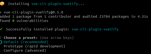
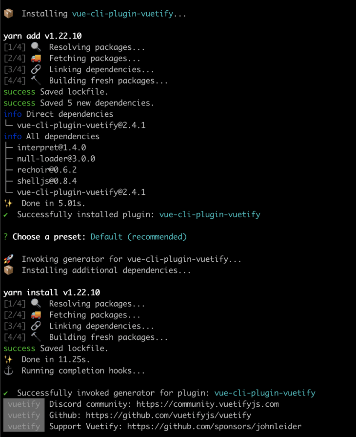
Leave the presets as is and wait for the installation to complete. The image below shows the outputs after adding the plugin:
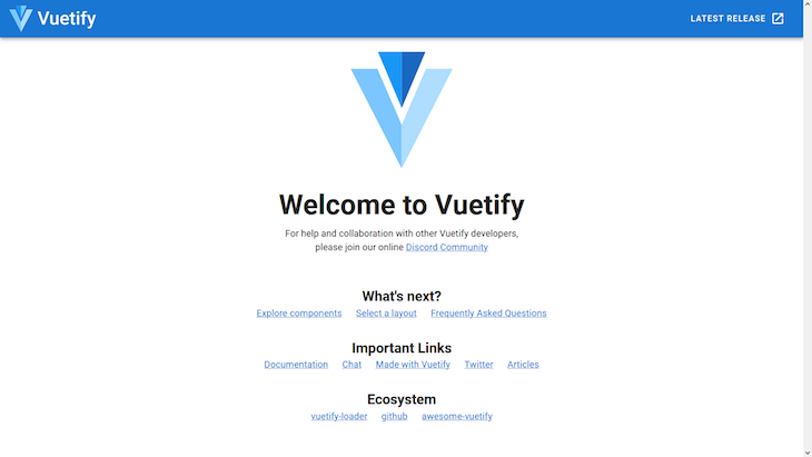
To start the application, simply run the npm run serve command. Doing so will cause the file changes watcher to start and listen to our edits, automatically updating the pages:
Before continuing with the tutorial, I’d recommend reading about some of Vuetify’s basic components in the official documentation.
We won’t use any of the content generated by Vuetify in App.vue, so you can delete all of the contents. We’ll begin by constructing the first part of the screen, including sections for Navigation, Body, and the Footer.
Navigation will include the toolbar and menus. When viewed via desktop, our app will follow the in-depth menu display pattern, along with a navigation drawer that is common to mobile apps and websites viewed on smartphones with the hamburger icon template.
The image below shows how our site will display on an iPhone:
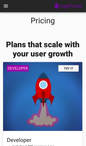
First, create a new file called navigation.vue in the /src/components/ folder and add the following code:
<template>
    <span>
        <v-navigation-drawer app v-model="drawer">
            <v-list>
                <template v-for="(menu, i) in menus">
                    <v-list-item :key="i">
                        <v-list-item-content>
                            {{menu.value}}
                        </v-list-item-content>
                    </v-list-item>
                    <v-divider :key="`divider-${i}`"></v-divider>
                </template>
            </v-list>
        </v-navigation-drawer>
        <v-app-bar app dark>
            <v-app-bar-nav-icon class="hidden-md-and-up" @click="drawer = !drawer"></v-app-bar-nav-icon>
            <v-spacer class="hidden-md-and-up"></v-spacer>
            <v-img src="https://assets.logrocket.io/img/logo.png" max-width="120px" max-height="25px"></v-img>
            <v-btn flat class="hidden-sm-and-down">Pricing</v-btn>
            <v-spacer class="hidden-sm-and-down"></v-spacer>
            <v-btn flat class="hidden-sm-and-down">Customers</v-btn>
            <v-btn flat class="hidden-sm-and-down">Docs</v-btn>
            <v-btn flat class="hidden-sm-and-down">Blog</v-btn>
            <v-btn flat class="hidden-sm-and-down">Login</v-btn>
            <v-btn color="purple darken-3" class="hidden-sm-and-down">Sign Up</v-btn>
        </v-app-bar>
    </span>
</template>

<script>
export default {
    name: 'RocketNavigation',
    data() {
        return {
            drawer: false,
            menus: [
                { value: 'Pricing' },
                { value: 'Customers' },
                { value: 'Docs' },
                { value: 'Blog' },
                { value: 'Login' },
                { value: 'Sign Up' }
            ]
        };
    }
};
</script>

<style scoped>
</style>
<template>
    <span>
        <v-navigation-drawer app v-model="drawer">
            <v-list>
                <template v-for="(menu, i) in menus">
                    <v-list-item :key="i">
                        <v-list-item-content>
                            {{menu.value}}
                        </v-list-item-content>
                    </v-list-item>
                    <v-divider :key="`divider-${i}`"></v-divider>
                </template>
            </v-list>
        </v-navigation-drawer>
        <v-app-bar app dark>
            <v-app-bar-nav-icon class="hidden-md-and-up" @click="drawer = !drawer"></v-app-bar-nav-icon>
            <v-spacer class="hidden-md-and-up"></v-spacer>
            <v-img src="https://assets.logrocket.io/img/logo.png" max-width="120px" max-height="25px"></v-img>
            <v-btn flat class="hidden-sm-and-down">Pricing</v-btn>
            <v-spacer class="hidden-sm-and-down"></v-spacer>
            <v-btn flat class="hidden-sm-and-down">Customers</v-btn>
            <v-btn flat class="hidden-sm-and-down">Docs</v-btn>
            <v-btn flat class="hidden-sm-and-down">Blog</v-btn>
            <v-btn flat class="hidden-sm-and-down">Login</v-btn>
            <v-btn color="purple darken-3" class="hidden-sm-and-down">Sign Up</v-btn>
        </v-app-bar>
    </span>
</template>

<script>
export default {
    name: 'RocketNavigation',
    data() {
        return {
            drawer: false,
            menus: [
                { value: 'Pricing' },
                { value: 'Customers' },
                { value: 'Docs' },
                { value: 'Blog' },
                { value: 'Login' },
                { value: 'Sign Up' }
            ]
        };
    }
};
</script>
The first tag refers to the definition of a template created in Vue. This tag requires that only one child element be added to the hierarchy; otherwise, we’ll receive an error. To bypass this check, we can add a <span> or any other neutral HTML element that encapsulates the others. For desktop visualization components to coexist, we need both <v-navigation-drawer> for mobile visualization and <v-app-bar>.
Let’s review some other important considerations. We use the app directive in both components so that Vuetify understands that they belong to the application at a more global level , that is, how to resize and readjust them relative to the parent element.
v-model defines what type of model we’re using , in this case, drawer. This element is important so that the list of menus does not appear as if it’s hanging. The JavaScript code that feeds your items is at the end of the listing.
The rest of your content represents a loop that iterates over the menu elements, predefined in the menus element. Here, we use the <v-list>component to iterate and compose the title sub-elements, <v-list-title> and <v-divider>.
In the <v-app-bar> element, we use the dark directive for Vuetify’s default night style import. The <v-app-bar-nav-icon> component represents our hamburger icon. It should, of course, only appear when we are viewing the app in mobile mode, which is why all elements of the toolbar receive CSS classes for the Material Design Viewport Breakpoints.
This is Vuetify’s default mechanism for controlling the display of elements based on the current viewport. See the official dimensions for each Vuetify prefix below:
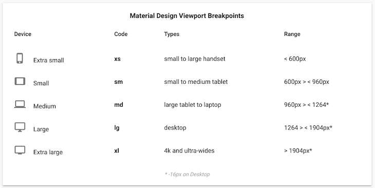
These conditions follow the hidden-{breakpoint}-{condition} format.
In the hidden-md-and-up class, the breakpoint sets the viewport size to md for medium devices, and the condition applies the class based on and-up. In other words, it hides the element on the specified breakpoint, md, and larger, lg through xl breakpoints. The rest of the toolbar’s elements are the opposite. They will be hidden when the device viewport is small sm or lower, down.
For color, Vuetify offers a predefined color palette that you can use via CSS classes. Lastly, the @click property defines that a click on the hamburger icon will trigger the activation of the navigation drawer. Otherwise, the click will not take effect. It’s worth remembering that the effect is a toggle.
Now, let’s create our second template, the body, for pricing plans. To do so, create a new file called plans.vue in the same directory and add the following code:
<template>
    <v-container grid-list-lg>
        <v-row column>
            <v-col class="text-xs-center display-1 my-5">Pricing</v-col>
            <v-col class="text-xs-center display-1 font-weight-black">Plans that scale with your user growth</v-col>
        </v-row>
        <v-row row wrap>
            <v-col>
                <v-card>
                    <v-img :src="images.rocket1" height="300px">
                        <v-container fluid>
                            <v-row>
                                <v-col flexbox>
                                    <span class="subheading purple white--text px-1 py-1">DEVELOPER</span>
                                </v-col>
                                <v-btn small>Try it</v-btn>
                            </v-row>
                        </v-container>
                    </v-img>

                    <v-card-title primary-title>
                        <div>
                            <h3 class="headline">Developer</h3>
                            <ul>
                                <li>Includes 1,000 sessions / mo</li>
                                <li>14 day data retention</li>
                            </ul>
                        </div>
                    </v-card-title>
                </v-card>
            </v-col>

            <v-col>
                <v-card>
                    <v-img :src="images.rocket2" height="300px">
                        <v-container fluid>
                            <v-row fill-height>
                                <v-col flexbox>
                                    <span class="subheading purple white--text px-1 py-1">TEAM</span>
                                </v-col>
                                <v-btn small>Try it</v-btn>
                            </v-row>
                        </v-container>
                    </v-img>
                    <v-card-title primary-title>
                        <div>
                            <h3 class="headline">Team</h3>
                            <ul>
                                <li>Starting at 10,000 sessions / mo</li>
                                <li>Starting at 1 month retention</li>
                            </ul>
                        </div>
                    </v-card-title>
                </v-card>
            </v-col>

            <v-col>
                <v-card>
                    <v-img :src="images.rocket3" height="300px">
                        <v-container fluid>
                            <v-row fill-height>
                                <v-col flexbox>
                                    <span class="subheading purple white--text px-1 py-1">PROFESSIONAL</span>
                                </v-col>
                                <v-btn small>Try it</v-btn>
                            </v-row>
                        </v-container>
                    </v-img>
                    <v-card-title primary-title>
                        <div>
                            <h3 class="headline">Professional</h3>
                            <ul>
                                <li>Any volume of Sessions</li>
                                <li>Custom data retention</li>
                                <li>On-premise available</li>
                            </ul>
                        </div>
                    </v-card-title>
                </v-card>
            </v-col>
        </v-row>
    </v-container>
</template>

<script>
export default {
    name: 'RocketPlans',
     data() {
        return {
            images: {
                rocket1: require('../assets/rocket_1.jpg'),
                rocket2: require('../assets/rocket_2.jpg'),
                rocket3: require('../assets/rocket_3.jpg')
            }
        }
    }
};
</script>
Vuetify comes with a powerful 12-point grid system that you can use to make web applications. The grid system is built on top of CSS Flexbox, and it provides five media query breakpoints that you can use to target specific screen sizes:
XS: Screen sizes less than 600pxsm: Screen sizes between 600px and 960pxmd: Screen sizes between 960px and 1264pxlg: Screen sizes between 1264px and 1904pxxl: Screen sizes greater than 1264pxThe grid system provides the following components:
v-container: Can be used to center content on a pagev-row: A wrapper component for v-col. It has a standard gutter of 24px and uses Flexbox to control the layout of its children columnsv-col: A content holder that must be a direct child of v-row. v-col allows you to specify column widths across the five breakpoints, and when no column widths are specified, it will render columns with equal widthv-spacer: A spacing component that can either be used to fill the available space or make space between child componentsOur container is a simple, horizontally aligned CSS Grid. The first item in the container is a column, <v-row>. I quickly aligned two texts in the center of the page with the following props:
text-cs-center: Aligns text on the horizontal x-axis to the centerdisplay-1: Vuetify typography for a default <h4> element sizemy-5: Spacing setting for Vuetify margins. Here, m comes from the margin, and y comes from the vertical y-axis. According to the Material Design specification, the scale ranges from 0 to 5font-weight-black: Font weight for Vuetify typography; sets the font weight to 900The next layout is a row consisting of three cards. Each card, represented by a <v-card>, is composed of two main elements, an image and a title.
In Vuetify, an image, <v-img>, is made of components, which work with src and point directly to the image that may be hosted externally.
To access the files locally, like in our case, you need to expose each of them as data attributes with their respective paths relative to the assets folder; see the script at the end of the listing. You can access the image files in the GitHub project link at the beginning of this article.
Within each image, we create another container with the fluid prop, which extends the width of the container to be the same as the parent container. Each container will contain a span text with the title of each card and a call-to-action button. Here, we are using more props for subheading and alignment. px-1 stands for a horizontal padding value of 1 out of 5.
The <v-card-title> component defines the content of the card , usually the title and description, but it may contain other elements like buttons. When viewed in mobile mode, Vuetify will rearrange the cards vertically.
To create the footer, go to the components directory of your project and create the footer.vue file. Add the following code:
<template>
<v-footer height="auto" dark>
<v-row justify-center row wrap>
<v-col lighten-2 py-3 text-xs-center white--text>
©2019 — <strong>LogRocket // Vuetify</strong>
</v-col>
</v-row>
</v-footer>
</template>
<script>
export default {
name: 'RocketFooter'
}
</script>
Our simple footer is composed of the items we discussed previously. For each of the .vue files, we need to define the names of each template, i.e., how they will be recognized externally by other.
For the main page, we’ll use the App.vue file that was already created. Add the following code to it:
<template>
    <v-app>
        <rocket-navigation></rocket-navigation>
        <rocket-plans></rocket-plans>
        <rocket-footer></rocket-footer>
    </v-app>
</template>

<script>
import RocketNavigation from '@/components/navigation';
import RocketPlans from '@/components/plans';
import RocketFooter from '@/components/footer';
export default {
    name: 'LogRocketApp',
    components: {
        RocketNavigation,
        RocketPlans,
        RocketFooter
    }
};
</script>
Vue requires the <v-app> tag, which centralizes the other elements that constitute its application.
The remainder of the implementation is relatively simple. All we have to do is import the other component files via the import x from y directive and export them as usual. Note that we have to hyphenate each tag before we can use it in the template. Therefore, Vuetify can recognizes how each camel case has been translated.
When starting with a new framework, there are many factors one needs to consider. The advantage of Vuetify is that many of the pros and cons have already been absorbed by Vue itself. You have to analyze the real needs of your project. As we mentioned before, Vuetify may not suit your project if you rely on the design itself. But if it does, you will have a productive and extremely powerful tool on hand to create amazing web pages.
Have you used Vuetify? If yes, how was the experience? Feel free to leave your feedback in the comments . You might help someone with a similar project. Happy coding!
Debugging Vue.js applications can be difficult, especially when users experience issues that are difficult to reproduce. If you’re interested in monitoring and tracking Vue mutations and actions for all of your users in production, try LogRocket.

LogRocket lets you replay user sessions, eliminating guesswork by showing exactly what users experienced. It captures console logs, errors, network requests, and pixel-perfect DOM recordings — compatible with all frameworks.
With Galileo AI, you can instantly identify and explain user struggles with automated monitoring of your entire product experience.
Modernize how you debug your Vue apps — start monitoring for free.

Local AI proxy tutorial for detecting, masking, and rehydrating PII before prompts reach cloud LLMs.

Learn how Graph RAG uses connected knowledge structures to improve retrieval beyond simple text similarity.

Learn how sibling-index() enables clean, JavaScript-free stagger animations using native CSS.

useEffect breaks AI streaming responses in ReactSee why useEffect breaks AI streaming in React, and how moving stream state outside React fixes flicker and stale updates.
Would you be interested in joining LogRocket's developer community?
Join LogRocket’s Content Advisory Board. You’ll help inform the type of content we create and get access to exclusive meetups, social accreditation, and swag.
Sign up now