A high-quality, enterprise-level software product usually has a complete software development team with several UI/UX designers, business analysts, developers, testers, and DevOps engineers — a great product is always a result of collaboration. Using popular design tools like Figma, UX designers translate business flow specifications into product prototypes based on Human-Computer Interaction (HCI) aspects.

According to the company size, dedicated UI designers or full-stack developers translate prototypes into well-architectured, real-world software product interfaces after the design handoff process. In this phase, teams receive ready-to-develop design prototypes from UX designers. The design handoff process bridges two different job roles, so it‘s often chaotic if the product is complex. In 2023, Figma introduced Dev Mode to offer developer-focused features to solve common issues in design handoff.
In contrast, Zeplin offers a whole collaborative platform for design handoff. Zeplin helps software teams by implementing features for every challenge the team faces along the design handoff process. Let’s compare Zeplin with Figma Dev Mode and find out what suits better for your software product team!
Regardless of the software development model, every team follows the well-known Software Development Life Cycle (SDLC) to create and maintain software systems. In SDLC, the design handoff process, known as the design delivery process, happens between design and development milestones.
Design handoff is all about sending a complete, self-explanatory prototype for developers for implementation, but this process isn’t as simple as we expect due to the following challenges:
These challenges often make the handoff process chaotic by adding time-consuming meetings and endless quick text chats between designers and developers. Solving these challenges using manual strategies with meetings and chats (i.e., posting new, ready-to-develop prototype screen names in a group chat constantly) is undoubtedly a waste of time.
Fortunately, Figma Dev Mode and Zeplin competitively offer productive solutions for these challenges to save time.
Figma was an interface design prototyping tool from its inception, so it released many productive features targeting UX designers.
Now, Figma Dev Mode is a platform mode that adds developer-focused features to smoothen the design handoff process. Designers can mark specific design sections or screens as read-for-development and share a Dev Mode-enabled Figma design with developers. Once developers enter Figma Dev Mode, they can identify screens that are ready to build, inspect design elements, compare versions, generate code snippets, and view annotations:
In addition to the Dev Mode interface, Figma strives to boost developer productivity with developer-focused integration options by providing extensions/integrations for VS Code, GitHub, Jira, Trello, and so on.
Zeplin is a fully-featured, collaborative platform to solve challenges in the design handoff process. Since it focuses solely on the design handoff workflows, it doesn’t offer inbuilt interface designing features like Figma. So, it lets you import designs from popular tools like Figma, Adobe XD, Adobe Photoshop, and Sketch.
Zeplin covers many aspects of the generic design handoff process by offering features like element inspection, Git-like version history, productive search, developer-friendly screen organization (i.e., group screens by sections), fully-featured interaction flow management, collaboration tools, and code generation:
Apart from its core design handoff features, it boosts developer productivity via VS Code, Trello, Storybook, Jira, etc. extensions/integrations.
Let’s go through Zeplin and Figma in a head-to-head comparison.
It sounds like both Figma Dev Mode and Zeplin strive to solve the same problem, right? But which solves design handoff challenges better? Let’s do a complete one-to-one comparison and identify which solution better suits your current design delivery workflow!
Having good learnability factors is mandatory for any design/development platform since those factors affect product delivery time and budget. If a platform is easy to learn, designers and developers can save time by not spending hours understanding the specific platform.
Figma Dev Mode is not a separate platform — it’s a switchable mode in the Figma platform. From the UX designer’s perspective, this is great because they can use the same familiar platform for the handoff process, but developers have to learn how to use Figma as a developer. Figma hides many designer-specific features to improve learnability and offers developer-friendly views for better productivity:
Zeplin is a separate platform, so UX designers and developers should become familiar with it as new users. Since it handles only the design delivery process, its interface only contains three self-explanatory segments: Dashboard, Flow, and Styleguide, so anyone can get started with Zeplin in record time:
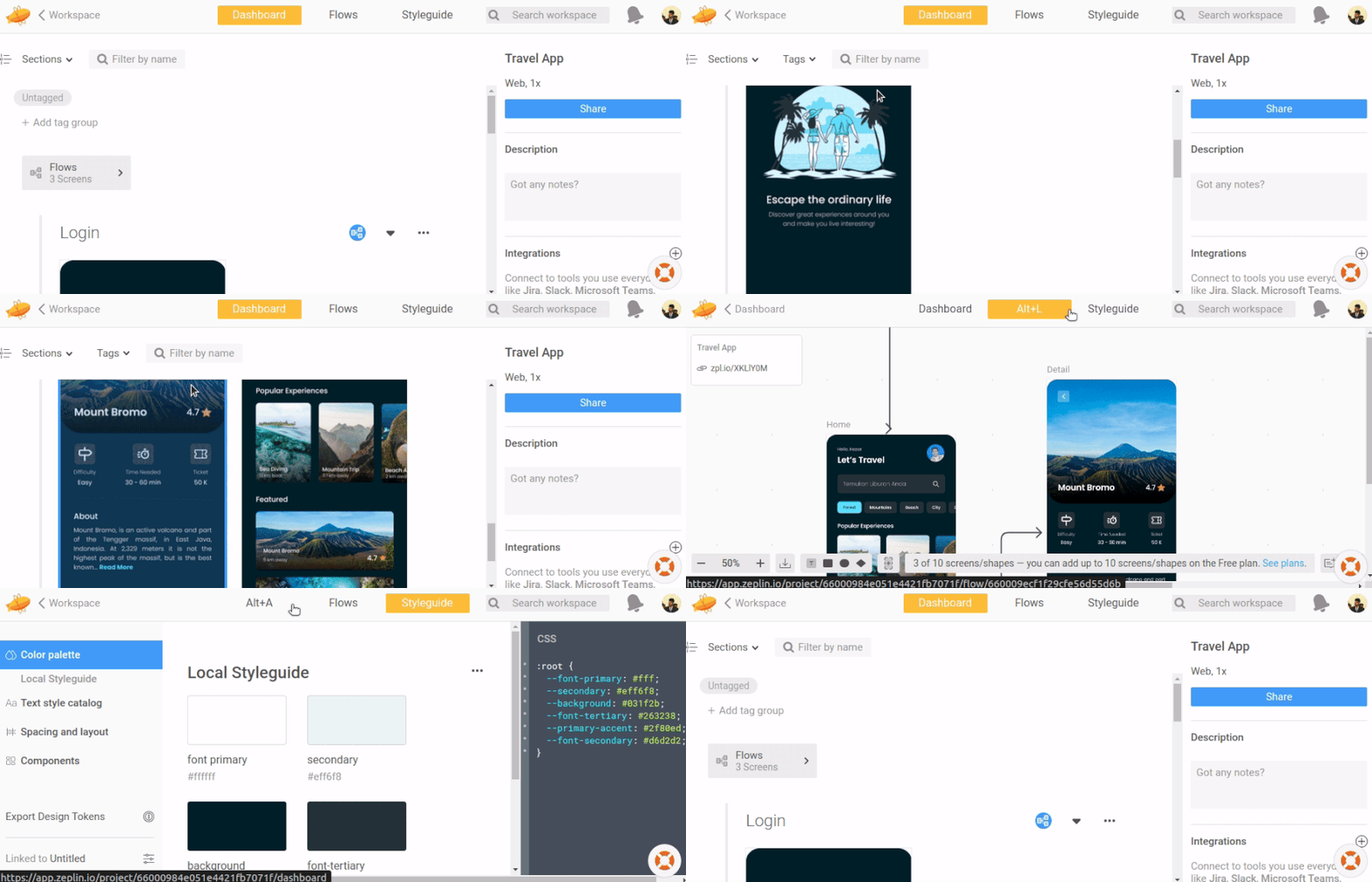
Both Figma Dev Mode and Zeplin have good learnability factors, but Zeplin stands ahead from learnability factors because of its minimal, clean interface arrangement that suits any role in a specific software team.
Choosing the optimal design handoff flow is crucial since it affects the productivity of every team member. A better design handoff flow drastically reduces the time the entire team spends in communication channels.
Figma Dev Mode’s design delivery relies on the ready-for-dev button that marks a specific section or frame as ready-to-build. Once UX designers mark which segments can be developed, they can share a link that brings developers to the Dev Mode:
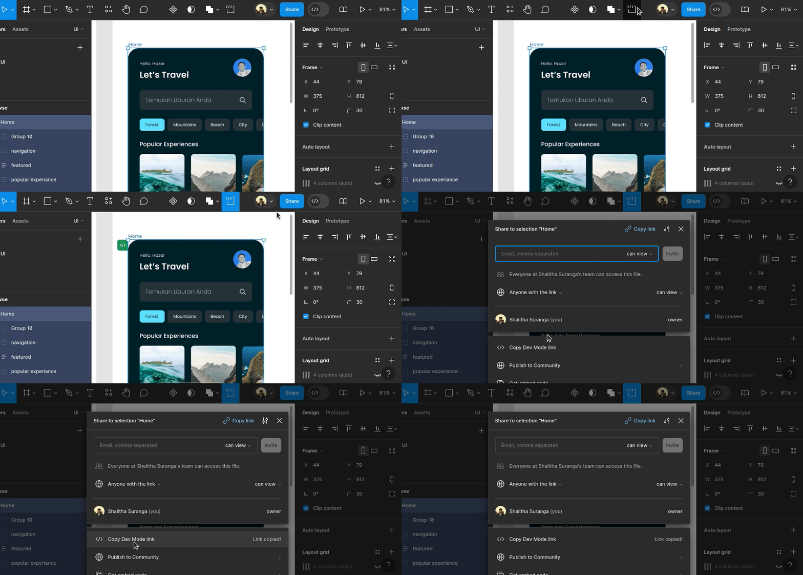
As a collaborative platform, Figma users can add comments and design annotations. Here we won’t see a clear flow in the Figma design handoff since everything we do is switching between two modes: Design and Dev. Figma offers design handoff-focused features for developers, but it doesn’t offer a fully-featured handoff flow with isolated design/development environments, approvals, etc.
Zeplin takes prototypes from other designing tools by isolating developers from the original prototyping tool. As a result, designers can edit and publish screens to Zeplin when they are ready to build simultaneously without worrying about what developers see:
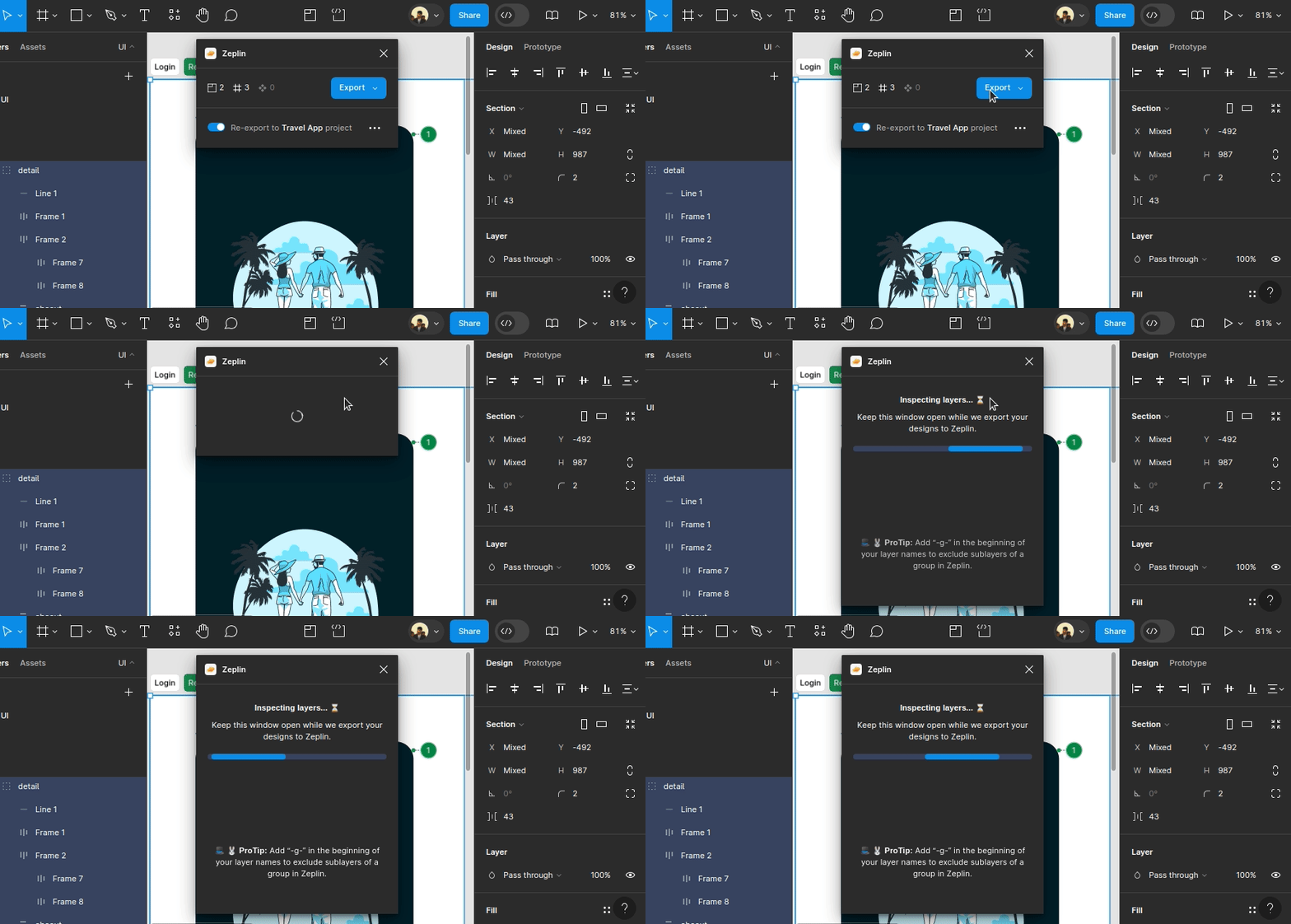
Zeplin also completes the handoff process by offering design approval support. Like Figma, Zeplin supports adding annotations and comments for collaboration.
Zeplin offers a fully-featured design-handoff flow by isolating development-ready designs, while Figma uses the ready-for-dev flag as the primary handoff option.
UX designers and developers see product interfaces differently according to their jobs. UX designers often think from the non-technical user’s perspective and consider product designs as a composition of shapes. Developers typically analyze product designs based on programmable interface layouts (i.e., Flexbox) and components. So, an optimal design handoff platform often pays attention to developer-friendly views.
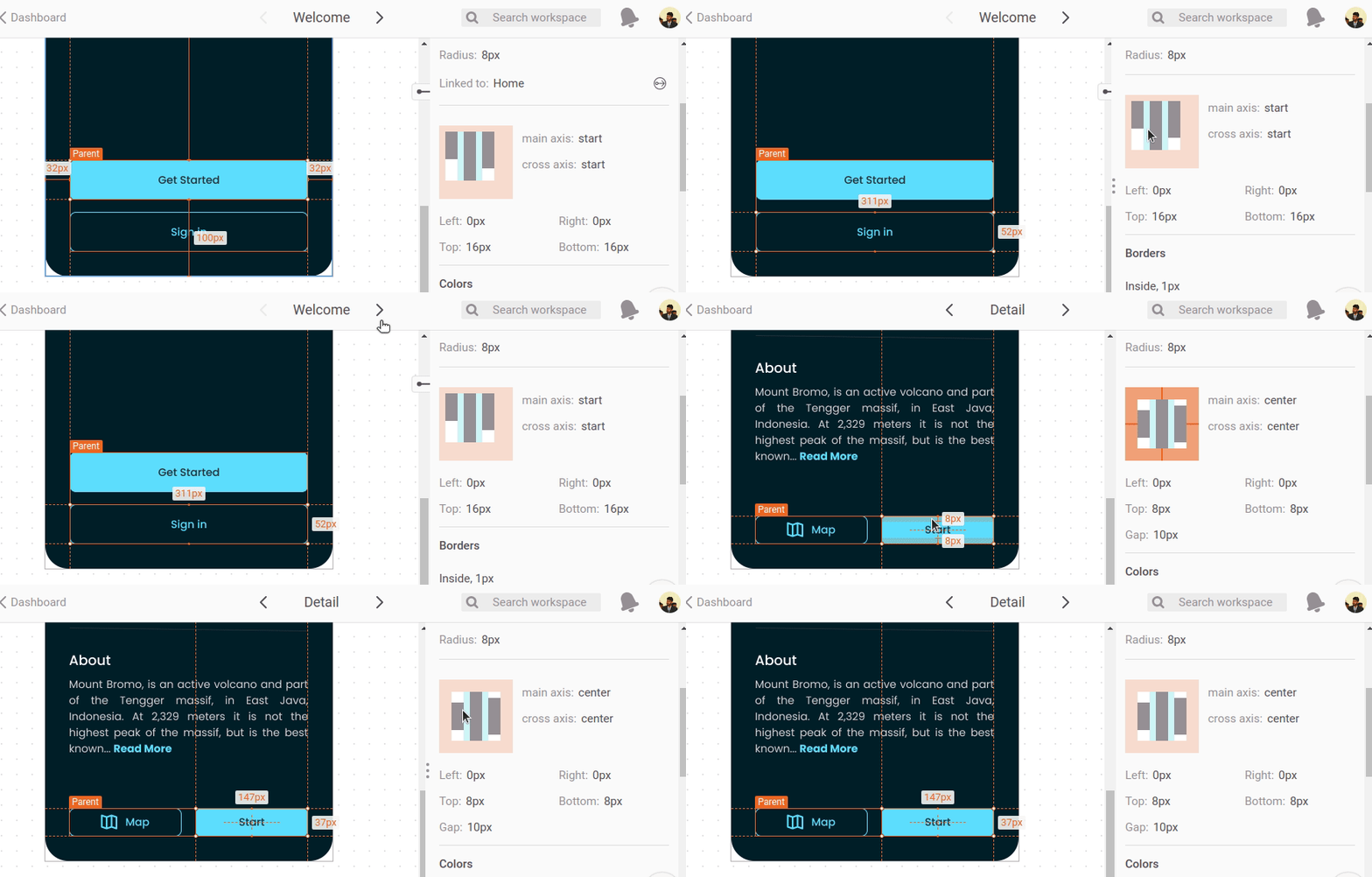
Figma Dev Mode lets you inspect design elements by disabling editing, and it lets you check dimensions, margins, and padding in a browser-like box-model preview widget. Dev Mode renders the same designer view during element inspection:
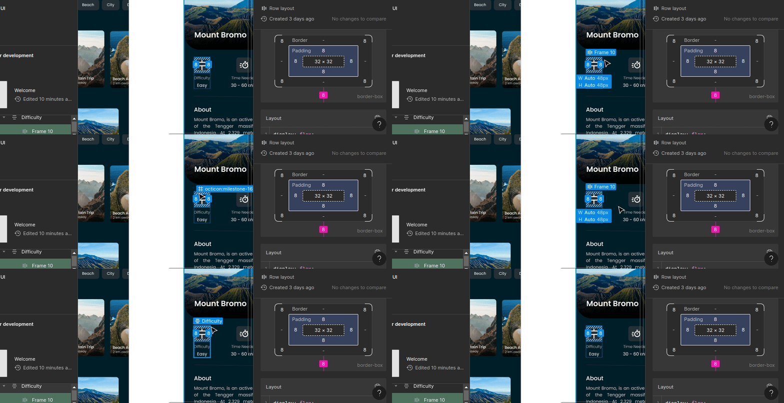
Zeplin implements element inspection for individual screens and lets you see the same information that Figma shows. Additionally, it lets you inspect quickly with a layout thumbnail, but it doesn’t offer a browser-like box-model preview widget as Figma:
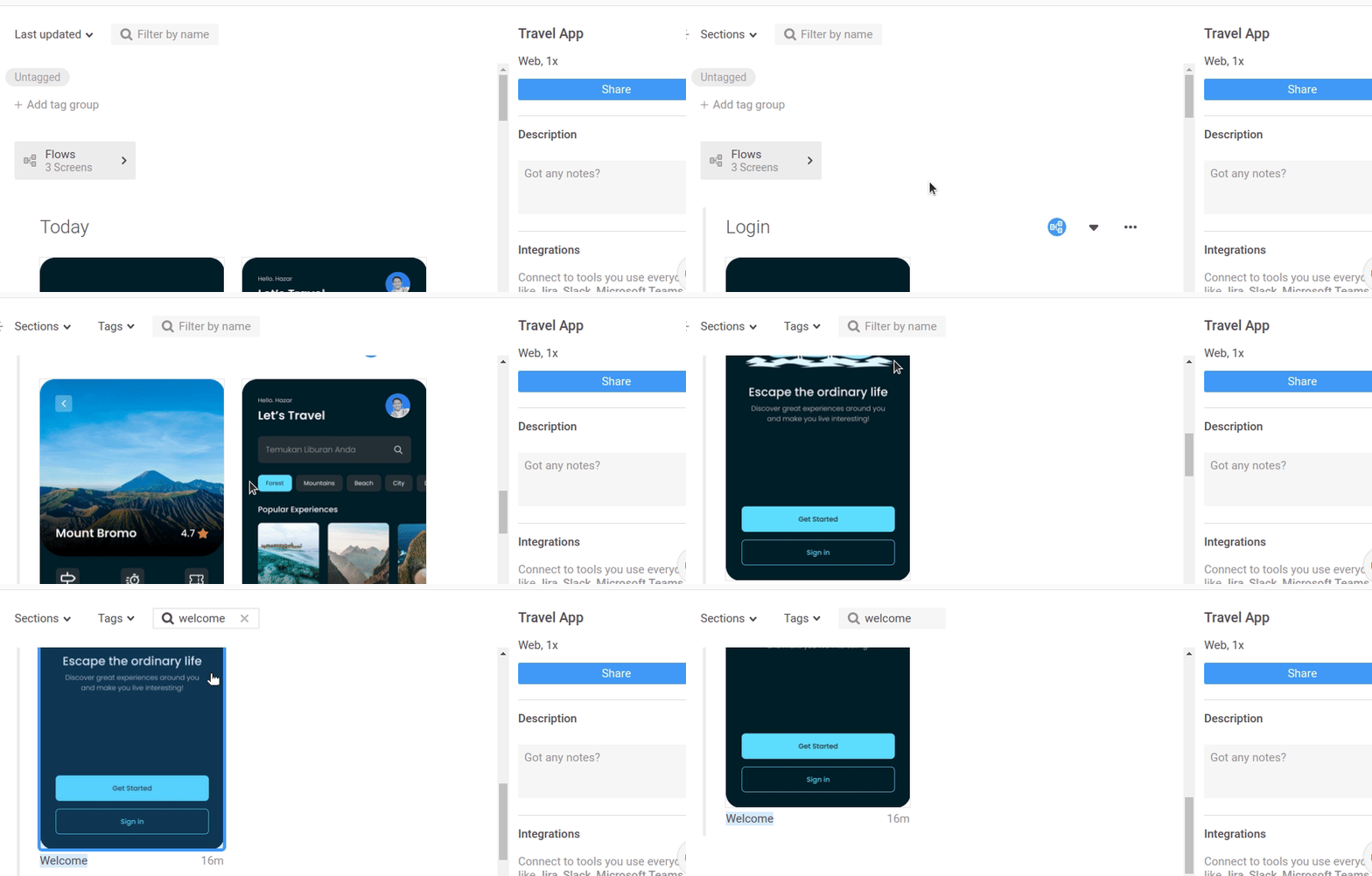
Zeplin’s dashboard page offers some developer-focused features. It lets you organize screens by sections. Figma designer sections automatically get converted into Zeplin sections, so you don’t need to create sections manually. Unlike Figma Dev mode, Zeplin lets you filter and sort screens by sections, as shown in the following preview:
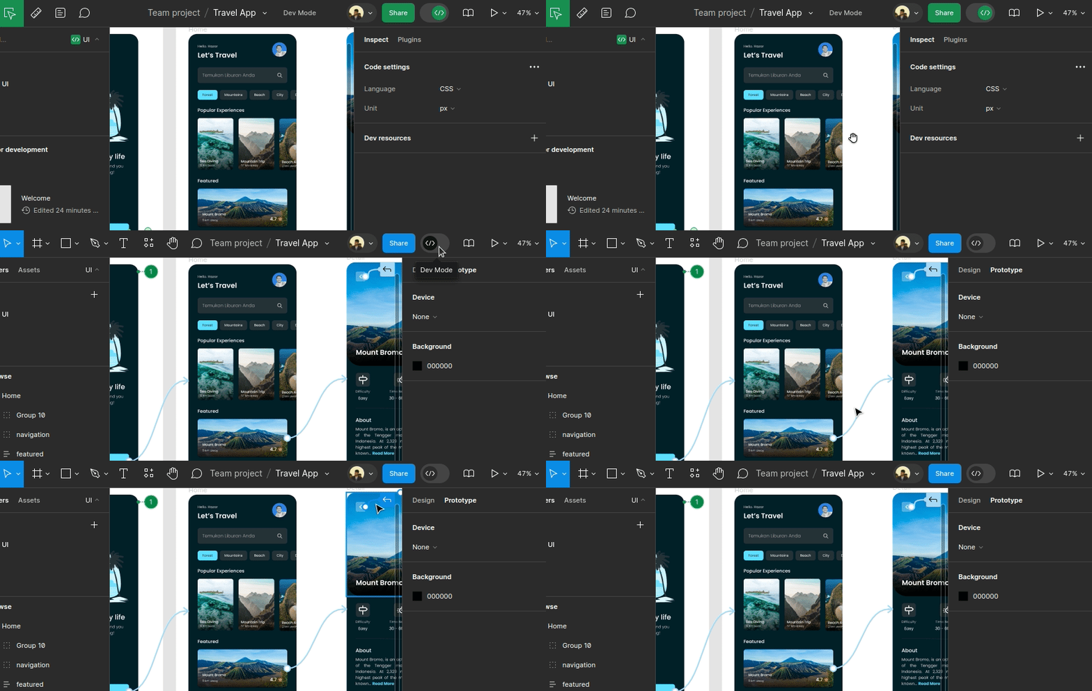
In Figma, Dev Mode hides interaction flows, so we have to turn on design mode to see them. Figma shows any interaction flow and lets designers edit them as follows:
Zeplin shows flows on a separate page with some extra features like customizing interaction flows, and flow elements support (i.e, labels, diamond shapes, etc.), but it only shows Figma screen navigation actions:

Similar to software system codebases, design prototypes also often have multiple versions. For example, a UX designer may send a login page screen design for development and create another version of the specific screen to experiment with an idea suggested by product owners.
Figma solves the version control problem by offering file branching and autosave-based version history.
The branching concept may look complex initially, but well-trained UX designers can adhere to the prototype-branching concept. Figma lets designers send one prototype version for development and edit one prototype version by creating a branch without affecting the original read-for-development version.
Figma automatically creates a version history based on autosave per branch and lets developers compare every change as follows:
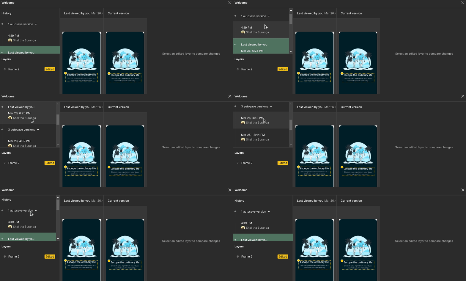
Meanwhile, Zeplin is a separate platform that imports designs from other designing tools, so it doesn’t offer a branching feature by letting designers do branching within their favorite design tools. In Zeplin, designers don’t even need to do branching to edit a prototype since it asks designers to do a Git-like commit with changes during the design importing process:
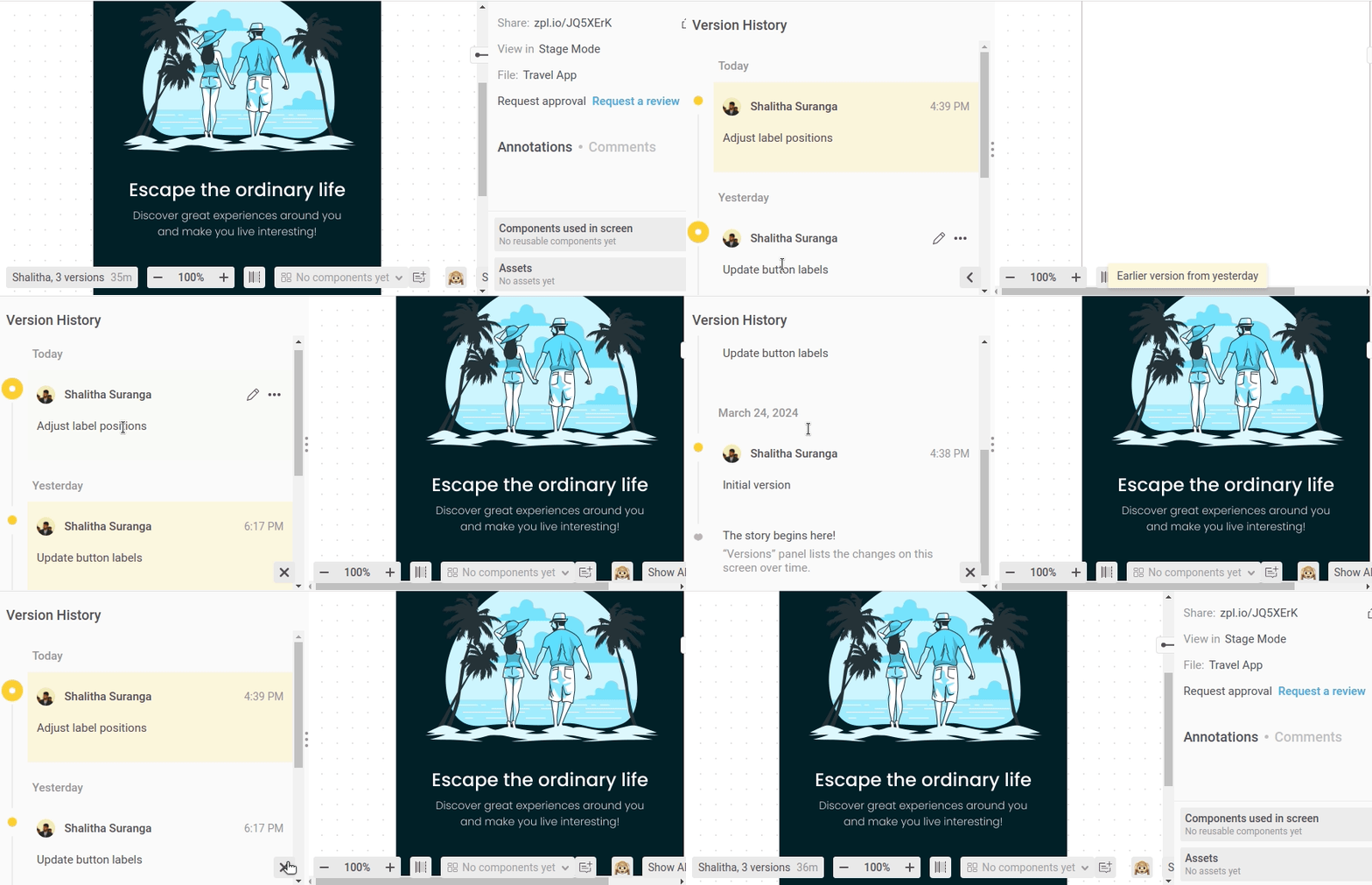
Zeplin creates the version history based on manual, meaningful import events and doesn’t auto-sync autosave events from designing tools. It also lets you compare version history snapshots similar to Figma Dev Mode, but it always shows meaningful version history messages as shown in the above preview.
The design handoff product can become more productive if the prototype element styling code gets auto-generated. Then, developers can copy-paste element layout definitions and component styles without translating every prototype element style manually from scratch.
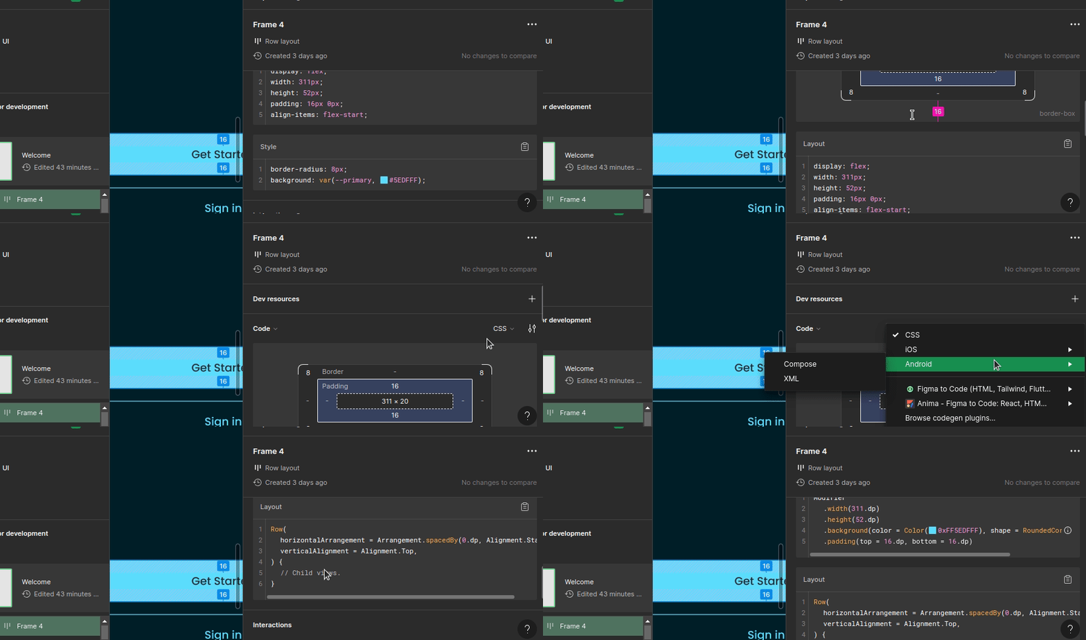
Figma Dev Mode code generation has built-in support for HTML/CSS, Android Compose/XML, and iOS SwiftUI/UIkit. We can use Figma community plugins to generate code for React, Flutter, Tailwind, etc. Dev Mode lets you change code generation language/framework at any time:
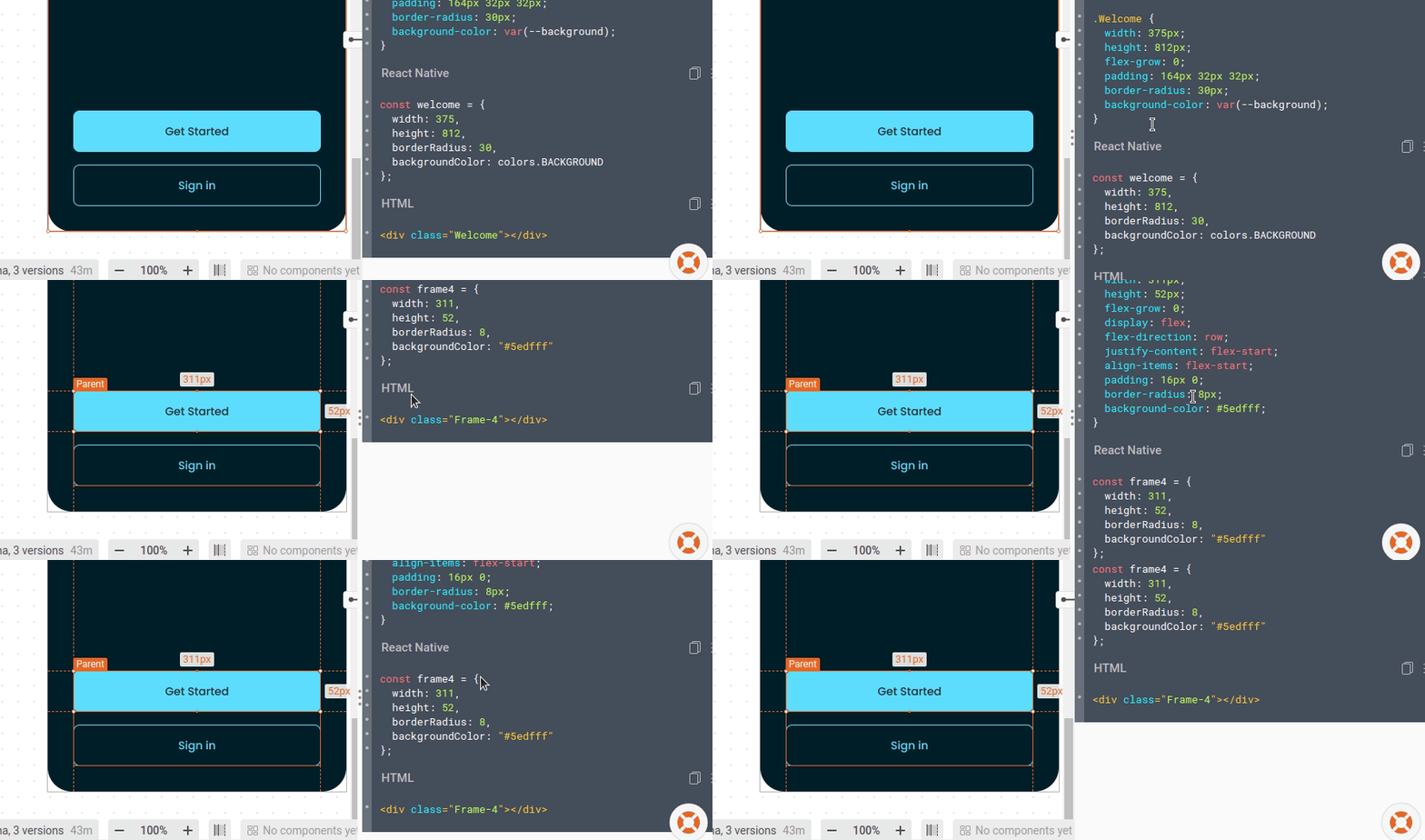
Zeplin code generation has inbuilt support for HTML/CSS, Android XML, and iOS SwitchUI/UIkit. Zeplin official and community extensions help you generate code for React Native, Flutter, Xamarin, Tailwind, etc. Unlike Figma Dev Mode, Zeplin’s inbuilt code generators are not switchable and get auto-added based on the project configuration, but extensions let you generate code for multiple targets as follows:
VS Code (Microsoft Visual Studio Code) became the modern software industry’s default code editor because of its productivity features and developer-friendly design, so every software engineering-related platform tends to introduce VS Code extensions for users.
Figma offers a fully-featured VS Code extension to boost software development by letting developers view designs, collaborate, link code with design components, and autocomplete code based on Figma-generated code. The Figma desktop/web app’s Dev Mode isn’t much developer-friendly from the screen arrangement perspective, but this VS Code extension groups screens based on sections in a developer-friendly manner:
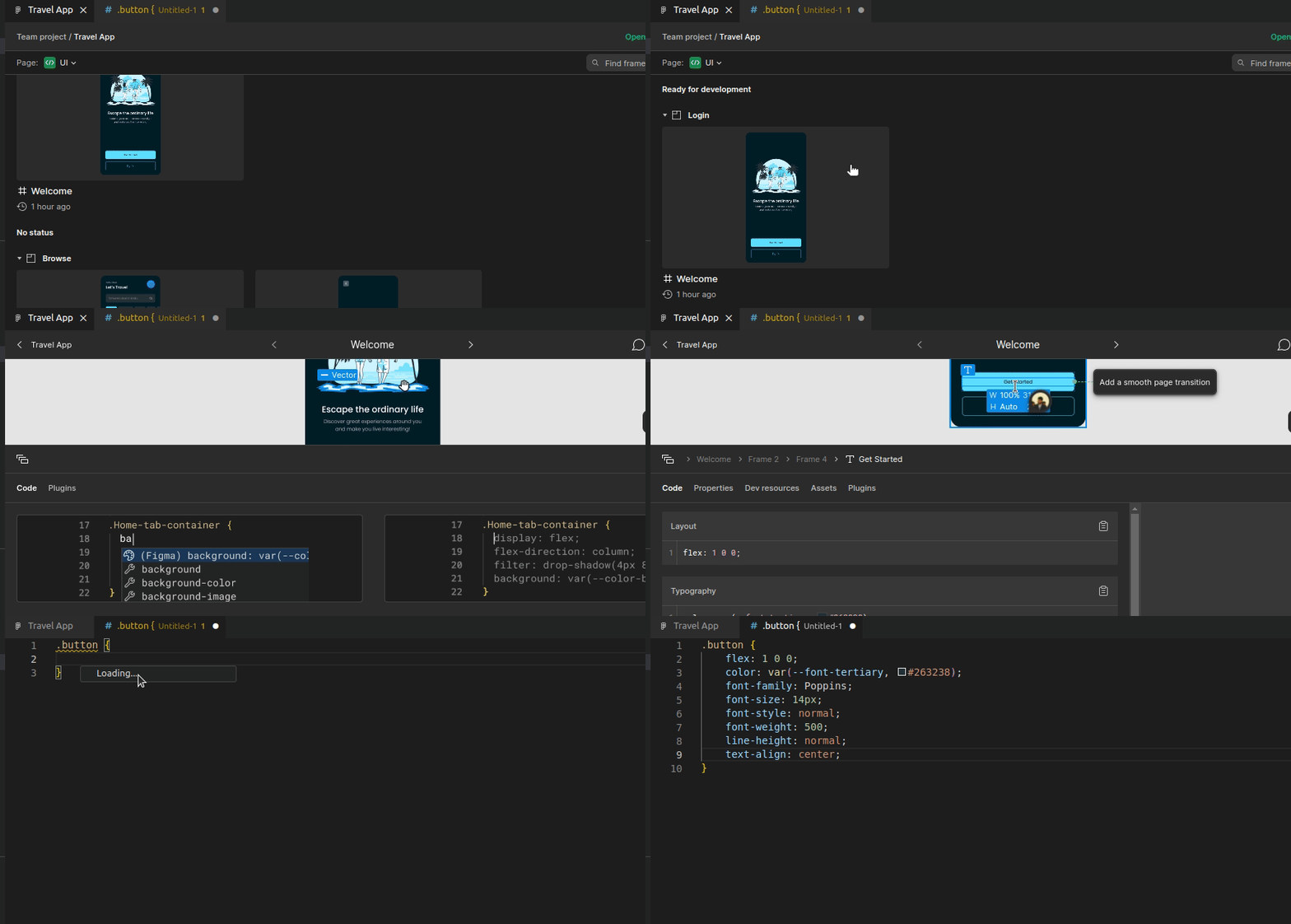
Zeplin offers a minimal VS Code extension that lets developers browse prototype screens productivity. It offers a productive instant search feature, activity log, and Jira integration to navigate to prototype screens. It doesn’t offer inbuilt autocompletion or design preview within VS Code but lets you open the Zeplin desktop app or web app instantly for such needs:
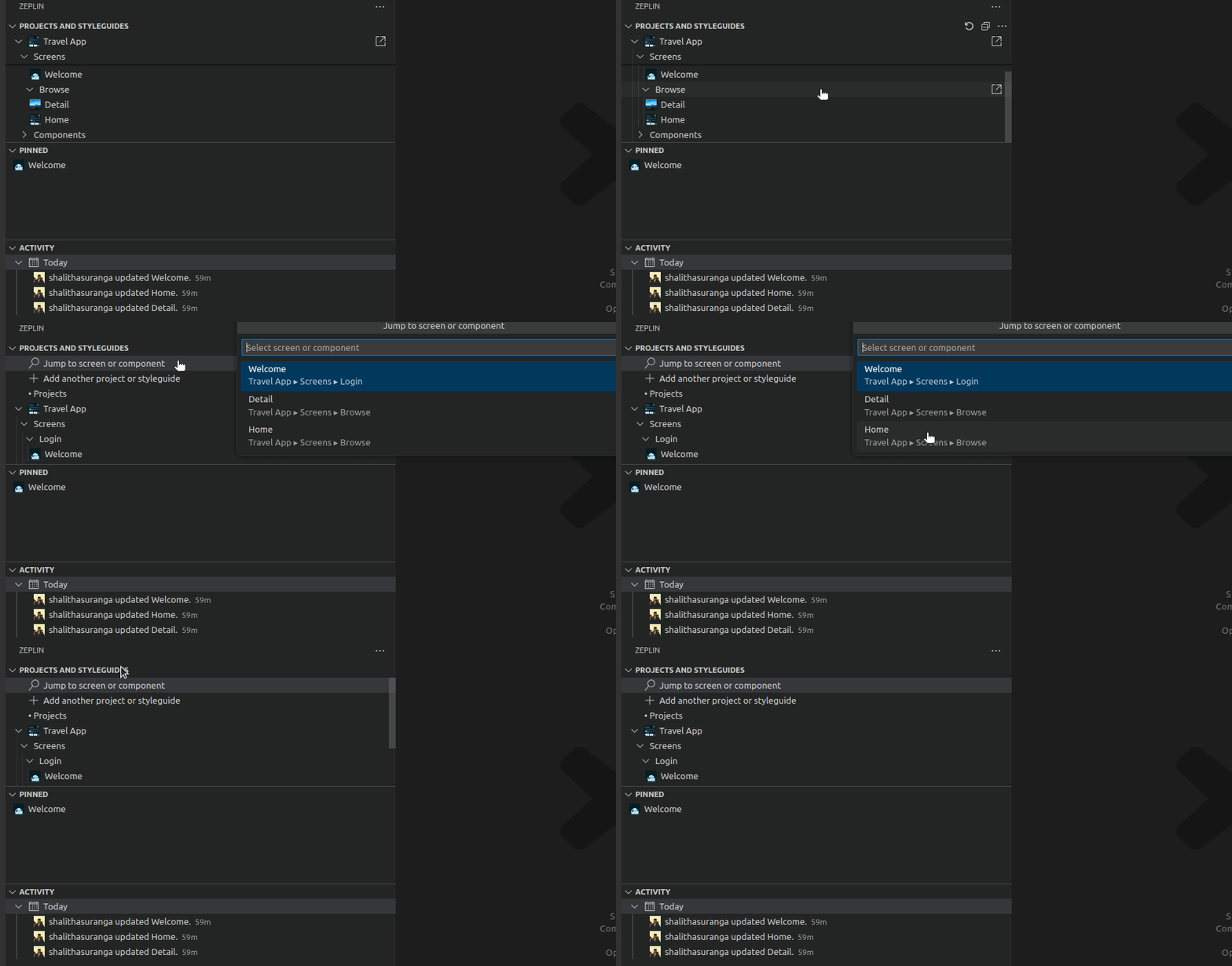
The Zeplin extension also lets you connect code with components similar to Figma. Zeplin extension is a minimal sidebar-only one and opens the desktop/web app to see designs. According to this GitHub issue, the Zeplin development team will improve the VS Code extension in the future by letting users see prototypes directly within VS Code.
Apart from the VS Code integration, both Zeplin and Figma offer extensions to integrate Jira, Microsoft Teams, Trello, etc., like team collaboration platforms.
Every modern SaaS product comes with subscription-based pricing packages. Figma Dev Mode is not a separate app, so it is included in the Figma platform pricing model as a feature. Meanwhile, Zeplin offers a different pricing model according to their business strategy. Pricing is undoubtedly a factor to consider before selecting a design handoff tool.
Both Figma and Zeplin offer free packages for users to use or learn the platform for free. You don’t have to pay for Zeplin to try it for your design handoff process, but Figma needs you to upgrade to the Professional plan to try Dev Mode. In Zeplin, using a free account, you can try almost all features except the design approvals feature and version diff. Zeplin increases the number of flows and approvals when the package level increases.
Figma offers the prototype editor and only a few features for the free package and activates more features (i.e., branching) when the package level increases.
Figma Dev Mode requires a $12 monthly subscription to start using it, but Zeplin lets you use it for free by limiting a few features. Zeplin packages start from $10 and all ready-made packages are eligible for a 30-day free trial, unlike Figma.
Read more about pricing details from the following links:
Both platforms offer developer-friendly features competitively to solve challenges in the design handoff process.
Zeplin offers a better organization of prototype screens, a fully-featured customizable flow designer, and a minimal but productive interface, but its VS Code extension doesn’t implement all the features that developers need.
On the other hand, Figma’s VS Code extension offers more developer-focused features than Zeplin’s extension, but Figma Dev Mode misses a productive search, a better screen organization, and a developer-friendly minimal interface design. Both Zeplin and Figma offer desktop apps for MacOS and Windows operating systems.
Zeplin stays ahead with the Figma Dev Mode from the design delivery flow perspective. Figma Dev Mode is a platform mode that toggles designer/developer features, but Zeplin is a fully-featured, collaborative platform that offers a productive environment for the design handoff process. Zeplin’s Git-commit style workflow isolates ready-to-build and work-in-progress prototype screens better than Figma’s complex branching feature.
Figma Dev Mode doesn’t offer a fully-featured handoff flow, so it’s suitable for software teams that don’t strictly follow a well-structured design handoff process. Zeplin solves the handoff challenges better with a fair design delivery flow, so it’s suitable for teams that strictly follow a well-structured design handoff process. Zeplin is a separate tool that can import designs from Figma, so using Zeplin with Figma is a productive way to improve the handoff process of any modern software product team.
Both Zeplin and Figma can offer new developer-friendly design handoff features to compete with each other, but Zeplin’s well-defined, collaborative design delivery flow won’t become a Figma Dev Mode feature since Figma’s primary goal is to provide a designing platform — not a design handoff platform like Zeplin. Zeplin’s Git-commit style, approval-based design delivery flow offers a simpler, generic solution for design delivery challenges than Figma Dev Mode and branching-like features.
Figma is a fully-featured interface designing tool and the Dev Mode is one of the features that help the design handoff process, but Figma doesn’t offer a fully-featured workflow for the handoff process, so using Zeplin along with Figma is a wise decision for large-scale software teams that need a strict, well-structured design handoff process.
Credits: Traveling Mobile App free design file released under Creative Commons 4.0 (CC 4.0) license used in Figma and Zeplin previews. Minor modifications were made to the original design file to demonstrate Figma to Zeplin import features.
LogRocket's Galileo AI watches sessions and understands user feedback for you, automating the most time-intensive parts of your job and giving you more time to focus on great design.
See how design choices, interactions, and issues affect your users — get a demo of LogRocket today.
A three-week mobile banking project taught me that the “proper” UX process is not always realistic. Sometimes, the better approach is to work with what you know, identify what you still need to learn, and make the strongest decision possible under real constraints.
A/B testing compares two versions of a design to see which performs better with real users. Here’s how UX teams can use it to test hypotheses, measure outcomes, and make smarter product decisions.
This case study shows how one ad experience redesign increased total ad exposure while lowering perceived friction, proving that timing and context can matter more than raw interruption.

As products evolve into ecosystems, navigation becomes a system-level challenge. This article explores how to align structure, context, and user journeys to create seamless movement across tools without confusion.