Humans almost always react based on what they can see — what we see plays a crucial role in our daily interactions. And with websites and applications, especially, there has to be a balance between cool-looking graphics and functionality. Visual communication and UI/UX design are two concepts involved in this process.

In this post, I’ll talk about visual communication and UI/UX design and explore how they’re essential for digital product design. I’ll also delineate their differences and how they work together to create engaging digital experiences.
Visual communication is conveying information using visual elements. Examples of visual elements include photos, icons, videos, tables, charts, maps, posters, typography, and more.
We interact with many visual elements daily, online and offline — and they’ve been so hardwired into our subconscious that we barely notice or think about them.
Consider a traffic light, for example. It says “STOP,” “WAIT,” or “GO,” but it doesn’t actually speak. It changes from red to yellow and green, and we instinctively understand. Emojis are also great tools for visual communication in less formal situations. Pictures and videos can say much more and communicate more clearly than words.
If you see a can of Coca-Cola anywhere in the world, you’ll instantly recognize it. With visual communication, you don’t need to understand a language to understand the message.
Visual communication is straight to the point, ensuring quick communication with the audience. The goal is to make your website or application more engaging for the users. Visual communication helps the audience retain information better.
UI/UX stands for user interface and user experience, focusing on how users interact with digital products. You can say they’re not so identical twins with slightly different personalities:
UI design is about designing the interface where a user interacts with a digital product. You’re interacting with a UI right now. In web development, it’s called the frontend.
UI elements include input controls like buttons and text fields, informational elements like icons, and navigational elements like search bars.
There are three types of user interfaces:
UX design focuses on how users will engage with a website or application. Yes, it looks good — it has to look good — but is it usable? Will users find what they’re looking for without help? Is it accessible to different kinds of users and devices?
The best designs have a user-first approach. The designer must view the product from the user’s perspective. Understand what the target audience expects to see when interacting with your digital product. You can’t assume they’ll understand. That’s why you’re the designer.
Understanding user behavior and preferences ensures you don’t create a product that frustrates or confuses the users. From the page layout to the colors, fonts, buttons, navigation, and more, consider what the users want to see and include it in your design.
You should also consider the number of steps, or lack of steps, required to complete a task. For instance, it’s notoriously difficult to cancel certain subscriptions even though you can subscribe with one click. At the same time, you don’t want actions like delete to be one click and done. Most users expect to be asked for confirmation.
Successful UI/UX designs will make your website or application easy to use and intuitive.
Despite having some similarities, visual communication and UI/UX focus on different things.
Visual communication focuses on conveying messages in an aesthetically pleasing manner. UI/UX design is more concerned with the usability and functionality of a digital product.
One objective of visual communication is to use visual elements to present accurate, easy-to-understand information to a broad audience.
On a website or application, icons represent certain actions or features. If you see a trashcan, it must mean delete, a magnifying glass is for search, a moon or sun means you can switch themes by clicking on the icon, a plus sign means to add something new, and so on. Users should be able to understand the functionality of the icons and symbols on a webpage without necessarily needing a label.
The priority of UI/UX design is ensuring users can interact with these visual elements effortlessly. Users should be able to complete their tasks easily.
Visual communication and UI/UX design can help a brand enforce its branding and establish a strong visual identity. You can say that UI design is about designing the visual elements used for visual communication.
One goal of visual communication is to make a website or application more memorable. This can be achieved by implementing consistent visual elements like logos, color schemes, and typography into UI/UX design. These elements will help users instantly recognize a brand across any platform.
UI/UX designers should ensure that the visual elements in their design evoke the right emotion in the target audience. This will help ensure they remain loyal to the brand.
Adding micro-interactions can help provide visual feedback so users know when they’ve done something on your website or application. For example, the Facebook animations when you react to a post and Reddit’s loading animation featuring the Snoo alien. These make your digital product more engaging and improve the overall user experience.
One way to achieve successful UI/UX design is to follow design principles like visual hierarchy. Enforcing visual hierarchy can vastly improve the usability of a website or app.
Visual hierarchy creates an order of importance among your design elements. It controls how the elements are arranged to guide the user’s attention toward important information. Typography is an important visual element that designers use to establish hierarchy in a digital product.
Visual hierarchy can be established using several principles, such as size, color, spacing, and contrast. The goal is to create separation and a clear structure to guide the user through your digital product.
The concept of size or scale is quite simple. The bigger the element, the more important it must be.
Take the headings in this article, for instance. The title is the biggest and most important; the H2 headings indicate the start of a new section, the smaller H3s for sub-sections, and finally, the body text.
We all know the body text contains key information, but readers will not look at it first. The bigger and bolder headings attract the reader’s attention and guide them towards the body. Sometimes, readers can scan the headings to quickly find the information they’re looking for instead of reading through the entire article.

Consider this screenshot from Canva’s website showcasing their subscription plans:
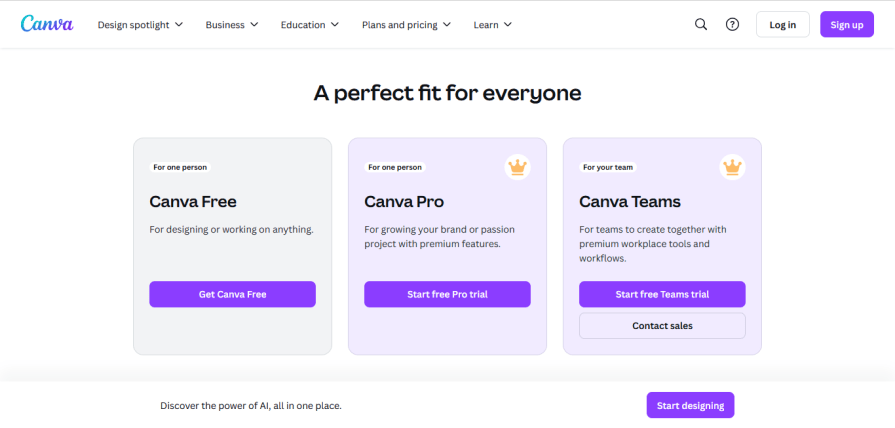
The reader will see the names of the tiers, “Canva Free”, “Canva Pro” and “Canva Teams” first, before moving on to other text. The goal here is to guide them to the call to action.
Color and contrast are important tools designers use for visual communication.
Take a look at this, what do you see?
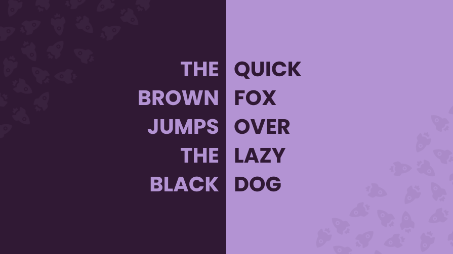
You’d be forgiven for saying, “THE BROWN JUMPS THE BLACK, QUICK FOX OVER LAZY DOG.” Your instinct is to read from top to bottom and not left to right because of the color of the text and background.
Now, look at this:
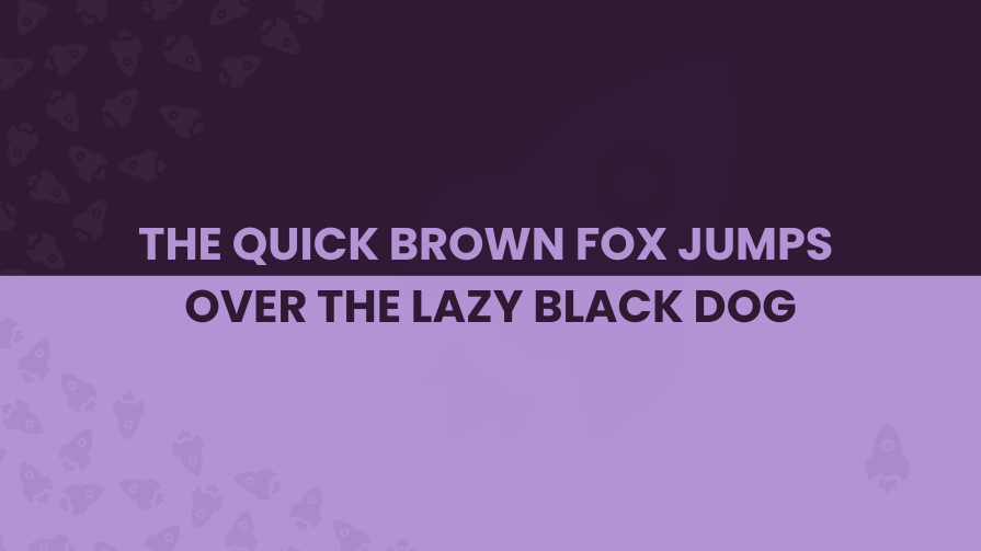
In this example, you can easily read the text in the correct order: “THE QUICK BROWN FOX JUMPS OVER THE LAZY BLACK DOG.”
Some might argue that the orientation helps, and this is true, but take a look at this:
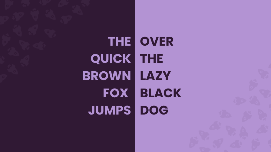
Despite being vertically oriented, it makes perfect sense because the contrasting colors create separation and tell you which text belongs together and how you should read it.
Everyone knows this sentence and may not be fooled by the colors or orientation, but imagine if it was text you weren’t familiar with. Important information may not reach the target audience because the designer didn’t understand the power of visual hierarchy.
Consider this screenshot of a footer:
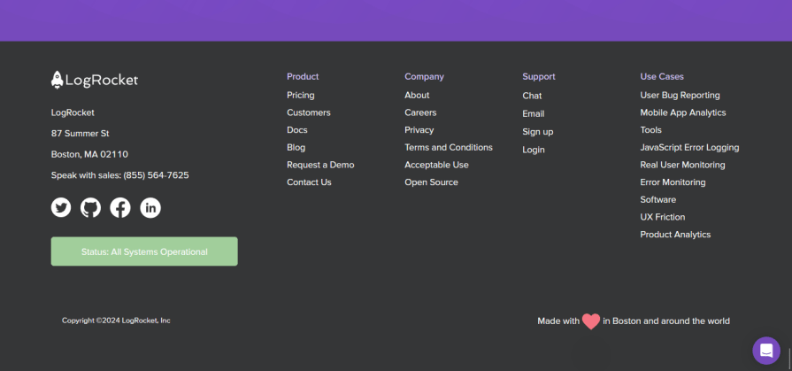
In this footer, users will instinctively recognize the headings and links despite their similar sizes because of their different colors.
It’s important to note that some colors perform better than others as visual cues. Red is particularly attention-grabbing, along with yellow and orange. Most notifications use the color red.
Here’s another example from Canva:
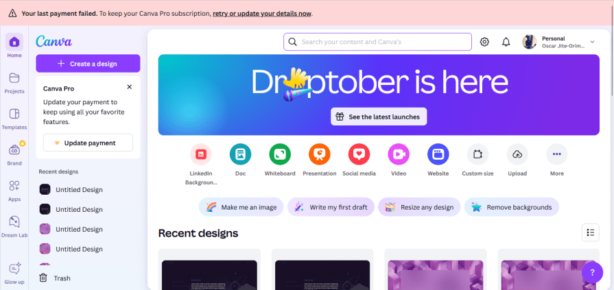
It’s hard to miss the banner on the top notifying the user that their payment failed. Red creates a sense of urgency, which is the right reaction for this scenario. If you look at the text in the notification, you’ll be drawn to the bold text. This is another example of good visual hierarchy.
Before you begin your design process, think of the most important information or the message you want to send to the potential viewers. This will help you map out the hierarchy in your design. When successfully implemented, they will understand what to look at first and be able to process the information faster.
Slack is a great example of how to use visual communication and UI/UX design. They use a good mix of visual cues to sell themselves to you.
Take a look at their homepage:
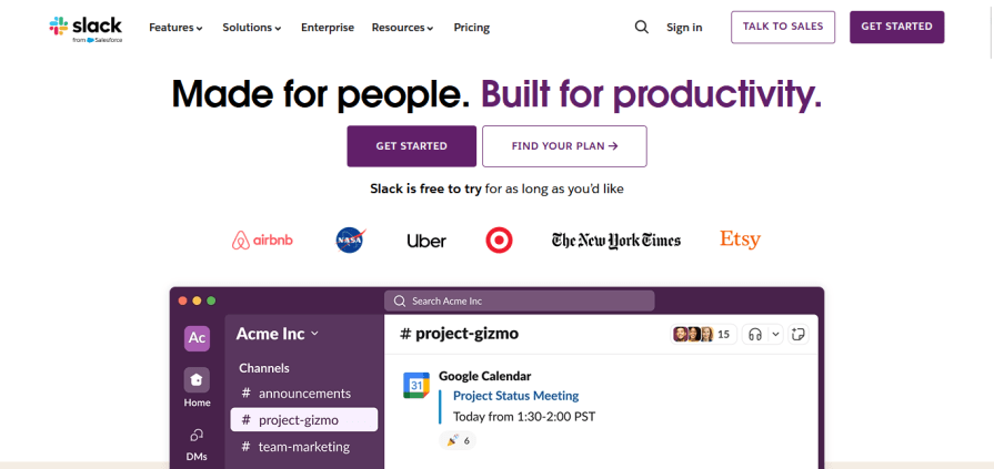
The typography is clear and highlights key messages. Slack’s UI is far from being minimalistic, but it’s simple and consistent without distractions.

Its main features are highlighted throughout the homepage with short animations. This helps Slack connect with potential users because they can learn about the product and see it in action without reading lengthy bodies of text.
Their pricing information uses bold typography to highlight the tiers and their cost. The “best value” tier is highlighted, and users will immediately notice the offer discount.
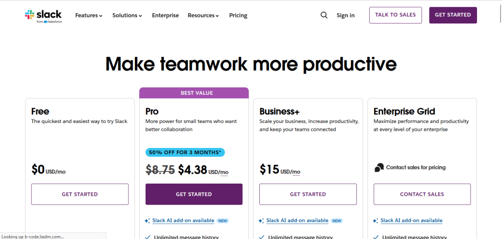
The call-to-action buttons are prominent and hard to miss.
Slack’s approach should guide designers who want to create an aesthetic and user-friendly digital product. Its combination of visual communication and UI/UX design makes it highly intuitive.
Visual communication and UI/UX design can help you create approachable and enjoyable digital products.
Together, they improve usability, establish brand identity, and create a good user experience. They make digital products more functional and intuitive and create user connections, encouraging loyalty and engagement.
LogRocket's Galileo AI watches sessions and understands user feedback for you, automating the most time-intensive parts of your job and giving you more time to focus on great design.
See how design choices, interactions, and issues affect your users — get a demo of LogRocket today.
AI tools can generate beautiful UI concepts in minutes, but most teams struggle to integrate those outputs into real design systems. This guide explores why AI drifts toward generic patterns and how to build governed workflows that keep speed without sacrificing brand consistency.

Adaptive interfaces personalize experiences using behavioral signals and machine learning. But when personalization becomes autonomous, systems can reinforce patterns, limit discovery, and shape user behavior in ways designers didn’t intend.
Security requirements shouldn’t come at the cost of usability. This guide outlines 10 practical heuristics to design 2FA flows that protect users while minimizing friction, confusion, and recovery failures.

2FA failures shouldn’t mean permanent lockout. This guide breaks down recovery methods, failure handling, progressive disclosure, and UX strategies to balance security with accessibility.