Persuasive design is a controversial subject in UX spaces. While persuasive design techniques can provide numerous advantages to both businesses and users when implemented responsibly, there can also be negative consequences to users when this design approach is adopted in an unethical manner.

In this article, we’re going to outline exactly what persuasive design is, its value in digital experiences, and how to implement it responsibly. We’ll also be covering the darker side of persuasive design techniques and the practices used to manipulate or take advantage of users. By the end, you should have a clear idea of how to use research into human psychology to provide your users with a more positive experience, as well as understand the practices to avoid.
Here’s a clickable list of the areas we’ll be discussing:
Persuasive design is concerned with influencing user behavior through design decisions. It does this through the implementation of specific features and characteristics within a digital product or service, with elements influenced by psychological and social research. Although predominantly used in online shopping experiences, this design approach is also used in other industries such as management software, social care, and health.
Persuasive design is particularly effective due to humans’ aversion to decision making. Typically, our brains don’t like to make decisions as this requires a lot of energy, and, where possible, we like to conserve as much energy as we can.
To help us do this, our brains create shortcuts that mean we don’t have to overthink, or make the same decision more than once. Cognitive bias is what occurs when our brains frequently create these kinds of shortcuts, and these biases help us make quicker decisions.
In persuasive design, designers are able to identify and work with users’ cognitive biases to find patterns that can be used in website or product design. These patterns can be harnessed to make the user journey more seamless and to enable faster decision making.
Persuasive design can be beneficial to businesses and brands when trying to capture and hold the attention of their target audiences. It enables brands to communicate in a more focused way, supports the decision-making process, persuades users to reach their objectives, and can even encourage new patterns of behavior.
Let’s take a look at some of the most common principles in persuasive design — framing, reciprocity, scarcity, social proof, and authority — and how they are used.
With so much choice out there for consumers these days, it’s natural for potential customers to compare products and offerings from different companies before making a purchasing decision. Framing involves presenting and comparing information in such a way that it is appealing or more preferable to consumers. This is done because frequently users choose an item based on how information is presented, rather than the specifics of the information itself.
In UX, the law of reciprocity is when a business gives users something for free without asking for anything in return. Users feel obliged to return favors and repay good deeds. When they are given something for free at the start of the interaction with a business, users are motivated to further interact with a website or purchase a product.
The idea behind the scarcity principle in persuasive design is that when users perceive something to be in limited supply, they are more likely to want it. Due to its effectiveness in prompting registrations and purchases, this is a principle that is adopted frequently on ecommerce platforms and even in real-life settings.
The scarcity principle can be applied to time, information, or products.
Social proof is when users follow or copy the behavior of others, or wait until others are taking action before taking action themselves. Social proof is based on the idea that individuals feel more reassured to make a decision and are less anxious about doing so because they are not alone in behaving this way.
Authority in persuasive design refers to users seeking expert validation of a product or service or finding reliable sources of information to help inform decision making. Expert recommendations boost the chances of users taking an action.
Let’s have a look at some persuasive design techniques that UX designers use to enhance digital experiences.
The role of color in persuasive design is gaining increasing importance because, in addition to the emotional responses individuals have to different colors, research reveals the impact that color has on the brain’s ability to retain and understand information. Scientists and psychologists have found that certain colors bring about hormonal mental arousal, which causes improvements in short-term memory retention.
Colors also lead to increased emotional and perceptive responses. A designer can boost credibility in a product and increase a customer’s sense of trust in a brand. In addition, different colors can be used to communicate positive or negative information, increase focus, and dispel doubt.
A designer will also need to be aware of the different, even contrasting, meanings the same color will hold in different cultural groups. For example, in many cultures around the world, the color purple represents wealth, luxury, fame, and nobility. However, in Latin America and South America, purple is the color of mourning and death.

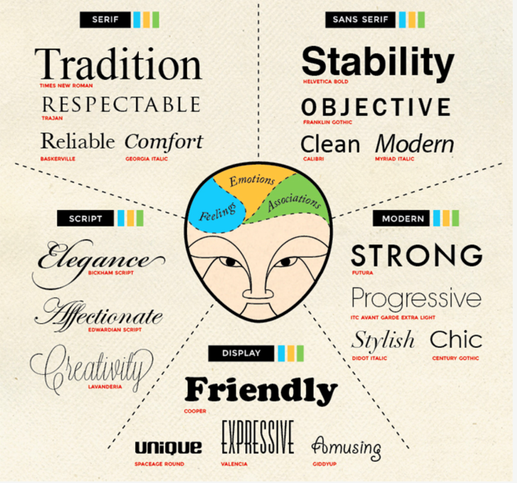
Similar to how great packaging can influence a customer’s decision to buy a physical product in a store, typography plays a key role in influencing the perceived credibility and trustworthiness of a digital product or service. In addition, typography has a huge impact on accessibility.
How easy something is to read and digest will make or break a digital offering because a user will quickly give up on a website that they are struggling to understand. In addition to visual accessibility, the typography of a site will work with other elements on a page to establish a visual connection and create a specific look and feel.
While they are unlikely to be actively aware of the typography influencing their decisions, each font choice prompts different emotional reactions in users. Serif typefaces decrease reading speed, which can either persuade users to spend longer on your content or put them off reading it altogether, while sans-serif typefaces enable faster reading, improving accessibility.
Typography can have numerous functions in influencing user behavior. It can establish credibility, convey tone, help build a visual hierarchy, enable readability, and enhance a brand’s identity.
Visual cues (sometimes known as directional cues) point users toward elements of your website that are likely to lead to conversion. These elements could be a CTA, a checkout page, or a sign up page.
Visual cues can be divided into explicit visual cues and implicit visual cues. As the name suggests, explicit cues are easy to spot. They are usually symbols like arrows that direct the user to exactly where they need to go.
Implicit visual cues are less obvious. Instead of explicitly directing the user, they subtly highlight areas of the page or specific elements on it. Color contrast is a commonly used implicit visual cue.
When used responsibly, persuasive design techniques can be valuable tools in every UX designer’s toolkit that help users reach their goals, make better-informed decisions, and enjoy the delightful experience of a website or app.
However, as persuasive design harnesses user psychology to influence behavior, there are numerous ethical considerations that must be taken into account in order to ensure users are not manipulated or taken advantage of.
When users realize that designers employed deceptive or dubious techniques to gain their attention or prompt a purchase, they can feel exploited. This reduces an individual’s trust in a brand, decreases their engagement with a company, and creates a very negative user experience. Ultimately, these techniques can result in destroying a brand’s overall reputation.
Dark patterns, also known as deceptive design, are when a website or app is designed in such a way that the user is inclined or persuaded to do things that they didn’t intend to do — for example, purchasing a product. Other examples include being unable to delete an account or discovering that the links to unsubscribe from a newsletter are barely visible.
Examples of dark patterns (or deceptive design) include:
As we have seen, when used irresponsibly, persuasive design can be an actively harmful practice. However, when used in a responsible and ethical way it can enhance and improve the user experience while bringing about significant benefits for a brand.
When using persuasive design in your work, it’s important to be as transparent as possible about when you are implementing persuasive techniques. This can be achieved through clear labeling and authentic messaging.
Users should also always have the opportunity to decline engaging with these design elements. A designer can point a user toward setting adjustments or simply provide an opt out button to give users control over what they are seeing and interacting with.
While users are becoming increasingly aware of data protection and their rights as consumers, it’s still important for the design team to be respectful of a user’s privacy. Users should again have complete control over who they give their data to, and how. They should also be made aware that providing their data is not a necessity of engaging with a website or buying products.
While the majority of UX designers will only want the user to have a positive experience that enhances their impression of a brand, it’s still important to remember that this is the priority, and encouraging unhealthy behaviors should be avoided at all costs. A UX designer should seek to engage in lifelong education on best practices in persuasive design and stay up to date on the latest research in the area.
Here are some of our favorite examples of persuasive design techniques that enhance the user experience, guide and support decision making, and leave a positive impression on website visitors.

Whipping Post uses lots of white space, very large product images, minimal text, and clear typography to create an authoritative and persuasive overall design.

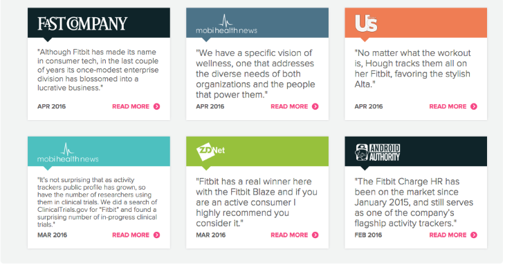
Fitbit uses the authority principle by boasting expert recommendations from well-known and respected brands and websites to boost its own authority and build trust with users.

Booking.com uses the scarcity principle by informing users of how many rooms are still available through their service to prompt quick decision making.

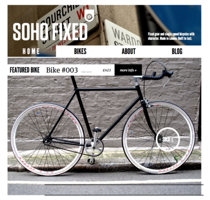
Soho Fixed also uses the scarcity principle with its subtle use of the word “sold” on the lower right side of the page.
Evaluating the effectiveness of persuasive design is done using commonly adopted UX testing methods. A UX designer will conduct in-depth usability testing; observing users as they interact with the digital interface in order to see how the persuasive design elements help or hinder the user in reaching their goals.
Interviews, surveys, and questionnaires are also common methods used by UX teams to better understand how effective their design is. Depending on the style of questioning, users can rate interactions or give detailed accounts of their experiences with a design, giving UX teams valuable insights into what could be improved.
A/B testing — when a UX designer creates two versions of a design element or webpage to see which performs better with users — can also be used to measure the effectiveness of persuasive design elements. When one design proves to be more popular with users, or enables more users to complete the task at hand, the design team knows this is the more effective option to send through to development. Finally, five-second tests, heuristic evaluations, and even eye-tracking tests, can be used to get an overview of a design’s effectiveness with users.
In this article, we’ve taken a look at how persuasive design can be used in a responsible way to enhance the user’s experience and enable them to reach their goals. We’ve also run through the ethical considerations for UX designers when implementing persuasive design elements in their designs and how to ensure users are kept safe.
Remember, if you’re unsure about how persuasive design elements in your interface are influencing your users’ behavior, take the time to test. The best insights you’ll get will be from users themselves who will be able to inform you of their experiences with your design, what’s working well, and what could be improved.
Header image source: IconScout
LogRocket's Galileo AI watches sessions and understands user feedback for you, automating the most time-intensive parts of your job and giving you more time to focus on great design.
See how design choices, interactions, and issues affect your users — get a demo of LogRocket today.

Adaptive interfaces personalize experiences using behavioral signals and machine learning. But when personalization becomes autonomous, systems can reinforce patterns, limit discovery, and shape user behavior in ways designers didn’t intend.

Security requirements shouldn’t come at the cost of usability. This guide outlines 10 practical heuristics to design 2FA flows that protect users while minimizing friction, confusion, and recovery failures.

2FA failures shouldn’t mean permanent lockout. This guide breaks down recovery methods, failure handling, progressive disclosure, and UX strategies to balance security with accessibility.

Two-factor authentication should be secure, but it shouldn’t frustrate users. This guide explores standard 2FA user flow patterns for SMS, TOTP, and biometrics, along with edge cases, recovery strategies, and UX best practices.