Motion design and animations are powerful tools that bring digital designs to life. By adding movement and visual interest, they create engaging and memorable experiences for users. They are used in UI and UX design to highlight key features, guide the user’s attention, and create a sense of continuity between different elements. From subtle animations to more complex visual effects, motion design can help make digital experiences more intuitive, exciting, and fun.
Previously, product designers had to work with motion designers or learn new skills to animate UI elements using software such as After Effects and then export the animations to be added to applications or websites.
However, Figma released the smart animate feature in 2020, which simplified the process of animating UI elements and creating stunning animations to present and sell concepts to stakeholders or generate more realistic prototypes for testing with final users.
Although this feature cannot perform all the advanced functions of After Effects, it can help visualize the desired final outcome to motion designers if you pass the animation off.
This article provides a step-by-step guide on using Figma’s smart animate feature to prototype animations. We break down the process into steps to help you understand what prototyping is and how to prototype simple animations for individual UI components, as well as more complex ones for entire pages. We also offer tips for advanced and tricky implementations of smart animate.
By following this guide, designers can learn to create basic to complex animations that will help elevate their designs and create engaging and memorable experiences for their users.
Figma introduced its prototyping feature in December 2016, allowing users to create hotspots that link static frames and generate clickable prototypes to simulate user flows and interactions.
These prototypes are typically used for two purposes: first, to showcase the UI or UX to different stakeholders, and second, to validate the usability and functionality of a design with users. By identifying usability issues and refining the concept before the final product is built in the development phase, designers can create a better product that meets users’ needs.
To create a prototype, click the Prototype tab in the right-side toolbar and start linking frames or UI components using hotspots to other UI components, frames, or external websites.
Once you have created all the hotspots, select the device on which you want to display the prototype (e.g. ,mobile phones, computers, and others) and play or share the final outcome with others.
Figma introduced basic animation features in December 2020, allowing users to add simple animations between frames, such as “instant” or “dissolve” transitions that occur when a user clicks a hotspot. While these animations make transitions more subtle, they have limitations compared to the smart animate feature introduced in March 2021.
Smart animate allows for more complex animations that simulate real-world movements like sliding, fading, and scaling. It uses an algorithm to automatically animate objects between two frames based on their position, size, and layer hierarchy. This makes it easier for designers to create engaging and dynamic designs without relying on external animation tools. Overall, the addition of animation features in Figma has made it a more versatile tool for creating interactive and visually compelling designs.
Smart animate is a feature in Figma that allows you to create seamless animations between frames. It works by searching for matching layers across multiple frames, taking into account the naming, position, and hierarchy of the UI components.
Once a matching layer is found, Figma identifies the differences between the frames and applies a transition to animate between them. This animation can be applied to an entire frame, component, or single UI element, giving designers the flexibility to create various types of animations.
Smart animate supports several properties that you can use to create beautiful animations:
Before starting, it’s important to plan out the animation and prepare the design assets. For example, if you want to spin a wheel, you may need four frames with the wheel rotated 45 degrees in each frame.
To apply smart animate:
Tip: If you want to apply smart animate to specific layers in your prototype while using another main transition, you can select those layers and check a box that says Smart Animate Matching Layers in the right side panel.
This will apply smart animate only to the selected layers, while the rest of the prototype will use the main transition you have selected. This is useful if you want to add some extra animation to specific elements without disrupting the overall flow of your design.
The different animation easing options available in Figma’s Smart Animate can greatly impact the look and feel of your animations. Linear, ease in, ease out, ease in and out, and custom are the most common easing options, each with its unique characteristics.
Linear, the default option, offers a smooth and consistent animation speed without any acceleration or deceleration. Ease in starts the animation slowly and increases in speed, building a sense of anticipation or tension. On the other hand, ease out starts the animation quickly and slows down towards the end, releasing tension and providing a sense of resolution.
The ease in and out option starts the animation slowly, increases the speed in the middle, and then slows down again towards the end. This provides a smooth and natural-looking animation, with a sense of momentum that builds up and then slows down.
Custom easing, on the other hand, allows you to create your own unique easing curve by adjusting the Bezier handles on a graph. This option provides complete control over the animation speed and timing, allowing you to create complex and unique animations that best fit your design.
It’s important to experiment with different easing options to find the one that works best for your specific animation. Choosing the right easing option can help make your animation look and feel natural, fluid, and polished, elevating your overall design.
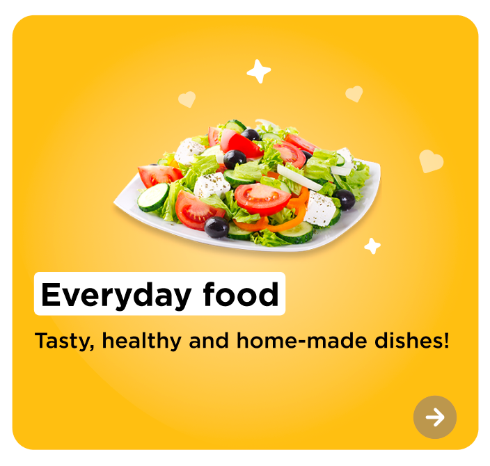
This tutorial will be about how to easily animate a product card with a shine and inspiring transition to showcase different food options, still you can use the same concept to sell different products.
Imagine you want to create a product card for a food delivery app; the main goal is to communicate a new section for “Everyday Food,” a place where users will find tasty, healthy and homemade food.
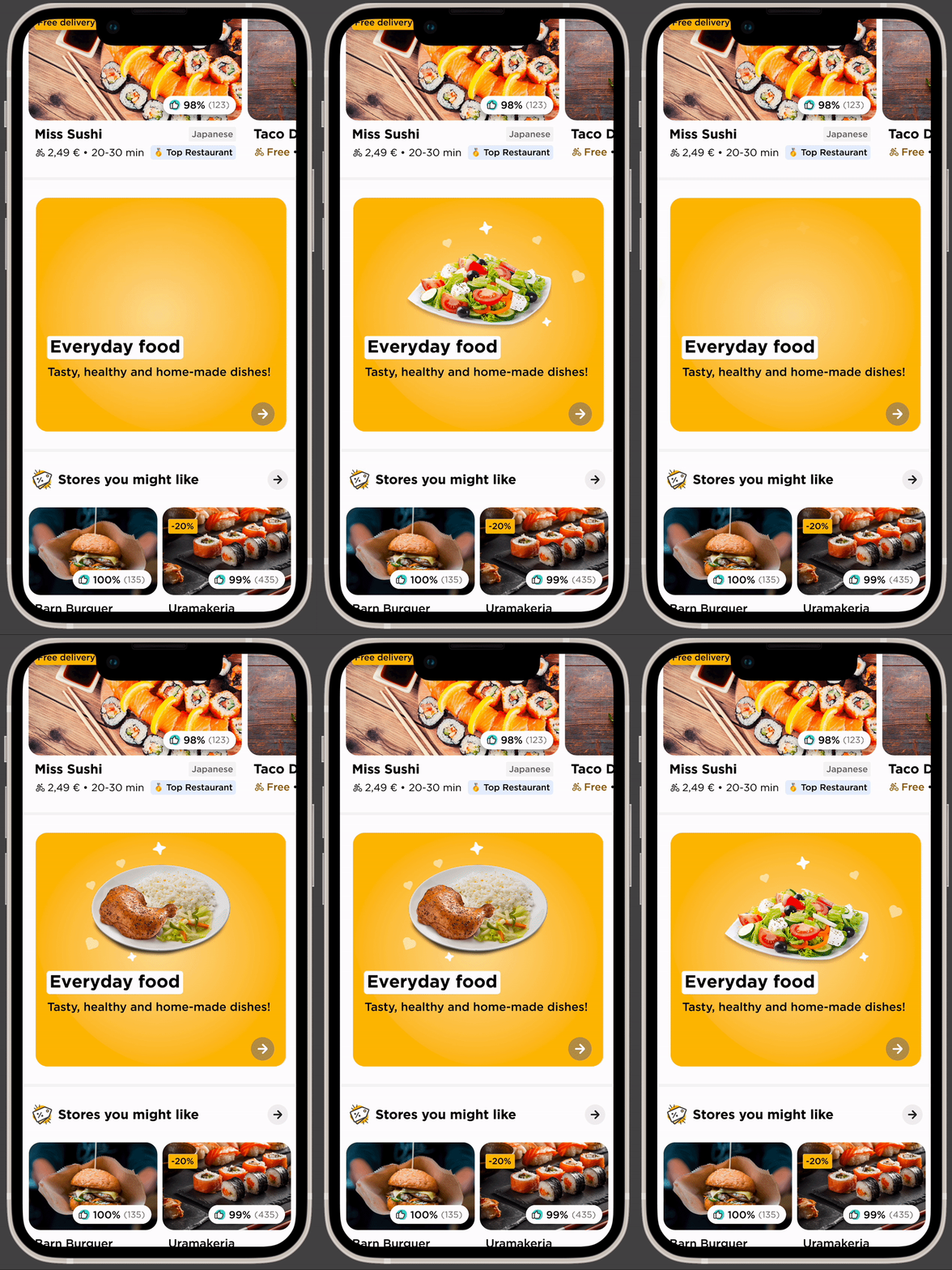
On this card we will place images and text, so the idea is to animate the food images inside and out the card to make it more lively and interactive while the confetti is blinking when the food appears. We will use two food dishes, a salad and a chicken with rice plate, but it would be possible to use as many dishes as you like.

In this concept, we will play with two properties mentioned before:
Remember there are other properties such as filling or rotation, but in this case I opted to only use the two mentioned above.
Create a new Figma file and set up the artboard:

Add the circle on top of the card:

Add the text:

Add the food images:

Add the confetti:

Create the arrow:

Create component and variants:
Variant 2:
Variant 3:
Variant 4:

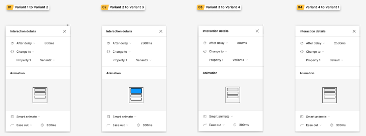
Variant 1 to Variant 2
Variant 2 to Variant 3
Variant 3 to Variant 4
Variant 4 to Variant 1
In conclusion, motion design and animations have become essential elements of modern digital designs, and they play a crucial role in creating engaging and memorable user experiences.
Figma’s smart animate feature has revolutionized the animation workflow for product designers, allowing them to create complex and sophisticated animations with ease.
By mastering smart animate, designers can create compelling animations that simulate real-world movements and bring their designs to life. Furthermore, this skill can help designers advance in their careers by making their designs more marketable and impressive to stakeholders and end-users alike. Ultimately, learning smart animate is a valuable investment for any product designer looking to take their skills and designs to the next level.
LogRocket's Galileo AI watches sessions and understands user feedback for you, automating the most time-intensive parts of your job and giving you more time to focus on great design.
See how design choices, interactions, and issues affect your users — get a demo of LogRocket today.

Multimodal UX goes beyond designing for screens. Learn how context-aware systems, progressive modality, failover modes, and accessibility-first design create better digital product experiences.

Learn how context-aware mode prioritization and seamless transitions improve multimodal UX and reduce mode confusion.

Research is becoming more democratized, product cycles are accelerating, and AI is transforming synthesis and ResearchOps. Here are the three trends shaping UX research in 2026.

Voice support is not the same as multimodal UX. Here’s how to design systems with true mode continuity and context-aware interactions.