Contextual inquiry is a user research method where product teams meet users in their natural environment to understand how they interact with a product. It’s one of the most effective ways to understand users deeply — their pain points, how they interact with a product, and how they work around challenges — to improve UX.

Unlike other user research methods, contextual inquiry puts you right at the heart of the action, letting you observe users in their natural environment. The benefits of this first-hand observation are enormous!
Think about this: When someone asks how you perform a task, do you go into every last detail, even how you feel at various points? Probably not! You’d most likely mention only the key moments in your experience.
This is where contextual inquiry has the edge over self-reported or lab-based research methods. Observing and interviewing users as they interact with a product in their usual setting allows you to pick up important but often overlooked details, like workarounds, unconscious habits, and even environmental factors that shape their experience.
So, why does this matter? With contextual inquiry, you gain deeper, more relevant insights into user behaviors, revealing important aspects you might miss with other research methods. Let’s unpack the benefits of contextual inquiry and touch on some of its drawbacks. Plus, we’ll explore how it stacks up against similar research approaches and see how you can apply it in your work.
Editor’s note: This article was rewritten on 7 March 2025 to provide a clear list of the benefits and challenges of contextual inquiry studies, outline easy steps to structure a contextual inquiry, describe the differences between contextual inquiry and other user research methods like contextual interviews and user interviews, and more. Special thanks to the original author, Melike Ceren Inan Toygar, for her contributions to the first version of this guide.
Observing users in action lets you uncover real challenges they face, including ones they may not even realize exist. This makes contextual inquiry exceptionally useful for complex tasks that require deep analysis. This user research method:
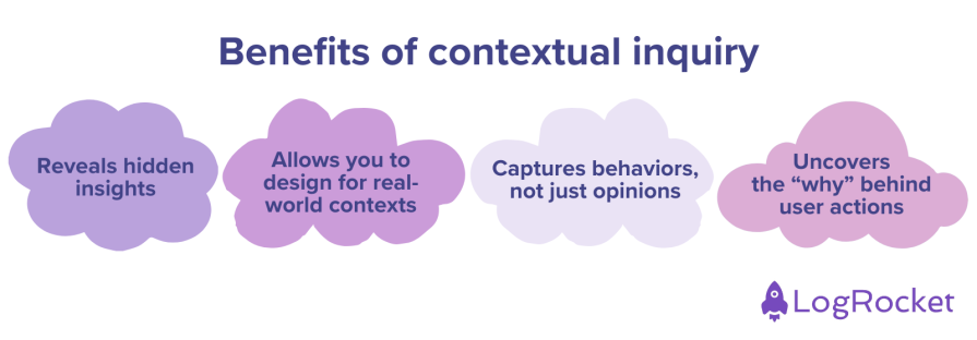
For instance, if you ask a school teacher how they plan and deliver lessons, they’ll likely describe a structured process — following a curriculum, using prepared materials, and sticking to a set plan. But spend ten minutes in a classroom, and you’ll witness a different story:
While contextual inquiry gives a deep insight into user behavior, it’s not without its own challenges. Let’s take a look at some of them:
Despite these challenges, you can maximize the value of this research method by following four key principles.
When conducting contextual inquiry, or any type of research, for that matter, it’s important to have a clear focus. Define your research goals and stick to them throughout your study.
Say you’re working on a productivity tool for remote workers. Your focus can be: Understanding how remote workers prioritize tasks and manage their time in a home office environment.
Having a clear focus like this makes the research more effective as it keeps your observations and questions aligned with the problem you’re trying to solve.
Observe and interact with the users as they perform real tasks in their natural environment. The environment can be an office, a grocery store, a classroom, or an airport runway.
Focus on observing their actions and understanding the reasons behind them. This means taking note of the tools and artifacts they use, and everything else that takes place as they do their job. For example:
The goal is to get the full picture of how they work, not just what they say they do.
Unlike traditional interviews where you’re expected to lead the session as a researcher, contextual inquiry is a two-way street. Both you and the participant play an active role, letting the conversation flow naturally to cover important details that might not come up otherwise.
This method produces reliable data as you get information from them right as they’re performing the task.
Observing something is one thing, but accurately interpreting it is another. That’s why you need to review your interpretations of the participant’s workflows with them after the session. This helps validate your interpretations and allows the participant to clarify anything you’ve misunderstood.
By doing this, you can effectively bridge the gap between what users do and why they do it.
Now that we’ve gone over the four key principles of contextual inquiry, let’s look at how to set up your contextual inquiry study for success:
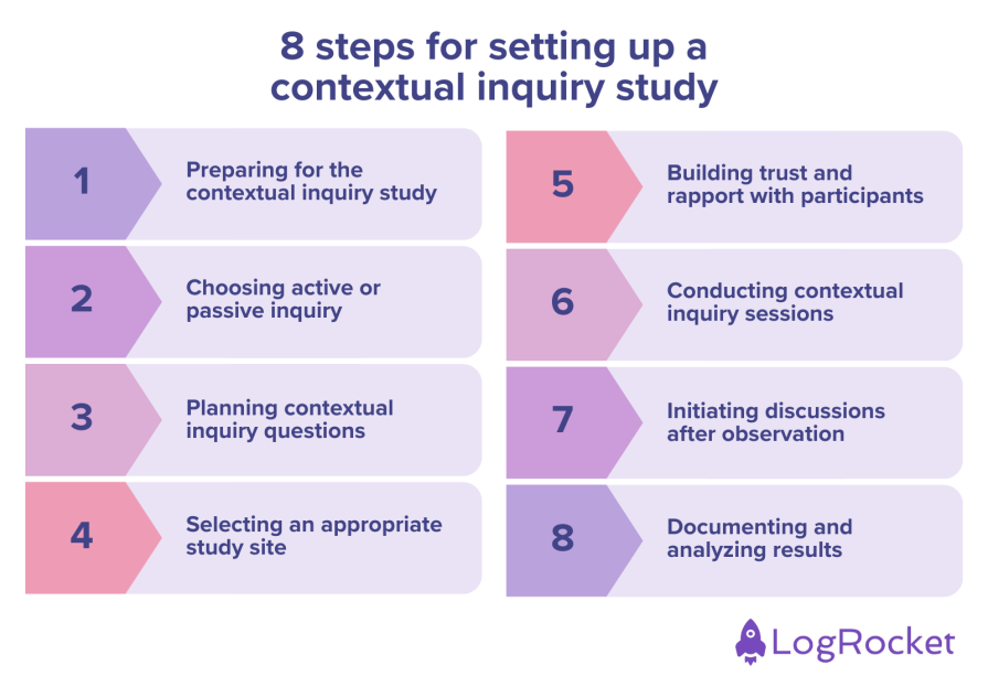
Before diving into contextual inquiry, you’ll need a clear research objective. What do you want to learn, and how will it inform your design decisions?
Once you’re armed with a clear objective, review existing data like analytics, past UX interview notes, past usability test findings, and product usage. This ensures that your research builds on prior insights rather than starting from scratch.
For each user group you’re targeting, aim for at least five or six participants. However, more complex workflows may require a larger sample.
Each session typically lasts between one to two hours, so keep things flexible. Consider breaking down the session like this:
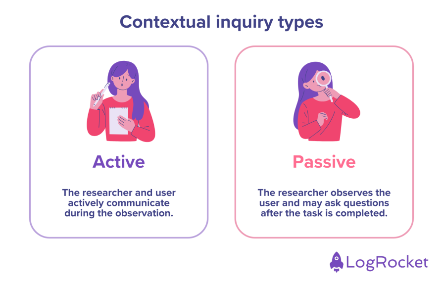
There are two forms of contextual inquiry:
Active inquiry is important if you have a lot of questions or need to request clarifications. Your goal is to understand the steps of the user workflows, observe their unconscious habits, and take notes. However, even with this method, it’s important to agree ahead of time on when you can interrupt. Be careful not to interrupt the participant at the wrong times.
Sometimes, participants need to focus fully on their tasks, so popping in with questions might not be ideal. In such cases, passive inquiry works better. For example, if a user is talking to a customer, you wouldn’t want to interrupt. It’s best to wait until they’re done and then ask about what you observed.
As you observe their workflow, it’s important to keep an eye out for external factors that might influence it. We tend to picture our products being used in a simple, controlled setting. However, real life is complex. Contextual inquiry gives you insights that traditional user interviews simply can’t.
Many of your questions will naturally stem from actions you observe as you’ll want to understand the participants’ reasoning. While such reactive questions are important, you should also prepare a list of proactive questions to ensure a deeper understanding of user behavior.
Here are some possible questions you can ask:
Make sure to balance different types of questions to get the full picture. Ask questions related to the task, frustrations and pain points, why they make certain decisions, and how and why they adjust while working.
Choose a contextual inquiry site that accurately represents the user’s natural environment i.e. where they typically interact with the product. This can be a grocery store, an emergency room, or a factory floor. If possible, select multiple sites for a variety of scenarios.
In situations where an in-person contextual inquiry isn’t possible, you can conduct it virtually. In this case, you observe the participants remotely via video call or screen sharing.
The goal is to capture real-world behaviors in the most authentic setting possible. So, be sure to:
As with any other UX research, it’s important not to pressure the participant. They should know you’re not there to judge them but to observe and learn.
A good way to do this is by framing the session with the user and establishing certain boundaries with them. Depending on these boundaries, the inquiry can be either active or passive. Once you’ve explained your research purpose, what to expect, and the general timeline, you can establish these boundaries with questions like:
This phase basically involves multiple iterations of two steps:
As you proceed, you’ll naturally form a balance between observation and engagement. To ensure that you don’t leave anything out, be sure to:
Say you’re observing a nurse on duty as they enter patient data. You might notice that they enter some data directly into the electronic medical record (EMR), and jot some down on paper. You can start by asking why they do that.
Based on their response, you might assume that they find it faster to jot down notes manually during patient interactions and update the EMR later. It’s important to validate this assumption. To do this, you could ask, “So, do you use the paper notes as a temporary reference before entering everything into the system?”
By following up with such questions, you allow participants to confirm or correct your assumptions.
After the observation phase, initiate a discussion about what you saw. Encourage the users to reflect on their workflow, challenges, and preferences. Doing so helps bridge the gap between what users do and why they do it.
Here are some good follow-prompts to kickstart the discussion:
This discussion is necessary as it helps uncover pain points and helps you spot opportunities to improve your product.
Action speaks louder than words. That’s true. However, you need to ensure that you’re interpreting these actions correctly. As a part of the contextual inquiry wrap-up, summarize your observations and confirm them from the user. This will help to prevent any false perceptions.
When you return to your office, it’s time to analyze your findings. Like any UX research, it’s important to avoid falling into the trap of confirmation bias. Remember, your contextual inquiry data is based on a limited number of users, so be careful not to assume that your observations apply to everyone.
Contextual inquiry, as a qualitative method, helps lay the foundation for understanding user behavior. To validate your insights, your team can follow up with quantitative methods like analyzing user analytics data or measuring your customer effort score through surveys.
Beyond these eight steps you can follow to structure a contextual inquiry study, there are also a few general best practices you should keep in mind:
Now, let’s explore how contextual inquiry compares to two other user research methods with similar-sounding names: contextual interviews and user interviews.
| Contextual inquiry | Contextual interviews | User interviews | |
|---|---|---|---|
| Description | Contextual inquiry is a user research method that involves observing and interviewing users as they perform tasks in their natural environment. | Contextual interviews are structured user research sessions conducted in the user’s environment. However, they focus on direct questioning rather than observation. | User interviews are structured or semi-structured conversations where users are asked about their needs, preferences, and experiences. |
| Pros |
|
|
|
| Cons |
|
|
|
| Use cases |
|
|
|
I worked in the product team at a B2B marketplace designed for pharmacies. On the platform, pharmacies could trade various products with each other. I worked on several predefined features when I first joined the company. However, it wasn’t until I went on field trips that I truly understood how pharmacies interacted with our platform.
When you’re in the same environment as the user, it gives you a deep understanding of what’s happening in their world. In this case, we were trying to understand how they decided to buy from our platform instead of other competitors.
I expected them to have a stock list, compare websites carefully, and give their orders according to the comparison. However, I quickly realized that pharmacies were making a lot of ad hoc orders. Even more surprisingly, I noticed that one of the barriers they faced on our platform was passwords.
When users tried to access our platform, they often forgot their passwords and ended up switching to other websites they used more frequently. These users were usually in a rush — juggling multiple procurement options, making fast business decisions, and responding to patients at the pharmacy.
These working conditions impact how users interact with a product. But, unfortunately, our dashboard couldn’t capture their stress or the critical moment when our platform failed to meet their urgent needs.
At another job, I worked on digitizing the workflows of the technical service team in a micro-mobility company. The existing system only tracked when a scooter entered and left the warehouse. I needed to understand how they were currently operating to create a system that logged their actions and spare parts usage.
I became an apprentice for the technical service staff. I made it clear to them that I wasn’t there to evaluate their performance but to understand their process and help develop better tools for them. I observed the technical service staff closely and noted any steps they took—from inspecting the scooter, hypothesizing the broken part, and trying to fix it.
As a result, we mapped out different ways the team members were operating and optimized our app accordingly.
Contextual inquiry puts you at the heart of the user’s experience. It’s one of the most powerful research methods for uncovering deep, actionable insights about user behavior.
Although it comes with its own challenges like time constraints, recruitment difficulties, and high costs, the depth of user understanding makes it all worth the effort. The insights you obtain from this research method will enable your team to create more user-centered products that integrate seamlessly into the users’ daily lives.
Just be sure to structure your study carefully, choose the right inquiry approach, document your findings, and analyze them objectively. That way, you’ll uncover insights that go way deeper than the surface.
Header image source: IconScout
LogRocket's Galileo AI watches sessions and understands user feedback for you, automating the most time-intensive parts of your job and giving you more time to focus on great design.
See how design choices, interactions, and issues affect your users — get a demo of LogRocket today.
A three-week mobile banking project taught me that the “proper” UX process is not always realistic. Sometimes, the better approach is to work with what you know, identify what you still need to learn, and make the strongest decision possible under real constraints.
A/B testing compares two versions of a design to see which performs better with real users. Here’s how UX teams can use it to test hypotheses, measure outcomes, and make smarter product decisions.

This case study shows how one ad experience redesign increased total ad exposure while lowering perceived friction, proving that timing and context can matter more than raw interruption.

As products evolve into ecosystems, navigation becomes a system-level challenge. This article explores how to align structure, context, and user journeys to create seamless movement across tools without confusion.