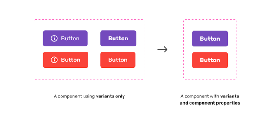
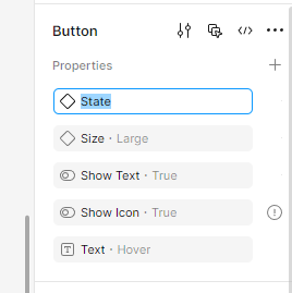
Figma’s component properties offer a powerful way to create a set of customizable attributes that can be applied to any object, helping teams better understand what they can (and cannot) change on any given component. These include variants, Boolean toggles, instance swaps, and text properties. You can also customize overrides, which apply to the specific instance you’re working with.
Component properties in Figma allow you to define customizable attributes — such as variants, Boolean toggles, instance swaps, and text — that control the appearance and behavior of a component. They streamline design workflows by reducing the need for multiple variants.
Properties are customizable settings applied to components. Instances are copies of components that inherit those properties but can be customized individually using overrides.
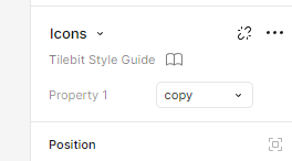
Instance swap is one of Figma’s component properties. It lets you replace nested components within an instance without affecting the main component, allowing for quick and consistent swapping of icons, buttons, or other reusable elements directly from the Properties Panel.
To override an instance in Figma, select the instance and modify any property, such as text, color, or visibility. These changes apply only to the selected instance without altering the main component or other instances.
Select the instance, open the Properties Panel, go to the Overrides section, and click the reset button. The instance will then revert to the original component settings.
Use variants for major design changes, like different states, sizes, or styles. Use component properties for smaller customizations, such as toggling visibility or swapping icons.
Editor’s note: This article was updated on 28 March 2025 to discuss Figma’s component properties in the context of the new UI3. The author added information to address common inquiries, provided a comparison table to quickly summarize what each component property is and what it’s for, and more.
From my own personal experience, uncertainty and questions around component changes have dramatically reduced among teams since they were first announced at Config 2022. Touted as a way to increase productivity, resolve issues around variant duplication, and simplify communication between teams, component properties promised to streamline design systems, reduce the need to create multiple variants to cover various scenarios, and surface options in the components property sidebar.
It’s now 2025, and with the gradual rollout of UI3, Figma promises even clearer, simpler workflows when working with components and properties. This update is gradually rolling out, so there’s a chance you may not see it yet. Once available, you’ll notice a clearer separation between instances, overrides, and default values, reducing confusion when modifying components.
Not sure if you have UI3? If your toolbar appears fixed at the bottom rather than the top, then you’re on UI3:
Component properties primarily include variant states, boolean toggles, instance swaps, and text edits. Properties such as fonts and colors should be handled via Styles, not component properties (more on Styles later).
Layouts for certain components are still managed using variants, making it easy to show how a component might change based on context—like mobile compared to desktop. If you’re new to Figma, this might feel confusing at first, but it’ll become clearer as we go along.
Fundamentally, component properties make it easy to adjust the look and feel of an object without having to make major design changes. All in all, they’re a super powerful way to give you and your team more control, especially if you happen to be in the midst of maintaining or creating a design system:
From personal experience, I have found component properties fantastic for daily runway work with engineering teams. Being able to rapidly convey ideas and build prototypes using components with component properties has done wonders for our workflow.
They also free up time for the design team to focus on discovery and more conceptual ideas for upcoming features further in the year. Excited to learn more about component properties? Great! But before we move on to component properties, let’s take a closer look at the updated Properties Panel introduced in UI3.
Figma’s UI3 update brings important improvements to the Properties Panel, making instance management clearer and faster.
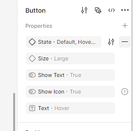
The new Properties Panel is divided into two key areas: Instance Properties and Overrides.
At the top of the Properties Panel, you’ll find settings directly related to your selected instance, including:
We’ll see how to use these in more detail later.
Just below the Instance Properties settings, you can find the Overrides section. Here, you’ll clearly see any customizations applied specifically to the instance you’re working with. You can also reset overrides back to their default settings if needed. You can do this by selecting the entire instance, and then selecting the reset button.
In the above example, you can see that I’ve selected an icon within an instance, which means I can now swap it with another icon:
This structured approach simplifies how you adjust and manage your component instances, making your design workflow smoother.
Let’s have a look at making our initial component.
Components can be created from layers, groups, and frames.
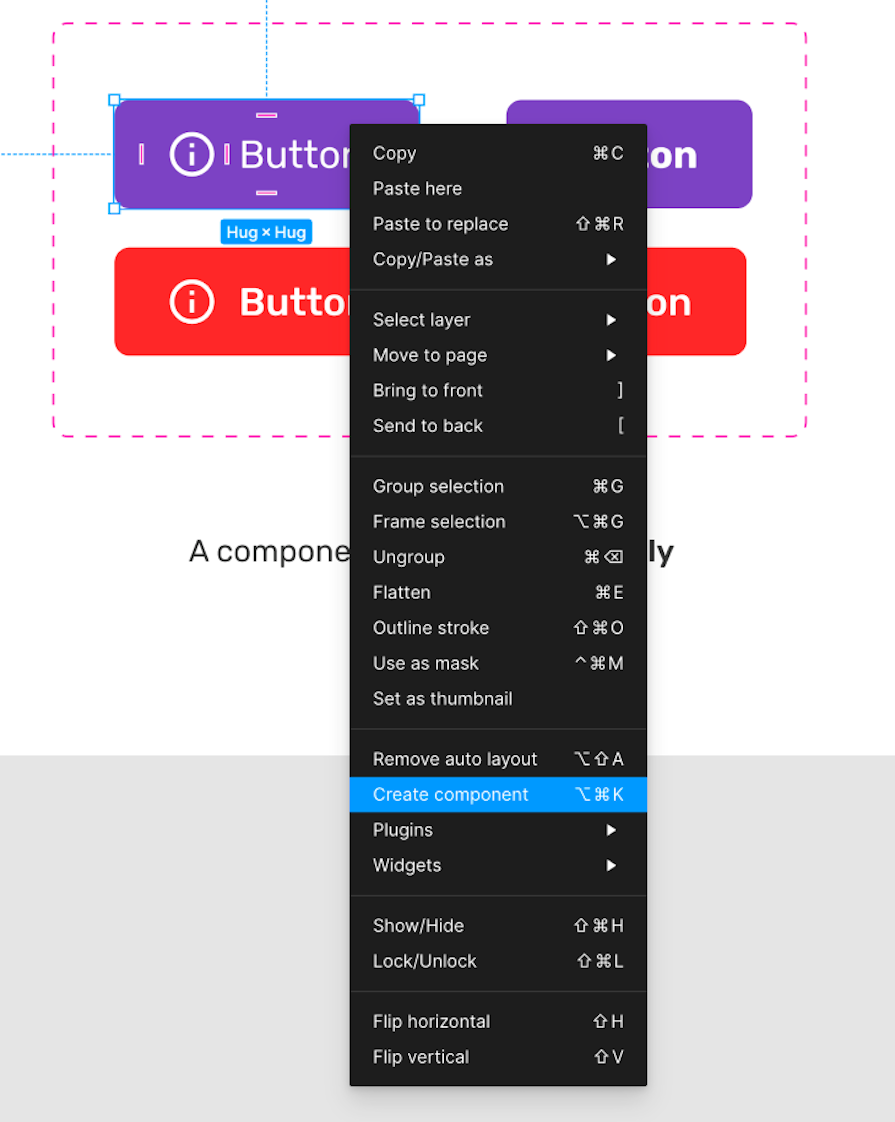
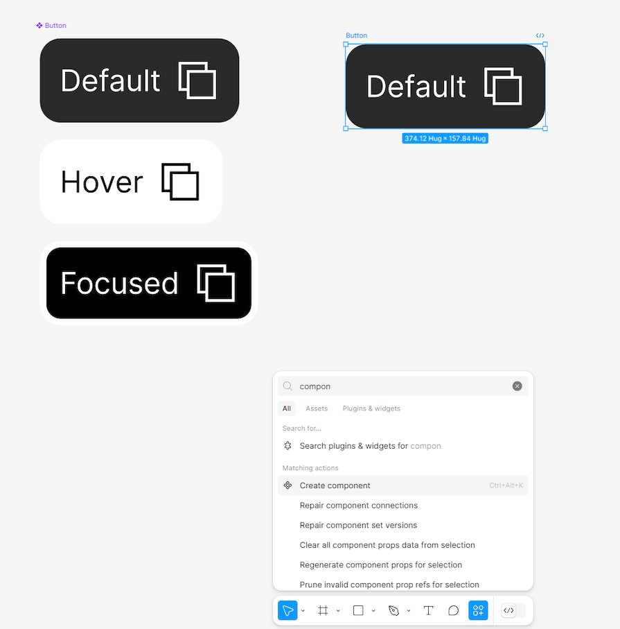
To create a component, you must select either layers, groups, or frames and then select Create component from the toolbar, or by using the appropriate keyboard command:
CTRL + ALT + K⌥ Option + ⌘ Command + KYou can also right-click your layer, group, or frame and choose Create component from the context menu:
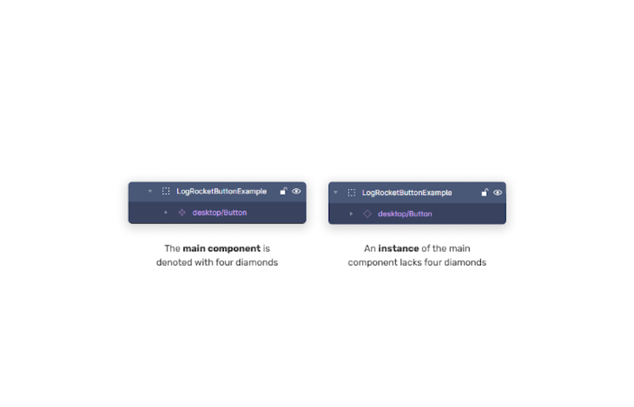
Think of the main component as the original version — the source of truth. When you duplicate this component, each copy you create is called an instance. You always create the main component first; any copies you make afterward become its instances.
If you change the main component, every instance automatically updates to match those changes. However, individual instances can have unique overrides (like text or color changes), which stay even when the main component is updated.
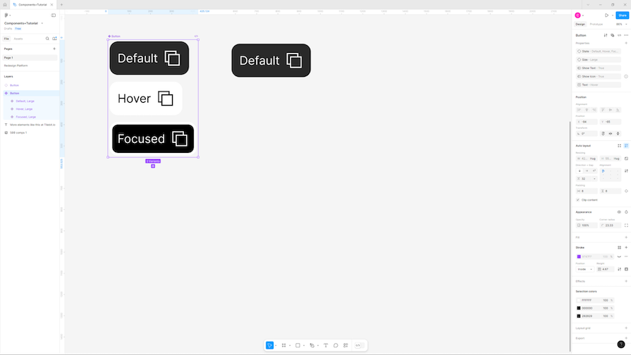
An instance is simply a single copy of your main component. If you need different versions of a component — like a button with hover, disabled, or pressed states — you’ll create variants, which are multiple predefined versions grouped into one component set.
An instance can reflect any of these predefined variants, and you can still customize each instance individually using overrides. For example, you might have multiple button states grouped as variants. Each instance of your button can use one of these variants, and then you can further personalize each instance by editing text, color, or visibility without changing your original component set:
If you edit something directly in an instance — like changing its text or color — only that particular instance changes. Figma sees each instance as unique whenever you make these overrides. Edits like this won’t affect your main component or other copies. But remember, if you update the main component’s layout, every instance still updates to match, unless you’ve specifically changed something:
With the main component created, let’s look at each individual component property in more depth, and explore how they can benefit designers.
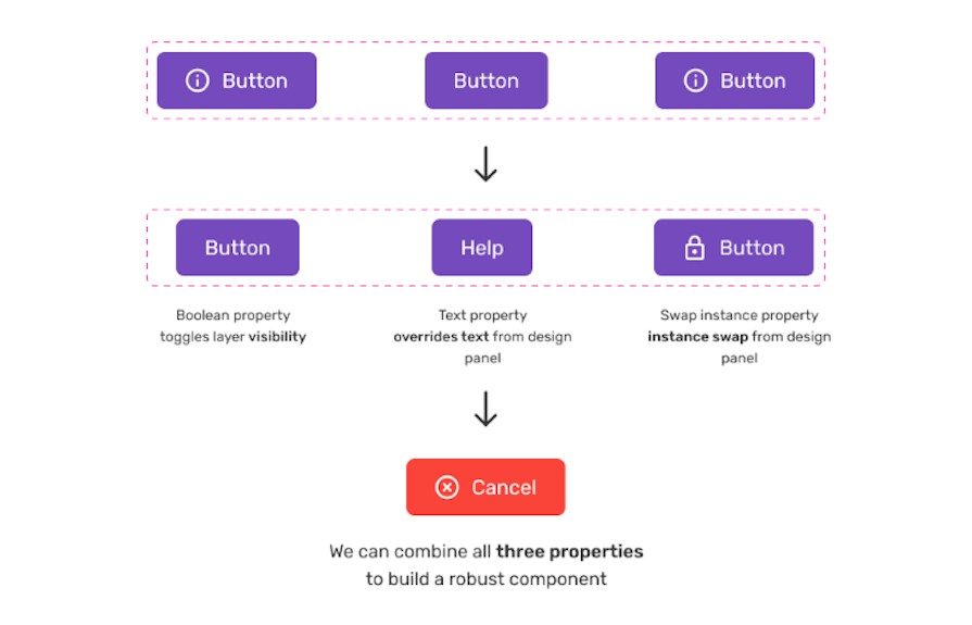
Instance overrides give designers flexibility to make customizations to individual component instances without affecting the original or main component.
For example, imagine you’ve created a main button component with a black background. If you need a version of this button with a pink background for a particular screen or scenario, you can easily select that specific button instance and change its background color:
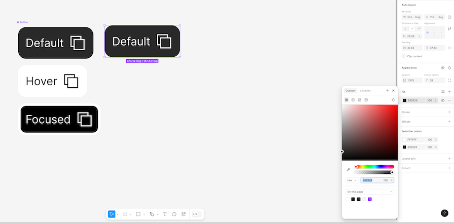
This pink button now has what’s known as an instance override — it has diverged from the main black button component, but the original remains untouched.
Overrides aren’t limited to color changes; they apply to text, visibility, icons, and more. They’re especially useful for situations where slight variations are needed within consistent component structures. However, keep in mind that instance overrides are specific to individual instances, meaning they won’t automatically carry over to other instances or affect your main components.
This helps maintain consistency across designs while allowing enough flexibility for context-specific customizations.
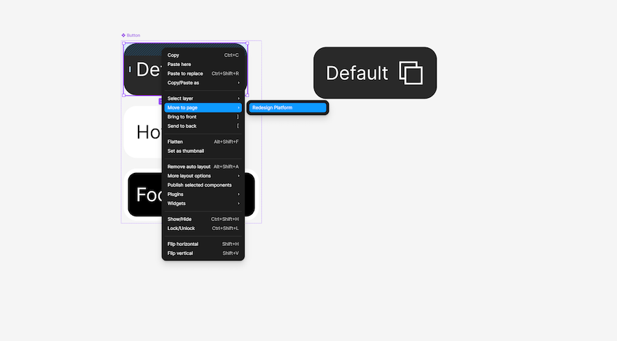
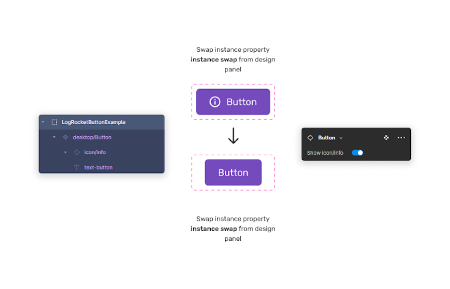
The Component Menu in Figma now includes a dedicated “Swap instance” panel, enabling designers to quickly replace nested components within an instance without impacting the main component.
While this might sound similar to instance overrides, it’s important to understand the difference clearly. Instance swapping specifically involves replacing one component within another — for example, quickly changing the icon in a button from a plus icon to an arrow icon—by selecting a new component from a predefined set of options.
On the other hand, instance overrides refer broadly to any customization of a specific instance, such as changing colors, text, or visibility, without affecting the main component. Instance swapping is essentially a targeted type of override, focusing exclusively on replacing one nested component with another.
Both are powerful, but while overrides give broader flexibility for general changes, instance swapping provides a structured way to handle nested component changes consistently and efficiently:
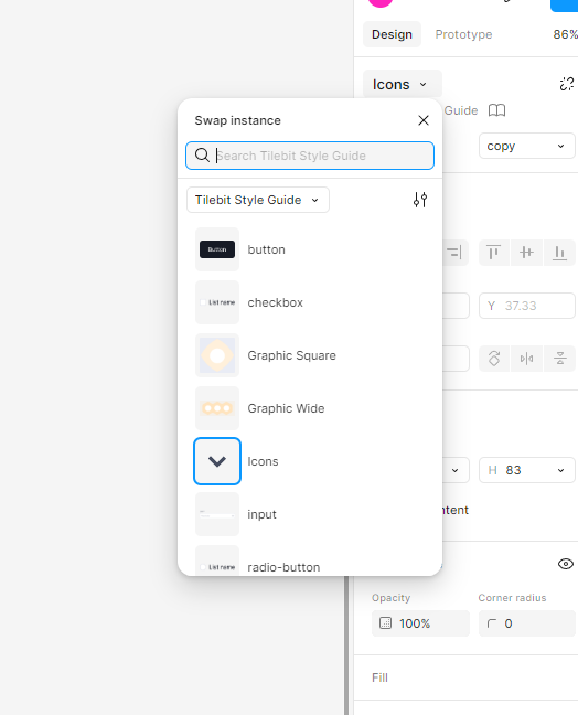
When you select something nested within an instance, the Properties Panel clearly shows all available instances which you can swap.
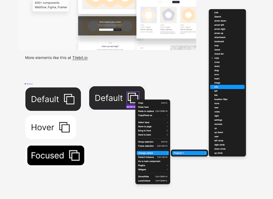
Additionally, you can swap instances directly via the context menu. Right-click on the nested item (like an icon) and select Swap instance. If you’ve made changes and want to revert, select Reset instance from the same menu:
This flexibility helps designers make instance-specific customizations while maintaining a single source of truth, keeping components consistent across the design.
Previously, components were page-bound, making it harder to reuse across different files. You can now drag components across pages while maintaining their link.
To change a component across pages:
Figma will retain all instances of the component across pages.
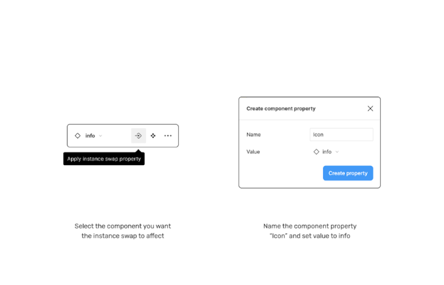
Previously, instance swap properties — where you define specific components that can be easily swapped — had to be set when initially creating the component. Now, you can also add these properties later, making existing components more flexible.
To add an instance swap property:
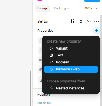
This is useful for adding flexibility to existing design systems without rebuilding components.
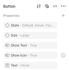
Managing component properties has improved in 2024 with bulk editing capabilities.
To rename a property, click the property name and type a new one:
To reorder properties, drag properties in the right-hand panel and arrange them in the order you want:
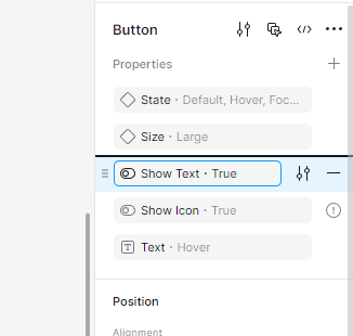
To delete a property, click the minus (–) button next to the property name:
This cleanup makes organizing components more efficient.
A common mistake in Figma is mixing up properties with instances. Here’s a simple way to understand it:
Properties are customizable settings defined on a component, such as color, text visibility (Boolean), or variant states. These settings exist inside the main component itself.
Instances are individual copies of a main component. You can tweak the properties of each instance separately without changing the original component.
If you encounter the error message “Not used within component,” it usually means:
How to fix it:
Ctrl+Alt+K on Windows devices or ⌥ Option+⌘ Command+K on Mac devices)These steps should clear up the confusion, ensuring smooth and error-free swaps in your Figma workflow.
Variants are ideal for different sizes, colors, styling, and states (i.e., Interactive). We know that variants aren’t new, but it’s worth talking about them in the context of component properties — especially as Figma considers variants a part of component properties according to their own documentation.
When a variant is created, it exists inside what’s known as a component set. A component set is a way to identify related components by grouping them together. In simple terms, buttons, tables, or even table cells can exist within their own component sets. It’s simply logical to group these together as related entities, especially folks that are new to your Figma projects.
The main benefit of variants is that they represent and carry specific attributes like size, layout changes, or state changes defined by variant properties. Need to design a button with hover states? Let’s have a look at an example of that below:
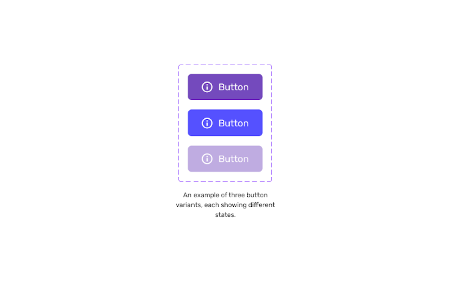
Imagine you want to design a button with different states like enable, hover, and disabled. Variants demonstrate to your immediate team, or stakeholders, what all the different permutations will look like. Every possibility can be mapped out elegantly and bundled up into an in-house design system.
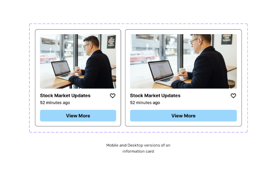
Or perhaps you’re creating a series of information cards, and want to show how they’ll look on mobile, tablet, and desktop? Variants have you covered. As well as that, if you want to add a degree of interactivity to your Figma designs, then variants are a must.
Interactivity is fantastic for showcasing your work to stakeholders. Using an example, again, of a simple button, we can demonstrate what switching between a hover and default state will look like once implemented by the development team:
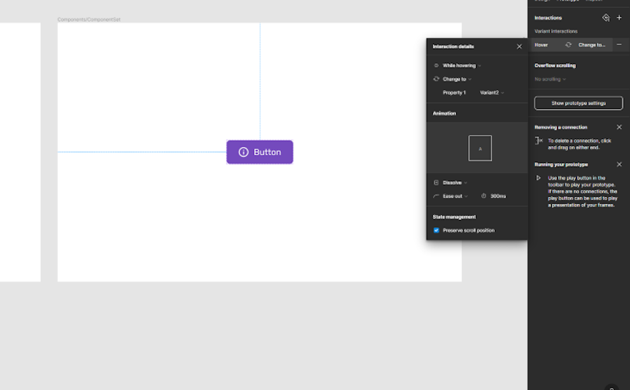
While this is a simple example, you can imagine the implications this will have on other components. Checkboxes, dropdowns, bottom sheets…the list goes on!
Here’s how you can use variants:
As you can see from the below example, the left card is the main component for mobile designs, with the card on the right being a variant of that. That variant that I have created has been tweaked by me, and I’ve created a card that is now more suitable for desktop:
N.B.: Even though the purpose of component properties is to reduce the number of variants created, variants are still needed in specific situations. If you have a major design change like size or color, then variants still rule. Communicating interaction, like a hover state or form interaction, can only be done using variants
Remember, variants are great for creating elements with multiple states. Being able to create, for example, one master button or information card that has multiple variations for different contexts is a huge time saver for solo designers and larger design teams.
Booleans are ideal for being able to toggle visibility between items.
Boolean is a term that means something is either on or off. The light switch in your home is a good example of a Boolean control. Either the light is on, or off, depending on the position of the switch.
While Boolean is a simple concept in practice, it’s my opinion that this property is one of the most useful of all the component properties. By using the Boolean property in Figma, designers can show or hide certain elements within a component, and the option is conveniently displayed in the design panel.
Let’s look at an example you’re likely familiar with. Imagine creating a button that includes an icon. If you want the icon to appear inside the button, the Boolean property should be switched to on. If you don’t want to show the icon, the Boolean property should be switched off:
Simple, right? Let’s take a more detailed look at how to implement the Boolean property correctly.
Select your component. In this case, I have selected a button that houses an icon. Select the Component property button in the layer panel of the sidebar. Let’s name the property “has icon” and set the value to True, which in this example means “on” — in other words, the icon will default to being visible:
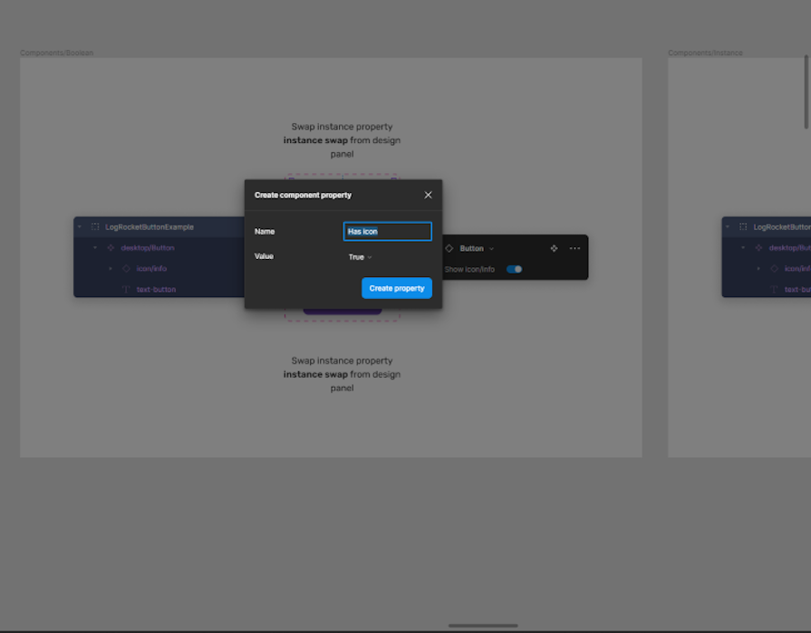
Select Create property. Congratulations, “has icon” will now be displayed as a toggle switch in the button panel on the right-hand side of Figma. You can now toggle visibility on this element:
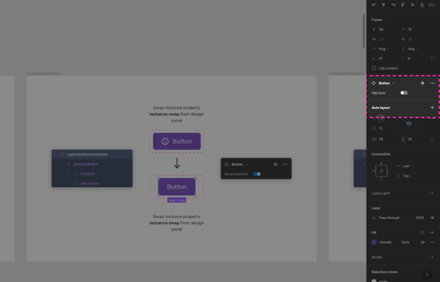
While we’re at it, let’s create a property to hide and show the text as well!
To do this, again, select the Component property button — but this time select Create property. Let’s name it “has text” and set the value to True. This means the default value will show text. If we now go back over to the property panel, we can find all the control properties in one place.
Controlling the visibility of certain elements on a canvas is a hugely powerful feature in Figma, and one of the most used component properties with all the teams I’ve worked with.
Instance swaps are ideal for customizing instances quickly:
The instance swap property is a component property that allows us to swap a component directly from the dropdown within the property panel. By doing this, you don’t need to select a layer in the component itself to swap it. This is a great quality-of-life update that makes designing UI in Figma more streamlined.
I mostly use instance swapping when swapping icons inside components such as buttons, alerts, or navbars. Having a set of defined instance swaps in those contexts is great for larger teams too. With multiple designers jumping in and out of designs, having defined instance swaps communicates to the team, “These icons have been signed off and can be used in this context.”
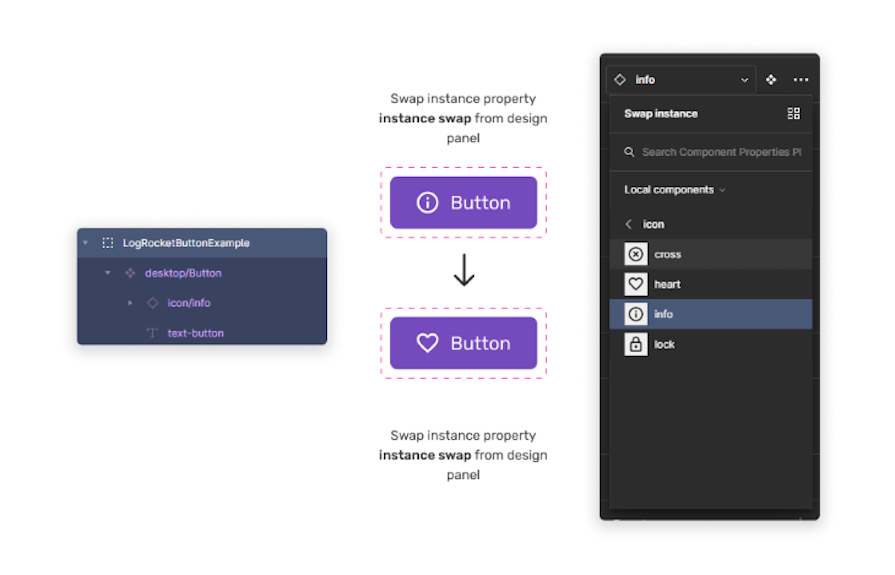
Instance swaps are now created and managed directly through the updated Properties Panel (part of the UI3 rollout), making the process more streamlined. Give the instance swap a name, and select Pick instance for the value.
At this point, you’ll be able to create what’s known as a “preferred list of values.” This is a way to set a default selection of icons that you or the team have decided to prioritize. The instance swap menu will now have a purple pill called Icon. Now, create an instance of the master component. Going back over to the sidebar, you’ll notice we can now use the component property controls to select a different icon using the dropdown:
A typical use case for the instance swap property in Figma would be for swapping elements within a design library.
For example, say you have a library of buttons with different styles, but you want to quickly change the style of one of them. With the instance swap property, you can quickly swap the button with another one in the library without having to manually delete and replace the existing button. This saves time and helps ensure consistency throughout the design.
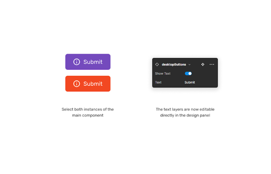
The text property is the most straightforward of all the component properties. When enabled, you’ll now have the option to update the text layer directly in the properties panel, rather than potentially having to click down into multiple layers to eventually find the text you want to update. Changing multiple instances of text is also now possible as well:
Another neat benefit is creating a named value that reflects what the engineering team might be more familiar with. For example, naming the button “Label” and giving it the value of “Click me.”
Straightforward as the text component property may be, it’s one that has a lot of use cases. Examples range from adding titles or descriptions to a dashboard, labeling sections of an application, or providing instructions for a map. Wherever there’s text, there’s an opportunity to use the text component property.
However, the text component should be used at the discretion of the team — having an abundance of editable text fields in the design panel could become unwieldy and have the opposite effect on making life for the team easier!
Styles in Figma let you define visual elements like colors, text properties, effects, and layout grids, making it easier to maintain design consistency throughout your project. Instead of manually applying the same color or font settings repeatedly, you can save these as reusable styles. When you update a style, the changes instantly appear everywhere it’s applied, saving time and reducing errors.
You can create styles for:
Styles also help ensure collaboration runs smoothly, as everyone working on your project can quickly access and apply the correct visual standards without guessing or checking design specifications manually.
| Property | What it does | Best for | Example use cases |
|---|---|---|---|
| Variant | Allows different states of a component | Creating multiple states in one component | Button states (hover, pressed, disabled), dark mode vs. light mode components |
| Boolean | Toggles element visibility | Show/hide parts of a component | Showing an icon inside a button, hiding a subtitle in a card |
| Instance Swap | Swaps one nested component for another | Quickly changing icons, buttons, or other reusable elements | Replacing a plus icon with an arrow in a button, switching a card layout |
| Text | Edits text inside a component from the Properties Panel | Updating text quickly without modifying layers | Changing button labels, adjusting card titles |
| Color/Style | Uses Styles for fonts, colors, and effects | Maintaining consistent design language | Applying brand colors to UI elements |
| Overrides | Modifies text, colors, visibility, etc. at the instance level | Making temporary, instance-specific changes | Customizing a single button instance in a UI |
If you’re new to component properties in Figma or a seasoned pro, the best way to learn is by diving in yourself. With the introduction of UI3, exploring these properties has become even easier and more intuitive.
Thankfully, the design community continues to create fantastic resources to help you see component properties in action. My personal favorite is the Component Properties Playground by Figma. Component Properties (Case Study) by Vic is also a fantastic resource within Figma, explaining the intricacies of using component properties in a large design team at Microsoft.
What I love about Figma is experimenting. Opening up a new canvas to explore ideas, creating new buttons and elements, and then using component properties to add a degree of flexibility that couldn’t have been done before this update. It’s fun, exciting, and best of all, it’s an amazing time to be a designer!

LogRocket's Galileo AI watches sessions and understands user feedback for you, automating the most time-intensive parts of your job and giving you more time to focus on great design.
See how design choices, interactions, and issues affect your users — get a demo of LogRocket today.

I was working with an intern on a UX research project, and before we even started, we both had private […]

AI has accelerated design execution, but speed can come at the expense of intentionality. Learn how UX teams can preserve product thinking and judgment.

UX testing is not limited to layouts, copy, and visual design. Full-stack and server-side experiments help teams evaluate how backend logic, APIs, algorithms, and product flows affect the overall user experience.

In A/B, A/B/n, or multivariate testing scenarios, using p-value with traditional null-hypothesis-based statistical analysis is so common, and most designers […]

 Learn more →
