AI, once seen as a potential threat, is proving to be a remarkable ally in the design world, set to revolutionize the pace of production for designers. As the initial AI hype from ChatGPT and Midjourney is over, we begin to see the emergence of actual AI tools specifically made for some fields. While most people haven’t caught up yet, some have already integrated AI into their daily routines.
Early adopters wasted no time exploring AI’s potential in the realm of UX design, to generate copy and illustration with ChatGPT and Midjourney. Numerous articles and YouTube videos have explained how to use these “generalist” AI in UX design workflows. An in-depth exploration of the subject can be found in Daniel Schwarz’s article on AI in UX design.
Building on this foundation, the future holds the promise of more specialized AIs converging to accelerate every step of designing. The current landscape already demonstrates AI’s proficiency in generating wireframes, mockups, illustrations, icons, and texts, seamlessly integrating them into design software like Figma. As designers, we stand at the threshold of an AI-driven design era, where innovation meets efficiency in ways previously unimagined.

A wireframe is a simplified representation of an application, website, or user interface through a schematic visual depiction. It sketches the layout of elements, functionalities, and primary information, without colors, images, or text.
Designers use wireframes as the foundational step in prototyping, establishing the structure, organization, and hierarchy of interface elements. Proposing a wireframe allows various parties (designers, developers, customers, and investors) to swiftly grasp the layout and flow of the user experience.
A project lacking a wireframe can complicate stakeholder communication management. It’s simpler to project and request changes to a wireframe created on paper within minutes than to an advanced interface that demands setup time. Additionally, a wireframe sets a clear direction, avoiding distractions in exploring different concepts during high-fidelity design.
Often, especially novice designers bypass wireframing, diving straight into high-fidelity models. The wireframing stage can challenge some, as basic shapes (circles, rectangles, lines) limit meaningful results. Due to a lack of illustration, some opt for computers over traditional paper and pencil for idea visualization.
In terms of user needs from designers, AIs need to make it easier to get a project off the ground. The perfect AI would understand the ideas we have and transcribe these ideas directly into digital format, making it possible to compare several ideas and criticize and reorganize them according to the project.
The AI would also need to be highly reusable, to be able to generate many different organizations, since there are an infinite number of ways of meeting users’ needs. AI would also need to bridge the gap between paper and computer so that we could scribble our ideas on a sheet of paper and not waste time transcribing them into design software.
For expediting wireframe creation, the two tools to use are image-to-design and text-to-design AIs.
As a Figma plug-in at $42/year with ten trials for newcomers, Wireframe Designer functions as text-to-design. Through a user-friendly window, describe a desired topic, and the AI produces high-quality wireframes based on the prompt. The AI handles coherent text generation, icon incorporation, and carousel creation.
Wireframe Designer logically structures sections based on the described site or application. More detailed prompts will be followed to an extent, but vague descriptions also give great results. The more impressive part of this AI is that everything is in auto layout, a welcome bonus that helps revamp the wireframe with ease.
Dubbed “the Figma of nondesigners,” Uizard is a rival of Figma. The cloud design tool employs a brick-based approach on a blank page to create digital projects. Uizard’s first AI demonstration is 5 years old; it is a precursor in this field.
The image-to-design AI transforms paper sketches into editable designs. It eliminates the need for paper-to-computer transcription, seamlessly connecting physical media with the digital realm. Although the wireframes created are only editable in the Uizard platform, the time gained with this AI is worth giving a try.
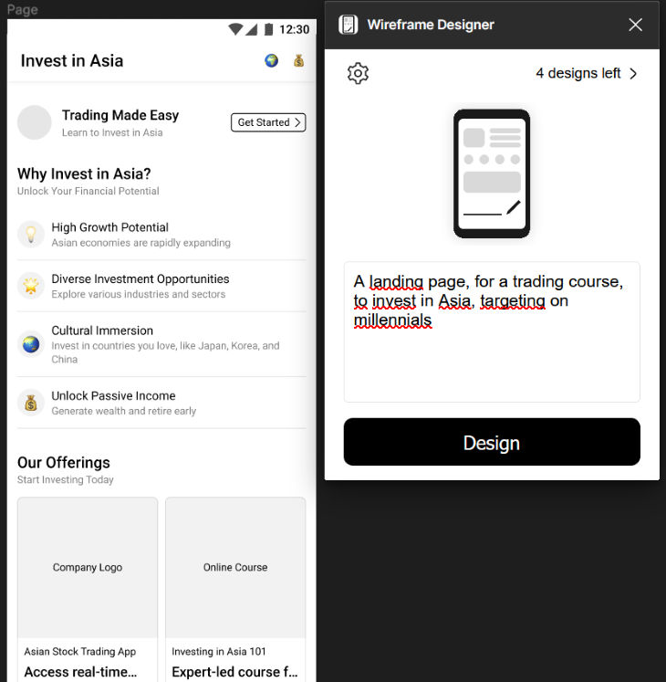
Here, I used Wireframe Designer to set the basis of a landing page. The prompt used was, “A landing page, for a trading course, to invest in Asia, targeting millennials”
I’ve got a great basis to start working on, composed of a header and five sections, some texts, and everything in auto layout. I would have revamped this wireframe because I have other ideas in mind, but for the beauty of science, I left it as it was created by AI:
In UX design, a mockup portrays a static, intricate visual rendition of a user interface, like an application, website, or software. It bridges the gap between the wireframe (structural sketch) and the interactive prototype, aiming to present the precise visual layout and appearance of the interface. Mockups encompass graphic elements such as colors, typography, images, and icons, contributing to a more lifelike portrayal of the eventual user experience.
Designers use mockups to envision and convey the design to stakeholders, developers, and team members, simplifying comprehension of the overall interface aesthetics before progressing to development and interactive prototyping.
At this stage, the designer’s main challenge is transitioning from a wireframe that defines information architecture to a mockup depicting various product pages. This phase typically garners the most criticism from stakeholders, who perceive it as a finalized product and tend to criticize every facet, from illustrations to text choices. Paradoxically, projecting oneself onto squares and empty circles is easier than envisioning a detailed page.
To facilitate this stage, AIs should produce comprehensive, coherent pages editable as needed. The ideal scenario entails mockups aligning with selected wireframes, seamlessly generating illustrations, icons, and personalized text to convey intended messages (ultimately streamlining the management of a design system).
Some AIs offer all-encompassing solutions, but can also assist in generating specific mockup components. For instance:
Build.io is a third-party design platform that integrates with Figma via a free plugin, necessitating an OpenAI API key. The “text to design” plugin prompts detailed input and example sites for inspiration. A range of options is then presented, complete with classic organization, illustrations, and text.
The results exhibit advanced component configurations, often impressively intricate. Build.io also facilitates exporting designs to their site for coding, utilizing AI once again. As with many AIs, mastering effective prompting is crucial for optimal outcomes.
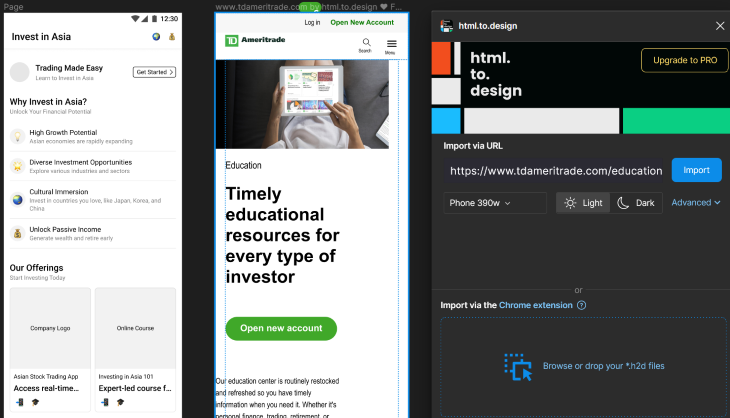
HTML to design is a Figma plugin that offers spontaneous scrapping instead of prompt-driven generation. By inputting an URL, an editable reproduction of the webpage materializes on Figma. This tool proves invaluable for finding inspiration, directly comparing competitors’ strategies within Figma, and simplifying redesign missions.
I used HTML to design to scrap some of the biggest actors in the trading field. It helps to compare my wireframe to their architecture. My wireframe misses a log-in function, an illustration at the beginning, and a call-to-action visible directly. The typography doesn’t create enough hierarchy.
Midjourney and Stable Diffusion, the two most potent text-to-image AIs today, have given rise to a plethora of tools for generating illustrations and icons on demand. All these tools run on the same principle: writing a prompt to generate pictures. The differences center around two factors:
Here are two examples of such AI tools that give good results:
A free image generation plug-in. Upon receiving a prompt, it conjures up several images aligning with the provided description. The results consistently exude allure and are very good to create portraits.
This tool offers the added perk of customizable image ratios, allowing you to tailor the visual output to your preference. Furthermore, four different models are available, adapting the rendering to your desire for heightened realism or artistic flair. Once you know how to prompt, this AI saves a lot of time in cases where stock photos don’t match our ideas.
Magic Icon is a tool from Diagram, a Figma-affiliated enterprise. Diagram is an innovative company that develops a whole suite of AI tools tailored for Figma. Magic Icon operates on a prompt to generate personalized icons. From a robot icon to an astronaut munching on a burger, anything can supposedly take form. The outcome’s quality depends on the request’s complexity. Even for an AI, crafting meaningful icons constrained by limited colors and bold shapes is a hard task.
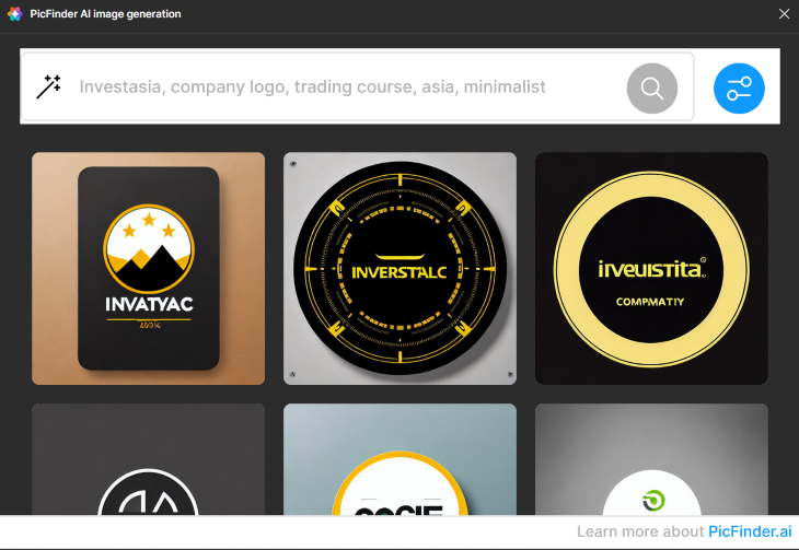
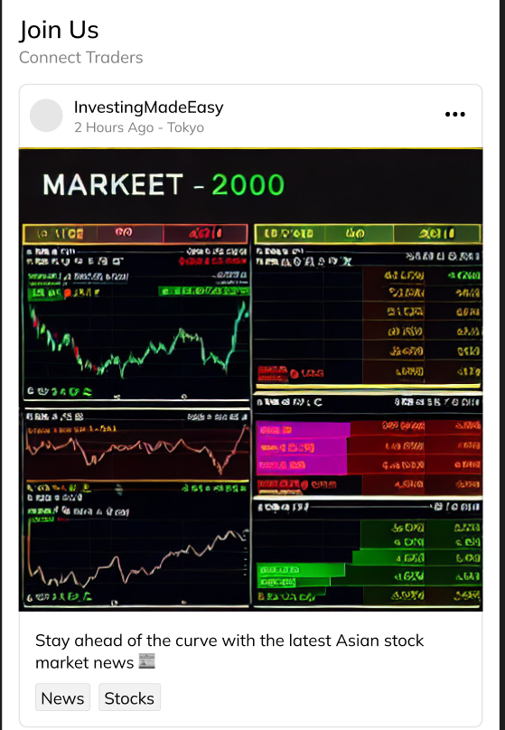
PicFinder generates pictures to fill up the blank space in my wireframe. The prompt requires five words, so I wrote the description followed by “trading”,” Asia”, and “minimalist” and gave a name to my page: Investasia. Here are the results for a company logo, a trading course, and a market update:
The most prevalent AI tool type on Figma’s Community is copywriting AI. The goal is always to transform the “lorem Ipsum” into a coherent copy based on context. Almost all these tools run on ChatGPT and facilitate the modification of text in one click instead of copy-pasting everything. The two differentiating factors here will be the quality of copy and the ease to modify text in the mockup.
Three nice tools for that are:
Magic Copy is also from Diagram; it offers seamless text editing, one element at a time. Its usage is straightforward: select a text element within the layout, furnish a prompt outlining your requisites, and opt for one of the AI’s three suggestions. The AI promptly substitutes the text, and the intuitive prompt accommodates various constraints. For instance, you can stipulate a maximum word count.
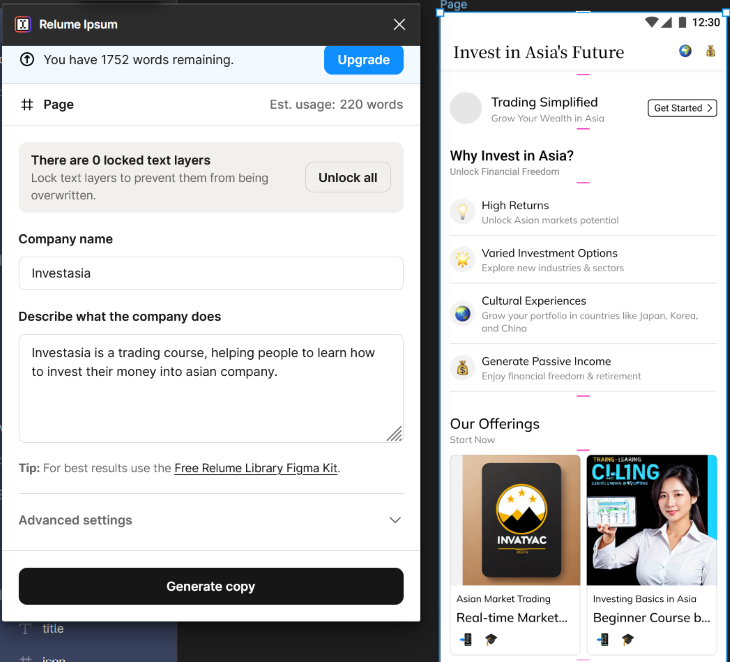
Relume Ipsum is a plugin that starts at $90, with a 2,000-word free trial. It facilitates simultaneous modification of all text within a frame.
To get good results, AI necessitates a substantial degree of contextual information. The copy’s quality changes according to the mockup’s structure. While an ill-structured layout gets a poor copy, a well-organized layout generates remarkably impressive outcomes — all attainable with a single click.
FontExploreAI is a different kind of copy AI that is great to mention. FontExplore is a plugin that operates by suggesting fonts based on descriptions. Navigating the myriad font options for a project can prove perplexing. Utilizing AI to curate fonts that resonate with specific characteristics like “futuristic,” “serious,” or “youthful entrepreneur” is an ingenious strategy.
For my mockup, I used FontExplore to find the right fonts to use. I decided to opt for Noto Serif JP for my title and Mulish for the rest. Both have been recommended based on a three-word description “trading, serious, Asian,” and every text selected was changed in one click. Then I used Relume Ipsum to write better copy. By giving it a description of “investasia,” every text layer was modified in one click. Is the copy better? It’s up to people to judge.
Correctly naming elements is one of the most time-consuming tasks in designing a model. Even experienced designers often find themselves delivering projects with labels like “Frame 189,” “Image 22,” and “Line.”
Designing interfaces occasionally places designers in a state of flow. Maintaining this flow becomes challenging when constant renaming of each element is a necessity. This challenge becomes even more pronounced when the required level of nesting is uncertain, especially with auto layout usage. Modifying the prototype might also involve altering element names to align with new adjustments.
The previously mentioned AIs automatically name each element generated, but if the goal is to rename a project done by hand:
Selecting a frame assumes the role of analyzing the model’s structure and assigning coherent names automatically to elements. Elements within auto layout are understood either as “container” or “button”; the names can change if you use the plugin multiple times.
Autoname proves most effective toward the project’s end to give a more professional appearance to the layers. Notably, it’s now possible to customize AI-generated names by providing a template, thereby enhancing personalization!
Magician is another plugin by Diagram. Magician works just like Autoname but tends to provide more consistent results due to enhanced element analysis.
As Diagram is affiliated with Figma, their AI may have benefitted from more extensive training in recognizing Figma-specific design patterns and best practices, potentially accounting for the slightly superior quality. Nonetheless, whether the AI can adapt to our naming conventions or only its predefined approach prevails remains to be determined.
The transition of AI from mainstream to specialized applications marks an exciting chapter. These complex algorithms, which learn through continuous usage, hold immense potential. By training AI specifically for designing interfaces, the field is writing a new chapter, unlocking remarkable future outcomes.
AIs prove themselves as remarkable tools for designers. While some may find the prospect of machines contributing to their work unsettling, the incorporation of AIs promises to elevate interface design to unprecedented levels of efficiency and innovation. AIs already reduce the time used:
This dynamic fusion of human ingenuity and AI capabilities sets the stage for an exhilarating future where the iterative process and deep thinking of the user’s needs take a bigger place as straightforward realization. The horizon gleams with exciting possibilities, where designers and AIs work hand in hand, shaping interfaces that seamlessly blend creativity and functionality, transcending limitations and propelling us toward a new paradigm of design excellence.
Header image source: IconScout
LogRocket's Galileo AI watches sessions and understands user feedback for you, automating the most time-intensive parts of your job and giving you more time to focus on great design.
See how design choices, interactions, and issues affect your users — get a demo of LogRocket today.

Zero UI works well for screenless, voice-first experiences, but most digital products still require visual interaction. Here’s why multimodal UX offers a more scalable foundation for the future of design.
Multimodal UX goes beyond designing for screens. Learn how context-aware systems, progressive modality, failover modes, and accessibility-first design create better digital product experiences.
Learn how context-aware mode prioritization and seamless transitions improve multimodal UX and reduce mode confusion.

Research is becoming more democratized, product cycles are accelerating, and AI is transforming synthesis and ResearchOps. Here are the three trends shaping UX research in 2026.