Your skill gap isn’t always obvious. There are skills that most UX bootcamps never point out or add to their curriculum, and these skills low-key make the difference between a good designer and a great one.
You open LinkedIn and see designers proudly sharing their new motion design projects, or announcing that they just learned a shiny new UX skill like AI prototyping or 3D UI. Those are great, but there are other skills that don’t look flashy enough to post about, and they quietly hold a product together behind the scenes. What makes these skills special is how their impact compounds over time. The more you practice them, the more they strengthen your decision-making, teamwork, and consistency across projects. They may not earn you instant likes, but they build the kind of long-term value that separates seasoned designers from beginners.
In this article, we’ll look at seven underrated UX skills that might not trend on your feed but will make you a more valuable designer, speed up collaboration, and help you ship better products.
Unlike typical design meetings, UX workshops are designed for deep collaboration. They are short, focused sessions where designers, PMs, and stakeholders roll up their sleeves and actually work through a problem together. So being a UX workshop facilitator means knowing how to guide the group through these sessions — keeping the discussion focused, encouraging participation from everyone, and turning messy ideas into clear, actionable outcomes.
Many designers focus on sharpening their technical skills, but being able to guide a group toward alignment can have just as much impact on your career and on the product’s success. It makes you the designer who can align stakeholders, shape key decisions, and run faster, more focused meetings.
Want to get better at facilitation? You don’t have to wait until you’re leading your own workshop to start practicing. Try volunteering to co-facilitate your team’s next design critique or sprint retrospective, focusing only on keeping discussions time-boxed and balanced. Or offer to help plan the agenda for an upcoming stakeholder session, even if you’re just the note-taker, you’ll learn how facilitators structure conversations to stay productive.
You can also start small:
Need resources? There’s a great YouTube channel for UX workshop tips. Here are three videos to start with:
Another great resource is our downloadable workshop facilitation checklist — it’ll walk you through planning, running, and following up after a session so you feel confident from start to finish.
One of the worst mistakes you can make during developer handoff is leaving your designs up for interpretation. Without clear notes, callouts, and documentation, developers are left guessing — and you risk shipping a design that looks great in Figma but behaves completely differently in production.
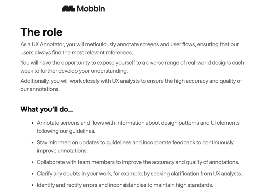
UX annotation solves this problem. It’s the practice of adding context to your designs, labeling states, explaining interactions, and clarifying edge cases — so everyone understands exactly what’s supposed to happen. This skill is still massively underrated. It doesn’t get much attention in bootcamps, and it’s not a flashy skill you’ll see trending on LinkedIn. Yet it’s so valuable that companies are hiring specialists just to annotate screens. Mobbin, for example, posted a UX Annotator job showing how much the industry values this work:
Learning annotation doesn’t just make life easier for developers — it makes you a better communicator and a more reliable designer. Teams love working with designers who hand off specs that leave no room for confusion.
If your designs ever feel messy or inconsistent, chances are you’re designing screens before understanding the objects that make up your product. Object-oriented UX (OOUX) flips that process. Instead of starting with wireframes, you start by identifying the key objects in your system and then make sure you know the action each object performs, so your designs feel smooth and even faster to design.
Why this skill matters:
Kickstart your learning:
Empty, loading, and error states can be grouped under what I like to call the “in-between moments.” These are moments in the user journey where there’s little to no content on the screen — either because there’s nothing to show yet, content is still loading, or something has gone wrong. Designing these states well is crucial: they can turn potential drop-off points into opportunities to keep users engaged and confident.
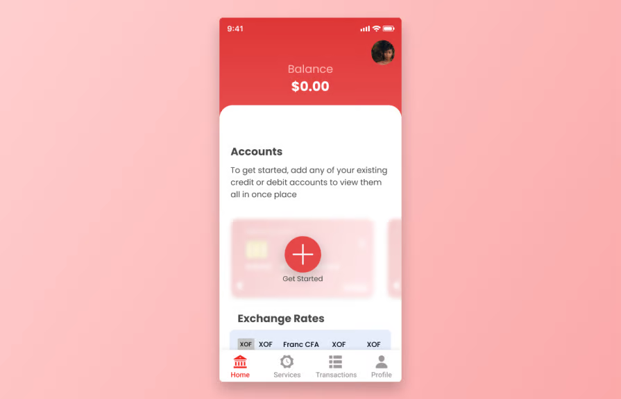
Empty states appear when there’s no data yet — like a brand-new account, no saved items, or a cleared cart:
Treating empty states as mere placeholders can cause you to miss out on a potentially meaningful touchpoint where you can engage and guide your users.
Loading states show up when the content is on its way but not ready yet. The goal is to reassure users that something is happening and reduce the feeling of waiting. Example: skeleton screens or a progress bar that shows real progress instead of just spinning:

Here’s the thing: no one likes waiting, especially these days. But it’s rarely possible to remove wait time altogether from digital experiences. Instead, UX designers should focus on designing those experiences in a more tolerable — or maybe even enjoyable — way.
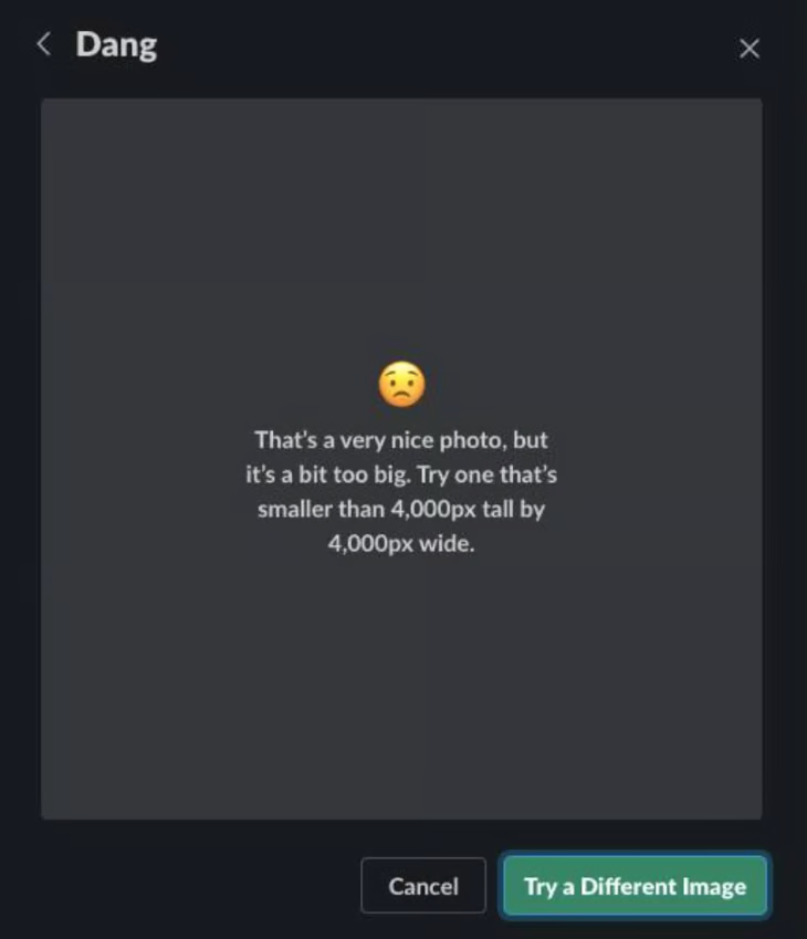
Error states appear when something goes wrong — a failed network call, invalid input, or server error. The goal is to clearly communicate what happened, reassure users, and provide a path to recovery. Example: “Couldn’t load content. Tap to retry.”
Designing these three states thoughtfully is often overlooked, but doing so can dramatically boost engagement, reduce churn, and create a smoother overall experience.
Information architecture is one of those concepts many designers hear about while researching ways to level up their skills — but it often gets skipped because it feels abstract or too technical. One of my designer friends at a rapidly growing startup, ran into this firsthand. He was tasked with redesigning navigation for a major feature, but without a solid IA framework, users ended up confused after launch. That experience exposed the gap in his process and pushed him to finally learn IA.
Investing in IA early saves you from that kind of pain. It’s what makes a product easy to navigate and keeps everything organized as it grows. A good IA means users find what they need faster, onboarding flows feel smooth, and adding new features doesn’t break your navigation:
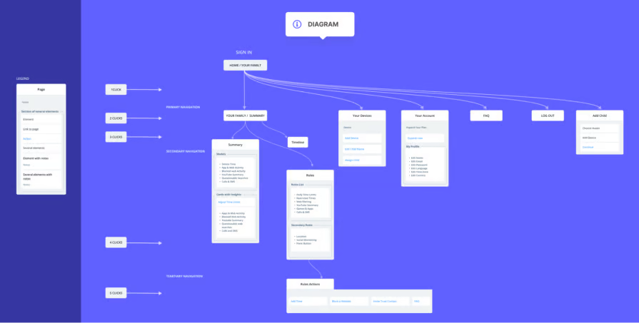
If you’ve never done an IA exercise before, start by mapping out your screens and grouping them into logical categories. Even this simple step can reveal hidden complexity and improve your product’s structure.
If IA decides where things live, taxonomy and labeling decide what to call them. The right words make navigation feel natural and help users trust they’re in the right place. The wrong words create confusion, hesitation, and misclicks — even if the structure itself is perfect.
Label UX is an underrated skill because it looks deceptively simple. Many teams pick whatever sounds clever, or use company jargon, without testing it with users. The result? Menus that feel overwhelming, search results that miss the mark, and features users never discover.
An easy first step is reviewing the language used across your product. Gather every menu item, button, and category name, then ask yourself: Would a first-time user understand these labels immediately? If not, rewrite them using the language your users actually use.
This is all about keeping track of your design files and making sure your team is always working from the right version. Let’s look at it practically. Imagine another designer on your team wants to add new components to your shared library. Editing the main file directly could break other people’s work or publish unfinished changes by mistake. With version control, they can create a safe copy, make their updates, review them, and merge them back only when everything is ready. Even for you as a designer, version control is powerful — you can explore ideas safely, compare different versions of your work, and roll back if something doesn’t work out.
Investing in this skill is especially important if you work on collaborative teams. It helps you avoid chaos, keeps your design system stable, and builds trust with developers and PMs because they know they’re always looking at the latest agreed-upon design.
Tools like Figma actually make this easier with its “Create branch” feature, but the real skill is in developing the habit: name your files clearly, document your updates, and avoid editing shared files without a safe process in place.
Investing in these skills would really help in the long term, with the way AI is coming up and all, being a full-stack designer, if that is a thing, is definitely needed to stay relevant in this industry. And you don’t have to be in quote “perfect”, just understanding it and the ways around them is enough to be honest. Happy designing!

LogRocket's Galileo AI watches sessions and understands user feedback for you, automating the most time-intensive parts of your job and giving you more time to focus on great design.
See how design choices, interactions, and issues affect your users — get a demo of LogRocket today.
AI tools can generate beautiful UI concepts in minutes, but most teams struggle to integrate those outputs into real design systems. This guide explores why AI drifts toward generic patterns and how to build governed workflows that keep speed without sacrificing brand consistency.
Adaptive interfaces personalize experiences using behavioral signals and machine learning. But when personalization becomes autonomous, systems can reinforce patterns, limit discovery, and shape user behavior in ways designers didn’t intend.
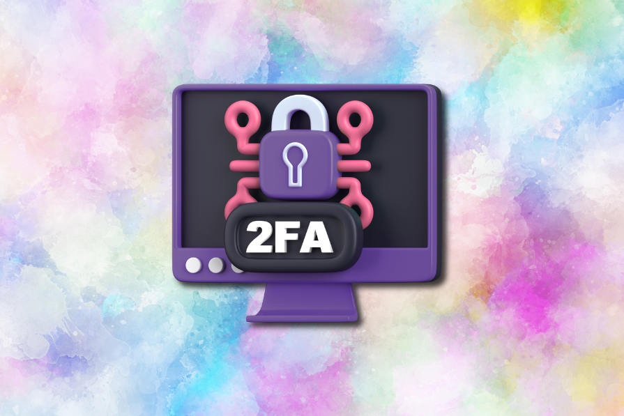
Security requirements shouldn’t come at the cost of usability. This guide outlines 10 practical heuristics to design 2FA flows that protect users while minimizing friction, confusion, and recovery failures.

2FA failures shouldn’t mean permanent lockout. This guide breaks down recovery methods, failure handling, progressive disclosure, and UX strategies to balance security with accessibility.

 Learn more →
