Imagine navigating through a website without needing to constantly scroll back to the top to use navigation controls. Well, that’s the main reason we have the T‑layout design. The T-layout keeps navigation always within reach, offering users a more seamless experience.
Let’s take a look at how this simple yet effective design approach shapes the way we interact with mobile-first websites. We’ll break the T-layout down into its key features, compare it to other layout styles, and see how to leverage its benefits most effectively.
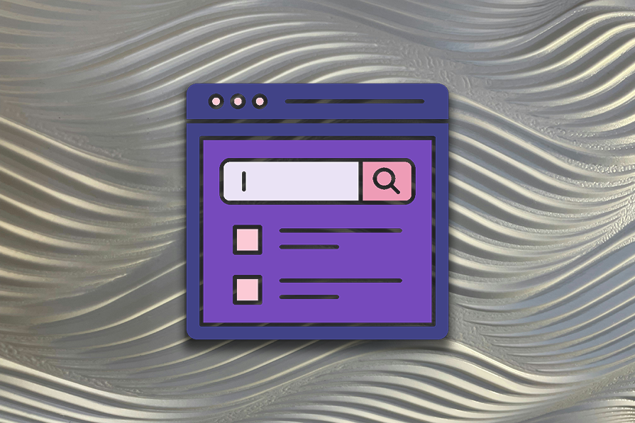
The T-layout is a design framework for applications on the web, especially for web applications on mobile devices. In a T-layout design, there’s a fixed horizontal section (usually a header or navbar) and a vertical section (usually the main content section, which is often scrollable).
The T-layout got its name from the way it’s structured — in other words, it looks like a T, as you probably expected. It’s made up of a horizontal section (the top of the “T”) and a vertical section (the stem of the “T”):
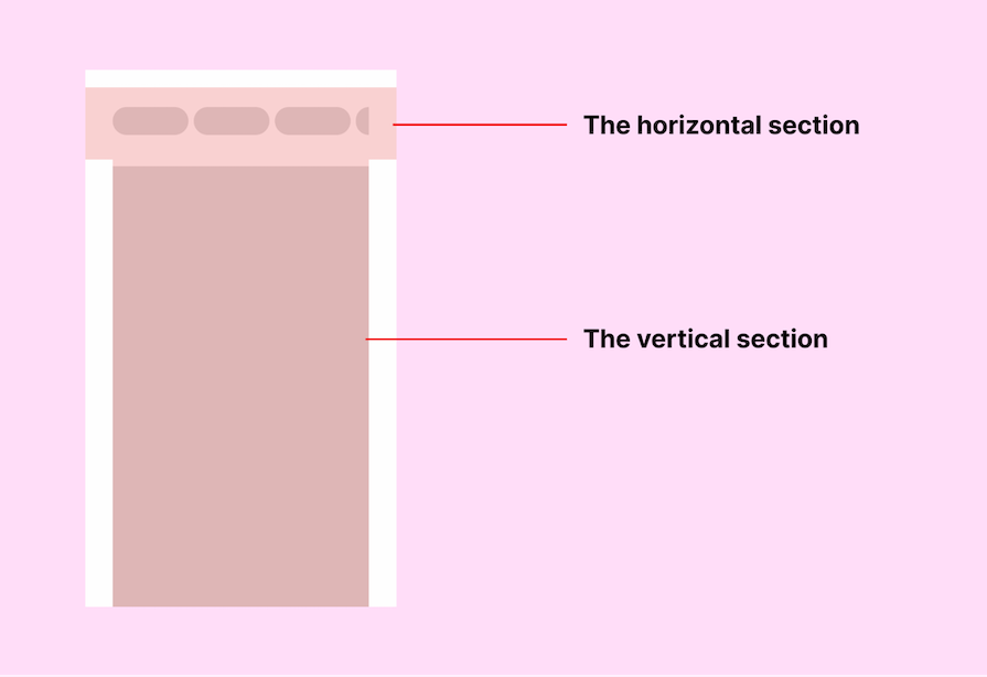
The horizontal section is located at the top of the web application. It can stretch to the whole viewport width at the top, and it’s typically there for navigation purposes (you can usually find the navigation menu there).
The vertical section is where the main content of the web application is placed. Whenever a user opens a web app, the vertical section will be the first part they’ll most likely interact with, as that is the main section visible to the user.
What truly makes a T-layout is the horizontal section. If this section is removed, the structure no longer resembles a T; it becomes more of an I, as seen in traditional UI layouts. This means the horizontal section must remain fixed in the layout to maintain its T shape.
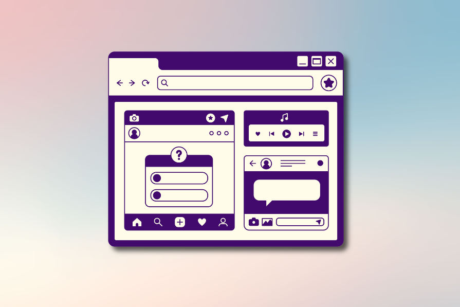
Other layout structures can still be classified as a T-layout if they retain a horizontal section. For example, a two-column grid with a horizontal section at the top can still be considered a T-layout:
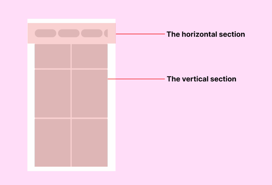
Think of it this way: the vertical section is a container for your web app’s content, and whatever layout exists within it doesn’t change the overall T structure.
While the T-structure typically has the horizontal section at the top, some web applications implement what I would call an upside-down T-layout, where the horizontal section is positioned at the bottom of the screen:
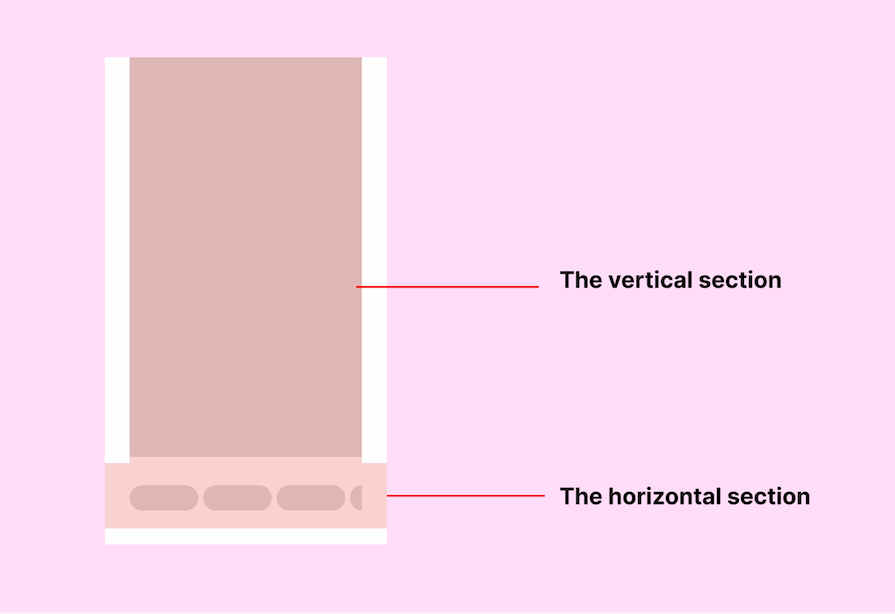
This is a good practice for mobile-first designs because it places the navigation controls closer to the user’s thumb, improving one-handed accessibility.
Some websites follow a UI layout where everything is arranged vertically — both the main content and navigation. In this kind of UI layout, the header or navigation controls are not fixed on scroll. This means users have to scroll all the way up just to access them again, or open them using secondary controls.
Allow me to use a real-world practical example to explain this. On Rapha’s mobile website, notice that all navigation options are tucked inside a hamburger menu.
Once you start scrolling, the navigation disappears. If you need to access the nav menu, you have to scroll back up. Rapha acknowledges this issue with a smart workaround — a floating “back to top” button that appears at the bottom right when users scroll down:
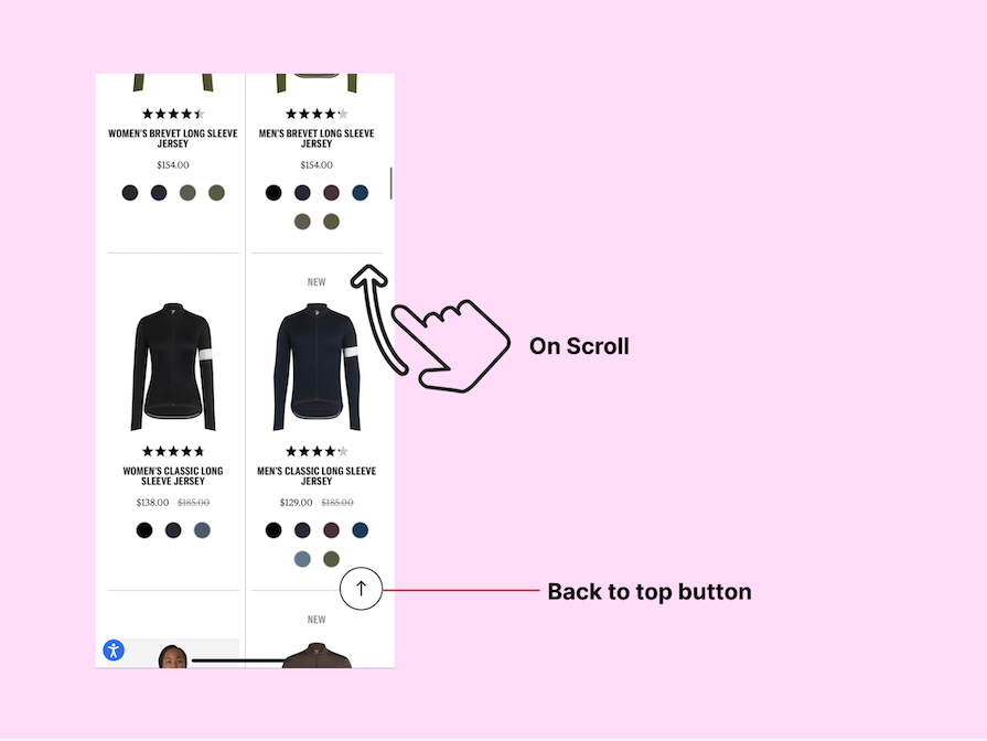
This small but effective feature helps users quickly return to the top without excessive scrolling. While it doesn’t completely solve the accessibility limitations of traditional UI layouts, it does improve navigation efficiency compared to websites that don’t provide a shortcut at all.
Now, let’s look at a couple of T-layout case studies that show the benefits of this layout in the real world. You can compare those use cases to the Rapha one above.
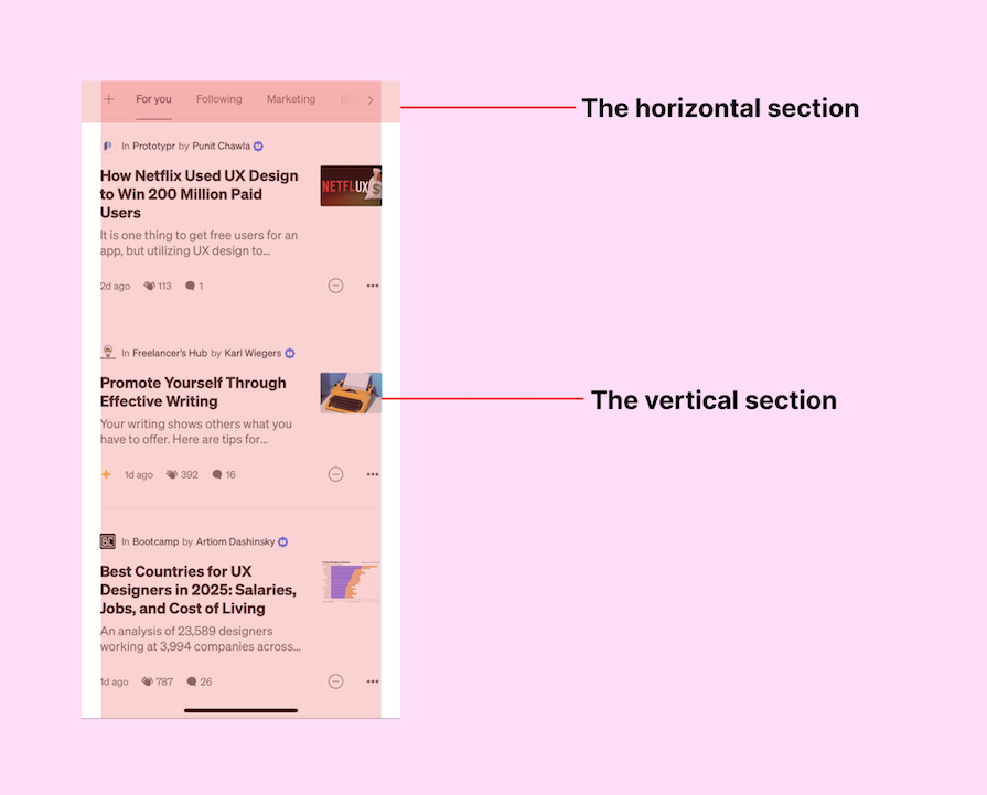
Medium’s mobile site is a prime example of T-layout design. Its top navigation bar remains visible while scrolling, allowing users to navigate between sections like “For You” and “Following” effortlessly. This ensures a smoother reading experience without requiring users to scroll back up:
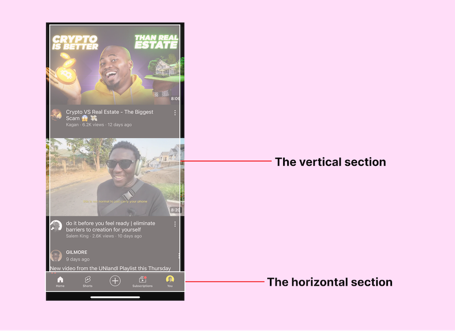
The interface in YouTube’s mobile app follows an upside-down T-layout, fixing key navigation controls at the bottom of the screen even when scrolling. This thumb-friendly design enhances accessibility, which makes it easier for users to switch between Home, Shorts, and other tabs without excessive scrolling:
Let’s go through some benefits of the T-Layout design that highlight its practical advantages over traditional layouts:
Traditional vertical layouts require users to scroll back up to access navigation, which can slow down the browsing experience. The T-layout solves this by keeping navigation fixed, allowing users to switch between sections without losing context.
Instead of hunting for menus or repeatedly scrolling to the top, users can navigate seamlessly, making interactions more efficient and frustration-free.
On mobile devices, ease of use often comes down to how well a layout aligns with natural thumb movements. A behavioral study from E-Streetwear found that most users rely on their thumbs for navigation, particularly when using one hand:
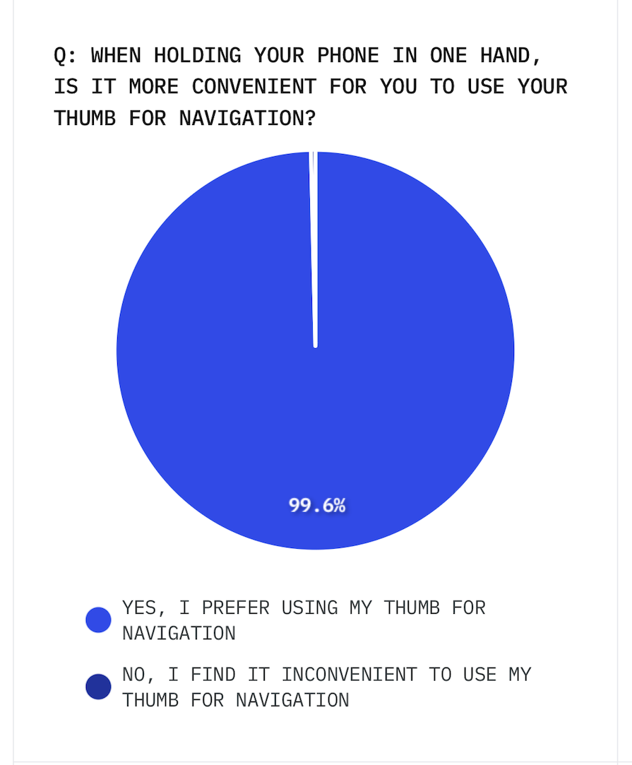
This study highlighted how users naturally interact with interfaces using a one-thumb zone, emphasizing the importance of placing key actions within this accessible area. T-layouts support this behavior and thus improve usability and comfort, especially for mobile-first designs.
Placing the navigation bar at the bottom in an upside down T-layout makes one-handed navigation effortless. This is why popular apps like Instagram and YouTube position key actions at the bottom, keeping them within easy reach and reducing hand strain.
A cluttered interface can overwhelm users with too many choices at once. The T-layout helps by clearly separating navigation from content, ensuring users can focus on what matters without unnecessary distractions.
Reducing visual overload helps users make decisions faster, interact with content more confidently, and experience less frustration. The end result is a more seamless and enjoyable browsing experience.
While the T-layout provides many benefits, not all websites necessarily need it. Its effectiveness depends on factors like target audience, content structure, interaction requirements, and more.
When the T-layout works best:
When a traditional layout might be better:
In other words, if your users are likely to need quick and easy access to a header or navbar, a T-layout is ideal. If navigation is simple or unnecessary, or you need to allocate screen real estate to other content, hiding or excluding the header or navbar might be better.
If a T-layout design is done well, it can make using a website much easier. It helps people find things faster, works better on phones, and doesn’t stress the brain too much.
Not every website needs a T-layout, but for sites where users are navigating between sections or pages constantly, or products made mainly for mobile users, it’s really useful. The T-layout makes digital products simpler and easier to use in many ways, which helps users browse content smoothly and keeps them on the site longer.

LogRocket's Galileo AI watches sessions and understands user feedback for you, automating the most time-intensive parts of your job and giving you more time to focus on great design.
See how design choices, interactions, and issues affect your users — get a demo of LogRocket today.
Explore the core principles of GUI design and learn how consistency, simplicity, feedback, accessibility, and user testing contribute to better digital experiences.

After five years in UX, I revisited the Daily UI challenge to reconnect with hands-on design. Along the way, I learned that great interfaces come from thoughtful briefs, sound judgment, and user feedback, not just better AI tools.
Learn what makes a great login screen through real-world examples and UX best practices for creating secure, accessible, and low-friction authentication flows.
Skeuomorphism helped define early digital interfaces by mimicking real-world objects to make technology more intuitive. Learn how it compares with flat design and neumorphism, why it declined, and where it still has a place in modern UX.

 Learn more →
