
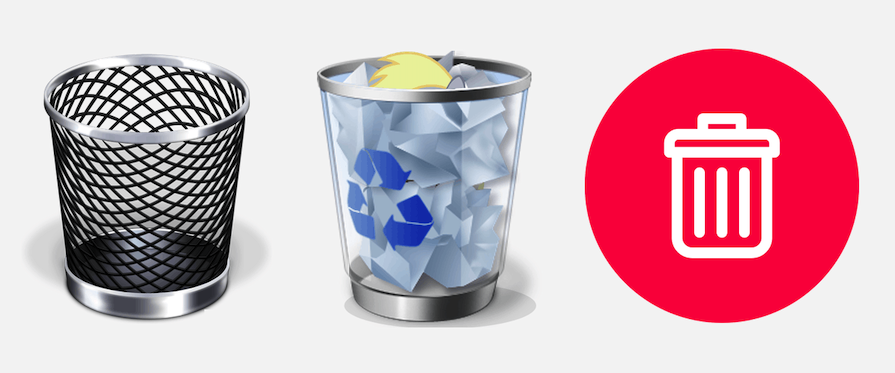
Skeuomorphism in graphic UI design describes interface elements that mimic real-world objects in how they appear or how the user interacts with them. These design elements act as cues resembling real life within the visual space. A good example is the recycle or trash bin, which lets you discard files, mimicking a design from real-life trash bins:
In Greek, “skeuos” means “container” or “tool,” while “morph” means “shape,” so skeuomorphic means “containing a shape.” In the brick-and-mortar days, the word “skeuomorphic” was originally used to describe physical products that carried over their shape or design from previous iterations. For example, a plant-based burger would still look like a beef burger.
Skeuomorphism in mobile UI design drew on designs from the early modern era of computing. Apple’s early iOS designs used skeuomorphism throughout their UI. It was regarded as intuitive because people who did not know how to use iPhones could take these cues from real life and intuitively learn how to use smartphones.
Editor’s note: This article was updated on July 14, 2026, to improve its structure and readability, refine comparisons with flat design and neumorphism, refresh best practices for skeuomorphic interfaces, and update related links across our UX design content.
Skeuomorphism is a design concept wherein items resemble their real-world counterparts. Skeuomorphism in UI uses real-world elements to make virtual objects more intuitive and easy to use.
Some examples of skeuomorphic design are e-wallets resembling real-life wallets, note apps looking like notepad paper, and camera lenses in camera apps that look like a real camera.
Skeuomorphism was replaced by flat design in 2013, when Apple unveiled its iOS 7 interface. Prior to that, skeuomorphism reigned supreme from 2007 to 2013. In 2019, a new design technique called neumorphism was born.
Apple largely moved away from skeuomorphic interfaces with iOS 7, replacing heavily textured visuals with a flatter visual language while still retaining subtle real-world cues in many icons and interactions. They abandoned skeuomorphism ultimately to serve the user. The user in 2013 already knew how to use skeuomorphic design, and needed fresher design cues that only had a hint of the old design. So at this time, Apple favored flat design for its minimalism.
Neumorphism is the modern-day skeuomorphism. It takes cues from both skeuomorphism and flat design. It’s minimalist, but still gives a sense of three dimensions. The old use of skeuomorphism favored a maximalist style of 3D dimension.
Yes. Although it is no longer the dominant design trend, skeuomorphism remains relevant because many modern interfaces still borrow its visual cues. It was one of the main design techniques used in the early days of the internet that inspired many modern icons, interfaces, and even trends like neumorphism; there are plenty of UI elements that still use some type of skeuomorphism today. But UI/UX design has also evolved throughout time to favor a more minimal approach, so it’s likely not as relevant for modern designers to know.
Use skeuomorphic elements when real-world metaphors improve discoverability or reduce learning, but avoid decorative realism that adds visual clutter without improving usability.
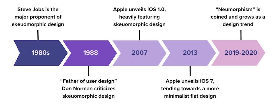
Before we really take a look at skeuomorphic design, we have to know where it came from. So here’s a brief history of skeuomorphism:
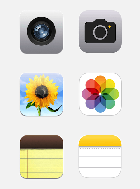
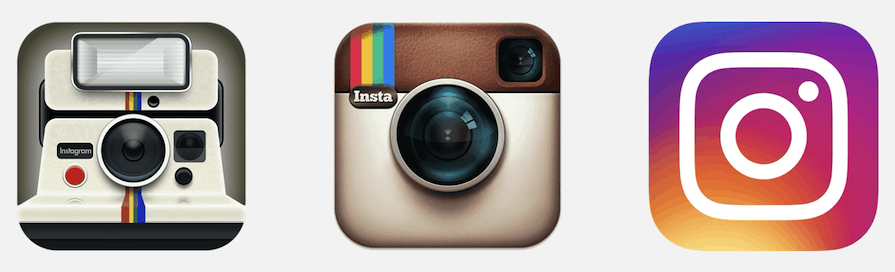
In the following side-by-side comparisons of some well-known iPhone apps, you can see how Apple has dropped the heavily skeuomorphic icons (left) to instead adopt a distinctly flat design (right) — a visual approach that the product continues to carry and refine today:
According to the IxDF, there’s some debate over whether or not users are accustomed to graphical user interfaces enough that skeuomorphic cues are no longer needed to help users understand how to use them:
“Opponents of skeuomorphism argue that natural-looking objects can make an interface look cluttered and that some of the objects mimicked in skeuomorphism have become obsolete and meaningless to users (e.g., the floppy disk for the “Save” action). Proponents, on the other hand, argue that humans can never become as accustomed to the digital world as we are to the physical world—so, simple skeuomorphism will continue to be helpful.”
The Forbes article mentioned above outlined some similar reasons as to why skeuomorphism “died.” For one, it was used in the 80s to come up with reasons for how to manage the evolution of the internet. It just wasn’t feasible that the way we use technology in the 80s and in the early 2010s would be the same. To evolve with technology, we have to let go of old patterns.
Another reason for the decline in popularity of skeuomorphism is scalability. It’s based on pixel-by-pixel rasters, which suited the prevailing trend. Today, more designers use vector graphics rather than raster graphics, which are better suited to flat design. Flat design is also much more scalable, especially when designing interfaces for multiple screens, such as phones, tablets, and computers.
While skeuomorphism was a major trend, I think it’s a trend of the past, and it’s not coming back anytime soon. Let’s take a look at two other trends: flat design and neumorphism.
Skeuomorphism paved the way for flat design to claim its title as the leading UI design style today. These two are opposites in many ways, and the varying factors that led to the rise and fall of skeuomorphism effectively led to the rise of flat design in turn.
While skeuomorphism mimics 3D objects in design, flat design uses 2D representations with vibrant colors:
Flat design debuted in 2013 with Apple’s iOS 7, Windows 8, and Google’s Material Design. Some characteristics of flat design are:
This visual aesthetic is characterized by a minimalist philosophy, embracing the “less is more” principle to emphasize usability and guide users directly to content. Showcasing flat and minimalist icons can enhance usability, enabling the user to easily identify and match the flat icon to the content:
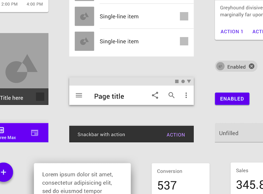
Compared to skeuomorphism, the two-dimensional nature of flat design makes it more minimalist and responsive, with simpler shapes that load faster.
Skeuomorphism is a remnant of the time when older generations were introduced to and were navigating the early days of the computer and the internet. A more realistic appearance made icons easier for users to recognize and understand at the time.
On the other hand, now that almost everyone has a smartphone and is connected 24/7, much of the appeal of skeuomorphism is gone. Users are generally already familiar with icons and their usage, so designers can use flat designs to hint at their meaning and purpose rather than relying on lifelike representations, thereby fostering greater emotional appeal for modern users.
One of the key design principles of UX/UI is “form follows function.” So, everything that is designed must have a specific function, and moreover, it must be in a functional form. Skeuomorphism, in many ways, seems ornamental, while flatter designs are both easy to understand and functional. This is another reason why skeuomorphism seems to no longer be in use, while flat design is more common.
When skeuomorphism dwindled for the reasons stated above, Alexander Plyuto designed an interface in 2019 that was largely influenced by it but applicable to modern use. This became known as neumorphism.
Neumorphism, a portmanteau of “neo” and “skeuomorphism,” is a modern-day iteration of the latter. It combines the best elements of both skeuomorphism and flat design, resulting in a minimalist appearance that still gives a sense of three dimensions in its life-like buttons.
Neumorphic elements like icons and buttons sit on top of the background surface in a raised shape, enhanced by shadows and sometimes embossing, making it very similar to skeuomorphic design. The color of the element is either the same or very subtly different from its background, which varies from its counterparts in skeuomorphism and flat design:
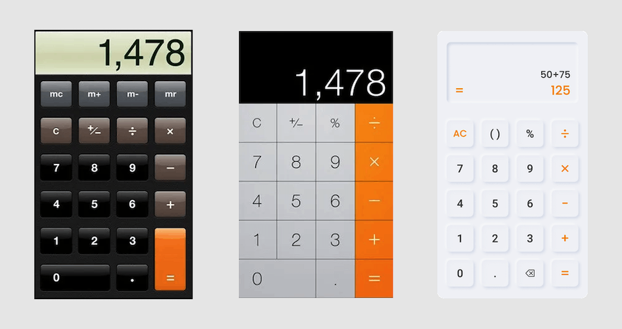
But unlike skeuomorphism, there are very few elements in the imitation of 3D objects. Neumorphism strikes a balance between skeuomorphism and flat design, featuring minimalist elements while also employing techniques such as embossing, shadows, and other effects from skeuomorphism.
However, there are certain problems with neumorphism — mainly, due to its low contrast ratio between the background and the icon, accessibility would be limited for blind or visually impaired users. There is also an accessibility issue with visual hierarchy: if all the buttons are embossed in a neumorphic style, it might be challenging for users to know which ones to press first.
So, while neumorphism offers a tempting “best of both worlds” in the great skeuomorphism-vs-flat-design debate, it’s important not to compromise on UX in your UI designs.
Skeuomorphism, though popular in its heyday, is less commonly used now than flat design or neumorphism. But where does skeuomorphism still apply, and what are the key examples of good skeuomorphic use?
If you take a closer look at the new iOS camera icon, you might notice that it still has some skeuomorphic design elements. Apple might have changed a few things — the old iOS 1.0 camera icon showed a shutter’s iris, while this one has a small outlined shape of a camera — but the icon overall is still a raised icon that gives the feeling of a three-dimensional button:
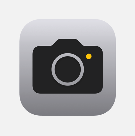
This is because it still has its affordances, borrowing a term from Don Norman. The less prominent skeuomorphic elements, such as the subtle shadow contour, provide more intuitive guidance on its use.
Likewise, modern smartwatches still feature skeuomorphic design for the most part, especially with the option to display the time on the watch face as an analog watch face. Is it a watch? Is it a computer on your wrist? It’s both, and it demonstrates how skeuomorphism still has its place in modern design.
Take digital calendars as another example. A calendar icon in any phone or laptop still has the hallmarks of skeuomorphism. The digital calendar itself has the sense of real-life planners or schedulers, but digitized, with room for events, notes, and even timers.
A significant part of the branding of certain apps, such as Paperlike, Goodreads, and Notability, is their features that make digital mediums feel like paper. This means that the appearance and even the slide of the hand on the screen must feel like a sheet of notebook paper.
Similarly, many savings apps still use lifelike elements such as wallets, piggy banks, and saving jars to make the savings experience more interactive. The look and feel of a real wallet make saving easier and more engaging, especially with the interactive elements that usually accompany money transactions.
When it comes to branding experiences and features with high customer appeal, skeuomorphic designs are still alive and well.
No flat design or skeuomorphic design could ever really mirror reality. But UI designers can try, especially if they can leverage aspects of these design approaches to enhance UX. As we’ve seen, skeuomorphism had its practical applications in the early days of the internet, and still has functionality in use cases today.
Skeuomorphism has evolved into many forms, such as neumorphism, and has influenced opinion, swaying UI design trends toward flat design. Both the lovers and haters of skeuomorphism cannot deny that it was an influential design technique that still has a place in certain areas of UX/UI design.
To employ skeuomorphism skillfully and tactfully, UI designers must consider UX. The user, who lives on the internet in daily life, is already familiar with many of the skeuomorphic design cues. To bring back skeuomorphism in daily use, designers must recognize how users use their intuition to get where they need to go online, and how skeuomorphic designs can assist them.
Skeuomorphism is no longer the dominant visual language of digital products, but its influence is still visible in modern interfaces, branding, and interaction patterns where familiarity improves usability.
This post contains original images by John Hirota. John Hirota is an illustrator working in the fields of design, culture, and education.
LogRocket's Galileo AI watches sessions and understands user feedback for you, automating the most time-intensive parts of your job and giving you more time to focus on great design.
See how design choices, interactions, and issues affect your users — get a demo of LogRocket today.

Your UX copy documentation isn’t just for human writers anymore. Here’s how to build a copy ecosystem that AI tools and agents can understand too.
Colors in UI aren’t just decoration. They’re the key to emotional impact, readability, and accessibility. This blog breaks down how to pick colors that don’t just look good — they work for your users.
For when you’re stuck in a UX design rut next, bring in lateral thinking. Lateral thinking will take your designs in fresh directions, solving tricky problems with unexpected creativity.

Giving designers AI tools is the easy part. I share how our team used office hours, small experiments, hackathons, and shared failures to build better AI habits together.


 Learn more →