When you pick up your phone to open an app, are you stuck flipping through lines and lines of text to find the app you’re after? Hardly. You know what app you want because you see and recognize the app’s icon and associate that icon with the app that you’re after.
Companies go to great lengths to ensure that you associate icons with their brand, whether you see them on your phone screen, a billboard, or a TV. While we passively observe this work, this doesn’t happen for free. An icon that is clearly legible on a billboard may struggle with recognition on a smaller display. In the inverse, an icon that is legible on a smaller display may look blurry or unrecognizable in a larger medium.
Fortunately, we can decide what icons to show and when to show them to our users. Essentially, there are multiple decision points where we can decide what icon to show, based on the current screen size. These decision points are called display breakpoints.
It would be nice if “viewport size” were the sole contributor to using display breakpoints. That way, if windows were small or big, we could just roll with the most appropriate icon. But our lives would be so flat-out uninspired if everything was that simple, right?
Of course, the size of a window does contribute to what should be displayed. But, displays have changed over the years. A laptop from ten years ago might look like this:

A device from this year might look more like this, though:

The key difference (apart from weight and any shred of repairability) in relation to the display is Pixels Per Inch, or PPI for short. Increasing the PPI while keeping the physical size the same leads to a crisper display. It’s literally what’s happening when we go from watching 1080p content to 4k content. The amount of pixels in a square inch increase from 116 on a 2008 MacBook Air to 224 in 2024 — almost double the amount.
Okay, so there’s a lot to know about displays, pixel ratios and density, yada yada yada. What does it all mean to us?
Let’s imagine we’re designing the look-and-feel for a user identification platform called Personally.
Our app will be used across a wide variety of devices. Our task at hand is to produce an icon for the app that looks good, and we’ve already been given the fingerprint icon to use.
![]()
Wait, our sole task is to produce an icon that looks good, and we’ve already got the icon? Amazing. We’ll be done in like, five minutes, tops.
But wait, why does the product designer look so angry? And what’s he putting in front of me? Look:
![]()
Oh, dear. How did we go from a crisp fingerprint to a blurry mess? We can’t put that on our webpage. We started out with this icon, so what went wrong?
Well, let’s think about screen sizes, and how many pixels we can fit on an individual screen.
If we were using a really, really old phone, the screen resolution might be 420×720 pixels, spread over a 4.5 inch display. Today, this display would look grainy if you looked at it. But, on a low-resolution display, a 96x96px display looks like this:
![]()
So, how would an icon this size look on a 4k display?
![]()
Yeesh, it’s just a fingerprint in an ocean of white. Our canvas size has increased, but our icon hasn’t increased at the same time. We know that this isn’t the intent, that the icon should increase in size as the DPI of the display increases. But our image is just a bitmap picture, so in order to make it bigger, the image renderer has to take a punt on missing image information and try to guess what should be there.
Through doing this, sharp borders become blurred, and graphical artefacts are produced. So essentially, the visual representation of the icon only has two options. It can stay small and become way to small to interact with. Or, it can scale up, but in doing so, it will have to fill in missing information and the icon will become blurry.
It’s hard to believe but people are shipping apps that are needlessly affected by this visual phenomenon. Let’s take a look.
Scalable graphics have been around for literally decades, so your eyes are probably on the brink of rolling out of your head at the idea that apps are still affected by this today. But, it’s still very much an issue. Take Glympse for example. I use Glympse to quickly share my location with family members or friends.

Can you spot the problem here? Let’s focus in on the bottom bar.
![]()
Notice how the icons are razor sharp, and the Glympse logo is a blurry mess? I could not have asked for a better example than this.
The reason for this is because the icon graphics are likely expressed in some scalable vector graphics format. This is the right choice because they are one colour.
Meanwhile, the Glympse logo is expressed in a non-scalable graphics format, such as PNG. If a scalable image format was used, here’s what it could have looked like (this is what I was able to produce without access to the original image, via InkScape).
![]()
The logo looks far more crisp.
And perhaps “icon crispness” isn’t at the top of your list in design priority, but bear in mind that all of these things contribute to a users’ perception of quality. If your app or website looks blurry or low-quality, users’ could think that your entire app is low quality, and you obviously don’t want that.
In the case of Glympse, its sole purpose is to share location, something that inherently requires precision. Are you selling the idea of precision by serving up blurry icons that could easily be avoided? Hardly.
The reason for the above issue is because the image isn’t scalable. To think about it, if we got a square piece of paper, and told an artist to draw a square on the piece of paper that took up 80% of the available space in the center of the page, we would get roughly the same result whether the paper size increased or decreased.
That’s essentially a gross oversimplification of what Scalable Vector Graphics (SVG) are. They define images through paths and vectors, which can scale up indefinitely with no loss of clarity. Other functionality is available, like gradients, and even animations. By defining how the picture should be drawn instead of storing the picture information directly, your SVG’s will work at any scale.
So, for icons and drawings, SVG’s are the natural way to go.
However, we don’t live in a world which can be completely defined by vector graphics. Sometimes, we do need to use an image format like PNG or JPG to show an image.
So then, what do we do?
Let’s consider loading an image within our web page.
For this example, I’ll use this picture:

The reason why, is because we will clearly be able to see any loss in image quality, the further the dots get away.
Originally, this image is 3872×2592, so it is fairly high quality. But it’s nearly 1mb in size. It wouldn’t make sense to send this image to a device that didn’t have the viewport space for such a large image.
On the other hand, we wouldn’t want to send a small image to someone with a large screen. It would become blurry quite quickly.
Essentially, we want to send the small images to the people who have low resolution screens, and bigger images to the people who have larger screens. But that’s quite a complex proposition if we wanted to do so programmatically through javascript.
Fortunately, we can use native HTML to load the correct image. To be precise, we can use srcset and sizes to load the right image at the right time.
To achieve this, we can set up some breakpoints on our img element, to take effect based on the container size. If the container is small when our image loads, then we load the small image. If the container resizes, like the user makes the window bigger, then our browser will automatically fetch the larger image as required.
This requires defining a srcset and sizes element on our img tag, and the values are seperated by commas. In our case, our images have the following properties:
These values go into our srcset attribute, appended with a w to represent that this is the real size of the image in pixels. Then, within sizes, we specify when we should load these images.
In practice, it looks like this:
<img src="images/small.jpg"
     srcset="images/small.jpg 500w, images/medium.jpg 1000w, images/large.jpg 1500w"
     sizes="(max-width: 600px) 500px, (max-width: 1100px) 1000px, 1500px"
     alt="Responsive Image" style="height: 100%; width: 100%;">
If the browser doesn’t support srcset (which is unlikely), then the user will just get the small.jpg. In the browser as the window is resized, if a larger image is required, it will be downloaded and displayed as required.
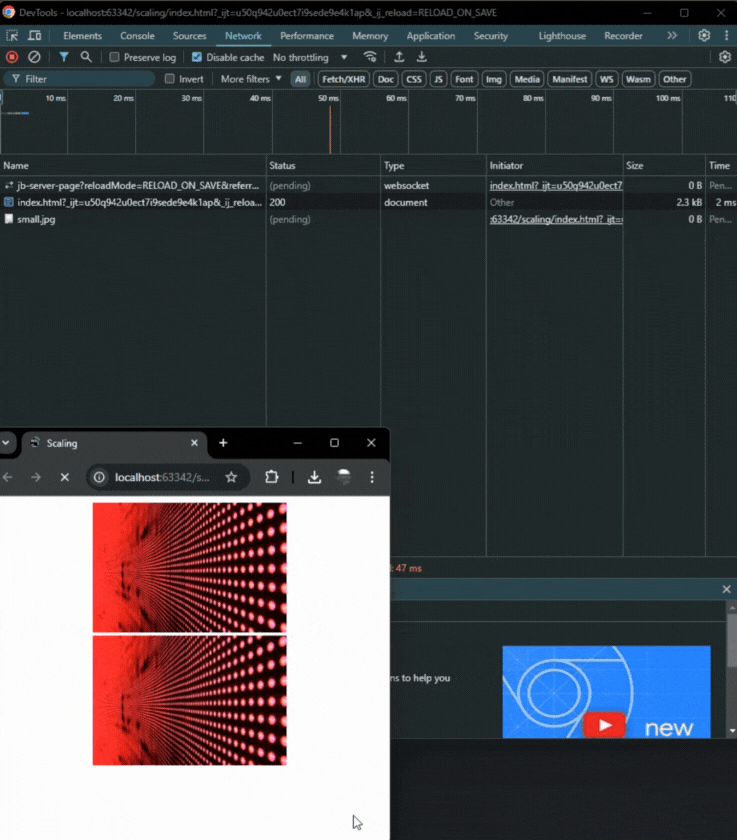
It’s obviously tempting to run amok and create eleven hundred variations on images so everyone gets the best experience, but that can actually create more problems, as the browser has to rapidly change between breakpoints and bring in more pictures to cope with resize events. In my case, having a 500px image scale to 600px is probably fine for most applications.
Also, images need to be the same. Don’t use this as an oppurtunity to widen the crop with larger images because that’s going to cause problems down the line. The only use of srcset should be to give a higher resolution image, if one is required.
How does it help clarity? In my example above, you’ll notice there are two images. One uses srcset, and the other just uses the standard img tag and loads the small image only.
When the browser window is scaled up, with the srcset example, the dots are still clearly legible:

However with the other example, we definitely begin to see a loss of visual quality:

By choosing the right images to display, and configuring our breakpoints accordingly, we can make good use of the available resources available to the end-user.
Icon scaling isn’t the kind of thing you can strike up a hours-long dinner conversation about, and if you try, people will probably leave. But, it’s a very important aspect of user experience. If we want our users’ to believe that we are selling a high quality, precise experience, then our media has to match up to that proposition. Fortunately, srcset and appropriate breakpoints make it easy to achieve this in modern browsers.
So, make sure to send the right image, and don’t make too many breakpoints!
LogRocket's Galileo AI watches sessions and understands user feedback for you, automating the most time-intensive parts of your job and giving you more time to focus on great design.
See how design choices, interactions, and issues affect your users — get a demo of LogRocket today.

As products evolve into ecosystems, navigation becomes a system-level challenge. This article explores how to align structure, context, and user journeys to create seamless movement across tools without confusion.
Figma’s AI features have exploded in 2026 — from text generation and image editing to full UI drafts and code handoff. But speed isn’t the same as quality. This guide breaks down every major feature, what it’s good at, and where human judgment still does the heavy lifting.
Zero UI works well for screenless, voice-first experiences, but most digital products still require visual interaction. Here’s why multimodal UX offers a more scalable foundation for the future of design.
Multimodal UX goes beyond designing for screens. Learn how context-aware systems, progressive modality, failover modes, and accessibility-first design create better digital product experiences.