The most fundamental aspect of all computer systems is the flow of input and output. The user provides the computer with some input, which then processes the input and returns some output. In UX, this output can be referred to as user feedback.

User feedback helps in error prevention and guides users through the interface. It’s essential to communicate with your users.
Dialogs, bottom sheets, and toast notifications all provide user feedback. These seemingly simple elements play crucial roles in guiding users, conveying information, and influencing interaction. But understanding their distinct usage is key to crafting a truly engaging user experience.
Before going into details to better understand their use case, we can generalize the three component types as follows:
Now that we know the nature of the three component types, we can create a hierarchy that dialogs are the most disruptive, bottom sheets are somewhat disruptive, and toast notifications are the least disruptive.
Therefore, we would use the most disruptive component for critical situations requiring immediate action and the least disruptive options for situations requiring the least attention. Bottom sheets are best suited for situations where the user needs contextual information while taking an action. However, this is an oversimplification; we can further explore their nuanced use cases by looking at examples of how they are used by prominent companies.
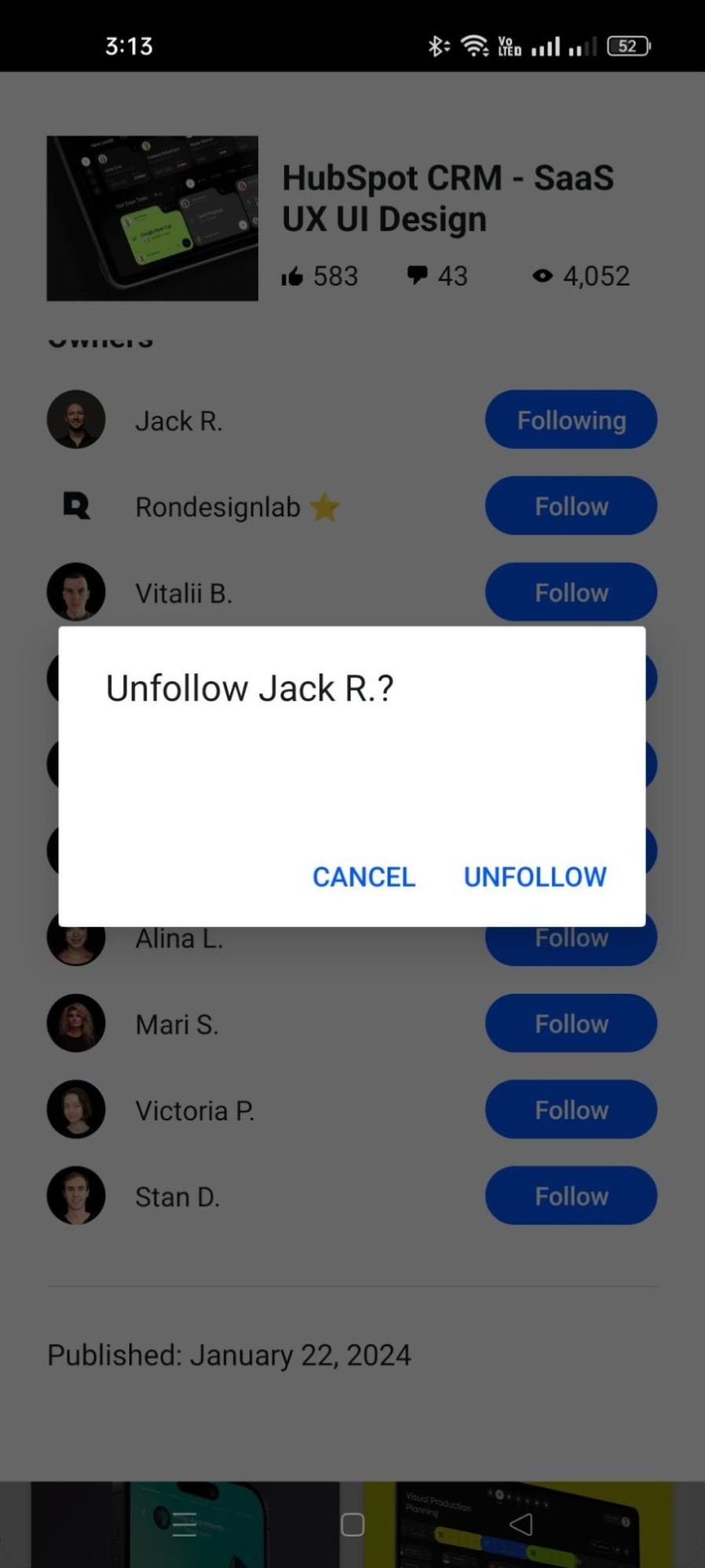
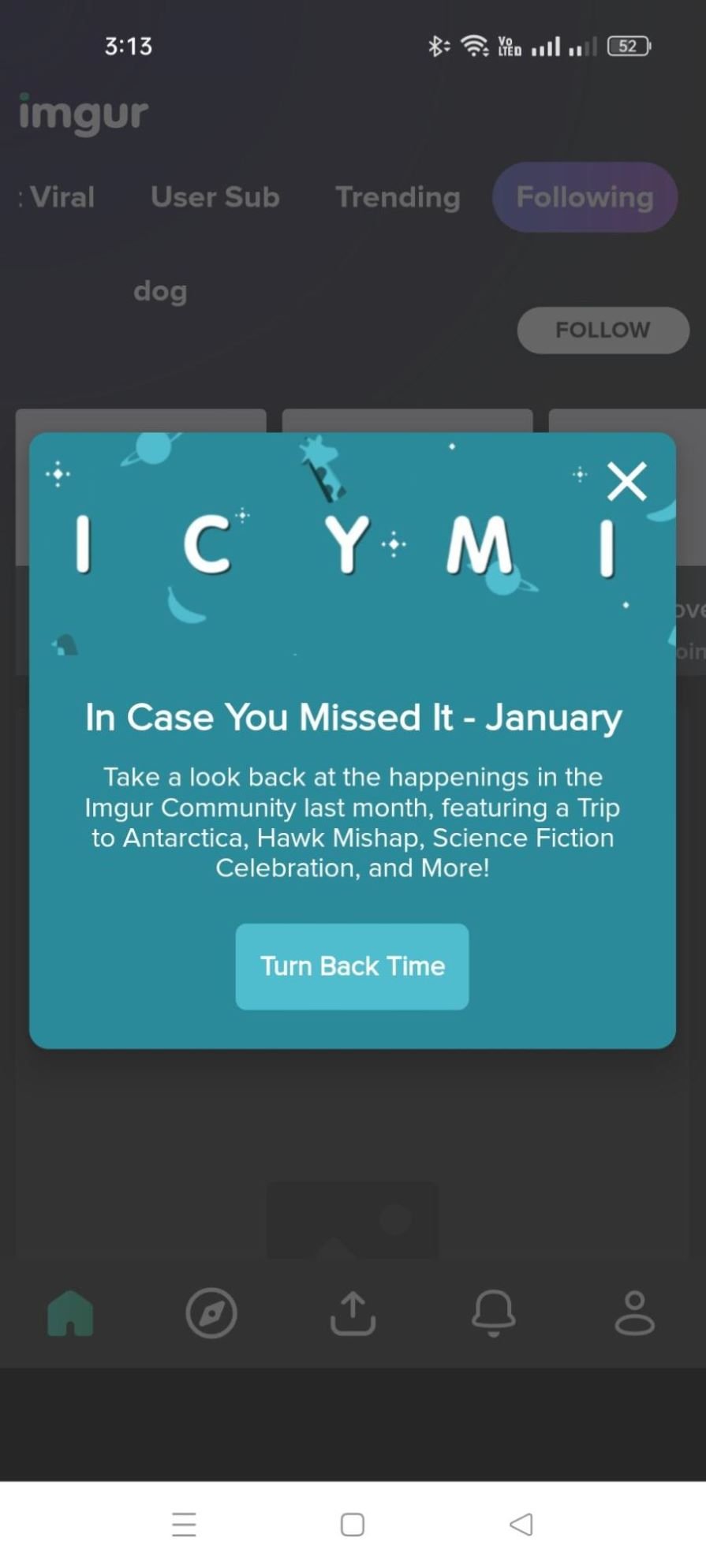
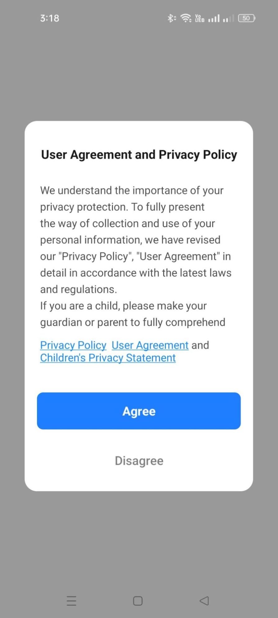
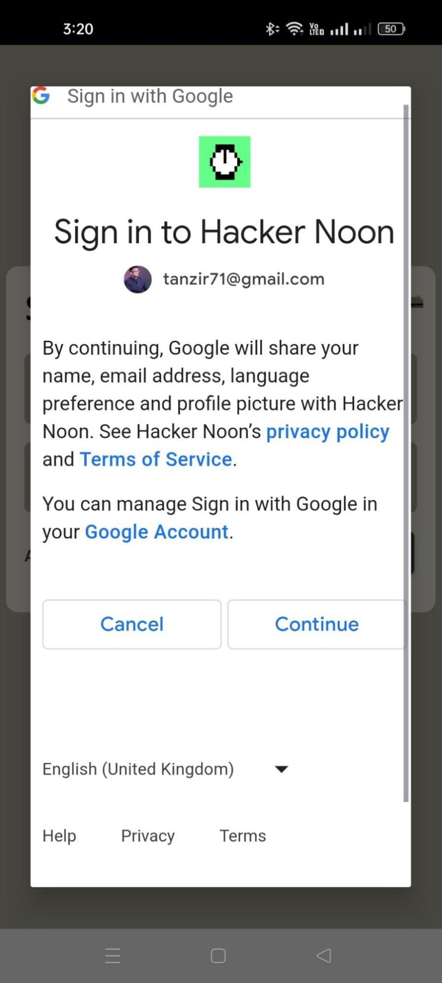
Dialogs break the user’s existing workflow and demand immediate attention toward important information, critical confirmation messages, or capturing necessary data. They are blocking in nature, and shift the entire focus onto themselves, by using a black overlay on the background content. These are known as lightboxes which we covered when we discussed modal windows.
This type of focus dominance is essential for situations such as warning the user of low battery status, requesting login credentials, or prompting the final confirmation before an irreversible delete action.
Dialogs can be of different types:
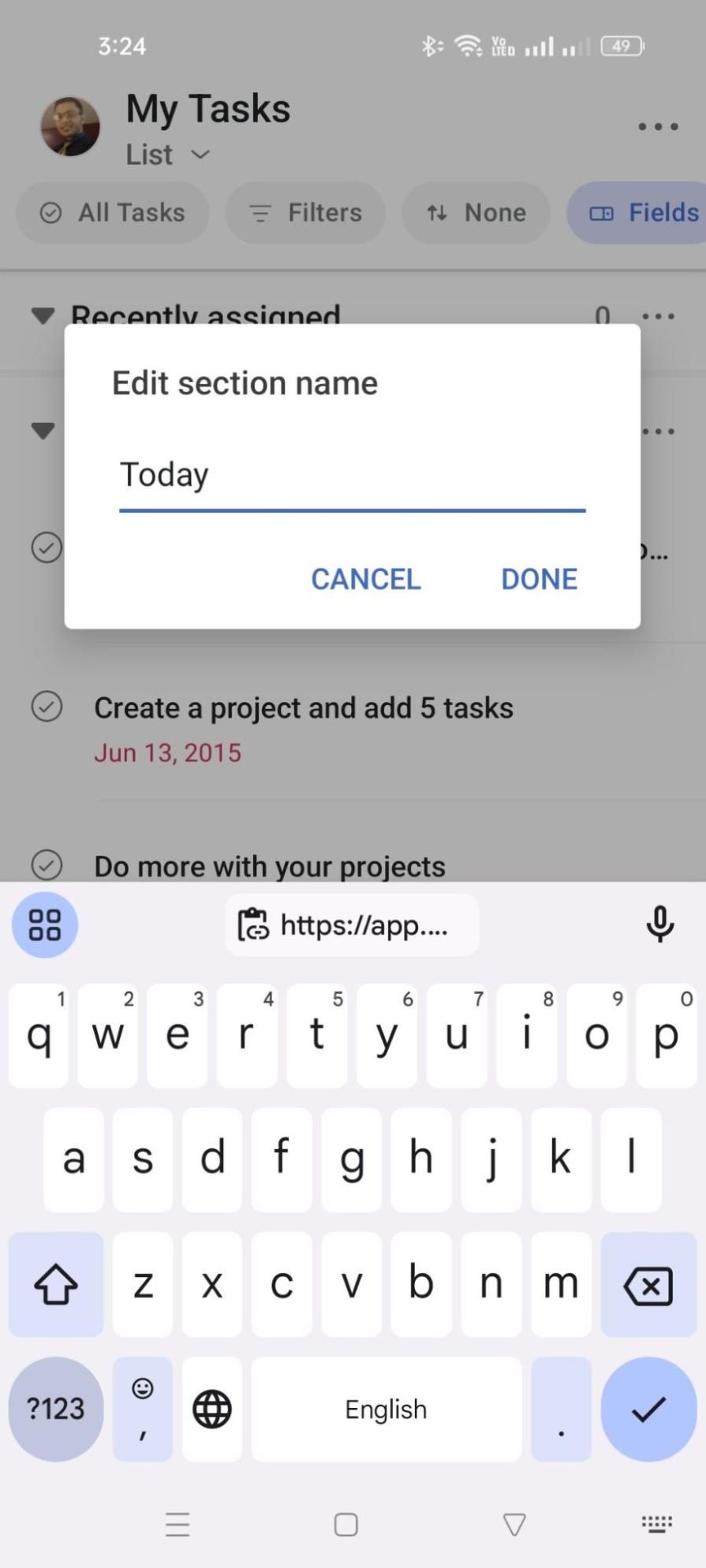
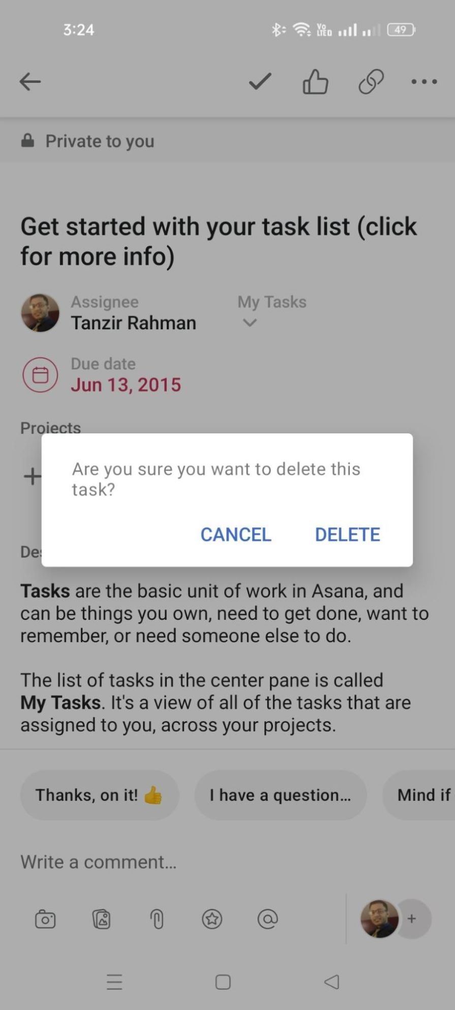
As discussed earlier, bottom sheets are less intrusive and less attention-grabbing than dialogs. However, they’re still quite effective and graceful in nature as they gently slide up from the bottom of the screen’s edge, and bring relevant options to the user’s focus.
Bottom sheets are effective because, while they do not block the user’s previous screen; they also successfully manage to grab attention fluidly because anything with motion grabs attention. In our article
In certain situations, bottom sheets deliver such a superior experience that anything else just doesn’t make sense. For instance, being able to filter data and watching the data change side-by-side to resemble the same experience as larger screens is unimaginable without bottom sheets. Bottom sheets can contain a variety of content, they can be roughly grouped into the following categories:
We already discussed that toast notifications are transient in nature (i.e., they are short messages that appear and disappear within a short period). This fleeting nature is their strength because they don’t distract the user from the task at hand.
Toast notifications typically appear in the periphery vision of the user and aid their workflow with useful information. “File saved successfully” and “Message sent” are important feedback for a user to ensure the user’s goals are being met. Toast notifications can be largely grouped into the following use cases:
Snackbars are just toast notifications with actionable components such as button sheets in them. Snackbars can be thought of as a hybrid between a bottom sheet and a toast notification, to deliver a compact experience. These are some scenarios of snackbars in action:
To give you an overview, this is a quick comparison of which component is best suited for which scenario:
| Scenario | Dialog | Bottom Sheet | Toast |
| Request critical confirmation | Alert Dialog | — | — |
| Present a list of contextual actions | — | Action Sheet | — |
| Capture user input for an action | Form Dialog | — | — |
| Inform about ongoing processes | Progress Dialog | — | — |
| Reveal additional details or settings | — | Content Sheet | — |
| Provide quick access to navigation or tools | — | Persistent Bottom Sheet | — |
| Convey brief status updates | — | — | Status Toast |
| Highlight temporary warnings or errors | — | — | Warning Toast |
| Offer immediate reactions to notifications | — | — | Actionable Toast |
This is just an approximate guide. The implementation of these components can vary based on the circumstance. For instance, dialogs can have illustrations and animations for a more delightful user experience, the height of bottom sheets can vary based on need, and toast notifications can use different colors and iconography to further convey different levels of urgency.
The key thing to keep in mind is that user needs take priority over all else, and the component adapts to those needs. In order to better narrate user needs, we might take a deeper look at accessibility, microinteractions, and A/B testing. The focus on accessibility ensures that the components are easy to understand and interact with.
By considering microinteractions, we ensure that we implement subtle animations and sounds to make the user experience delightful. A/B testing allows us to experiment with different designs and placements to discover the best user engagement.
Header image source: IconScout
LogRocket's Galileo AI watches sessions and understands user feedback for you, automating the most time-intensive parts of your job and giving you more time to focus on great design.
See how design choices, interactions, and issues affect your users — get a demo of LogRocket today.

Multimodal UX goes beyond designing for screens. Learn how context-aware systems, progressive modality, failover modes, and accessibility-first design create better digital product experiences.

Learn how context-aware mode prioritization and seamless transitions improve multimodal UX and reduce mode confusion.

Research is becoming more democratized, product cycles are accelerating, and AI is transforming synthesis and ResearchOps. Here are the three trends shaping UX research in 2026.
Voice support is not the same as multimodal UX. Here’s how to design systems with true mode continuity and context-aware interactions.