Shadows help elevate a design’s overall look and feel. They give UI elements a sense of depth and visual hierarchy, making the interface more realistic and intuitive. This post takes an in-depth look at shadows, explores the different kinds, goes over some techniques for executing elegant shadows, and teaches you how to create them in Figma with plugins.
Editor’s note: This blog was updated 26 May 2025 by the author to add a new section that covers basic principles for using shadow effectively, as well as to provide more relevant examples.
In UI design, shadows serve as more than just decoration. When used effectively, shadows help establish visual hierarchy, convey depth, and enhance user interactions in your design. Here’s an example of how shadows help elevate a design:
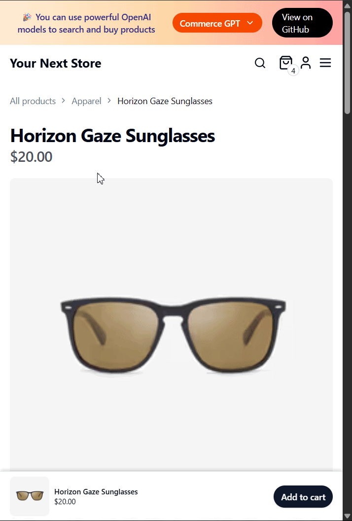
You can see that this ecommerce store makes use of a drawer component that slides up from the bottom of the screen to reveal additional information (the items a user has in their shopping bag). Notice how the shadow beneath the drawer creates a sense of elevation, drawing the user’s attention to it and visually separating it from the background.
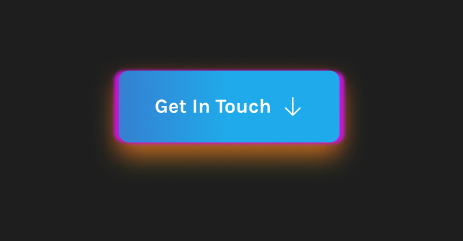
Shadows can also be used on clickable elements like a button to signal interactivity to the user:
In UI design, there are two main types of shadows that you should be familiar with — drop and inner:
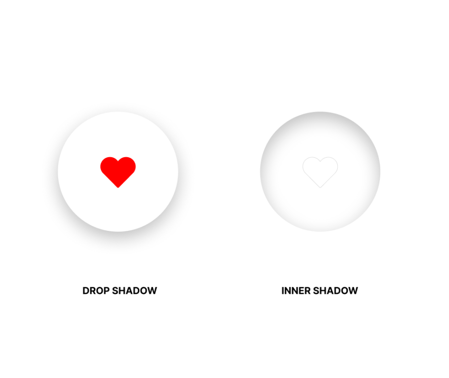
This article mainly focuses on drop shadows as they tend to be the most recognizable and widely used shadows in UI design. They create the illusion of an element lifting off the background, providing a subtle sense of elevation.
Drop shadows are typically cast in a direction opposite to the light source, highlighting the separation between elements and generating a three-dimensional effect. When applied correctly, drop shadows can contribute to a clean and polished appearance.
Inner shadows differ from drop shadows in that they’re placed inside an element’s borders. They create a look where the edges seem to sink in as if they’re carved into the design. Inner shadows are commonly used to show depth and emphasize the internal structure of elements.
Other types of shadows include text shadows and background blur shadows. However, you don’t need to know these in this article as they’re dependent on branding and really too contextual for most uses.
Design is naturally subjective, so trying to pick a universal, one-size-fits-all solution for implementing shadows isn’t the best approach. A “good shadow” ultimately depends on the overall goal of your design.
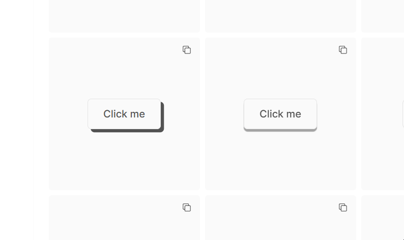
The good news is there are several known methods that you can apply to make your shadows appear more elegant. For instance, take a look at this design tweet that caught some attention on X:
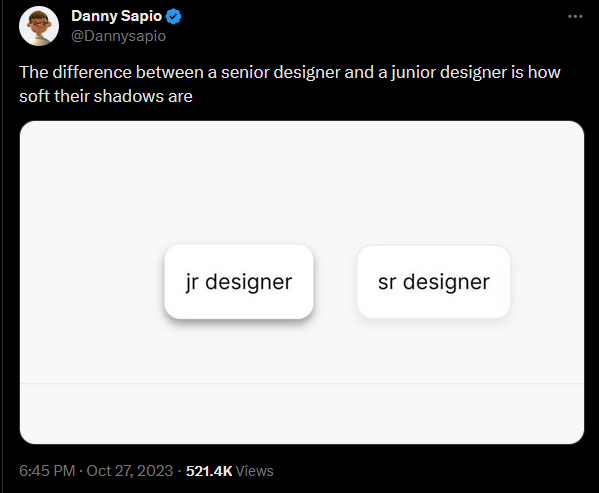
In this tweet, the author raises a point that “What differentiates a senior designer and a junior designer is how soft their shadows are.” While I don’t totally agree with their claim, I do agree with their main message — softer shadows make for better designs.
When you examine the shadows on the buttons more closely, it becomes evident that the button on the right, attributed to the “senior designer,” has a notably softer, more subtle quality with a low level of contrast compared to its counterpart on the left, made by the “junior designer” that has a harsh contrast with its background.
From the two samples, you can conclude that the color (including the opacity) and the blur value of the shadow plays a big role in its overall look and feel.
To use shadows effectively, it’s important to understand what you’re trying to achieve in your design. As stated earlier, shadows help create depth, establish visual hierarchy, and indicate interactivity. With that in mind, here are some foundational principles to guide your use of shadows.
Looking back on that X comparison between the “junior” and “senior” button shadows, it was clear that softer shadows tend to look more elegant and polished. Lower opacity and higher blur values often produce more realistic shadows, especially on lighter surfaces.
Consistency is a key component of design and shadows are no exception. You should align your shadow direction using consistent X, Y, blur, and spread values. Creating a reusable shadow component or token in your design software will help enforce this early.
An easy trick to make your shadow look real is to adapt it according to the background it’s cast on. For light surfaces, use darker grays or blacks with reduced opacity. For colored or dark backgrounds, use a darker tint of the surface color. You’ll see this in action momentarily.
You saw a strong example of this earlier with the call-to-action buttons that had a shadow, making the buttons look game-like and inviting to click.
There are a number of tools and Figma plugins out there to help you design professional shadows. You can use Beautiful Shadows, Shadow Maker, and SmoothShadow to create layered, realistic shadows that would be time-consuming to manually fine-tune.
Avoid these three common mistakes to successfully implement shadows into your UI design.
Having too many shadows on one screen or using overly intense shadows can make a UI feel noisy or heavy. For example:

Using the same black or gray shadow color across different colored backgrounds can break realism. Match your shadows with the background surface for a better look.
Not all elements need the same level of shadow depth. A card should cast a stronger shadow than a small tag. Treat shadows as part of your visual hierarchy toolkit, assigning depth based on component importance.
You can find drop shadows in Figma at the bottom of the right-hand panel under the effects category. When creating a drop shadow in Figma, you’re allowed to precisely control the position and appearance of the shadow through a few key properties. These properties include:
To help you use these components in Figma, I’ve applied a drop shadow to the card component below. Here’s the default shadow styling from Figma:

As you might notice, the default shadow isn’t anything impressive. At least not up to the standards of a “senior designer.”
So, you might wonder, how can you achieve a smoother drop shadow? The best shadow depends on the surface you’re creating it for.
It’s generally better to use a darker hue for the surface (or background) color to create an accurate shadow. When casting a shadow on any surface, the target color is the color of the surface underneath the component. In this case, where you have a white surface, using a darker version of white — gray or black — would be the best option for creating an accurate shadow.
By increasing the Y and blur values, you can achieve the shadow below:

Experienced designers would argue that this shadow still isn’t smooth enough — which is true because the contrast between the shadow and the surface is noticeable. Increasing the blur value and lowering the opacity both contribute to creating a softer shadow:

It helps if you keep the shadows across your design consistent. This means using the same light source angle (using X and Y offsets) and maintaining a consistent blur value. You could even have a “Y to blur” ratio that you use across all components in your design.
It’s just as easy to cast a shadow on a colored or dark surface using the earlier technique. However, if you’re casting a shadow on a black or near-black surface, then a better option would be to create a glow effect by using a lighter color of the target component — here’s an example from my website chinwike.space:

Supposing you want to cast a shadow on your blog post component over a green surface, you can use a darker hue of the color.
Let’s place the earlier component on a green surface. Below are two examples: one using a darker shade of green and another with a standard black shadow:

When applying shadows to UI elements, your choices are constrained, and the quality of these shadows falls short compared to those generated in a 3D environment. Nevertheless, you can use a few techniques or tools to enhance the visual appearance of your shadows.
Layering shadows involves stacking multiple drop shadows. This technique is effective for creating more detailed shadows than what using just one shadow would allow.
Take a look at this button featuring a combination of shadows. On the X-axis, you’ll notice two purple shadows peeking out on each side, while on the Y-axis, there are two shadows in yellow and red.
It’s important to be mindful of how colors interact when layering shadows, especially when changing the opacity. Here, the red and yellow shadows blend, producing an orange color:
In the above design, I used different colors to make the shadows visible. Now, check out a simpler design. Here, the shadows smoothly go from light sky blue to a darker navy blue, creating a nice, gradual change in color:
There are several plugins available in the Figma marketplace that can help you instantly create good-looking shadows on any component.
I mentioned Beautiful Shadows earlier and it’s my first recommendation for an easy plugin to create shadows with. This tool provides an intuitive interface and allows you to manipulate a controllable light source, casting shadows on your component in your desired direction. It then automatically generates shadow styles, often layering them for a polished effect:

This post explored the pivotal role shadows play in enhancing visual elements across a user interface. While UI design may not demand the same intricacies as other visual mediums, effective shadow application can significantly elevate a design’s overall aesthetic. Shadows, when strategically applied, create depth and visual hierarchy, contributing to a more realistic and intuitive interface.
Header image source: IconScout

LogRocket's Galileo AI watches sessions and understands user feedback for you, automating the most time-intensive parts of your job and giving you more time to focus on great design.
See how design choices, interactions, and issues affect your users — get a demo of LogRocket today.

AI agent simulations promise faster, lower-risk UX testing by replacing real users with AI-simulated personas. Here’s how the method works, where it falls short, and when designers should rely on simulated users versus real user testing.

A/B testing is great for comparing two versions of a design, but multivariate testing helps teams evaluate multiple design element combinations at once. Here’s how both methods work, how they differ, and when UX teams should use each one.

Design engineering has always lived between design and code. But with AI tools turning prompts into interfaces and code into editable canvases, that bridge is becoming a new way of building.
A three-week mobile banking project taught me that the “proper” UX process is not always realistic. Sometimes, the better approach is to work with what you know, identify what you still need to learn, and make the strongest decision possible under real constraints.

 Learn more →
