Progressive disclosure is a UX design technique that reduces users’ cognitive load by gradually revealing information as needed. It’s commonly used in product design to simplify complex content or break down large amounts of information into digestible bits.

In this article, we’ll explore when and where to use progressive disclosure, techniques for implementing it, and best practices for using it effectively.
Editor’s note: This article was updated by Chinwe Uzegbu on 21 March 2025 to provide a more actionable guide to progressive disclosure for UX designers. We added structured definitions for the four main types of progressive disclosure with a comparison table, updated real-world examples, and expanded the best practices section to help designers deal with the challenges of progressive disclosure design and apply these techniques more effectively.
Have you ever come across a user interface that felt overwhelming? Maybe it was a webpage with too many buttons or a mobile app with too much information crammed onto one screen. The sheer amount of visual noise can make it hard to focus.
Presenting users with too much information at once can cause cognitive overload, leading to frustration, confusion, and ultimately, decreased performance.
So how do you prevent this?
Use design tactics that break information into manageable chunks. One such technique is progressive disclosure.
By gradually revealing information as needed, progressive disclosure prevents users from feeling overwhelmed or lost when navigating large amounts of content.
Here’s how it works: Instead of bombarding users with a huge load of information at once, you break it into bite-sized chunks and show only what they need at any given time. For example, when designing a form, you can start with the essential fields and gradually reveal additional ones as the user progresses.
This structured approach reduces the cognitive load on users, leading to faster task completion, improved accuracy, and ultimately, higher user satisfaction and engagement.
Depending on the context, progressive disclosure can take on different forms. Let’s explore its key variations and alternatives:
Not all progressive disclosure is designed the same way. There are four main variants you can use:
| Type | How it works | Best for |
|---|---|---|
| Conditional disclosure | Reveals additional options when specific conditions are met (e.g. based on user input or selections) | Forms, checkout flows, search filters, interactive experiences |
| Contextual disclosure | Displays only the most relevant details at a time, revealing more as needed | Product pages, pricing breakdowns, decision-making interfaces |
| Progressive enabling | Disables certain elements until the user completes a required selection | Forms, authentication flows, guided user inputs |
| Staged (step-by-step) disclosure | Breaks down complex processes into simpler sequential steps, showing one task at a time | Onboarding flows, multi-step forms, guided user journeys |
Let’s take a closer look at each type, with examples to showcase their benefits in action.
Conditional disclosure involves revealing information to users only when certain conditions are met. So, instead of displaying everything at once, you show only the essential options and progressively reveal more based on the user’s actions or input.
This design approach is commonly used in forms, search filters, checkout flows, and other interactive experiences. Take Booking.com’s property booking process as an example:
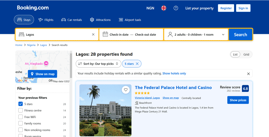
The platform uses conditional disclosure to keep the interface clean by showing only relevant information upfront and revealing more based on user input. In the GIF above, you can see how it reveals age input fields only when a user adds a child during the booking process.
Contextual disclosure involves revealing information only when and where it’s relevant to a user’s task or context. So, rather than displaying all the details upfront, you provide only what the user needs to make an informed decision. Then, as the user takes specific actions, you reveal additional information relevant to their context.
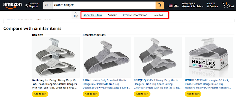
This Amazon product page is a good example of contextual disclosure:
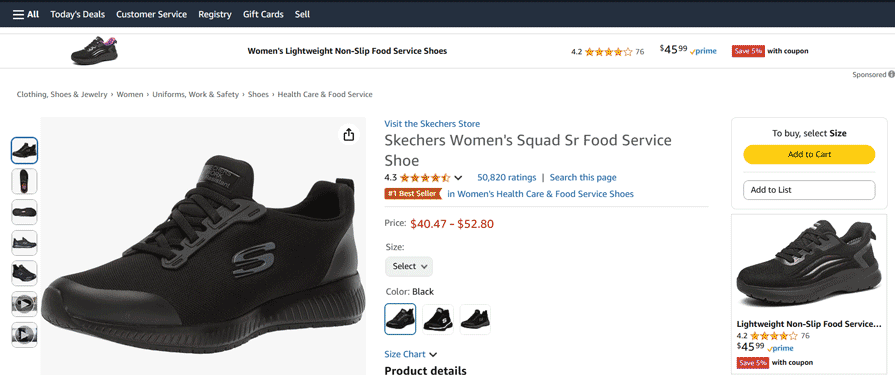
When a user selects an item, the system dynamically reveals contextually relevant details such as import fees, location-based shipping costs, delivery timelines, and product availability. This ensures that they have the information they need at the right moment.
Progressive or responsive enabling involves activating interactive elements only after a user has completed the necessary steps or provided the required information. In this approach, instead of making all interactive features available upfront, you enable them progressively based on the users’ actions or inputs.
In this example from Google Meet, the “Join” button stays inactive until a user enters a meeting code or link. Once they do, the button activates and becomes clickable:
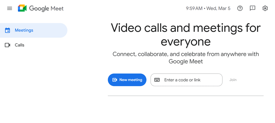
This approach ensures that users provide the required information before proceeding to the next step.
Staged disclosure involves taking users through a linear sequence of predefined steps, with only a fraction of information displayed at each stage. This design approach ensures that users are not overwhelmed, as it focuses on what’s important at each stage of their journey. It’s perfect for onboarding flows or multi-step forms.
Take Nike’s onboarding flow as an example:
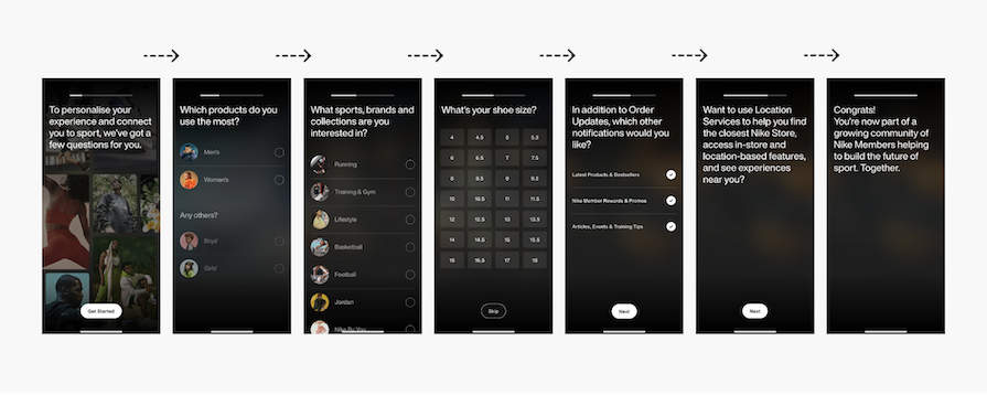
Instead of overwhelming users with multiple questions, the design simplifies the process by presenting one question per screen. This step-by-step approach minimizes cognitive load by allowing users to focus on one task at a time.
If you’re unsure about when and where to use progressive disclosure in UX design, here are some real-world applications to give you some ideas.
While you can use progressive disclosure in different contexts, it’s most useful when designing for novice users, complex tasks, and limited screen space.
When designing for new users, use progressive disclosure to introduce information and features gradually. Start with the essentials before revealing more advanced details. This helps them get familiar with the interface at their own pace without feeling overwhelmed.
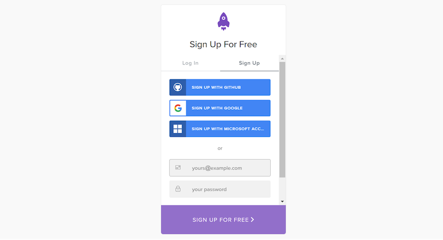
A common approach is to ask for the most basic details, like email and password, during sign-up and save more complex questions for later in the user journey.
Take LogRocket’s onboarding process, for instance. When a user initially signs up, LogRocket keeps the process simple by asking for only essential details like email and password:
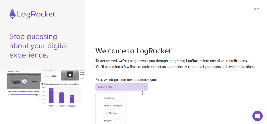
Once the user is inside the platform, they’re taken through an onboarding flow that gradually collects additional information, such as their job role and project preferences:
This approach reduces friction in the sign-up process by minimizing upfront effort, making it more likely for users to complete the task.
You can also use progressive disclosure to simplify complex tasks by breaking them into manageable pieces. Start by showing only the features that are most likely to be useful to the users, then keep the others hidden until the user requests them.
A common way to implement this technique is by presenting tools in their most basic form and hiding advanced features like customization until the user requests them, like in a Google Doc:
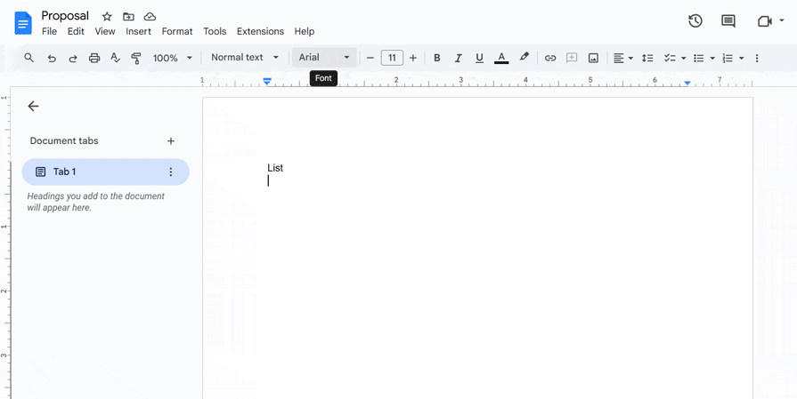
When users open the interface, they’re presented with basic tools such as font selection, text formatting, bullet points, numbering, etc. The advanced options for these tools remain hidden behind drop-down menus and additional settings. This keeps the toolbar clean and intuitive while still offering advanced features if needed.
Using progressive disclosure for contextual help is a great way to provide users with the right information at the right time without overwhelming them. To implement this, keep help text hidden until the user actually needs it.
A great way to use progressive disclosure for contextual help is to display context-specific tooltips:
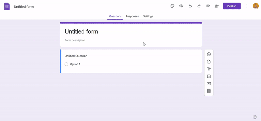
Take Google Forms, for example. When a user starts adding questions to a form, a tooltip appears, explaining how to manage responder permissions. This information is particularly helpful at this stage because the user is likely thinking about who will fill out the form and how they will access it.
When handling large amounts of information, you can use progressive disclosure to break it into smaller, more manageable chunks. So, instead of overwhelming users with everything upfront, you can display key details first and only reveal additional information when they request it.
UX designers commonly implement this by using accordions in FAQ sections. They show users a list of questions upfront, allowing them to expand the accordion to reveal the answers that are relevant to them:
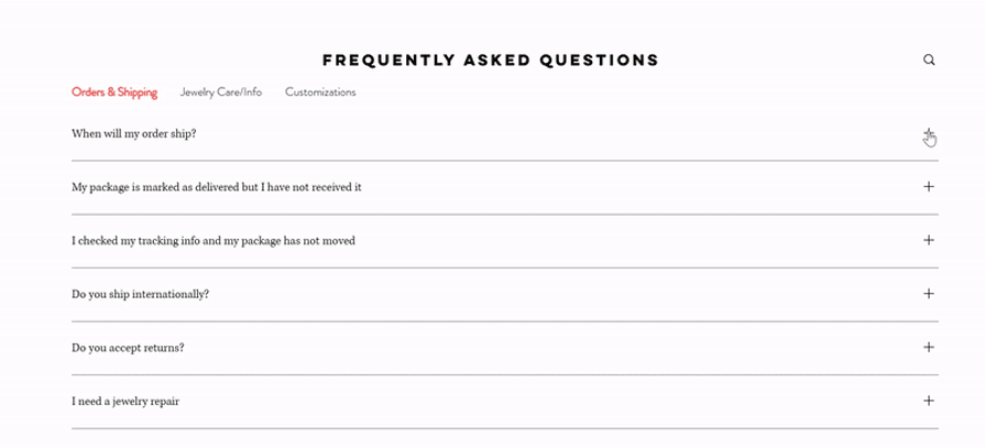
This approach makes the content more scannable and allows users to digest information easily.
Using progressive disclosure when designing for small screens is a smart way to present all the necessary information without cluttering the screen. With this approach, you can present the most important information upfront and allow users to access additional information when they need to.
Netflix’s mobile app uses progressive disclosure to manage the metadata by displaying only the first few cast members on the main screen. If users want the full list, they can tap “…more” to view the rest:
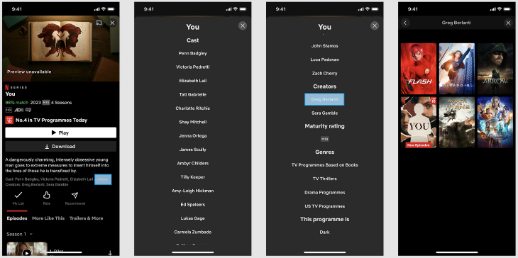
This approach saves screen space by showcasing the most relevant or popular cast members upfront while providing access to full details if they want to explore further.
We’ve looked at “when” and “where” to use progressive disclosure by exploring some real-world examples. Now it’s time to focus on the “how” by looking at how to implement progressive disclosure in your design.
Here are some of the most common techniques for applying progressive disclosure in your design:
Layering content in UX design is a way to present information in a hierarchy of layers, with the most important information presented first and less important information revealed as the user interacts with the interface.
UI patterns like tabs and scrolling can help layer content effectively to reduce the information a user is exposed to at any given time. Here’s how:
Amazon’s product page blends tabs and scrolling to effectively layer content so users can navigate large amounts of information without feeling overwhelmed:
The tabs at the top categorize content into sections. As users scroll, they progressively encounter each section. To make things faster, they can simply click a tab to jump straight to that section.
Before layering content, it’s important to prioritize the information you want to present to users. Identify the most important information users need to see first, then group related information into categories based on importance.
Expandable and collapsible sections help users access more information without cluttering the screen. With a tap or click, they can reveal or hide content as needed.
UI patterns like dropdowns and accordions are great for progressive disclosure as they reveal details only when users want them:
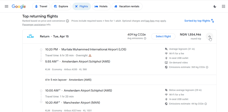
Google Flights prioritizes key information such as flight times, duration, number of stops, and price. If a user wants to know more, they can click the dropdown to reveal additional details like specific airport and layover details.
When using dropdowns or accordions for progressive disclosure, ensure that the headers clearly describe the content inside. This makes it easier for users to scan the options and find what they want to expand.
Another great way to implement progressive disclosure is to use hover and click actions. This approach allows the user to access additional content without overwhelming them upfront. Two common UI patterns you can use to achieve this are dialog boxes and popups.
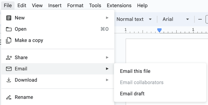
Google Docs uses hover action for progressive disclosure within the file menu. When users open the menu and hover over an option with a right chevron, like “Email,” a secondary menu pops up with more choices, such as “Email this file,” “Email collaborators”, and “Email draft.” This keeps the interface clean while ensuring users can access other options if needed.
While progressive disclosure may seem simple to implement, it’s quite easy to get wrong. Let’s explore common challenges and best practices to help you do it right.
For all its benefits, progressive disclosure isn’t always simple to implement. Often, you’re designing an interface with progressive disclosure because you have a lot of information to organize and present to users without overwhelming them. Let’s talk through some best practices you can follow.
Prioritization is key when implementing progressive disclosure. Think about what the user wants to accomplish and what information they need to get there. This helps ensure that important details are presented clearly and at the right time.
Group related information together to make it easy for users to find what they need. Use headings, subheadings, and visual cues like bold or larger text, colors, or icons to highlight key information. This helps ensure that the most important information stands out.
Maintaining consistency is crucial when implementing progressive disclosure. This means using uniform techniques and patterns throughout the interface so users know what to expect when accessing additional information.
A great way to ensure consistency is by using a design system—a set of reusable components, guidelines, and best practices. Sticking to the same approach for handling complex content makes it easy for users to understand how information is hidden and revealed.
You can also conduct a competitive analysis to understand how industry products work. By analyzing their interfaces, you can identify what works (and what doesn’t), allowing you to design a user-friendly experience that feels familiar and effective.
While progressive disclosure helps reduce cognitive load, too many layers can have the opposite effect, overwhelming users rather than simplifying their experience. Ideally, keep the disclosure levels below three, with clear and intuitive navigation paths.
If your design needs more than three levels, it’s a sign that you need to reorganize your content. Consider simplifying it by grouping related information into logical sections or categories to reduce the number of layers.
To make progressive disclosure more effective, tailor how and when information is revealed to align with the unique needs, goals, and characteristics of different user groups. This approach ensures that users get the most relevant information at the right time.
For example, you may prioritize guided experiences like tooltips and walkthroughs for new users to help them understand the interface. More advanced users, on the other hand, might prefer quick access to settings and shortcuts.
As with any design technique, it’s important to conduct user testing and gather feedback when implementing progressive disclosure. This can help identify areas where the technique is working well, as well as areas where it may be causing confusion or frustration.
User testing can also reveal inconsistencies or confusing design elements that may need to be addressed. By incorporating user feedback and testing throughout the design process, designers can ensure that their interface is consistent and meets the users’ needs.
To sum it all up, progressive disclosure is a powerful UX design technique that reduces cognitive load and enhances user experience. By gradually revealing content as needed, it helps users navigate an interface and complete their tasks without feeling overwhelmed.
Common techniques for implementing progressive disclosure include layering content, using expandable and collapsible sections, and incorporating hover and click actions. For best results, understand the user’s goals, prioritize the most important information, focus on simplicity and usability, and maintain consistency throughout the user experience.
By using progressive disclosure effectively, you can design user-friendly interfaces that provide users with the information they need in a way that’s easy to understand and navigate. Whether you’re designing a website, app, or other digital product, incorporating progressive disclosure can help make your interface more effective and engaging for your users.
Header image source: IconScout

LogRocket's Galileo AI watches sessions and understands user feedback for you, automating the most time-intensive parts of your job and giving you more time to focus on great design.
See how design choices, interactions, and issues affect your users — get a demo of LogRocket today.

After five years in UX, I revisited the Daily UI challenge to reconnect with hands-on design. Along the way, I learned that great interfaces come from thoughtful briefs, sound judgment, and user feedback, not just better AI tools.

Learn what makes a great login screen through real-world examples and UX best practices for creating secure, accessible, and low-friction authentication flows.

Skeuomorphism helped define early digital interfaces by mimicking real-world objects to make technology more intuitive. Learn how it compares with flat design and neumorphism, why it declined, and where it still has a place in modern UX.
Memos don’t have to be complicated. Just keep them clear, concise, and focused on actionable items. More on that in this blog.


