Emphasis is a core design principle that directs the viewer’s attention to what matters most using color, size, contrast, placement, and other techniques. When done well, emphasis enhances UX by improving visual hierarchy and ensuring users see and understand the most important content first.

Most designers grasp the emphasis principle of design instinctively, even before they learn the terminology for it. However, it wasn’t until I expanded my understanding of UI/UX design that I truly understood its impact and how to apply it effectively.
Chances are, you’ve encountered emphasis in design without realizing it. In this article, I’ll break down what it is, why it matters, and how you can use it intentionally to create more engaging and user-friendly designs.
Editor’s note: This blog was updated 18 April 2025 by Chinwike Maduabuchito to provide new information for 2025, expand on effective ways to add emphasis to a design, and include a FAQ section.
Emphasis in design is all about making certain elements stand out to guide how users interact with them. Simply put, it involves using design elements like color, white space, and typography to convey a message or prompt a specific action from the user.
For example, consider the following poster:
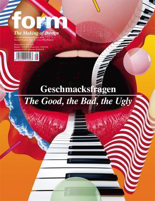
This magazine cover is undoubtedly bold and eye-catching, but it struggles with emphasis in a few ways that can make the design feel confusing:
All these problems can be solved by strategically emphasizing key aspects of the design to not only make it more pleasing to the eye, but also easier to read and more informative.
To handle emphasis effectively, try incorporating some of these key techniques into your designs.
Scale (or size) is one of the most powerful tactics for applying emphasis in design. Our eyes are naturally drawn to the largest element on a page or screen, making it an effective way to direct attention and establish hierarchy. Scale tends to be the first thing we notice, before color, contrast, or typography. A massive headline will always command attention before a bold color accent or a different font style.
While searching the net for suitable examples of emphasis in design, I came across a poster from around 2012 or early 2013 — shortly after Barack Obama won re-election for his second term as U.S. President. In this poster, a large portrait of Barack Obama dominates the page, making him the undeniable focal point of the design:
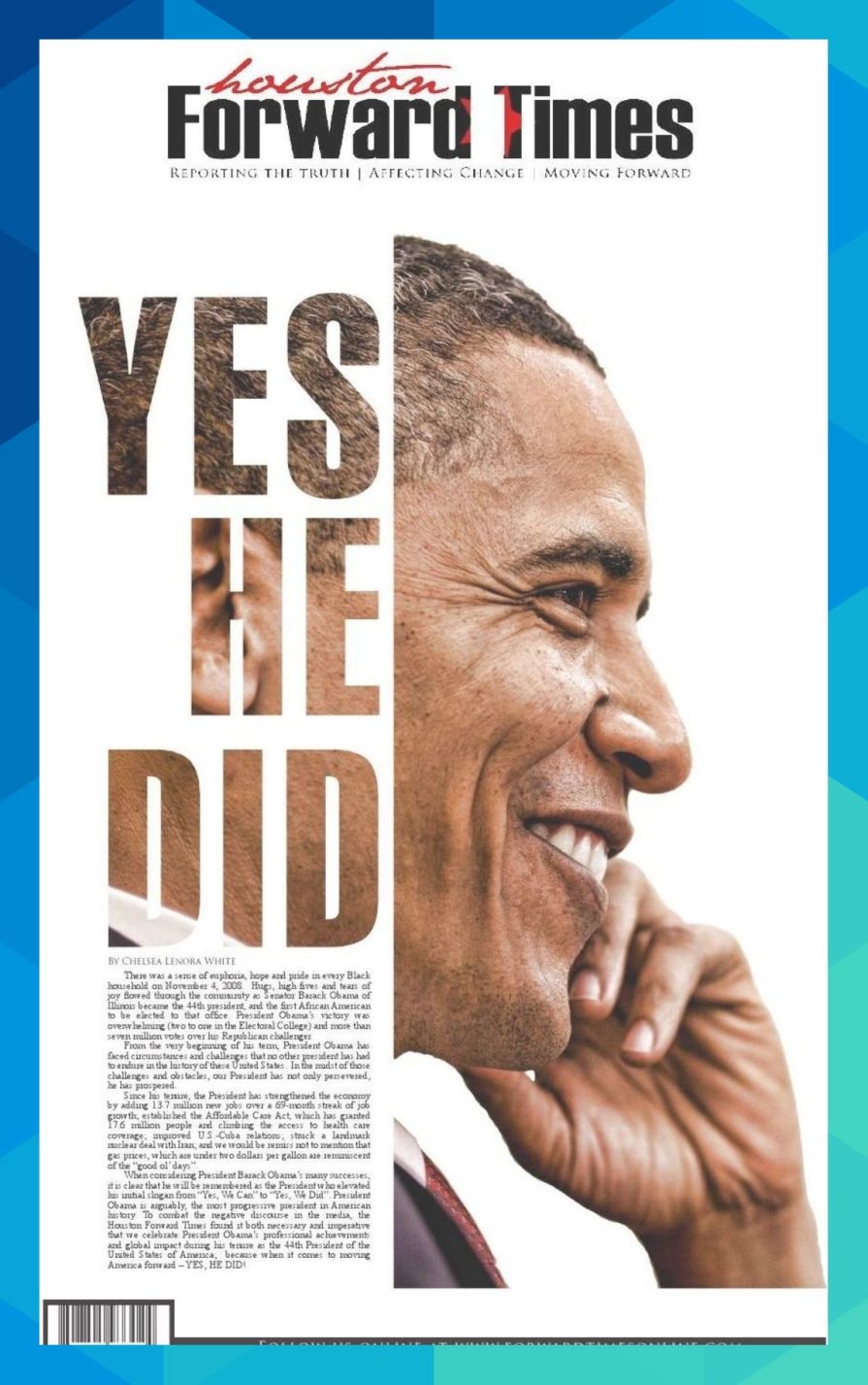
This is a common strategy in print design, where scale is used to create impact and draw attention. Additionally, the bold, oversized text “YES HE DID” references his 2008 campaign slogan, “Yes We Can.”
The shift from “Yes We Can” to “Yes He Did” is a powerful use of emphasis — not just in scale but in wording — reinforcing that the hope and promises of his campaign translated into real action and historical achievement.
Color helps guide attention and create emphasis. In some sense, it’s the foundation of a design and can be used to highlight important elements, establish hierarchy, and evoke emotions that influence user perception.
You can also use color to establish contrast — our next emphasis strategy. It defines the distinction between text and background, enhances readability, and ensures key information is easily absorbed.
Beyond function, color also carries psychological weight. Red grabs attention and conveys urgency, often used in error messages or sales promotions. Blue suggests trust and stability, making it a favorite in corporate branding. Warm colors (reds, oranges) tend to energize, while cool tones (blues, greens) create a sense of calm.
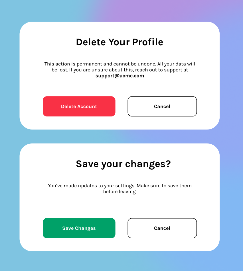
In web applications, strategic use of color can help direct attention to a call-to-action button, making it stand out against a neutral background. For example, a website modal might use red for a CTA button when the action is destructive, such as deleting a resource, while a cool color signals a non-destructive action, like saving changes:
Used strategically, color doesn’t just decorate — it communicates.
Contrast in design refers to using differences in elements like color, size, or shape to create clear visual distinctions. This makes key parts stand out, improves readability, and draws attention. It’s another fundamental tactic for emphasizing important elements in a design.
In the Houston Forward Times poster, contrast is used effectively to enhance emphasis. The bold “YES HE DID” text, with its cutout effect revealing Obama’s skin tones underneath, creates a strong color distinction against the white background while maintaining readability:
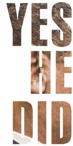
Dark text on a white surface is commonly encouraged in the design world to create excellent contrast. In this case, the dark brown text against the crisp white background achieves AAA accessibility standards, making the message highly readable even from a distance.
Beyond color contrast, the size contrast between the headline and the body text also plays a crucial role. The large, bold typography of the slogan immediately grabs attention, while the smaller body text provides supporting details. This hierarchical contrast ensures that the most important message is seen first.
One of the first things a visitor notices about your product is your font design. Effective typography isn’t just about picking a font, it’s about controlling elements like typeface, weight, size, spacing, and hierarchy to guide the viewer’s attention and show brand personality.
Referencing the HFT poster shown earlier, you can spot how the publishing company uses typography to make their brand name bold and memorable while distinguishing it from the rest of the copy on the poster:
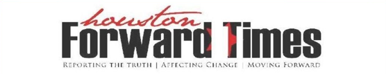
The publishing company’s logo makes use of both color and typography to stand out. The curvy, italic typeface helps establish brand identity and separates the organization’s name from the rest of the message without disrupting the design’s impact.
Beyond branding, typography is often used to create hierarchy. Larger, heavier fonts naturally draw attention, which is why headlines are bold and prominent, while subtitles and body text are smaller and lighter. This structured approach helps viewers process content effortlessly.
At its core, typography is shaped by four key elements: typefaces, line spacing, font weight, size, and height. When these elements are carefully adjusted, they create clear, effective, and visually appealing communication.
Here’s a fact that might surprise you! The fonts you see in Word documents or design software aren’t actually fonts — they’re typefaces. A typeface is a family of fonts, like Times New Roman or Helvetica, which includes different styles such as regular, bold, italic, and bold italic:
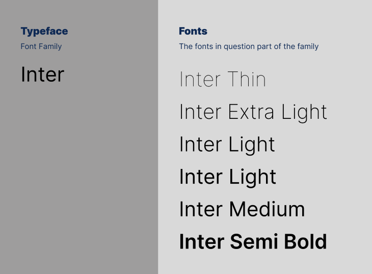
Fonts, on the other hand, are the different variations in the same font. Times New Roman has four fonts: regular, italic, bold, and bold italic.
Negative spaces refers to the empty areas in design elements such as a little bit of space around a button or a line of space underneath some text. If you’ve ever read a long document or book, it becomes hard to read after a while if there’s not enough space between the design elements. This can create a strain on your eyes and is quite unpleasant.
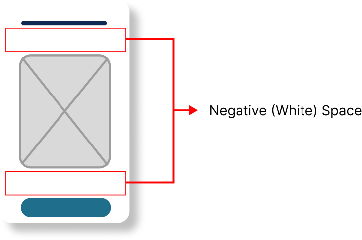
White space plays a crucial role in guiding attention and improving readability. When used effectively, it enhances clarity, prevents visual clutter, and directs focus toward key elements, such as calls to action (CTAs).
Consider these two variations of a SaaS website’s landing page:
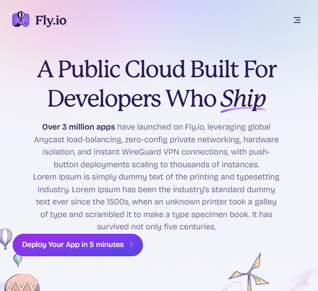
In this design, the CTA is buried beneath a lot of text, making it easy to overlook. It also isn’t positioned correctly in the center to draw attention. The lack of negative space around the button causes it to blend into the surrounding content rather than stand out.
This design will be much better if the CTA sits just below a short line of subtext, with enough white space separating it from other elements as done in the original:
Proximity and negative space work hand in hand to create emphasis. By placing related elements close together while ensuring enough space around key actions, you can make interactions feel more intuitive. A cluttered layout forces users to search for important elements, whereas a well-structured design naturally guides the eye to what matters most.
Novelty is a powerful tool for capturing attention. When something stands out as new or unexpected, it sparks curiosity and engagement.
Returning to the Houston Forward Times poster again, the poster uses novelty in its design by transforming a well-known phrase into something unexpected, inviting readers to interact with the content. It modifies Obama’s “Yes We Can” slogan to “Yes We Did,” which sparks curiosity in readers who are already familiar with the original slogan but are now wondering what the new twist means.
Novelty doesn’t only relate to news; in this case, it can also refer to the design of the poster, particularly the cutout typography that integrates Obama’s image with the text. A reader who hasn’t seen that type of effect might appreciate it and probably stick around to read the end of the story.
Another powerful technique in design that I didn’t fully grasp until later in my career is the use of visual cues. Once I did, it had a transformative impact on the way I approach design, especially in guiding user behavior and creating emphasis.
Visual cues are elements within the design that subtly guide users’ attention or actions. These cues can be something as simple as an arrow pointing towards a section you want users to explore, an icon that indicates the content a piece of text represents, or even a small animation that shows a button has been clicked, confirming user interaction.
A great example of this is the use of this floating button on Pinterest’s website:
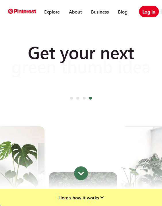
The button gently floats up and down at the bottom of the screen, acting as a subtle yet constant visual cue that draws the user’s attention toward it. This animation isn’t overwhelming — it’s just enough to grab the user’s focus and nudge them to click and explore more content. Movement creates a sense of urgency and encourages interaction without being too aggressive, helping to keep users engaged and making the CTA more prominent.
These cues draw your attention and make you interact with the design more. As an ex-Apple user, nothing was more satisfying than the woosh sound when an email was sent. While this is an auditory cue and not a visual one, it still achieves the same goal.
Now that you have a sense of design emphasis, this section covers the most frequently asked questions around its principles.
Emphasis in design is all about making certain elements stand out to guide how users interact with them. Simply put, it involves using design elements like color, white space, and typography to convey a message or prompt a specific action from the user.
Emphasis is crucial because it helps guide the viewer’s eye to the most important aspects of a design. Without emphasis, a design can feel cluttered and overwhelming, making it difficult for users to know where to focus their attention. By emphasizing key elements, you ensure that your message or call to action (CTA) gets noticed.
There are several ways to create emphasis:
Yes, especially if overused. Too many elements with equal emphasis can create visual chaos, making it difficult for users to know where to look. The key is balance: Emphasize the most important elements and allow other parts of the design to be secondary.
Absolutely! In UX design, emphasis helps users navigate a site or app more intuitively. By emphasizing key actions (like a CTA button) or important information (like headlines), you can improve the user experience, making it easier for users to take action quicker.
Mastering design emphasis means more than just making elements stand out. It’s about guiding the viewer’s attention with purpose. By leveraging techniques like scale, color, contrast, typography, negative space, novelty, and visual cues, you create designs that aren’t only visually appealing but also functional and intuitive.
Great design isn’t about applying every technique at once but knowing when and how to use them effectively. When emphasis is used thoughtfully, it enhances clarity, improves user experience, and ensures that key messages are communicated effortlessly.
Header image source: IconScout

LogRocket's Galileo AI watches sessions and understands user feedback for you, automating the most time-intensive parts of your job and giving you more time to focus on great design.
See how design choices, interactions, and issues affect your users — get a demo of LogRocket today.
Explore the core principles of GUI design and learn how consistency, simplicity, feedback, accessibility, and user testing contribute to better digital experiences.

After five years in UX, I revisited the Daily UI challenge to reconnect with hands-on design. Along the way, I learned that great interfaces come from thoughtful briefs, sound judgment, and user feedback, not just better AI tools.
Learn what makes a great login screen through real-world examples and UX best practices for creating secure, accessible, and low-friction authentication flows.
Skeuomorphism helped define early digital interfaces by mimicking real-world objects to make technology more intuitive. Learn how it compares with flat design and neumorphism, why it declined, and where it still has a place in modern UX.

 Learn more →
