The inherent intangibility is one of the biggest challenges of user experience design.

On the one hand, intangible factors, such as the experience the user goes through and their needs, hopes, and pains, are all essential in the process of defining the right solution. On the other hand, it’s often hard to act and collaborate on such abstract inputs.
This is where UX mapping techniques shine as invaluable tools. By UX mapping techniques, we usually refer to various ways of visually representing intangible parts of user experience. An empathy map is a classic example of UX mapping technique.
Let’s dive deeper into the topic and cover the fundamental visual maps every designer should use.
There are many benefits to visualizing intangible aspects of user experience. The four most prominent ones include:
Visually representing the user’s journey, touchpoints, and emotions makes it easier for team members to develop a shared understanding of the user experience. It helps everyone be on the same page regarding the goals and priorities of the design process.
Rather than relying solely on verbal descriptions, the visual nature of mapping techniques, such as empathy maps, makes concepts more tangible. This tangibility makes it significantly easier for team members to discuss, critique, and collaborate on design ideas.
The best way to use UX maps in the design process is to thread them as a living artifact that evolves as the product and our understanding of users evolve. It helps keep the whole team up-to-date with the latest discoveries.
Collaboration becomes remarkably smoother when, instead of relying on verbal concepts, you can physically manipulate, comment, and work together on a tangible artifact in real time or asynchronously.
Although there are countless UX mapping techniques out there, the most commonly used are:
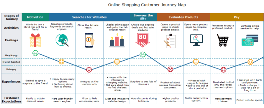
Customer journey maps are the fundamental UX design tool that allows us to illustrate the end-to-end experience of customers interacting with our product. It involves creating a step-by-step representation of a customer’s interactions with the product across various touchpoints (e.g., login screen, homepage, payment form). By identifying emotions and pain points associated with those touchpoints, UX designers can gain insight into where to focus their discovery efforts:
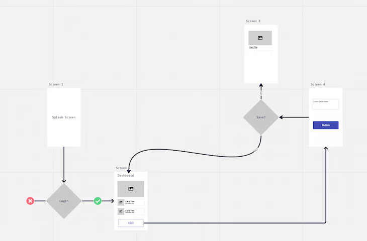
User flows are visual representations showcasing the steps users take to accomplish specific tasks within our product. They help us understand the number of steps users have to take, decisions users have to take along the way, and alternative flows our users might take.
This understanding helps us identify potential bottlenecks or areas of confusion, helping us optimize the interfaces for smoother and more user friendly experiences:
A service design blueprint is a detailed and visual representation that outlines the end-to-end service delivery process. Contrary to the customer journey map, which focuses primarily on the customer, the service design blueprint includes the customer-facing journey and backstage processes, such as the IT system or employee actions.
It helps us understand the entire ecosystem rather than just an isolated segment:

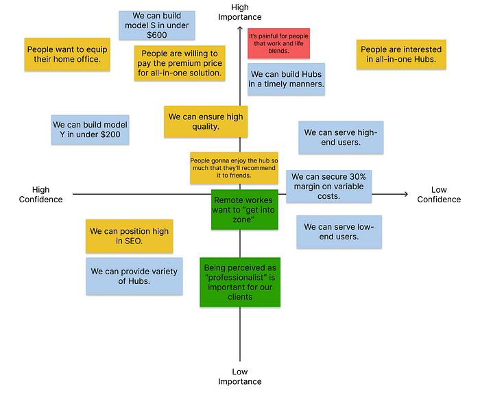
There are four underlying types of assumptions:
Assumption maps encourage us to clearly identify and name these assumptions and then map them on a 2×2 chart based on their importance and the evidence level to confirm whether the assumption is true. By visually mapping out our inherent assumptions, we can more easily use them to guide our prioritization and scoping efforts:
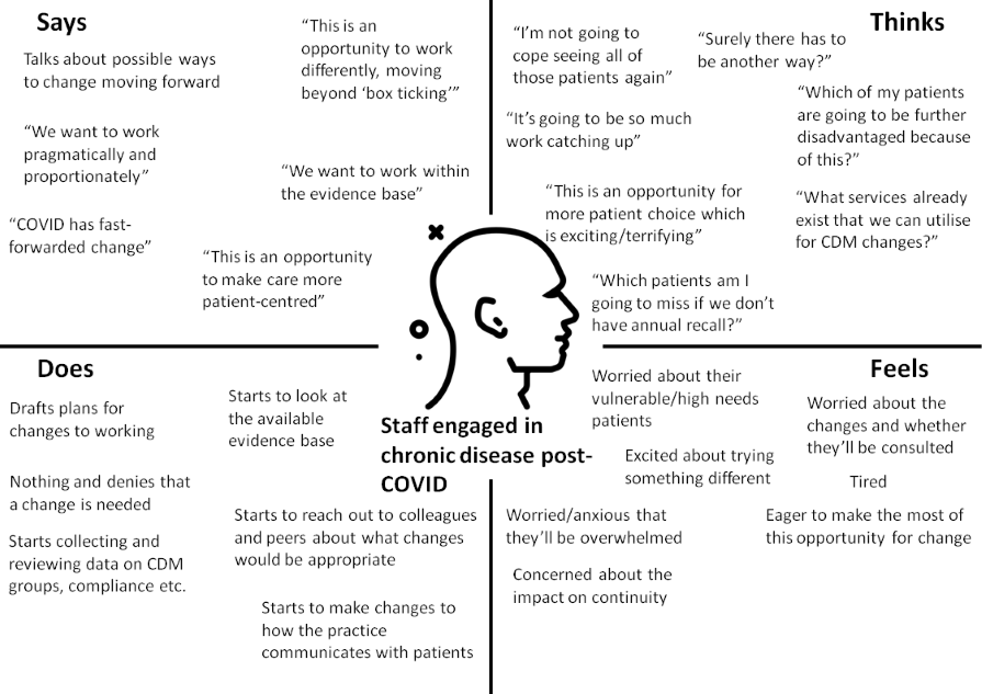
An empathy map is an artifact that helps us capture knowledge about our users and typically consists of four quadrants:
This tool is at the forefront of designing thinking techniques and is especially useful in the early stages of the discovery process, guiding the whole team toward most user-centered solutions:
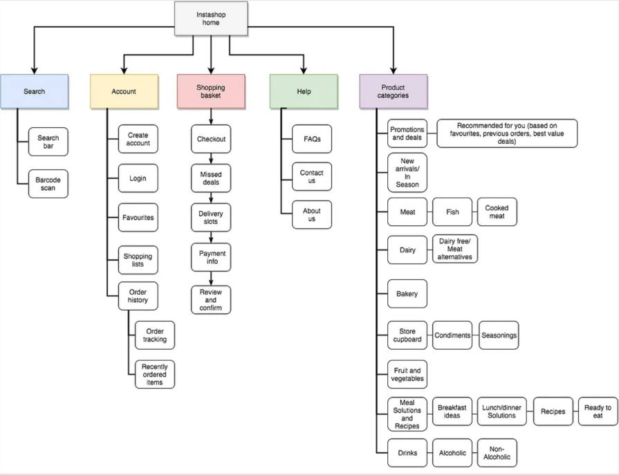
Information architecture is a visual map of how the information, including pages and subpages, is organized and categorized on the website.
By categorizing the website’s content by relevant themes, we can design an intuitive and user-friendly page structure:
The ability to visualize intangible aspects of user experience is a must-have skill for every designer. We’ve learned some of the main techniques, such as customer journey maps, user flow maps, service design blueprints, assumption maps, empathy maps, and information architecture. These give us a powerful tool that fosters understanding, boosts collaboration, and ultimately enhances the overall design process.
Header image source: IconScout

LogRocket's Galileo AI watches sessions and understands user feedback for you, automating the most time-intensive parts of your job and giving you more time to focus on great design.
See how design choices, interactions, and issues affect your users — get a demo of LogRocket today.

Learn what makes a great login screen through real-world examples and UX best practices for creating secure, accessible, and low-friction authentication flows.

Skeuomorphism helped define early digital interfaces by mimicking real-world objects to make technology more intuitive. Learn how it compares with flat design and neumorphism, why it declined, and where it still has a place in modern UX.
Memos don’t have to be complicated. Just keep them clear, concise, and focused on actionable items. More on that in this blog.

AI has made polished, confident content easy to generate, but that does not make it trustworthy. This article explains how UX teams can design stronger quality signals using source transparency, validation, confidence communication, and reputation.


