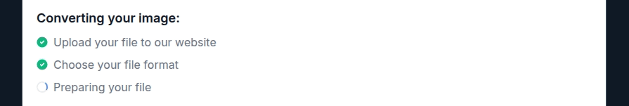
A skeleton loading screen is a popular UI design technique that effectively indicates the loading state by mimicking the final UI structure with animated visual placeholders. Unlike preloader animations and progress bars, skeleton loading screens improve perceived performance well since users can feel how data segments will appear on the screen even though they are not yet loaded.

In this article, we’ll learn the skeleton loading screen technique, how it differs from preloader animations (i.e., spinners) and progress bars, examples from popular software products, and best practices for using skeleton screens in your software product UIs.
Editor’s note: This article was updated by Shalitha Suranga on April 16, 2025, to include fresh examples, updated best practices, and a clearer breakdown of how skeleton screens differ from spinners and placeholders. These changes make it easier for designers to choose the right loading strategy for smoother, more user-friendly experiences.
A skeleton screen is a technique for web and app design to address the challenge of increased page loading times. Instead of displaying a blank screen or using a traditional loading animation, a skeleton screen shows users an outline or wireframe of the page’s layout and structure while the actual content is still being loaded in the background.
As the content loads, the placeholders in the skeleton screen will update with the actual interface until the entire page is loaded.
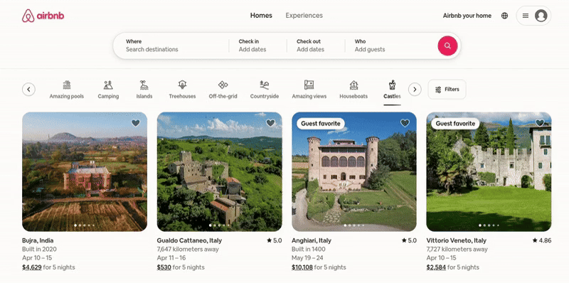
For example, see how the Airbnb desktop website seamlessly reveals the actual content from the skeleton screen:
This technique provides users with a more engaging experience than facing a loading spinner or blank screen. Our attention spans are shorter than ever, and skeleton screens serve to keep them. The skeleton or structure of the page gives users a sense of what the page will look like while it loads.
As most skeleton structures themselves play a loading animation (e.g., pulsating animation) and loaded content starts appearing, it provides a sense of progress while keeping users engaged and less frustrated. Each piece of loaded content is like a way of keeping the users’ attention and preventing them from abandoning the website or app:
Using skeleton loading screens brings the following benefits to your software product:
Skeleton loading screen comes with a few challenges as well, but designers can easily overcome them:
Based on the behaviour and design, we can identify three skeleton loading screen types that you can use in your UI designs according to your design preferences:
This is the simplest form of the skeleton loading screen, as it always renders a static wireframe of the final UI with static visual placeholders:

Displaying a static placeholder for a longer time may affect the user’s mood, and they assume that the product UI is broken, so this approach is suitable for content loading scenarios that don’t often expand over about one second.
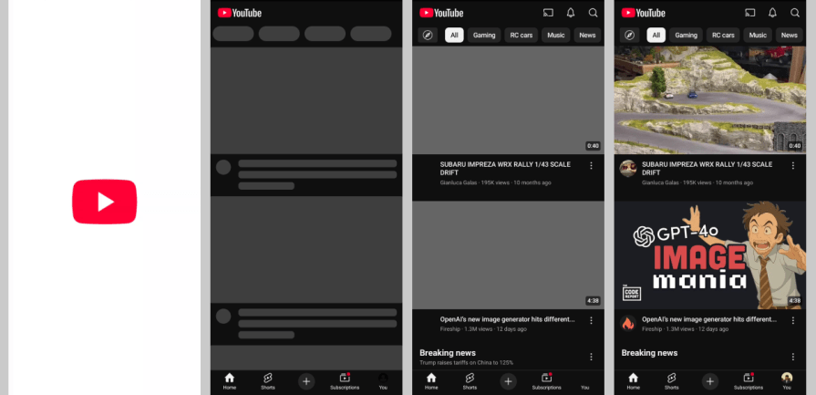
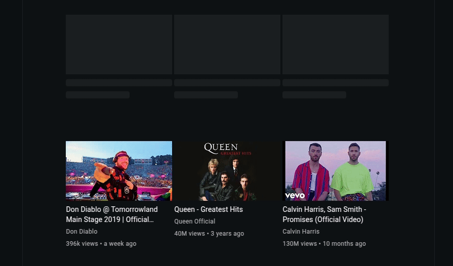
YouTube mobile, for example, uses a static skeleton loader for video thumbnails.
These skeleton loaders play an animation rather than just rendering a static placeholder set. Most designers choose animated skeleton loaders since they indicate the loading state effectively and keep the user engaged even if the loading time expands over about one second.
Here are common animations used in skeleton loaders:

Apart from these effects, some designers use shining effects, flashing effects, and sci-fi animations with their creative design skills.
This minimal skeleton loading screen type instantly renders a frame with only basic segments like header and footer, and a large single placeholder or empty region until the content gets loaded.
This approach works well for simple UIs under shorter content loading times, but it isn’t recommended for medium-sized or large UIs with slow content loading times since users can get confused with the static frame, assuming something is broken.
Let’s evaluate some well-designed skeleton loading screens of some popular digital products to learn practical aspects of skeleton loader design:
Facebook is the world’s largest and most popular social network. Facebook’s desktop web app implements skeleton loading animations for almost all dynamically loaded UI segments:
Notice the following design facts:
Overall, the Facebook desktop website implements an engaging, minimal skeleton loading screen that improves the perceived performance.
The Uber company offers the most popular transportation services app, Uber, which offers online ride-booking and courier services. The Uber mobile app implements an engaging skeleton loading screen for the vehicle options selector section until Uber calculates pricing for the selected ride:
Notice the following design facts:
Overall, the Uber Android app implements a unique, well-designed skeleton loader along with a preloader animation for better UX.
eBay is one of the largest online marketplaces in the world. The eBay desktop website effectively uses the skeleton loading technique in the products screen to improve UX and keep users engaged during the loading state:
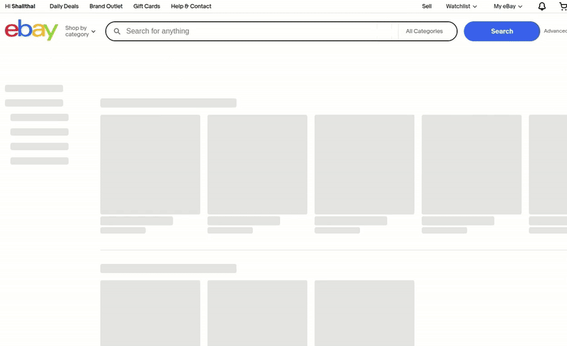
Notice the following design facts:
Overall, eBay implements a somewhat minimal skeleton loading screen compared to the final screen state to construct a better, engaging skeleton loading screen.
To effectively implement skeleton screens into your website or application, there are a few best practices to follow to provide an optimal loading experience for your users.
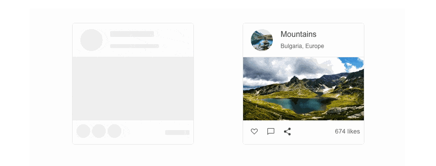
A skeleton screen should be consistent in layout and structure with the final loaded screen. This gives users an idea of what the final screen will look like, as well as where to potentially find the type of content they are looking for.
Given that a skeleton screen is an accurate preview of the page layout, users can start to process the different sections and elements on the page, and anticipate where certain content will appear before it’s fully loaded:
Motion has long been used to communicate ongoing activity or progress. Think of progress bars that advance as loading continues or spinners that continuously rotate. Skeleton screens are no different and should incorporate animations to assure users that the page is not stuck and that content is still loading.
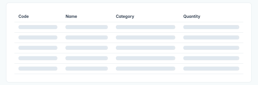
Skeleton screens primarily work best when loading container-based components, such as tiles, structured lists, grids, data tables, and card components. Containers are more visually complex and distinct, so a skeleton loading state can be used to convey and differentiate the overall layout.
Full pages with a variety of multimedia and content are also great use cases for skeleton screens:
On the other hand, smaller components, such as smaller buttons, form fields, and labels, don’t require a skeleton state. These components are associated with immediate user action and response, so displaying a skeleton for them might mislead the user into thinking that they are available to interact with while the page isn’t fully loaded yet.
Skeleton screens are more focused on structure and layout while excluding the smaller details, like icons or status indicators.
Using placeholders only for primary structural components and excluding smaller, secondary UI elements creates minimal but better skeleton loading screens that smoothly transition into the final loaded screen state.
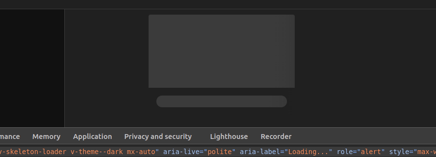
Accessibility features and considerations help users to use your product productively regardless of their physical ability levels. Choosing distinguishable colors for skeleton screens’ placeholders and implementing clear but undistracted animations is the best way to clearly indicate the loading state by prioritizing accessibility. Moreover, using platform-specific accessibility APIs in the final product UI lets screen reader tools properly understand the loading state and loaded state in skeleton screens.
For example, see how the Vuetify Vue component library’s skeleton loader component uses suitable colors for both light and dark themes and uses ARIA attributes:
If a product design team decides to include a skeleton loading screen, designers will have to implement one with their prototyping tools for the high-fidelity prototype, and developers also have to implement one in the real product UI with product development tools. Implementing an animated skeleton loader in a prototype is easy and productive since Figma-like prototyping tools have plugins that turn any screen into skeleton placeholder groups.
After the design handoff process, developers can implement a skeleton loader screen based on the high-fidelity prototype specifications using the following approaches:
A skeleton loading screen is one of the few different loading indicators used in web and app design. Preloader animations (i.e., spinners, unique animations) and progress bars are also popular loading indicators that some software products use instead of the modern skeleton loading screens.
Let’s compare skeleton loading screens with other loading indicators to identify the best use case for each technique.
Skeleton screens are miles ahead in terms of keeping the user engaged while they wait. They provide a more visually interesting loading experience while preloader animations tend to be repetitive and mundane.
While you can design preloader animations and progress bars with graphical elements to look more appealing, they don’t offer a preview of the layout or structure of a page like skeleton screens do:


Users who encounter a preloader animation understand that a process or task is ongoing. However, it does not indicate the progress or speed of the loading time.
A progress bar indicates loading progress, but it doesn’t give an idea of the final screen state and doesn’t implement a smooth transition to the final screen.
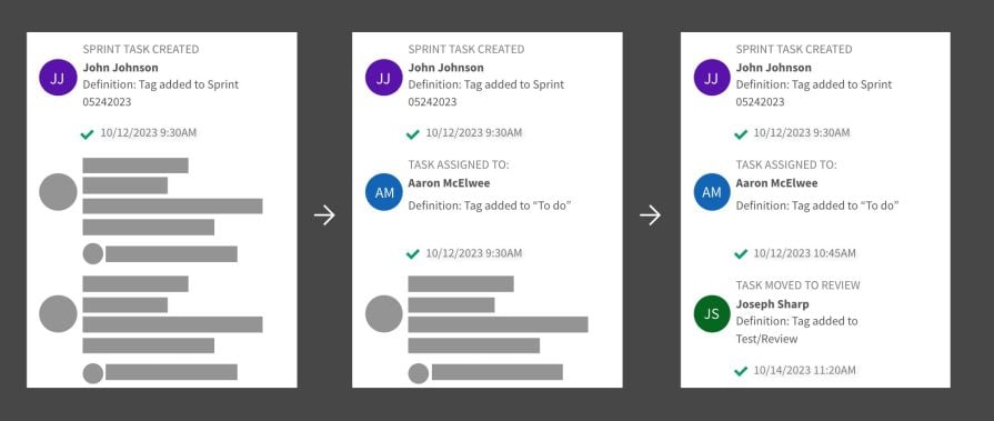
A skeleton screen creates the perception of progress by revealing content and replacing the placeholders as they load. This progressive loading experience also makes the loading time seem faster, as the interface gradually comes into view:
Skeleton screens are ideal for loading pages with various elements, such as images, text, videos, and other content. They provide an engaging loading experience that illustrates the page’s layout while creating a sense of progress and speed.
Content-heavy applications or websites can benefit from skeleton screens when loading pages:
Preloaders are best for simple tasks or actions, such as opening a file or submitting a form. In these cases, there isn’t much content to visually load. Instead, the user is simply waiting for the task or action to be completed. The emphasis is on simplicity and having a clear indication of an ongoing process without added visuals:
Here is a summary of skeleton loading screens vs. other loading indicators that you can use to easily find the optimal loading indicator for your design scenario:
| Comparison factor | Preloader | Progress bar | Skeleton loader |
|---|---|---|---|
| Types and examples | Spinners, animated bars, and other animated graphical loaders | Traditional progress bars or modern progress bars | Static, animated, and frame-display skeleton loaders |
| Loading state indication | Yes | Yes | Yes |
| Loading progress indication | No | Yes | Yes, if progressive loading is implemented |
| Design effort | Low | Low | Medium |
| Transition to the loaded state from the loading state | Not smooth | Not smooth | Seamless |
| Improves perceived performance | Not significantly | Not significantly | Yes, since users can feel that the content loads faster |
| Usage scenario | The user is waiting for a short task completion and is not interested in knowing the exact progress | The user is waiting for a somewhat long task completion or unknown content structure and is interested in knowing the exact progress | The user is waiting to see structured content hosted in container-based layouts, i.e., a grid-based layout |
| Usage example | Indicating a sub-task completion in a list | Loading a complex 3D model within a software screen | Loading video thumbnails in a grid layout |
Overall, the skeleton loading screen technique offers the best solution to indicate the loading state for structured content segments in any software product screen.
If you’re looking to increase user engagement during load times in your website or app, consider implementing a skeleton screen. They offer a dynamic way to display a page’s structure and layout while it loads, allowing users to anticipate the location and organization of content on the page. It also creates a sense of perceived progress and speed for the user, making the wait time less painful than a preloader or progress bar would.
Skeleton screens are used by many companies that follow best practices like maintaining layout consistency and incorporating motion effects to indicate that the page isn’t stuck. Skeleton loading screens can be used for even visually complex container-based components by using placeholders only for primary structural elements, excluding other smaller elements like labels, buttons, form fields, etc.
In a world where digital experiences are run by capturing user attention, skeleton screens are an excellent technique for designers to leverage. With thoughtful design, they can turn a boring, loading phase into a positive experience that keeps the user engaged.

LogRocket's Galileo AI watches sessions and understands user feedback for you, automating the most time-intensive parts of your job and giving you more time to focus on great design.
See how design choices, interactions, and issues affect your users — get a demo of LogRocket today.

I was working with an intern on a UX research project, and before we even started, we both had private […]

AI has accelerated design execution, but speed can come at the expense of intentionality. Learn how UX teams can preserve product thinking and judgment.

UX testing is not limited to layouts, copy, and visual design. Full-stack and server-side experiments help teams evaluate how backend logic, APIs, algorithms, and product flows affect the overall user experience.
In A/B, A/B/n, or multivariate testing scenarios, using p-value with traditional null-hypothesis-based statistical analysis is so common, and most designers […]

 Learn more →
