Will Rogers popularized the quote, “You never get a second chance to make a good first impression” a long time ago. However, this phrase was in circulation before he said it.
To make this quote more accurate, we can add that research suggests it takes around seven seconds to form a first impression of something or someone. Obviously, your impression can change over time as you interact with the subject.
When it comes to digital products, users often form an impression even faster than in the physical world — around 50 milliseconds. Users quickly assess visual elements, designs, and overall usability as they interact with your site or app. A well-designed interface can have a significant impact, while issues like slow loading times or poor design can negatively affect this initial experience.
It’s vital to recognize that newcomers to your website or application are often navigating unfamiliar territory, with limited knowledge of its functionality and structure, even if it seems self-evident to you as a product creator. Creating an onboarding process to guide users in understanding the architecture of the product can prevent initial churn and the feeling of confusion that may lead to them deleting the app.
This article aims to help you understand the concept of onboarding, the different types of onboarding, and its architecture, and it offers tips to create an outstanding onboarding experience. It will also provide guidance on creating onboarding solutions tailored to B2B contexts.
User onboarding entails skillfully guiding individuals as they initially engage with a product or service. Think of it as extending a warm invitation to explore a digital world. This experience typically involves introducing users to a product’s core features, functionalities, and benefits, aiming to provide a smooth and engaging introduction.
During onboarding, we present users with a series of interactions and instructions that help the user understand the product they’ll be using. It can go from an explanation with text, images, or video to a guided task completion using progressive disclosure.
Onboarding can be brief when interacting with the app for the first time or it can extend in multiple phases while using different features, such as when using SaaS platforms or B2B products. In the end, the goal is to set the user up for success.
A well-designed onboarding experience can significantly improve user retention rates, with some businesses reporting an increase of up to 50 percent in long-term user engagement. On the flip side, a poorly executed onboarding process can lead to higher churn rates, contributing to a potential loss of 25 percent or more of newly acquired users.
These metrics showcase the crucial role of user onboarding in building lasting relationships between users and products. They stress the significance of promptly introducing value within the user journey, nurturing loyalty, and diminishing the chances of users disengaging from the platform. While specific percentages may vary, the impact of effective onboarding is undeniably significant.
Similar to regular onboardings, the B2B onboarding for digital products refers to the process of guiding and familiarizing users with websites, applications, or SaaS platforms in a manner that aligns with their specific needs and objectives.
Unlike consumer-focused onboardings, which address individual users, B2B onboarding focuses on business, teams, and corporations.
There are various types of onboarding, with several designed specifically for websites, apps, and SaaS platforms, including those geared towards B2B use. These onboarding approaches are essential for guiding users during their initial interaction with the platform.
Generally, onboarding takes place the first time a user opens the app, but in some instances, it can extend to later stages, such as when a user first uses a particular feature. When it comes to B2B, if we focus on complex products with different roles and permissions, the onboarding can be personalized for each one, creating a unique and tailored experience.
Users begin onboarding themselves by independently exploring the platform. This minimalistic approach may suit self-explanatory apps or SaaS platforms.
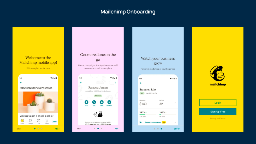
This is a common onboarding method for mobile apps. Typically, after signing up, users are presented with a few screens (up to five) that introduce the basic functionalities of the application.
The tutorial may include images or videos with concise text descriptions. It’s crucial to provide a sense of progress and an option to skip the tutorial if wanted:
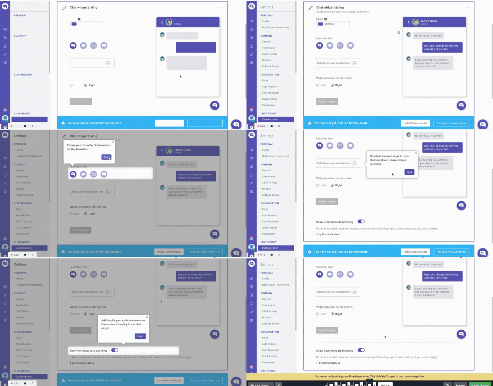
Guided onboarding is particularly valuable for complex products because it helps users understand where and how to employ different features. It provides a smooth start and facilitates familiarity with the product’s capabilities:
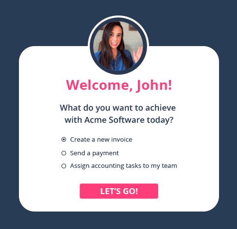
This onboarding approach encourages users to start using the app by assigning various tasks, such as adding profile information or setting up their accounts. It’s usually used to introduce users to complex functionalities:
Offering a straightforward approach, tooltips visually guide users to discover key features of the application or website. It’s a minimalist method for aiding users in finding their way:
Designers employ gamification in various products to transform tedious and complex tasks into enjoyable and engaging experiences. Elements like badges, coins, or rewards motivate users to explore the platform’s key features:
For complex B2B SaaS products, in-person or remote training sessions may be provided to make sure that employees understand the software through extended training.
The choice of onboarding method, or whether to combine different types of onboarding for complex products, often hinges on the target audience, the product’s complexity, and the need for user guidance.
When it comes to B2B onboardings, it’s important to highlight that the advanced complexity may overwhelm new users, so a well-designed onboarding is key for the success of the relationship. Here is a list of things to remember when designing an onboarding for B2B solutions:
Generally, companies pay extra for personalization in B2B platforms. With tailor-made experiences, you can either train all these clients in person or remotely, or you can create a self-explanatory onboarding with customization for different types of roles. This will help employees quickly understand the software and jump in to use it.
This will only happen if we understand deeply the unique needs and challenges of the user target. By empathizing with the user we can tailor a unique and personalized experience to focus on teaching key features that may be complicated to use without guidance.
To conclude this section, remark on the importance of clear communication and focus on the value proposition. The B2B user needs to understand not only how to use the product, but also why is valuable for their specific needs.
By following these best practices, B2B onboarding can become a strategic tool for user engagement and retention, making sure not only the user knows how to use the product but also find value in it.
There is no perfect strategy to create a good onboarding. Everything will depend on the product and the target audience, but here is a list with best practices and a step-by-step flow to create a memorable, smooth onboarding experience.
Everything starts with a warm welcome and an introduction to the new software. Contemplate offering a warm welcome and expressing gratitude for selecting your product. Provide a concise introduction to the product’s essential features and direct the user toward the next action.
After welcoming the user, we need them to create a unique user account to start using the software. Account setup can take two forms: it can be a manual process, similar to opening a bank account, or a streamlined experience, such as a straightforward social login.
The primary goal is to lead the user through the setup process with the least amount of effort, minimizing the number of necessary actions. In some cases, we can defer certain aspects of the setup to a later stage, allowing you to concentrate solely on the fundamental setup. This approach enables users to quickly understand the software’s value proposition and discover why it’s an excellent choice.
Once a user establishes their account, it is time to guide the user to the core features of your product. Offer a guided tour to showcase the most important features.
Remember, you have only one chance to make a good impression, so make this smooth to allow the user to get familiar with the tools they will be using. If possible, create hands-on experiences to allow the user to interact with the tools.
Here, most onboardings will conclude the experience, but for most complex experiences such as B2B products, we may require continued onboarding with tips you can find in the next point.
If your onboarding is intensive, create a task completion onboarding where the user needs to finish all tasks to complete it; progress indicators or checklists can visually help represent completed or remaining tasks.
Knowing how far they’ve come and what’s left to explore can motivate users to continue using the app; you can use gamification elements to reward task competitions.
Even though the heavy part of the onboarding is the first time the user launches the app or website, it is important to update users with the release of new versions of the software. In this scenario, you can use tooltips or other actionable strategies to onboard users to the new releases.
There are a few golden rules to follow in creating a reliable onboarding process that helps new users understand your product and complete basic tasks smoothly. Let’s review these ten fundamental rules to create outstanding UX onboarding.
Keep the onboarding simple — the less, the better. At this stage, we only want the user to learn basic features and get to know the software. Avoid going too deep, as it may lead to churn and overwhelm.
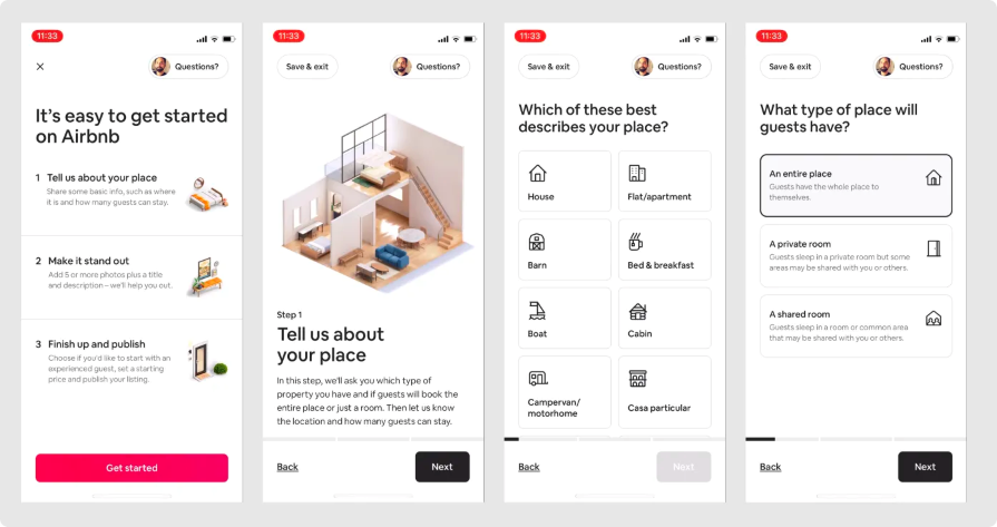
Airbnb’s onboarding involves a few clear steps: set up your profile, list a space, or book a stay, ensuring a simple and user friendly experience:
Communicate the value proposition of each onboarding step with text and visuals. Highlight the most famous features of the product and explain the reasons behind the client’s decision to start using it.
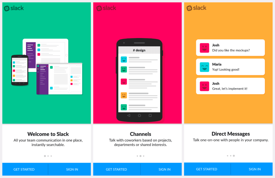
Slack effectively communicates its value by highlighting features like channels, direct messages, and file sharing, making it clear how users can improve team communication:
Gradually introduce information in each onboarding step to avoid overwhelming users. Creating a user journey map is akin to an artist sketching an outline, ensuring every onboarding goal is met without setbacks. This involves deciding on the map range (covering the whole product, a website page, or a single feature) and selecting a user persona based on thorough user research.
The map should incorporate user needs, expectations, and intentions, considering the user’s emotional journey. Identifying touchpoints aligns the onboarding process, resulting in a comprehensive user journey map for effective onboarding UX.
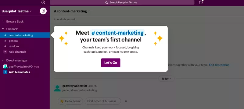
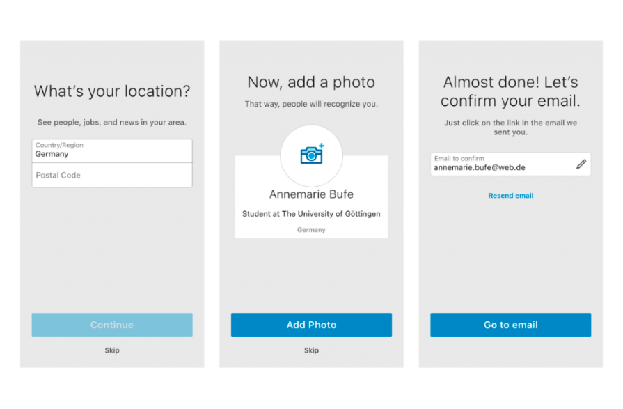
LinkedIn progressively discloses information by guiding users to complete key sections of their profile over time, preventing information overload:
Don’t throw information out without indicating or guiding users on where and how to perform the actions they want to learn. Help users navigate the onboarding using tooltips or other visual clues.
Google Docs provides real-time feedback during collaborative document editing, allowing users to see changes made by others instantly, enhancing the collaborative onboarding experience:
![]()
Beyond tooltips, use visual patterns like icons, animations, or illustrations to indicate actions. Some apps use a mascot to guide users through onboarding and make the experience more enjoyable and colorful.
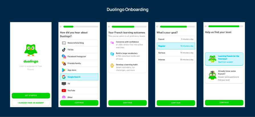
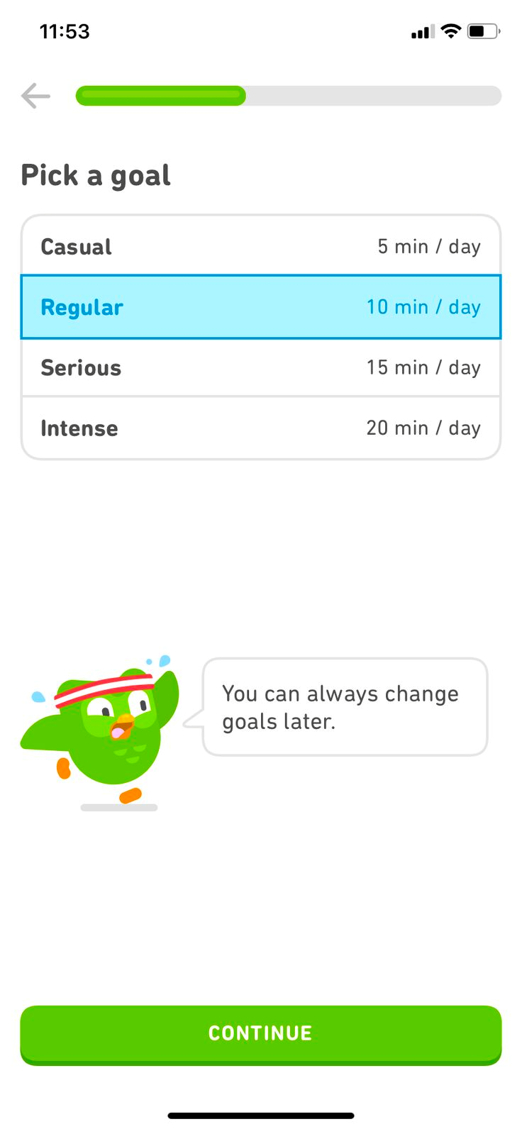
Duolingo, the language lessons app, uses the famous owl to guide users in each step of the onboarding. The branding immediately engages users:
When the product offers various features or options, let users select their preferences before navigating an application with thousands of choices available. Understanding user needs and expectations is paramount.
While redesigning existing patterns relies on data analysis and user input, initiating a design from scratch requires market research, case studies, or customer engagement. Regardless of the approach, identifying customer needs is crucial before diving into onboarding design.
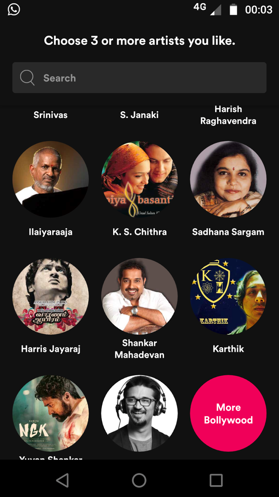
Spotify asks users about their music preferences during onboarding and creates personalized playlists based on their favorite genres and artists:
Onboarding may not be clear to users unfamiliar with the new software architecture of your product. That’s why it’s important to guide them with buttons or other steppers to walk them through the next steps.
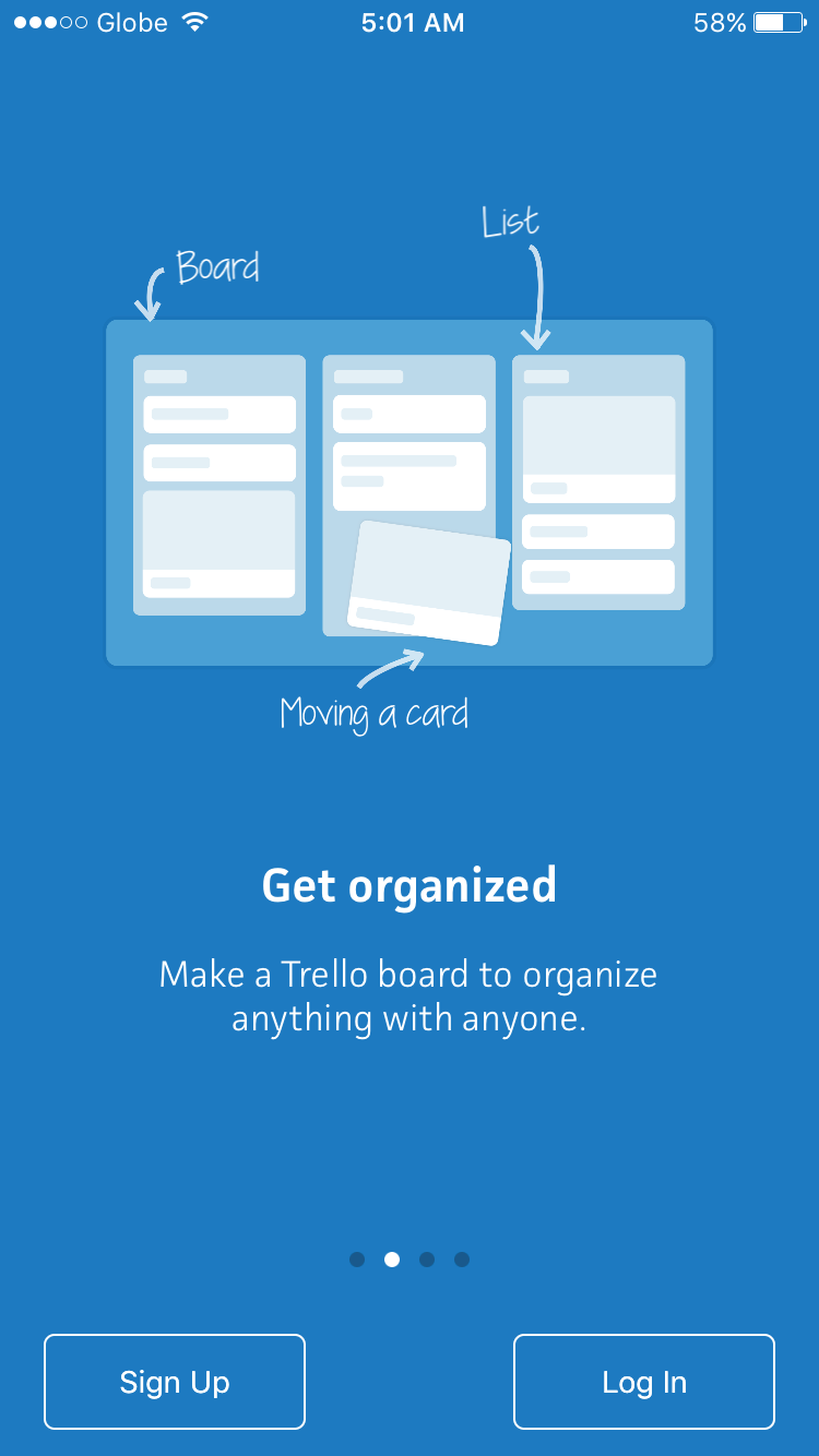
Trello’s onboarding features clear CTAs, guiding users to create boards, add cards, and collaborate with team members:
During onboarding, users need feedback to guide them on what they’ve done right or wrong and what they can improve.
Google Docs provides real-time feedback during collaborative document editing, allowing users to see changes made by others instantly, enhancing the collaborative onboarding experience.
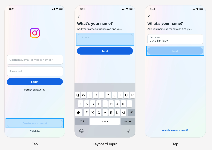
Design for multiplatform products, from small smartwatches to smart TVs with wide screens. Ensure a seamless experience for all devices by adapting the onboarding to the screen, considering that features may vary between devices.
Instagram’s mobile onboarding is optimized for a smooth experience, allowing users to quickly set up profiles, follow friends, and start sharing photos and videos. It’s a delightful mobile experience:
Regardless of meticulous planning, there is always room for enhancement. Uncovering areas for improvement necessitates testing user onboarding processes.
One effective approach is through A/B testing. Employing an A/B testing platform or opting for a product adoption solution with inbuilt A/B testing facilitates a thorough evaluation of different onboarding strategies to optimize user experiences.
There are other research techniques that you can use here, such as remote usability testing that you can conduct unmoderated; its cost is low compared to other techniques makes it a good choice.
We create onboardings for individuals or enterprises to help first-time users understand how to use your product as quickly and effectively as possible.
Especially for B2B solutions, it is important to create an onboarding that will result in a bridge between the solution and the user. Successful B2B onboarding relies on personalization, clear communication, and an emphasis on value. Understanding user needs, welcoming them warmly, and simplifying setup are essential. This comprehensive approach provides user engagement, alignment with business goals, and sustained product adoption.
LogRocket's Galileo AI watches sessions and understands user feedback for you, automating the most time-intensive parts of your job and giving you more time to focus on great design.
See how design choices, interactions, and issues affect your users — get a demo of LogRocket today.

Multimodal UX goes beyond designing for screens. Learn how context-aware systems, progressive modality, failover modes, and accessibility-first design create better digital product experiences.
Learn how context-aware mode prioritization and seamless transitions improve multimodal UX and reduce mode confusion.
Research is becoming more democratized, product cycles are accelerating, and AI is transforming synthesis and ResearchOps. Here are the three trends shaping UX research in 2026.
Voice support is not the same as multimodal UX. Here’s how to design systems with true mode continuity and context-aware interactions.