Neumorphism mixes the effects of minimalism and realism to create interfaces that are easy to comprehend, but aren’t overwhelming to the eye. Neumorphic designs appear soft and feather-like due to the use of shadows and highlights that create depth on the interface.
Keep reading to learn about neumorphism’s origins, how you can use it in your designs, and how it compares to other design trends.
Editor’s note: This blog was updated 16 May 2025 by the author to provide an expanded definition of neumorphism, cover neumorphic design principles, offer real-life examples, and answer FAQs.
Neumorphism brings a modernized flavor to flat design by maintaining simplicity while eliminating flatness. Instead of relying on high-contrast and heavy textures to distinguish elements from each other, neumorphism uses subtle shadows, highlights, and gradients to create a soft and clean surface. Neumorphism still provides visual clarity, but balances intuitiveness with simplicity.
Neumorphic interfaces include UI components like buttons, cards, and dropdowns that look like they’re “rising” or “sinking” into the application’s background. This visual styling creates depth and hierarchy without diminishing its minimal appeal.
However, to fully understand neumorphism, you need to go back and review the evolution of modern-day interface design with skeuomorphism and flat design.
As personal and home computers became more commonplace, there was a growing need to make new digital experiences feel familiar to users’ mental models. These interfaces first integrated physical experiences through skeuomorphism, which inserted familiar elements from the physical world into the digital:
Features of skeuomorphic interface design include:
Skeuomorphism helped users become more comfortable with digital experiences. But the design trend had its share of cons including unappealing visuals that looked cluttered, and poor loading speeds from the interface’s detailed elements.
Flat design emerged in the early 2010s to address the cons of skeuomorphism. This trend took a “form follows function” approach by focusing on the usability of the interface and minimizing details. No more shadows, textures, and gradients — and no more literal interfaces.
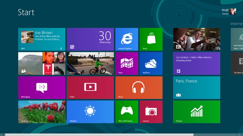
Microsoft was among the first to adopt flat design, as you can see in this older version of their homepage:
Features of flat interface design include:
Though flat design’s approach is directly influenced by skeumorphism’s limitations, it also had its share of cons. For example, it caused some usability issues since users couldn’t always tell what was interactive or not, and it was widely regarded as too simple.
So where is the balance between being too cluttered and literal versus being too simple and unclear?
Neumorphism (or new-skeuomorphism) was introduced around 2019 once flat design began losing traction. This design trend blends the best features of skeuomorphism and flat design, bringing back elements from the realism found in skeuomorphic design to balance with the minimalism found in flat design:
Like the transition from skeuomorphism to flat design, neumorphism is a response to flat design’s limitations. Features of neumorphism include:
Think of this trend as a modernized skeuomorphic interface — that’s why it’s called new-skeuomorphism. The reintroduction of shadows, gradients, and textures makes these interfaces feel realistic without being overly cluttered.
Now that we’ve reviewed neumorphism’s origins and how it combines different UI design styles, let’s analyze neumorphism’s core design principles more closely.
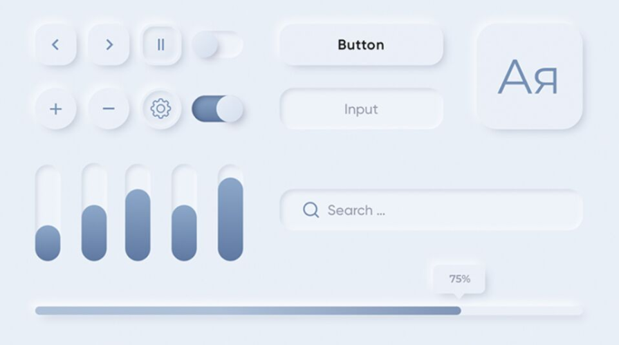
One of the most noticeable details of neumorphism is how it uses simple, monochrome color palettes. Almost the entire interface uses the same color with some pops of an accent color. But instead of using plain white or black as the main or “base” color, products use an off-white (e.g., #F4F4F4) or off-black (e.g., #252525) to allow the interface’s shadows and gradients to show better.
Of course, only using monochromatic, solid colors can feel boring and lifeless to users — reducing visual appeal. To combat this issue, neumorphism also adds subtle gradients to UI components to boost visual appeal and reinforce the interface’s “light source” (more on this in 3D effects). Not only that, this style also uses small bursts of a bold color to draw the user’s attention to important call-to-actions (CTAs) to guide their next actions.
In summary:
As mentioned in the previous section, neumorphic interfaces use a “light source” to add dimension and illuminate objects in the design. The 3D effect created from the shadows and highlights also adds visual interest and elements of realism from our natural environments. Since neumorphism is defined as soft and subtle, any shadows and highlights used should be faint and diffused in order not to overpower the interface.
It’s important to note that the shadows and highlights used in the interface need to maintain the same “light source” direction, such as coming from the top-right or top-left of the screen. So if the light comes from top-left, a highlight should be placed on the element’s top-left corner, and a shadow should be placed on the element’s bottom-right corner.
In summary:
Lastly, neumorphism is known for its smooth and airy UI design. To maintain this style, it can’t use sharp corners — this would add too much contrast and definition to elements. Instead, neumorphic interfaces use elements, like cards and buttons, with rounded corners and high radii to emphasize its softness and friendliness.
Not only do the rounded elements provide harmony between the shapes and the application background, it encourages the user’s eye to move and flow through the interface more naturally.
In summary:
To better understand how to use neumorphism, it’s important to know its ideal use cases, as well as its potential limitations.
Neumorphism provides a way to blend the “form follows function” principle while adding creativity that was lost during the flat design era. These interfaces still look modern, but include more visual styling than the bare bones required.
Additionally, the simplicity of neumorphic design is easily translated across different experiences in one application, as well as across products from the same family. This can help different teams designing for the same company remain consistent with both aesthetics and interactions.
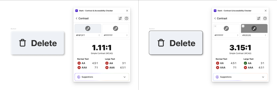
Neumorphism brings up both accessibility and usability concerns due to the low-contrast and minimal color schemes that define the design trend. However, there are ways to address these concerns while still using elements of neumorphic design.
For example, users with visual impairments like color blindness or low vision may have trouble reading neumorphic interfaces. To meet Web Content Accessibility Guidelines (WCAG), non-decorative elements on an interface must have a three-to-one color contrast ratio against adjacent colors. This includes UI components like buttons or input fields.
Because neumorphism typically uses low-contrast designs, it normally fails this three-to-one color contrast ratio requirement. A simple way to update your design to meet this standard is by adding a gray border to the non-decorative element:
As for usability concerns that can impact any user, interactive elements on neumorphic interfaces may not be distinguishable from non-interactive elements. This can cause users to become stuck or confused on a given webpage. Even worse, it could cause a user to abandon your website or application.
A few ways to address usability issues in neumorphic design is using strategic visual cues, like using a bold color or clear text labels for interactive elements, implementing visual indicators for hover and active states, and more.
Of course, creating accessible experiences is a must in 2024. Traditional neumorphic designs are not accessibility-focused, but that doesn’t mean they can’t be. Ensure text and non-text elements, like UI components, meet the specific WCAG color contrast requirements to create neumorphic designs that are inclusive.
The neumorphic design trend has its pros and cons. If you or your team decide it’s the right approach for your product, make sure to address the accessibility and usability concerns before officially adopting it as your interface’s visual language.
If you decide you want to incorporate neumorphism into your designs, the good news is it’s easy to adopt. But if you’re unsure where to start, I’ll demo how to create a neomorphic segmented control in Figma.
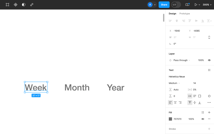
Segmented controls are a UI component that allow a user to swap between views or content on a webpage. The segmented control I’ll demonstrate below will allow the user to swap between different views on the web page for week, month, and year.
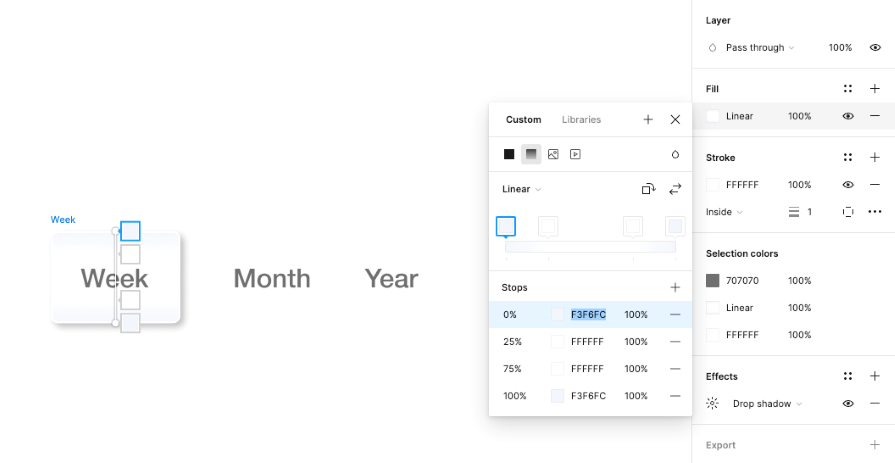
The segmented control will include three controls to swap between our views. Follow these steps to create the text layers you need:
You should see something like this:
You need to visually indicate one control that is currently selected and two controls that aren’t selected:
Here’s the result:
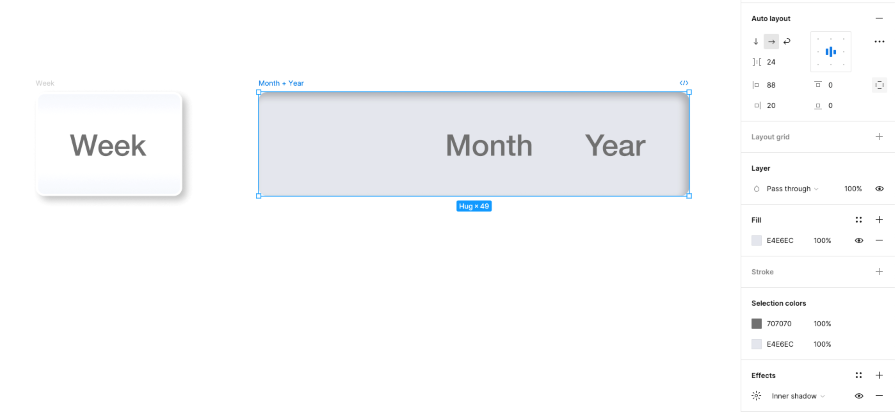
Now, you need a base for your segmented control to contain the three week, month, and year controls:
Note that since I added an inner shadow to the frame, I can’t add the “selected” control frame into the base frame. If I did this, the inner shadow would cover the “selected” control and I wouldn’t get the debossed effect for the base.
Here’s our design so far:
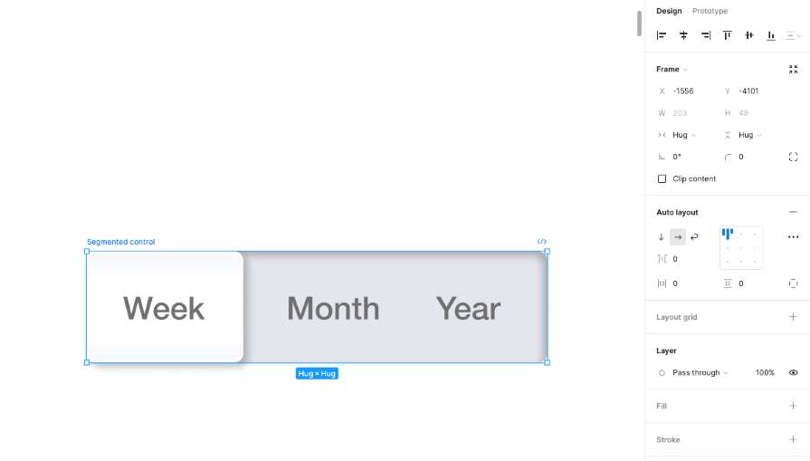
Our base contains space for the “selected” control, but they haven’t been combined into our single segmented control yet. Here’s how to combine them:
The final design concept looks like this:
That’s it! Now you have a segmented control that follows the neumorphism trend. The use of drop shadows and inner shadows creates three-dimensionality by elevating the “Selected” control and debossing the base. These visual effects give the realistic effect of neumorphism.
To help you get started on designing neumorphic interfaces, here are some UI kits you can use for both your Figma designs as well as your code needs:
As you can see, neumorphism is simply blending minimalism and realism into the same elements. Keep trying these visual effects on other UI components, like a button, to create a webpage or mobile design.
Now that we’ve discussed what neumorphism is and how it came about, let’s review a few examples in action. Let’s take a look at each below.
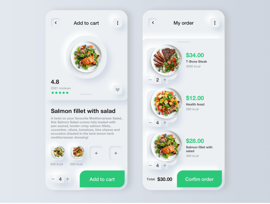
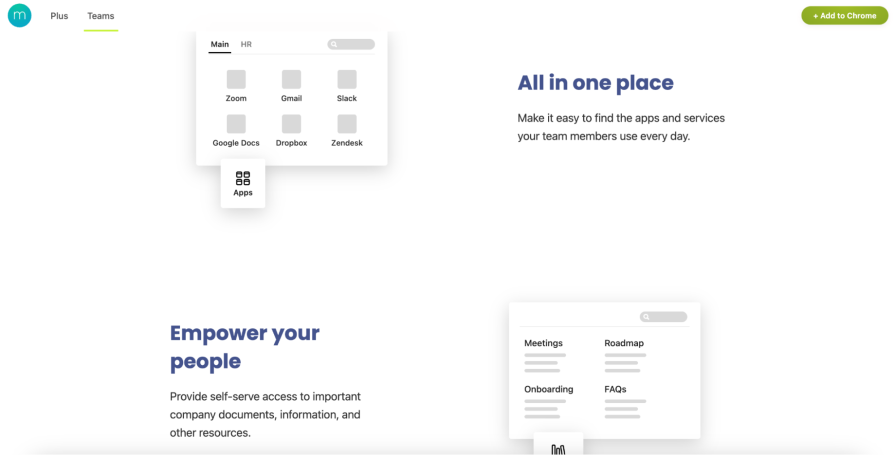
Momentum Dash, an extension that helps you customize your browser experience, uses elements of neumorphism within its website. Though Momentum’s entire website isn’t strictly designed with neumorphism, it includes small moments of the UI style.
How is Momentum Dah’s UI neumorphic?
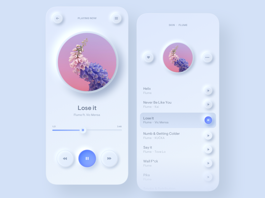
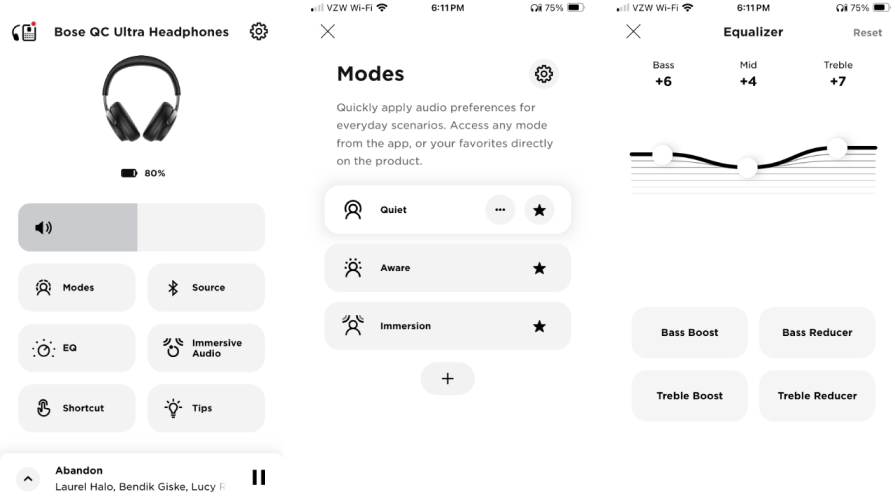
Bose, an audio hardware company, includes a music app that implements a mix of flat design and neumorphism. Bose uses a grayscale color palette on a white application background to maintain a simple, clean interface that isn’t overwhelming to the eye.
How is Bose’s music app neumorphic?
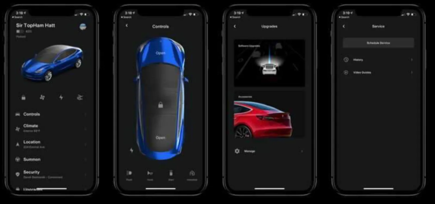
Lastly, an old version of Tesla’s mobile app showcases an influence of neumorphic design with its off-black application background color behind various shades of dark-grey. This dark theme approach helps the bold, bright car colors, like the red and blue, stand out in the UI to attract the user’s attention.
Something to note from the Tesla designs is that its UI doesn’t include shadows and highlights, so it doesn’t have the normal depth associated with neumorphism.
How is the Tesla mobile app neumorphic?
Each concept checks the boxes for the visual effects to include when designing for this UI style. Simplicity, minimal color, and use of shadows all create an interface that blends minimalism and realism.
We’ve already discussed skeuomorphism and flat design. So, what other interface designs are trending? Turns out, there are many — and I’m sure there will be more in the future.
Similar to neumorphism, glassmorphism began trending around 2020. It also stems from flat design with its minimalist approach. Glassmorphism has been popularized through its use in Apple and Microsoft’s operating systems. Some features to identify glassmorphism include:
You can achieve the “frosted glass” appearance by adjusting the opacity and background blur of a design element in the foreground. The translucent appearance distinguishes the foreground element, but doesn’t completely cover the background.
In this way, glassmorphism helps users understand where they are in a product experience when popups or modals appear, since they can still see the primary background.
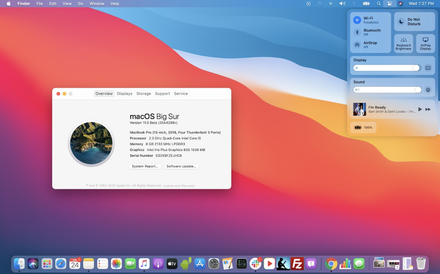
Apple’s macOS Big Sur release in 2020 introduced glassmorphism into their interface design. The operating system adopted bold, colorful gradients as its background, and the menu toolbar was replaced from a traditional white to the frosted glass effect:
Although glassmorphism is a popular trend today, it can pose accessibility issues. If the background blur or opacity doesn’t produce a high enough contrast with its background, the readability of text elements can become difficult for users with visual impairments.
If you use glassmorphism, your text and non-text elements need to meet their specific color-contrast requirements to make sure users can see the interface’s content.
Up next is neubrutalism, which was popularized in 2022. This design trend is also influenced by flat design, but rejects the idea of realistic interfaces found in skeumorphism. Instead of using subtle shadows and gradients to give elements a three-dimensional look, it uses bold colors and dark outlines.
Other features of neubrutalism include:
A well-known example of neubrutalism is Figma. It checks all the boxes of the trend from its use of bright colors for background fills, bold outlines, and futuristic typography (it uses a font called Whyte, if you’re curious):
Because neubrutalism uses unusual color schemes and bold colors for background fills, it can be hard to distinguish interactive elements on the webpage.
Color is typically used to draw the user’s eye to certain elements, like CTAs. So, using many colors on a given webpage can be overwhelming and confusing to users. If you use neubrutalism in your designs, make sure users aren’t confused by too many colors.
Dark mode, of course, isn’t a new concept — computers in the 1970s had a dark mode setting by default. However, dark mode didn’t start trending until around 2017. Once big tech companies like YouTube and Twitter released dark mode for mobile devices, the trend started to grow.
Dark mode can either be a display setting for users to select from or the only color scheme a product supports. In dark mode, the interface adopts a dark color scheme that creates a “nighttime” look. It’s less straining on the user’s eyes and is more sustainable due to the dark colors requiring less energy.
Features of dark mode include:
Many products support both light and dark modes, but some products only offer dark modes. Netflix only uses dark mode, as well as other streaming services like Hulu and Max. Some speculate this is to give the feeling of being in a movie theater:
Most products should support both light and dark modes to allow the user to pick their preferred display setting. However, due to the energy-saving benefits of dark mode, designers might consider only supporting dark mode like Netflix or defaulting to dark mode.
The design trend you select for your product should be based on your users, what your competitors are doing (or not doing), and your company’s branding. For example, if your product needs something edgy and unconventional, choose neubrutalism. If your product emulates big tech companies like Apple, consider neumorphism or glassmorphism.
Whichever route you decide to go, you need to ensure the designs resonate with your users and are inclusive for users with disabilities.
Now, in case you have any lingering questions, this section covers the most frequently asked questions about neumorphic designs.
Neumorphism, also known as “new-skeuomphism,” is a UI design style that began becoming popular around 2019 through the early 2020s. This style mixes design principles from skeuomorphism and flat design by using monochromatic color palettes, subtle shadows, and highlights. These principles help balance minimalism with realism to provide natural depth and visual interest — reducing UI clutter without sacrificing user engagement.
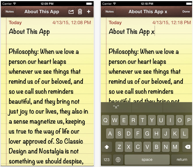
Skeuomorphic design imitates materials and objects found in the “real-world,” such as the older version of the Apple Notes App simulating a real notebook. Skeuomorphism does this by translating functions in the real-world into digital usage, as well as using high-contrast shadows and textures.
Neumorphism also imitates the realism found in skeuomorphism, but uses soft, low-contrast lighting and shading. Neumorphism simplifies designs further by removing textures and color variety typically found in skeuomorphism to maintain a minimalist approach.
When neumorphism is used intentionally and with care (view the drawbacks in the next question), its soft and airy styling can make interfaces feel more welcoming and intuitive to users. When UI components use a more subtle design, but still give the affordance of being interactive, the user’s cognitive load is reduced.
Since neumorphism provides a sense of depth through shadows and highlights, the user’s eye is naturally drawn to actions they can take in the interface–maintaining clarity without clutter.
A few drawbacks to be mindful of when designing neumorphic interfaces include:
Choosing the look and feel of a product’s interface isn’t an easy decision. Your product’s user groups, competitors, and company-branding should all be factored into the decision-making process.
Neumorphism is an exciting design trend you may consider adopting to help modernize and differentiate your product as it:
At the same time, neumorphism spurs concerns around accessibility and usability issues. If you use neumorphism in your product design:
Neumorphism isn’t the only design trending now. Big tech companies such as Apple and Netflix are using trends such as glassmorphism, neubrutalism, and dark mode as well. When selecting a design trend to use for your product, compare and contrast the look and feel each trend gives to products and how it drives the brand. The most important thing is to make sure the design trend resonates with your user groups.

LogRocket's Galileo AI watches sessions and understands user feedback for you, automating the most time-intensive parts of your job and giving you more time to focus on great design.
See how design choices, interactions, and issues affect your users — get a demo of LogRocket today.
AI has made polished, confident content easy to generate, but that does not make it trustworthy. This article explains how UX teams can design stronger quality signals using source transparency, validation, confidence communication, and reputation.
Inclusive design is evolving beyond accessibility alone. This guide explains how UX designers can create more inclusive products through usability, accessibility, neurodiverse UX, adaptive personalization, multimodal design, and culturally aware product experiences.

I was working with an intern on a UX research project, and before we even started, we both had private […]

AI has accelerated design execution, but speed can come at the expense of intentionality. Learn how UX teams can preserve product thinking and judgment.

 Learn more →
