Editor’s note: This article was updated by Chinwike Maduabuchi on 10 February 2025 to provide more insights into the different pros and cons of natural vs. reverse scrolling, explain scenarios where one option might be better for your digital product over the other, and answer common questions about scrolling direction.

Picture this scenario: A teacher is lecturing using a fancy touchscreen whiteboard with slides that change vertically. At one point, a student calls out, “Sir, I missed the last slide on the screen. Could you please go back? I need it for my notes.” So, the teacher places their hand on the board and swipes up.
But to the teacher’s shock, the content moves up and the next slide is shown. Some students laugh. The teacher wonders: “Why did it go the opposite way?”
This moment of confusion reveals a cognitive problem we face when navigating digital devices today.
See, it’s not entirely the teacher’s fault. They could have thought swiping up would bring the content above the screen back into view. After all, doesn’t scrolling up on a mouse wheel do just that? This is a design loophole we’ve created for ourselves, and it has birthed the debate of natural vs. reverse scrolling.
In this post, we’re going to dive into the philosophy of natural and reversed scrolling, explore their history, and learn their differences so we can decide what option to pick for ourselves and our users.
When trying to explain and differentiate these two types of scrolling, it’s important to keep two things in mind:
The key difference between the two scroll modes lies in how content responds to your input:
In other words, with natural scrolling, you swipe or scroll downward and the content moves down (while the scroll bar moves up). With reverse scrolling, you swipe or scroll downward and the scroll bar moves down (while the content moves up):
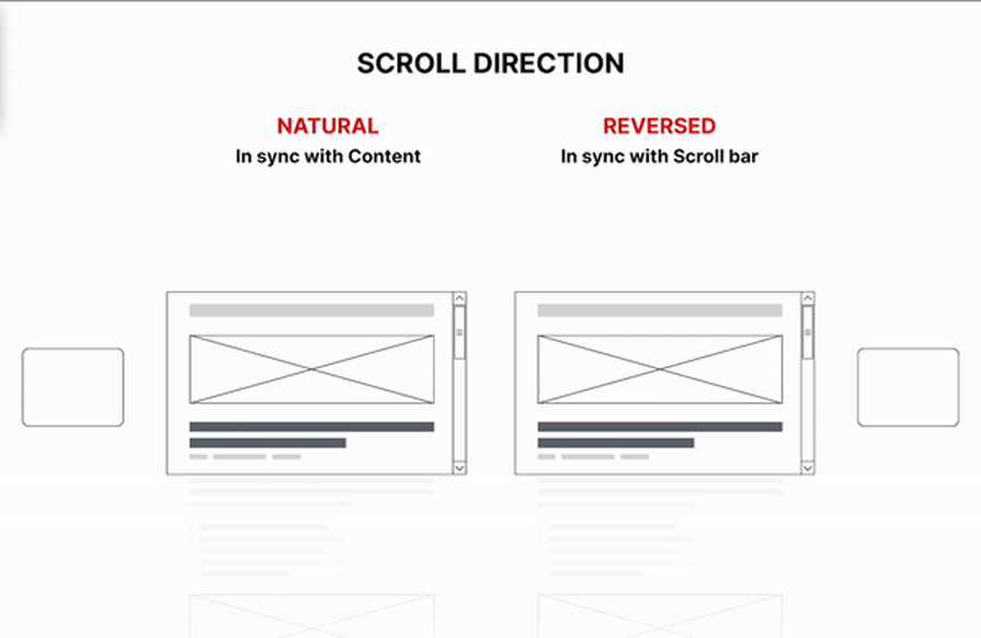
Let’s imagine the teacher in our scenario to be an elderly man who doesn’t own a touchscreen device. He navigates digital content on his laptop using a mouse, mainly for school-related tasks. Recently, the school introduced him to a digital whiteboard as part of its initiative to modernize the learning experience.
His first attempt to scroll followed the method he’s used to: reverse scrolling. He assumed that swiping up on the touchscreen would move the content down to reveal older material at the top. However, he quickly learned that modern devices don’t work that way. Almost all devices today support natural scrolling, where swiping up will move the content (in the same direction) up to reveal new information.
This shift impacts cognitive load and muscle memory. If you’re accustomed to reverse scrolling with a mouse, switching to natural scrolling on a touchscreen can feel daunting — your brain expects the content to move in the opposite direction. Additionally, switching between devices with different scrolling methods demands extra mental effort as you adjust to the change.
The device type also plays a big role. Mouse and scroll bars typically use reverse scrolling whereas touchscreens and trackpads are gesture-based and employ natural scrolling to reduce strain and make interaction more intuitive by aligning your gestures with the content movement.
Generally speaking, natural scrolling is ideal for touchscreens and creative tasks, while reverse scrolling suits legacy systems and traditional workflows. However, switching between devices with different methods can impact productivity.
Benefits of natural scrolling:
Drawbacks of natural scrolling:
Benefits of reverse scrolling:
Drawbacks of reverse scrolling:
When designing your product, consider your users’ devices and workflows to choose the scrolling method that provides the smoothest, most efficient experience.
In case you’re stuck trying to reverse how you scroll, or perhaps you want to remind yourself of the differences before we move on, here’s how you can change the scroll direction:
Win + I to launch the Settings appIn ancient times, scrolls were long and designed to be read in segments. While reading, only a portion of the scroll was visible at any given moment. By holding the scrolls at both ends, the thickness of the rolled-up sections provided a clear sense of reading progress.
Fast forward thousands of years, and while the medium for interacting with information has transformed — from physical scrolls to digital screens — the user experience remains fundamentally the same:
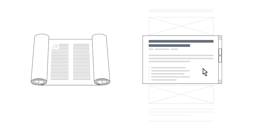
Now, let’s explore how reversed scrolling — once rooted in the mechanics of ancient scrolls — got overthrown by the gesture-based natural scrolling we experience on today’s devices.
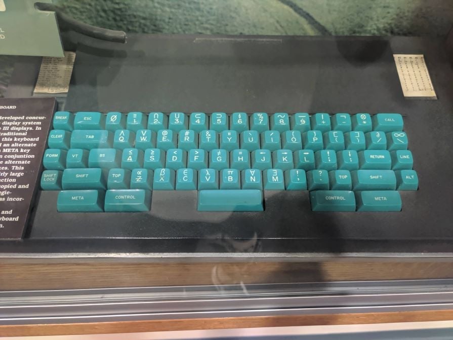
In the late 1960s, the first text editors introduced new ways to interact with on-screen content, leading to innovations in cursor movement and viewport control. Among these was the trackball, an input device that allowed users to scroll through content by rotating a ball embedded in a fixed base.
Though modern trackballs are smaller and less commonly used, the core scrolling behavior they introduced remains the foundation of how we navigate digital content today. This invention set the stage for the creation of the scrollbar — a visual tool that would become essential for managing longer documents and understanding a user’s position within them:
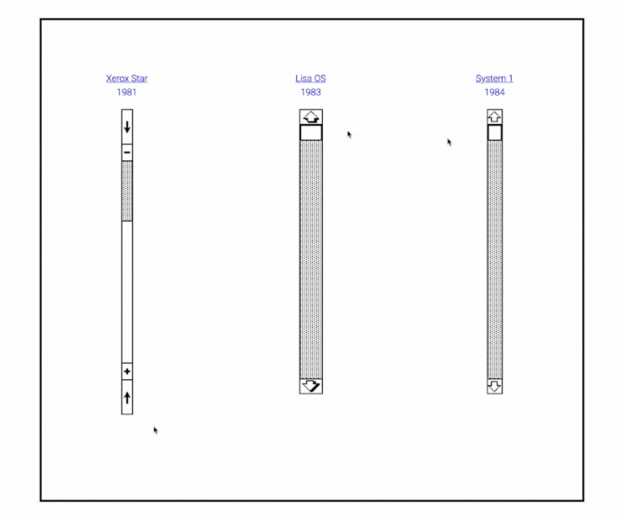
The scrollbar emerged to address a fundamental challenge: helping users move through and track their progress as they interacted with a document.
While the first computer mouse prototype was built in 1964, it reached personal computers much later. The Xerox Alto was one of the first computers designed for individual use in 1973 and was the first one to support a mouse:
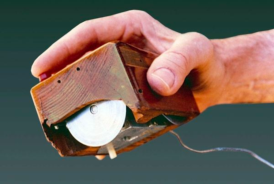
In 1981, the Xerox Star was shipped with a mouse and with the navigation adapted for it. That includes the scrollbar. This new scrollbar was quite a misleading one, trying to combine natural and reverse behavior. That pattern was quickly changed to the reversed one, which is still the convention for the scrollbars on every device.
One more invention appeared: arrow buttons. They allowed users to navigate through the files in a reversed manner, corresponding to the direction of the movement. Arrows have come a long way to become what we’re familiar with today:
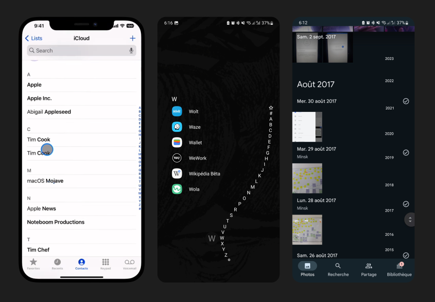
In the late 1990s to early 2000s, touchscreens became more common. Companies first introduced them with PDAs, and later with smartphones and tablets. Some of these devices presented two options for scrolling — either by manipulating the content if you touch the content part (the “natural” way) or by touching and manipulating the scrollbar (the “reverse” way).
While we quickly adopted the common behavior and it remains unchanged today, scrollbars on touch interfaces were slowly evolving to almost complete extinction. When you encounter them today, they’re often in an updated form:
In 2011, Apple took a major leap in its UX strategy by introducing natural scrolling as the default behavior in OS X 10.7 Lion — a change that disrupted 15 years of conventional reversed scrolling.
Apple’s decision to introduce natural scrolling was largely influenced by its vision of unifying interactions across its ecosystem with the touch-based gestures users had become familiar with on devices like the iPhone and iPad. On these devices, scrolling in the direction of content (up to move the content up, down to move the content down) had already become the norm.
By aligning the desktop experience with touch-based scrolling, Apple aimed to create consistent interaction design across all its devices. The idea was to make scrolling more intuitive, much like the way users interact with their smartphones and tablets, where natural scrolling feels more instinctive.
Natural scrolling eventually gained acceptance as users adapted to the new behavior, and it has since become the standard across Apple’s devices. This early flexibility set Apple apart from other platforms like Windows, which would introduce this feature much later:
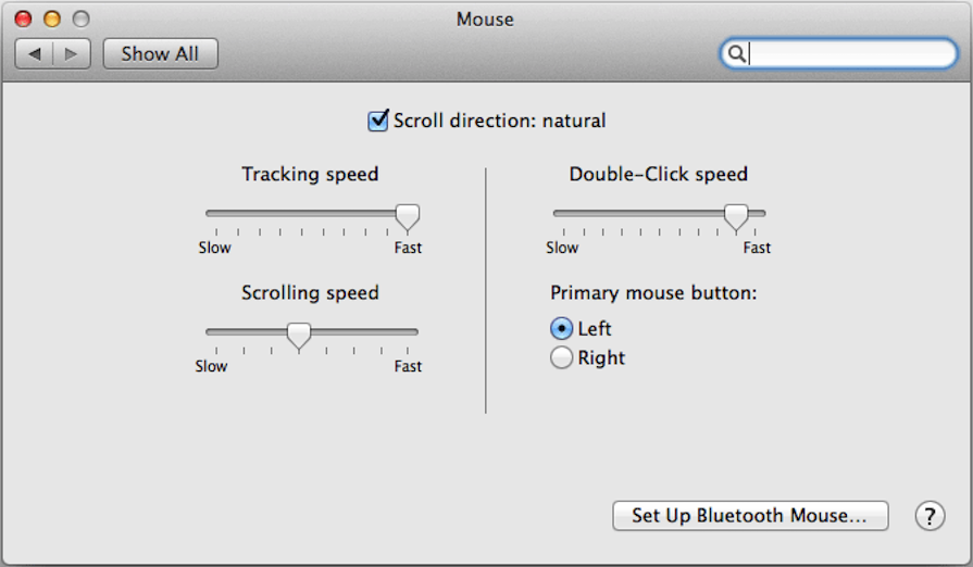
Reverse scrolling happens when the content in focus moves in the opposite direction of the applied input or gesture.
To fix inverted scrolling, you can usually adjust the setting in your device’s system preferences or control panel. On macOS, go to System Settings> Access Mouse or Trackpad > Scroll & Zoom and toggle “Natural Scrolling” On Windows, go to Settings > Bluetooth & Devices > Mouse and look for the “Scrolling direction” option.
Natural scrolling is typically better for touchscreens, as it mimics our interaction with physical objects providing a more intuitive experience.
Yes, most devices allow you to toggle between natural and reverse scrolling in the system settings.
Switching between scrolling methods can create confusion, especially for users who frequently switch between devices or operating systems. It may take some time to adjust, which can temporarily impact productivity.
Natural scrolling is typically better for creative tasks like graphic design or video editing, as it feels more aligned with the user’s physical movement when navigating large canvases or timelines.
Yes, reverse scrolling can work on touchpads or mice, but it might feel unnatural for some users accustomed to natural scrolling, especially on gesture-based devices.
Not necessarily. Natural scrolling is ideal for touchscreen devices and creative tasks, but reverse scrolling might be better for users familiar with traditional workflows or older systems. When choosing a scrolling method, it’s important to consider the specific needs of your users and their devices.
Choosing between natural and reverse scrolling boils down to user preference, device type, and context. Here are the key takeaways from this discussion:
Natural scrolling:
Reverse scrolling:
Ultimately, there is no universally “correct” scrolling method, though natural scroll is increasingly becoming the norm. The best approach depends on the user’s habits, device usage, and specific tasks.
If you’re deciding which option to use in your digital product design, test out both options with your users, switching the scroll direction on different devices to see how it feels. Does natural scrolling make navigation smoother? Is sticking with reverse scrolling more comfortable?
Feel free to share your experiences and opinions in the comments below!
Header image source: IconScout
LogRocket's Galileo AI watches sessions and understands user feedback for you, automating the most time-intensive parts of your job and giving you more time to focus on great design.
See how design choices, interactions, and issues affect your users — get a demo of LogRocket today.
A three-week mobile banking project taught me that the “proper” UX process is not always realistic. Sometimes, the better approach is to work with what you know, identify what you still need to learn, and make the strongest decision possible under real constraints.
A/B testing compares two versions of a design to see which performs better with real users. Here’s how UX teams can use it to test hypotheses, measure outcomes, and make smarter product decisions.
This case study shows how one ad experience redesign increased total ad exposure while lowering perceived friction, proving that timing and context can matter more than raw interruption.

As products evolve into ecosystems, navigation becomes a system-level challenge. This article explores how to align structure, context, and user journeys to create seamless movement across tools without confusion.