The first time I learned that menu means “list” in French, it all clicked. A mega menu is literally a big list. And that’s exactly what it is in modern web design. It’s a large, expandable panel that groups multiple links or categories into a single dropdown. It’s a go-to pattern for sites with deep information architecture — ecommerce platforms, enterprise tools, product suites — anywhere that needs to surface a lot of navigation options at once.
But here’s the thing. Mega menus can either guide users or confuse them.
When designed well, they’re seamless extensions of a site’s structure, i.e., clear, scalable, and user-friendly. When done poorly, they’re overwhelming dropdowns that add friction and kill momentum.
From a UX lens, a great mega menu should:
I recently reviewed a few live examples that stood out. In this piece, I’ll point out what they do right, design tips worth borrowing, and common pitfalls to avoid.
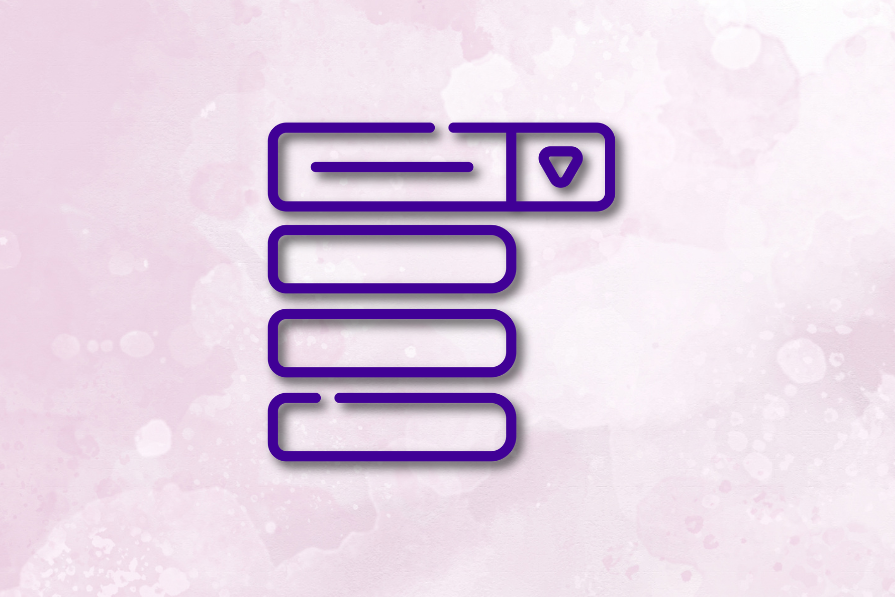
A mega menu is a type of navigational UI element that displays a large, multi-level list of links in a single dropdown panel. It’s typically used on websites with complex information architecture or many categories — like ecommerce platforms, design tools, SaaS products, and media outlets.
Unlike standard dropdowns, mega menus don’t just list a handful of items. They organize entire sections of a site into one glanceable view:
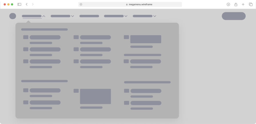
I like to think of it as a visual sitemap that appears on demand. It often features headings for categories, sub-links under each heading, and sometimes icons or images for clarity. The name “mega menu” plays on that French root of “menu,” meaning a list – except here we’ve supersized it to handle lots of choices.
| Menu type | Best for | Strengths | Limitations |
| Mega menu | Sites with many categories or deep IA | Can show large sets of links at once,with clear grouping | Can overwhelm if poorly organized; harder to make mobile-friendly |
| Dropdown menu | Simple websites, basic nav structures | Easy to implement, minimal space usage | Limited to few links; poor for complex structures |
| Hamburger menu | Mobile apps, minimalist UIs | Saves space, familiar on mobile | Low discoverability, hides content until clicked |
| Sidebar menu | Dashboards, apps, admin panels | Great for multitasking, always visible | Can take up screen space; not ideal for content-heavy pages |
| Tabbed navigation | Comparison pages, step-by-step flows | Intuitive, encourages quick switching | Works best for limited categories; not scalable for large nav |
Figma sits at the center of the modern design workflow. From core design and prototyping features to FigJam, Dev Mode, plugins, templates, resources, and community resources, it’s more than a tool. It’s a full platform:
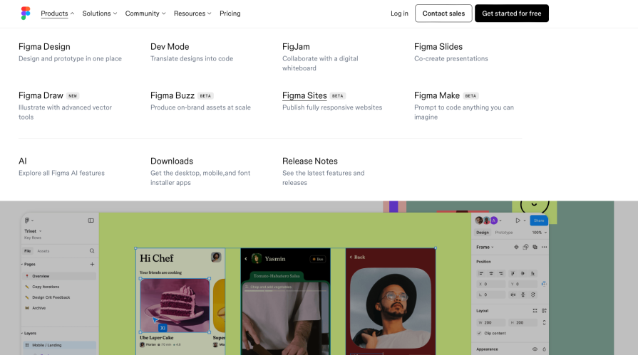
That kind of product depth creates a navigation challenge. A basic top nav wouldn’t cut it. You need something scalable, a way to show depth without overwhelming.
That’s where the mega menu comes in. Instead of trying to cram everything into a few dropdowns, Figma uses a click-to-open mega menu that helps users explore by category, not chaos. As a design-led company, they do a solid job of making the menu feel purposeful and easy to use.
What works well:
Upwork is a freelancing platform that serves a wide range of users — from solo creatives and small teams to large enterprise clients. Their services cover everything from project-based hiring and consulting to longer-term contracts, spanning categories like design, development, writing, and more.
That kind of variety requires a navigation system that can help people explore by need — not just product. And that’s where their mega menu comes in. It’s clean, visual, and built to scale. Whether you’re a freelancer browsing opportunities or a business looking to hire, the menu helps you find your lane quickly without feeling lost:
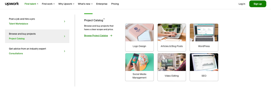
Upwork’s menu feels corporate but functional. It presents their complex offerings without feeling random or cluttered. They achieve balance by limiting each column’s width and using consistent bullet points under each heading.
What works well:
Brix is a Webflow development agency, but they don’t stop at dev. They offer end-to-end services across design, web design, UI/UX design, and more. They also work across different industries like SaaS, healthcare, fintech, and education. That’s a lot of angles to cover, and a standard top nav wouldn’t cut it:
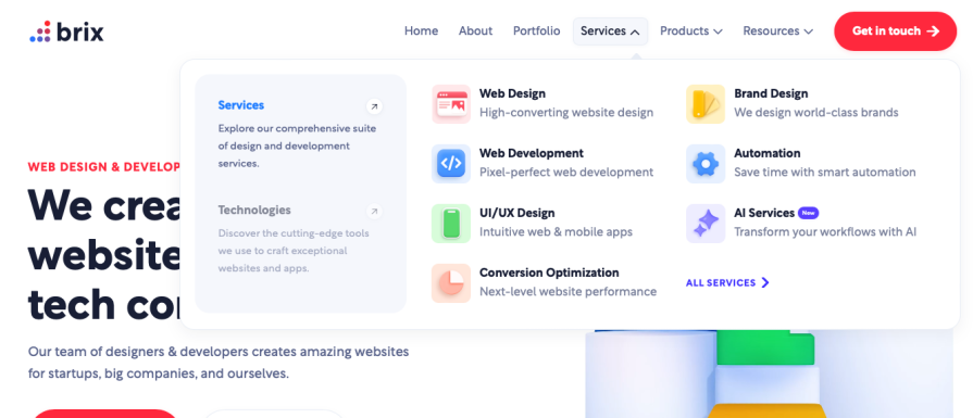
In my exploration, I noticed Brix uses their colours on icons and graphics in the menu, which is a bit more adventurous than a standard text list. This adds personality and helps the menu feel like an integrated part of the page (they’re essentially selling their expertise, after all).
What works well:
To design a mega menu that supports — and not sabotages — the UX:
Even experienced teams fall into these traps:
A mega menu isn’t just a UI element. It’s a bridge between user intent and a product architecture. It needs to do more than list links. It must help users orient themselves, make quick decisions, and feel in control.
The best mega menus are invisible until you need them — and helpful the moment you do. They organize complexity into clarity. They guide, don’t distract. And they evolve with your product’s needs.
Designing a great one isn’t about packing in everything you can. It’s about creating space, structure, and support. When in doubt, test with real users. Watch where they hesitate. And design until hesitation disappears.

LogRocket's Galileo AI watches sessions and understands user feedback for you, automating the most time-intensive parts of your job and giving you more time to focus on great design.
See how design choices, interactions, and issues affect your users — get a demo of LogRocket today.
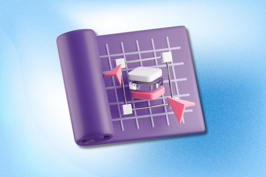
AI tools can generate beautiful UI concepts in minutes, but most teams struggle to integrate those outputs into real design systems. This guide explores why AI drifts toward generic patterns and how to build governed workflows that keep speed without sacrificing brand consistency.

Adaptive interfaces personalize experiences using behavioral signals and machine learning. But when personalization becomes autonomous, systems can reinforce patterns, limit discovery, and shape user behavior in ways designers didn’t intend.
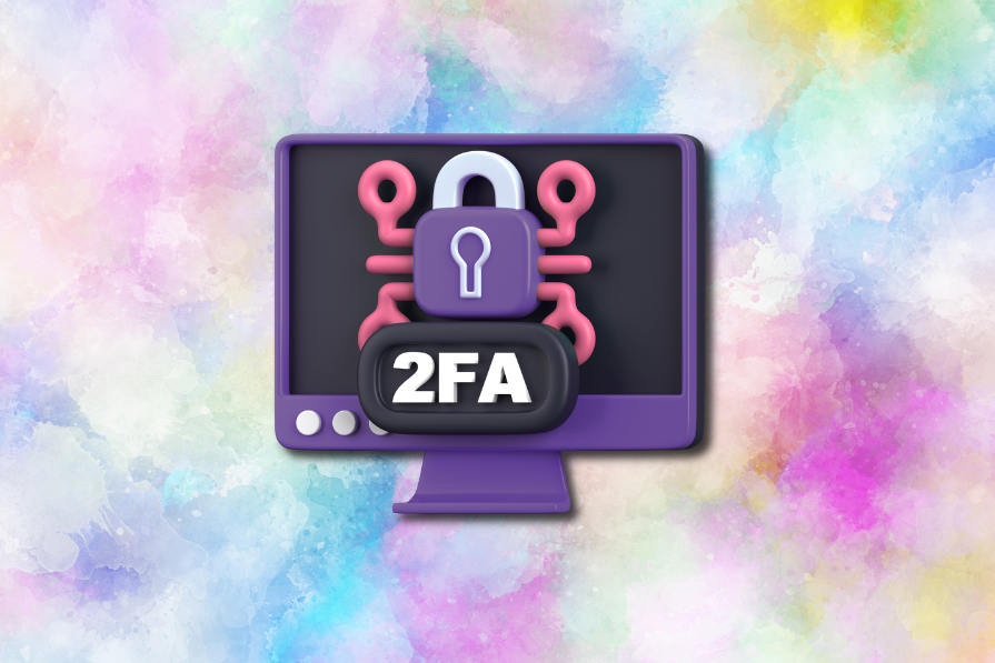
Security requirements shouldn’t come at the cost of usability. This guide outlines 10 practical heuristics to design 2FA flows that protect users while minimizing friction, confusion, and recovery failures.

2FA failures shouldn’t mean permanent lockout. This guide breaks down recovery methods, failure handling, progressive disclosure, and UX strategies to balance security with accessibility.

 Learn more →
