So you’ve designed the perfect landing page. The design is a masterpiece. From the layout to the visual hierarchy, everything is spot on. You’ve even crafted killer copy and CTAs to ensure this landing page converts. Great work!

But wait a minute. Can your users actually locate that perfectly designed CTA button? How would they even know how to navigate this newly designed page?
Here’s the thing: immaculate design alone isn’t enough. Without taking appropriate measures to guide your users’ attention, all your perfectly crafted elements would contribute nothing to the user experience. And one great way to influence how your users navigate your page is by employing directional cues.
In this article, we’ll explore the world of directional cues by looking at what they are and how to use them effectively. We’ll also add some examples of designs that effectively use directional cues to enhance your understanding of the concept.
So, if you’re ready, let’s discuss directional cues!
Directional cues act like GPS on an interface. They are visual hints that guide users toward the most crucial elements on a page, thus aiding them to accomplish their goals. One example is the use of arrows to direct users.

Generally, directional cues fall into two main categories: explicit and implicit directional cues. We’ll delve deeper into each of these categories in a moment. But first, let’s discuss the psychology behind how users interpret and follow directional cues.
With all the visuals that bombard us daily, we can’t possibly pay full attention to everything our eyes come in contact with. So, our brains are constantly seeking ways to prioritize information. Fortunately, directional cues help with this. They act as navigational signposts that help us make sense of all the chaos.
These directional cues tap into our cognitive biases and past experiences to direct our attention toward crucial elements of an interface, resulting in an enhanced user experience. For instance, if you’ve come across arrows indicating direction while traveling, any arrow on an interface would instinctively strike you as a cue to point you in the right direction.
So, we’ve explored why directional cues work. It’s time to see how they work by looking at some directional cues and their applications.
As the name implies, explicit cues are obvious visual elements that guide users’ attention and actions. These directional cues indicate where users should look or what they should do.
Explicit cues include arrows, eye gaze, strategic object positioning, and gestures. Let’s see what these directional cues look like in action:
Arrows are one of the most straightforward and commonly used directional cues. They assist users in navigating content, moving through sequences, or locating a crucial element.
The following example uses an arrow to direct users to the required action on the page — entering their email address.
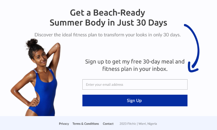
A clever little trick, right? But explicit cues don’t always have to be this obvious. Occasionally, designers might employ a more subtle approach to direct the users’ attention. Taking advantage of the power of eye gaze is one of these approaches.
Another subtle yet effective directional cue is the human eye. Naturally, people are inclined to look at what others are looking at. In other words, if the image on an interface has gaze directed at an element, the users are also likely to look at that element.
In the following example, the eye gaze is directed toward the form, compelling the users to notice it. Not only will this save the users time, but it will also increase the likelihood of them taking the required action.

This method doesn’t only work with eye gazes; users will also look at an area if someone points in that direction. Designers can harness this power by directing gestures toward specific elements on an interface.
Gestures are another (not-so-subtle) way of directing users’ attention. By using an image of someone pointing or gesturing toward a particular direction in an interface, you can shift the user’s focus to that direction.
As shown in the following example, the model points to the form, which forces the user to pay attention to it.
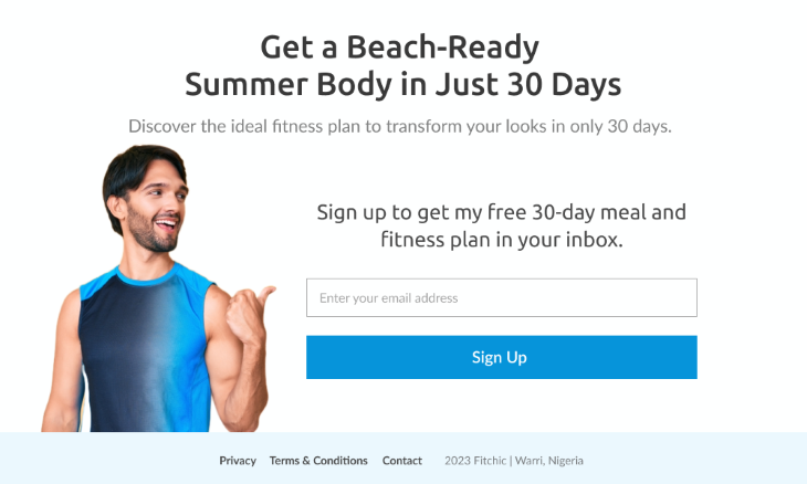
But you don’t always have to use human images to direct focus. Objects work just as well. Users will also focus on an element if an object points toward its direction.
By positioning objects to point toward a particular area, designers can shift users’ focus to the crucial elements of an interface.
Here’s an example with a delivery truck facing the signup form. Users will shift their focus to the signup form without even realizing it.

The examples we’ve looked at thus far show how you can explicitly guide a user’s focus. But you don’t always have to make your cues obvious. You can make things much more subtle by employing implicit directional cues.
And just in case you’re wondering what implicit cues are, we’re about to explore that.
Implicit cues subtly highlight specific elements on a page. They are so subtle they can often go unnoticed by the user. Some common types include white space, color contrast, and visual hierarchy.
Let’s see what these cues look like in action:
White space refers to the empty or blank areas between elements on an interface. By strategically using white space, you can guide the user’s attention to specific actions on an interface and improve overall user experience.
Here’s a landing page with substantial white space around the headline, subheadline, and email capture form.

White space does a great job of capturing users’ attention and avoiding information overwhelm. But if you observe our example more closely, you’ll notice that the elements that stand out the most are the ones with the highest color contrast. That brings us to another type of directional cue. And it has to do with colors.
Using contrasting colors is another form of directional cue. You can direct users’ attention to specific actions on a page by creating stark color contrasts.
In the following example, the color contrast accentuates crucial elements on the page, making it easier for the user to spot them.

While color contrast effectively guides users’ attention, it isn’t always the most accessible method because colorblind users can miss color-specific cues. Therefore, it is best to combine color-related directional cues with other techniques. One such technique is visual hierarchy.
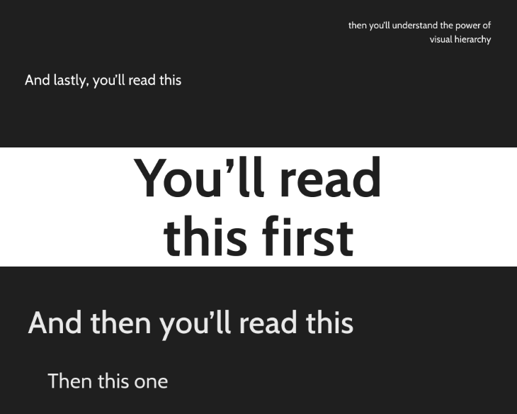
By designing elements with varying sizes, colors, and placement, you can guide users’ eyes to the key actions on a page. This strategy works well for taking users through complex interfaces and avoiding information overwhelm.
Let’s take a look at how this works with an example.
So far, we’ve seen the many potentials of directional cues — helping users locate specific elements, navigate complex interfaces, and take action faster. However, none of these can be possible if your directional cues don’t align with users’ expectations. Let’s now look at how to meet the users’ expectations.
It’s not just about using directional cues; your cues must be as intuitive as possible for users to perceive them. Luckily, some fundamental guidelines can help with that. Design principles such as size, placement, and consistency can help to create intuitive directional cues. Now, let’s explore the roles each of these factors play in designing effective directional cues:
The larger the size of a directional cue, the more prominent it is in the design. And as we know, users are more likely to perceive a more prominent directional cue. However, it is essential to strike a healthy balance. If your directional cues are too large, they can overwhelm the design.
The location of directional cues largely influence how users perceive and follow them. Therefore, it’s essential to place directional cues in areas where users are naturally inclined to look. For example, placing directional cues along an “F-shaped” path is a good idea as users typically scan a webpage in that pattern.
Consistency is essential for an intuitive design. When you use consistent directional cues through your design, your users will develop mental models of navigation patterns that will help make navigation more intuitive.
Having discussed some design principles that can improve the intuitiveness of your directional cues, let’s explore some best practices for implementing them.
With all the information we’ve covered, you are almost ready to start implementing directional cues like a pro. But we want to ensure you get the best out of your directional cues, so here are a few more tips for you. Note that these tips apply to implicit and explicit directional cues:
Like every aspect of design, directional cues should reflect the brand identity. Therefore, you should opt for cues that align well with the established brand guidelines. Whether it’s the color palette, typography, or imagery, always keep things in alignment with the brand’s style.
The device, screen size, and orientation can affect how an element appears on the screen. Therefore, you should adapt your directional cues to various devices and screen sizes to ensure they are functional across all platforms.
User testing is a crucial part of any design process. Always conduct in-depth testing on your directional cues to learn how users perceive and interact with them. You can then use the feedback to iterate your directional cues to ensure they serve their intended purpose.
Having covered some best practices to keep in mind, you now have just about enough knowledge to apply directional cues effectively. But here’s the thing: all your carefully designed directional cues would amount to naught to any user who can’t perceive them. So, you need to keep all groups of users in mind. Therefore, accessibility is essential. And that’s what we’re about to discuss.
As we’ve already established, users rely on directional cues to lead them in the right direction. This dependency requires a high level of trust. Exploiting this trust for personal gain by manipulating users to spend more time on a website or compelling them to engage in unfavorable actions is unethical.
Therefore, always put the user’s well-being first before your own interest. Talking about the well-being of the users, one way to ensure this is by implementing the following accessibility considerations:
Give users the option of customizing how they receive directional cues based on their needs. For example, you can allow users to adjust the font size, color contrast, etc. This flexibility will ensure that people with a wide range of abilities can perceive your directional cues.
Avoid using only visuals as a way to guide users. Combine visual, auditory, and tactile directional cues to cater to various sensory needs. For example, by adding alternative text to images, users who rely on screen readers can perceive the directional cues they are supposed to give.
Now it’s time to wrap this all up by highlighting some key takeaways and lessons for designing effective directional cues.
Immaculate design alone isn’t sufficient. You should direct your users to what matters most to ensure conversion. Hence, you need directional cues. Directional cues act like GPS, helping users find crucial elements to accomplish their goals. These cues can be implicit or explicit. Explicit cues such as arrows and eye gaze are overt ways of directing a user’s focus, while implicit cues like whitespace are more subtle.
By adhering to design principles, accessibility guidelines, and best practices while using directional cues, you can create designs that are easy to navigate and more likely to get results. But remember, the purpose of directional cues is to assist users, not manipulate them.
Header image source: IconScout
LogRocket's Galileo AI watches sessions and understands user feedback for you, automating the most time-intensive parts of your job and giving you more time to focus on great design.
See how design choices, interactions, and issues affect your users — get a demo of LogRocket today.
A three-week mobile banking project taught me that the “proper” UX process is not always realistic. Sometimes, the better approach is to work with what you know, identify what you still need to learn, and make the strongest decision possible under real constraints.
A/B testing compares two versions of a design to see which performs better with real users. Here’s how UX teams can use it to test hypotheses, measure outcomes, and make smarter product decisions.
This case study shows how one ad experience redesign increased total ad exposure while lowering perceived friction, proving that timing and context can matter more than raw interruption.

As products evolve into ecosystems, navigation becomes a system-level challenge. This article explores how to align structure, context, and user journeys to create seamless movement across tools without confusion.