People come with all different types of abilities and disabilities. By designing with accessibility in mind, you can open up a world of opportunities for users of all abilities to engage with your work. It’s not just about doing the right thing; it’s about creating a more inclusive future for all. Everyone deserves a fair and equal opportunity to access the same experiences.

As design teams grow in UX maturity, design systems not only help maintain consistency across products but also increase designer efficiency. They provide the building blocks to what you’re building, the many pieces to the puzzle, and one of those pieces is accessibility.
Accessibility is often forgotten or treated as an afterthought in the design process when it really should be a key aspect of every designer’s process. It ensures that everyone, regardless of their abilities, can access and use the experiences that you create. By incorporating accessibility into your design system, you’re creating a more inclusive experience for all users.
Think about it this way — if you design with accessibility in mind from the beginning, you won’t have to go back and make changes later on. It becomes an integral part of your design process, saving you time and ensuring that your designs are inclusive from start to finish.
In this article, we’ll talk about accessibility guidelines, incorporating accessibility into your design process, and testing your design system. It’s time for designers to stop ignoring accessibility and start embracing it as an essential aspect of design.
Accessibility guidelines are the unsung heroes of the design world. They make sure that designers have the tools and knowledge to make their designs easily accessible to everyone, regardless of their abilities.
Now, you might be thinking, “Great, more rules and regulations”. But trust me, these guidelines are actually pretty cool. They cover everything from website design to user experience to technology compatibility, making sure everyone can use and enjoy digital content.
Arguably the most well-known guidelines in the accessibility world are the Web Content Accessibility Guidelines (WCAG). They were developed by the World Wide Web Consortium (W3C) and have become an international standard for measuring accessibility. These guidelines cover every aspect of web content accessibility. It’s like a blueprint for making sure your content is accessible to everyone.
WCAG has three levels of conformance to help us understand how accessible an application is. These levels are:
For example, consider pre-recorded videos like films or social media.
To meet Level A, there must be an alternative for the video that presents the same information in a different format, such as captions.
To meet Level AA, an audio description must be provided for the pre-recorded video. An audio description is basically a narration of the video, usually inserted when there are breaks in the dialog, that describe visual details to the audience, such as a character’s facial expressions or a scene change.
To meet Level AAA, the pre-recorded video must include extended audio descriptions when necessary. These are implemented when the breaks between dialog are too short to include narration and would provide important information for the audience to understand the full context of the video.
So, think of these levels as bronze, silver, and gold — each level builds on the last, and the highest level has the most accessibility features.
If you’re designing for the US government, then you’ll want to get familiar with Section 508. These guidelines were created to give people with disabilities equal access to information and communication with the government, regardless of their abilities.
All electronic and information technology used by the government must comply with Section 508 standards. This includes everything from websites and applications to software and hardware.
Organizations that fail to comply with Section 508 can face some hefty penalties and even lawsuits, so it’s important to make sure that all technology used by the government is accessible.
If you’re looking to learn more about designing with accessibility, the IBM Equal Access Toolkit and Microsoft’s Inclusive Design Toolkit are great resources to check out. These toolkits offer accessibility checklists, insights on how people with disabilities experience products, as well as tools to help you document accessibility in your designs, such as image alt text and heading ranks.
Some additional resources include the A11y project and Deque. The A11y Project is a one-stop shop for all things related to accessibility, and its goal is to make the web more inclusive for everyone, regardless of ability. The project provides a variety of resources, including guides on accessibility testing, tutorials on creating accessible components, and information on assistive technologies.
Deque is a trusted and experienced provider of digital accessibility solutions, and they work with a wide range of organizations, from large corporations to government agencies, to help them create more inclusive and accessible digital experiences. Some of the services offered by Deque include accessibility testing and remediation, accessibility training, and education, and consulting services to help organizations implement accessibility into their design and development processes.
So, step into the shoes of your users with disabilities and think about their needs. These resources can help you understand their perspective and create a design system that accommodates all use cases.
Designing with accessibility in mind not only benefits individuals with disabilities, but it leads to creative and innovative solutions that can improve the user experience for everyone. But first, it’s helpful to understand the different types of disabilities so that we can learn how to design for each use case.
When considering permanent, temporary, or situational disabilities, there are various ways in which accessible design can make a difference.
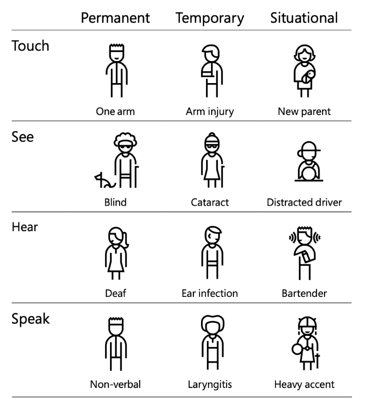
For those with permanent disabilities, accessible design can remove barriers and provide equal access to products and services. For example, by incorporating high-contrast color schemes and large text into a website design, individuals with low vision can navigate the site with ease.
Temporary disabilities, such as broken arms or temporary vision impairments, can also benefit from accessible design. A website with easily navigable, large buttons, and clear labeling can allow someone with a temporary disability to use the site without frustration.
Situational disabilities, such as those that may be in low light conditions, can also be accommodated by accessible design. This can include designing a responsive layout that adapts to different screen sizes and providing clear, large text that is easy to read in any lighting situation.
A design system typically has a style guide and a component library. The style guide is made up of elements like colors, typography, spacing, or elevation that help define the look and feel of the UI. The component library contains reusable UI elements, such as buttons, checkboxes, tags, or tooltips. The design system might also include a pattern library, which provides guidance on groups of UI elements used in a pattern, such as a navigation menu or rule builder.
Accessibility considerations vary depending on the design element. But the first step to building accessibility into your design system is making sure each element, component, and pattern is accessible. Here are some accessibility best practices to follow when building out your design system.
Consider the contrast between background and foreground colors. Use a color contrast checker to make sure the colors you’ve chosen meet the WCAG AA level for contrast.
To make things even easier for your team, provide color guidelines for your main design elements like text or icons, depending on the background color. And always keep in mind that relying solely on color to convey important information is not recommended and could make your design inaccessible to some users.
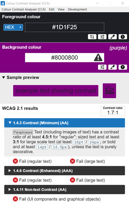
To make typography accessible, make sure that your text is readable and legible. Readability refers to how easy it is for a reader to understand the meaning of the text, while legibility focuses on the ease with which individual letters can be distinguished from one another.
Choose a large, clear typeface with adequate line spacing and make sure it is scalable so users can adjust the font size. Pay attention to font weight and style, using bold and italic styles to create contrast but avoiding too many variations. This will help make the text easier to read for everyone, including those with visual impairments.

Use alternative text, or alt text, for images and graphic elements.
Alt text should be concise and accurately describe the content and function of the image. For example, if an image depicts a chart or graph, the alt text might describe the data being represented. If an image is used as a button or link, the alt text should describe its purpose.
Keep in mind, the alt text shouldn’t be redundant or repetitive of other content on the page, such as image captions.

Make sure that the icons in your design system can be easily understood by everyone, regardless of their cultural background or language. It’s helpful to include text labels or descriptions for each icon, such as in a button, to ensure that the meaning is clear for everyone, including people who are blind or have low vision.

Complex or cluttered icons might look cool, but they don’t always scale well and can be tough to distinguish. Keeping your iconography simple and universal is the way to go.
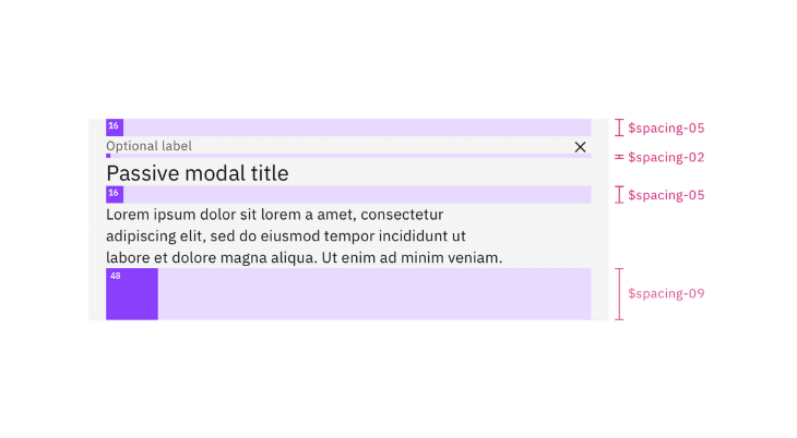
Ensure there is adequate space between elements on the page, and that elements do not overlap or become too close together. This helps make the page easier to navigate and improves readability. On mobile devices, more spacing between elements can improve touch accuracy, especially for users with mobility impairments.
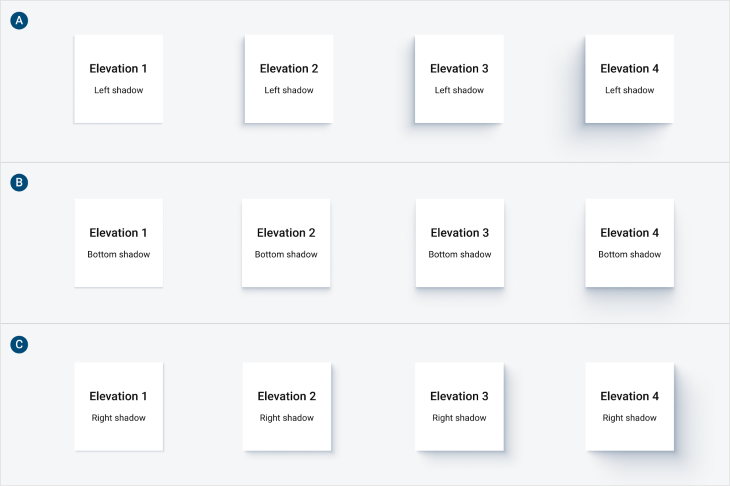
When using visual hierarchy, use elevation to indicate the relative importance of elements on the page. For example, an important toast message should have a higher elevation so that it appears on top of other UI elements and can be noticed by users. Avoid using elevation as the only means of conveying important information.
To ensure your design system is accessible, you’ll need to test the components and patterns for keyboard and screen reader accessibility.
Not all users have the mobility to use a mouse to navigate a page. That’s why you must ensure that users can interact with your designs using only a keyboard. This includes enabling users to navigate the page, access all functionality, and complete tasks without using a mouse.
With keyboard users, the tab order is of utmost importance. Tab order dictates the order in which a user navigates through a page using the keyboard. It’s important to ensure that tab order is logical and includes options to skip to the main content.
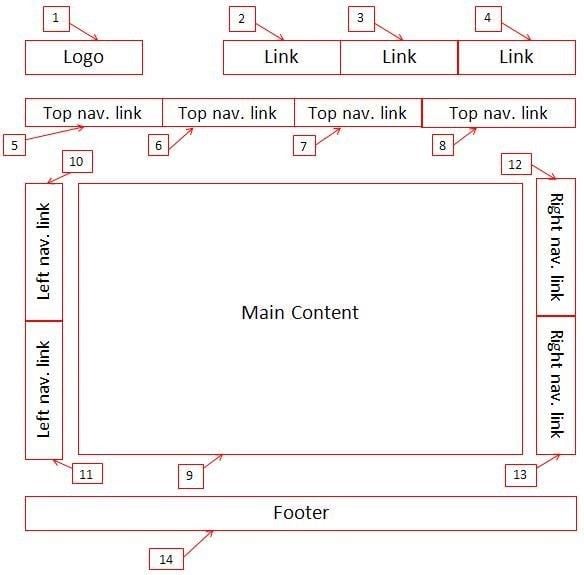
Additionally, think about actions that are done primarily with a mouse, such as dragging and dropping an object. Include guidelines in your design system on alternative ways for keyboard users to complete the same action.
To ensure that your design system is keyboard navigable, test out your components and patterns by tabbing through them. Think about navigating back and forth, as well as providing shortcuts to skip sections of content. By catching any potential keyboard accessibility issues early, you can fix them before they become a problem.
For people with low vision or blindness, screen readers enable them to use an application or website without having to see the screen. The screen reader will translate the content of a page into speech or Braille. It will read out loud the label associated with each UI element in focus as the user tabs through the screen. Some of the most common screen readers used include NVDA, JAWS, VoiceOver (iOS), and ZoomText.
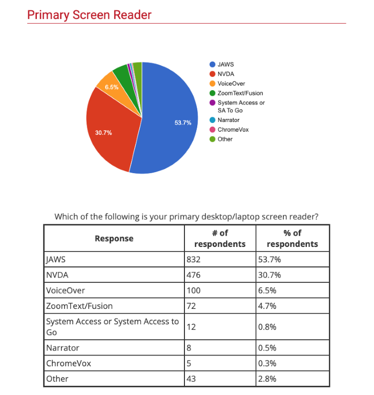
To ensure that your design system is screen reader accessible, make sure to test out each component and pattern with a screen reader. Include descriptive labels for any interactive elements, such as links or buttons. Think about whether your descriptions accurately describe the associated element if you couldn’t see it. This process can help designers build empathy with screen reader users and understand how to write descriptive labels that make sense.
Design systems are meant to enable design teams to create consistent experiences more efficiently. As designers, we need to think about how all types of users can experience our products, including people with disabilities.
If a design system has accessibility built into it, then there is a higher chance of the final product being more accessible. That’s not to say that you shouldn’t still conduct accessibility testing after your product has been released. But building an accessible design system gets designers thinking about accessibility throughout their design process, and not leaving it as an afterthought. That is the key to building more accessible and inclusive products that everyone can experience equally.
Header image source: IconScout
LogRocket's Galileo AI watches sessions and understands user feedback for you, automating the most time-intensive parts of your job and giving you more time to focus on great design.
See how design choices, interactions, and issues affect your users — get a demo of LogRocket today.

As products evolve into ecosystems, navigation becomes a system-level challenge. This article explores how to align structure, context, and user journeys to create seamless movement across tools without confusion.

Figma’s AI features have exploded in 2026 — from text generation and image editing to full UI drafts and code handoff. But speed isn’t the same as quality. This guide breaks down every major feature, what it’s good at, and where human judgment still does the heavy lifting.

Zero UI works well for screenless, voice-first experiences, but most digital products still require visual interaction. Here’s why multimodal UX offers a more scalable foundation for the future of design.

Multimodal UX goes beyond designing for screens. Learn how context-aware systems, progressive modality, failover modes, and accessibility-first design create better digital product experiences.